Hammer of God #1, February 1990, First Comics
writers: Mike Baron & Roger Salick
artist: Steve Epting
letterer: Diane Valentino
colorist: Les Dorscheid
editor: Bob Garcia
Sometimes I wonder if A Comic A Day is fueled by pure cosmic intervention. I read Hammer of God this morning and was surprisingly impressed, and when I came home from work, I wanted to seek refuge in an old, familiar comic book, something that I wouldn’t have to pick apart like a Thanksgiving turkey before bedtime. I dug up Captain America #19, which I reviewed way back in July, for sheer nostalgia’s sake, not to mention that Cap is always a reliable character for dynamic characterization and action-packed page-flipping, the two qualities I look for in a casual read. However, when I glanced at the credits, I literally smirked at the sight of Steve Epting’s name – the artist also responsible for the visuals in Hammer of God, published sixteen years prior. Of the thousands of comics in my collection (I really should count them someday, just to know), what are the odds that I’d encounter such a coincidence? But that’s what I’m saying. Maybe it isn’t a coincidence.
Despite its title, Hammer of God is less reliant on deistic intervention. In fact, the characters in this comic book are rather bestial in nature; our hero, Judah “the Hammer” Maccabee, is a humanoid baboon with a pompadour, traveling the universe as a freelance hero for hire. In this issue, the first of a four-issue miniseries, the Hammer’s clients are turning up murdered, as someone tries to frame Judah for their deaths. He suspects the Gucci, a mysterious alien mob, and in the end, when a ship full of innocent partygoers is destroyed, the Hammer vows to drop his vengeance on whoever is responsible. From the supplemental material I read throughout this issue, I’ve concluded that Hammer of God is a spin-off of Nexus, a popular superhero title by First Comics. Jacob’s spotlight is thusly long overdue, as the character’s look and personality dominate the book and maintain an intrigue all his own. In fact, how this character was resigned to a supporting role until now is beyond me, considering the assertiveness his creators infuse throughout all of his actions.
As I said before, tonight I sought the solace of an old, familiar comic book. Honestly, I’d prefer a new one, but with so many comics in line for a daily review, I must resist their siren song to preserve their sanctity for this project. In other words, it’s killing me not to read all of the books I buy as soon as I buy them, because of the thousands of comics already in my collection, I so devoured them throughout my youth that I feel like I know them too well. I can watch certain movies ad nauseum, and I can read certain issues over and over again, but it’s always good to take a break so the material seems fresh the next time around. A Comic A Day was inspired in part by these feelings toward my whole collection. I’ve simply read my comics too many times, because I treasure their role in my development as a collector. All this is to say, if I had this issue of Hammer of God ten years ago, I don’t think my young eyes could’ve been ripped away from it. Epting’s art is so . . . pure, it appeals to both one’s inner child and the more sophisticated reader, capturing the drama, attitude, and perspective this story needs to be effective. The characters are so expressive, the speech balloons sometimes simply aren’t necessary – but they help. Even the first page strikes me as something of a modern Kirby incarnation. Hammer of God is familiar in an entirely new way.
Comparing this early Epting work to Captain America #19, I can see the evolution of the artist as a visual storyteller, but to be fair, the material is so different, I wonder if the contrast speaks more to Epting’s sheer diversity than his mere development. That issue of Cap is rather urban and most definitely terrestrial, while the Hammer gives us a virtual tour of space – and this isn’t Star Trek space, with awkwardly prosthetic-caked humanoid alien races. It’s Star Wars space, with weird, animal-looking creatures all its own. (Really, besides Tribbles, did Star Trek ever present an alien that wasn’t so humanoid looking?) We’re talking floating amphibian heads . . . and with other characters like Fang S. Drool bullying around, writers Baron and Salick keep things interesting. I smell a conspiracy brewing behind the seemingly harmless subplots of this establishing issue, but without even reading the rest I assume this is one Hammer that has a hard time getting nailed.
Interestingly, as I’ve scoured back issue bins for obscure comics to add to this blog’s ranks, I’ve often neglected to consider that I’m literally adding issues to my already extensive collection. I’m shooting myself in the foot, as it were. As much as I want a new breed of titles to devour, as much as I long to step out of my capes-and-tights comfort zone to see what else this wonderful medium has to offer, I’m merely blowing my self-contained bubble a little bigger by incorporating these books into my ever-expanding collection. At the end of the year, as much as I’ll have all of these unique reading experiences under my belt, I’ll also have more comics that, eventually, I’ll grow tired of, as well. I wonder, is this cosmic destiny, or a cruel fate? Is the hand of God guiding A Comic A Day . . . or his hammer?
I’d prefer the baboon.
Wednesday, January 31, 2007
Tuesday, January 30, 2007
Zed #6
Zed #6, 2005, Gagne International Press
by Michel Gagne
In the context of the comic books I’ve reviewed lately, Zed #6 is easy reading material. In fact, the entire issue took only minutes to consume, which is saying something considering how much time a fully illustrated twenty-two-page book takes to read and analyze. I’m trying to take this project seriously, despite some of the frivolous fluff I’ve encountered. I’m trying to accept the responsibility of this challenge, even six months later, as every day I’m potentially handling somebody’s life’s work. I can’t dismiss it as fluff, for their sake. Even if it is.
Fortunately, Zed #6 is not fluff. In fact, this issue represents my dilemma, eliciting my sympathy for Zed, a squiggle of a character waking from a ten-year near-death experience to find his world savagely ravaged by the despot Maxuss. Zed visits his Uncle Lazar to gather the decade’s news, when Maxuss tracks him down and sends a robotic drone to attack. Uncle Lazar is potentially fatally wounded, and Zed is apparently outmatched. To be continued. Gagne is a ruthless writer, gently building a house of cards for the reader and intentionally swiping at it to ignite our empathy and excitement. He makes us feel for Zed like we’re supposed to. It’s a good thing.
I’m not familiar with Gagne’s entire body of work, but I have seen what he is capable of before, thanks to his multi-part Detective Comics back-up story “Spore.” In “Spore,” an alien possesses Batman and grows into a city-sprawling parasite, but not before the Dark Knight injects himself with a microchip that fights the symbiote on a cellular level. Much of the story is told from the microscopic perspective, but illustrated as if the conflict was larger than life. So, approaching Zed, I knew what to expect, and Gagne delivered, thankfully on a more above-epidermal level. Some perceive abstract art as a stretch of reality, retaining just enough of its subject’s characteristics to identify what it is. Gagne’s work is seemingly the inverse; he taps into the abstract dimensions around us and barely contains them in brushstroke, capturing them in bubbly, wavy lines that just manage familiarity. It’s refreshing.
But what does this have to do with A Comic A Day? I don’t want to be a Maxuss to some proverbial Zed’s home world. I know how I feel about this blog, the more in depth I plunge into its potential, so I can only imagine what a comic book means to its creator. Look at Gagne’s investment; he published Zed himself, and for a guy that can secure a back-up in Detective, he probably had other options. His creativity became his responsibility, a lofty life’s goal that produced ironically entertaining results. We artists can only hope.
Monday, January 29, 2007
Strike! #1
Strike! #1, August 1987, Eclipse Comics
writer: Charles Dixon
penciller: Tom Lyle
inker: Romeo Tanghal
letterer: Kurt Hathaway
colorist: Ron Courtney
editor: Cat Yronwode
On Martin Luther King Day, I began a series of reviews to commemorate the approach of Black History Month this February. As I’ve introspectively explored my reasons for tackling this thematic project-within-a-project, I’ve thought about the essence of Dr. King’s ministry, and specifically, how it relates to the pop culture that spawns these comics I so adore. The very concept of “Black History Month” implies a distinct and separate desire to be understood, a concerted cry that beseeches society to comprehend what black culture has experienced and endured. I dare to suggest that the true mission of Black History Month advocates should be eradication – should be the day when “black history” is so naturally incorporated into our general consciousness that we as a global communally accept each others’ respective plights, and further relate to them in the context of our own struggles, neither of which overshadow the other. Remember, Dr. King longed not for color-centrism, but color blindness. In pop culture, while some cultures are more adept at specific forms of expressions than others, to segregate each strand back to its origins is to deny everyone the chance to enjoy the richness of the tapestry. Musicians are musicians no matter what kind of music they make, and superheroes are superheroes no matter what part of the city they live in.
I’m looking at you, VH1’s The White Rapper Show.
Actually, I’m looking at Strike!, a comic book with bigoted undertones undoubtedly designed to inspire its readers to think about such things. Written by “Charles Dixon,” the famous Batman and Robin scribe, I presume, Strike! is, on the surface, an unadulterated superhero comic book about a child that discovers the lost diary and power harness of a former World War II meta-soldier. In fact, a majority of this introductory issue establishes the history of Sgt. Strike’s coveted harness, which utilizes the power of a mysterious meteorite, and how it transformed military man Russell Carlyle into the Golden Age icon that fought for, but eventually lost faith in, his country. Yes, Sgt. Strike is another Captain America rip-off, akin to the distained-but-not-forgotten Captain Paragon. However, despite the issue’s adventurous wartime bravado, Dixon’s first few pages set the series’ true tone.
Dennis is a black community college student trying to escape the ghetto through education, trapped between the ruthlessness of his peers and the pride of his father to really get anywhere. The first panel of the second page delivers an unexpected dose of prejudicial harshness; while Dennis and his friend Bobby strolls past a cluster of hoodlums, one of them shouts, “Hey, it’s my man Dennis an’ his little faggot Ko-rean buddy.” That infamous “f-word,” which has made the recent rounds thanks to Grey’s Anatomy actor Isaiah Washington’s slip of the tongue earlier this month, appears at least two more times in the next few panels. First of all, I wonder if I would’ve been as affected by the slur had the term not been in the news so much lately. Secondly, I wonder if Dixon strategically planted this hot-button word in his story to set the stage for future issues’ subplots. After all, when Dennis dons the Strike power harness at the end of this issue, we’re led to believe that he plans to adopt the hero’s identity for a new generation. Will America accept a black face under the mask of a former, beloved, white superhero? Fortunately, Dixon doesn’t pigeonhole prejudice to any given stereotype, but assures us that everyone is a perpetrator as much as he is a victim. In a stroke echoing reality, it’s a black man that uses the “f-word.” If anyone is to escape the circumstances of their surroundings, Dixon implies that he must first escape the confines of his worldview.
So, although Strike! #1 primarily stars an old white super-soldier, the future of his black successor legitimizes this issue’s place in my series of Black History Month reviews. In fact, while my previous two installments focused more on the issues’ iconic characters, Strike! dares to tackle the struggle of acceptance. Thinking upon the concept, and of the plight Dixon creates with Dennis, I wonder if acceptance is the right word. The way Dennis and his friend is attacked by their peers, the way he longs to flee his native community, conjures speculation that even many young black people do not accept their culture as it is presented to them. If it weren’t so distinctive to their very identity, would this challenge seem so dire? If black youth understood that other kids of different cultures felt the way desperation to escape their circumstances, would they seek more help from outside their sphere? Perhaps acceptance isn’t the word, as much as integration.
Sunday, January 28, 2007
Propeller Man #6
Propeller Man #6, November 1993, Dark Horse Comics
by Matthias Schulthesis, with Stephane Severac
translated by Jennifer Van Winkle
letterer: Ellie de Ville
Before I delve into today’s entry, I’d like to tie up the loose ends I left dangling in my Shatter review. To recap, following my consecutive reviews of Utopiates #1 and Shatter #3, I discovered that the concept behind these two issues, published twenty years apart, were remarkably similar, in that their protagonists were characteristically altered by doctored RNA injections. (That’s the simple version.) So, in good faith that the creators of Utopiates didn’t swipe the idea, I e-mailed Josh Finney, who was kind enough to respond promptly with some insightful answers. I won’t reprint my initial e-mail but I will summarize my questions interview-style, because frankly I’ve secretly hoped to interview one of the folks behind a comic I’ve reviewed. This may be the closest I get:
Is the art of Utopiates created by tracing photographs or photographic references?
One problem we kept running into was the assumption we were simply "tracing" photographs. And yes, while photo reference does play a huge part in what we do, with issue #2 we decided to portray a number of things that simply do not exist in our reality. I think most people would be amazed if they knew just how much of Utopiates is free drawn or digitally painted.
I must ask if Utopiates was in any way inspired by Shatter?
Until recently I'd never heard of the book, although I'm quite interested in picking up a copy. A number of Utopiates fans have told me about Shatter and its similarity to Utopiates, so I'm quite curious. From what I can gather, if anything, Utopiates and Shatter drew their influence from the same place --that being 1980's era cyberpunk. Like the author of Shatter, I'm a huge fan of books like William Gibson's Neuromancer, and films like Blade Runner.
Is the RNA injection/trait transference concept was a staple in sci-fi that I wasn't aware of?
Yes. The idea of using custom-built RNA to transfer everything from genetic programming to brain-information from one person to another is a staple of the cyberpunk genre...although I believe Utopiates is the first to use it as a metaphor for Heroin. The concept has appeared in stories by Mike Swanwick, William Gibson, and John Shirely. Although, believe it or not, the first time I'd ever encountered the concept was in 1991 when I saw the TV movie, "Knight Rider 2000." Jeez...did I just admit that???
Yes, you did. Thank you, Josh. You can also read my review of Utopiates #1 at Geek in the City, complete with a few images from the issue, and find out more about the series at Bloodfire Studios. Call me an enabler.
Now, Propeller Man #6. At first glance, Propeller Man is the Rocketeer on steroids, garbed in thick red leather, a peculiar headpiece, and a huge propeller strapped to his back. However, Propeller Man is by no means as focused; suffering from a gradually depleting amnesia, in this issue our skyward star discovers that he has a daughter who may be in danger. Despite his frequent attempts to contact her, Propeller Man finds his Princess (that’s her name) in the crosshairs of a bow-and-arrow-wielding madman, and although he initially prevents his daughter’s attack, a rampaging robot distracts him enough for Princess to fall into evil hands. Meanwhile, Propeller Man’s buddy Bill tries to transfer his dead brother’s active brain into a durable robot body. His circumstances are obviously macabre, but Propeller Man is one hero that can strike back when it really hits the fan.
Artistically, Propeller Man is generally beautifully illustrated, with deep lavish hues and shading, but some panels take this richness overboard and muddy the intended images. Still, the cityscapes are mythically captured and the blocking of the characters is quite cinematic; Propeller Man wouldn’t make for a very linear movie, but it would make for a visually breathtaking one. Overall, while I enjoyed my read of Propeller Man, I didn’t find the work to be particularly memorable. Then again, this issue was a transition from what the eight-issue miniseries sought to establish to how it was going to end. This issue just kept the blades spinning, so although I don’t know everything about this unfortunate hero, I got the drift.
And I’ll stop now.
Saturday, January 27, 2007
Green Arrow #1
Green Arrow #1, February 1988, DC Comics
writer: Mike Grell
illustrators: Ed Hannigan & Dick Giordano
letterer: John Castanza
colorist: Julia Lacquement
editor: Mike Gold
I could have read and reviewed Green Arrow #1 a week and a half ago, to celebrate Oliver Queen’s pivotal role in the Justice League’s first live action television appearance on Smallville, but honestly, I’ve always been intimidated by Mike Grell’s legendary run with this character. When I began collecting comics and I frequented the Stalking Moon Comics shop in Glendale, Arizona, I thumbed through the back issues of all of my favorite heroes to see what their respective titles were like, and Green Arrow’s books just looked the most complex– the most romantic, in the classic sense. My impression was that Grell’s take on Ollie expounded upon his definitely liberal role in the classic Green Lantern/Green Arrow series, coupled with a healthy dose of mid-life crisis, vigilante edition. I still don’t know if that impression was accurate, but finally reading this first issue, I can see why my younger self was so intimidated. Rape, therapy, the weaknesses of our legal system . . . surely lofty subjects for a kid just getting into comics, yet truly the bitter reality of a life dedicated to fighting crime.
While I was reading this issue, the hubbub about Dakota Fanning’s new movie came to mind – the one that recently premiered at the Sundance Film Festival and that casts the young actress as a rape victim. In this inaugural arc, Dinah (a.k.a. Black Canary) and Ollie’s couples counselor (coincidentally named Annie Green) is such a victim, and her accused rapist has been released for a retrial eighteen years after the crime. The perpetrator is terrorizing her via mail, having sent her a piece of the dress he tore those years ago, and Green Arrow agrees to protect her. When a masked man tries to break into Dr. Green’s home, Ollie stops him, but finds his fired arrow merely bent and blood-free, as if the attacker were either armored or super-powered. Then . . . to be continued. Like Green Arrow, we readers are left perplexed, which is a surefire way to assure that we’ll return to finish this caper with him.
Reading the letters page, many of Green Arrow’s fans liken Grell’s miniseries The Longbow Hunters, the prequel to this ongoing series, to Miller’s then-recent The Dark Knight Returns as the revitalization of a classic hero, sans the continuity-bending future riff. Secondary characters like Green Arrow have blank slates to work with, unhindered by years’ worth multi-title canon and various artists’ interpretation. In the editor’s much needed and appreciated historical lesson on said letters page, I was reminded that Arrow has been around since the ‘40s, although we’d never know it, as Ollie has often merely ridden shotgun to Green Lantern or Batman in The Brave and the Bold. Grell’s “Suggested for Mature Readers Only” seems to be the best take on the character; Ollie is reestablished as a 43-year-old vigilante in an era of comics when revamping superheroes for a younger audience was the norm (i.e. Byrne’s post-Crisis Superman relaunch), creating a relevance to Arrow’s adventures in addition to the political context already woven into his tapestry. Grell makes Green Arrow more than a gimmick – he makes the guy interesting, and further, Hannigan and Giordano’s art puts a face to this sophistication. The mechanics of each page seem deliberate, as the artists even utilize elements like gutter size to emphasize specific moments of drama and poignancy. I felt more mature just reading this issue . . .
. . . which is, again, a good reason why I shouldn’t have read this series as a kid. Frankly, I think it would have “grown me up” too quickly. Tired crossover stunts like “Knightfall” and “The Clone Saga” were deep enough fare to ease me into how heavy comics could be. Now, after discovering and devouring books like Preacher, I’m ready for anything. Alas, before Vertigo, Marvel’s MAX, and the dozens of indies out there tackle this seemingly rated-R material, DC had a few prestige books like Green Arrow paving the way. Leave it to an archer, with a name that indicates our cue to go no less, to point us in a certain direction. Superheroes like him are created for kids, but they’re worthy of adults.
Friday, January 26, 2007
Shatter #3
Shatter #3, June 1986, First Comics
writer: Steven Grant
artist: Steve Erwin & Bob Dienethal
colorist: Les Dorscheid
letterer: Rick Oliver
Long-time readers of A Comic A Day know that I have often both inadvertently and intentionally compared comic books that have very little in common. As a firm believer in synchronicity, I can easily find some link between any set of issues, if not through the dynamics of their respective stories, than in their production or packaging. However, today’s issue, Shatter #3, presented an uncanny connection with yesterday’s read, Utopiates #1. I didn’t look for this one; this one found me.
A read of yesterday’s post would reveal that Utopiates, a relatively new issue, was about a futuristic drug culture in which junkies shoot up manipulated strands of RNA to get a high off other people’s personality traits. The premise behind the main character in Shatter, published twenty years ago, is that his coveted artistic talent is the result of an injection of artist RNA. The coincidence is too curious to ignore. I wonder, were the creators of Utopiates inspired by this old series? While the RNA element was a catalyst for the Shatter series, at least in this issue the strange science wasn’t the story itself; where Utopiates was pure RNA-drug addiction. Erik Larson recently wrote on Comic Book Resources that ideas are everywhere. Did Utopiates elaborate on a minor idea to create a compelling comic book . . . or did they swipe it?
This peculiar parallel isn’t the only aspect that makes Shatter unique. As I read the issue and was befuddled by its plot, I wondered why the artwork looked so grainy, and why the lettering was so rigidly typeset. All became ironically clear when I read the letters page; Shatter was created on an Apple Macintosh computer. The pages were MacPaint files and printed on an Apple Laserwriter, which was undoubtedly cutting edge for its time, but now terribly dated. More astute may be aware of this series as a frontrunner in the use of computer programming to generate original comic art; me, I’ve never heard of Shatter. As for the editor’s claims that the comics of the future would be created exclusively on the computer, I’m grateful his prophecy hasn’t come true. Of course a majority of coloring and lettering in the medium is now digitally created and applied, but as a purist fanboy, part of the joy of reading comics is imagining the artist applying pencil to paper, sketching and solidifying their ideas on the page. Besides, in such a fickle industry when artists depend on the sales of their original and commissioned works for supplemental income, I don’t think prominent artists would allow such a technological revolution. The name of the book may be Shatter, but it didn’t establish any real breakthroughs, that’s for sure.
So, Shatter may not have made the connection with modern comics that was originally intended, but I’ve still found something to bring it into the present. With a different comic to read daily, I rarely follow up on the peculiarities I discover along the way. I don’t want one day to overshadow another, in most cases. Yet, in this case, I’m curious if the parallel between this issue and Utopiates isn’t just a coincidence. Stay tuned.
Thursday, January 25, 2007
Utopiates #1
Utopiates #1, Bloodfire Studios
by Josh Finney and Kat Rocha
starring: Matthew Scull, Steven Freeman, Mistress Cyn
I'm proud to announce that I am now a contributor to Geek in the City, a website that I envy as the image I've always sought to achieve on the 'net, if only I had more cyber savvy. Still, the opportunity to submit some writings without the burden of posting or formatting is the best of both worlds, I suppose. One of my contributions will be a weekly review from A Comic A Day, a new conscious effort to read at least one issue from the new release shelf every Wednesday (or, in this case, Thursday, as Space Beaver warranted my attention last night). So . . .
Yesterday I strolled into my local comic book/gaming shop, interested in a new release that I could offer to both Geek in the City and my daily blog A Comic A Day as the latest achievement in sequential art greatness. I've only been to this shop a few times, each of which has ended in disappointment because of their narrow selection of new titles, but its geographic convenience is hard to beat. So, perusing the new release rack, my first impression was the sheer volume of "number two" issues; apparently, I missed one heck of a launch last month. Then, in the bottom right corner of the last shelf, darn near scrapping the floor, I found Utopiates. Ironically, a comic book about drugs was destined to fulfill my weekly need for artistic sustenance. We geeks love our destined fulfillments.
The drugs featured in Utopiates aren't as satisfying, at least to the long-term thinker. Starring an unnamed Every Adolescent rife with an angst I thought had gone the way of grunge rock, Utopiates presents a drug by the same name that offers brief but blissful escape through the injection of "mental imprints of other people" neatly packaged in an identity-altering RNA strand. Although our wayward anti-hero experiences every utopiate from "porn star" to "thuglife," his true addition is the "family" dose, which instills a sense of love and comfort, that which the lost generation so desperately needs, I presume. Of course, his addiction has nasty consequences, and in the end, this issue reads like a twisted version of A&E's reality show Intervention. Thought caption driven, this issue could have used more dialogue to assert its characters' personalities and motives, but as a study in drug addiction cut with a pinch of sci-fi sweetness, Utopiates #1 is an entertaining, if challenging inaugural effort.
The most distinctive aspect of this issue is its art, seemingly a blend of photo-tracing and digital imagery. You can see I credited the issue's creators and stars, as I would imagine that each panel was carefully, physically choreographed and captured in some way before any manual rendering took place. Therefore, the characters lack the fluidity that comes from a standard artist's exaggeration of the human body, and the background is set dressing to the pain-staking detail designated for this issue's "actors." Still, the overall package presents a terrifyingly real situation, as if, as writer Josh Finney implies in this supplemental essay, the lead character was someone we might remember from high school. However, Finney mentions Los Angeles, and unless I missed the reference in the actual story, I had no idea that this issue took place in my own backyard, albeit in some indiscriminate future. These are minor but noticeable details in an issue packaged with a specific purpose, and mission accomplished, I say. Aside from the next issue, I'll never touch utopiates, you can be sure.
I should mention that Utopiates reminded me of Brian Wood's Channel Zero and the recent Image series The Nightly News. The issue's supplemental glossary is an interesting and in some cases necessary way to attract a core fanbase.
My girlfriend often jokes about how we should go on Intervention, with an episode apparently dedicated to my obsessive need for comics and action figures. (Even I admit that four different Red Tornado action figures is a bit much, but I wouldn't buy them if they didn't make them!) As much as I don't think segments showing me scouring the pegs at Target are as interesting as a junkie lamenting his plight curled up in a sewer drain (a real moment from the A&E "classic"), the thought that we geeks have something in common with the drug abuser is frighteningly familiar. Am I the only one that examines the paint application on a Spider-man Classics Demogoblin before I make my purchase, the fanboy equivalent to asking a pusher, "Is this the good stuff?" Surely I'm not alone in the fulfillment of beholding a complete Legion of Doom in animated form on my shelves (and we're getting closer everyday, people!). Yes, we love our destined fulfillments . . . but unless we have girlfriends that get dragged through these seedy comic shops, they're usually harmless, victimless crimes. I do not have a problem . . .
Wednesday, January 24, 2007
Space Beaver #1
Space Beaver #1, October 1986, Ten-Buck Comics
writer/artist: Darick Robertson
letterer: Rob Read
I left yesterday’s review dangling intentionally, because I knew that today’s subject, Space Beaver, would flesh out any concepts that I began to explore, namely the “personified animal” genre of comics. I implied that the Teenage Mutant Ninja Turtles set the stage for the slew of bestial protagonists sprung from the ‘80s, particularly in the indie comics market, as up-and-coming artists undoubtedly recognized and envied Eastman and Laird’s unprecedented success – success, that, in part, lends tremendous credit to their characters’ first impression. In this case, it’s in the name. “Teenage Mutant Ninja Turtles” is such a motley assemblage of words, each evoking an iconic (or stereotypical) mental image, then synthesizing to create the natural personalities of our generation’s favorite half-shell heroes. The desperate leadership of Leonardo, the dexterity of Donatello, the rashness of Raphael, and the mischievous Michelangelo – together, they’re the uber-teen . . . that have mastered the martial arts and fight alien triceratops warriors from time to time. Tell me that isn’t an instant success!
So, comic books like Fish Police and Space Beaver are natural consequences of such a widespread, popular phenomenon, akin to Batman the deluge of superheroes following Superman’s seemingly overnight success. (Comic book aficionados know that “overnight” is a vexed term here, but you know what I mean.) At first glance, the creators simply threw a bunch of fictional genres in one hat and some animal names in another, mixed ‘em up, and pulled out one of each, “creating” a “concept” that should mirror the Turtle’s acclaim. “Space . . . Beaver! Yes!” (A part of me wishes for a combination of yesterday’s read with today’s. Who wouldn’t at least flip through a comic book called Beaver Police? But I digress.) I wonder if these creators’ aspirations were daunted because of the transparent parallel of their characters’ names? I mean, if I’m making this connection between the Turtles, the Fish, and the Beaver, I’m sure others have, as well. Bucky O’Hare is an “animal comic book” that has achieved some merit, especially for completist Neil Adams fans, and his name implies more of an Irish drunk than an ornery space-faring bunny. Could these roses have smelled sweeter if by another name?
Of course, the content is critical to any comic book’s success. The Turtles are essentially urban vigilantes with adolescent mentalities, an extremely marketable concept with the potential to swing toward kid-friendly cartoon fodder or grim-‘n-gritty feature film. (I defy anyone that claims Teenage Mutant Ninja Turtles, the first movie, wasn’t a whole-hearted adaptation of the original source material, which isn’t exactly a child’s bedtime reading, comparable to the Spider-man franchise or Sin City.) Fish Police features an underwater world, while fantastic in itself still maintains a semblance of surface world reality that makes a reader wonder why the creators endured the effort. Space Beaver is closer to the spirit of this subgenre, telling an action-packed tale with dynamic characterization, but again, with little relation to its intended impression – we see little if any of the main character, yes, a beaver, in space. Unless the term implies the characters’ origins, and hence why they can talk and shoot guns and whatnot, a better title would have been Warrior Beaver, or even plainly Angry Beaver. Again, a comic book I wouldn’t mind reading . . .
I will say, I was surprised to discover Darick Robertson behind Space Beaver. Darick Robertson is the co-creator and illustrator of Transmetropolitan, the critically acclaimed Warren Ellis opus about a controversial (putting it mildly) investigative journalist that topples the corrupt President of the United States – a Vertigo series that may have been ahead of its time. Nevertheless, Robertson has since earned stints on more mainstream books like The Punisher, and most recently, the Garth Ennis superhero commentary The Boys. All things considered, this book was a find for twenty-five cents, as Robertson’s fan favorite grit takes an early shape in these pages. His dialogue could be tighter, and his backgrounds could be more detailed, but his characters are expressive and his sequences are dramatic and fluid. Surprisingly, Robertson makes the leap from anarchistic space beaver to renegade journalist seem natural. Long story short, Space Beaver’s nemesis Lord Pork, yes, a pig, uses his presumed dead lover to lure him into a trap. I assume a confrontation between the former lovers is in store, and if Robertson doesn’t use the line, “Frankly, my dear, I don’t give a dam,” before some climatic gunshot, he’s missing a prime, almost once in a lifetime opportunity.
The verdict? Teenage Mutant Ninja Turtles struck a cord in the right place, at the right time, nothing else. Something about the way Eastman and Laird captured their original likenesses and personalities on paper resonated with the industry, creating a modern success story not unlike Superman’s creators, sans the ownership issues. In fact, therein lies the secret to their longevity; despite their franchising and cross-media appeal, the half-shell heroes retained some semblance of their roots at all times. They were always teenaged, mutants, ninja, and turtles. Even Superman has, at times, not been so super, and although the Fish Police were both fish and police, from the issue I read, they were neither definitely. Space Beaver is a beaver, to be sure, but he could have just as easily been Sewer Beaver. (I’m not sure if I’d want to read that one.) The Turtles started with a strong voice, while their successors constantly, merely sought one. And in the animal kingdom, a whimper is easily muffled by a roar.
Tuesday, January 23, 2007
Fish Police Special #1
Fish Police Special #1, July 1987, COMICO The Comic Company
writer/artist: Steve Moncuse
colorist: Tom Vincent
letterer: L. Lois Buhalis
editor: Diana Schutz
I don’t know if a comic book with “police” in its title is a natural follow-up to The OJ Simpson Story, but something is definitely fishy about both. In this case, fish actually star in this story, in what I can only describe as Snorkles meets Quantum Leap. In his introduction, creator Steve Moncuse describes this issue as his first in color, and as a prequel to his ongoing Fish Police series. I don’t know if either efforts or admissions were worthwhile. Firstly, this story was so aloof that it barely kept my attention, and secondly its “talking head” pace hardly warranted any extra visual dimension, let alone color. However, considering yesterday’s review, I wonder if I should steer clear of such criticism. Let’s focus on the story, shall we?
In Fish Police Special, a metal-barbed fish named Hook and an investigative reporter octopus Oscar attempt to preserve the life of Gill, a police officer fish that seems a little out of his skin. Despite his fishy appearance, his thoughts seem to imply a sense of confusion and frustration, as if Gill were either the victim of a mind/body swap or a raging case of amnesia. Unaware of the monster hiding in his bathroom, Gill is too preoccupied with his befuddling predicament than to help Hook and Oscar defeat the beast, fulfilling some of prophecy. I’m sure faithful readers of Fish Police understand the significance and chronology of these events; me, as an outside . . . I don’t get it. I’m a fish out of water.

I will say that Moncuse had a strong concept on his hands, and he personified the creatures of the sea well, but with a series so mired in its own back-story, it’s no wonder we don’t see fresh catches of Fish Police on the stands today. The Ninja Turtles have cornered that market, and Eastman has maintained the spirit of the original graphic novels enough through his self-publishing ventures to fill the “weird talking humanoid animals” genre. Still, it might require more looking into. Stay tuned.
Monday, January 22, 2007
He Said/She Said Comics #5: The OJ Simpson/Nicole Simpson Story
He Said/She Said Comics #5: The OJ Simpson/Nicole Simpson Story, First Amendment Publishing
writer: Arthur Meehan
artists: Mike Scorzelli, Roberto Andujar, Mike Apice, Bruce Scultz
I’m a staunch believer in synchronicity – the convergence of seemingly unrelated events. That said, could my reading The OJ Simpson Story on the same night Prison Break made its mid-season debut really be a coincidence? I’d intended this review as the second part of my Black History Month series, but with news surrounding Simpson’s recent undistributed book about how he would have committed the infamous murders of Nicole Brown-Simpson and Ron Goldman, and subsequently “leaked” chapter published in Newsweek, “history” is hardly the category for this material. Despite recent headlines, as The OJ Simpson/Nicole Simpson Story was published shortly after the initial controversy, presumably while Simpson’s criminal trial was in progress, this issue is an interesting trip back in time – a reminder of how public, poignant, and shocking those original events were. In this context, even if Simpson’s book was hypothetical conjecture, was reminding us of those torrid events really worth the fresh copy?
In a similar vein, was a comic book adaptation so soon after the murders really in good taste? The publishing company’s moniker, First Amendment Press, boldly and preemptively answers that question, implying the proclamation, “We have the right to tell this story!” To their credit, this flipbook, one side dedicated to the prosecution, the other to the defense, merely recreates already established perspectives, a harmless effort if the intention is education. However, the packaging is what presents the real controversy, the true moral dilemma to me as the reader. On Nicole’s cover, her tear-streaked face stares at us helplessly, while a brow-furrowed OJ hovers over her shoulder with the eeriness of an old Universal monster movie poster. On the OJ side, the Juice’s visage dominates the cover, with Nicole but one of three smaller images (alongside Shapiro and Goldman) in the background. Aside from the accusations of murder, as if that weren’t enough, the most critical criticisms OJ has faced throughout this case is his asserted perception that he is the victim – victim of the media, of Nicole’s adultery, of his own personal demons. Her minimal exposure on one end and the exploitation of her pain on the other is indicative of the tragedy permeating this whole tragedy.
The same phenomenon exists inside the issue, although a tad more subtly. First of all, in my opinion, the OJ side of the issue is better illustrated. Just my opinion, could be my own perception, but now noted nevertheless. Further, following the infamous Bronco chase scene in each segment, the text leads us to a climatic, painted splash page of its respective subject. Tell me if you detect a bias. On OJ’s side, the captions express, “Instead of a grand jury indictment of O.J., (necessary for a trial), the judge now orders a pre-trial hearing to begin a week later. And in the meantime . . . OJ sits waiting in his cell, with nothing but his memories,” followed by another image of a domineering OJ with Nicole a subtext alongside silhouettes of football players and his old high school photo. On Nicole’s side, the captions lead, “After his surrender, OJ is officially taken into custody and charged with 2 counts of murder. And as the media mourns a fallen hero . . . The true victims await justice.” I ask, was the word hero necessary in a description of Simpson from Nicole’s perspective? At least her story could have been illustrated decently.
The supplemental material is the true betrayer of this issue. A haphazard glossary of legal terms and “the cast” of characters is pseudo-educational enough, but the satiric list of “celebrity reactions” is truly distasteful. A quote attributed to Richard Simmons has the flamboyant fitness guru asking, “What a shame about that sweet Ronnie Goldman. Uh, has anyone claimed the body yet?” No joke. I’m an avid supporter of crude and risqué humor, and even over a decade later, that quip sends shivers up my spine.
So how would this issue contribute to the context of Black History Month? I am by no means qualified to analyze this phenomenon any further than its role in the comic book medium, but considering Simpson’s recent headline renaissance, I have to wonder how a civilly convicted murderer has earned our affection again. Did the African-America community express any outrage over Simpson’s attempt to exploit those murders for his own gain, in book form? Even if the guy is innocent of the crime, he’s become guilty of tastelessness. Still, perhaps in a move that embodies the success of definitively black pop culture, OJ combined the victim and criminal stereotypes into a synthesis that the common man could not resist discussing over the water cooler, that a journalistic juggernaut like Newsweek could not resist running in their pages. My only real question is, with all of the talented, outstanding people in their culture, is OJ Simpson really the one black people want making their history?
The ‘60s had the moon landing. The ‘70s had Watergate. The ‘80s had the collapse of the Berlin Wall. And, we, the generation of the grungy ‘90s, have OJ and his Bronco chase. We all remember where we were during that pivotal chase, and years later during the anticlimactic trial. For all of the airtime OJ Simpson hijacked, are we a better country for it? Did our criminal justice system refine itself in those well-publicized fires? Is the comic book medium better for having an issue among its multitudes dedicated to this crime, or the other He Said/She Said crimes advertised in this issue? I know this – Prison Break may have premiered after a month hiatus tonight, but Heroes did, too. And, maintaining a semblance of synchronicity in the face of this issue, I think we all still need one.
Sunday, January 21, 2007
Star Trek: The Next Generation: The Space Between #1
Star Trek: The Next Generation: The Space Between #1, January 2007, IDW Publishing
writer: David Tischman
artist: Casey Maloney
colorist: Leonard O’Grady
letterer: Robbie Robbins
editor: Dan Taylor
A Comic A Day has boldly gone into the Star Trek: The Next Generation franchise before, but IDW’s new TNG miniseries The Space Between warrants a second look at Star Trek’s sophomore enterprise. The series published by DC Comics was released concurrent to the television show’s original run and could only provide supplemental stories to enhance the growing TNG legend, undoubtedly with restrictions aplenty regarding any dynamic character development. Now, IDW can retrospectively contribute to the legend without peripheral consequences. For all intents and purposes, The Space Between is Star Trek: The Next Generation, maybe even for a next generation for Next Generation fans.
Still, with this first issue, writer David Tischman treads lightly, telling a simple single-issue story that embellishes the characters as we knew them and pits the Enterprise crew in an exciting but ultimately consequence-free adventure. At the beginning of this story, Captain Picard establishes contact with the chancellor of the “technologically advanced but traditionally isolationist world” Tigan, and Commander Riker, Lt. Commander Data, and Lt. Tasha Yar transport to the planet to secure the planet’s Federation membership. When they arrive, they discover that the world’s leadership has inexplicably changed. The new chancellor attacks the away team and repels the Enterprise from orbit with a gravimetric pulse. Spoiler alert: In the end, Riker and company learn that the Tigan people are subject to the cybernetic interfaces implanted in each of their citizens, and that if the government were to rewrite history, the culture would adapt accordingly. The Enterprise snaps out of their lightspeed interstellar impulsion and returns to find the new chancellor overthrown by her number one, the keeper of the information network. Presumably, the fact that he hadn’t tried to seize power before assures the Federation that Tigan is now in safe hands.
Despite Stat Trek’s bold perspective of the future, each of its incarnations has been privy to the pop culture that spawned it, and The Space Between is no exception. (Interlude: To prove my point, consider that, despite all of Captain Kirk’s romances with females from varied alien species, it was his kiss with Uhura, television’s first interracial smooch, that warrants the most reflection. From the 23rd century, the Enterprise journeyed into new territory in the 1960s’ Civil Rights Movement!) The concept of legacy pervades the corrupt chancellor’s need to rewrite history, and I wonder if Tischman sought to tell a parable about today’s American political landscape. We may not have cybernetic implants, but our reliance on the Internet, and the many outlets for up-to-the-minute news and reviews, is the contemporary equivalent, and if any politician sought to change recent history with a well-crafted revision, he need only flood the airwaves with his assertions before we consider the new tale to be true. Even if Tischman didn’t intend this analogy, the magic of Star Trek is this inevitable relevance, the effortless connection between humanity despite the century. We can rest assured that the franchise is in the right hands.
Visually, Maloney seals the deal. To establish this issue as season one fare, we have a beardless Riker, collarless Starfleet uniforms, and a very much alive Tasha Yar. With its concurrency to the TV series, the DC TNG title maintained near perfect caricatures of its characters, but so far removed from those bounds, IDW and Maloney can give Picard and his crew a little more expression and animation. I doubt anyone will review their season one DVDs to compare the part in young Riker’s hair, or to calculate the thread count of Worf’s ceremonial sash. The iconic imprints of each character are all we need, now; Maloney isn’t drawing Gates McFadden anymore – he’s drawing Dr. Crusher. He can really go where no illustrator has gone before.
Yes, if you can’t tell, this fan is excited that The Next Generation crew is back. With rumors slowly confirming that the next Star Trek film will follow the prequel trend, telling Starfleet Academy stories of Kirk and Spock, I wonder if The Space Between is our last look at the NCC-1701-D crew in awhile. If that’s the case, The Space Between is an appropriate title in more ways than one – not only by bridging the gap between those old television episodes, but by building a bridge from fans to these characters, as well. Believe me, when it comes to the Enterprise, that’s one bridge upon which I enjoy dwelling.
Saturday, January 20, 2007
Plastron Cafe #4
Plastron Cafe #4, June 1993, Mirage Publishing
contributors: Tom Stazer, Mary Kelleher, Kevin Eastman, Rick Vietch, Anthony Smith, Eric Vincent, Mary Kelleher, A.C. Farley
To celebrate the critical role coffee shops and cafes have played in the implementation of A Comic A Day -- I posted my first review from a Dietrich's in downtown Orange, California, and about 30% of my entries have been logged from coffee shops around Orange County -- I picked up Plastron Cafe, assuming from its title that this series would feature science fiction stories centered on or around a coffee shop. I guess I should stick to The Hitchhiker's Guide to the Galaxy for that motif. Instead, Plastron Cafe, from co-creator of the Teenage Mutant Ninja Turtles Kevin Eastman, is a general anthology of short science fiction stories sans caffiene, with a faux menu on the instead front cover outlining the "entrees" readers could find inside. Usually, the name of a comic book refers to its characters or stories, but to title a series based solely on a vague format motif is a bold and oddly appealing idea, at least to me. The implication is, while some folks frequent cafes for the coffee, others prefer the smoothies or fancy sandwiches. You know, different strokes for different folks. The presumption is, of the four shorts in this issue, everybody should like at least one of them.
Fortunately, the second story in this collection features Casey Jones, and I don't care who you are, everybody has a soft spot for Casey Jones. April O'Neil may always be the Ninja Turtles' first love from the human race, but Casey is their guilty pleasure, the urban id that enables them to embrace their inherent, flgarant masculinity, even if they are reptilian by nature. Eastman uses Cafe to share some of Casey's solo adventures; in this case, Casey is infiltrating a cult of alien lobsters-turned-humans trying to lift their terrestial curse. Their criminal activities aren't his primary motivation, though; apparently, one of them stole his mask. Good old Casey. Unfortunately, this chapter precedes the real action-packed climax, but as an old fan, I was just as satisfied watching Casey getting ready to rumble, as he fashions an armor from a fallen crustacean's shell. Two good lines: When Casey's bikini-clad guide shows him the lobster carcass and wonders if the sight shocks him, Jones replies, "Actually, some of my best friends are mutants." Then, when he makes his helmet from one of the beast's claws, he muses, "When you've been street-fighting as long as I have, you look for the potential in every day objects." Well put. Casey Jones. The youth of America's first official bad ass.
The other tales on the Plastron's menu aren't as meaty, but some go down pretty smoothly. The first story, "Spaced," is about a spaceship's motley crew, and in this case, their attempt to capture an alien blob stowaway. Aside from the bombshell's public romance with the crew's resident gray alien, the most notable aspect of this yarn is the Wolverine rip-off character aptly named Snikt. The "wings" of hair protruding from his mohawk, and his wonton violent attitude, establish him as a shallow and ultimately pointless spoof, and I wonder why the authors chose to incorporate him in an otherwise Star Trek-esque satire. (When the blob flees into the ventilation shaft, someone remarks, "They always do. You'd think by now the engineers would start making them smaller." Good point.) Still, "Spaced" was a good choice for this issue's first story slot, as I quickly understood what kind of anthology was ahead: a decently humored science fiction romp.
With the exception of "Alien Fire." Starring Xinta, "the alien trapped in Ed's mind," this abstract story started strongly enough, establishing that this Zoidburg-from-Futurama looking alien was traversing the pop culture riddled mindscape of some aimless human host. The image of a Marilyn Monroe-turned-Statue of Liberty was actually quite poignant in its own way, but perhaps in an effort to mirror real life, when the creators recreate the Beatles' first appearance on Sullivan, things get confusing. The imagery becomes more convulted, and I wonder if the effort was more linear than I thought in the context of previous installments. On this Cafe's menu, "Alien Fire" was the initially tasty treat that betrays itself with a bitter aftertaste.
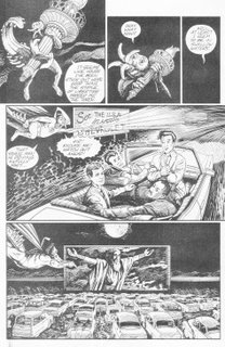
"Bioneers," the last story billed as a preview but just as long as the others," stars a bestial humanoid akin to television's Beauty and the Beast trying to acquaint himself at a science fiction convention, where a borderline delusional role-playing girl has attached herself under the pretense that his gharish appearance is a well-crafted costume. When their kiss reveals his true nature, security tries to place the beast in custody, but he effortlessly bests them and flees. A melancholy permeates this tale, and understandably so, as the creature undoubtedly senses a shallow acceptance in the midst of the convention, yet a fearful rejection when his real identity is revealed. So mankind can dress up like and pretend to be mythological beings, but they cannot accept one in real life? With a title like "Bioneers," I wonder if this series of shorts treads ground on these perplexing paradigms of geek culture.
So, does Plastron Cafe offer a tasty treat for every patron that strolls through its proverbial door? The problem is, while customers walking into a cafe generally know what they're getting into, a comic book so vaguely titled is more of a gamble. With Eastman's name attached, I was assured to find something I'd like. As a comic book barista, his reputation precedes him. Still, unlike Dietrich's, which recently folded to a Starbucks buy-out, would I frequent this Cafe again if another competed across the street? Depends on its blends, I guess.
contributors: Tom Stazer, Mary Kelleher, Kevin Eastman, Rick Vietch, Anthony Smith, Eric Vincent, Mary Kelleher, A.C. Farley
To celebrate the critical role coffee shops and cafes have played in the implementation of A Comic A Day -- I posted my first review from a Dietrich's in downtown Orange, California, and about 30% of my entries have been logged from coffee shops around Orange County -- I picked up Plastron Cafe, assuming from its title that this series would feature science fiction stories centered on or around a coffee shop. I guess I should stick to The Hitchhiker's Guide to the Galaxy for that motif. Instead, Plastron Cafe, from co-creator of the Teenage Mutant Ninja Turtles Kevin Eastman, is a general anthology of short science fiction stories sans caffiene, with a faux menu on the instead front cover outlining the "entrees" readers could find inside. Usually, the name of a comic book refers to its characters or stories, but to title a series based solely on a vague format motif is a bold and oddly appealing idea, at least to me. The implication is, while some folks frequent cafes for the coffee, others prefer the smoothies or fancy sandwiches. You know, different strokes for different folks. The presumption is, of the four shorts in this issue, everybody should like at least one of them.
Fortunately, the second story in this collection features Casey Jones, and I don't care who you are, everybody has a soft spot for Casey Jones. April O'Neil may always be the Ninja Turtles' first love from the human race, but Casey is their guilty pleasure, the urban id that enables them to embrace their inherent, flgarant masculinity, even if they are reptilian by nature. Eastman uses Cafe to share some of Casey's solo adventures; in this case, Casey is infiltrating a cult of alien lobsters-turned-humans trying to lift their terrestial curse. Their criminal activities aren't his primary motivation, though; apparently, one of them stole his mask. Good old Casey. Unfortunately, this chapter precedes the real action-packed climax, but as an old fan, I was just as satisfied watching Casey getting ready to rumble, as he fashions an armor from a fallen crustacean's shell. Two good lines: When Casey's bikini-clad guide shows him the lobster carcass and wonders if the sight shocks him, Jones replies, "Actually, some of my best friends are mutants." Then, when he makes his helmet from one of the beast's claws, he muses, "When you've been street-fighting as long as I have, you look for the potential in every day objects." Well put. Casey Jones. The youth of America's first official bad ass.
The other tales on the Plastron's menu aren't as meaty, but some go down pretty smoothly. The first story, "Spaced," is about a spaceship's motley crew, and in this case, their attempt to capture an alien blob stowaway. Aside from the bombshell's public romance with the crew's resident gray alien, the most notable aspect of this yarn is the Wolverine rip-off character aptly named Snikt. The "wings" of hair protruding from his mohawk, and his wonton violent attitude, establish him as a shallow and ultimately pointless spoof, and I wonder why the authors chose to incorporate him in an otherwise Star Trek-esque satire. (When the blob flees into the ventilation shaft, someone remarks, "They always do. You'd think by now the engineers would start making them smaller." Good point.) Still, "Spaced" was a good choice for this issue's first story slot, as I quickly understood what kind of anthology was ahead: a decently humored science fiction romp.
With the exception of "Alien Fire." Starring Xinta, "the alien trapped in Ed's mind," this abstract story started strongly enough, establishing that this Zoidburg-from-Futurama looking alien was traversing the pop culture riddled mindscape of some aimless human host. The image of a Marilyn Monroe-turned-Statue of Liberty was actually quite poignant in its own way, but perhaps in an effort to mirror real life, when the creators recreate the Beatles' first appearance on Sullivan, things get confusing. The imagery becomes more convulted, and I wonder if the effort was more linear than I thought in the context of previous installments. On this Cafe's menu, "Alien Fire" was the initially tasty treat that betrays itself with a bitter aftertaste.
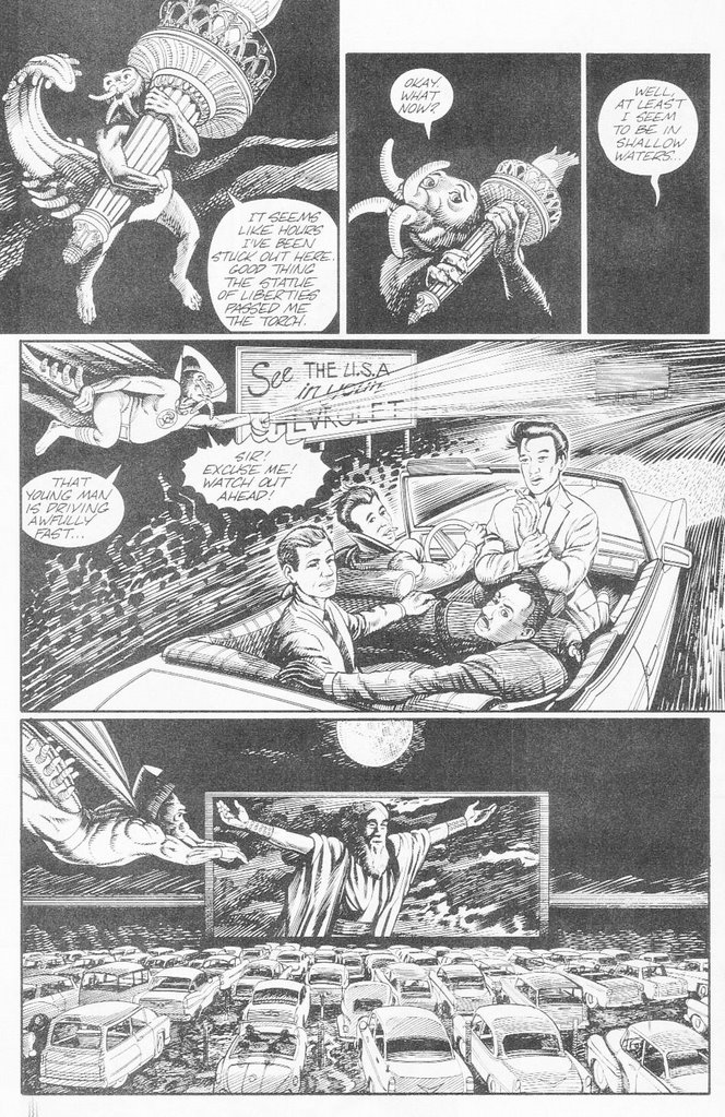
"Bioneers," the last story billed as a preview but just as long as the others," stars a bestial humanoid akin to television's Beauty and the Beast trying to acquaint himself at a science fiction convention, where a borderline delusional role-playing girl has attached herself under the pretense that his gharish appearance is a well-crafted costume. When their kiss reveals his true nature, security tries to place the beast in custody, but he effortlessly bests them and flees. A melancholy permeates this tale, and understandably so, as the creature undoubtedly senses a shallow acceptance in the midst of the convention, yet a fearful rejection when his real identity is revealed. So mankind can dress up like and pretend to be mythological beings, but they cannot accept one in real life? With a title like "Bioneers," I wonder if this series of shorts treads ground on these perplexing paradigms of geek culture.
So, does Plastron Cafe offer a tasty treat for every patron that strolls through its proverbial door? The problem is, while customers walking into a cafe generally know what they're getting into, a comic book so vaguely titled is more of a gamble. With Eastman's name attached, I was assured to find something I'd like. As a comic book barista, his reputation precedes him. Still, unlike Dietrich's, which recently folded to a Starbucks buy-out, would I frequent this Cafe again if another competed across the street? Depends on its blends, I guess.
Friday, January 19, 2007
Rakan #1
Rakan #1, May 2005, AK Comics
writers: Dr. Ayman Kandeel & Todd Vicino
penciller: Raphael Albuquerque
inker: Raphael Kras
letterer: Waleed Al-Telbany
colorist: Chris Peter
editor: Sara Kareem
First of all, what are the odds of scoring a penciller and an inker both named Raphael? Nice.
The foreign origins of yesterday’s comic book made it difficult to understand, at least to a naïve westerner like me, so today’s read, one of the AK Comics dedicated to telling stories of Middle Eastern superheroes, is an appropriate follow-up, and thankfully much easier to digest. In fact, Rakan #1 is so desperate for its readers’ awareness that it summarizes its story on the inside front cover before the actual story really begins. Yes, the inside front cover, which is too text intensive for my tastes, offers an origin synopsis of the Rakan character, the same story that follows in illustrated form for twenty-four pages afterward. I never would’ve read that blurb so intently if I thought that it would ruin the overall reading experience. Is this the first comic book that provides its own spoilers? How oddly repetitive and unnecessary, especially for a first issue.
Fortunately, Rakan’s humble beginnings are interesting enough to keep my attention a second time, especially when they’re beautifully illustrated by Team Raphael. Their expressive, borderline cartoony style reminded me of Ed McGuinness, with a Kubert-esque interpretation of the Middle Eastern desert. Many of these pages have a graceful fluidity that speaks to the story’s cultural richness, to Rakan’s connection with the earth and, thanks to the teachings of his mentor, his spirit. In one sequence, we can feel the desert sand clogging up a young Rakan’s nose, in another, the backgrounds look as ethereal as the Sheba martial arts he masters. For a comic book the size of an ashcan preview (a cost effective format that increased its circulation fourfold, according to the issue’s introduction), it packs quite a punch.

I wish Rakan’s story was as easy to explain. So his village is plundered and destroyed, and while wandering the desert, Rakan is attacked by a pack of hyenas. Fortunately and peculiarly, a saber-toothed tiger leaps into the fray and saves him, eventually raising the boy as its own. When the tiger dies, Rakan wanders with the beast’s real son, his makeshift tiger-brother Arameh. Rakan finds and is soon tutored by Sheikh Nasser (enter that Sheba stuff), and although Rakan defeats the band of thieves that attacks his master, he cannot save Sheikh from death. Sheikh’s dying words commit Rakan to the quest of finding his master’s long-lost daughter, which is presumably the driving force behind the rest of this series. Truly, this origin sequence could have lasted for issues in and of itself, with a Tarzan-like epic featuring Rakan’s tiger family, and again with a focus on Sheikh’s trainings, akin to the opening act of Batman Begins. AK Comics may be intended to spotlight strengths from Middle Eastern culture, but I can’t help but observe some definitely western parallels. Am I a keen analyzer, or a narrow-minded nationalist?
Something else regarding the contributor’s names I couldn’t help but notice . . . writer Dr. Ayman Kandeel . . . AK Comics . . . Did the founder of this comic book company dare to use his initials as the corporate moniker? A bold move considering the global implications of this company’s mission. I’m not sure if I feel any more educated about Middle Eastern culture, but hey, at the end of the day, I enjoyed Rakan, no matter how many times I read his story. This comic book served one purpose, at least: entertainment.
writers: Dr. Ayman Kandeel & Todd Vicino
penciller: Raphael Albuquerque
inker: Raphael Kras
letterer: Waleed Al-Telbany
colorist: Chris Peter
editor: Sara Kareem
First of all, what are the odds of scoring a penciller and an inker both named Raphael? Nice.
The foreign origins of yesterday’s comic book made it difficult to understand, at least to a naïve westerner like me, so today’s read, one of the AK Comics dedicated to telling stories of Middle Eastern superheroes, is an appropriate follow-up, and thankfully much easier to digest. In fact, Rakan #1 is so desperate for its readers’ awareness that it summarizes its story on the inside front cover before the actual story really begins. Yes, the inside front cover, which is too text intensive for my tastes, offers an origin synopsis of the Rakan character, the same story that follows in illustrated form for twenty-four pages afterward. I never would’ve read that blurb so intently if I thought that it would ruin the overall reading experience. Is this the first comic book that provides its own spoilers? How oddly repetitive and unnecessary, especially for a first issue.
Fortunately, Rakan’s humble beginnings are interesting enough to keep my attention a second time, especially when they’re beautifully illustrated by Team Raphael. Their expressive, borderline cartoony style reminded me of Ed McGuinness, with a Kubert-esque interpretation of the Middle Eastern desert. Many of these pages have a graceful fluidity that speaks to the story’s cultural richness, to Rakan’s connection with the earth and, thanks to the teachings of his mentor, his spirit. In one sequence, we can feel the desert sand clogging up a young Rakan’s nose, in another, the backgrounds look as ethereal as the Sheba martial arts he masters. For a comic book the size of an ashcan preview (a cost effective format that increased its circulation fourfold, according to the issue’s introduction), it packs quite a punch.
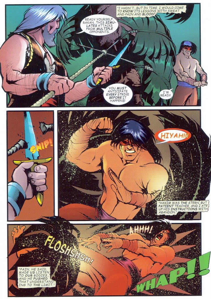
I wish Rakan’s story was as easy to explain. So his village is plundered and destroyed, and while wandering the desert, Rakan is attacked by a pack of hyenas. Fortunately and peculiarly, a saber-toothed tiger leaps into the fray and saves him, eventually raising the boy as its own. When the tiger dies, Rakan wanders with the beast’s real son, his makeshift tiger-brother Arameh. Rakan finds and is soon tutored by Sheikh Nasser (enter that Sheba stuff), and although Rakan defeats the band of thieves that attacks his master, he cannot save Sheikh from death. Sheikh’s dying words commit Rakan to the quest of finding his master’s long-lost daughter, which is presumably the driving force behind the rest of this series. Truly, this origin sequence could have lasted for issues in and of itself, with a Tarzan-like epic featuring Rakan’s tiger family, and again with a focus on Sheikh’s trainings, akin to the opening act of Batman Begins. AK Comics may be intended to spotlight strengths from Middle Eastern culture, but I can’t help but observe some definitely western parallels. Am I a keen analyzer, or a narrow-minded nationalist?
Something else regarding the contributor’s names I couldn’t help but notice . . . writer Dr. Ayman Kandeel . . . AK Comics . . . Did the founder of this comic book company dare to use his initials as the corporate moniker? A bold move considering the global implications of this company’s mission. I’m not sure if I feel any more educated about Middle Eastern culture, but hey, at the end of the day, I enjoyed Rakan, no matter how many times I read his story. This comic book served one purpose, at least: entertainment.
Thursday, January 18, 2007
Grenuord #2
Grenuord #2, February 2006, Fantagraphics Books
by Francesca Ghermandi
translated by Kim Thompson
On a big evening for comic book fans everywhere – yes, I’m talking about the first live action appearance of the Justice League of America on network television (and no, the unaired CBS Justice League pilot and the live action Super Friends special of the ‘70s don’t count) – I find myself in the midst of a dilemma. Normally, I’d connect this critical event with my review, to incorporate the two mediums in a way that would validate this review and comprehensively analyze the impact comics have had on pop culture. Alas, just my luck, I’ve committed myself to a comic book that is as far from the superhero genre as they come. In fact, this issue may be as far from Western pop culture as we know it. Grenuord refuses to succumb to the wiles of my writing, which is as frustrating as it is excitedly challenging.
Interestingly, the inside front cover provides a synopsis of the previous issue’s story, and since this is the second installment, I was surprised to find a rather lengthy and detailed summary. Grenuord #1 must have been one heck of an issue. What I couldn’t find, aside from on the cover, is a creator’s credit, until I read the fine publication print. There, I derived the correct spelling of Francesca Ghermandi’s name, as well as Kim Thompson’s, the editor and translator. “Ah,” I thought, relieved. “That explains why I have no idea what’s going on. It’s foreign.” Indeed, Grenuord is unlike any comic book I’ve ever read, particularly visually. If the characters don’t look like candles or overly inflated Michelin men, they’re no more than thick scribbles on the page. Truly, to a mainstream fan like me, this issue is a riddle that, without a hint, I may never be able to solve.
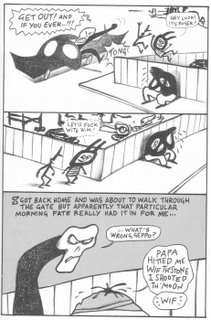
The nature of this story is relatively easy to understand, but how it’s nurtured heightens the issue’s peculiarity. George Henderson is having a bad day; he loses his job, his car is towed, he’s mistakenly taken to the police station for questioning, and the girl he’s interested in suggests they ignore each other, for her father’s sake. Actually, outlining this plot this way helps me get it more, but the antics of a few misshapen misfits propel a subplot with an absurd momentum. The characters tease a homeless man and rope him into some sort of illegal activity. What it is, I’m not sure, nor can I identify the blob that befriends the group at the end of the story. You really have to see it to believe it. I find it hard to believe that Grenuord makes sense in any language.
Still, the point of A Comic A Day is to open my mind to reading experiences like this. I’d like to think that when this year is over, opportunities to read new and different comics like this will evoke as much excitement as an appearance of the Justice League on Smallville. This issue’s rendering of the artist’s original work was impressive, so I enjoyed each page as a visual feast, if anything. That’s the thing about international cuisine. You’ll never know if you like it if you don’t try it.
by Francesca Ghermandi
translated by Kim Thompson
On a big evening for comic book fans everywhere – yes, I’m talking about the first live action appearance of the Justice League of America on network television (and no, the unaired CBS Justice League pilot and the live action Super Friends special of the ‘70s don’t count) – I find myself in the midst of a dilemma. Normally, I’d connect this critical event with my review, to incorporate the two mediums in a way that would validate this review and comprehensively analyze the impact comics have had on pop culture. Alas, just my luck, I’ve committed myself to a comic book that is as far from the superhero genre as they come. In fact, this issue may be as far from Western pop culture as we know it. Grenuord refuses to succumb to the wiles of my writing, which is as frustrating as it is excitedly challenging.
Interestingly, the inside front cover provides a synopsis of the previous issue’s story, and since this is the second installment, I was surprised to find a rather lengthy and detailed summary. Grenuord #1 must have been one heck of an issue. What I couldn’t find, aside from on the cover, is a creator’s credit, until I read the fine publication print. There, I derived the correct spelling of Francesca Ghermandi’s name, as well as Kim Thompson’s, the editor and translator. “Ah,” I thought, relieved. “That explains why I have no idea what’s going on. It’s foreign.” Indeed, Grenuord is unlike any comic book I’ve ever read, particularly visually. If the characters don’t look like candles or overly inflated Michelin men, they’re no more than thick scribbles on the page. Truly, to a mainstream fan like me, this issue is a riddle that, without a hint, I may never be able to solve.
The nature of this story is relatively easy to understand, but how it’s nurtured heightens the issue’s peculiarity. George Henderson is having a bad day; he loses his job, his car is towed, he’s mistakenly taken to the police station for questioning, and the girl he’s interested in suggests they ignore each other, for her father’s sake. Actually, outlining this plot this way helps me get it more, but the antics of a few misshapen misfits propel a subplot with an absurd momentum. The characters tease a homeless man and rope him into some sort of illegal activity. What it is, I’m not sure, nor can I identify the blob that befriends the group at the end of the story. You really have to see it to believe it. I find it hard to believe that Grenuord makes sense in any language.
Still, the point of A Comic A Day is to open my mind to reading experiences like this. I’d like to think that when this year is over, opportunities to read new and different comics like this will evoke as much excitement as an appearance of the Justice League on Smallville. This issue’s rendering of the artist’s original work was impressive, so I enjoyed each page as a visual feast, if anything. That’s the thing about international cuisine. You’ll never know if you like it if you don’t try it.
Wednesday, January 17, 2007
Butternut Squash #1
Butternut Squash #1, November 2005, Speakeasy Comics
by Ramon Perez & Rob Coughler
The inexplicably titled comic book Butternut Squash is a compilation of three to six panel comic strips by the same name, each an autobiographical labor of love by their creators and rife with the quirky inside jokes one might expect from a self-styled geek fraternity. And I mean that as a compliment. Although I didn’t find many of the strips laugh out loud funny, as I progressed through this introductory issue I couldn’t help but appreciate and relate to the camaraderie exhibited by our wayward protagonists, one a coffee-loving cartoonist, the other a part time employee at a sex shop and a coffee shop. In fact, the consistent, post-modern analyses of coffee, women, and pop culture evoked an almost embarrassing familiarity, as I’m sure any geek could read these strips and find some point of connection, however brief but just as poignant. Could Ramon and Rob embody a modern day Vladimir and Estragon from Samuel Beckett’s Waiting for Godot, each poised in perpetual anticipation for something that may never come yet equally content with the frivolous passing away the hours in the meantime? I doubt it, but it’s still fun to read.
Butternut Squash also meets one of my objectives for the new year, namely to read and review comic books that tweak or manipulate the comic book format for its own ends. With the exception of the covers and supplemental essays at the end, this issue is in a landscape layout; as I read the first half of BNS on the bus this morning, I embarrassingly had to flip the book sideways, like I was looking at a naughty magazine or something. The format is understandable, though, as a majority of the strips are a mere three panels, and the landscape style maximizes the size and resolution of each panel more effectively. Perez has a distinguishable and expressive artistic imprint on each strip, but some are definitively hits and conversely misses, and the crisp, computerized coloring adds a vitality and depth to each image that a black and white format would have forsaken for punchlines – a risky gamble, considering that some of these strips present very little comedic value whatsoever. These are the constructive criticisms, but generally, I enjoyed Butternut Squash. Ramon and Rob let us into their intimate circle of friends for twenty plus pages, a bold move in any medium, but in comics, we get to see their quirks and shortcomings, too. It’s challenging, and the result is charming. Butternut Squash would be just as good a comic if by any other name.
Tuesday, January 16, 2007
Winter World #1
Winter World #1, September 1987, Eclipse Comics
writer: Chuck Dixon
artist: Jorge Zaffino
painter: Julie Michel
letterer: Tim Harkins
editors: Timothy Truman & Letitia Glozer
A cold snap has gripped America. California Governor Ahnold has declared a statewide state of emergency (a redundant term now that I see it in print), as crops suffer from irredeemable frost and water pipes buckle under their own frozen weight. It’s a peculiar predicament that reveals how vulnerable we are to Mother Nature’s scorn.
Winter World is such a predicament to the nth degree. In a twist on the Water World scenario (although this miniseries came first), the world is apparently blanketed in snow, virtually held hostage by a persistent, bitter cold. Writer Chuck Dixon, best known for his work on Nightwing and Birds of Prey, focuses on a wayward trader who becomes the reluctant caretaker of a young woman that joins his aimless journey. Unfortunately, the two are enslaved by a fresh vegetables peddler, who warm biosphere becomes an ironically cruel and seemingly inescapable prison, until our hero is sprung by . . . I never thought I’d type this . . . his faithful mutant ferret. The end times are truly near.
Dixon would lead us to believe that his nomadic trader is a bad guy, as he assures his stowaway, “Listen up! If you weren’t some skinny kid wit no tits, I’d trade you to scum . . . and I wouldn’t lose a minute’s sleep over it!” However, at the end of this issue, following his escape, the same seeming jerk thinks, “. . . how long would it take before I could forget that kid I left back at the farm?” Well, according to your own words, how about a minute? So something exudes warmth in this perpetual December; little did we expect ‘twas our anti-hero’s heart.
I don’t think I’ve seen Jorge Zaffino’s work before, but he is good. The first several pages of this issue are solid, and although the end gets a little sloppy, the guy masters the human form and atmospheric establishment. When we see a work crew cleaning the biodome’s sewage system, we can practically smell the waste, thanks also to Julie Michel’s rich paint palette. This issue is a fine example of what scrutinizing readers had at their disposal in the late ‘80s: well illustrated tales of dynamic characters in challenging circumstances. As much as we want to be as tough as them, we know we can never truly bear their burdens.
Just look at the way we’re handling this cold snap! One would think we’re living in a winter world now, the way the news has personified the weather as if it were an elusive criminal with a carefully planned strategy. The way the climate swings in America, especially California, in a few weeks we’ll be complaining of the heat. No wonder Mother Nature has given us the cold shoulder. We’re never satisfied.
Monday, January 15, 2007
Mr. T and the T-Force #3
Mr. T and the T-Force #3, October 1993, NOW Comics
writer: Mike Baron
artist: Norm Breyfogle
colorists: Suzanne DeChnik, Holly Sanfelippo, Todd S. Turtle
letterer: Andrea Albert
editor: Joan Weiss
creative director: Mr. T
Happy Martin Luther King Day. Although, honestly, I'm wondering if "happy" is the best term to honor today. Today may celebrate Dr. King's life, but we cannot do so without remembering his abrupt death -- how this holiday, the only one on our calendar that warrants government closure to honor an individual that wasn't a president or old world saint (I'm looking at you, St. Patrick), may not even exist had Dr. King not been so tragically and suddenly assassinated. Perhaps "Remember Martin Luther King Day" better captures the true reason for this season. So, how can A Comic A Day remember Dr. King's legacy? By reviewing comics featuring prominent black heroes of the medium, of course! At the Comic Con last July, I picked up several comics starring black characters and have kept them in reserve to review between today and the end of February, which is Black History Month, with a few additional, well-rounded purchases since. One such purchase shall be the first in my weekly "Black History Review" series, Mr. T and the T-Force.
Long time readers, I know what you're thinking. "Haven't you already reviewed a Mr. T comic book?" you ask. Yes, in September, to recognize the new TV Land reality show I Pity the Fool, I reviewed Mr. T #1 by AP Comics, a relatively recent issue depicting "the Baraccan one" (as Murdock called him in The A-Team) as a reclusive ex-con, imprisoned for a crime he didn't commit and torn between apathy and do-gooding, for all the good it obviously did for him. It was a dark issue, particularly for a celebrity that has embraced the spotlight as an outspoken beacon of tough love. Mr. T and the T-Force is more like the Mr. T we know and love from his heyday, when his strength and bravado preceded him in the fictional realm, when his animated caricature was a brash and passionate as we always hoped the T would be. Mr. T was the proverbial Dark Knight Returns for Mr. T fans; Mr. T and the T-Force is Batman: The Animated Series Mr. T, capturing the spirit of all of his previous incarnations to create a product that anyone can embrace.

From Mr. T, AP Comics
Of course, Mr. T and the T-Force is corny; in fact, aside from the kid Mr. T summons to gather some information on a car theft ring, I don't know who or what is the "T-Force," unless the title refers to the sheer superhuman strength Mr. T summons throughout this adventure. In a mere twenty pages, T bends a gun out of shape, tosses a few fools around like ragdolls (including the token swirling of a punk over his head, He-Man style), and throws a diesel tire at an oncoming gun-toter, nearly all while handling a massive video camera, huge even by early '90s standards. The prop offers the most interesting insight into Mr. T's methods, though, as he uses a Trojan horse method and hides in the trunk of Rolls Royce to infiltrate the car thieves' HQ and capture their likenesses on tape, inarguable evidence to assure their guilt -- a plan worthy of Hannibal Smith himself. Remember my analysis of tough guys using their brains and brawn in concert? Thank you, Mr. T.

From Mr. T and the T-Force, Now Comics
I'd be remiss not to mention that this issue is illustrated by Norm Breyfogle, who illustrated last Monday's Of Bitter Souls (again, who says I don't have a method to my madness here), and who has been the subject of my praise here on more than one occasion. To my recollection, I've never beheld Breyfogle work in which he's captured the visage of a real person, and to add another notch to my fanboyish banter, he does an excellent job recreating Mr. T in comic book form. Many comic caricatures of celebrities appear too rigid to be realistic, or too fluid to adhere consistently to the original person, but Mr. T is so virtually a cartoon in real life that one would really have to try to botch him up. (AP Comics' Neil Edwards did a good job, too.) I don't think there's anything Breyfogle could do wrong in my book -- and don't look at me like I'm the only fan that has thought that of a comic book creator. How many issues of All-Star Batman and Robin has DC cranked out since its launch two years ago, with two of the biggest fan faves at the helm? If Miller and/or Lee can still do no wrong, so can Breyfogle, okay?
If the two Mr. T comics that I've read have anything in common, it's the gold-chained one's inability to ignore a plea for help; in both issues, Mr. T mixes it up with the baddies at a friend's or acquaintance's humble request. (Like Luke Cage, sans paycheck -- another hero we'll observe in the coming weeks.) If he is in a position to help, he cannot resist getting involved. I think Dr. King would've approved of Mr. T's celebrity, particularly as this theme of responsibility infuses all of his work. The interview at the end of Mr. T and the T-Force reinforces these concepts, as T credits his mother, father, and self-taught determination for his overcoming "the urban trap." Interestingly, Mr. T is rarely classified as a black hero, and in his cartoons and comics, he's a role model for every child, regardless of race. This was Dr. King's dream, to eradicate those presuppositions of ethnic identity and to create a world where everyone's strengths, mental or physical, contribute to a society that helps everyone succeed. And I pity the fool that doesn't share that dream.
writer: Mike Baron
artist: Norm Breyfogle
colorists: Suzanne DeChnik, Holly Sanfelippo, Todd S. Turtle
letterer: Andrea Albert
editor: Joan Weiss
creative director: Mr. T
Happy Martin Luther King Day. Although, honestly, I'm wondering if "happy" is the best term to honor today. Today may celebrate Dr. King's life, but we cannot do so without remembering his abrupt death -- how this holiday, the only one on our calendar that warrants government closure to honor an individual that wasn't a president or old world saint (I'm looking at you, St. Patrick), may not even exist had Dr. King not been so tragically and suddenly assassinated. Perhaps "Remember Martin Luther King Day" better captures the true reason for this season. So, how can A Comic A Day remember Dr. King's legacy? By reviewing comics featuring prominent black heroes of the medium, of course! At the Comic Con last July, I picked up several comics starring black characters and have kept them in reserve to review between today and the end of February, which is Black History Month, with a few additional, well-rounded purchases since. One such purchase shall be the first in my weekly "Black History Review" series, Mr. T and the T-Force.
Long time readers, I know what you're thinking. "Haven't you already reviewed a Mr. T comic book?" you ask. Yes, in September, to recognize the new TV Land reality show I Pity the Fool, I reviewed Mr. T #1 by AP Comics, a relatively recent issue depicting "the Baraccan one" (as Murdock called him in The A-Team) as a reclusive ex-con, imprisoned for a crime he didn't commit and torn between apathy and do-gooding, for all the good it obviously did for him. It was a dark issue, particularly for a celebrity that has embraced the spotlight as an outspoken beacon of tough love. Mr. T and the T-Force is more like the Mr. T we know and love from his heyday, when his strength and bravado preceded him in the fictional realm, when his animated caricature was a brash and passionate as we always hoped the T would be. Mr. T was the proverbial Dark Knight Returns for Mr. T fans; Mr. T and the T-Force is Batman: The Animated Series Mr. T, capturing the spirit of all of his previous incarnations to create a product that anyone can embrace.
From Mr. T, AP Comics
Of course, Mr. T and the T-Force is corny; in fact, aside from the kid Mr. T summons to gather some information on a car theft ring, I don't know who or what is the "T-Force," unless the title refers to the sheer superhuman strength Mr. T summons throughout this adventure. In a mere twenty pages, T bends a gun out of shape, tosses a few fools around like ragdolls (including the token swirling of a punk over his head, He-Man style), and throws a diesel tire at an oncoming gun-toter, nearly all while handling a massive video camera, huge even by early '90s standards. The prop offers the most interesting insight into Mr. T's methods, though, as he uses a Trojan horse method and hides in the trunk of Rolls Royce to infiltrate the car thieves' HQ and capture their likenesses on tape, inarguable evidence to assure their guilt -- a plan worthy of Hannibal Smith himself. Remember my analysis of tough guys using their brains and brawn in concert? Thank you, Mr. T.

From Mr. T and the T-Force, Now Comics
I'd be remiss not to mention that this issue is illustrated by Norm Breyfogle, who illustrated last Monday's Of Bitter Souls (again, who says I don't have a method to my madness here), and who has been the subject of my praise here on more than one occasion. To my recollection, I've never beheld Breyfogle work in which he's captured the visage of a real person, and to add another notch to my fanboyish banter, he does an excellent job recreating Mr. T in comic book form. Many comic caricatures of celebrities appear too rigid to be realistic, or too fluid to adhere consistently to the original person, but Mr. T is so virtually a cartoon in real life that one would really have to try to botch him up. (AP Comics' Neil Edwards did a good job, too.) I don't think there's anything Breyfogle could do wrong in my book -- and don't look at me like I'm the only fan that has thought that of a comic book creator. How many issues of All-Star Batman and Robin has DC cranked out since its launch two years ago, with two of the biggest fan faves at the helm? If Miller and/or Lee can still do no wrong, so can Breyfogle, okay?
If the two Mr. T comics that I've read have anything in common, it's the gold-chained one's inability to ignore a plea for help; in both issues, Mr. T mixes it up with the baddies at a friend's or acquaintance's humble request. (Like Luke Cage, sans paycheck -- another hero we'll observe in the coming weeks.) If he is in a position to help, he cannot resist getting involved. I think Dr. King would've approved of Mr. T's celebrity, particularly as this theme of responsibility infuses all of his work. The interview at the end of Mr. T and the T-Force reinforces these concepts, as T credits his mother, father, and self-taught determination for his overcoming "the urban trap." Interestingly, Mr. T is rarely classified as a black hero, and in his cartoons and comics, he's a role model for every child, regardless of race. This was Dr. King's dream, to eradicate those presuppositions of ethnic identity and to create a world where everyone's strengths, mental or physical, contribute to a society that helps everyone succeed. And I pity the fool that doesn't share that dream.
Sunday, January 14, 2007
Elk’s Run #1
Elk’s Run #1, 2005, Hoarse and Buggy Productions
writer: Joshua Hale Fialkov
artist: Noel Tuazon
colorist: Scott A. Keating
letterer: Jason Hanley
editor: Jason Rodriguez
When I first saw the contemporary classic Napoleon Dynamite, I marveled at the film’s apparent timelessness, effortlessly synthesizing three decades of pop culture into a singular effort that undoubtedly represents “Middle America’s” transparent bubble reality. Without argument, our country’s most influential cultural trends ebb from the coasts – California and New York, specifically and respectively – and in the time it takes these influences to reach the heartland, they’ve finally adapted to the previous wave, resulting in an awkward collision of years’ worth of fads. Therein explains the essence of Napoleon Dynamite, garbed in clothes ripped from the racks an ‘80s thrift shop, but vulnerable to the music and technology that so gripped the rest of our America’s youth. Yes, with so many people talking to hot chicks on the Internet all day, I was amazed at the sheer preservation of some pockets of our country . . .
. . . but this phenomenon swings both ways. How many small towns in the middle of America virtually exist as islands in themselves, preserved by the presuppositions of a bygone era? For example, how long did that child molesting polygamist maintain his compound in Arizona before 20/20’s expose introduced his well-contained evil to the rest of the world? How long did those folks in Waco, Texas prepare for their fatal confrontation with the authorities, brainwashing one another with an ideology that the rest of the country never knew existed? As a proud resident of Southern California, news stories and modern fables like these occasionally encourage me to pull my head out of the rump that is Orange County to take a look around, to realize that we aren’t the global community the Internet gurus might have us believe. Elk’s Run is one such fable.
Elk’s Run is the apparent opposite of Napoleon Dynamite, starring a kid frustrated with his awkwardness and seclusion but really unsure of what to do about it. Rather than resort to delusions of grandeur (which were, in Napoleon’s case, hilarious), this kid wallows in typical adolescent apathy, a plot device one could find in Goonies if anywhere, except the setting of Elk’s Run presents an interesting twist that may validate our protagonist’s internal strife. Elk’s Ridge, West Virginia retains something of a cultish hold on its residents; no one leaves, and the men dominate the women with a ‘50s sitcom mentality sans the “pleasant” in their proverbial Pleasantville. In fact, when one of their own accidentally runs over and kills a friend of our protagonist’s (I can’t find his name), the menfolk reap vengeance by inflicting the same crime upon the helpless perp; yes, they run him over, with our kid’s father at the head of the pack. Witnessing this homespun act of justice, our protagonist vows to flee Elk’s Ridge, and really, who would blame him?
Elk’s Ridge is written with the verbose melodrama of a frustrated adolescent, a convincing take on an apathetic teenager wondering what else the world has to offer. Tuason’s artwork is minimal but effect, strongly supported by Keating’s colors. A back-up feature, which is basically Dilbert meets Teen Wolf, is an odd match with the feature story but an interesting light-hearted peak at what else Hoarse and Buggy is capable of. It’s decently written, also by Fialkov, and illustrated by Nate Bellegarde, with a crisp, expressive cartoony style. Really, if Michael Jackson’s Thriller was about a bookish office nerd, these guys nailed it.
Needless to say, based on the introduction of this review, Elk’s Run offers a broad scope of introspective fodder; I simply decided to opt on a comparison with other, recent stories that address the cultural bubble surrounding “Middle America.” The concepts of family and friends and the dynamics of growing up are all brewing beneath the surface of this tale, as well – virtually bubbles in their own right ready to burst with this series culminating events. Ultimately, no matter where one lives or how fast new of Paris Hilton’s Friday night wardrobe reaches them, if one is happy and feels at home in their surroundings, what else matters? Clearly, the creators of Elk’s Run feel at home with this potentially controversial material. That should make open-minded readers happy.
Saturday, January 13, 2007
Cobb #2
Cobb #2, June 2006, IDW Publishing
writer: Beau Smith
artist: Eduardo Barreto
letterer: Robbie Robbins
editor: Dan Taylor
Tough guys are cool. Everyone knows that. The real argument is, what makes a tough guy? In the plot synopsis of the previous issue on the inside cover of Cobb #2, we are led to believe that Frank Cobb is quite the tough guy, established as a former Level One Secret Service agent that was jailed for “sending five men to the hospital.” Now, working for his mentor Jack Murphy’s security and investigation agency, Cobb finds himself in the crosshairs of the Russian mafia in an attempt to protect their godfather’s ex-lover. This second chapter begins with the mob at Cobb’s front door –
– but the natural way he reacts practically betrays the previous issue’s cliffhanger. Cobb tosses a baseball at the goons, who misunderstand the red herring as a grenade (a process that unnecessarily consumes an entire page), then barrels at them guns blazing, which is an entertaining device, but hardly an impressive one. In fact, until he runs out of ammo three-fourths through the issue and finally resorts to using a baton, the “Level One Secret Service agent” is less Frank Cobb than Frank Castle, carving his way through the imposing mobsters with a barrage of bullets. In the end, Cobb’s efforts protect the girlfriend, but the henchmen swipe Jack’s granddaughter; however, if this issue is any indication, I assume Cobb will simply stroll through the godfather’s front door and simply take her back.
So, you see my dilemma. Is Cobb really a tough guy? The way he used that baton was impressive, noticeably and strategically wounded the mobsters’ hands, rendering them ineffective even with a gun. Still, a solid twenty-two pages of story offers plenty of room to show off a thing or two, and with an issue seemingly dedicated to violent confrontation, a little variety goes a long way. Cobb and company strike me as likable characters, but I can find plenty of comics featuring excessive gunplay. It’s those characters that don’t resort to hiding behind a trigger, the proverbial renaissance men of violence and/or combat, which make these efforts so thrilling. That line from The Dark Knight Returns about the seven ways Batman can disarm a gun-toting thug (“One of them . . . hurts.”) evokes such admiration, and in the Punisher archives, the most entertaining scenes are the ones that depict Frank’s creativity in combat – you know, Popsicles and blow torches and stuff. To me, a tough guy uses his brain to best use his brawn. His brutality leaves psychological scars, as well as physical.
A few more notes about Cobb #2: I’ve always enjoyed Eduardo Barreto’s art, and his involvement was one of the reasons I purchased this issue. I think Barreto is responsible for many of the generic images of Superman and Batman that we see on the mainstream merchandise clogging the seasonal aisles at Target and Wal-Mart, since his style is clean. In Cobb #2, however, as much as I enjoyed the vitality of this issue’s nonstop action, Barreto’s lines looked muddied, as if the resolution of his work hadn’t been translated from the page properly. Even if this is just a technical error, something he couldn’t have been responsible for, it affected my impression of the overall package. Further, I must say that Beau Smith’s pacing was adequate, but much of his dialogue came across as terribly unnatural, as if the characters had written their lines and were reading them professionally in an otherwise highly suspenseful situation. Some of the awkward syntax may reflect Smith’s attempt to capture the broken English of the Russian mob, yet if that’s the case, his effort is more insulting than accurate. Makes the KGBeast look like Tom Clancy.
One funny line: When Cobb throws a few dead associates in the way of some oncoming thugs, remembering that baseball volley, one of the henchmen blurts, “Agggh! He is always throwing strange things at us!” Heh heh.
Something with real potential was brewing beneath the surface of Cobb #2, as if each page concealed an essence that I really enjoyed if not for the pesky semantics of its actual presentation. Perhaps the creators’ execution of this story was as flawed as Cobb’s plain old shoot ‘em up strategy – yes, it gets the job done, but there are better ways to do it. Other ways present more risks, and you may have to get your hands dirty by stretching your bounds a bit, but the payoff is worth it. Tough guys don’t come from the easy way out.
Friday, January 12, 2007
Apocalypse Nerd #1
Apocalypse Nerd #1, January 2005, Dark Horse Comics
by Peter Bagge
What do movies like Armageddon, Independence Day, and War of the Worlds have in common? Aside from the suspenseful peril from an interstellar threat shtick, apocalyptic films like these always tell their stories through the eyes of the defiant hero, the brave everyman that decides to spit in the face of mortal danger and oftentimes inadvertently discovers the means with which to vanquish impending doom on a global scale. Rarely has the tale of the common common man in the midst of worldwide panic been told. Mars Attacks did it. Maybe Louis Tulley in Ghostbusters did it. Now, Apocalypse Nerd does it. Thank God. Finally, a testament for the rest of us.
In Apocalypse Nerd, distinctive and acclaimed cartoonist Peter Bagge introduces us to Perry, the “nerd” in question, who, while returning from a weekend mountain getaway with his machismo buddy Gordo, discovers that they missed a nuclear attack on Seattle, courtesy Kim Jung Il. With a lack of information and in the sudden grip of desperation, Perry and Gordo decide to return to the cabin from whence they came, until they realize that Gordo’s friends that own the cabin may return for shelter and security, too. Surely, their jars of pickles and cashews couldn’t keep them all alive! So, Gordo decides to hunt for deer, successfully wounding one, but Perry earns some stripes in the end by dealing the fatal blow. With a flare gun to the deer’s head. Desperate times . . .
Bagge’s tale is surely survival of the whiniest, and while Perry’s constant complaining and pessimism offers both amusing and annoying respite to the bitter, potential reality of the story’s terrorist backdrop, our Apocalypse Nerd is also the most relatable character I’ve read in a while. In one instance, he fears the worst for all of mankind, in another, he tries to muster the courage simply to remain in the cabin alone while Gordo goes a’hunting. Gordo is a foil, his bravado a bit too exaggerated not to classify the character as an archetype or an allegory for Bagge’s perception of those Will Smith or Tom Cruise types. In a few cases throughout the latter half of this issue, I expected to turn the page and find Gordo dead by some obscene accident of his own design, leaving Perry to fend for himself. Although I have no doubt that this trend continues throughout the series, I wonder, would Bagge actually kill him? Or is this contrast between these two reactions to the apparent end of the world what drives our desire to read stories like Apocalypse Nerd? Until our inevitable crisis comes, is the only way to determine how we would respond based on which character we like (or loathe) most? Art is, if anything, a broken mirror.
Bagge includes a short tale at the end of this issue dubbed Founding Fathers Funnies Presents, starring the “odd couple” of John Adams and Ben Franklin. It’s an odd yarn in the context of this issue’s cover story, unless Bagge sought to compare the end of America with its humble beginnings. A few moments of the strip were chuckle-worthy, but I think the concept deserves either a comic all its own, or a web-comic forum. Did Bagge have pages to fill, or was he genuinely and equally passionate about this tale, too?
So, President Bush confirmed it. We’re sending more troops into Iraq. I can only imagine that we should anticipate potential fallout from such a decision, that some color-coded scale should tell us that the terrorists might attempt retaliation in the face of our military’s boldness. Bring it on. I know what to do. I finally have a hero. I have the Apocalypse Nerd. Maybe we all have an apocalypse nerd . . . inside each and every one of us. It’s in the bag.
Sorry.
Thursday, January 11, 2007
The Bogie Man #1
The Bogie Man #1, September 1986, Fat Man Press
writers: John Wagner & Alan Grant
artist: Robin Smith
letterer: Bambos Georgiou
Yesterday's review of Jeremiah Harm was intentionally brief, firstly to emphasize my highly anticipation as the primary post of the day, and secondly to set the stage for today's offering, The Bogie Man, which is also written, at least in part, by Alan Grant. I may have mentioned Alan Grant before; in fact, for every time I've mentioned my adulation for Norm Breyfogle's run on Batman and Detective Comics, you can replace his name with "Alan Grant." Grant, with Wagner for a time, wrote at least one of Batman's two prominent titles in the '90s, arguably the Caped Crusader's most popular decade ever, what with his movies and animated series and action figures and . . . well, I can fill pages with the numerous incarnations Batman experienced thanks to well negociated franchising rights. Yet, for the fans that still followed the Dark Knight in his native medium, Grant was more often than not pulling the strings; in fact, Grant launched the third of Batman's four ongoing books in the '90s, Shadow of the Bat. But I digress. Needless to say, the guy is a good writer, and I'm glad to see he's still in the business.
This issue takes us back a bit, to those days when Grant & Wagner may not have had much of a reputation in the States. The Bogie Man is as it sounds: a comic book about a guy that thinks he's Humphrey Bogart. Simple enough, but when you add that the disillusioned fellow is an escapee from an asylum, believes himself to be a gumshoe in the middle of a case, and has armed himself for protection, then a harmless gag turns into an interestingly dangerous concept. Indeed, without the establishment that this guy's fantasy could turn deadly for the bystanders around him, the Bogey Man really is nothing more than an ongoing homage, a potentially satirical take on the actor's classic vocal and physical mannerisms. I use the word "classic" and I realize the layer of modern vs. "the way things used to be" also comes into play here. If Bogie were around nowadays, would he be just as seemingly insane as his admirer from this issue? Quite possibly . . .
Therein lies the evidence of Grant and Wagner's genius. Their creation of the Bat-villain the Ventrioquist is a simple enough idea, but when you add that special layer of crazy, that hint of commentary that elevates a two-bit bad guy into a "supervillain," then readers come back for more. Unfortunately, they often come back for the magic, not the magicians behind the curtain. Batman is still as popular as ever, notably sans those supplemental series from the '90s, but still a powerhouse all his own. Today's writers may be giving the Caped Crusader a few worthy adventures, but the guys like Alan Grant that were redefining the character for a new generation have Batman some hope. Thanks to them, we know that if the franchising rights go belly up, Batman is still at home in his comic books. Do you really need that talking toothbrush, anyway?
Wednesday, January 10, 2007
Jeremiah Harm #1
Jeremiah Harm #1, May 200, Boom! Studios
writers: Keith Giffen, Alan Grant
penciller: Rael Lyra
inker: Joe Prado
colorist: Imaginary Friends Studio
letterer: Ed Dukeshire
When two inmates escape from their intergalactic prison, the panicked authorities reluctantly recruit another inmate, former bounty hunter Jeremiah Harm, to bring the fugitives home. Although Giffen and Grant’s narrative is sometimes too rife with unnecessarily lofty vernacular, their experience, like Harm’s ruthlessness when he hits the streets, speaks for itself. This issue is a tight story of trust all on its own, while at the same time establishing a foundation for future chapters to revisit. When I picked up this issue, I was surprised to discover Alan Grant’s name on such a recent work; as a fan of his Batman run throughout the ‘90s, I had wondered if his hasty exit from those mythos was his own choice. Either way, when I saw his name, I was drawn to this issue with the fervor of a fan attending a movie premiere just because his favorite actor makes a cameo. I figured, even if the effort stinks, at least I can add this issue to my growing Alan Grant collection. What’s the harm in that?
Quarterly Report: October-December 2006
To paraphrase a classic, this quarter of the A Comic A Day project was the best of times and the worst of times. In my first quarterly report (which was logged a mere three days after those first three months were complete, which means, if my current pattern persists, the next quarterly report will be written shortly after our year is complete), I listed the varied obstacles I had encountered during this blog's launch, including an "unstable Internet connection." To clarify, my Internet provider at work is connected to a T1 line, which is fairly reliable, and at home my girlfriend and I still use good old AOL dial-up, the cyber equivalent to Native American smoke signals, I know. It's slow, but effective. So, the instability is often a result of my desire to "get out of the house and write," to frequent coffeeshops and inhabit that weirdo-with-the-huge-laptop role, that wanna-be writer we all see from time to time toiling over his lingual wares and a toffee nut frappaccino. That's me. I thought that this obsession would be the death of A Comic A Day. I never would have suspected that my friend's computer in Goodyear, Arizona, with its global satellite hook-up from the open desert to the world wide web, would have been my Achilles heel. Alas, on November 4, I confidently read, reviewed, and presumably posted an entry about Top Shelf's Conversation #2, then discovered my effort was in vain the following day, too late to correction and maintain this blog's chronological continuity. I felt like my experiment had failed.
Fortunately, though I felt like failure, I was too discouraged to return to the frontlines with my keyboard blazing, and when I returned to California, I posted not one, not two, but three posts in a single day: the lost review, that day's review, and the second part of my impression of Action Comics #844, an issue so fueled by its own hype that I felt it warranted more thoughts than a single entry could muster. Perusing my list of comics from the past three months, I observe that Action #844 represents a phenomenon I encountered on several occasions: the collision of mediums through creative involvement. Richard Donner's current run on Action has certainly elicited some attention, thanks in large part to his latest efforts to secure his legacy in the Superman franchise. His seemingly insistent and arguably pompous Superman II: The Richard Donner Cut is the comic book equivalent of Bill Clinton's retrospective reports on his single-handed bin Laden near-misses. Yes, gentlemen, we see and understand that you played critical roles in your respective theaters, but we also recognize that other players have since had equal or even more prominent influence in those regards. The world will spin without you -- and in Donner's case, it'll even spin backwards. Other celebrity contributions I encountered last year weren't nearly as lofty; Bruce Campbell's Man With The Screaming Brain Rob Zombie's Spookshow International were fun romps, inspiring the frivolous vigor with which they were undoubtedly penned. However, the distinction remains that those series were the unique byproducts of their famous creators and could possibly not exist at all without their input. Now you know why even one day's respite from this project affects me so.
Campbell's and Zombie's comics were also cornerstones in my effort to parallel my reviews with the given month's respective holiday, and for obvious reasons, Halloween was the most successful season for this endeavor. While Christmastime inspires definitively "Christmas comics," any horror title is technically qualified for the "Halloween comic" category. Fortunately, the horror genre includes enough sub-genres, i.e. ghosts, monsters, psychological thriller, etc., to keep thins interesting, and I'm satisfied that I explored the gamut of nightmarish possibilities. Holidays, especially the commercially potent ones like Halloween and Christmas (sorry, Columbus Day and Kwanzaa), speak to comic book culture, what with their rife visual iconography and mythologies. Santa has all but become one of the Justice League's "big seven," as his appearances in the medium surely out number B-listers like Aztek by now, and old St. Nick even earned his own entry in The Official Handbook of the Marvel Universe this year. Although I will continue to make my entries socially relevant through overt connections to holidays and events (and I have mastered the skill of stretching any content to parallel another subject of choice, if you haven't noticed that already), October, November, and December are obviously the best months for this exercise. No more visions of sugar plums.
Finally, last quarter skimmed the surface of this experiment's potential regarding the varied formats of comics. I read both Nickelodeon Magazine and Heavy Metal Magazine, each on opposite sides of the audience spectrum, yet each also offered fresh takes on the comic as a malleable forum for thoughts and ideas. Further, although neither would be traditionally classified as comic books, their comic content was more concentrated than many mainstream, readily available titles, and their numerous contributors liken the mags to print incarnations of the web comic forums that are steadily increasing in popularity. These magazines are significantly keep the print format important. Further, I'd like to experience more differently formatted comics this year; The Best of DC Christmas issue, The Clock Maker, and the dreaded Conversation #2 are good testimonies that good things can come in smaller, or at least differently shaped, sizes. I already have a few issues that will fulfill this objective, but I'd dig an unconventional comic once a week, to maintain the balance of what the medium has to offer altogether. This iceberg runs deep.
The joy of A Comic A Day is discovering and/or incorporating my long-time favorite aspects of comics into the flow of this project, and this quarter offered those opportunities, too. The Thundercats, the Ghostbusters, and Agents Mulder and Scully all made appearances these last few months, all of whom are childhood favorites and not commonly associated with comics. Artists like Norm Breyfogle made critical contributions, too -- the very creators that sucked me into comics all those years ago, now with new material to fuel the guilty pleasures of my inner child, who really isn't feeling very guilty at all. Believe it or not (another comic from this quarter), some days I actually lament reading only one comic at a time! Nothing is more frustrating for a fanboy like me than splurging in a discount bin, bringing home a fat stack of unread or even unheard of issues, and reading only one. Maybe a day's respite was good for A Comic A Day. When someone finally calls my little comic book collecting hobby to the carpet as borderline obsessive, I can use that day as evidence in my sanity's favor. Thank you, you faulty satellite you . . . where ever you are.
Subscribe to:
Posts (Atom)