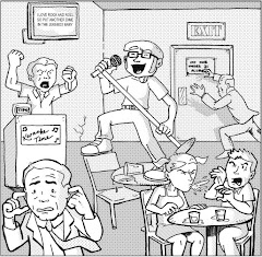
Star Trek: Klingons: Blood Will Tell #1, April 2007, IDW Publishing
writers: Scott Tipton and David Tipton
artist: David Messina
art assistance: Elena Casagrande
colorist: Ilaria Traversi
letterer: Neil Uyetake
editors: Dan Taylor and Chris Ryall
Warp drive. Transporters. Replicators. Despite all of the incredible technological strides Star Trek credits humanity's future, in my opinion the hardest aspect of Roddenberry's epic for me to understand is the Prime Directive -- the objective study and understanding of otherworldly cultures. In an age when even our most beloved celebrities like Mel Gibson, Michael Richards, and Don Imus cannot embrace the human diversity in their very midst, I wonder if mankind will be so prepared to accept different alien cultures in just a few hundred years. Captain James T. Kirk was the personified epitome of this struggle; while he shared Starfleet's vision to explore "strange new worlds," his blatant prejudice toward the Klingon Empire was evident every time his Enterprise encountered them. Further, since Kirk was our captain, we, the audience, believed in his presuppositions, assuming his rage was righteous -- so much so that some Trekkies might consider my term "prejudice" too harsh. Kirk was one of us, from Earth, so we had every reason to relate to him.
Either way, IDW Publishing dares to test the bounds of their latest incarnation of the Star Trek universe by giving the most challenging culture in mankind's future history, those damn Klingons, the chance to tell their side of the story . . .
Star Trek: Klingons: Blood Will Tell is one of the most ambitious Star Trek comic book efforts to date; while each Trek TV series (except Enterprise, I believe) has had its own comic book adaptation in the past, only Marvel's Starfleet Academy has had the least correlative ties to previously aired material, "boldly going" where no supplemental Trek media had gone before. With just a few issues of Star Trek: The Next Generation: The Space Between under their belt, IDW is taking a huge risk in marketing and distributing a series about Klingons prior to their next project, Star Trek: Year Four, the fourth year of the Original Series' five-year mission. Klingons may be Trek's most widely recognized alien contribution to sci-fi/pop culture, but do they enamour fans enough to carry their own five issue mini? Indeed, as its title suggests, their blood will tell.
As I've explained before, I was a diehard fan of The Next Generation as a kid, but I was disconnected from the series in its latter seasons, and regarding the other series, I'm a casual fan at best. I don't speak Klingon, and I'm not familiar with Empire history as much as the hardcore Trekkie would be, so if this series betrays any previously established lore, I wouldn't know. Further, while I know each issue in this series is to tell the other side of a classic Trek tale, I had to Google the specific episode title and summary. (I can say that I have seen the catalyst episode "Errand of Mercy," just a few weeks ago on TV Land, in fact. I'm not completely lost in space here.) All that is to say, I'm reviewing this issue as a comic book first, and as a contribution to the Trek franchise second. The way I see it, even if Blood Will Tell offers a few points of discontinuity, simply being a good comic book is contribution enough.
And, indeed, it is a good comic book. Writers Scott and David Tipton waste no time delving into the multi-faceted aspects of Klingon culture, first establishing the ongoing perspective of a council member whose vote will sway the Empire's burgeoning alliance with the Federation, then the doomed captain of a Klingon warship that dares to engage some constitution class starship called Enterprise. In just a few pages we see both the political and practical sides of war, in the allegorical way that Roddenberry often sought with his "wagon trail to the stars." (Insert comparisons to the war in Iraq here.) Then, enter Commander Kor from the second season Original Series episode "Errand of Mercy," and his plight with Captain Kirk over the pivotal planet Organia. In a nutshell, the pacifist people of Organia allow the Klingons to capture Kirk and Spock on their own soil, volleying allegiance between the two sides until revealing their ethereal nature as weapons-hating peacenicks. While Kirk can smirk off the stalemate, Kor obviously plots to battle another day, seething with dissatisfaction. Even through these different points of view, this is a fun story about intergalactic strife -- a classic "Manifest Destiny" parable.
If this series reveals anything about the Klingons as a people, its their neverending need for conflict. If they aren't picking fights with the Federation or among themselves, they're seemingly in a constant state of struggle within themselves, from Kor's unresolved hubris to the councilman's attempt to balance honor with guile. By the end of this miniseries, I wonder if we the readers are meant to relate less with Kirk . . . and more to the Khan. (Who was himself not a Klingon, but whose origins as a bioengineered "superman" are attributed to the development of the Klingon brow -- the Klingons botched the experiments, with cranial consequences, as the Tiptons attempt to bridge this aesthetic gap between TOS and TNG.)
I should mention that Klingons is beautifully and meticulously illustrated and colored, perhaps even more so than The Space Between, which is indicative of IDW's serious handling of the Trek franchise. In fact, aside from their multiple variant covers (I steer away from the picture covers and scored the David Messina piece, though I would've preferred the Joe Corroney option had I seen it), a special edition is available completely in Klingon, with the script supplied in English to embellish (and interpret) the reading experience. It doesn't get any more Prime Directive than that. Imagine if Marvel had published the Kree/Skrull War in Kree and/or Skrull . . .
So, as usual, Star Trek dares to take us one step closer toward the future it prophesied for us, by challenging us to embrace a culture we heretofore dubbed the enemy. Come on, even when we like them, we're suspicious of them, wondering when some gnarly Klingon sister will dare to seduce us into fathering her offspring ruler of the Empire. By exploring the corners of the Star Trek universe, IDW asks us to explore a small piece of ourselves, and fortunately, as long as Trek has its multitude of mythologies and characters to explore, I see nothing final to this frontier.
Monday, April 30, 2007
Sunday, April 29, 2007
RQW #1
RQW #1, November 2002, Don't Eat Any Bugs Productions
by Ray Friesen
My girlfriend and I went to the Los Angeles Festival of Books at UCLA today, and, still fresh from the Alternative Press Expo, I expected to see some small press comics representation. While I did see some of the alternative book publishing houses I recognized from APE, like AK Press, very few comics played into that equation. In fact, RQW #1 was the only traditional comic book we found, and despite the praise from Golden Apple Comics and Bongo Comics on its back cover, I'd never heard of this title before. The way its creator pitched it, I expected an educational book, and while his storyline has that potential, Friesen emphasizes youth-oriented humor -- which is a nice way of saying this book is really kind of childish. That's not necessarily a bad thing, as I often advocate that comics need to target kids again, if only from the business standpoint of assuring a future financial viability (I started saving coins for comics when I was eleven or so), so RQW may be on to something here. However, as a linear plot, it simply drops the ball. On the surface, this series is about Raymond Q. Wonderfull, nephew of the detective Clark N. Dagger, whose mad scientist neighbor has asked him to deliver a package with some immediacy. With the aid of his cousin, who is prone to serious injury, and a talking penguin, because, as I've said, penguins sell books nowadays, "RQW" (which is a bad title for a book, as casual readers have no association with those letters whatsoever -- "Wonderfull" would have been better if the character's name is that important) experiences an incredible adventure, that, while thrilling, by its own admission makes no sense, incorporating ninjas and killer sharks for just a few panels a piece, with vague humor excusing senseless shock value . . . again, intended for kids, I presume. RQW actually has the makings of a promising franchise, buts its number one makes for a mildly amusing read at best. Then again, for a comic book at a big time book fair, fundamental might have been the way to go . . .
Addendum (added April 30, 2007): Although I haven't updated reviews following their initial post in the past, after browsing the Don't Eat Any Bugs website (linked above), I feel compelled to mention that Friensen's art work on-line is sharp, and his storytelling style is a bit more clever than RQW #1 conveyed. I assume his skills have been sharpened since that flagship issue, and since I purchased his book to support my small press brethren in the first place, I'd be remiss not to give him some props. This web-strip thing deserves some further examination . . .
Saturday, April 28, 2007
Doom Town
Doom Town, 1999, Chick Publications
by Jack T. Chick
Of the two topics one should never discuss in public -- politics and religion -- A Comic A Day has successfully dodged the latter . . . not that my review of Captain Confederacy will ever top the Drudge Report, but, in their attempts to parallel "real life," comic books often incorporate politically driven subplots to create an air of social relevancy. Most of the time, this dynamic works; heck, Marvel's recent "Civil War" storyline was one long political allegory, if one actually believed Joe Quesada's hype from his appearance on The Colbert Report. Very few comics tread into religious territory; of course, Preacher tackled spiritual stereotypes head on, but rarely will superheroes (or cowboys, or emo rock stars, to cover a variety of genres here) find themselves in the midst of a religious subplot. Unless Daredevil or Spawn are perched atop some old church's cross, the topic is just too controversial to even casually explore in comics. Still, as an art that expresses to desires and conflicts of humanity, comic books cannot avoid religion entirely . . .
Enter Jack T. Chick.
While Jack Chick's classic "Chick tracts" are often perceived as extreme evangelist pamphlets first, they are in fact primarily minicomics, utilizing the visual sequential storytelling medium to convey the good news about Jesus Christ. Honestly, you don't have to a Christian to enjoy these little comics; in fact, Chick doesn't create these things for Christians at all. These modern allegories usually depict the plight of a heathen and their eventual conversion; for instance, the four tracts (each an average of twenty two-page panels, thus very easy to consume in mass quantities) I read today star a bully (in War Zone), an injured actor (in Fame), a homosexual (in Doom Town), and a Halloween haunted house attendee (in Happy Halloween), all of whom inevitably find themselves in the midst of a soul-searching crisis. The circumstance and dialogue are usually a bit extreme -- in Happy Halloween the crisis begins when a kid bolts from a haunted house and gets hit by a car -- but the introspection is real, an emotional struggle Chick believes is universal to everyone.
Heck, he's probably right.
Still, unless one is in the midst of one of these crises, or the spirit is really moving, I don't see how these tracts simply aren't anything more than chuckle-worthy. This review's specific issue, Doom Town, recreates the Biblical tale of Sodom and Gomorrah in a thinly veiled allegory to America's contemporary homosexual culture, and while Chick illustrates the modern gay crowd as leather-clad biker "bears," the Christian "hero" of this story, with his loose-collared button-up and thin Jim Dangle-like mustache, looks more realistically homosexual than anyone else. This guy prays for a homosexual to talk to and finds one within the same panel, later explaining to his target, "I really care about homosexuals, and I want them to know that they will face a horrible judgment." Yes, Chick doesn't pull any spiritual punches, and this tract is one of the more tender I've read. (In Fame, a hospital cleaning lady tells an ailing yet arrogant movie star, "Hasn't anyone ever told you that you're going to hell?") In a world where celebrity's are apologizing for their slips of the tongue every other day, Chick's hardcore Christianity is a refreshing breath of confident, even cocky belief, whether you buy it or not.
Further, Jack Chick is an incredible artist, plain and simple. Some of his tracts are illustrated in a Mad Magazine caricature style, perhaps intended to parallel the goofiness of their hedonistic anti-heroes, some of whom are caricatures of society itself. Doom Town has a different air about it; seemingly painted in water color, this issue boasts a rich depth in its design, an almost Alex Ross-like quality to it. ("Kingdom come," indeed!) If the Sodom and Gomorrah flashback had been rendered in that Mad style, I wouldn't have taken it as seriously; the rich grayscale of this other style truly expressed a respect for this Biblical account, conveying Lot's struggle with a harsh realism that contrasted his outrageous objective. (If you don't know the tale, Lot must find at least five decent people in his town of Sodom in order to spare it the Lord's wrath, but when a pair of angels visit the vexed believer, every man in town demand that Lot offer them forth so they can have sex with them. Those must have been some good looking angels.) As an artist, Jack Chick does that old adage justice, that he could've used his talents "for the forces of good or evil." I guess only you can decide which side he's on, but he's unabashed in taking that side, either way.
So, picture those Scary Art fellows to my left, some Kirby monsters to my right, and the Chick tract booth staring me down from across the aisle at last weekend's Alternative Press Expo. That should give you a sense of the sheer diversity that small press con offers its attendees and exhibitors. Yes, those long hours between folks thumbing through our comics are introspective enough, but to have Jack Chick's material promising an eternity in hell if I continue my current comics-centric lifestyle . . . I initially wondered why Chick tracts would be so popular at APE in the first place. Then I realized. "When in Rome . . ."
Friday, April 27, 2007
Pig's Missing Poo
Pig's Missing Poo, Robot Publishing
by Robert Goodin
For two years now, Robot Publishing's booth at the Alternative Press Expo has captured my attention, thanks to their eclectic offering of beautifully bound and incredibly illustrated minicomics. In 2006, I purchased Knock Out!, a story about an aging boxer, and 3 Stories, a tongue-in-cheek trio of superhero stories. This year, the small press outfit earned my biggest purchase of the weekend -- a whopping seven dollars for three minis, one of which is Pig's Missing Poo, an inexplicably titled collection of shorts by Robert Goodin. Goodin's definitive style, which one can undoubtedly sample at his website (which even I have yet to visit but have linked to above anyway), is stretched between four distinct tales, all of which retain some semblance of modern fable in their sophisticated simplicity. In fact, the last and most charming story, about the friendship between a monkey and a crocodile, the latter of whom regrettably attempts to deliver his chimp pal to his monkey-heart-hungry wife, is adapted by an Indian fable. (The monkey's ride on the croc's back reminded me of the gingerbread man fable -- ah, look it up.) Indeed, Goodin's first tale is a quirky piece starring Vladimir and Etragon like buddies, two definitely human looking characters in contrast to the blobs of personification that star in the following story, titled "The Lovely Evening Urbanus Met Mr. Thadeus Cornloaf," about two loners getting drunk and passing out in the gutter. I think my begrudging favorite of the quartet of shorts, however, is a one-page riff called "That's Life," featuring a helpless head that laments its permanent station until a friendly bird offers to roll him to the ocean. The last panel is macabre gag, as the head, in its all of glee, is accidentally impaled on a jagged stone. Goodin has a transparent, seemingly dark sense of humor, but not without its poignancy, an appropriate air for such a tiny book. Like Robot Publishing's tiny outfit, it packs quite a punch. Despite its title, this little companion is anything but missing poo, but I'm glad I found it.
Thursday, April 26, 2007
Cry Voltage
Cry Voltage, 2007, originally serialized in Pipe Down Zine
by Jason Margos
Cry Voltage is an ironically tiny book about a rather large robot and its human companion, its discontent creator. On the run, “Volt” and “Watts” (Watts is the guy, though their names seem effectively interchangeable) hide in a forest, where they discover a peculiar trail of cubes that leads them to an expanse of pyramids, which basically attacks them. Watts wakes up and finds his faithful robotic apprentice Cooper, and together they look for Volt among the seemingly ancient structures. When they find Volt, he kicks Cooper into the atmosphere and towers over his creator, somehow dangerously changed. Then . . .
. . . to be continued.

By its own admission, Cry Voltage is “drawn in a stream of consciousness style without a plot or script,” so creator Jason Margos may not even know what happens next. Either way, this story is so well illustrated, it deserves a much larger format. (The image above is a two page spread!) Margos' script may be loose, but his brush stroke reveals a confidence and expresses a tone that truly capture the imagination. Cry Voltage isn't The Iron Giant or even Miller's Big Guy and Rusty, but a true tension is brewing beneath the surface of this tale, a potentially tumultous epic about the trials of friendship. Indeed, this minicomic cries voltage in more ways than one -- it's electric. Check it out at Pipe Down Zine's website (which isn't a bad read, either) to see the pages in color.
Wednesday, April 25, 2007
Dr. DeBunko: When Human Flesh Bursts Into Flames!
Dr. DeBunko: When Human Flesh Bursts Into Flames!, May 2006, Salt Peter Press
by Chris Wisnia
editor: Rob Oder
Continuing my "neighboring APE exhibitors" series, Dr. DeBunko is the brainchild of Chris Wisnia, an artist perhaps best known in the convention circuit for his ongoing homage to classic Jack Kirby monsters. Indeed, while those old "tales of suspense" attempted to persuade readers to believe the fantastic -- that huge monsters could walk the Earth, for instance -- Dr. DeBunko is a "debunker of the supernatural," a realist in a seemingly unrealistic world. Despite such contrast, this minicomic's content is just as compelling. Real monsters may not pummel our planet, but some inquiries have plagued us for years.
Inquiries like, "Can human flesh burst into flames?"
Dr. DeBunko is challenged to answer this question when he arrives on the peculiar scene of Mrs. Numbfelt's untimely death, where the only evidence of her demise is two charred legs and a pile of ash. So, did she burst into flames? Is spontaneous combustion real? The answer is yes. If one falls asleep holding a lit cigarette, with one's oxygen machine on, after fixing a gasoline leak while wearing a flammable polyester jumpsuit, all of which precedes one popping a sleeping pill or three, yes, spontaneous combustion can happen. Dr. DeBunko's investigation may have been brief, but it was also incredibly decisive. I feel more educated just for having read it.
Seriously, Dr. DeBunko: When Human Flesh Bursts Into Flames! is a funny little piece of sequential storytelling that offers poignant insight into the ignorant yet conspiratorial faction of American culture, those folks that still cling to definitively "old world" thinking to explain the peculiarities of nowadays. Wisnia is a multi-faceted artist and seems to have intentionally illustrated his Dr. DeBunko adventures in a mock Victorian style (I was reminded of the old Strand Magazine Sherlock Holmes illustrations I so like), not that these tales take place in that period, but that the perspectives and mysteries therein betray similar ways of thinking. In fact, at APE, a few attendees recommended that Chris tune in to Art Bell and George Noory's late night radio talk show Coast to Coast, usually found on the AM dial, always tackling the mysteries of life -- true "tales of suspense." I concur. Dr. DeBunko could very well be a guest on their show.
The true charm of this little issue is the same dynamic that made the Mulder/Scully relationship in The X-Files so engaging. However, in this case, Mulder is a band of slack-jawed cops and bystanders, and Scully isn't nearly as sexy. Sure, the whole point of this issue is the "serious" handling of a tongue-in-cheek controversy. Yet, the irony of Dr. DeBunko, and the secret to Chris Wisnia's success, is that somewhere spontaneous combustion is still a hot issue. I guess Kirby isn't the only one to make someone shout, "Flame on!"
Tuesday, April 24, 2007
The Possum #1
The Possum #1, September 2006, Possum Press
by Blair Kitchen
Presumably, I don't have to explain to you that superhero titles are not commonplace at the Alternative Press Expo. The very name of the event implies that one would find something alternative to the mainstream, and in the comic book industry, superheroes define the mainstream. Now, capes and tights aren't commonplace but they aren't absent completely; in fact, they could be just as successful as any autobiographical zine (for example) if they approach the genre in an alternative way, exploring super-types in unconventional ways. The Possum is such a title, and in fact may be the most unique superhero book I've ever read. In a market saturated with every kind of meta-human archetype imaginable, that's certainly saying something.
First of all, I must say that The Possum is masterfully and beautifully illustrated. In his introduction, Blair Kitchen reveals his experience in the animation business, and this issue is indicative of the skills acquired during those years, as most of these pages are so detailed in their sequential potential that they reflect the faux motion of well-planned storyboards. While the Possum's world looks like and operates under the laws of a cartoon, a few real moments of emotional connection and vulnerability keep the story just this side of absurd. In fact, since the Possum's power is essentially a zombie-like invulnerability to pain, cartoon-like circumstances are essentially the only way to demonstrate his true potential. Throw a school bus at him. Drop a bookcase on him. Toss him out of an ambulance strapped to a gurney and watch him plummet through the city. While these scenes sound like something out of a Bugs Bunny cartoon, are they any less extreme than what Superman experiences on any given day?
But I'm getting ahead of myself. The Possum is really Stuart Spankly (who is really an exaggerated incarnation of creator Blair Kitchen's adolescence), a wanna-be comic book artist that inexplicably breaks the fourth wall to introduce himself to readers and establish his excitement over a forthcoming convention at the local old folks' home where he can promote his series, The Possum. See how that goes full circle? At the con, a crazy old coot, tired of watching his beloved bingo nights postponed by these special events, reveals that he has horded his medications to create a zombie pill that creates an ambivalence to pain. Enter Spankly, garbed in the Possum suit his mother made for him, who discovers the pill and unwittingly swallows it, becoming the very superhero he created. He thwarts the old man's plan to create an army of zombie fish to reclaim his bingo night, and thus his career as a crimefighter begins. Isn't that always the way?
This origin issue is an action-packed seventy-two pages, which is incredibly ambitious for self-published superhero book, and many of the pages are laid out well and easy on the eye -- further, the characters are expressive and agile, retaining realistic proportions with a twist of cartoon flexibility. My only critique is Kitchen's pacing, which at times is so sequential that some panels are blatantly unnecessary. When Spankly rides his bike to the comic book store, we watch him pedal, park, remove his helmet, etc. I understand the importance of ambiance and tension, but I wonder if Kitchen had planned for seventy-two pages and needed some fluff to achieve the goal. Still, The Possum doesn't take itself too seriously, and just by talking to us the readers, Spankly acknowledges the confines of his comic book world. Not that Kitchen sought the Hamlet play-within-a-play motif, but the angle adds a charm and believability to a story that might otherwise seem too looney 'toon to be taken seriously. As it is, The Possum #1 is just plain fun. I think you'd enjoy it.
I have The Possum #2 waiting in the wings to read, as well, but I decided to enjoy this inaugural issue on its own, as some APE attendees most likely only purchased this number one as a test read. (I didn't purchase either books; Kitchen and his brother were kind enough to offer a trade for some of my K.O. Comix.) In that experimental environment, where everyone is looking for the next best thing, the Possum may have taken a step toward saving superheroes. They probably didn't even know they needed saving . . . but that's what makes them so helpless in the first place. Leave it up to a possum to work so well in the shadows.
Quarterly Report: January-March 2007
"Patrick Stewart, Mr. T, and O.J. Simpson in . . .
A Comic A Day, the Third Quarter: Attack of the Samurai Penguin."
If I created a movie poster to represent this penultimate quarter of the A Comic A Day challenge, would I consider such a sensational tag line? Absolutely. First of all, the box office has proven that penguins make good movies; further, sensationalism (or more specifically its abusive father capitalism) is an inarguable commonality among the diverse selection of comic books I read between January and March. From movie tie-ins like Ghost Rider: Trail of Tears #1 to celebrity-touting titles like Leonard Nimoy's Primortals, from issues that promote corporate agendas like Captain Nauticus and the Ocean Force #1 to series that exploit current events like He Said/She Said Comics #5: The OJ Simpson/Nicole Simpson Story, many of these comics have a hook, some marketable reason to read them aside from the fact that they're just potentially entertaining comic books. This phenomenon begs the question, "Does the comic book industry wonder if it can really exist on its own?"
Consider the first comic book I read this calendar year, Spider-man: Reign #1. While this underscored miniseries initially reserved the promise of offering a dark final chapter to the Spider-man saga, in an unapologetically inspired-by-The Dark Knight Returns way (an air I approve of since Spidey is renowned for poking fun at his adversaries), the rise of Sandman and Venom as prominent and sympathetic villains by its final issue persuaded me to perceive the arc as just another appendage to the Sony Spider-man 3 marketing machine (similar to Spidey's recent "back in black" fashion move) . Sure, Venom was the presumed villain from the beginning, but Flint Marko's inconsequential side story was page filler for suspense's sake, an emotional footnote to the real action. Did Kaare Andrews intend to expound upon the Sandman's parental plight or was this digression's inclusion the result of editorial insistence? The fact that I even have to ask is indicative of the medium's susceptibility to the 24 hour pop culture cycle. Which came first, the comics or the movies?
Speaking of anticipated movies, one of the driving forces behind many reviews this quarter was the release of TMNT, the return of the Teenage Mutant Ninja Turtles to the big screen. As a fan of the Turtles franchise and a burgeoning student of comic book history, I thought this radical renaissance was significant; I stand by my assertion that Eastman and Laird are our generation's Siegel and Shuster, creating characters that quickly became larger than they could've imagined, that spawned a trend in popular fiction that they certainly didn't intend but couldn't help but fuel. Alas, while the latter founded the immensely popular superhero genre as we know it today, the former established a . . . well, multi-adjective animal trend. The most blatant Turtles' spin-off that I've read, Adolescent Radioactive Black Belt Hamsters, was neither homage or spoof, but a seemingly legitimate attempt to launch a franchise with its own identity -- a phenomenon that wouldn't have held water in any other medium. (Can you imagine a small but stable movie studio trying to produce a film about an adventurous archaeologist named Illinois Smith? Further, to be fair, at the suggestion of the Hamsters' creator, I read another ARBB issue this month and liked it . . . but what do they say about first impressions?) Yet, this small trend reveals the true potential of the comic book industry; with enough determination and capital, anyone can contribute anything to the medium.
I've been asked more than once how I can afford the arduous task of reading (thus, purchasing) a comic book a day for an entire year. Well, frankly, many of the comic books I've read have been pulled from the discount bins of shops and conventions throughout California and Arizona -- very few have been purchased at anything over their original cover price (and I would've purchased those Rocketeer issues at an inflated price, if that hobby shop not hadn't marked all of their back issues a measly dollar). That is to say, when one pulls a black-bagged issue of Superman #75 out of a quarter box right after Space Beaver #1, a certain sense of context begins to supersede one's perspective of the industry as a whole. No matter where a comic book might fall on the spectrum of production and talent, from the "big two" publishers to the struggling small press companies, everything is subject to public consumption and discretion. Supermarket #4 had an incredible look and feel for a single comic book issue; I bought it for a quarter. Shatter #3 was written by the highly respected Steven Grant and was billed as the future of comics, what with its exclusively computerized production; I bought it for a quarter. These issues aren't bad, but in an industry that is constantly evolving and expanding, they simply have to go somewhere. What's the promise of a movie development deal if your source material is buried in a dusty old quarter box in some retailer's warehouse? I'd be remiss not to mention that this quarter also featured comics that honored Black History and Women's History Months. Unlike previous holiday-oriented reviews, specifically during October and December, these issues weren't intended to boast the themes I had assigned them, yet each title contributed to my grand tapestry in one way or another, if not by establishing respective comic book icons (Static Shock and Power Man in February, the Grrl Scouts and the Grrrl Squad in March), then by asserting appropriate, applicable themes (see Strike!'s urban commentary or Iron Jaw's anti-feminist agenda). As comic books become a more significant driving force in pop culture, the medium's status as an art form, and thus a reflection of the human condition, could be easily forgotten. Yet, what would Spider-man be is Peter Parker wasn't a puny nerd, or the X-Men if Stan Lee wasn't inspired by the Civil Rights Movement of the '60s? The human condition is what makes this industry rich cinematic fodder in the first place!
What's this emphasis on movies and supplemental comic book media, you ask? Well, I confess an introspective inspiration to this quarterly review's intentions. I recently read a commentary that accused aspiring writers and artists of resorting to on-line review blogs, like A Comic A Day, when their original creative pursuits fail. While I'm still generating original material via my self-publishing vehicle K.O. Comix (the banner under which I exhibited at last weekend's Alternative Press Expo, another nagging inspiration for this drive toward originality), I cannot argue that my daily writing efforts fuel this project -- that is very stipulation of this personal challenge in the first place. I guess I'm saying that the movie industry is comic books' proverbial blog cop out -- the means through which, when all else fails, it can establish some sense of legitimacy. Like the frustrated artist, like me and dozens of fanboys like me, the comic will never be satisfied with itself and will remain its own toughest critic, yet it also won't hesitate to succumb to sensationalism if the opportunity arises. You ask me, originality and diversity could solve both problems, since they're both as ironically abundant as the quarter bins that now house the comic books that touted these qualities in the first place. Truly, comics suffer from the snake-eating-its-own-tail syndrome.
On a plane.
Monday, April 23, 2007
Breathers #0
Breathers #0, April 2007, Just Mad Books
by Justin Madson
I felt like a child on the night before Christmas today. I couldn't wait for work to end (which is a rare feeling for someone who likes his job) so I could get home and tear into my Alternative Press Expo (APE) swag, which I promptly divided into three categories: promotional items (mostly business cards and flyers with websites and comics I'll look up later), zines and other materials for casual consumption, and finally comic books acquired specifically for A Comic A Day. Some of these comics were gained by trading some of my zines (more information about Far & Wee later), I actually purchased a few that made a positive visual first impression. Breathers #0 was one of the first that grabbed me, thanks in large part to the coupling of its simple title and accompanying cover image: an average Joe, seemingly distraught, wearing a huge gas mask hooked up to a laptop-sized hip device. Elegantly drawn and softly hued, I was instantly intrigued . . .
. . . and mildly deceptive. Creator Justin Madson's "springboard" story for his miniseries Breathers establishes a high end concept -- a world in which the air is simply no longer breathable and human are forced to wear personal respiratory devices to live -- not with an emphasis on that eye-catching, face consuming technology, but rather the man behind the mask. This "average Joe," with the unaverage name Koller Trick, is emotionally invested in an affair with a married woman, and while wondering the city in thought, he gets lost. Unfortunately, his lady love's husband finds him, knocks him out, and takes his breather. When Koller wakes up and realizes his situation, he stumbles through the city desperately, no one aiding him, fueled by the hope that his lover will help him. (Spoiler alert!) In the end, he falls and dies, ironically steps away from her apartment, where she sees him . . . and draws the curtain. Despite the odd atmospheric conditions (appropriate for a post-Earth Day review), this issue is very much a human story, and I simply didn't expect it.
Breathers would (and should) be classified as an "emo" book -- a tale that over-explores its emotional depths and pleads for your sympathy while trying to remain relevant and legitimate in spite of itself. It succeeds. I was entrenched in Koller's world, both through his breaking heart and soon-to-be shattered lungs. What happened to Earth that its air was unsafe to breathe, and in fact fatal? Would Koller reconcile the conflict of his heart, and, thanks to a few subtle clues, did his lover truly love him back? In Breathers #0, the reader is urged to sympathize with both personal and global desperation so compellingly, thanks to Madson's peculiarly yet charmingly disproportionate (and three-fingered?) human figures, the reading experience is darn near breath-taking. I will certainly pursue the series' first issue. But I won't hold my breath -- Koller, in all of his futile determination -- wouldn't approve.
Honestly, between my APE stash, the forthcoming Free Comic Book Day, and the old issues I have still laying around from past comic shop binges, I have plenty of material to last until June 30, the last day of the A Comic A Day challenge. In fact, I may have too many issues, which isn't a bad thing, if only I can get to all of the small press material in conjunction with the mainstream stuff I still want to review. Like Breathers, the challenge with projects like this is maintaining that balance between personal preference and real potential, between finely focused and big picture pursuits. Almost a year later, I still can't catch my breath!
Sunday, April 22, 2007
Bakerville U.S.A.
Bakerville U.S.A., JoeDon Comics
writer: Mike "Muffin" Adam
penciller: Nik Caesar
inker: Philip Vaughan
For the folks that live in San Francisco, this Sunday is undoubtedly like any other, but to me, an exhibitor at the little Alternative Press Expo in an odd corner of town, and essentially a tourist, this morning the city stands in some strange air of defiance, having effortlessly survived the weekend's rainstorms and now basking in the glow of an Earth Day sun. San Francisco has survived much worse, as we all know, but to behold its architecture in this fresh morning light is really something. In Orange County, everything tends to look the same, from track homes to apartment complexes to strip malls to Starbucks; I've observed very little preservation in Los Angeles, and, although the city of angels boasts many older buildings, I doubt they'd withstand an argument from some city council determined to attract new revenue with a movie theater multiplex shopping center and a parking garage. So, pardon me if I enjoy these few minutes before APE to take it all in.
Back to the subject of comic books, actually, APE attendees may suffer from the same visual phenomenon. Mainstream comics usually offer much ado about nothing, in that their escapist fantasies (of which I'm a big fan, mind) are often repetitious if not completing regurgitating the same conflicts and character paradigms. Even the mainstream independent scene is little more than autobiographical comics or homages to trends of old, all of which can be good, but still notably the same. APE is the San Francisco to comics' Los Angeles, although indie comix aren't on an island and can in fact expand exponentially, if we let it. I'm going to write a review of APE at my LiveJournal and maybe for Geek in the City (Aaron!), but this context will explain my approach to this final review, the target of which is another of my exhibiting neighbors, like yesterday's Metro Gnome.
Bakerville U.S.A. is a zombie comic. Now, I already know what you're thinking: zombies are everywhere in comics right now. What makes this book so different? Well, this book is about zombies and corndogs. See? Actually, for the most part, that's the pitch these guys from JoeDon Comics dish out to passers-by, and it certainly attracts attention. Who wouldn't like a comic book about a kid that drives an ice cream truck that tries to find shelter from a zombie army in an old amusement part only to survive yet hallucinate due to old corndogs thereby finding the delusional strength to fend off the undead with an immobile army of lawn gnomes? Tell me you'd find that at your local comic book store. Well, hopefully someday you will, because the JoeDon fellows are talented, friendly, and deserving of a little props.
Honestly, as I alluded in Metro Gnome, the art in this issue leaves a little something to be desired, not that it doesn't tell the story well, and in fact some of the panels absolutely pop with a raw, violent energy sure to attract fans of those goth comics I've reviewed in the past, but in comparison to the other zombie books you might find in the marketplace, this issue doesn't have the solidarity. Hey, it's independent. These guys, like many of the folks at APE, are the proverbial garage bands of comics, self-producing material that is certainly rough around the edges but definitely capable of holding their own. I'll tell you this -- compared to some of the zombie books I've read, which are just as dead as their subject matter in their delivery, this one has been one of the most entertaining. While the back-up tale, "I, Scott, the Sheriff," is essentially just a shoot 'em up B-story, JoeDon's crew is obviously trying to utilize the medium to its complete potential. Trying to breathe some life into this struggling genre with the undead: deliciously ironic -- but not as delicious as human flesh.
I'd be remiss not to link to their site, since I say they should be out there in the commonplace and I have some means of helping, in my own little circle here. We small-pressers need to stick together!
Look at me. Holiday nut that I am, and I don't even mention it's Earth Day. Further, in my digression about urban development, I betray a penchant for old architecture rather than the beloved green, which is surely the trend du joir for a day like today. You know what? Humans live on Earth, too, and for all of the harm we've apparently afflicted on the planet, we're capable of some beautiful things, as well. If you could see the city from this cafe window right now, you'd feel the same way. If you could stroll the aisles of APE today, you'd feel the same way. This element is what makes zombie tales so timelessly compelling -- they always star that one "hero" that refuses to buy in, that does his own thing to preserve his old way of life (namely, living). How easy would it be, in a world full of the undead, in the human mind that just wants to be accepted, to take that fateful bite and join the others? Some folks don't want to be like the others.
Those folks are at the Alternative Press Expo.
Saturday, April 21, 2007
Metro Gnome #1
Metro Gnome #1, 2007
by Steve Fuson
Today was my first day at the Alternative Press Expo (APE), a small press convention in San Francisco hosted by the same crew that puts on the San Diego Comic Con. If you're in the area, swing by the Concourse on 7th (good luck finding parking) and visit booth #510: K.O. Comix. You can even pick up my latest fanzine Far & Wee: Pilot Issue, an inaugural attempt to start a retrospective jam piece featuring fellow geeks' proverbial origin stories. I just a few fellow geeks to help me put together the next issue! As an exhibitor, today could've been better, but anytime someone's eyes light up (and their wallet come out) at the sight of one of our books, I feel like the trip is worth it. Now, as an attendee, APE should prove very beneficial for A Comic A Day, particularly in the context of my new year's resolution to read books of varied size and content, those that utilize the medium in different and dynamic ways.
Of course, my first grab from APE is a standard-sized comic book, but we have to ease into these things slowly, you know? I bought Metro Gnome for my girlfriend because she likes gnomes, but reading the issue, the concept is interesting enough for me to check out the series again. See, Metro is a gnome "born, raised, and named for his urban surroundings," and despite his presumed magical and benevolent nature, has become a passive brawler, especially with cats that eye him for lunch. His friend Foulmouth the rat (nice name) isn't much help, enabling Metro to remain street, if you will. Alas, their lives are destined to change when an angel (initially disguised as a pidgeon) commands Metro to find a girl with mystical potential. Metro initially refuses but something compels him otherwise -- perhaps that nagging urge toward his native nature. Honestly, I've never read a comic book about a gnome, and for my first one to exhibit such a conflicted depth of character is amusing (as I hope was the intention) and interesting.
Steve Fuson (whose table is right across from mine on the aisle so I'd better be careful what I say here -- I do have to look him in the eye tomorrow) displays crisp writing skills, and this first installment does an excellent job of telling us who his comic is about and what the driving conflicts will be. How Fuson gets the point across, however, may be a detriment to the book, as his art could use some room for improvement. Don't get me wrong, his page layouts and character placements are solid, but his inking could use some varied depth -- a potential result of the issue's small press printing, but hopefully a constructive comment nevertheless. Some grayscale and/or zipatone would really add some nice layers to his well established urban backdrop. With the right amount of attention, with the concept Fuson is playing with here, the city, and any other environment Fuson puts Metro in, will have some character all its own.
I conclude by commenting that, in a romantic city like San Francisco, with a rainy night like tonight, I'm grateful for the centering feeling reading comics, and this blog, provides. I know that might sound uber-geeky, and even sad, but fellow fanboys will agree that the comic book is the kind of portable medium that survives and circumstance -- just as we presume Metro will. Now, fellow fanboys, if you want to write some of those feelings down . . .
Friday, April 20, 2007
Aquaman #2
Aquaman #2, September 1994, DC Comics
writer: Peter David
penciller: Marty Egeland
inker: Brad Vancata
colorist: Tom McCraw
letterer: Dan Nakross
editors: Eddie Beranza & Kevin Dooley
Believe it or not, for as much as I love me my superheroes, I never read the issue where Aquaman loses his hand, until today. While at the time the move may have been ill-received and controversial, I'm just not impressed. Like Superman's death at the hands of Doomsday or Batman's crippling at the knee of Bane, this physically dramatic in the life of an icon occurred at the hands of some new villain, whom Aquaman meets and promptly kills all in this issue. Oh, and pardon my pun, there -- I won't brag about it the way Peter David touts his quips within the very same story. On one page, Aquaman says he doesn't need a hand in defeating this one-hit wonder, then, after the piranha thing, the bad guy boasts, "You did say you didn't a hand to finish me off. So I thought I'd test it out." Yeah, we get it. A clever flash of foreshadowing becomes a drawn out gag. Ho hum. Ultimately, we all know this "can't miss new direction" was eventually halted by yet another new direction, as the lives of our favorite superheroes often change like the tide. Still, in retrospect, I prefer the loss of Aquaman's hand as told in the animated Justice League series. At least those writers didn't want us to give them a hand for their efforts. You know, because that means they'd want applause for . . . oh, never mind.
Thursday, April 19, 2007
Walt Disney Micky Mouse #144
Walt Disney Micky Mouse #144, September 1973, Western Publishing Company
I really wish I didn't have to give this issue the bottom line treatment, but with A.P.E. but a day away, I'm desperately trying to get a few projects done, and I knew that this issue would be light enough for a meager "thumbs up/thumbs down" kind of review. I mean, we're talking about Micky Mouse here. He deserves some respect. Still, "thumbs up" is all I have to give right now. Maybe I'll redraft this review tomorrow night from my hotel room in San Francisco. No better place to talk about Disney anyway . . .
I really wish I didn't have to give this issue the bottom line treatment, but with A.P.E. but a day away, I'm desperately trying to get a few projects done, and I knew that this issue would be light enough for a meager "thumbs up/thumbs down" kind of review. I mean, we're talking about Micky Mouse here. He deserves some respect. Still, "thumbs up" is all I have to give right now. Maybe I'll redraft this review tomorrow night from my hotel room in San Francisco. No better place to talk about Disney anyway . . .
Wednesday, April 18, 2007
ALF #23
ALF #23, December 1989, Marvel Comics
writer: Michael Gallagher
penciller: Dave Manak
inker/colorist: Marie Severin
letterer: Rick Parker
editor: Sid Jacobson
EIC: Tom De Falco
When industry professionals pontificate about the legitimacy of comic books as a literary artform, oftentimes Superman is cited as an allegorical example of the immigrant paradigm, rocket-flight to Earth from the dying planet Krypton compared to the immigrant's perception of America as a land of opportunity and vibrancy. The parallel is vivid and optimistic . . . and I wonder why more folks don't liken the imagery to another critical figure in modern fictional literature: Alf. Alf, which we all know is short for "Alien Life Form," was abandoned on Earth, too, never to return to his beloved homeworld Melmac. However, in this Marvel Comic adaptation of Alf's classic television series, we get a glimpse of some Melmacian technology, a Meleporter, that accidentally whisks Alf away to various corners of the globe. While his patented wit enables him to endure, the really sympathetic character here is Willy, who would like all of us to believe Alf is the bane of his existence, but without the furry little cat eater, the poor guy succumbs to almost instant strife. Fortunately, when the Meleporter realizes that it's no longer on Melmac, it returns Alf to Willy and family, much to their relief. Truly, Alf's brief respite around the globe is another indication of the immigrant's international plight, and a subtle indication of the real promise of America.
Of course, I'm kidding. This issue was barely readable and I dragged myself through it during Thank God You're Here commercial breaks. Perhaps the most entertaining aspect of this issue was its ads, promoting those old Saturday morning cartoons. With a December 1989 copyright date, this issue effectively marks the end of the oft dubbed Reagan years. As a child of that era, I feel like an immigrant in my own time, over here. Thanks for reminding me, Alf. Go eat a tennis racket or something, eh?
Tuesday, April 17, 2007
Neil Gaiman's Mr. Hero: The Newmatic Man #1
Neil Gaiman's Mr. Hero: The Newmatic Man #1, March 1995, Tekno Comix
writer: James Vance
penciller: Ted Slampyak
inker: Bob McLeod
letterer: John Workman
colorists: Kell-O-Graphics, Zachary Lynch, & Tony Kelly
editor: Ed Polgardy
While I highly respect Neil Gaiman as an incredibly innovative and imaginative writer, I must call him out on his Mr. Hero, a steam-powered clockwork man from the raw industrial planet Kalighoul that is stored on Earth for years until discovered by a mime, Jenny, and her simple-minded but dedicated strong man companion. You, Mr. Gaiman, sir, have simply fine-tuned Baum's wind-up warrior Tic Toc, infusing the character archetype with an alien origin (not that Oz wasn't an alien land) and a definitively crude mechanical essence that stands in bold defiance of our world's sleek, modern technology. Writer James Vance structures this inaugural issue with typical comic book tension, building up the first full fledged appearance of its visually appealing title character until the final pages of the issue, showing off Mr. Hero's nobility and strength in a good, old fashioned exchange of fisticuffs with some thugs threatening Jenny. Even sans one of his hands, Mr. Hero takes out the thugs in short order, and interestingly, while his steam-powered nature contrasts today's concept of robotics, his gentlemanly nature seems to predate even his crude mechanics, making the clunky character one big, walking contradiction, which may be what Gaiman intended in the first place. Mr. Hero's other hand is still in his original benefactor's possession, an alien lizard king that will undoubtedly adopt one half of the creator versus creation in subsequent stories. Still, this issue manages to stand on its own as a satisfying read, establishing the origin of a unique hero and an even more unique relationship between this odd twist on Dorothy and her clockwork friend Tic Toc. Like I said, Mr. Gaiman, I'm onto you -- but I get it, too. Why reinvent the wheel, right?
Monday, April 16, 2007
Kindergoth #1
Kindergoth #1, 2003, Bloodfire Studios
writer: Lee Kohse
artist: Jeff Zugale
With Dateline NBC buzzing in the background, the Drudge Report and the initially accused's LiveJournal fresh in my browser's history, and my mind finally wrapping itself around today's tragic events at Virginia Tech, now more than ever I'm grateful for the brief respite of comic books. The evil plots of comics' supervillains and mad scientists are only two dimensional, and ultimately, the good guys usually win. For all of the accusations that law enforcement could have done a better job, for all of the presumptions that the gunman was some Asian blogger recluse, no one is going to win this one. The lack (or restraint) of information is going to keep the bloodthirsty public in a media-fueled rage, and the families of those poor victims in mourning. Whatever you do that preserves your hope for humanity -- prayer, meditation, fellowship with friends -- do it now. Me, I'm trying to operate business as usual. I'm reading a comic book.
I had intended to read Kindergoth today regardless of these current events, but something about the title's implied synthesis of school and solemnity appealed to me on many levels. Of course, I thought this comic would be a Hot Topic farce, similar to titles like Serenity Rose and Bear. Visually, Kindergoth wasn't as seemingly chicken-scratched as those books, those self-styled "goth" stories; artist Jeff Zugale's cartoony approach parallels writer Lee Kohse's light-hearted approach to a potentially lofty concept. Unfortunately, I think Zugale's art loses a generation of charm through the inking process; while his finished pages struck me as bland, I was impressed by his carefully detailed sketchbook supplements -- if only that charm could've been spread throughout this inaugural issue. Kohse's writing is finely patterned, with a punchline at the end of the every page as if each turn were a strip in itself, contributing to a bigger picture. I admit some perplexity at his decision to use a commercially viable concept like Kindergoth to tell a watered down alien abduction farce, but he makes it work, albeit barely. His characters evoke shades of South Park without the crudity or relevance, and although these tykes are a bit too sophisticated to be believable kindergartners, I dig the smart take on childhood overall. I wonder if I'd be as satisfied with the next issue.
Unfortunately, I don't think I'll have time to find out. A Comic A Day rolls on. Still, with Dateline wrapping its impromptu expose on today's events, I realize that some things will linger a bit longer than others. If only life could remain as simple as it seemed when we were in kindergarten, eh?
Sunday, April 15, 2007
Hermes vs. the Eyeball Kid #1
Hermes vs. the Eyeball Kid #1, December 1994, Dark Horse Comics
writer: Eddie Campbell
artists: Eddie Campbell & Peter Mullins
art assistance: April Post
writing assistance: Wes Kublick
Comic books are often classified in one of two categories: modern mythologies or absurd, juvenile funnybooks. With two clashing characters named Hermes and the Eyeball Kid, this issue may be the first to accept both distinctions. Hermes is indeed the speedy god with the winged sandals, and the Eyeball Kid is . . . well, a guy with a bunch of eyeballs, so as a reader discovering this series for the first time (this incarnation is a reprint, although I don't know where the story originally appeared), I'm not sure if Campbell is attempting to establish legitimate lore, or just silly satire. Just a few pages into the read, ultimately, I didn't care anymore, because the thing was just too much fun to classify either way.
You know, I remember learning about Greek mythology for the first time in the eighth grade, and I was initially bored with those old soothsayers' lofty storytelling styles. Even modern interpretations of those ancient verses retained such stoicism that make my eyes droop at the very thought; however, since then, I've developed an appreciation for those myths' complexities. They are truly the comic book adventures of the past, and I can only assume that their original audiences were just as compelled with the next chapter of Odysseus' journey then as we are with what will happen in this week's 52 now. All that is to say, I sense that writer/artist Eddie Campbell sought to infuse this dichotomy in Hermes vs. the Eyeball Kid. This issue's plot, the culminated first three parts of this multi-round bout, establishes all of the important characters succinctly, yet each supporting character retains some semblance of complexity that both distracts yet contributes to the main event. While I read through these backstories eagerly in anticipation for those title characters, I was also intrigued by the origins of that head in the hat box, or the wagerers of the fight's outcome. Yeah, you should really check it out. It's a trip.
Perhaps one of the most lasting impressions of this issue is the realization that, for all of the comics I've read before and during this challenge (easily thousands by now), I still have many supposed "classics" to read. Not that Hermes vs. the Eyeball Kid is on anyone's top ten lists, but Eddie Campbell is a sensational artist, and although I'm familiar with his resume, this is the first of his works I've read thoroughly. Believe it or not, I just began the first The Invisibles graphic novel. I know, I know. Apparently, you could never have enough eyeballs to read all of the incredible comics out there.
Saturday, April 14, 2007
Gabagool! #4
Gabagool! #4, May 2003, Mike Dawson Comics
by Mike Dawson with Chris Radtke
If you, my fellow fanboys, ever find yourselves in a position to argue that geeks are not fat, hairy, unemployed, sex-starved oddballs, don't submit Gabagool! #4 as evidence. Although lead character Christopher Vigliotti is employed at the beginning of this issue, his surfing such fan favorite sites as Ain't It Cool News and Comics2Film may have contributed to his getting fired by page four . . . a generally sympathetic situation until Chris opens his severance check to find a $10,000 stipend. Believe me, a sum that large is dangerous in the hands of an admitted geek, and the contemplation of this cash's fate is what makes Gabagool! #4 a surprisingly entertaining read.
This issue, and perhaps Gabagool! as a series (if I ever find another issue, I'll let you know) is one part Office Space, one part Clerks, with a fair share of Swingers in this case, considering how Chris and his friends decide to spend his mini-fortune: on a whirlwind trip to "Hedo," Jamaica, where "you'd have to be a retard not to get laid there!" When Chris and company decide to make this trip, I assumed that the rest of this issue would document their failed attempt to get laid in that distant land, but interestingly, in true geek form, the subsequent pages offer their mere preparation for the trip: confirming arrangements with a travel agent, confirming the trip's potential with crazy Cousin Larry, and finally Chris getting his back waxed -- a scene so humorous and vivid I nearly forgot I was reading a comic book and thought I had tuned in for a Seinfeld rerun instead. In fact, Chris both looks and acts like George Castanza, which means that his seemingly normal vacation may present some quirky diversions. Apparently creators Mike Dawson and Chris Radtke wouldn't have it any other way.
While this issue is entertaining, its story is comparatively mundane, which may lead one to believe that its events are autobiographical in nature. Now, I haven't looked up Mike Dawson Comics (I like to read and review these comics cold, as if each were my first foray into comics every time), but I'd venture to say that, though specific elements may be inspired by true events, the main plot may be a fabrication or elaboration. Simply put, the circumstances are just a bit too linear and eccentric to be completely true. Further, Dawson and Radtke put the story together in a solid succession of events, A leading to B and so forth, that I can only assume that this chapter in their characters' lives is less of a graphically adapted adventure and more of a carefully planned story arc. With so much going right for Chris after the initial shock of getting fired, I wonder if he'll eventually learn that the $10,000 was an accidentally unintended amount, that someone in accounting misplaced a decimal point and only intended to allocate $1000. I'd understand if this twist is contrary to the creators' intentions, and I wouldn't presume to impose on their work, but this move seems like a natural point of contention in an otherwise flawless story.
Between the lead story about getting laid in Jamaica, and the shorter follow-up story about "Li'l Gabagool!" characters roleplaying the rescue of a lizard princess and thus getting rewarded with the chance to "have their way with her," it is painfully obvious that geeks are a sexually repressed lot. Still, this peculiar characteristic may be the common ground we share with more common folk. You give me ten grand, I'm buying toys and comics . . . but ask any other guy what they would do and you'd hear them go the Gabagool route. Yes, geeks may be oddballs, but we're people, too.
Friday, April 13, 2007
Mutation #1
Mutation #1, July 2005, Speakeasy Comics
writer: George T. Singley
artist: Ethen Beavers
colorist: Jaime Jones
letterer: Steve Dutro
designer: Tim Kane
After yesterday's heartfelt review of Mr. Stuffins #1 (which can also be found at Geek in the City), and my two-part analysis of swiping earlier in the week, I was anxious for a light read today, an entertaining, action packed comic book experience that would warrant little contemplative thought and utilize the visual medium to its utmost potential. Boy, did the fates smile upon me when I picked up Mutation #1! Yet, like a cursed monkey's paw, this issue dared me to be careful what I ask for -- while I sought something a bit shallow, I didn't want a story that was nonexistent. Simply put, Mutation #1 is an awesome sketchbook or ashcan but in my opinion by no means a legitimate "number one."
My guess is that writer George Singley is artist Ethen Beaver's biggest fan, because establishing a legitimate plot seems secondary to offering a string of cool pictures in Mutation #1. Sandwiched by two lengthy action sequences, the only semblance of a story in this issue is the scene in which Mutation, in his alias as a college student, falls asleep during class -- something Peter Parker was doing probably before Singley and Beaver were in diapers. Singley manages to establish that Mutation lives with his girlfriend and goes to Silver City University in those precious three pages . . . and waits a stunning nineteen pages to show off his hero's superpowers, which is apparently the ability to manipulate and shapeshift his body. Yes, he's Plastic Man with Superman's strength, flight, and durability, which carried him through the first fight sequence just fine, as if the whole malleability thing was an afterthought. "Oh, yeah, his name is Mutation. Maybe we should make him mutate or something." And your title is "writer." Maybe you should write something.
I know -- I'm being harsh. I should be grateful that Mutation gave me what I wanted: a relatively quick yet entertaining read. Further, admittedly, Beaver's art is very nice, very Oeming meets Timm. Perhaps his cartoony style contributed to the generally shallow feel of this issue; I felt like I was perusing a storyboard for an animated series more than I was reading a comic book, which isn't always a bad thing, if some supplemental material offers added insight into the creative/behind-the-scenes process. I really enjoy those little extras. Instead, Speakeasy treats us to a slew of ads, all of which are respectively appealing, yet equally shallow. While I've enjoyed Of Bitter Souls, if this issue is any indication of what the company has to offer, I'll never have to buy another of their issues again. I can merely flip through them at the comic shop and get the same effect.
While I love the superhero genre, I suppose comic books like this are the unfortunate consequence of the popular comic book trend -- the misunderstanding that superheroes are all about action. From those original, grainy Golden age issues, superheroes have always been about character and originality, something Mutation sorely lacks. Its title hero has the same powers as two of DC's canon characters, and its look, however pleasing to eye, eludes to other artists' awesome styles. If Mutation needs to change anything, it's its leech-like hold on everything else that seems to work, because when you plant a seed in shallow soil, it cannot grow the roots it needs to grow.
Thursday, April 12, 2007
Mr. Stuffins #1
Mr. Stuffins #1, May 2007, Boom! Studios
writers: Andrew Cosby & Johanna Stokes
artist: Lee Carter
colorist: Pablo Quiligotti
letterers: Terri Delgado & Marshall Dillon
Last weekend, during my Easter visit home, I scoured my mother's garage and storage shed to recover some of my old toys. Frankly, I felt like it was time for my boys to come home. He-Man (original, Battle Armor, and Power Punch), Secret Wars Captain America, and Krang's rock soldier bodyguard General Tragg were among some of the action figures to make the journey from Arizona to California, not to mention Castle Grayskull, Snake Mountain, the Turtles' sewer lair, the Technodrome, and (to celebrate its return in last week's Justice League of America #7) the Hall of Justice. Oh, I don't mean to show off. I'm just proud that my mother sought to preserve these treasures of my childhood, or at least wasn't proactive in getting rid of them. You remember those burgeoning days of geekdom, when your comic books came to life in plastic on the floor of your bedroom, when, at night, you dreamt that they came to life to finish the battles you had started. Of course, as adults, now we know better.
Now, if someone had stuck a highly classified, completely interactive microchip into one of your toys, springing it to life and making it beat up the bullies at your school, that's another story . . .
Meet Mr. Stuffins: one part Tedd Ruxpin, one part the Terminator. Yes, simply put, (Spoiler alert!) when a desperate scientist on the run hides a highly coveted microchip in a talking teddy bear's package, the toy's eventual owner Zach, torn between his floundering father and embittered mother, suddenly finds himself with a new best friend. Somehow, the chip transforms the innocent toy into a killing machine, who, in one of the most clever catalysts for motivation I've read in comics, calls his "home base" Tattertot Toys for his mission, only to hear the automated operator reply, "Thank you for calling . . . your child's safety is our number one priority."
"Roger that," Stuffins replies. Then the adventure begins. Mr. Stuffins goes to school with Zach and beats up some bullies in the bathroom, an incident for which Zach is promptly blamed. Further, Stuffins complains about Zach's foam dart guns, since they're not even "riot foam" and can hardly harm a man. While many kids would wet their pants with excitement at the prospect of having a cute and cuddly killing machine at their disposal, with all of the other unstable elements in Zach's life, he really just seems annoyed. Little does he suspect that Stuffins' skills may come in handy to protect the family he so desperately wishes would stay together when, on the last cliffhangery splash page, a gang of goons closes in on his house, presumably in pursuit of that cutting edge microchip. They obviously don't know what they're getting into, nor did I when I picked up this issue.


The cover of this issue mimics a Casino Royale poster, depicting Mr. Stuffins sporting a suction cup gun and Oreoes in lieu of poker chips, an eye-catching image that perfectly epitomizes what readers have in store, and further writers Cosby and Stokes manage to take a potentially one-hit wonder concept -- the tagline "My teddy bear's a secret agent!" could last one year or one panel depending on how it's played -- and establish a legitimate story about the trials of childhood. While Stuffins riding shotgun in Zach's backpack elicits the suspenseful shades of The Indian in the Cupboard, Zach's parents' separation is just as tense, and the writers wisely restrain themselves from the undoubtedly tempting soap operatics such a subplot could demand. In one issue we're privy to two significant spousal disputes, just enough to let us know how serious the situation is without muffling the secret agent/teddy bear action, which is, I dare say, absolutely charming. I chuckled a few times in spite of myself, amused by Stuffins' tough guy attitude. If I knew Teddy Ruxpin had this much potential, I would've ditched My Buddy a long time ago!
(This review is rapidly turning into a lost segment from VH1's I Love the '80s, but I digress.)
My only critique toward this issue's story is its handling of young characters other than Zach, namely the bullies that confront him in the restroom. I know it's a little thing, but I work with kids and am very sensitive to the portrayal of children in fiction, especially in comic books, a medium that targets youth. The bullies tease Zach about not washing his hands, as they say, "after a tinkle," and, seriously, I don't think a bully would use the word "tinkle" this side of Eddie Haskel. Believe it or not, kids have really dirty mouths, so "after a piss" wouldn't have been too drastic and actually would've made their presence more intimidating. Believe me, if a teddy bear going postal is believable, so is a bully going Andrew Dice Clay. Speaking of VH1.
Carter’s art is perfect for this subject matter, balancing reality with stuffed animal fantasy, capturing the imbalance of this issue’s dark Christopher Robin/Winnie the Pooh paradigm. The coloring is ironically a bit too dark for my tastes, obscuring some the visuals unnecessary shadow or blackness, even during the daytime school sequences. Perhaps the hushed tones are intended to express an overwhelming sense of solemnity, that, despite the potentially frivolous nature a toy-turned-Terminator story entails, this thing could have some serious consequences. With those gun-toting goons on the last page we're assured things are going to get worse before they get better, but I hope Mr. Stuffins has a light at the end of the tunnel. These characters look and feel so instantly compelling that one only wants to see the best for them.
Mr. Stuffins should be an instant success in many circles because it plays into every geek's affinity for toys. Hey, as an action figure aficionado for decades, I can attest to that sense of comfort one feels when their heroes are in the room, albeit plastic. Heck, I know Power Punch He-Man isn't really going to spring up and power punch anything on his own -- even when I go to sleep -- but I feel better just having him around. It's subconscious protection. We can't all have a Mr. Stuffins, you know.
Wednesday, April 11, 2007
Madman Atomic Comics #1
Madman Atomic Comics #1, April 2007, Image Comics
writer/artist: Mike Allred
colorist: Laura Allred
letterer: Nate Piekos
If you went to your local comic book shop last Wednesday, you undoubtedly noticed Madman Atomic Comics #1. It's hard to ignore Mike Allred's psychedelic cover, depicting his pupil-less yet wide-eyed hero leaping from a purple-shrouded background of spiny tentacles. The picture is eerie and intriguing, and with that "number one" below the characteristic Image logo, I couldn't resist Allred's relaunch. Frankly, I've avoided Madman in the past; like the chick from high school you automatically dub out of your league, I thought Allred's work looked too good for me to understand. I wasn't sure if Madman's series (and I think he's had three of them) were mired in continuity or episodic for the sake of a burgeoning audience, but either way I was strangely intimidated by how much fun they looked. I don't know if I can really describe the phenomenon, but needless to say, I'm over it.
Fortunately for oblivious new readers like me, Madman is rediscovering who he is, so by picking up this issue I may be on the groundfloor of some new chapter in his life. From page one, Madman is trapped in a frozen world, "Not icy frozen," he succinctly explains, "Completely still frozen." While the general populace appear to be rapidly decaying, an orbital drone with whom Madman is familiar (and that is named Warren) arrives and almost annoying prods the desperate hero to recount his origins. In fact, most of this issue is one long flashback, which I presume would be annoying for long-time Mad-fans, yet freshly entertaining for newbies like me. I'd rather not summarize this summary again, if only to mention that I didn't know Madman was essentially a modern Frankenstein. The sheer vastness of his adventures, as explained by Warren, indicates that Madman may be one of the apocalyptic four horsemen, perhaps the horseman of death, as he is a living defiance of the reaper's blade. Allred definitely leaves the door open for some ethereal mayhem, to be sure.
Yet, as my original impression led me to believe, it's Allred's artistic style that truly captures the imagination, capturing the essence of many genres in the context of this encapsulating escapade, from space to cityscapes to the complexities of the searching mind. This issue is just a trip. I'm definitely on board for the ride. Well, whether or not Madman finds himself in subsequent issues, I finally did, and in this context, that's all that matters!
Side note: Check out The Engine, Warren Ellis' message board, where I've posted an illustration for his "Remake/Remodel" thread, a weekly challenge to re-imagine well known characters. Last week, Witchblade, this week, Sherlock Holmes. I dig it.
Also, a plug for my current events blog The Tumblr Grumblr. Threw a thought about some shiny nappy people up there that might cock an eyebrow.
Tuesday, April 10, 2007
Clint: The Hamster Triumphant #1
Clint: The Hamster Triumphant #1, September 1986, Eclipse Comics
writers: Don Chin & Ken Meyer, Jr.
penciller: Ken Meyer, Jr.
inker: Mike Drigenberg
letterer: Kurt Hathaway
The old adage, "Don't judge a book by its cover," is an ironic one regarding the comic book medium. The cover of a comic book, more so than the cover of any other book or magazine, is intended to draw in (pardon the pun) an audience with a single, dynamic image, to represent its issue's contents while restraining itself just enough to encourage potential readers to actually open it. The cover of yesterday's subject, Knight Watchman #1, had such an effect on me, but most notably because of a glitch in the matrix, if you will. Frankly, the cover looked familiar, perhaps from when you first saw this issue on the shelves back in '98, I thought:

However, the nagging in my gut pulled me less toward the character and more toward Ben Torres' technique. Sure enough, a brief Google search led me to this image:

(This is the best quality I could find.) This image is a John Romita, Jr. lithograph offered through Dynamic Forces, though the illustration could've been used in another capacity, as well. Looks familiar, doesn't it? This beautiful piece was the victim of swiping.
I mentioned the phenomenon yesterday, particularly when I noticed specific panels in Knight Watchman #1 that resonated with my inner fanboy, that again instilled that matrix ripple effect. Here's one such example:


When Erik Larsen drew that page in Savage Dragon #4 five years before the release of Knight Watchman #1, did he know he was offering future artists an action pose template? Did Frank Miller and Todd McFarlane know that their respective styles would become the subject of such mimicry for decades to come? While the comic book artist community may have varied opinions on the subject, as a fan shelling out my hard-earned money for all of these issues, I think swiping is a lazy rip-off. It's like buying an album you think is full of ten new tracks only to discover ten cover songs -- speaking of covers. Artists that swipe, especially so blatantly, without even that "after so-and-so" signature that implies homage nowadays, are literally tracers, and I don't mean in the way that Kevin Smith mused. They present the equivalent of those weird Spider-man coloring books you can find at Big Lots or the 99 Cents Store; in fact, they utilize some of the same McFarlane/Larsen material! Heck, Knight Watchman was black and white . . .
And is "Knight Watchman" just a riff on The Dark Knight Returns and The Watchmen, both well respected comics that came out around the same time and changed our generation's appreciation of the medium?
But I digress. Speaking of derivative covers, need I even post the original inspiration for today's issue? Man, do I feel sorry for far-sighted fans that might've accidentally picked this one up back in the day!

In my opinion, my review of the Adolescent Radioactive Black Belt Hamsters last month was one of the most harsh I'd ever written. Excited for the release of TMNT, I was embittered by my late introduction to the slew of titles from the mid-'80s that tried to capitalize off of the half-shell heroes' success, and the ARBBH seemed to best epitomize that trend. I tore their jam issue Lost Treasures apart, but writer Don Chin was nice enough to respond appreciatively and in fact refer a few of the Hamsters' other adventures so I can garner a broader perspective of their lore. So, when I found Clint #1 at a hobby shop in Glendale, Arizona during the Easter weekend, I thought it a sign.
Of course, when I saw this cover, I also thought, "Here we go again. Can't this guy come up with any ideas of his own?"
Then I opened the issue. Like the first story from the Lost Treasures issue, I was instantly captured by the art, in this case offered by Meyer and Drigenberg, whose cooperatively scratchy style best suits the personified animal-meets-pseudo political satire genre of the Hamsters. (Yeah, the humans in this issue look like something you'd find in a newspaper's Opinions page, with a twist of Bill Plimpton, all meant in a good way.) While Clint and his rodent brothers still have that beak-grimace indicative of the Turtles, their expressions are unique and characteristic, establishing these wayward heroes as potential icons in their own right. Seriously, just flipping through this book was a delight, even on the page that actually credits an Elektra-like image as "Blatant Miller Swipe." Hey, at least they're honest.
What surprised me most about this issue was Chin's crisp storytelling. He had a right to mention it in his response to my last post about his work; The Hamster Triumphant is embarrassingly compelling, appealing to almost every guilty pleasure my inner fanboy clamors for in a humorous comic book. The plot: Clint, the proverbial Leonardo of the Hamsters I reckon, decides to pursue the transvestite "Queenpin of Crime" when the mob boss claims 50 of his monk warrior brethren -- I don't mean he/she killed them, but rather turned them into he/she's, too! It's a funny premise for revenge, heightened when Clint is captured by the 'Pin's goons and a Curly-looking mouse (complete with condescending Larry and Moe rodent siblings) helps him escape and attack the cross-dressing empire. Alas, (spoiler alert), Curly bites the big one and Clint is enraged to the point of aerial pursuit, which is where this issue ends. While the death of a mouse would seem as minuscule as the animal itself, the emotional impact actually tricks the reader into making an investment in the story. Yes . . . Chin got me.
Of course, a few of Chin's gags fall flat with me, especially when he breaks the fourth wall on more than one occasional to reference the dynamics of the comic book medium. Do the Hamsters know they're just comic book characters, or is this dynamic a ploy to wiggle out of potential plot holes? Also, to match the source material of this issue's cover I presume, David Letterman and Paul Shaffaer make a cameo appearance here, and while I was initially amused by their splash page, their subsequent sequence as commentating eavesdroppers took the joke too far. Still, while Lost Treasures was an anthology of sorts, the linear nature of this story allows for more diverse attempts at lingual and visual humor, and while the connections to other comics propel the plot, they maintain a sense of satire in the big picture scope of Chin's Hamsters' character development. Unlike my initial impression, I actually forgot that these heroes are just rip-offs of a much more successful franchise. Its cover and concept aside, I enjoyed The Hamster Triumphant as a comic in itself.
I suppose swiping will always be a topic of controversy in the comic book medium, just as creators will continue to draw conflict about the originality of their work. (As I'm typing this, I hear a story on talk radio about Ghost Rider's original scribe suing Marvel over some ownership rights.) I suppose the trend is more confusing than anything. When McFarlane and Larsen and the rest founded Image in the early '90s, they did so on the basis of creator integrity and originality. Don't their successors realize that, while imitation is the greatest form of flattery, it's also everything that their mentors rose against? (Hey, let's not argue that Youngblood was just a gang of Wolverine and Cable clones, okay?) If you want to follow in their tradition, I imagine that you'd want to find your own voice, as, Wolvie haircuts aside, those artists unarguably did. Ultimately, when I see images that remind me of previously published panels, especially when those images are so brazenly on the cover of an issue, I perceive that the responsible artist is essentially revealing to his audience that he's a struggling talent at best. That his lack of skill is the victim of a poorly implemented cover up.
(Hey, Don, if you're still reading, let me know what you think!)
Subscribe to:
Posts (Atom)