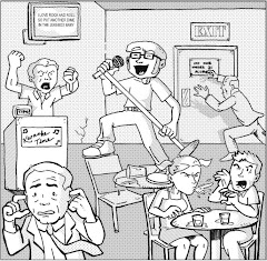
Felon #1, November 2001, Image Comics
writer: Greg Rucka
penciller: Matthew Clark
inker: Ray Snyder
colorist: Matt Nelson
letterer: Dreamer Design's Robin Spehar & Dennis Reinsler
editor: Renae Geerlings
EIC: David Wohl
Interestingly, Greg Rucka is the epitome of the phenomena I've recently explored, first in my review of New York Times best-selling author Brad Meltzer's new Justice League of America (found only at Geek in the City), then in yesterday's post about Dale Keown and his early work Dragonforce. Keown was a relatively unknown artist when he stormed the industry with his phenomenal work on The Incredible Hulk, and conversely, Brad Meltzer was a New York Times best-selling author before tackling the breadth of DC's ready to be exploited universe, still, each had little credibility in the comic book medium. I mock Meltzer's credential because of the way DC touts it so, like, "Look who we have!" Despite his similar status as a writer, Rucka's immersion into the comics field was a bit more subtle. When I read his Batman work toward the end of No Man's Land, I was blown away by the way he constructed a story, by the means through which he managed to slip in little moments of character development. When I found out Rucka was a novelist, I wasn't surprised, but I wasn't overwhelmed by the prestige, either. Bottom line, Rucka has the Meltzer clout and the Keown charm -- at least on paper.
That said, Felon didn't impress me. We've recently discussed the failings of A Comic A Day to grasp the true essence of an entire series, or at least a writer's or artist's comprehensive effort, through any single issue, and first issues are the worst example. Yet, first issues are the only examples that are actually accurate by this standard: without the benefit of a character's previously acknowledged history, or the context of an already established story, creators have a mere single issue's worth of material or impress . . . or dissuade. So, while picking up a series in its teen issues is an unfair singular assessment, I can confidently say that Felon #1 failed to grab me. I just don't know if Rucka is going somewhere important with this one. Following the steps of a female ex-con on her first few days out of the joint, Cassiday swipes a credit card, treats herself to a night in a swanky hotel, then pursues her former associates, any of whom may have set her up as the fallgal, to collect on her share of "the money." Yes, with Rucka's expertise on crime drama, from the guy that I once read doesn't sit with his back to the door "just in case," this issue is way too vague in its focus to be effective. Felon could continue as a linear story about underworld revenge, or an intense character study into the criminal mind. I wouldn't have wanted to drop another three bucks to find out, even though I really only spent a quarter on this one.
Artistically, Matthew Clark's characters look a little too rigid, a bit from the Phil Jiminez school, which is actually the George Perez school. Plenty of full body shots of Cassiday. I get it. She's hot, and tough. Now tell a story, already. Without narrative captions, which are often overused, mind, the visuals aren't even telling much of a story. Taking a shower? Watching TV? The stuff she couldn't do in the slammer . . . the stuff of a bored housewife's blog.
Ultimately, I wonder if Rucka is the one getting away with a crime here, using his name and impression as a crime-drama writer to tell a bland tale about an underdeveloped yet over-exploited concept. With Prison Break on hiatus this week, I thought Felon mind fill the void. It's just created another, like the empty cell Cassiday left behind. She got out, just to put us in.
Tuesday, March 13, 2007


Monday, March 12, 2007
Dragonforce #8
Dragonforce #8, 1989, Aircel Comics
by Dale Keown
Blogger's note: Check out my review of Justice League of America #1-6 at Geek in the City. Consider it an A Comic A Day annual! Now, on to today's post . . .
Every now and then, an artist will come from no where and take over a title, then quickly take the industry by storm. Frank Miller did it with Daredevil. Mark Bagley did it with Amazing Spider-man. And Dale Keown did it The Incredible Hulk. When Keown took on the artistic chores for old Jade Jaws just in time for the Joe Fixit era to transition to the Smart Hulk era, he not only reaped the benefit of Peter David's culminating success but added his own fluid flair to the title's transformation. With hints of Byrne and Davis, Keown has a style so much his own that when I pulled this issue of Dragonforce from the quarter bin last weekend, I instantly knew he was responsible. Sure, artists like Keown seem to come from no where, but they have to come from somewhere. They have to ride the rivers before they burst into the mainstream, you know?
Obviously familiar with Dale Keown's Hulk work, reading Dragonforce #8 was a visually surreal experience, because honestly, his style hasn't changed much since 1989. His proportions could use some work, and his backgrounds were never the most confident sometimes going pages on end with mere headshots or action lines as a distracting tactic, but his stringy muscular forms are consistent, his expressive faces still twisted with either lip-curled rage. The surrealism was a result of beholding Keown's work in this black and white independent format, as if his true potential was just brewing beneath the poor resolution of these pages. Now, Keown wrote and lettered this issue, too, and frankly, it's best experienced as a picture book -- not that Keown is a terrible writer, but his storytelling style should remain predominantly visual. And in many cases, his lettering, specifically his sound effects, are an eye sore. Thank goodness there were other folks around to help when he finally went pro.
The Dragonforce remind me of the Starjammers, an interstellar band of travellers each with unique powers, and in this issue they're trying to flee capture at the hands of their enemies. Each characters' abilities are implemented in their escape and Keown gives us a hint at his skill crafting big monsters and robots, but, again, these efforts speak more to his sequential, visual style versus the actual narrative. Needless to say, the shallow reader in me will definitely flip through this issue again. Whether or not I look at the words . . .
I deem it appropriate that Dale Keown burst onto the scene with The Incredible Hulk. His early betrays an incredible talent bottled up, looking for release in a format and on a character that can explore the breadth of his skill. With the various stages the Hulk endured during his run with David, Keown certainly had diverse material to work with, from the psycho-drama of Banner's mindscape to the technology of the Pantheon (Have we heard from them lately?), all of which bares root here in Dragonforce. The real force was Keown himself. I'm glad we found him . . . or did he find us?
by Dale Keown
Blogger's note: Check out my review of Justice League of America #1-6 at Geek in the City. Consider it an A Comic A Day annual! Now, on to today's post . . .
Every now and then, an artist will come from no where and take over a title, then quickly take the industry by storm. Frank Miller did it with Daredevil. Mark Bagley did it with Amazing Spider-man. And Dale Keown did it The Incredible Hulk. When Keown took on the artistic chores for old Jade Jaws just in time for the Joe Fixit era to transition to the Smart Hulk era, he not only reaped the benefit of Peter David's culminating success but added his own fluid flair to the title's transformation. With hints of Byrne and Davis, Keown has a style so much his own that when I pulled this issue of Dragonforce from the quarter bin last weekend, I instantly knew he was responsible. Sure, artists like Keown seem to come from no where, but they have to come from somewhere. They have to ride the rivers before they burst into the mainstream, you know?
Obviously familiar with Dale Keown's Hulk work, reading Dragonforce #8 was a visually surreal experience, because honestly, his style hasn't changed much since 1989. His proportions could use some work, and his backgrounds were never the most confident sometimes going pages on end with mere headshots or action lines as a distracting tactic, but his stringy muscular forms are consistent, his expressive faces still twisted with either lip-curled rage. The surrealism was a result of beholding Keown's work in this black and white independent format, as if his true potential was just brewing beneath the poor resolution of these pages. Now, Keown wrote and lettered this issue, too, and frankly, it's best experienced as a picture book -- not that Keown is a terrible writer, but his storytelling style should remain predominantly visual. And in many cases, his lettering, specifically his sound effects, are an eye sore. Thank goodness there were other folks around to help when he finally went pro.
The Dragonforce remind me of the Starjammers, an interstellar band of travellers each with unique powers, and in this issue they're trying to flee capture at the hands of their enemies. Each characters' abilities are implemented in their escape and Keown gives us a hint at his skill crafting big monsters and robots, but, again, these efforts speak more to his sequential, visual style versus the actual narrative. Needless to say, the shallow reader in me will definitely flip through this issue again. Whether or not I look at the words . . .
I deem it appropriate that Dale Keown burst onto the scene with The Incredible Hulk. His early betrays an incredible talent bottled up, looking for release in a format and on a character that can explore the breadth of his skill. With the various stages the Hulk endured during his run with David, Keown certainly had diverse material to work with, from the psycho-drama of Banner's mindscape to the technology of the Pantheon (Have we heard from them lately?), all of which bares root here in Dragonforce. The real force was Keown himself. I'm glad we found him . . . or did he find us?
Sunday, March 11, 2007
Evil Ernie: Depraved #3
Evil Ernie: Depraved #3, September 1999, Chaos! Comics
writer: Brian Pulido
penciller: David Brewer
inker: Curtis Arnold
colorist: Jason Jensen with John Merrifield
letterer: Comicraft's Oscar Gongora
editors: Phil Nutman & Brad Gould
Seems like zombies dominate the comic book shelves these days. Yet, before Robert Kirkman raised the Marvel Universe from the dead, before Bruce Campbell fought an army of darkness as a sequential art form, Evil Ernie was plotting world domination. Evil Ernie was perhaps the first "dark" comic book I remember perusing as a young collector . . . and I didn't like it. Just as I described my first impression of Ghost Rider a few weeks ago, Evil Ernie struck me as a decent idea for a tattoo, nothing more. Reading this issue now, I'm convinced otherwise. Evil Ernie's no mere tattoo . . . he'd make an excellent sleeve.
According to the Evil Ernie Timeline nestled on this issue's inside front cover, the "undead teenage psychopath" began his zombie journey in 1991 and has starred in several miniseries since, and in this one, Depraved, he achieves his magnum opus -- evoking megadeath, not the band, but the complete extinction of all life on earth. Ironically gathering undead followers with the vigor of a rock and roll show, Evil Ernie's march toward megadeath has destroyed the Mississippi Wall, a barrier that separated the living from the dead, bringing him face to face with his similarly undead parents. In a show of adolescent angst many teens must have revelled when this issue was first released, Ernie gleefully chops up his mom and dad and rejoins his army in Armageddon. Surprisingly, this concludes the miniseries, with little hope for humanity's redemption save a splinter of group of zombies that acknowledge their ability to think as life. We often debate when life begins in the womb, but to discuss when life begins when one is undead . . . that makes my head hurt.
I will confess an appreciation for Brewer and Arnold's art, specifically thanks to Jensen and Merrifield's dynamic coloring. A book called Evil Ernie: Depraved instantly creates a dark impression, but with an emphasis on the character's green, Kirby-dot-riddling torso glow, and the occasionally scarlet splash of blood or flame, a true depth of all things depraved is achieved. I wonder if the checkerboard floor of Ernie's parents' kitchen is intended to express the dichotomy of despair and hope throughout this issue, or if I'm simply hoping for a touch of some literary class in an otherwise bloody gorefest. This issue can't be that deprived!
I haven't seen Evil Ernie in a few years, but then again, I haven't been looking for him. Even if I were, I wonder if he'd stand out among the veritable army of darkness that clouds the new release racks nowadays. Still, books like Warren Ellis' Black Gas owe a debt to Evil Ernie's epic legacy. We're always telling teenagers to make something of their lives. This kid made something of his death. Talk about an overachiever.
writer: Brian Pulido
penciller: David Brewer
inker: Curtis Arnold
colorist: Jason Jensen with John Merrifield
letterer: Comicraft's Oscar Gongora
editors: Phil Nutman & Brad Gould
Seems like zombies dominate the comic book shelves these days. Yet, before Robert Kirkman raised the Marvel Universe from the dead, before Bruce Campbell fought an army of darkness as a sequential art form, Evil Ernie was plotting world domination. Evil Ernie was perhaps the first "dark" comic book I remember perusing as a young collector . . . and I didn't like it. Just as I described my first impression of Ghost Rider a few weeks ago, Evil Ernie struck me as a decent idea for a tattoo, nothing more. Reading this issue now, I'm convinced otherwise. Evil Ernie's no mere tattoo . . . he'd make an excellent sleeve.
According to the Evil Ernie Timeline nestled on this issue's inside front cover, the "undead teenage psychopath" began his zombie journey in 1991 and has starred in several miniseries since, and in this one, Depraved, he achieves his magnum opus -- evoking megadeath, not the band, but the complete extinction of all life on earth. Ironically gathering undead followers with the vigor of a rock and roll show, Evil Ernie's march toward megadeath has destroyed the Mississippi Wall, a barrier that separated the living from the dead, bringing him face to face with his similarly undead parents. In a show of adolescent angst many teens must have revelled when this issue was first released, Ernie gleefully chops up his mom and dad and rejoins his army in Armageddon. Surprisingly, this concludes the miniseries, with little hope for humanity's redemption save a splinter of group of zombies that acknowledge their ability to think as life. We often debate when life begins in the womb, but to discuss when life begins when one is undead . . . that makes my head hurt.
I will confess an appreciation for Brewer and Arnold's art, specifically thanks to Jensen and Merrifield's dynamic coloring. A book called Evil Ernie: Depraved instantly creates a dark impression, but with an emphasis on the character's green, Kirby-dot-riddling torso glow, and the occasionally scarlet splash of blood or flame, a true depth of all things depraved is achieved. I wonder if the checkerboard floor of Ernie's parents' kitchen is intended to express the dichotomy of despair and hope throughout this issue, or if I'm simply hoping for a touch of some literary class in an otherwise bloody gorefest. This issue can't be that deprived!
I haven't seen Evil Ernie in a few years, but then again, I haven't been looking for him. Even if I were, I wonder if he'd stand out among the veritable army of darkness that clouds the new release racks nowadays. Still, books like Warren Ellis' Black Gas owe a debt to Evil Ernie's epic legacy. We're always telling teenagers to make something of their lives. This kid made something of his death. Talk about an overachiever.
Saturday, March 10, 2007
The Lone Ranger #1 Director’s Cut
The Lone Ranger #1 Director’s Cut, 2007, Dynamite Entertainment
writer: Brett Matthews
artist: Sergio Cariello
colorist: Dean White
letterer: Simon Bowland
writer: Brett Matthews
artist: Sergio Cariello
colorist: Dean White
letterer: Simon Bowland

After a work-related weekend retreat, I was excited to read as engrossing and entertaining a comic book as The Lone Ranger #1 Director’s Cut. I wrote two-page review that explored its depths as the character study of a hero and an insight into the origins of a comic book, then stepped away from the computer for but a moment to return to a blank screen, the document completely gone. (At home, I cut and paste text into my post for more editing options.) I was so completely pleased with the way I wrote that review that I refuse to try and bang it out again in just under an hour’s time (I’m looking hard at 11:15 p.m. right now), so I regret to offer this “bottom line” in the hopes that I can redraft my review for a supplemental to tomorrow’s post.
The Lone Ranger #1: Director’s Cut was the quintessential origin issue, beginning the epic of an American hero with a sense of compassion and courage, while exploring the beginning of a comic book concept with insight and introspection from Matthews and the rest of the creative team. As its title might imply, The Lone Ranger #1 is a singular experience indeed.
Friday, March 09, 2007
Ex Parte #1
Ex Parte #1, April 2002, Lone Star Press
writer: Bill Williams
penciller: Coy Turnbull
inker: Rus Sever
colorist: Thomas Mullin
letterer: Thom Zahler
writer: Bill Williams
penciller: Coy Turnbull
inker: Rus Sever
colorist: Thomas Mullin
letterer: Thom Zahler

Remember when Namor decided to attack the surface world for its indiscretions against the underwater realm? What if Namor was arrested and tried for his crimes as an international terrorist? Ex Parte is a series about a lawyer working super-criminal law, and in this first issue, this is her case. Writer Bill Williams doesn't mire his legal fable in legislative mumbo jumbo but successfully balances courtroom drama with a fair sense of comic book bravado, like Law & Order meets Heroes. (Williams cites The Prisoner as an influence.) Coy Turnbull's art is crisp and expressive, rounding out a solid initial effort for this series . . . and, to connect the comics I've read on my work-related respite to San Diego, Mike Wieringo, who I mentioned in yesterday's review, drew this issue's cover, which seems to double as an actual prologue panel for the ensuing material. For a new series, Ex Parte left a classic, tasteful impression -- it would've been a crime to handle this kind of story any other way.
Thursday, March 08, 2007
Spider-man, Storm & Luke Cage
Spider-man, Storm & Luke Cage, May 2005, Marvel Comics/American Cancer Society
contributors unlisted

Every year I volunteer for the local American Cancer Society’s Relay for Life, a twenty-four hour track and field event designed to raise money and support for cancer prevention, research, and survivorship. I picked up this special comic book at a related event last night, read it on the road this morning, and surprised to find a genuine superhero adventure smoldering beneath an anti-smoking public service announcement. Luke Cage is coaching a citywide track team but his star runner has been enticed by a secret syndicate encouraging the kid to smoke and through his race, led by a new supervillain appropriately dubbed Smokescreen. Cage, Spidey, and Storm break up the ring and get the athlete back on track – literally, I guess. The writer maintained the integrity of the message while preserving a sense of adventure and wonder for a younger audience, the intended readership for such a preventative lesson. The artist also implemented a solid sense of page layout and drama, in the old mighty Marvel manner with a touch of Mike Wieringo influence. The creators should have been credited for their successful efforts, I say, but I can understand why they weren’t. Preventing cancer is the real inspiration for this issue. It’s the kind of enemy anyone can fight, with a little time. It’s the kind of cause that calls everyone to be a hero.
contributors unlisted

Every year I volunteer for the local American Cancer Society’s Relay for Life, a twenty-four hour track and field event designed to raise money and support for cancer prevention, research, and survivorship. I picked up this special comic book at a related event last night, read it on the road this morning, and surprised to find a genuine superhero adventure smoldering beneath an anti-smoking public service announcement. Luke Cage is coaching a citywide track team but his star runner has been enticed by a secret syndicate encouraging the kid to smoke and through his race, led by a new supervillain appropriately dubbed Smokescreen. Cage, Spidey, and Storm break up the ring and get the athlete back on track – literally, I guess. The writer maintained the integrity of the message while preserving a sense of adventure and wonder for a younger audience, the intended readership for such a preventative lesson. The artist also implemented a solid sense of page layout and drama, in the old mighty Marvel manner with a touch of Mike Wieringo influence. The creators should have been credited for their successful efforts, I say, but I can understand why they weren’t. Preventing cancer is the real inspiration for this issue. It’s the kind of enemy anyone can fight, with a little time. It’s the kind of cause that calls everyone to be a hero.
Wednesday, March 07, 2007
Hot Rods & Racing Cars #84
Hot Rods & Racing Cars #84, April 1967, Charlton Comics
contributors unlisted
Before I dive into today’s review, I’d like to respond to a comment posted by “Hal” regarding my post about Eclipse Comics #1. Hal remarked that a potential handicap of the A Comic A Day challenge is its singular look at any given series. He cites, for example, “. . .your reviews really have little relevance for a continuing comic series. When you reviewed Ninja High School #6 . . . you were disappointed to see that it didn't seem to actually involve a high school . . .Which is why you shouldn't have been reviewing NHS: It wasn’t meant to be a stand-alone comic issue but that's all you’ve seen of it.” Further, “I had a similar reaction when I read your review of Prime #1. Breyfogle’s viewpoint . . . made the comic work. You weren’t going to appreciate that in a single issue. And that’s all the time you could give it.” Yes, indeed, Hal, and as you said in so many words, therein lies the rub.
Respectful, critical commentary. I really appreciate his feedback (and anybody else’s if you’d like to chime in), and to elaborate, while the sheer momentum of this project effectively prevents further examination of the specific series I encounter for the first time (and I am planning on revisiting some surprising favorites eventually – Freaks of the Heartland comes to mind), my narrow focus on each day’s respective material offers a unique insight I may never have experienced with the baggage of my fifteen years’ worth of reading comics. Yes, I’m reading comics I never would have touched before, by creators whose efforts I would have remained ignorant of, but even more importantly, I’m experiencing a phenomenon that is inevitable with such a growing market (and art form) as comics – the presumption that every comic book could be somebody’s first comic book, without the benefit of an apparent lifetime’s worth of collecting. I understand how storytelling works, and how an issue or three of Ninja High School can actually be void of ninjas and high school without missing the coming-of-age angst that truly drives the series’ essence. But a novice reader that digs the title and buys the issue on a whim? Without even a “last issue summary” (a fairly recent addition to most mainstream comics that show how spoiled we readers are), I imagine the reader would want his money back. Yes, the whole quarter.
The bottom line is, I’m trying to get a vibe from comics, not any singular series – not that you misunderstood, Hal, but simply to clarify the focus of this binge/purge reading process. I’m looking at the comic book, every comic book I get my hands on, as an interactive work of art – yes, a part of an ongoing whole, but still a singular entity that should evoke some merit on its own. Otherwise, the single issue format should bow to the graphic novel phenomenon . . . and in many ways, it already has. Still, the comic book has nearly a century’s worth of content still begging to be read, and if any given issue is too dated by its era, then as art it still silently beseeches to be seen a significant forefather to what the medium has become. For better or worse, I’m answering that call, and eight months deep, I still feel like I’m driving blind.
Speaking of driving, I chose to read Hot Rods & Racing Cars today as a makeshift warning that tomorrow through Saturday, I will be on a work-related road trip to San Diego, thus my reviews will most likely be reduced to a mere sentence or two, hopefully with a solid recap to follow the beginning of next week. Thankfully, Eclipse Comics #1 evoked plenty of material to keep you faithful readers busy for a day or two, I hope. Yes, I’m trying to write more now to make up for my forthcoming limited effort, so just grit and bear it, okay?
That said, I must admit, I’m not a car guy. I got my driver’s license late in life, and I still ride my bicycle nearly everywhere I go. (Yeah, like the forty-year-old virgin. Ha ha. You’re the one reading a comic book blog.) Moreover, a comic book about hot rods and racing cars seems like a conflict of interest, because while both are visually entertaining, the still frame storytelling of a comic is the sheer opposite of the fast-paced drama of the racetrack. Still, the four stories in this issue pull it off, if only by injecting each tale with a challenging conflict supplemental to the rubber hitting the road. For instance, the first story is about an old driver that tries to shoo some gypsies from his property only to face a curse that results in a cat propelling his hot rod off the road. The same fate befalls his son, and soon thereafter his grandson, if next issue offers a similar yarn (I think we’re meant to believe otherwise, with this kind of build up). Now, if gypsies were on the cover of this comic book, I’d have bought it without the hesitation my hand felt reaching for a vehicle-centric rag. In the end, a comic about cars just seemed novel. I guess it still is.
The second story is actually less a battle of the engines than a battle of the sexes, as a good Samaritan rescues a puppy hit and run by a police captain’s daughter, so spoiled that she insists that his reckless driving nearly hurt her. The captain insists that his wife taught their daughter how to drive well, but when a fellow cop finds dog hairs on her bumper, he confesses, “Also, I don’t like to say this, Sir, but I’ve seen Pam and Mrs. Vandergrift drive, and I think they both could use some instructions . . .” It’s typical mid-century domestic hierarchy, as the captain assures us he’ll send his wife for more lessons immediately. Hey, women don’t drive that bad . . . when they’re driving you up the wall!
The Rebs was the most confusing tale of the four, told in a first person hick vernacular that made the linear plot difficult to follow. From what I reckon, two adventurous brothers are arrested for reckless driving, released, then challenged by some local rich boys to a race, where they all become friends and plan to romp their cars another day. In contrast to the previous story, I wonder if this tale implies that mid-century hidden homoeroticism I’ve heard so much about. A bunch of guys . . . getting together to rev their engines and whatnot . . . manly to a fault, I think.
Clint Curtis Meets the Golden Boy is this issue’s cover story (literally, as the cover simply reproduces panels from the interior art), in which Curtis and “Golden Boy” Gary Golden square off in a soap box derby race. Golden yearns for the championship and has a rep for cheating, but still loses despite Clint’s right rear wheel popping off. Gary’s dad stifles his son’s whining and encourages the boy to front good sportsmanship so they could effortlessly scheme a later victory, and ironically, Gary wins a sportsmanship award. This is a fun, old-fashioned tale – essentially a glorified Goofus and Gallant strip, if you ever read Highlights Magazine. I enjoyed it and was glad to see it end the issue rather than kick it off, as the cover suggested. With the two potential duds in the middle, this comic had a solid skid into the finish line.
Logistically, a few minor elements about the construction of Hot Rods caught my eye. First of all, the lettering appears to be typed. I don’t know how else to describe it, but the font simply looks too consistent for someone’s penmanship, even a professional letterer’s from ’67. The typeface is centered in balloons like a standard comic, though, so while its perfection is noticeable, it isn’t distracting. Also, interestingly, the second page in the first story was placed out of sequence. Fortunately, the error was so recognizable the reader could compensate, but I wonder if later reprints (if there were any) were corrected.
I’m sure my road trip this weekend won’t be as thrilling as these vehicular adventures, so I’m glad I got to experience them vicariously through Clint Curtis and company. We geeks have a few staple rides we treasure – the Batmobile, the A-Team van, Doc Brown’s time machine – but a nice turf-tearing street race always excites, no matter who’s behind the wheel or what kind of car is in front of it . . . or if we only see it panel by panel. Hey, at a real racetrack, spectators only see the cars for a moment, as well, as they zip past their section of the bleachers, eh? Just as I only see one comic in a breadth of any series during this challenge, eh?
Ah, see how I bring that back ‘round? Like a spinning wheel, I tell you.
contributors unlisted
Before I dive into today’s review, I’d like to respond to a comment posted by “Hal” regarding my post about Eclipse Comics #1. Hal remarked that a potential handicap of the A Comic A Day challenge is its singular look at any given series. He cites, for example, “. . .your reviews really have little relevance for a continuing comic series. When you reviewed Ninja High School #6 . . . you were disappointed to see that it didn't seem to actually involve a high school . . .Which is why you shouldn't have been reviewing NHS: It wasn’t meant to be a stand-alone comic issue but that's all you’ve seen of it.” Further, “I had a similar reaction when I read your review of Prime #1. Breyfogle’s viewpoint . . . made the comic work. You weren’t going to appreciate that in a single issue. And that’s all the time you could give it.” Yes, indeed, Hal, and as you said in so many words, therein lies the rub.
Respectful, critical commentary. I really appreciate his feedback (and anybody else’s if you’d like to chime in), and to elaborate, while the sheer momentum of this project effectively prevents further examination of the specific series I encounter for the first time (and I am planning on revisiting some surprising favorites eventually – Freaks of the Heartland comes to mind), my narrow focus on each day’s respective material offers a unique insight I may never have experienced with the baggage of my fifteen years’ worth of reading comics. Yes, I’m reading comics I never would have touched before, by creators whose efforts I would have remained ignorant of, but even more importantly, I’m experiencing a phenomenon that is inevitable with such a growing market (and art form) as comics – the presumption that every comic book could be somebody’s first comic book, without the benefit of an apparent lifetime’s worth of collecting. I understand how storytelling works, and how an issue or three of Ninja High School can actually be void of ninjas and high school without missing the coming-of-age angst that truly drives the series’ essence. But a novice reader that digs the title and buys the issue on a whim? Without even a “last issue summary” (a fairly recent addition to most mainstream comics that show how spoiled we readers are), I imagine the reader would want his money back. Yes, the whole quarter.
The bottom line is, I’m trying to get a vibe from comics, not any singular series – not that you misunderstood, Hal, but simply to clarify the focus of this binge/purge reading process. I’m looking at the comic book, every comic book I get my hands on, as an interactive work of art – yes, a part of an ongoing whole, but still a singular entity that should evoke some merit on its own. Otherwise, the single issue format should bow to the graphic novel phenomenon . . . and in many ways, it already has. Still, the comic book has nearly a century’s worth of content still begging to be read, and if any given issue is too dated by its era, then as art it still silently beseeches to be seen a significant forefather to what the medium has become. For better or worse, I’m answering that call, and eight months deep, I still feel like I’m driving blind.
Speaking of driving, I chose to read Hot Rods & Racing Cars today as a makeshift warning that tomorrow through Saturday, I will be on a work-related road trip to San Diego, thus my reviews will most likely be reduced to a mere sentence or two, hopefully with a solid recap to follow the beginning of next week. Thankfully, Eclipse Comics #1 evoked plenty of material to keep you faithful readers busy for a day or two, I hope. Yes, I’m trying to write more now to make up for my forthcoming limited effort, so just grit and bear it, okay?
That said, I must admit, I’m not a car guy. I got my driver’s license late in life, and I still ride my bicycle nearly everywhere I go. (Yeah, like the forty-year-old virgin. Ha ha. You’re the one reading a comic book blog.) Moreover, a comic book about hot rods and racing cars seems like a conflict of interest, because while both are visually entertaining, the still frame storytelling of a comic is the sheer opposite of the fast-paced drama of the racetrack. Still, the four stories in this issue pull it off, if only by injecting each tale with a challenging conflict supplemental to the rubber hitting the road. For instance, the first story is about an old driver that tries to shoo some gypsies from his property only to face a curse that results in a cat propelling his hot rod off the road. The same fate befalls his son, and soon thereafter his grandson, if next issue offers a similar yarn (I think we’re meant to believe otherwise, with this kind of build up). Now, if gypsies were on the cover of this comic book, I’d have bought it without the hesitation my hand felt reaching for a vehicle-centric rag. In the end, a comic about cars just seemed novel. I guess it still is.
The second story is actually less a battle of the engines than a battle of the sexes, as a good Samaritan rescues a puppy hit and run by a police captain’s daughter, so spoiled that she insists that his reckless driving nearly hurt her. The captain insists that his wife taught their daughter how to drive well, but when a fellow cop finds dog hairs on her bumper, he confesses, “Also, I don’t like to say this, Sir, but I’ve seen Pam and Mrs. Vandergrift drive, and I think they both could use some instructions . . .” It’s typical mid-century domestic hierarchy, as the captain assures us he’ll send his wife for more lessons immediately. Hey, women don’t drive that bad . . . when they’re driving you up the wall!
The Rebs was the most confusing tale of the four, told in a first person hick vernacular that made the linear plot difficult to follow. From what I reckon, two adventurous brothers are arrested for reckless driving, released, then challenged by some local rich boys to a race, where they all become friends and plan to romp their cars another day. In contrast to the previous story, I wonder if this tale implies that mid-century hidden homoeroticism I’ve heard so much about. A bunch of guys . . . getting together to rev their engines and whatnot . . . manly to a fault, I think.
Clint Curtis Meets the Golden Boy is this issue’s cover story (literally, as the cover simply reproduces panels from the interior art), in which Curtis and “Golden Boy” Gary Golden square off in a soap box derby race. Golden yearns for the championship and has a rep for cheating, but still loses despite Clint’s right rear wheel popping off. Gary’s dad stifles his son’s whining and encourages the boy to front good sportsmanship so they could effortlessly scheme a later victory, and ironically, Gary wins a sportsmanship award. This is a fun, old-fashioned tale – essentially a glorified Goofus and Gallant strip, if you ever read Highlights Magazine. I enjoyed it and was glad to see it end the issue rather than kick it off, as the cover suggested. With the two potential duds in the middle, this comic had a solid skid into the finish line.
Logistically, a few minor elements about the construction of Hot Rods caught my eye. First of all, the lettering appears to be typed. I don’t know how else to describe it, but the font simply looks too consistent for someone’s penmanship, even a professional letterer’s from ’67. The typeface is centered in balloons like a standard comic, though, so while its perfection is noticeable, it isn’t distracting. Also, interestingly, the second page in the first story was placed out of sequence. Fortunately, the error was so recognizable the reader could compensate, but I wonder if later reprints (if there were any) were corrected.
I’m sure my road trip this weekend won’t be as thrilling as these vehicular adventures, so I’m glad I got to experience them vicariously through Clint Curtis and company. We geeks have a few staple rides we treasure – the Batmobile, the A-Team van, Doc Brown’s time machine – but a nice turf-tearing street race always excites, no matter who’s behind the wheel or what kind of car is in front of it . . . or if we only see it panel by panel. Hey, at a real racetrack, spectators only see the cars for a moment, as well, as they zip past their section of the bleachers, eh? Just as I only see one comic in a breadth of any series during this challenge, eh?
Ah, see how I bring that back ‘round? Like a spinning wheel, I tell you.
Tuesday, March 06, 2007
Power & Glory #4
Power & Glory #4, May 1994, Malibu Comics
writer/artist: Howard Chaykin
letterer: Ken Bruzenak
colorists: ‘Bu Tones & Lydia Nomura
editors: Dan Danko & Kara Lamb
I mentioned Howard Chaykin in my Captain Confederacy post a few days ago, so I’d be remiss not to review one of his comics. Appropriately, Power & Glory is yet another Captain America riff, with an emphasis on the celebrity a super soldier would garner from today’s hero hungry world. When the adventures Apex, short for American Powerhouse Experiment, lose their public appeal despite his sidekick’s (staged) death, the hero and his entourage experience a hilarious sequence of romantic entanglements, making Chaykin’s epic less heroic than soap operatic. Eventually, Apex’s benefactor Malcome LeStrange connects with trafficker-turned-movie mogul Jean Paul M’Butu and their cooperative efforts seem as conspiratorial as they do natural. This is the last issue of the four issue miniseries yet Chaykin’s writing is so natural that I’m interested even in the midst of this climatic chapter. Further, while his choice to keep his characters in the forefront of his page layouts, avoiding extensively detailed background work to emphasize on his protagonists’ expressions and reactions, his style is masterful – the opus of a pro playing with the narrative boundaries of his genre. I’m interested in reading Chaykin’s American Flagg now more than ever, and I hope I’ll find an issue before the A Comic A Day challenge is over. In fact, such a review could offer a penultimate analysis of the Captain America paradigm . . . perhaps better dubbed the homemade soldier motif. Chaykin obviously knows what he’s doing. While Captain Confederacy tweaked the socio-political context of the homemade soldier subgenre, Power & Glory emphasized the socio-pop-cultural. Are comic book creators just really that patriotic?
writer/artist: Howard Chaykin
letterer: Ken Bruzenak
colorists: ‘Bu Tones & Lydia Nomura
editors: Dan Danko & Kara Lamb
I mentioned Howard Chaykin in my Captain Confederacy post a few days ago, so I’d be remiss not to review one of his comics. Appropriately, Power & Glory is yet another Captain America riff, with an emphasis on the celebrity a super soldier would garner from today’s hero hungry world. When the adventures Apex, short for American Powerhouse Experiment, lose their public appeal despite his sidekick’s (staged) death, the hero and his entourage experience a hilarious sequence of romantic entanglements, making Chaykin’s epic less heroic than soap operatic. Eventually, Apex’s benefactor Malcome LeStrange connects with trafficker-turned-movie mogul Jean Paul M’Butu and their cooperative efforts seem as conspiratorial as they do natural. This is the last issue of the four issue miniseries yet Chaykin’s writing is so natural that I’m interested even in the midst of this climatic chapter. Further, while his choice to keep his characters in the forefront of his page layouts, avoiding extensively detailed background work to emphasize on his protagonists’ expressions and reactions, his style is masterful – the opus of a pro playing with the narrative boundaries of his genre. I’m interested in reading Chaykin’s American Flagg now more than ever, and I hope I’ll find an issue before the A Comic A Day challenge is over. In fact, such a review could offer a penultimate analysis of the Captain America paradigm . . . perhaps better dubbed the homemade soldier motif. Chaykin obviously knows what he’s doing. While Captain Confederacy tweaked the socio-political context of the homemade soldier subgenre, Power & Glory emphasized the socio-pop-cultural. Are comic book creators just really that patriotic?
Monday, March 05, 2007
Eclipse Monthly #1
Eclipse Monthly #1, August 1983, Eclipse Comics
various contributors
If you think it’s hard to create an original idea for a comic book, imagine the challenge of founding and running a successful comic book company, a veritable stable of fresh ideas that each retains a uniqueness while simultaneously promoting a continuity the publisher can market as their mark on the industry. Whew. Of the hundreds of comic book publishers that have made a blip on the “nerdar” (nerd + radar . . . I’m copyrighting that one), only a few have survived, and even then, many have adapted to trends in pop culture to maintain a vitality old and potential readers alike could embrace. For example, when I say DC Comics, the average reader thinks of Superman, Batman, Wonder Woman . . . when I say Marvel, Spidey, the Hulk, and Captain America come to mind. These beloved characters are corporate brands, their likenesses practical logos for multimedia conglomerates. When I say Dark Horse, what would the average reader conjure? Hellboy and the Goon? Star Wars? Propeller Man? The breadth of their material is understandably diverse to reach as wide an audience as possible; with the arguable exception of the Star Wars franchise, Dark Horse doesn’t have the historical appeal of Superman or Spider-man. By no fault of its own, it simply isn’t grounded in Americana yet.
What if I said Image Comics? The titles many older fans may think of aren’t even in publication anymore. Those creators have returned to the corporations they fled from, and meanwhile, Image has truly and ironically become a source for the independent material we thought those Wolverine clones represented in the first place. But I digress.
What if I said Eclipse Comics? Anything? Hello? Exactly? Unfortunately, Eclipse is one of those comic book companies that didn’t make it, and if this first issue of Eclipse Monthly is any indication, it’s really our loss. Now, honestly, none of the five stories in this anthology completely gripped me; however, the spirit of the book was practically palpable. From the editors’ introductory essay to the very short stories that made up this issue, I bought into hype – that Eclipse as a publisher was genuinely interested in providing a variety of graphic material by an equally diverse array of established and up-and-coming artists. I’ve only reviewed a handful of Eclipse comics for the A Comic A Day challenge, but with this one issue I feel like I’ve doubled that number. The eclipse may have passed, but some of us are still looking skyward.
The first of the five stories in Eclipse Monthly #1 is called Cap’n Quick and a Foozle, by legendary Batman artist Marshall Rogers. In this tale, Rogers abandons capes and cityscapes for childish fantasy – yes, I know superheroes are by nature childish fantasy, but in this case, Rogers pursues the genre literally. In his attempt to construct shoes that will enable him to travel into his video games, an apparently genius little boy somewhat succeeds, entering the foozle dimension where he meets a Santa Claus-looking dude and his odd bird-like creature (a foozle) on the run from ruthless mutants. When the old guy gets captured, the foozle and the little genius are on their own, which is I presume where the adventure begins. Rogers is bordering on the surreal with this escapist fantasy, but his art is as solid and detailed as ever. Obviously, I’m familiar with his more mainstream Detective Comics stuff, so Cap’n Quick is an interesting and engrossing departure. Unfortunately, I don’t know if these pages are enough to fully sink the hook through my mouth. I have a taste, but do I want to take a seat at the table?
The Masked Man by B.C. Boyer is a little more tantalizing. I thought I had read an issue of The Masked Man for A Comic A Day before, but a search of my past posts was fruitless. I know I have an issue of it laying around here somewhere, and after this short story, I’m interested in finding it. Now, The Bank Robbery is a rather predictable tale, but Boyer pushes the conventions of this old parable to the limit – in the face of his peers’ rejection, a geeky little boy insists that he helped the hallowed Masked Man prevent a bank robbery the week before, and he recounts the incident to his tormentors’ disbelief. While this innocent fable ends exactly the way you’d expect, the boy’s mother is surprisingly shot in the midst of the initial bank robbery, and though she survives, it’s a touch of brutality I wouldn’t have expected from another escapist childish fantasy. (Yes, in the end, the Masked Man swings by to say “hiya” to his new young friend, and the bullies suddenly clamor for the kid’s attention. Please tell me you saw that coming.) Another shocking revelation: the Masked Man isn’t a superhero, but a rather well known, brave concerned citizen that happens to wear a mask. Again, I’m interested in more, but potentially dissuaded by this short story’s cheesiness. If the other Masked Man memoirs are an odd unbalance of violence and innocence, it’s one ride I might pass up.
Rio is a western by Doug Wildey about an outlaw hired by President U.S. Grant to pursue a railroad baron aimlessly killing wild stock and leaving the Indian population without the natural means to survive. It’s the briefest story of the bunch, if not in page length than in raw material; Wildey’s renditions of the west are classical and elegant, and while his heroes are physically rugged, their old souls exude a warmth of an old America. And by old, I mean young, but I digress again. Rio confronts the baron without firing a bullet but with the tension of those moments right before one hits the bone. When I turned the last page, I actually had to flip back in disbelief that the story was over. It was engrossing, and I had dug in, but alas, I wonder if I’ll ever see Rio again. Eclipse was unintentionally asking, with this lone western tale of its time, I’m sure: Where have all the cowboys gone?
I couldn’t finish Sax Rohmer’s Dope adapted by Trina Robbins. Originally penned as a novel by the creator of Fu Manchu, the story essentially documents a celebrity’s decent into drugs and despair, and while the concept is obviously a timeless one, I couldn’t stomach the manner in which it was told. Consider this line from opium dealer Sin Sin Wa, “Me no hab gotchee wifee.” Honestly, Robbins’ crude illustrations weren’t enough for me to endure this old epic, either. Although I thought it a dud, Dope still betrays a bravado for a variety of work. I mean, adapting a work from 1919? Eclipse wanted readers, right?
Finally, and perhaps most appreciatively, is Steve Ditko’s Static. Yes, the Steve Ditko of Amazing Spider-man fame. In Static, Ditko revisits the scientific superhero shtick when Mac Rey, assistant to Dr. Ed Serch, tests a suit designed to withstand extreme climates, only to have the suit malfunction and form a bond that enables him to uses its energy in various fashions to fight crime. Frankly, it’s standard old Marvel fare, complete with a technological doohickey with an unlikely, derivative name like enego, although Ditko tries his best to infuse a sense of philosophy by pitting scientific theory against moral and social responsibility. What Ditko fails to grasp is, when the science is unfounded fantastic fiction, we readers feel no real connection to it, thus the presumed lesson isn’t worth learning in the first place. I mean, the distinguishing traits of Static’s powers are those famed Kirby dots. Kirby dots. ‘Nuff said, eh?
So, with names and character archetypes both new and old, Eclipse offers a taste of what it, as a publisher, has, er, had to offer. The only consistency between each of these five stories is their creators’ freedom to write and draw anything they want, and while the raw expression of creativity is contagious, it isn’t a fever with widespread potential. At least, not anymore. Still, just as an eclipse is a passing phenomenon, it’s always bounds to happen again. We fans love stuff like this. We’re always looking up for it.
various contributors
If you think it’s hard to create an original idea for a comic book, imagine the challenge of founding and running a successful comic book company, a veritable stable of fresh ideas that each retains a uniqueness while simultaneously promoting a continuity the publisher can market as their mark on the industry. Whew. Of the hundreds of comic book publishers that have made a blip on the “nerdar” (nerd + radar . . . I’m copyrighting that one), only a few have survived, and even then, many have adapted to trends in pop culture to maintain a vitality old and potential readers alike could embrace. For example, when I say DC Comics, the average reader thinks of Superman, Batman, Wonder Woman . . . when I say Marvel, Spidey, the Hulk, and Captain America come to mind. These beloved characters are corporate brands, their likenesses practical logos for multimedia conglomerates. When I say Dark Horse, what would the average reader conjure? Hellboy and the Goon? Star Wars? Propeller Man? The breadth of their material is understandably diverse to reach as wide an audience as possible; with the arguable exception of the Star Wars franchise, Dark Horse doesn’t have the historical appeal of Superman or Spider-man. By no fault of its own, it simply isn’t grounded in Americana yet.
What if I said Image Comics? The titles many older fans may think of aren’t even in publication anymore. Those creators have returned to the corporations they fled from, and meanwhile, Image has truly and ironically become a source for the independent material we thought those Wolverine clones represented in the first place. But I digress.
What if I said Eclipse Comics? Anything? Hello? Exactly? Unfortunately, Eclipse is one of those comic book companies that didn’t make it, and if this first issue of Eclipse Monthly is any indication, it’s really our loss. Now, honestly, none of the five stories in this anthology completely gripped me; however, the spirit of the book was practically palpable. From the editors’ introductory essay to the very short stories that made up this issue, I bought into hype – that Eclipse as a publisher was genuinely interested in providing a variety of graphic material by an equally diverse array of established and up-and-coming artists. I’ve only reviewed a handful of Eclipse comics for the A Comic A Day challenge, but with this one issue I feel like I’ve doubled that number. The eclipse may have passed, but some of us are still looking skyward.
The first of the five stories in Eclipse Monthly #1 is called Cap’n Quick and a Foozle, by legendary Batman artist Marshall Rogers. In this tale, Rogers abandons capes and cityscapes for childish fantasy – yes, I know superheroes are by nature childish fantasy, but in this case, Rogers pursues the genre literally. In his attempt to construct shoes that will enable him to travel into his video games, an apparently genius little boy somewhat succeeds, entering the foozle dimension where he meets a Santa Claus-looking dude and his odd bird-like creature (a foozle) on the run from ruthless mutants. When the old guy gets captured, the foozle and the little genius are on their own, which is I presume where the adventure begins. Rogers is bordering on the surreal with this escapist fantasy, but his art is as solid and detailed as ever. Obviously, I’m familiar with his more mainstream Detective Comics stuff, so Cap’n Quick is an interesting and engrossing departure. Unfortunately, I don’t know if these pages are enough to fully sink the hook through my mouth. I have a taste, but do I want to take a seat at the table?
The Masked Man by B.C. Boyer is a little more tantalizing. I thought I had read an issue of The Masked Man for A Comic A Day before, but a search of my past posts was fruitless. I know I have an issue of it laying around here somewhere, and after this short story, I’m interested in finding it. Now, The Bank Robbery is a rather predictable tale, but Boyer pushes the conventions of this old parable to the limit – in the face of his peers’ rejection, a geeky little boy insists that he helped the hallowed Masked Man prevent a bank robbery the week before, and he recounts the incident to his tormentors’ disbelief. While this innocent fable ends exactly the way you’d expect, the boy’s mother is surprisingly shot in the midst of the initial bank robbery, and though she survives, it’s a touch of brutality I wouldn’t have expected from another escapist childish fantasy. (Yes, in the end, the Masked Man swings by to say “hiya” to his new young friend, and the bullies suddenly clamor for the kid’s attention. Please tell me you saw that coming.) Another shocking revelation: the Masked Man isn’t a superhero, but a rather well known, brave concerned citizen that happens to wear a mask. Again, I’m interested in more, but potentially dissuaded by this short story’s cheesiness. If the other Masked Man memoirs are an odd unbalance of violence and innocence, it’s one ride I might pass up.
Rio is a western by Doug Wildey about an outlaw hired by President U.S. Grant to pursue a railroad baron aimlessly killing wild stock and leaving the Indian population without the natural means to survive. It’s the briefest story of the bunch, if not in page length than in raw material; Wildey’s renditions of the west are classical and elegant, and while his heroes are physically rugged, their old souls exude a warmth of an old America. And by old, I mean young, but I digress again. Rio confronts the baron without firing a bullet but with the tension of those moments right before one hits the bone. When I turned the last page, I actually had to flip back in disbelief that the story was over. It was engrossing, and I had dug in, but alas, I wonder if I’ll ever see Rio again. Eclipse was unintentionally asking, with this lone western tale of its time, I’m sure: Where have all the cowboys gone?
I couldn’t finish Sax Rohmer’s Dope adapted by Trina Robbins. Originally penned as a novel by the creator of Fu Manchu, the story essentially documents a celebrity’s decent into drugs and despair, and while the concept is obviously a timeless one, I couldn’t stomach the manner in which it was told. Consider this line from opium dealer Sin Sin Wa, “Me no hab gotchee wifee.” Honestly, Robbins’ crude illustrations weren’t enough for me to endure this old epic, either. Although I thought it a dud, Dope still betrays a bravado for a variety of work. I mean, adapting a work from 1919? Eclipse wanted readers, right?
Finally, and perhaps most appreciatively, is Steve Ditko’s Static. Yes, the Steve Ditko of Amazing Spider-man fame. In Static, Ditko revisits the scientific superhero shtick when Mac Rey, assistant to Dr. Ed Serch, tests a suit designed to withstand extreme climates, only to have the suit malfunction and form a bond that enables him to uses its energy in various fashions to fight crime. Frankly, it’s standard old Marvel fare, complete with a technological doohickey with an unlikely, derivative name like enego, although Ditko tries his best to infuse a sense of philosophy by pitting scientific theory against moral and social responsibility. What Ditko fails to grasp is, when the science is unfounded fantastic fiction, we readers feel no real connection to it, thus the presumed lesson isn’t worth learning in the first place. I mean, the distinguishing traits of Static’s powers are those famed Kirby dots. Kirby dots. ‘Nuff said, eh?
So, with names and character archetypes both new and old, Eclipse offers a taste of what it, as a publisher, has, er, had to offer. The only consistency between each of these five stories is their creators’ freedom to write and draw anything they want, and while the raw expression of creativity is contagious, it isn’t a fever with widespread potential. At least, not anymore. Still, just as an eclipse is a passing phenomenon, it’s always bounds to happen again. We fans love stuff like this. We’re always looking up for it.
Sunday, March 04, 2007
Jonny Quest #31
Jonny Quest #31, December 1988, Comico the Comic Company
writer: William Messner-Loebs
penciller/letterer: Marc Hempel
inker/colorist: Mark Wheatly
letterer/colorist: Kathryn Mayer
editor: Diana Schutz
Every Sunday night, half a million geeks gather around their television set to watch Adult Swim, Cartoon Network’s eclectic collection of late night animated shorts created by and for an immature mature audience – if that makes sense. Space Ghost: Coast to Coast put Adult Swim on the map, followed by a slew of other series inspired by old Hanna Barbara cartoons, including Harvey Birdman: Attorney at Law, Sealab 2021, and my favorite Venture Bros., an obvious homage to Jonny Quest and his peculiar adventure-prone family. I confess, I’ve seen more episodes of the Venture Bros. than the classic Jonny Quest, but if the latter offers thought-provoking tales like the one in the last issue of its Comico series, I’ll be glued to Boomerang for foreseeable future.
When I picked up Jonny Quest #31 a few weeks ago, I didn’t know it was the last issue of its series, and fortunately, the standalone story was both a perfect entry point for new readers and finale for old fans. With the little knowledge I have of the old Jonny Quest cartoon show, I expected to follow the Quests on a sci-fi adventure of either galactic or inter-dimensional proportions; instead, we readers take a rather pedestrian and in fact urban trek with the boys through a surprisingly poignant tale of domestic dispute and injustice. To avoid studying English history with Race, Jonny and Hadji join Dr. Quest’s girlfriend Kathy on her rounds as a social worker. On route, they encounter a petty gang of thieves (that the boys take care of effortlessly), an old retired carpenter that refuses to go to a home, an delusional widow that nearly unwittingly dies of gas fumes, and an abusive father that threatens his family with a gun before turning it on himself. Kathy grabs his arm in time to assure its merely a flesh wound, but the material is incredibly dramatic for a series I would’ve assumed family friendly. For a final issue, the writer seems intent on giving his audience something to think about.
Indeed, despite this bleak backdrop of societal dysfunction, the boys retain a sense of innocence and optimism that fuels Kathy until the end, as if Jonny and Hadji are perpetually trapped in the “happily ever after” mentality of a cartoon while their supporting cast is thrust mercilessly into the real world. The writer maintains a believable balance of the tragic and the blissful until the very end, when Kathy’s day ends with Dr. Quest’s long-anticipated proposal, as if he’s rewarding not only his characters’ endurance, but his readers’, as well. I presume this is the last “new” adventure we’ve seen of the Quest family. It’s a fulfilling end to a lifetime’s worth of adventure.
I must say, as taken as I was by this issue’s story, I was equally if not more so appreciative of its art. Hempel and Wheatley turn in some stellar work, rife with clean, angular lines and the dramatic tension necessary for the narrative. I dare say their work is reminiscent of Frank Miller’s Daredevil in its page layout and expressive characters (since that work is fresh in my mind after tonight’s G4 Icons special about the 300 creator). Honestly, the whole package was much more than I anticipated from a comic book inspired by a long lost cartoon. It had an identity and a relevance all its own. I miss this series, and I never even read it!
Alas, the letter column is full of fans’ farewell missives; I guess they saw it coming. Their feedback confirms my impression that Jonny Quest was a much deeper read than anyone expected, but much to everyone’s delight. This comic was proof positive of how a seemingly dead franchise can be brought back to life respectably and relevantly. Seriously, this issue had nearly all the elements I look for in a comic book: a nice, tight fist fight, a thought-provoking subplot rife with social significance, colorful dynamic characters, and art that’s easy on the eyes. I might pass this one around for a few friends to read . . . and I’m sure they’ll look at it just as I did, when I pulled it from that quarter box. “Jonny Quest? Why not?” I’m telling you, this material was more adult than anything Cartoon Network airs on Sunday night. It’s definitely a quest worth taking.
Does anyone know if Comico collected any of their series, or who currently owns the rights to Jonny Quest as a comic book?
writer: William Messner-Loebs
penciller/letterer: Marc Hempel
inker/colorist: Mark Wheatly
letterer/colorist: Kathryn Mayer
editor: Diana Schutz
Every Sunday night, half a million geeks gather around their television set to watch Adult Swim, Cartoon Network’s eclectic collection of late night animated shorts created by and for an immature mature audience – if that makes sense. Space Ghost: Coast to Coast put Adult Swim on the map, followed by a slew of other series inspired by old Hanna Barbara cartoons, including Harvey Birdman: Attorney at Law, Sealab 2021, and my favorite Venture Bros., an obvious homage to Jonny Quest and his peculiar adventure-prone family. I confess, I’ve seen more episodes of the Venture Bros. than the classic Jonny Quest, but if the latter offers thought-provoking tales like the one in the last issue of its Comico series, I’ll be glued to Boomerang for foreseeable future.
When I picked up Jonny Quest #31 a few weeks ago, I didn’t know it was the last issue of its series, and fortunately, the standalone story was both a perfect entry point for new readers and finale for old fans. With the little knowledge I have of the old Jonny Quest cartoon show, I expected to follow the Quests on a sci-fi adventure of either galactic or inter-dimensional proportions; instead, we readers take a rather pedestrian and in fact urban trek with the boys through a surprisingly poignant tale of domestic dispute and injustice. To avoid studying English history with Race, Jonny and Hadji join Dr. Quest’s girlfriend Kathy on her rounds as a social worker. On route, they encounter a petty gang of thieves (that the boys take care of effortlessly), an old retired carpenter that refuses to go to a home, an delusional widow that nearly unwittingly dies of gas fumes, and an abusive father that threatens his family with a gun before turning it on himself. Kathy grabs his arm in time to assure its merely a flesh wound, but the material is incredibly dramatic for a series I would’ve assumed family friendly. For a final issue, the writer seems intent on giving his audience something to think about.
Indeed, despite this bleak backdrop of societal dysfunction, the boys retain a sense of innocence and optimism that fuels Kathy until the end, as if Jonny and Hadji are perpetually trapped in the “happily ever after” mentality of a cartoon while their supporting cast is thrust mercilessly into the real world. The writer maintains a believable balance of the tragic and the blissful until the very end, when Kathy’s day ends with Dr. Quest’s long-anticipated proposal, as if he’s rewarding not only his characters’ endurance, but his readers’, as well. I presume this is the last “new” adventure we’ve seen of the Quest family. It’s a fulfilling end to a lifetime’s worth of adventure.
I must say, as taken as I was by this issue’s story, I was equally if not more so appreciative of its art. Hempel and Wheatley turn in some stellar work, rife with clean, angular lines and the dramatic tension necessary for the narrative. I dare say their work is reminiscent of Frank Miller’s Daredevil in its page layout and expressive characters (since that work is fresh in my mind after tonight’s G4 Icons special about the 300 creator). Honestly, the whole package was much more than I anticipated from a comic book inspired by a long lost cartoon. It had an identity and a relevance all its own. I miss this series, and I never even read it!
Alas, the letter column is full of fans’ farewell missives; I guess they saw it coming. Their feedback confirms my impression that Jonny Quest was a much deeper read than anyone expected, but much to everyone’s delight. This comic was proof positive of how a seemingly dead franchise can be brought back to life respectably and relevantly. Seriously, this issue had nearly all the elements I look for in a comic book: a nice, tight fist fight, a thought-provoking subplot rife with social significance, colorful dynamic characters, and art that’s easy on the eyes. I might pass this one around for a few friends to read . . . and I’m sure they’ll look at it just as I did, when I pulled it from that quarter box. “Jonny Quest? Why not?” I’m telling you, this material was more adult than anything Cartoon Network airs on Sunday night. It’s definitely a quest worth taking.
Does anyone know if Comico collected any of their series, or who currently owns the rights to Jonny Quest as a comic book?
Saturday, March 03, 2007
Captain Confederacy #3
Captain Confederacy #3, 1986, SteelDragon Press
writer: Will Shetterly
artist: Vince Stone
Since the beginning of the superhero genre, the penultimate proof of abnormal strength has been the lifting of a car. Of course, Superman did it on the cover of Action Comics #1, and more critically for today’s context, Captain Confederacy does it on the cover of his third issue – but the Captain’s parallel with the Man of Steel ends there. In fact, his alias evokes an obvious connection with another captain, the one of the winged cowl variety. Now, I’ve read a few Captain America rip-offs over the course of the A Comic A Day challenge – Captain Paragon, the Fighting American, and Sgt. Strike come to mind, and I’m sure I’ll get to the U.S. Agent and a few others before this year is over – but Captain Confederacy is by far the most unique of the patriotic clones, because he doesn’t fight for America. He fights for the Confederacy . . . presumably in a country permanently divided by a Civil War that turned out quite differently than the one we’ve learned about in school. Apparently, benching automobiles is the only historical consistency between Captain Confederacy’s world and ours.
Alas, in this issue, Captain Confederacy, a.k.a. Jeremy Gray, has turned in his cowl, and at the wrong end of a hold-up, the only cause he seems interested in defending is his own. Jeremy’s assailant, Susan Sawyer, takes him for a stroll, eventually trying to persuade him to take up his mantle again against the Confederacy. Since I haven’t read the previous issues of this series, I don’t know what the context of this reality is, but apparently the Civil War is a divergence point for this continuity and that difference has affected societal norms in Captain Confederacy’s world. “You have black friends,” Sawyer tells him. “You’ve seen how things are for them.” Before Cap can make a decision, the C.B.I. arrives to “save” him, then the cops shortly after that – which is when Jeremy lifts the car to prove his identity to the awestruck police, who let him pass without C.B. I. interference. While this issue isn’t very action-packed, the very concept of this series poses some interesting “what if” questions. If a country was divided, then one of those halves was conflicted yet again amongst itself, would anyone want to defend it in the first place? By definition, isn’t that a house built on shifting sands?
Writer Will Shetterly instills his script with a dichotomy of conflict and nobility. While the Confederacy has challenged its Captain’s beliefs, Jeremy is still a respectable character, yearning for a civilian life rather than fight for a cause that may not jive with his convictions. He’s a man without a country . . . but not without admirers. Sawyer claims that the super solider program is really a glorified public relations campaign, yet she’s convinced that his clout could start a revolution. These political overtones, peppered with a decent sense of humor and harmless flirtation, are more thought-provoking than anything I’ve read in a Captain America comic, not to mention any comics inspired by ol’ A-head. This issue’s letters pages are rife with fellow fans that agree.
Vince Stone’s artwork is surprisingly good – I say “surprisingly” because black and white comics from this time period generally aren’t drawn really well, at least in my experience. But Stone’s art reminds me of an amateurish Phil Jiminez, or in cooperation with the storyline, a young Howard Chaykin. Some of the inking betrays the crosshatching trappings of the time, and the production value may not be in his favor, but the painted cover reveals the true potential of Stone’s work. At the end of the experience, my thumb is pointing north for the good Captain’s visuals.
Ironically, comics’ first captain, Captain America, is involved in his own little Civil War right now, a crossover event that has captured the eyes and ears of readers across our country. Many fans may be invested in those characters’ futures, but realistically, the spoils of that war won’t affect the pedestrian lives of its audience. Captain Confederacy is a different story, taking that classic Marvel “what if” concept and applying it to our history, inadvertently making us bit players in his patriotic adventures. Where would you stand? If the namesake hero of this issue, and this hypothetical era, cannot answer that question, it must not be an easy one. This creative team is as noble as their character for tackling it in the first place.
writer: Will Shetterly
artist: Vince Stone
Since the beginning of the superhero genre, the penultimate proof of abnormal strength has been the lifting of a car. Of course, Superman did it on the cover of Action Comics #1, and more critically for today’s context, Captain Confederacy does it on the cover of his third issue – but the Captain’s parallel with the Man of Steel ends there. In fact, his alias evokes an obvious connection with another captain, the one of the winged cowl variety. Now, I’ve read a few Captain America rip-offs over the course of the A Comic A Day challenge – Captain Paragon, the Fighting American, and Sgt. Strike come to mind, and I’m sure I’ll get to the U.S. Agent and a few others before this year is over – but Captain Confederacy is by far the most unique of the patriotic clones, because he doesn’t fight for America. He fights for the Confederacy . . . presumably in a country permanently divided by a Civil War that turned out quite differently than the one we’ve learned about in school. Apparently, benching automobiles is the only historical consistency between Captain Confederacy’s world and ours.
Alas, in this issue, Captain Confederacy, a.k.a. Jeremy Gray, has turned in his cowl, and at the wrong end of a hold-up, the only cause he seems interested in defending is his own. Jeremy’s assailant, Susan Sawyer, takes him for a stroll, eventually trying to persuade him to take up his mantle again against the Confederacy. Since I haven’t read the previous issues of this series, I don’t know what the context of this reality is, but apparently the Civil War is a divergence point for this continuity and that difference has affected societal norms in Captain Confederacy’s world. “You have black friends,” Sawyer tells him. “You’ve seen how things are for them.” Before Cap can make a decision, the C.B.I. arrives to “save” him, then the cops shortly after that – which is when Jeremy lifts the car to prove his identity to the awestruck police, who let him pass without C.B. I. interference. While this issue isn’t very action-packed, the very concept of this series poses some interesting “what if” questions. If a country was divided, then one of those halves was conflicted yet again amongst itself, would anyone want to defend it in the first place? By definition, isn’t that a house built on shifting sands?
Writer Will Shetterly instills his script with a dichotomy of conflict and nobility. While the Confederacy has challenged its Captain’s beliefs, Jeremy is still a respectable character, yearning for a civilian life rather than fight for a cause that may not jive with his convictions. He’s a man without a country . . . but not without admirers. Sawyer claims that the super solider program is really a glorified public relations campaign, yet she’s convinced that his clout could start a revolution. These political overtones, peppered with a decent sense of humor and harmless flirtation, are more thought-provoking than anything I’ve read in a Captain America comic, not to mention any comics inspired by ol’ A-head. This issue’s letters pages are rife with fellow fans that agree.
Vince Stone’s artwork is surprisingly good – I say “surprisingly” because black and white comics from this time period generally aren’t drawn really well, at least in my experience. But Stone’s art reminds me of an amateurish Phil Jiminez, or in cooperation with the storyline, a young Howard Chaykin. Some of the inking betrays the crosshatching trappings of the time, and the production value may not be in his favor, but the painted cover reveals the true potential of Stone’s work. At the end of the experience, my thumb is pointing north for the good Captain’s visuals.
Ironically, comics’ first captain, Captain America, is involved in his own little Civil War right now, a crossover event that has captured the eyes and ears of readers across our country. Many fans may be invested in those characters’ futures, but realistically, the spoils of that war won’t affect the pedestrian lives of its audience. Captain Confederacy is a different story, taking that classic Marvel “what if” concept and applying it to our history, inadvertently making us bit players in his patriotic adventures. Where would you stand? If the namesake hero of this issue, and this hypothetical era, cannot answer that question, it must not be an easy one. This creative team is as noble as their character for tackling it in the first place.
Friday, March 02, 2007
Leonard Nimoy’s Primortals #2
Leonard Nimoy’s Primortals #2, April 1995, Tekno Comics
writer: Lawrence Watt-Evans
penciller: Scot Eaton
inker: Mike Barreiro
letterer: Ken Bruzenak
colorist: Zachary Lynch
computer colorist: Kell-o-Graphics and Jung Choi
chief scientific advisor: Dr. Charles Sheffield
editor: James Chambers
Who else can best explore the possibility of communicating with extraterrestrial species than Leonard Nimoy? In his role as Mr. Spock on Star Trek, Nimoy played one of the first aliens in fiction that the audience was supposed to like; further, according to Star Trek lore (specifically the feature film First Contact), Vulcans are the first aliens to befriend Earth, what with humanity having discovered warp drive. Yes, Leonard Nimoy should know what he’s talking about, if only as an apprentice in storytelling to the great Gene Roddenberry, so with his name emblazoned on the cover of this issue so prominently, I eagerly purchased this issue from a local twenty-five cent back issue box, assured that I’d find myself treading where no reader has gone before . . .
I was wrong. Apparently I’m an issue shy of reading something actually coined by Nimoy, though even he was merely interviewed in a supplemental piece at the end of the Primortals #1. At the end of this issue, Dr. Charles Sheffield, a supposed scientist that offers the most generalized perception of this concept as possible, in the broadest terms imaginable. When asked about his vision of the future, Sheffield answers, “We can reach solutions by understanding what technology can and can’t do and using it the right way.” Does someone really need to be a scientist to figure that out? Further, regarding the possibility of receiving a transmission from outer space, Sheffield asserts, “They might understand mathematical theorems, but actual conversation might take centuries.” Centuries? In one century our nation went from cotton gin industry to DSL Internet connectivity. I wonder if the study of possible extraterrestrial life really stunts one’s faith in humanity.
As far this issue’s actual story, Nimoy inspired it, but he didn’t write it. Bouncing between the hapless scientists that received Earth’s first inexplicable subspace transmission and the alien that sent it in an attempt to deceive humanity against his enemies, and although this is only the second issue of Primortals, I’m already lost. While the apparent pacifist nature of one of the alien despot’s is an interesting contrast to our expectations, the dichotomy isn’t anything we haven’t seen in such comic epics as the Kree-Skrull War. On the human side, I was amused by writer Watt-Evans’ inclusion of the media in the scientist’s futile attempt to keep his extraterrestrial communication a secret, but otherwise, I was frankly bored by the series of head shots that ultimately took this chapter of the plot no where. Unfortunate for a tale that could take us to the depths of the galaxy.
Regarding the artwork, an initial of this artists’ style reveals the indicative exaggerated anatomy indicative of this image conscious era (pun intended), but upon closer examination, I wonder if Primortals is a potential example of that panel-swiping phenomenon I’ve heard so much about. Yes, I’ve heard of young artists actually swiping their favorite page layouts and adapting them for their own characters and story. Some of these panels remind me of images from The Incredible Hulk that may have been released around that time, but I haven’t done my research yet. This is flat out aimless accusation on my part. Honestly, I hope I’m wrong. If you put Leonard Nimoy’s name above the title of your comic book, you better be prepared to bring the original material one might expect from a hero of the sci-fi genre.
Me, I wasn’t into it. I’ve read quite a few comics during the A Comic A Day challenge that boast celebrities’ names to push paper. While I trust the folks at Tekno Comics may have genuinely sought to launch a new branch of science fiction, I’m afraid neither the science nor the fiction of the Primortal universe appeals to a general audience. If I decided to explore the high concept of alien communication, I wouldn’t mire my material in unapproachable continuity-dependent subplots. I’d want new readers to effortlessly hope aboard with every issue. To want otherwise would simply be . . . illogical. Is it any wonder this series didn’t live long or prosper?
writer: Lawrence Watt-Evans
penciller: Scot Eaton
inker: Mike Barreiro
letterer: Ken Bruzenak
colorist: Zachary Lynch
computer colorist: Kell-o-Graphics and Jung Choi
chief scientific advisor: Dr. Charles Sheffield
editor: James Chambers
Who else can best explore the possibility of communicating with extraterrestrial species than Leonard Nimoy? In his role as Mr. Spock on Star Trek, Nimoy played one of the first aliens in fiction that the audience was supposed to like; further, according to Star Trek lore (specifically the feature film First Contact), Vulcans are the first aliens to befriend Earth, what with humanity having discovered warp drive. Yes, Leonard Nimoy should know what he’s talking about, if only as an apprentice in storytelling to the great Gene Roddenberry, so with his name emblazoned on the cover of this issue so prominently, I eagerly purchased this issue from a local twenty-five cent back issue box, assured that I’d find myself treading where no reader has gone before . . .
I was wrong. Apparently I’m an issue shy of reading something actually coined by Nimoy, though even he was merely interviewed in a supplemental piece at the end of the Primortals #1. At the end of this issue, Dr. Charles Sheffield, a supposed scientist that offers the most generalized perception of this concept as possible, in the broadest terms imaginable. When asked about his vision of the future, Sheffield answers, “We can reach solutions by understanding what technology can and can’t do and using it the right way.” Does someone really need to be a scientist to figure that out? Further, regarding the possibility of receiving a transmission from outer space, Sheffield asserts, “They might understand mathematical theorems, but actual conversation might take centuries.” Centuries? In one century our nation went from cotton gin industry to DSL Internet connectivity. I wonder if the study of possible extraterrestrial life really stunts one’s faith in humanity.
As far this issue’s actual story, Nimoy inspired it, but he didn’t write it. Bouncing between the hapless scientists that received Earth’s first inexplicable subspace transmission and the alien that sent it in an attempt to deceive humanity against his enemies, and although this is only the second issue of Primortals, I’m already lost. While the apparent pacifist nature of one of the alien despot’s is an interesting contrast to our expectations, the dichotomy isn’t anything we haven’t seen in such comic epics as the Kree-Skrull War. On the human side, I was amused by writer Watt-Evans’ inclusion of the media in the scientist’s futile attempt to keep his extraterrestrial communication a secret, but otherwise, I was frankly bored by the series of head shots that ultimately took this chapter of the plot no where. Unfortunate for a tale that could take us to the depths of the galaxy.
Regarding the artwork, an initial of this artists’ style reveals the indicative exaggerated anatomy indicative of this image conscious era (pun intended), but upon closer examination, I wonder if Primortals is a potential example of that panel-swiping phenomenon I’ve heard so much about. Yes, I’ve heard of young artists actually swiping their favorite page layouts and adapting them for their own characters and story. Some of these panels remind me of images from The Incredible Hulk that may have been released around that time, but I haven’t done my research yet. This is flat out aimless accusation on my part. Honestly, I hope I’m wrong. If you put Leonard Nimoy’s name above the title of your comic book, you better be prepared to bring the original material one might expect from a hero of the sci-fi genre.
Me, I wasn’t into it. I’ve read quite a few comics during the A Comic A Day challenge that boast celebrities’ names to push paper. While I trust the folks at Tekno Comics may have genuinely sought to launch a new branch of science fiction, I’m afraid neither the science nor the fiction of the Primortal universe appeals to a general audience. If I decided to explore the high concept of alien communication, I wouldn’t mire my material in unapproachable continuity-dependent subplots. I’d want new readers to effortlessly hope aboard with every issue. To want otherwise would simply be . . . illogical. Is it any wonder this series didn’t live long or prosper?
Thursday, March 01, 2007
Ninja High School in Color #6
Ninja High School in Color #6, May 1993, Eternity Comics
creator/artist: Ben Dunn
writer: James Hanrahan
letterer: Craig Miller
colorists: Diane Botta, Jennel Cruz, Malibu Packrats
editor: Hank Kanalz
When I first started collecting comics, I was intrigued by Ninja High School. I never read an issue, but I loved the title. I imagined high school halls full of kung fu adventure, Saved by the Bell meets Bruce Lee, something like that. At the time, I think I was intimidated by the manga style, and the potential continuity I would have to decipher to really enjoy an issue. The black and white format may have dissuaded my young eyes, as well, as I was rapidly accustomed to the bright primary colors of superheroes and adolescent mutant amphibians and the like. Needless to say, I wasn’t as open-minded as I am now. Kids, right?
Well, I was excited to pick up this issue of Ninja High School, in color, no less. I was eager to see if the material met my expectations . . . and like my real first day of high school, I was blind-sided, confused, and ultimately disappointed. Even with the color, Ninja High School made no sense to me whatsoever.
First of all, this issue doesn’t take place anywhere near a high school. Jeremy and his little brother Rick travel to Sapporo to visit the grandfather they’ve apparently never met, and during their first few days in his expansive mansion, they care for a wounded snow crane that eventually takes flight again. When a blizzard strikes, a beautiful naked girl stumbles to their doorstep and Jeremy quickly falls in love with her. In fact, after just a day of wintertime frivolity, Jeremy resolves, “I’m in love. We were meant for each other! Tomorrow I ask her to marry me!” While such impetuous infatuation is perhaps the only real remnant of high school that rings true in this issue, Grandpa discovers that the girl is really some sort of witch, and when Jeremy also learns her true nature, she flees into the night, seemingly remorseful that his love would only come from her manipulating magic. I think we’re supposed to believe that she was that crane from the first act of this issue, but the connection of any act in throughout this book frankly completely eludes me.
Secondly, while Grandpa dons ninja gear, this issue offers very little ninja action. The real momentum behind this story is the characters’ reactions to their circumstances. When Jeremy and Rick arrive in Sapporo, Grandpa’s chauffer is more than he seems, a subplot for a later time, I assume. When the mystery girl is more than she seems, Grandpa’s housekeeper is more than suspicious. Everyone seems to have some secret connected to Jeremy’s journey, and while this issue is an effective standalone, these dangling threats are almost enough to pull me in for more, if I wasn’t afraid of the raw torrent of adolescent emotion the next chapter might bring. Here, Jeremy’s ready to get married – in the next issue, will he father quintuplets for a few pages or what? Who needs ninjas when the teenage mind is enough of a kick in the head?
Visually, series creator Ben Dunn captures his characters and the overall mood effectively, but his manga style isn’t as solid as I’ve seen from the genuine overseas article, almost as if Dunn were merely imitating those old favorite masters. I wonder how critical Ninja High School was a decade or two ago in ushering those eastern comics into our mainstream – manga volumes are as synonymous to comic book collecting now as trade paperbacks or graphic novels. Did this series school us in the influence of this genre? I don’t know . . .
. . . and I don’t think I’ll find out anytime soon. I’m transferring out of Ninja High School. The curriculum just doesn’t appeal to my developed learning technique. Like geometry class, I’m asking myself, “When will I ever need this in real life?” The likelihood of my needing to calculate the speed of two trains barreling toward potential collision is as possible as a beautiful nude women stumbling to my doorstep during a snowstorm. Ninja High School still intrigues me, but not as it did before. Now I’m just wondering what folks saw in it in the first place.
creator/artist: Ben Dunn
writer: James Hanrahan
letterer: Craig Miller
colorists: Diane Botta, Jennel Cruz, Malibu Packrats
editor: Hank Kanalz
When I first started collecting comics, I was intrigued by Ninja High School. I never read an issue, but I loved the title. I imagined high school halls full of kung fu adventure, Saved by the Bell meets Bruce Lee, something like that. At the time, I think I was intimidated by the manga style, and the potential continuity I would have to decipher to really enjoy an issue. The black and white format may have dissuaded my young eyes, as well, as I was rapidly accustomed to the bright primary colors of superheroes and adolescent mutant amphibians and the like. Needless to say, I wasn’t as open-minded as I am now. Kids, right?
Well, I was excited to pick up this issue of Ninja High School, in color, no less. I was eager to see if the material met my expectations . . . and like my real first day of high school, I was blind-sided, confused, and ultimately disappointed. Even with the color, Ninja High School made no sense to me whatsoever.
First of all, this issue doesn’t take place anywhere near a high school. Jeremy and his little brother Rick travel to Sapporo to visit the grandfather they’ve apparently never met, and during their first few days in his expansive mansion, they care for a wounded snow crane that eventually takes flight again. When a blizzard strikes, a beautiful naked girl stumbles to their doorstep and Jeremy quickly falls in love with her. In fact, after just a day of wintertime frivolity, Jeremy resolves, “I’m in love. We were meant for each other! Tomorrow I ask her to marry me!” While such impetuous infatuation is perhaps the only real remnant of high school that rings true in this issue, Grandpa discovers that the girl is really some sort of witch, and when Jeremy also learns her true nature, she flees into the night, seemingly remorseful that his love would only come from her manipulating magic. I think we’re supposed to believe that she was that crane from the first act of this issue, but the connection of any act in throughout this book frankly completely eludes me.
Secondly, while Grandpa dons ninja gear, this issue offers very little ninja action. The real momentum behind this story is the characters’ reactions to their circumstances. When Jeremy and Rick arrive in Sapporo, Grandpa’s chauffer is more than he seems, a subplot for a later time, I assume. When the mystery girl is more than she seems, Grandpa’s housekeeper is more than suspicious. Everyone seems to have some secret connected to Jeremy’s journey, and while this issue is an effective standalone, these dangling threats are almost enough to pull me in for more, if I wasn’t afraid of the raw torrent of adolescent emotion the next chapter might bring. Here, Jeremy’s ready to get married – in the next issue, will he father quintuplets for a few pages or what? Who needs ninjas when the teenage mind is enough of a kick in the head?
Visually, series creator Ben Dunn captures his characters and the overall mood effectively, but his manga style isn’t as solid as I’ve seen from the genuine overseas article, almost as if Dunn were merely imitating those old favorite masters. I wonder how critical Ninja High School was a decade or two ago in ushering those eastern comics into our mainstream – manga volumes are as synonymous to comic book collecting now as trade paperbacks or graphic novels. Did this series school us in the influence of this genre? I don’t know . . .
. . . and I don’t think I’ll find out anytime soon. I’m transferring out of Ninja High School. The curriculum just doesn’t appeal to my developed learning technique. Like geometry class, I’m asking myself, “When will I ever need this in real life?” The likelihood of my needing to calculate the speed of two trains barreling toward potential collision is as possible as a beautiful nude women stumbling to my doorstep during a snowstorm. Ninja High School still intrigues me, but not as it did before. Now I’m just wondering what folks saw in it in the first place.
Wednesday, February 28, 2007
Power Man #40

Power Man #40, February 1977, Marvel Comics
writer: Marv Wolfman
penciller: Lee Elias
inker: Frank Giacoia
letterer: Denise Wohl
colorist: Janice Cohen
While the ad at the end of yesterday’s Strange Tales confirmed that I should close Black History Month with a review of Luke Cage, Power Man, this issue’s cover confirmed it: tied to a train, attacked by the villainous Big Brother, Cage valiantly proclaims, “Luke Cage fights to his last breath!” An appropriate siren song for this series of posts, I say. Well done, Power Man.
Power Man #40 doesn’t boast any of the enigmatic themes I’ve derived from the other issues specifically spotlighted for Black History Month, but carrying around that mighty Marvel chip on his shoulder and a healthy dose of seemingly bad luck, Cage is an excellent example of his peers’ raw determination. Even in the face of the stereotypically jive-talking Cheshire Cat, Power Man retains his cool . . . and his integrity.

Just look at the way he hails a cab. A student of the great Rosa Parks, this guy is. ‘Nuff said, eh?
Tuesday, February 27, 2007
Strange Tales #172
Strange Tales #172, February 1974, Marvel Comics
writer: Len Wein
penciller: Gene Colan
inker: Dick Giordano
colorist: Glynis Wein
letterer: L.P. Gregory
editor: Roy Thomas
Considering some of the supernaturally inclined comic books I’ve read for A Comic A Day thus far, this issue of Strange Tales is tame in comparison. However, such a veritably classic roster of acclaimed talent in its credits (Wein! Colan! Giordano!) could make even the most mundane tale a thrilling one, and this Brother Voodoo adventure is no exception. Perhaps I’m too jaded, but every perfectly rendered panel in this issue struck me as a prime example of How to Draw Comics the Marvel Way, exuding a sense of suspense in spite of its title character’s cool composure in the face of overwhelming and, yes, strange adversity. I guess when the paranormal comes naturally to you, there’s nothing super about it.
When Brother Voodoo saves a helpless young woman from the roaring waters of the mighty Mississippi River, she identifies herself as Loralee Tate, a New Orleans Police Chief’s daughter, and recounts how she nearly drowned. Apparently, earlier that day, Loralee received a black rooster in the mail, and was pursued by a band of hooded mystery men shortly afterward. Although she eluded, a strange fog surrounded her vehicle, took the shape of a haunting face, and plunged her car into the river. Brother Voodoo calls Loralee’s father, but the hooded men find them first; Brother Voodoo initially defends himself well but is eventually overcome, and when Chief Tate awakens him, Loralee and the men are gone. Despite the Chief’s warnings, Brother Voodoo disappears to pursue the case. The last image we readers digest is the cult’s lair, as they prepare to sacrifice Loralee on the pyre of their dark lord. I’d be interested in the conclusion of this issue if only know more about Brother Voodoo’s macabre adversaries, but perhaps what makes them most strange is their lack of motive. Pleasing a demonic deity is simple enough, eh?
This issue of Strange Tales was very similar to yesterday’s Jungle Attack, particularly regarding its caption-ridden storytelling style. As I cited in yesterday’s post, the captions in Jungle Attack were a bit more poetic, and I dare say relevant in retrospect; as an experiment in graphic literature, I skipped many of the captions during my first read of Strange Tales #172, then revisited the material to see if any of the monologue offered a deeper understanding of the plot. For naught. While the third person perspective certainly peppered a few of the scenes and provided some back-story for the eccentric Brother Voodoo, some of the moments may have been even more perilous sans lofty explanation. I understand that this style is indicative of its era, and thus classic and respectable by our standards – in fact, throughout this analytical experience, I’ve discovered that, for the most part, the older the book, the longer the read. Have modern comics lost some of their meat in the ascension of the artist as celebrity? An evaluation for another time, I reckon.
In the meantime, Brother Voodoo is another fine example of a black superhero, boasting an expertise in the supernatural, a sense of selflessness toward the oppressed, and courage in the face of danger. Interestingly, an ad in the back of this issue for Luke Cage’s book brags that Cage is “The First and Still the Greatest Black Superhero of All,” so although I’ve been very eager to read the Archie Bunker adventure I’ve been saving for months (see yesterday’s review for details), I might have to dust off this Power Man issue I’ve also kept in waiting to conclude Black History Month with a bang. Just as Brother Voodoo is man who was given a chance to live again, he has inadvertently breathed new life into this series of reviews for one last run. A tale stranger than fiction . . .
writer: Len Wein
penciller: Gene Colan
inker: Dick Giordano
colorist: Glynis Wein
letterer: L.P. Gregory
editor: Roy Thomas
Considering some of the supernaturally inclined comic books I’ve read for A Comic A Day thus far, this issue of Strange Tales is tame in comparison. However, such a veritably classic roster of acclaimed talent in its credits (Wein! Colan! Giordano!) could make even the most mundane tale a thrilling one, and this Brother Voodoo adventure is no exception. Perhaps I’m too jaded, but every perfectly rendered panel in this issue struck me as a prime example of How to Draw Comics the Marvel Way, exuding a sense of suspense in spite of its title character’s cool composure in the face of overwhelming and, yes, strange adversity. I guess when the paranormal comes naturally to you, there’s nothing super about it.
When Brother Voodoo saves a helpless young woman from the roaring waters of the mighty Mississippi River, she identifies herself as Loralee Tate, a New Orleans Police Chief’s daughter, and recounts how she nearly drowned. Apparently, earlier that day, Loralee received a black rooster in the mail, and was pursued by a band of hooded mystery men shortly afterward. Although she eluded, a strange fog surrounded her vehicle, took the shape of a haunting face, and plunged her car into the river. Brother Voodoo calls Loralee’s father, but the hooded men find them first; Brother Voodoo initially defends himself well but is eventually overcome, and when Chief Tate awakens him, Loralee and the men are gone. Despite the Chief’s warnings, Brother Voodoo disappears to pursue the case. The last image we readers digest is the cult’s lair, as they prepare to sacrifice Loralee on the pyre of their dark lord. I’d be interested in the conclusion of this issue if only know more about Brother Voodoo’s macabre adversaries, but perhaps what makes them most strange is their lack of motive. Pleasing a demonic deity is simple enough, eh?
This issue of Strange Tales was very similar to yesterday’s Jungle Attack, particularly regarding its caption-ridden storytelling style. As I cited in yesterday’s post, the captions in Jungle Attack were a bit more poetic, and I dare say relevant in retrospect; as an experiment in graphic literature, I skipped many of the captions during my first read of Strange Tales #172, then revisited the material to see if any of the monologue offered a deeper understanding of the plot. For naught. While the third person perspective certainly peppered a few of the scenes and provided some back-story for the eccentric Brother Voodoo, some of the moments may have been even more perilous sans lofty explanation. I understand that this style is indicative of its era, and thus classic and respectable by our standards – in fact, throughout this analytical experience, I’ve discovered that, for the most part, the older the book, the longer the read. Have modern comics lost some of their meat in the ascension of the artist as celebrity? An evaluation for another time, I reckon.
In the meantime, Brother Voodoo is another fine example of a black superhero, boasting an expertise in the supernatural, a sense of selflessness toward the oppressed, and courage in the face of danger. Interestingly, an ad in the back of this issue for Luke Cage’s book brags that Cage is “The First and Still the Greatest Black Superhero of All,” so although I’ve been very eager to read the Archie Bunker adventure I’ve been saving for months (see yesterday’s review for details), I might have to dust off this Power Man issue I’ve also kept in waiting to conclude Black History Month with a bang. Just as Brother Voodoo is man who was given a chance to live again, he has inadvertently breathed new life into this series of reviews for one last run. A tale stranger than fiction . . .
Monday, February 26, 2007
Jungle Action featuring Black Panther #19
Jungle Action featuring Black Panther #19, January 1976, Marvel Comics
writer: Don McGregor
penciller: Billy Graham
inker: Bob McLeod
letterer: D. Wohl
colorist: P. Goldberg
editor: Marv Wolfman
A few housekeeping notes before today’s review. Firstly, I feel compelled to mention a potential violation of the A Comic A Day rules and regulations: last week, I reviewed The Brave and the Bold #1 by Mark Waid and George Perez (a post that can also be found with additional commentary at Geek in the City), an issue I excitedly purchased for its crisis-free superhero flare. A few days later, when the afterglow dimmed, I realized that I had read The Brave and the Bold #124, a classic issue featuring legendary artist Jim Aparo on the cover, a mere ten days into the A Comic A Day challenge. Remember, my first rule is, “I can only read one issue from any given series throughout the ACAD year. Therefore, if I read Action Comics #1, I cannot attribute any other issue of Action Comics to the challenge. (However, in this instance, other titles featuring Superman would still be in play, if only for one issue each.)” Now, here’s the loophole: if different series starring Superman are each in play, why not different series of the same title? The modern The Brave and the Bold is a much different work than its predecessor from the Bronze Age – in fact, the name is really the star, isn’t it? If it starts at number one, it’s a different series, that’s what I say! What? Stop looking at me like that . . .
Secondly, I purchased many of the comics I’ve intended for my Black History Month series at the San Diego Comic Con – yes, in some cases, I’ve planned that far ahead – but with the other issues I’ve acquired since then and reviewed in the last few weeks, I find myself with one more Marvel issue than I can read. Remember, my third rule is, “A maximum of four out of my seven weekly reads can come from one of the ‘big two’ publishers, DC and Marvel Comics. This limit guarantees exposure to several other, potentially independent publishers at least three times a week.” Since the ACAD week begins on Saturday, when I read a DC book, I only have three “big two” issues left through Friday, but four Marvel issues remaining that I intended for February. So, sorry, Luke Cage, but I’ll get to you in March. Black Panter, Brother Voodoo, and Archie Bunker are too pressing in this month’s context to ignore. (Yes, Archie Bunker. Keeping things interesting.)
Now, if I recall (since the Comic Con was several months ago, though it seems just like yesterday), today’s and tomorrow’s issues actually inspired my holiday-themed reviews in the first place. Comic books called Jungle Action featuring Black Panther and Strange Tales featuring Brother Voodoo beg for some attention during these racially sensitive times. Or, I wonder, is my sensitivity to the outdated and potentially offensive nuanses of these titles what makes these posts so offensive in the first place? When I find an issue of Amazing Adventures featuring Captain Cracker out there, I’ll feel a bit better, I bet.
To make matters worse, in Jungle Action #19, Black Panther fights the Klan. Yes, that Klan. He’s not even in the jungle – well, the urban jungle, perhaps, but I don’t think that was the originally idea for the self-proclaimed House of Ideas. Anyway, the Klan, and a more open-minded splinter group dubbed the Dragon’s Circle that has apparently welcomed a few black members, are attacking the Lynne family, first killing their eldest daughter then attacking her sister in the graveyard. Fortunately, Monica Lynne is a friend of Black Panther’s, who is desperately trying to solve the mystery of this cult, despite the Lynne families’ mournful, tight lips. He battles them several times in this thirty-one page issue, including ads, springing with the raw energy of righteous rage. Artists Billy Graham and Bob McLeod maintain an adventurous flow throughout this book that pops vibrantly in the mighty Marvel manner despite the captions of endless narrative that clutter each page . . . which is, I guess, in the mighty Marvel manner, too.

Yes, writer Don McGregor spares no expense setting up each scene, then detailing each scene lingually as it transpires visually, then wrapping up each scene to make sure we get a shorter second time around. I’ll admit, I was initially put off by the sheer volume of words on each page, a practice today’s writers actually try to avoid under some twenty-seven-words-per-panel principle, or something like that. Indeed, I dragged my eyes across every alliterative phrase until I came across this single panel’s worth of captions on page fifteen:
“The moon seems unnaturally huge; a prisoner in ahumid cage that can never escape. The buildings appear empty – as if they have not had residents in ages. Faded posters add to the impression. Yet with the morning, the door speak of the incredible dry spell. It seems the heat will be with them forever. They are as much prisoners of it as the moon.”
While this text paints such a distinct picture, one of three panels on the page, its cyclical imagery struck as a stroke of literary mastery, an element most often found in classical prose. Not what I’d suspect from a comic book called Jungle Action.
In the end, I enjoyed this book, and while the story is “to be continued,” Black Panther kicks enough Klan butt to satisfy my curiosity about the saga just fine. As royalty, Panther represents the best of Black History Month – retaining a legitimate position of political power (albeit tribal) while still pursuing a vigilant quest for social justice. Sure, donning a mask breaks the traditional rules of law enforcement – a phenomenon the Panther briefly tackles with a local sherrif in this issue – but, hey, I’m all for a little rule-bending, you know what I mean? Bending isn’t breaking. It’s creative flexibility with the bounds of preestablishment. You dig?
writer: Don McGregor
penciller: Billy Graham
inker: Bob McLeod
letterer: D. Wohl
colorist: P. Goldberg
editor: Marv Wolfman
A few housekeeping notes before today’s review. Firstly, I feel compelled to mention a potential violation of the A Comic A Day rules and regulations: last week, I reviewed The Brave and the Bold #1 by Mark Waid and George Perez (a post that can also be found with additional commentary at Geek in the City), an issue I excitedly purchased for its crisis-free superhero flare. A few days later, when the afterglow dimmed, I realized that I had read The Brave and the Bold #124, a classic issue featuring legendary artist Jim Aparo on the cover, a mere ten days into the A Comic A Day challenge. Remember, my first rule is, “I can only read one issue from any given series throughout the ACAD year. Therefore, if I read Action Comics #1, I cannot attribute any other issue of Action Comics to the challenge. (However, in this instance, other titles featuring Superman would still be in play, if only for one issue each.)” Now, here’s the loophole: if different series starring Superman are each in play, why not different series of the same title? The modern The Brave and the Bold is a much different work than its predecessor from the Bronze Age – in fact, the name is really the star, isn’t it? If it starts at number one, it’s a different series, that’s what I say! What? Stop looking at me like that . . .
Secondly, I purchased many of the comics I’ve intended for my Black History Month series at the San Diego Comic Con – yes, in some cases, I’ve planned that far ahead – but with the other issues I’ve acquired since then and reviewed in the last few weeks, I find myself with one more Marvel issue than I can read. Remember, my third rule is, “A maximum of four out of my seven weekly reads can come from one of the ‘big two’ publishers, DC and Marvel Comics. This limit guarantees exposure to several other, potentially independent publishers at least three times a week.” Since the ACAD week begins on Saturday, when I read a DC book, I only have three “big two” issues left through Friday, but four Marvel issues remaining that I intended for February. So, sorry, Luke Cage, but I’ll get to you in March. Black Panter, Brother Voodoo, and Archie Bunker are too pressing in this month’s context to ignore. (Yes, Archie Bunker. Keeping things interesting.)
Now, if I recall (since the Comic Con was several months ago, though it seems just like yesterday), today’s and tomorrow’s issues actually inspired my holiday-themed reviews in the first place. Comic books called Jungle Action featuring Black Panther and Strange Tales featuring Brother Voodoo beg for some attention during these racially sensitive times. Or, I wonder, is my sensitivity to the outdated and potentially offensive nuanses of these titles what makes these posts so offensive in the first place? When I find an issue of Amazing Adventures featuring Captain Cracker out there, I’ll feel a bit better, I bet.
To make matters worse, in Jungle Action #19, Black Panther fights the Klan. Yes, that Klan. He’s not even in the jungle – well, the urban jungle, perhaps, but I don’t think that was the originally idea for the self-proclaimed House of Ideas. Anyway, the Klan, and a more open-minded splinter group dubbed the Dragon’s Circle that has apparently welcomed a few black members, are attacking the Lynne family, first killing their eldest daughter then attacking her sister in the graveyard. Fortunately, Monica Lynne is a friend of Black Panther’s, who is desperately trying to solve the mystery of this cult, despite the Lynne families’ mournful, tight lips. He battles them several times in this thirty-one page issue, including ads, springing with the raw energy of righteous rage. Artists Billy Graham and Bob McLeod maintain an adventurous flow throughout this book that pops vibrantly in the mighty Marvel manner despite the captions of endless narrative that clutter each page . . . which is, I guess, in the mighty Marvel manner, too.

Yes, writer Don McGregor spares no expense setting up each scene, then detailing each scene lingually as it transpires visually, then wrapping up each scene to make sure we get a shorter second time around. I’ll admit, I was initially put off by the sheer volume of words on each page, a practice today’s writers actually try to avoid under some twenty-seven-words-per-panel principle, or something like that. Indeed, I dragged my eyes across every alliterative phrase until I came across this single panel’s worth of captions on page fifteen:
“The moon seems unnaturally huge; a prisoner in ahumid cage that can never escape. The buildings appear empty – as if they have not had residents in ages. Faded posters add to the impression. Yet with the morning, the door speak of the incredible dry spell. It seems the heat will be with them forever. They are as much prisoners of it as the moon.”
While this text paints such a distinct picture, one of three panels on the page, its cyclical imagery struck as a stroke of literary mastery, an element most often found in classical prose. Not what I’d suspect from a comic book called Jungle Action.
In the end, I enjoyed this book, and while the story is “to be continued,” Black Panther kicks enough Klan butt to satisfy my curiosity about the saga just fine. As royalty, Panther represents the best of Black History Month – retaining a legitimate position of political power (albeit tribal) while still pursuing a vigilant quest for social justice. Sure, donning a mask breaks the traditional rules of law enforcement – a phenomenon the Panther briefly tackles with a local sherrif in this issue – but, hey, I’m all for a little rule-bending, you know what I mean? Bending isn’t breaking. It’s creative flexibility with the bounds of preestablishment. You dig?
Sunday, February 25, 2007
Static Shock: Rebirth of the Cool #1
Static Shock: Rebirth of the Cool #1, January 2001, DC Comics/Milestone Media
writer/editor: Dwayne McDuffie
artist: John Paul Leon
colorist: Melissa Edwards
letterer: John Workman
Static Shock: Rebirth of the Cool is essentially Static Returns in regards to his comic book roots, but when this issue was originally released, the character had received more prestige as a Saturday morning cartoon star than as a founding character of the then-defunct Milestone Universe. So, ironically, while this miniseries sought to exploit Static’s return to popularity, it also attempts to re-launch an imprint of dormant characters, a lofty goal for a mere four issues . . .
Leave it to Dwayne McDuffie to accomplish it in one. In this first issue, a retired Static (if a fourteen-year-old can retire from anything) seems to reunite with the gamut of Milestone’s heroes, as each of them, dubbed Boom Babies thanks to the explosive phenomenon that instilled them with powers, are inexplicably disappearing. While the not-yet-captured heroes try to persuade Virgil to don his Static costume and responsibilities once again, the kid seems determined to resume a normal life, presumably discouraged by a tragedy experienced at the end of his last adventure. Of course, when one of his peers uses him as bait to track the enemies snatching their friends, Static must come to her rescue – and his return seems unexpected enough to momentarily dissuade them. It’s a triumphant moment that we’ve seen many times before – the seemingly beaten hero taking on the weight of the world once again for one more go – but Static’s isn’t without its due excitement and entertainment value. This issue is a good start to a potentially action-packed miniseries.
The characters of Dwayne McDuffie’s Milestone Universe are obviously close to his heart, yet unfortunately, their mass appeal may be dated by the hysteria surrounded the emergence of superheroes in the early ‘90s. With Image unleashing legion of characters on an unsuspecting fandom (a “dark age” I’ve analyzed before), McDuffie took advantage of the climate, but, based on the impression I received reading and reviewing Icon last week, his attempts were more focused, more imbued with intent. He wasn’t just telling superhero stories for comics’ sake, but his imprint impressed as a carefully woven web of morality plays emphasizing the racial issues rampant in American pop culture. In fact, this characteristic may explain Static’s commercial success as a cartoon series; Static may have become more general audience friendly, but he didn’t compromise his integrity as a young black superhero. While Rebirth of the Cool isn’t necessarily as affected by ethnic overtones, by then, Static and perhaps Milestone itself had their legs to stand on. They didn’t have to wear their essence on their sleeve to still embody it, and although this miniseries may not have incited a Milestone renaissance, it may offer an ironic sense of closure fans needed.
Also, my friend Aaron from Geek in the City has suggested in my review of Icon that the Milestone Universe may have met an untimely end during one of DC’s crises. An unfortunate loss, I insist, if it’s true.

John Paul Leon is an incredible artist, and while his work may be a tad too dark for a book intended to attract a Saturday cartoon crowd to Virgil’s native medium, his realistic portrayal of the human form is so visually engaging that I almost forgot Static’s pop culture origins in animated form. I remember the issues of Marvel’s Earth X I read, and that Anarky arc in Shadow of the Bat Leon illustrated, and I’ve always wondered what kind of material would best suit his skills. If Static wasn’t as action-packed, he would be the perfect character for Leon, with a diverse cast, and detailed urban backdrop, and enough character development for Leon to utilize his ability to capture the breadth of these figures’ emotions as only he can. Static’s world isn’t just black and white anymore, and Leon’s heavy inks and expressive storytelling tell the tale almost as well as McDuffie’s script.
I hope we haven’t seen the last of Static Shock. McDuffie managed to squeeze Virgil into Justice League Unlimited in its last season, a smooth transition for the character considering his previous crossovers with Batman and Green Lantern, but Static deserves his own spotlight, as well. Many of the black superheroes in comicdom are too established in their respective universes to appeal to younger audiences nowadays; Black Lightning and Storm, for example, have been around since the ‘70s, and other characters like Steel are too dependant on parent franchises to maintain a solo career. Static Shock is the golden boy of his Milestone roots, the one that stood out and appealed to everybody for a little while. With Rebirth of the Cool, McDuffie proves that for any character lightning can strike twice. I say, let’s hold up a rod a try yet again.
writer/editor: Dwayne McDuffie
artist: John Paul Leon
colorist: Melissa Edwards
letterer: John Workman
Static Shock: Rebirth of the Cool is essentially Static Returns in regards to his comic book roots, but when this issue was originally released, the character had received more prestige as a Saturday morning cartoon star than as a founding character of the then-defunct Milestone Universe. So, ironically, while this miniseries sought to exploit Static’s return to popularity, it also attempts to re-launch an imprint of dormant characters, a lofty goal for a mere four issues . . .
Leave it to Dwayne McDuffie to accomplish it in one. In this first issue, a retired Static (if a fourteen-year-old can retire from anything) seems to reunite with the gamut of Milestone’s heroes, as each of them, dubbed Boom Babies thanks to the explosive phenomenon that instilled them with powers, are inexplicably disappearing. While the not-yet-captured heroes try to persuade Virgil to don his Static costume and responsibilities once again, the kid seems determined to resume a normal life, presumably discouraged by a tragedy experienced at the end of his last adventure. Of course, when one of his peers uses him as bait to track the enemies snatching their friends, Static must come to her rescue – and his return seems unexpected enough to momentarily dissuade them. It’s a triumphant moment that we’ve seen many times before – the seemingly beaten hero taking on the weight of the world once again for one more go – but Static’s isn’t without its due excitement and entertainment value. This issue is a good start to a potentially action-packed miniseries.
The characters of Dwayne McDuffie’s Milestone Universe are obviously close to his heart, yet unfortunately, their mass appeal may be dated by the hysteria surrounded the emergence of superheroes in the early ‘90s. With Image unleashing legion of characters on an unsuspecting fandom (a “dark age” I’ve analyzed before), McDuffie took advantage of the climate, but, based on the impression I received reading and reviewing Icon last week, his attempts were more focused, more imbued with intent. He wasn’t just telling superhero stories for comics’ sake, but his imprint impressed as a carefully woven web of morality plays emphasizing the racial issues rampant in American pop culture. In fact, this characteristic may explain Static’s commercial success as a cartoon series; Static may have become more general audience friendly, but he didn’t compromise his integrity as a young black superhero. While Rebirth of the Cool isn’t necessarily as affected by ethnic overtones, by then, Static and perhaps Milestone itself had their legs to stand on. They didn’t have to wear their essence on their sleeve to still embody it, and although this miniseries may not have incited a Milestone renaissance, it may offer an ironic sense of closure fans needed.
Also, my friend Aaron from Geek in the City has suggested in my review of Icon that the Milestone Universe may have met an untimely end during one of DC’s crises. An unfortunate loss, I insist, if it’s true.

John Paul Leon is an incredible artist, and while his work may be a tad too dark for a book intended to attract a Saturday cartoon crowd to Virgil’s native medium, his realistic portrayal of the human form is so visually engaging that I almost forgot Static’s pop culture origins in animated form. I remember the issues of Marvel’s Earth X I read, and that Anarky arc in Shadow of the Bat Leon illustrated, and I’ve always wondered what kind of material would best suit his skills. If Static wasn’t as action-packed, he would be the perfect character for Leon, with a diverse cast, and detailed urban backdrop, and enough character development for Leon to utilize his ability to capture the breadth of these figures’ emotions as only he can. Static’s world isn’t just black and white anymore, and Leon’s heavy inks and expressive storytelling tell the tale almost as well as McDuffie’s script.
I hope we haven’t seen the last of Static Shock. McDuffie managed to squeeze Virgil into Justice League Unlimited in its last season, a smooth transition for the character considering his previous crossovers with Batman and Green Lantern, but Static deserves his own spotlight, as well. Many of the black superheroes in comicdom are too established in their respective universes to appeal to younger audiences nowadays; Black Lightning and Storm, for example, have been around since the ‘70s, and other characters like Steel are too dependant on parent franchises to maintain a solo career. Static Shock is the golden boy of his Milestone roots, the one that stood out and appealed to everybody for a little while. With Rebirth of the Cool, McDuffie proves that for any character lightning can strike twice. I say, let’s hold up a rod a try yet again.
Saturday, February 24, 2007
Bloodlines: A Tale from the Heart of Africa #1
Bloodlines: A Tale from the Heart of Africa #1, 1992, Epic Comics
writers: Cindy Goff & Rafael Nieves
artist: Seitu Hayden
letterer: Bill Oakley
colorist: Brad Vancata
editor: Marc McLaurin
While yesterday’s subject, Numb, was interestingly introspective, Bloodlines is provocatively global in its context; further, since the end of February is near, I figure I better get a move on with the comics I’ve intended to review during Black History Month. Bloodlines is beautifully packaged with an eye-catching Brian Stelfreeze front cover and an impressionist image of Africa on the back, but unfortunately, the issue’s contents aren’t as easy to digest.
This “tale from the heart of Africa” works on a few different levels, and depending on the reader, leaves a powerfully convicting impression. Bloodlines essentially recounts the recent political of the African country Ngaragba, a French “colony” with poorly established borders that inadvertently yet dangerously ignored centuries’ worth of tribal boundaries. Enemy was pitted against enemy and families were divided, a tension that resulted in a military coup under the leadership of Colonel Jean-Bedel Bokassa. First named president, then self-proclaimed emperor, Bokassa was so fueled by an admiration for European royalty and Napoleon Bonaparte that the expectations of his rule became impossible for his impoverished populace to fulfill. When students couldn’t afford the expense school uniforms Bokassa decreed they wear, he swept up 200 of them and brutally murdered them himself. While this massacre revealed the horror of his reign, it also encouraged his French supporters to aid in his deposition. Bloodlines is a comic book about this terrible episode in history, and although such a clannish account rings of an epic from the Middle Ages, it happened between 1966 and 1979 – if not in your lifetime, then your parents’. And I presume that, like me, you had no idea.

African history, which is presumably equivocal to black history for most, is an enigma to the average American. Heck, unless Brad Pitt is adopting another, we’re too consumed with the melodramatics of our own political arena, if a celebrity’s personal woes aren’t dominating the headlines first. This ignorance is the vantage point from which writers Goff and Nieves decide to tell this tale, as doctor-in-training Sylvestri Adamba, the fictional former physician to Bokassa, shares his account as first an aid to, then a prisoner of, the dictator. Adamba was witness to the slaughter of those 200 children, a nightmare he’s managed to suppress in favor of a happy life with an American Peace Corps volunteer. Unfortunately, his girlfriend’s pal Cathy can’t let the past go, and she prods him to recount the story to completion. Basically, sans emotional solemnity, this issue is an illustrated history lesson evoked by nagging American guilt, a dimension that would damage to reduce the context’s impact if it wasn’t steeped in reality. In the beginning of the story, we see Cathy make fun of her mother for watching a special on Ngaragba’s history, but the plot commences five years later, when Cathy is actually in the needy nation with the Peace Corps, she wonders why she feels such an impassioned connection to the country. While we readers are dumbfounded by her seemingly short memory, we’re equally disappointed when her realization of the memory is as anticlimactic as an afterthought. With so much to digest in a relatively brief amount of comic book space, these character dynamics were unnecessary. The history is compelling in itself.
Further, when Cathy discovers a comic book adaptation about the atrocities in her dorm (a Hamlet-esque move, I presume), she muses, “Who wants to read a comic book about superheroes?” The commentary is lost on me, as it comes too deep in the issue to make a significant satiric impact. I’m already invested, genuinely interested. Why question it, or even make light of it? By the early nineties, the modern “indie comix” movement was in full swing. Bloodlines is a unique title in its historical relevancy, but not its overall presentation.
Still, of all of the comic books I’ve read these past few weeks, and the few I have yet to review, Bloodlines: A Tale from the Heart of Africa, represents the true scope of Black History Month. While we Americans celebrate the lives of Martin Luther King and Rosa Parks, black and white folks alike should occasionally pull back the lens to get a global perspective, if only to understand the breadth of the human condition. Political atrocity isn’t a racial phenomenon . . . nor is history, when you think about it. We share this planet, its land. We should all know what it’s been through, what lines have been drawn in its sand, and how we can cross them to unite.
writers: Cindy Goff & Rafael Nieves
artist: Seitu Hayden
letterer: Bill Oakley
colorist: Brad Vancata
editor: Marc McLaurin
While yesterday’s subject, Numb, was interestingly introspective, Bloodlines is provocatively global in its context; further, since the end of February is near, I figure I better get a move on with the comics I’ve intended to review during Black History Month. Bloodlines is beautifully packaged with an eye-catching Brian Stelfreeze front cover and an impressionist image of Africa on the back, but unfortunately, the issue’s contents aren’t as easy to digest.
This “tale from the heart of Africa” works on a few different levels, and depending on the reader, leaves a powerfully convicting impression. Bloodlines essentially recounts the recent political of the African country Ngaragba, a French “colony” with poorly established borders that inadvertently yet dangerously ignored centuries’ worth of tribal boundaries. Enemy was pitted against enemy and families were divided, a tension that resulted in a military coup under the leadership of Colonel Jean-Bedel Bokassa. First named president, then self-proclaimed emperor, Bokassa was so fueled by an admiration for European royalty and Napoleon Bonaparte that the expectations of his rule became impossible for his impoverished populace to fulfill. When students couldn’t afford the expense school uniforms Bokassa decreed they wear, he swept up 200 of them and brutally murdered them himself. While this massacre revealed the horror of his reign, it also encouraged his French supporters to aid in his deposition. Bloodlines is a comic book about this terrible episode in history, and although such a clannish account rings of an epic from the Middle Ages, it happened between 1966 and 1979 – if not in your lifetime, then your parents’. And I presume that, like me, you had no idea.

African history, which is presumably equivocal to black history for most, is an enigma to the average American. Heck, unless Brad Pitt is adopting another, we’re too consumed with the melodramatics of our own political arena, if a celebrity’s personal woes aren’t dominating the headlines first. This ignorance is the vantage point from which writers Goff and Nieves decide to tell this tale, as doctor-in-training Sylvestri Adamba, the fictional former physician to Bokassa, shares his account as first an aid to, then a prisoner of, the dictator. Adamba was witness to the slaughter of those 200 children, a nightmare he’s managed to suppress in favor of a happy life with an American Peace Corps volunteer. Unfortunately, his girlfriend’s pal Cathy can’t let the past go, and she prods him to recount the story to completion. Basically, sans emotional solemnity, this issue is an illustrated history lesson evoked by nagging American guilt, a dimension that would damage to reduce the context’s impact if it wasn’t steeped in reality. In the beginning of the story, we see Cathy make fun of her mother for watching a special on Ngaragba’s history, but the plot commences five years later, when Cathy is actually in the needy nation with the Peace Corps, she wonders why she feels such an impassioned connection to the country. While we readers are dumbfounded by her seemingly short memory, we’re equally disappointed when her realization of the memory is as anticlimactic as an afterthought. With so much to digest in a relatively brief amount of comic book space, these character dynamics were unnecessary. The history is compelling in itself.
Further, when Cathy discovers a comic book adaptation about the atrocities in her dorm (a Hamlet-esque move, I presume), she muses, “Who wants to read a comic book about superheroes?” The commentary is lost on me, as it comes too deep in the issue to make a significant satiric impact. I’m already invested, genuinely interested. Why question it, or even make light of it? By the early nineties, the modern “indie comix” movement was in full swing. Bloodlines is a unique title in its historical relevancy, but not its overall presentation.
Still, of all of the comic books I’ve read these past few weeks, and the few I have yet to review, Bloodlines: A Tale from the Heart of Africa, represents the true scope of Black History Month. While we Americans celebrate the lives of Martin Luther King and Rosa Parks, black and white folks alike should occasionally pull back the lens to get a global perspective, if only to understand the breadth of the human condition. Political atrocity isn’t a racial phenomenon . . . nor is history, when you think about it. We share this planet, its land. We should all know what it’s been through, what lines have been drawn in its sand, and how we can cross them to unite.
Friday, February 23, 2007
Numb
Numb
by Joshua Kemble
Numb packs a wallop despite its tiny packaging, telling the story of a wanna-be writer who calls upon memories of his exgirlfriend for inspiration. In fact, I don't know why Kemble didn't call his comic Muse, as he uses the word enough, but such a criticism is minor compared to his winning the Xeric Award, a grant led by Kevin Eastman to assure that indie creators have change to fund their projects. I can see why Numb won. It's visually engrossing and frankly tells a tale most artists understand. Broken heart = writing. It could be a catatonic state, to be sure.
And I know how it feels. I'm beat. One of the busiest days at work ever. I'm out.
by Joshua Kemble
Numb packs a wallop despite its tiny packaging, telling the story of a wanna-be writer who calls upon memories of his exgirlfriend for inspiration. In fact, I don't know why Kemble didn't call his comic Muse, as he uses the word enough, but such a criticism is minor compared to his winning the Xeric Award, a grant led by Kevin Eastman to assure that indie creators have change to fund their projects. I can see why Numb won. It's visually engrossing and frankly tells a tale most artists understand. Broken heart = writing. It could be a catatonic state, to be sure.
And I know how it feels. I'm beat. One of the busiest days at work ever. I'm out.
Thursday, February 22, 2007
The Brave and the Bold #1
The Brave and the Bold #1, April 2007, DC Comics
writer: Mark Waid
inker: George Perez
inker: Bob Wiacek
colorist: Tom Smith
letterer: Rob Leigh
editor: Joey Cavalieri
In the aftermath of DC Comics' latest Crisis, we readers are once again faced with the bittersweet inevitability of our favorite heroes' mortality, with the fact that these seemingly timeless characters are still vulnerable to any given generations' worth of writers' whims or editorial assessment. Some of these characters are icons that have endured for over half of a century, but for some reason, relatively recent trend in the grand scheme of this beloved medium dictate that death suddenly begets good storytelling. Yet, the bravery that would entail keeping these heroes in the ground recedes in light of the attention (and profit) inspired by said heroes' resurrections. Consider DC's "big seven;" to my knowledge, all but Batman have met the reaper (and not the Reaper from Year Two, either, you geeks, you) in some significant way -- significant implying a resultant "world without" arc -- unless a spine-shattering injury counts. Alas, these heroes return, sometimes sans judgement in the costume or haircut department, but eventually, things go back to normal. I, for one, usually bypass all that melodrama in the middle; if I abandon a series when the character perishes but return to it when they do, it's like the character never left. Yes, I deny myself the splendor of their return.
But, every now and then, crossovers like Infinite Crisis open a window not for a hero's resurrection, but for a title's, one of those Silver Age gems assumed lost to the high-priced collectors' market. Titles like The Brave and the Bold . . .
Honestly, despite my fanboy bitterness, I admit that the time is right for this old team-up book to return. Beloved characters like Hal Jordan, Ollie Queen, and Carter Hall (or however else he's spelling it these days) have returned, and while Brad Meltzer subjects them to head-shot soap operas about their feelings (What is he, a writer or something? Come on, except for the "big reveal" at the end, what happened in his last issue of Justice League of America?), they desperately need a forum to let their powers loose -- to stretch their super-legs now that they aren't six feet deep, or otherwise lost in some ethereal plane. Enter Mark Waid and George Perez, no strangers to DC's iconic stable. I don't know how this new incarnation of The Brave and the Bold came about, but I can imagine someone somewhere in the creative process proclaimed, "Why don't we team-up our favorite superheroes with the baggage of other titles' subplots or continuities? Why don't we make a title in which a couple of capes can get together and save the world and it's no big deal again?" With so many other titles not doing that, the time is right, I say.
In fact, Hal Jordan and John Stewart think so, too, as in the opening act of this issue they return from space swapping "best team-up" stories. (Spoiler warning: This paragraph summarizes the breadth of this issue, so skip it if you want to be surprised by the details.) Of course, Hal wins and saves himself from deep-sector patrol but on his way back to Earth discovers a fresh dead body floating in orbit. When Green Lantern contacts Batman (Who else would you call?), they each discover that they and dozens of other heroes have encountered the same phenomenon -- nay, the same man dead practically on their doorstep. Following a fight in the Batcave with a yellow monster, to which Hal's ring is no longer helpless, the heroes take their investigation to Las Vegas, where underworld hopeful Roulette reveals her possession of the Book of Destiny. She doesn't like having it, evident by her vain efforts to burn it. This adventure hits the fan when Bats and GL are attacked by aliens that are aware of their skills, even if their knowledge is a tad outdated (i.e. the yellow monster), who reveal that the murder victim was another alien whose ability to duplicate himself made him a good thief. They hired him to swipe the book for them, but the truth of the book convicted him to deny their offer -- hence, his death. So, the aliens swipe the book and Batman and Green Lantern must pursue them to the planet Ventura. To be continued.
Nothing but action and cosmic peril throughout this issue, as one should expect from a series called The Brave and the Bold. After all, if the odds weren't challenging, what's to be so brave about?
Truly, Mark Waid and George Perez are masters at the superhero adventure, but specifically, at these characters' cores. Hal Jordan is a fearless as ever, Bruce Wayne is as complex as ever, but their quirks aren't so assaulting as to dissuade readers that aren't familiar with the intricacies of DC's stable. In fact, what better way to get to know these guys, even outside of their own books, than by having them simply talk to each other, even while they're working -- if throwing big pennies at a ten-story monster is work. Waid's dialogue is rife with little truths about each character, things that only they would respectively say, responses to circumstances that are true to their canon. Interestingly, I wonder if Waid means to explore the longevity of these heroes; for instance, when Green Lantern offers Batman a will-powered lock pick, Bruce answers, "You could if this were 1967, but we deal in biometric security these days." Nice. Hal may know a thing or two about interstellar combat, but Batman has his feet firmly planted on the ground. Further, Perez's visuals are so perfect they seem almost stenciled from his resume of influential works. If I could criticise anything, I'd suggest a varied inking style, something that adds a different dynamic to Perez's classic standards. Maybe a guest inking spot by Bill Sienkiewicz, just to mix things up. But I may be too bold in saying so.
Bottom line, if you like superheroes and their endless melodramatics, you'll dig The Brave and the Bold. Just the title alone boasts that bravado we geeks love; it's not "The Brave and Bold," but The Brave and the Bold, valiance worthy of its own article, darn it! Further, you don't have to know what else is going on in the DC Universe to enjoy it. For creators to offer such an alternative . . . I don't know what's more brave, in this crossover epic market, I'll tell you what.
writer: Mark Waid
inker: George Perez
inker: Bob Wiacek
colorist: Tom Smith
letterer: Rob Leigh
editor: Joey Cavalieri
In the aftermath of DC Comics' latest Crisis, we readers are once again faced with the bittersweet inevitability of our favorite heroes' mortality, with the fact that these seemingly timeless characters are still vulnerable to any given generations' worth of writers' whims or editorial assessment. Some of these characters are icons that have endured for over half of a century, but for some reason, relatively recent trend in the grand scheme of this beloved medium dictate that death suddenly begets good storytelling. Yet, the bravery that would entail keeping these heroes in the ground recedes in light of the attention (and profit) inspired by said heroes' resurrections. Consider DC's "big seven;" to my knowledge, all but Batman have met the reaper (and not the Reaper from Year Two, either, you geeks, you) in some significant way -- significant implying a resultant "world without" arc -- unless a spine-shattering injury counts. Alas, these heroes return, sometimes sans judgement in the costume or haircut department, but eventually, things go back to normal. I, for one, usually bypass all that melodrama in the middle; if I abandon a series when the character perishes but return to it when they do, it's like the character never left. Yes, I deny myself the splendor of their return.
But, every now and then, crossovers like Infinite Crisis open a window not for a hero's resurrection, but for a title's, one of those Silver Age gems assumed lost to the high-priced collectors' market. Titles like The Brave and the Bold . . .
Honestly, despite my fanboy bitterness, I admit that the time is right for this old team-up book to return. Beloved characters like Hal Jordan, Ollie Queen, and Carter Hall (or however else he's spelling it these days) have returned, and while Brad Meltzer subjects them to head-shot soap operas about their feelings (What is he, a writer or something? Come on, except for the "big reveal" at the end, what happened in his last issue of Justice League of America?), they desperately need a forum to let their powers loose -- to stretch their super-legs now that they aren't six feet deep, or otherwise lost in some ethereal plane. Enter Mark Waid and George Perez, no strangers to DC's iconic stable. I don't know how this new incarnation of The Brave and the Bold came about, but I can imagine someone somewhere in the creative process proclaimed, "Why don't we team-up our favorite superheroes with the baggage of other titles' subplots or continuities? Why don't we make a title in which a couple of capes can get together and save the world and it's no big deal again?" With so many other titles not doing that, the time is right, I say.
In fact, Hal Jordan and John Stewart think so, too, as in the opening act of this issue they return from space swapping "best team-up" stories. (Spoiler warning: This paragraph summarizes the breadth of this issue, so skip it if you want to be surprised by the details.) Of course, Hal wins and saves himself from deep-sector patrol but on his way back to Earth discovers a fresh dead body floating in orbit. When Green Lantern contacts Batman (Who else would you call?), they each discover that they and dozens of other heroes have encountered the same phenomenon -- nay, the same man dead practically on their doorstep. Following a fight in the Batcave with a yellow monster, to which Hal's ring is no longer helpless, the heroes take their investigation to Las Vegas, where underworld hopeful Roulette reveals her possession of the Book of Destiny. She doesn't like having it, evident by her vain efforts to burn it. This adventure hits the fan when Bats and GL are attacked by aliens that are aware of their skills, even if their knowledge is a tad outdated (i.e. the yellow monster), who reveal that the murder victim was another alien whose ability to duplicate himself made him a good thief. They hired him to swipe the book for them, but the truth of the book convicted him to deny their offer -- hence, his death. So, the aliens swipe the book and Batman and Green Lantern must pursue them to the planet Ventura. To be continued.
Nothing but action and cosmic peril throughout this issue, as one should expect from a series called The Brave and the Bold. After all, if the odds weren't challenging, what's to be so brave about?
Truly, Mark Waid and George Perez are masters at the superhero adventure, but specifically, at these characters' cores. Hal Jordan is a fearless as ever, Bruce Wayne is as complex as ever, but their quirks aren't so assaulting as to dissuade readers that aren't familiar with the intricacies of DC's stable. In fact, what better way to get to know these guys, even outside of their own books, than by having them simply talk to each other, even while they're working -- if throwing big pennies at a ten-story monster is work. Waid's dialogue is rife with little truths about each character, things that only they would respectively say, responses to circumstances that are true to their canon. Interestingly, I wonder if Waid means to explore the longevity of these heroes; for instance, when Green Lantern offers Batman a will-powered lock pick, Bruce answers, "You could if this were 1967, but we deal in biometric security these days." Nice. Hal may know a thing or two about interstellar combat, but Batman has his feet firmly planted on the ground. Further, Perez's visuals are so perfect they seem almost stenciled from his resume of influential works. If I could criticise anything, I'd suggest a varied inking style, something that adds a different dynamic to Perez's classic standards. Maybe a guest inking spot by Bill Sienkiewicz, just to mix things up. But I may be too bold in saying so.
Bottom line, if you like superheroes and their endless melodramatics, you'll dig The Brave and the Bold. Just the title alone boasts that bravado we geeks love; it's not "The Brave and Bold," but The Brave and the Bold, valiance worthy of its own article, darn it! Further, you don't have to know what else is going on in the DC Universe to enjoy it. For creators to offer such an alternative . . . I don't know what's more brave, in this crossover epic market, I'll tell you what.
Wednesday, February 21, 2007
Ed the Happy Clown #8
Ed the Happy Clown #8, July 2006, Drawn and Quarterly Publications
by Chester Brown
When I was thumbing through the five-for-a-dollar boxes at Golden Apple Comics in Los Angeles a month or so ago, Ed the Happy Clown caught my attention despite and because of its diminutive size. I added the issue to my buy pile immediately, and it’s been in wait for today’s review since then. Had I actually opened the issue and perused the material, I wonder if I would’ve been so wonton in my purchase. Chester Brown is an excellent cartoonist, and his minimalist, slice-to-life-meets-the-arcane style set the stage for post-modern artists like Jeffrey Brown, but Ed the Happy Clown appears neither happy or a clown, and . . . he has a talking penis. With a little face and everything.
by Chester Brown
When I was thumbing through the five-for-a-dollar boxes at Golden Apple Comics in Los Angeles a month or so ago, Ed the Happy Clown caught my attention despite and because of its diminutive size. I added the issue to my buy pile immediately, and it’s been in wait for today’s review since then. Had I actually opened the issue and perused the material, I wonder if I would’ve been so wonton in my purchase. Chester Brown is an excellent cartoonist, and his minimalist, slice-to-life-meets-the-arcane style set the stage for post-modern artists like Jeffrey Brown, but Ed the Happy Clown appears neither happy or a clown, and . . . he has a talking penis. With a little face and everything.

Because of the many young people in my life (see my infrequently updated blog Damn Noisy Kids!), and my desire to remain a somewhat positive influence in their lives, I have avoided controversial material in this forum in fear that one of them may use their surprising technical know how to track me down on-line. I’d hate for one of them to comment, “So, I read that review about the talking penis last night,” not so much for the inappropriateness, but the awkwardness of having to explain why I read such a comic in the first place. Alas, when you read a different comic book every day for a year, you’re bound to stumble across the talking penis sometime, I suppose. I made it this far. I’m grateful for that, at least.
So, here we go. Ed the Happy Clown #8 is actually a reprint from Chester Brown’s original serial that appeared as Yummy Fur, circa 1988-1989 in this issue’s case. Whatever this story’s context, the content of this installment isn’t too difficult to fathom, once one overlooks the perverse obscurities of Brown’s chosen subject matter. When Ed is nearly cornered by Chet, a custodian that accuses the “clown” of stealing his hand, Josie, intercepts him, has sex with him, then kills him to fulfill her vampire blood thirst. (That’s two vampire books in as many days . . . Is it Halloween again so soon?) When Ed heeds the call of his – gulp – talking penis, the two decide to return the chatty phallus to his other-dimensional roots. With Ed missing in action, Josie goes home to find her mother having sex with a young man initially intended for her – a set-up gone right for mom, I guess – and carefully draws the blinds in her room to retire for the night. When Josie falls asleep, Chet’s severed hand raises the blinds, leaving us readers to assume the morning’s rays could fry the slumbering vampire. To be continued.
A story like this begs a few questions for an analytical reader like me, namely, what is the author trying to prove? Is Brown trying to make a statement with this material, or is he simply offering escapist, absurdist fiction for the comic reader interested in obscurity? The characters seem to share a sense of inadequacy, which isn’t unexpected from a story starring a talking penis, but without the context of the other issues in this series, I can’t get a grip on the whole package (pardon the pun). I will confess that I was engrossed, aside from being a bit grossed out, by Ed the Happy Clown; Brown’s illustrations are concise and easy to follow, presenting a sequential roadmap to a plot that might be anything but linear.
The most entertaining aspect of this issue was Brown’s addendum, a compilation of notes (in some instances, page by page commentary) about the production of the series and/or Brown’s experiences as an independent comic book artist. He credits Teenage Mutant Ninja Turtles for their singular success in the black and white indie market, a phenomenon that briefly flooded the medium with similarly formatted books with peculiar titles but unfortunately less than stellar success, a point I also made in my review of Space Beaver. (A talking penis/Space Beaver crossover is sure to be in the works after this review.) He also pays homage to Marvel Comics and drops a few names to credit his inspirations, most not surprisingly horror writers. While Ed is not scary, trace elements of horror are evident – but when Brown reveals “the man behind the curtain” to be a thoughtful artist with some insight into and appreciation for the industry, even the idea of a talking penis is easier to swallow . . . wait, I mean, er –
There’s no easy way to end this review. The bottom line is, while Brown may not have a deep literary thematic message behind his Ed the Happy Clown, reading this issue is irregardless a challenging experience. If you’re going to write about a talking penis, you obviously need a set of balls to match.
Sorry, kids.
Tuesday, February 20, 2007
The Binder #1
The Binder #1, 2004, Dig Comics
writer: Miguel Cima
artist: Ron Chan
letterer: J. Powell
production: Dirk Van Fleet
Although the Binder sounds like a hero that stands up against messy backpacks and lockers, in The Binder #1 he is the student of a witch and the trustee of a monster-fighting weapons master that, in this issue specifically, fights bloodthirsty vampires preying upon disease ridden African missions. Big difference. Independently published, The Binder wasn't a terrible read, and while I wasn't completely enthralled, I sensed a potential brewing beneath its surface, a Hellboy-meets-Agent Scully appeal that I'd appreciate more if the author honed his craft, or narrowed his focus. Writer Miguel Cima is obviously proud of his creation, boasting so in his supplemental essay page and even promoting the Binder short film he wrote/directed/produced. Alas, his dialogue strikes me a tad too unnatural, wavering from hipster colloquialisms (the vampires warrant a "British accent. Figures," from our wayward hero) to loft mythological verse, nothing too heady, but enough to mark a distinct contrast with other scraps of verse from the issue. The Binder has an arsenal of cool, supernatural weapons at his disposal, but surrounded by the paranormal, he exudes a subtle need for normalcy -- as if he strives for a disbelief his senses can never attain, with what he's seen. I wish Cima wandered in that direction a bit more; otherwise, he's offering comics another vampire hunter, another bogeyman chaser. We got plenty of those already. The Binder was an entertaining enough read, with an interestingly thought-provoking ending when one of the vamps supposes that their blood lust actually relieves the ailing AIDS patients -- but ultimately, it needs some tidying.
writer: Miguel Cima
artist: Ron Chan
letterer: J. Powell
production: Dirk Van Fleet
Although the Binder sounds like a hero that stands up against messy backpacks and lockers, in The Binder #1 he is the student of a witch and the trustee of a monster-fighting weapons master that, in this issue specifically, fights bloodthirsty vampires preying upon disease ridden African missions. Big difference. Independently published, The Binder wasn't a terrible read, and while I wasn't completely enthralled, I sensed a potential brewing beneath its surface, a Hellboy-meets-Agent Scully appeal that I'd appreciate more if the author honed his craft, or narrowed his focus. Writer Miguel Cima is obviously proud of his creation, boasting so in his supplemental essay page and even promoting the Binder short film he wrote/directed/produced. Alas, his dialogue strikes me a tad too unnatural, wavering from hipster colloquialisms (the vampires warrant a "British accent. Figures," from our wayward hero) to loft mythological verse, nothing too heady, but enough to mark a distinct contrast with other scraps of verse from the issue. The Binder has an arsenal of cool, supernatural weapons at his disposal, but surrounded by the paranormal, he exudes a subtle need for normalcy -- as if he strives for a disbelief his senses can never attain, with what he's seen. I wish Cima wandered in that direction a bit more; otherwise, he's offering comics another vampire hunter, another bogeyman chaser. We got plenty of those already. The Binder was an entertaining enough read, with an interestingly thought-provoking ending when one of the vamps supposes that their blood lust actually relieves the ailing AIDS patients -- but ultimately, it needs some tidying.
Subscribe to:
Posts (Atom)