Electric Girl #2, Spring 1999, Mighty Gremlin
by Michael Brennan
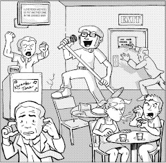
Electric Girl and yesterday's selection, Finder, are opposite sides of the same comics coin. Both black and white titles feature tormented adolescents with amazing abilities and the harsh worlds around them. The difference is, where Finder took itself way too seriously with lofty narrative and surreal imagery to convey a sci-fi fairytale, Electric Girl uses the frivolity of youth to tell fun, linear stories of peculiarity and teenaged angst. For all intents and purposes, Electric Girl is a superhero, with the powers of . . . well, electricity. She can generate it and control things powered by it. Yet, Electric Girl doesn't wear tights and fight madmen in the street and meet with other superheroes to defeat cosmic conquerors. In fact, even in her mundane domestic disputes, which in this issue include a convenience store robber and a rude baseball enthusiast, she's rather idle. The gremlin that only she can see causes most of the trouble and she just cleans it up, with the finesse of a Clark Kent caught with his pants around his ankles in the Daily Planet broom closet. Yes, the gremlin that only she can see. That's the peculiarity I was talking about.
As early as issue #2, author Michael Brennan apparently mastered the storytelling ability of offering fantastic situations while still establishing characters to whom we can relate. In one story, Electric Girl tries to ignore her parents fighting over the phone, something we all experienced in our turbulent childhoods, I'm sure. In another story, Electric Girl and her best friend help a couple of zombies exact revenge on the fast food joint that accidentally poisoned them to death. The initial sight of the rather cartoony zombie is admittedly macabre, but a few panels later, the character is just as lovable as the rest of the cast. I dare say that Brennan weaves the supernatural into reality so well, I wonder if these elements were intended to be as allegorical as they seem. The gremlin can be the embodiment of the wantonness adolescents repress to mature more quickly; the awkward zombie could represent how out-of-place many teens really feel nowadays. Thinking that deep may add validity to the book, but it loses all the fun, and I think that's the true intention.
And who says fun isn’t valid, anyway? Brennan presents all of the traits of a doom-and-gloom goth comic without the doom-and-gloom or the goth. Electric Girl can't shake this annoying, tricky gremlin over her shoulder and his trail of chaos, but she isn't devoid of happiness. In the first tale, when her mother surprises her with a new dog, EG smiles with the joy of a kid at Christmas. That's a commendable quality in comics today. Further, the entire package of the book, from its cute colorful covers, to the fun "table of contents" inside, generate a buzz that sets this series apart and creates an appeal for established fanboys and casual readers alike. Oh, yeah. This girl is electric, all right.
Thursday, August 03, 2006


Wednesday, August 02, 2006
Finder #27
Finder #27, July 2002, Light Speed Press
by Carla Speed McNeil
When I read the series synopsis of Finder on this issue's inside front cover, I was genuinely excited for the read.
Magri White has a whole world in his head. Magri has more virtual-reality visitors to his world in a day than a theme park gets in a year. Magri has a huge corporation that has grown up around him, and many thousands of employees dependent on his health and welfare. Magri also has a monster, which is hell-bent upon destroying his world and all the people in it. The monster is really Magri himself. Magri isn't telling anybody that.
What a compelling introduction. Unfortunately, the story's intrigue ends there. Granted, this issue is a well-constructed deconstruction of character, providing a tragic origin for Magri's surreal circumstances, but I'd hoped for a tale that drives the series' more linear concept. The first few pages offer a glimpse into this aspect of the epic, as the CEO of Magri's "Elsewhere Corporation" faces a potential investigation from the Royal Commission for Disease Control. Then, we’re in Magri's head, experiencing his memories and musings for the rest of the issue. Why even bother with this brief introduction in reality? In fact, its artwork is bit sloppy, as if the best efforts were reserved for the more climatic moments of the issue. This subplot is nearly as forgotten as it isabandoned by the end of the story.
The insight into Magri's internal struggles is interesting, but in my opinion, poorly paced and unnecessary clustered with too many lofty, fantastic concepts. The driving force behind Magri's trauma is apparently his unborn brother, whose condemnations from the womb are weird and overboard. Fortunately, the artist's skills with the pen really shine here, capturing the pensive frustration we’re supposed to feel with Magri. Its impact might have been more effective without some of the cluttering captions. Overall, the height of this tale may have been a visual treat, but its narrative was lacking something.
Ah, I've figured it out. (This is a real-time realization, folks!) That impressive series synopsis implies that Magri is a strong character, capable of deception that, while challenging, cannot be all consuming. I assumed that his self-made monster was a catalyst for conflict in an "elsewhere" otherwise perfect. Further, if thousands visit Magri's mind everyday, the risk of danger makes such an uncanny journey all the more alluring. Tell me you haven't been to Disneyland without remembering its reputation for poorly maintained attractions. If you don't know what I'm talking about, Google news articles about the Toon Town ride. If you do know what I'm talking about, it certainly didn't stop you from taking that vacation, eh? I figured Magri for a multi-faceted, proactive protagonist, not without his demons, but with a protective and engaging assertiveness. Instead, we're introduced to a weak, helpless man-child. Just as interesting, perhaps, but ultimately predictable.
I've read a few books like Finder. Pop Gun War, Don't Eat the Electric Sheep, and Street Angel come to mind. All black and white, all surreal, all allegorical in some way, really only completely understood by their authors. Books like these have created an urban subgenre in fantasy comics, an emo-meets-sci-fi niche that isn't too dark for the average reader to handle. If you're looking for a comic that'll take you on a mind trip, I recommend any of them. For me, the only mind trip I experienced in Finder was the downward spiral of unachieved expectations. As readers, we have our own inner demons, too.
by Carla Speed McNeil
When I read the series synopsis of Finder on this issue's inside front cover, I was genuinely excited for the read.
Magri White has a whole world in his head. Magri has more virtual-reality visitors to his world in a day than a theme park gets in a year. Magri has a huge corporation that has grown up around him, and many thousands of employees dependent on his health and welfare. Magri also has a monster, which is hell-bent upon destroying his world and all the people in it. The monster is really Magri himself. Magri isn't telling anybody that.
What a compelling introduction. Unfortunately, the story's intrigue ends there. Granted, this issue is a well-constructed deconstruction of character, providing a tragic origin for Magri's surreal circumstances, but I'd hoped for a tale that drives the series' more linear concept. The first few pages offer a glimpse into this aspect of the epic, as the CEO of Magri's "Elsewhere Corporation" faces a potential investigation from the Royal Commission for Disease Control. Then, we’re in Magri's head, experiencing his memories and musings for the rest of the issue. Why even bother with this brief introduction in reality? In fact, its artwork is bit sloppy, as if the best efforts were reserved for the more climatic moments of the issue. This subplot is nearly as forgotten as it isabandoned by the end of the story.
The insight into Magri's internal struggles is interesting, but in my opinion, poorly paced and unnecessary clustered with too many lofty, fantastic concepts. The driving force behind Magri's trauma is apparently his unborn brother, whose condemnations from the womb are weird and overboard. Fortunately, the artist's skills with the pen really shine here, capturing the pensive frustration we’re supposed to feel with Magri. Its impact might have been more effective without some of the cluttering captions. Overall, the height of this tale may have been a visual treat, but its narrative was lacking something.
Ah, I've figured it out. (This is a real-time realization, folks!) That impressive series synopsis implies that Magri is a strong character, capable of deception that, while challenging, cannot be all consuming. I assumed that his self-made monster was a catalyst for conflict in an "elsewhere" otherwise perfect. Further, if thousands visit Magri's mind everyday, the risk of danger makes such an uncanny journey all the more alluring. Tell me you haven't been to Disneyland without remembering its reputation for poorly maintained attractions. If you don't know what I'm talking about, Google news articles about the Toon Town ride. If you do know what I'm talking about, it certainly didn't stop you from taking that vacation, eh? I figured Magri for a multi-faceted, proactive protagonist, not without his demons, but with a protective and engaging assertiveness. Instead, we're introduced to a weak, helpless man-child. Just as interesting, perhaps, but ultimately predictable.
I've read a few books like Finder. Pop Gun War, Don't Eat the Electric Sheep, and Street Angel come to mind. All black and white, all surreal, all allegorical in some way, really only completely understood by their authors. Books like these have created an urban subgenre in fantasy comics, an emo-meets-sci-fi niche that isn't too dark for the average reader to handle. If you're looking for a comic that'll take you on a mind trip, I recommend any of them. For me, the only mind trip I experienced in Finder was the downward spiral of unachieved expectations. As readers, we have our own inner demons, too.
Tuesday, August 01, 2006
Adventure Comics #389
Adventure Comics #389, February 1970, National Periodical Publications (DC Comics)
Celebrating one month of A Comic A Day. With one-twelfth of this project complete, I can actually see the light at the end of the tunnel. I can do this. Granted, many of these posts have come in under the wire, just shy of 11:30 p.m. PST, but what can I say? As much as I'd like to read and write all day, a guy's gotta work. (And fortunately, I love my job, but that's a story for another blog.) So, although I've accomplished the goal of reading and reviewing a new-to-me comic book daily this past month, I haven't fully grasped the potential of this exercise yet. I originally intended to live with the comic for the day, to read it in the morning or early afternoon, let my impression of it stew in the context of my other daily, geeky thoughts, then post a synopsis sometime in the evening. As it is, I've been reading and writing immediately afterward, just to get the damn thing done. I hope things change when summertime is over. After all, in July, I experienced two of my biggest annual obligations: the Comic Con, and my girlfriend's birthday. If I can accomplish this daily digression in the midst of those events, I can do it anytime.
Since I began last month's entries with a Superman tale, I figured I'd begin this month with a Supergirl yarn from Adventure Comics. These stories are obviously intended for a female audience, yet they retain a trace of standard superhero bravado to maintain a secure male readership, as well. For example, the first tale begins with Supergirl deflecting a misfired rocket, then repairing a boy's broken bicycle. (Actually, she builds four bikes from the scraps of one -- a woman after my own pedestrian heart!) Alas, let the feeling begin, when the tale takes its thematic twist: when Supergirl's professor announces an upcoming Fathers' Day festival, one of her classmates sulks because her dad, a magician, hasn't performed since her mother died ten years ago. Convicted to help her depressed friend, Supergirl uses her super-ventriloquism on a picture of the deceased to inspire the magician out of retirement. In her civilian identity, Supergirl aids "Malcolm the Mysterious" throughout his ailing performance, and when a snobby classmate nearly discovers her secret, her tiny father emerges from the bottle city of Kandor to assist with more subtlety. As corny as this story sounds, the writer (whoever they are; the creators are anonymous) actually takes the subject matter fairly seriously, and ultimately, the tale is quite touching. I detect a "Super Gilmore Girls" quality to the college campus quibbles of these young ladies. I can see the appeal . . . if I was a girl, of course!
In the second tale, Brainiac (yes, the green-skinned humanoid Brainiac of yesteryear) traps the wiles of a womanizing space criminal in a robot duplicate so he can entice Supergirl's emotions, and in the end, shatter them. It's actually an intriguing plot; when the robot reveals that even Earth's Supergirl can't win him over, he destroys himself before her, presumably spiraling Supergirl's fragile heroism into retirement. Alas, even Brainiac's plans couldn't account for human error, and the space criminal swipes places with his clone, inadvertently foiling the plan. This story is classic Bronze Age weirdness, complete with liquid adhesive Kryptonite and a faux "rock garden" of Supergirl's jilted boyfriends. With Brainiac pulling these silly strings (no pun intended), the tale clung to just enough validity in continuity to make it enjoyable; if another, unknown villain was working behind the scenes, the yarn would have offered no context for Supergirl's character whatsoever. I mean, despite Brainiac's deviousness, the Maid of Steel still fell for the robot's charm (or lack thereof, really) rather effortlessly. Makes me wonder what a green-K roofie could do.
This issue of Adventure Comics represents everything the A Comic A Day challenge hopes to accomplish. Normally, I'd pass up an issue like this as pre-Crisis fluff for girls. Yet, reading and analyzing it in the broad (no pun intended there, either) tapestry of comics, I appreciate it for what it was when it was first released, and for what it is now. Books like Epic Illustrated, Mighty Samson, Forbidden Worlds -- issues I've enjoyed -- I may have never experienced without this motivation. This exercise is really putting the adventure back in comics.
Celebrating one month of A Comic A Day. With one-twelfth of this project complete, I can actually see the light at the end of the tunnel. I can do this. Granted, many of these posts have come in under the wire, just shy of 11:30 p.m. PST, but what can I say? As much as I'd like to read and write all day, a guy's gotta work. (And fortunately, I love my job, but that's a story for another blog.) So, although I've accomplished the goal of reading and reviewing a new-to-me comic book daily this past month, I haven't fully grasped the potential of this exercise yet. I originally intended to live with the comic for the day, to read it in the morning or early afternoon, let my impression of it stew in the context of my other daily, geeky thoughts, then post a synopsis sometime in the evening. As it is, I've been reading and writing immediately afterward, just to get the damn thing done. I hope things change when summertime is over. After all, in July, I experienced two of my biggest annual obligations: the Comic Con, and my girlfriend's birthday. If I can accomplish this daily digression in the midst of those events, I can do it anytime.
Since I began last month's entries with a Superman tale, I figured I'd begin this month with a Supergirl yarn from Adventure Comics. These stories are obviously intended for a female audience, yet they retain a trace of standard superhero bravado to maintain a secure male readership, as well. For example, the first tale begins with Supergirl deflecting a misfired rocket, then repairing a boy's broken bicycle. (Actually, she builds four bikes from the scraps of one -- a woman after my own pedestrian heart!) Alas, let the feeling begin, when the tale takes its thematic twist: when Supergirl's professor announces an upcoming Fathers' Day festival, one of her classmates sulks because her dad, a magician, hasn't performed since her mother died ten years ago. Convicted to help her depressed friend, Supergirl uses her super-ventriloquism on a picture of the deceased to inspire the magician out of retirement. In her civilian identity, Supergirl aids "Malcolm the Mysterious" throughout his ailing performance, and when a snobby classmate nearly discovers her secret, her tiny father emerges from the bottle city of Kandor to assist with more subtlety. As corny as this story sounds, the writer (whoever they are; the creators are anonymous) actually takes the subject matter fairly seriously, and ultimately, the tale is quite touching. I detect a "Super Gilmore Girls" quality to the college campus quibbles of these young ladies. I can see the appeal . . . if I was a girl, of course!
In the second tale, Brainiac (yes, the green-skinned humanoid Brainiac of yesteryear) traps the wiles of a womanizing space criminal in a robot duplicate so he can entice Supergirl's emotions, and in the end, shatter them. It's actually an intriguing plot; when the robot reveals that even Earth's Supergirl can't win him over, he destroys himself before her, presumably spiraling Supergirl's fragile heroism into retirement. Alas, even Brainiac's plans couldn't account for human error, and the space criminal swipes places with his clone, inadvertently foiling the plan. This story is classic Bronze Age weirdness, complete with liquid adhesive Kryptonite and a faux "rock garden" of Supergirl's jilted boyfriends. With Brainiac pulling these silly strings (no pun intended), the tale clung to just enough validity in continuity to make it enjoyable; if another, unknown villain was working behind the scenes, the yarn would have offered no context for Supergirl's character whatsoever. I mean, despite Brainiac's deviousness, the Maid of Steel still fell for the robot's charm (or lack thereof, really) rather effortlessly. Makes me wonder what a green-K roofie could do.
This issue of Adventure Comics represents everything the A Comic A Day challenge hopes to accomplish. Normally, I'd pass up an issue like this as pre-Crisis fluff for girls. Yet, reading and analyzing it in the broad (no pun intended there, either) tapestry of comics, I appreciate it for what it was when it was first released, and for what it is now. Books like Epic Illustrated, Mighty Samson, Forbidden Worlds -- issues I've enjoyed -- I may have never experienced without this motivation. This exercise is really putting the adventure back in comics.
Monday, July 31, 2006
Forbidden Worlds #135
Forbidden Worlds #135, May-June 1966, American Comics Group
writers: Zev Zimmer, Pierre Alonzo
artists: Pete Costanza, Chic Stone
The cover of this issue promises "Stories of Strange Adventure," and I'll admit, each of the three tales within contain a peculiar element that would make even Agents Mulder and Scully cock a melodramatic eyebrow. Forbidden Worlds was another serial series, or as I'm calling them now, another training ground for up and coming artists of the era. Who knows if Zev Zimmer or Chic Stone are pseudonyms, but when the creators' names are cooler than their heroes' – i.e. Magicman – I think strange is the appropriate word for it.
Indeed, the first tale features headliner Magicman, and, although his adventures seem rather pedestrian from the start – he saves his dimwitted friend from plummeting off of a rollercoaster – things take a turn for the peculiar when they return to their hotel room. Magicman dreams of his medieval father's demise and conjures a spell to travel back in time to rescue him. Yes, an image of a doomed patriarch vaguely resembles a Shakespearean influence, as does the swashbuckling sword fight with the wizard's dissenter, but in this case, Rosencrantz saves the day. Magicman's tubby sidekick, the same oaf he saved from the treacherous rollercoaster, literally catapults to the hero's rescue, and in an odd digression from the story's tone, nearly marries a princess until she inexplicably falls for this adventure's villain on his way to jail. It's as weird as it sounds. By the end of the yarn, the magical time travel seems almost commonplace compared to these fickle, unconventional characters. Their quirks made the short as entertaining as it was strange. Magicman's proclamation of note: "I'm Magicman – I've got muscles and I've got strong magic! What can beat that combination?" What, indeed?
The other two stories are less character, more concept pieces, the first of which is entitled "The Vengeance of the Vine!" Explorer Roger Dennis plunders a golden idol from a "missionary post, deep in the backcountry of the Amazon," and the scientist among them sends Dennis a chunk of the living vine that protected it. Despite Dennis's best attempts, the vine reproduces on its own, consumes his home, and nearly takes his life. In the end, he turns himself in to the FBI. Who wouldn't? This tale is the epitome of the "man versus nature" conflict paradigm we all learned about in elementary school reading class. Interestingly, although this is the only story of the three without creators' credits, I thought these pages were well illustrated, its characters extremely expressive. For a tale that could've been a bunch of talking heads, the artist branched out and established some roots for himself in the industry. I'm sorry; I couldn't resist.
The final tale is a macabre and predictable tale about "Ghostly Revenge!" Steve McWhyte, "the most dangerous criminal of the age," is executed, but his sheer hatred is enough to keep is spirit alive long enough to kill the people responsible for his fate. Fortunately, a visit to the Institute for Psychic Phenomena offers the Travana Smoke, an odd vapor produced from burning a mysterious ash that repels ghosts. This story is very wordy for four little pages, and although the story was a simple one, it could have been stretched out for dramatic effect. I mean, we scarcely see any real death, except for a newspaper headline that proclaims, "Man Who Arrested Steve McWhyte Mysteriously Dead in Room Locked From Inside." Wouldn't life be so much easier if all headlines were that specific?
Speaking of headlines, to conclude, this comic lives up to its byline more than its title. Strange, yes, but forbidden? We the readers were granted complete access to these worlds, via their creators' odd storytelling styles. I hope these guys were proud of what they produced. Individually, these stories may not be gems, but they were packaged together for a reason in the first place. As one solid read, they're magic.
writers: Zev Zimmer, Pierre Alonzo
artists: Pete Costanza, Chic Stone
The cover of this issue promises "Stories of Strange Adventure," and I'll admit, each of the three tales within contain a peculiar element that would make even Agents Mulder and Scully cock a melodramatic eyebrow. Forbidden Worlds was another serial series, or as I'm calling them now, another training ground for up and coming artists of the era. Who knows if Zev Zimmer or Chic Stone are pseudonyms, but when the creators' names are cooler than their heroes' – i.e. Magicman – I think strange is the appropriate word for it.
Indeed, the first tale features headliner Magicman, and, although his adventures seem rather pedestrian from the start – he saves his dimwitted friend from plummeting off of a rollercoaster – things take a turn for the peculiar when they return to their hotel room. Magicman dreams of his medieval father's demise and conjures a spell to travel back in time to rescue him. Yes, an image of a doomed patriarch vaguely resembles a Shakespearean influence, as does the swashbuckling sword fight with the wizard's dissenter, but in this case, Rosencrantz saves the day. Magicman's tubby sidekick, the same oaf he saved from the treacherous rollercoaster, literally catapults to the hero's rescue, and in an odd digression from the story's tone, nearly marries a princess until she inexplicably falls for this adventure's villain on his way to jail. It's as weird as it sounds. By the end of the yarn, the magical time travel seems almost commonplace compared to these fickle, unconventional characters. Their quirks made the short as entertaining as it was strange. Magicman's proclamation of note: "I'm Magicman – I've got muscles and I've got strong magic! What can beat that combination?" What, indeed?
The other two stories are less character, more concept pieces, the first of which is entitled "The Vengeance of the Vine!" Explorer Roger Dennis plunders a golden idol from a "missionary post, deep in the backcountry of the Amazon," and the scientist among them sends Dennis a chunk of the living vine that protected it. Despite Dennis's best attempts, the vine reproduces on its own, consumes his home, and nearly takes his life. In the end, he turns himself in to the FBI. Who wouldn't? This tale is the epitome of the "man versus nature" conflict paradigm we all learned about in elementary school reading class. Interestingly, although this is the only story of the three without creators' credits, I thought these pages were well illustrated, its characters extremely expressive. For a tale that could've been a bunch of talking heads, the artist branched out and established some roots for himself in the industry. I'm sorry; I couldn't resist.
The final tale is a macabre and predictable tale about "Ghostly Revenge!" Steve McWhyte, "the most dangerous criminal of the age," is executed, but his sheer hatred is enough to keep is spirit alive long enough to kill the people responsible for his fate. Fortunately, a visit to the Institute for Psychic Phenomena offers the Travana Smoke, an odd vapor produced from burning a mysterious ash that repels ghosts. This story is very wordy for four little pages, and although the story was a simple one, it could have been stretched out for dramatic effect. I mean, we scarcely see any real death, except for a newspaper headline that proclaims, "Man Who Arrested Steve McWhyte Mysteriously Dead in Room Locked From Inside." Wouldn't life be so much easier if all headlines were that specific?
Speaking of headlines, to conclude, this comic lives up to its byline more than its title. Strange, yes, but forbidden? We the readers were granted complete access to these worlds, via their creators' odd storytelling styles. I hope these guys were proud of what they produced. Individually, these stories may not be gems, but they were packaged together for a reason in the first place. As one solid read, they're magic.
Sunday, July 30, 2006
Rai Trade Paperback
Rai Trade Paperback, reprinting material that originally appeared in Rai #0-4, March-June & November 1993, Valiant
writers: Bob Layton, David Michelinie
pencillers: David Lapham, Joe St. Pierre, Sal Velluto
inkers: Charles Barnett III, Kathryn Bolinger, Tom Ryder
colorists: Dave Chlystek, Jade, Knob Row
letterers: Jade, Brad Joyce, George Roberts, Jr.
editors: Don Perlin, Barry Windsor-Smith
trade paperback design: Simon Erich
Whew. That's a lot of credits.
My girlfriend's uncle was kind to give me a few old TPBs yesterday, and this compilation of Rai was the jewel among them, as I have never read the series before. Today, I had an hour or so to kill while waiting for America's only Monkees tribute band to take the stage at a free concert in the park, so I devoured nearly five issues of material in one sitting. I must confess, I thoroughly enjoyed the experience. (Oh, and the concert was great, too.)
I'm familiar with David Michelinie's writing from his nearly 100 issue run on Amazing Spider-man. When comics were booming in the '90s, Michelinie was driving the Webhead bandwagon; his run included the advent of Venom, the return of the Sinister Six, and the rise of superstar artists like Todd McFarlane, Erik Larsen, and Mark Bagley. Fortunately, he bailed before the Clone Saga tainted Spidey's good name, but for as much as he accomplished in an era when the spotlight was on comics' "next big thing," I doubt many remember him by name. All eyes were on artists and crossovers. (Remember "Maximum Carnage," anyone? Anyone?) Well, I remember him, and although Rai was written just prior to the height of all that Spider-mania, I was happy to hear from him again.
According to his tell-all intro, when Michelinie received the assignment to write the Rai series, the character had a little bit of baggage. Rai had appeared in a series of popular back-up stories that, as soon as they established the status quo of the concept, shattered Rai's world completely. So, here's the recap: the year is 4001. Japan is governed by a super-computer named Grandmother, which is in turn protected by the Rai, a warrior legacy. (Yes, the similarity to Darkseid's Mother Box is all too obvious.) The current Rai repels an alien invasion by raising Japan from Earth, but the floating city sustains too much damage to return! What's worse, at the end of the conflict, Grandmother literally elopes with another super-computer and disappears! Don't you hate it when that happens?
So, Rai's opening monologue of this TPB sums up the story's dilemmas quite nicely: "Japan floats in space. I float in Japan. Which one of us is more alone?" Although the subsequent captions are just as melodramatic, the tone establishes an mythological integrity to this series. Yes, Rai takes place in the future and boasts the trappings of a standard sci-fi epic, but its characters are rich with legacy, introspection, and political strife. The driving force of these first four issues is Rai's struggle over which faction to defend; he is sworn to protect all of Japan's people, but the "healers" work to restore the old order of things (albeit through terrorism), and the humanists have established a new progressive government. Rai's wife works for this government, so he eventually chooses the humanists, if only to regain the rights to visit his seemingly neglected baby in the Happy Cloud Executive Child Care Facility. This connection with his child is his only link to the way things were, a tragic trace of nobility in an otherwise chaotic civil war.
Again, for a story with the potential to amount to sci-fi fluff, Rai offers moments of intriguing political commentary and allegory. Consider the government's sanction of alternative drug abuse, because the general public seems less apt to fight the system when they're complacently high. When Rai goes renegade and stops the drug trade, even the people turn against him: "[The drug was a] momentary escape from our our fears, from a world changing too fast! It was all some of had!" Later, Rai's father, a former Rai himself, sides with the humanists to distract his son from the real action, the height of their plan (which was, incidentally, to coax Grandmother to return). The idea of father/son legacy, the should-I-do-as-Daddy-did dilemma, is one the modern American political theater knows all too well. In the end, we see Michelinie gain some practice for his stint on Spider-man with Rai's woe-is-me mentality: his Pyrrhic victory inspires him to retreat into exile. Aww.
Unfortunately, this is how the epic ends. I would actually love to find the next installment, to see how Rai redeems himself with his father, his wife, and his country. Wait a minute . . . Japan is floating above the Earth. Where the hell is he going?
My only other experience with Valiant is the Eternal Warrior, and I must confess, both series' artists seem remarkably bland. The background work is commendable for its detail, but it all seems to textbook, so void of personal flavor. Also, the coloring scheme in all of Valiant's books seems flat. I'm not sure what the common coloring techniques were back in the early '90s, but I remember what Image was producing, and Valiant's impressive cast of characters could have benefited from some visual overhaul. In the #0 story included in this TPB, we see Magnus Robot Fighter, Solar, and Turok, all respected properties, but ultimately lost in the shuffle of indie companies in that era. The market was flooded. As I said before, readers weren't looking for stories then. They wanted action-packed art and cool looking characters.
After reading Rai, remembering that collector-centric time, two words come to mind: their loss.
writers: Bob Layton, David Michelinie
pencillers: David Lapham, Joe St. Pierre, Sal Velluto
inkers: Charles Barnett III, Kathryn Bolinger, Tom Ryder
colorists: Dave Chlystek, Jade, Knob Row
letterers: Jade, Brad Joyce, George Roberts, Jr.
editors: Don Perlin, Barry Windsor-Smith
trade paperback design: Simon Erich
Whew. That's a lot of credits.
My girlfriend's uncle was kind to give me a few old TPBs yesterday, and this compilation of Rai was the jewel among them, as I have never read the series before. Today, I had an hour or so to kill while waiting for America's only Monkees tribute band to take the stage at a free concert in the park, so I devoured nearly five issues of material in one sitting. I must confess, I thoroughly enjoyed the experience. (Oh, and the concert was great, too.)
I'm familiar with David Michelinie's writing from his nearly 100 issue run on Amazing Spider-man. When comics were booming in the '90s, Michelinie was driving the Webhead bandwagon; his run included the advent of Venom, the return of the Sinister Six, and the rise of superstar artists like Todd McFarlane, Erik Larsen, and Mark Bagley. Fortunately, he bailed before the Clone Saga tainted Spidey's good name, but for as much as he accomplished in an era when the spotlight was on comics' "next big thing," I doubt many remember him by name. All eyes were on artists and crossovers. (Remember "Maximum Carnage," anyone? Anyone?) Well, I remember him, and although Rai was written just prior to the height of all that Spider-mania, I was happy to hear from him again.
According to his tell-all intro, when Michelinie received the assignment to write the Rai series, the character had a little bit of baggage. Rai had appeared in a series of popular back-up stories that, as soon as they established the status quo of the concept, shattered Rai's world completely. So, here's the recap: the year is 4001. Japan is governed by a super-computer named Grandmother, which is in turn protected by the Rai, a warrior legacy. (Yes, the similarity to Darkseid's Mother Box is all too obvious.) The current Rai repels an alien invasion by raising Japan from Earth, but the floating city sustains too much damage to return! What's worse, at the end of the conflict, Grandmother literally elopes with another super-computer and disappears! Don't you hate it when that happens?
So, Rai's opening monologue of this TPB sums up the story's dilemmas quite nicely: "Japan floats in space. I float in Japan. Which one of us is more alone?" Although the subsequent captions are just as melodramatic, the tone establishes an mythological integrity to this series. Yes, Rai takes place in the future and boasts the trappings of a standard sci-fi epic, but its characters are rich with legacy, introspection, and political strife. The driving force of these first four issues is Rai's struggle over which faction to defend; he is sworn to protect all of Japan's people, but the "healers" work to restore the old order of things (albeit through terrorism), and the humanists have established a new progressive government. Rai's wife works for this government, so he eventually chooses the humanists, if only to regain the rights to visit his seemingly neglected baby in the Happy Cloud Executive Child Care Facility. This connection with his child is his only link to the way things were, a tragic trace of nobility in an otherwise chaotic civil war.
Again, for a story with the potential to amount to sci-fi fluff, Rai offers moments of intriguing political commentary and allegory. Consider the government's sanction of alternative drug abuse, because the general public seems less apt to fight the system when they're complacently high. When Rai goes renegade and stops the drug trade, even the people turn against him: "[The drug was a] momentary escape from our our fears, from a world changing too fast! It was all some of had!" Later, Rai's father, a former Rai himself, sides with the humanists to distract his son from the real action, the height of their plan (which was, incidentally, to coax Grandmother to return). The idea of father/son legacy, the should-I-do-as-Daddy-did dilemma, is one the modern American political theater knows all too well. In the end, we see Michelinie gain some practice for his stint on Spider-man with Rai's woe-is-me mentality: his Pyrrhic victory inspires him to retreat into exile. Aww.
Unfortunately, this is how the epic ends. I would actually love to find the next installment, to see how Rai redeems himself with his father, his wife, and his country. Wait a minute . . . Japan is floating above the Earth. Where the hell is he going?
My only other experience with Valiant is the Eternal Warrior, and I must confess, both series' artists seem remarkably bland. The background work is commendable for its detail, but it all seems to textbook, so void of personal flavor. Also, the coloring scheme in all of Valiant's books seems flat. I'm not sure what the common coloring techniques were back in the early '90s, but I remember what Image was producing, and Valiant's impressive cast of characters could have benefited from some visual overhaul. In the #0 story included in this TPB, we see Magnus Robot Fighter, Solar, and Turok, all respected properties, but ultimately lost in the shuffle of indie companies in that era. The market was flooded. As I said before, readers weren't looking for stories then. They wanted action-packed art and cool looking characters.
After reading Rai, remembering that collector-centric time, two words come to mind: their loss.
Saturday, July 29, 2006
Lego Batman: Secret Files and Origins
Lego Batman: Secret Files and Origins - Prepared for Lego of America by DC Comics
writer: Stephan Nilson
penciller: Marcus Muller
inker: Joe Rubinstein
colorists: Rench & Mayer
letterer: Phil Balsman
editor: Jaye Gardner
Yes, Lego Batman. A comic book's a comic book, okay?
Distributed at the Lego booth at Comic Con, I assumed this one-shot would offer a shallow story designed to shamelessly promote the Lego Batman franchise. I was half right. While the characters are literally drawn like their Lego counterparts, and the story is a simple Arkham-escape affair, the issue maintains enough self-depreciating humor to remain an entertaining read. Consider this introductory exchange:
LEGO TWO-FACE: We're going to take this town apart, brick by brick.
LEGO JOKER: I don't know what's more fun; breaking this place apart or watching them put it back together.
The writer is virtually telling the smirking reader, "Yes, I know I'm writing a Lego comic book, but it's still Batman, you know? Now let me break into the industry in piece. I mean, peace. Damn." I don't envy the artists of this issue, and I must commend their ability to draw these products with enough agility and expression to still tell a story. Kids can certainly use this comic as inspiration for recreating their own Lego Batman adventures, which I'm sure is the point anyway, yes? I doubt Lego sought to publish a comic book that would actually get reviewed somewhere . . . that's what the A Comic A Day challenge is for.
Throughout the issue, Lego advertises their various Batman related products through "Secret Files and Origins" pages that are formatted just like the real thing. Again, I don't know if the self-inflicted sarcasm is intended, but a line like isn't written (or read) without a smirk or chuckle: "Orphaned as a young mini-figure due to the actions of a criminal, Bruce Wayne dedicated his life to fighting evil. Now he has rebuilt himself as the Batman." Nice. Actually, although these descriptions are sprinkled with references to the Lego-verse -- and Crisis on Infinite Playsets can't be far behind -- they're actually surprisingly accurate to the true characters' core. For instance, Robin's origin reveals, "Young Tim Drake did what few others had . . . he figured out that Bruce Wayne was secretly Batman!" Without dragging in the baggage from the "A Lonely Place of Dying" saga, this description concisely, and rather energetically I might add, sums up Tim Drake's dedication and ingenuity. Like good Lego directions, it's precise.
Generally speaking, I think this issue frightened me, because I liked it. With the whole Jason Todd/Red Hood arc, and now the Crisis/One Year Later thing going on, I've been distant from the Bat-titles, just waiting for the whole thing to blow over. In this issue, villains break out of Arkham, Bats and co. touch base with Commissioner Gordon, and the Dark Knight ultimately brings the bad guys to justice. That's a decent Batman story, no matter how it's built. Sometimes fluff can be filling.
Note: Although I was tempted to digress into an argument on comics and licensing, I want to keep the A Comic A Day posts focused on reviewing comics. You can check out that rant at my LiveJournal. That's a shameless ad, for ya.
writer: Stephan Nilson
penciller: Marcus Muller
inker: Joe Rubinstein
colorists: Rench & Mayer
letterer: Phil Balsman
editor: Jaye Gardner
Yes, Lego Batman. A comic book's a comic book, okay?
Distributed at the Lego booth at Comic Con, I assumed this one-shot would offer a shallow story designed to shamelessly promote the Lego Batman franchise. I was half right. While the characters are literally drawn like their Lego counterparts, and the story is a simple Arkham-escape affair, the issue maintains enough self-depreciating humor to remain an entertaining read. Consider this introductory exchange:
LEGO TWO-FACE: We're going to take this town apart, brick by brick.
LEGO JOKER: I don't know what's more fun; breaking this place apart or watching them put it back together.
The writer is virtually telling the smirking reader, "Yes, I know I'm writing a Lego comic book, but it's still Batman, you know? Now let me break into the industry in piece. I mean, peace. Damn." I don't envy the artists of this issue, and I must commend their ability to draw these products with enough agility and expression to still tell a story. Kids can certainly use this comic as inspiration for recreating their own Lego Batman adventures, which I'm sure is the point anyway, yes? I doubt Lego sought to publish a comic book that would actually get reviewed somewhere . . . that's what the A Comic A Day challenge is for.
Throughout the issue, Lego advertises their various Batman related products through "Secret Files and Origins" pages that are formatted just like the real thing. Again, I don't know if the self-inflicted sarcasm is intended, but a line like isn't written (or read) without a smirk or chuckle: "Orphaned as a young mini-figure due to the actions of a criminal, Bruce Wayne dedicated his life to fighting evil. Now he has rebuilt himself as the Batman." Nice. Actually, although these descriptions are sprinkled with references to the Lego-verse -- and Crisis on Infinite Playsets can't be far behind -- they're actually surprisingly accurate to the true characters' core. For instance, Robin's origin reveals, "Young Tim Drake did what few others had . . . he figured out that Bruce Wayne was secretly Batman!" Without dragging in the baggage from the "A Lonely Place of Dying" saga, this description concisely, and rather energetically I might add, sums up Tim Drake's dedication and ingenuity. Like good Lego directions, it's precise.
Generally speaking, I think this issue frightened me, because I liked it. With the whole Jason Todd/Red Hood arc, and now the Crisis/One Year Later thing going on, I've been distant from the Bat-titles, just waiting for the whole thing to blow over. In this issue, villains break out of Arkham, Bats and co. touch base with Commissioner Gordon, and the Dark Knight ultimately brings the bad guys to justice. That's a decent Batman story, no matter how it's built. Sometimes fluff can be filling.
Note: Although I was tempted to digress into an argument on comics and licensing, I want to keep the A Comic A Day posts focused on reviewing comics. You can check out that rant at my LiveJournal. That's a shameless ad, for ya.
Friday, July 28, 2006
Superman’s Pal Jimmy Olsen #141
Superman’s Pal Jimmy Olsen #141, September 1971, National Periodical Publications (DC Comics)
writer/artist: Jack Kirby
inker: Vince Colletta
Jack Kirby. Jimmy Olsen. Don Rickles. The holy trinity of comicdom.
When I saw the cover of Jimmy Olsen #141 at the Comic Con last week, I had to have it. Superman and the Guardian cradling a photograph of famous insult comedian Don Rickles? So long, Action Comics #1. Nice knowing you, Amazing Fantasy #15. I’m telling you, I’ve never been more excited by a comic book’s cover before.
Unfortunately, while reading today’s anticipated issue, its cover literally came off in my hand. Thankfully, I only dropped a dollar for the find, and besides, I’m less interested in the quality of a comic than I am its content. Sadly, I’m not sure if this story is any more durable than its binding. The most fascinating aspect of this yarn is its Superman-centric subplot; when we first see Clark in this issue, he’s trapped in a “bizarre space craft” and lost light-years from Earth! Ten rife-with-Rickles pages later (more on that in a moment), a “native to this star system” mysteriously appears to the rescue and introduces himself as Lightray! Anyone familiar with the tapestry Kirby created around the perilous mythology of Apokolips and New Genesis would understand the significance of this scene. I mean, Superman catches his first glimpse of Darkseid’s fire-pit planet in an issue of Jimmy Olsen – worse, an issue of Jimmy Olsen with Don Rickles on the cover! Who’d ‘a thunk an issue thirty-five years old would offer a fresh plot twist like that?
So, yes, Don Rickles. Prior to the comedian’s first appearance, Kirby introduces his “zany look-alike” Goody Rickels, who, like Jimmy, is suffering from a chemical that will consume them in a fireball from the inside out in less than twenty-four hours! (Of course, the Guardian recovers the cure from Intergang boss Mannheim just in time.) This issue offers little explanation of the Don-ppleganger’s origin, if at all unique other than his uncanny resemblance to Rickles, and when the two collide, the meeting’s peculiarity is cut short by the technicalities of the story. If Goody was a mere plot ploy to create this celebrity cameo, the attempt was shallow and would’ve been better served in an even more random context. I’ll take random over awkward any day.
Now, Don Rickles is one of the founding fathers of contemporary stand-up comedy and by far the best insult comedian of all time. This is not my opinion; it’s an established fact. Those early, classic Friars’ Roast specials wouldn’t have been half as memorable without the Rickles. That established, Rickles’ genuine wit is watered down and not well represented through his comic book incarnation. He’s less comedian, more foil, as he recoils from this issue’s events more than he cuts them down to size, which is what a good Rickles appearance should do. I expected Kirby to indulge us in some true self-depreciating humor, perhaps even at Superman’s suspense. In the end, like a bad Scooby-do cartoon, Rickles is begging the cops to drag him away, too. Hey, Don, can I join you?
Comic book connoisseurs would enjoy this issue’s back-ups, introduced by a self-caricature of Kirby and an interesting essay about the Golden Age history of the Newsboy Legion, whose first appearance from an April 1942 issue of Star Spangled Comics follows. The Guardian appears here for the first time, when rookie cop Jim Harper creates the disguise to fight the various thugs threatening his neighborhood. His inaugural war cry, “I probably look like a comic magazine superhero, out to grab crime by the horns,” would’ve annoyed me if it weren’t possibly one of the first statements of self-parody in the history of the superhero genre. Honestly, these features were the most entertaining of this issue. Makes me wonder if the “Jimmy Olsen comic” concept would’ve been better served simply as a series starring young, unlikely heroes, sidekicks, slack-jawed spectators, and rapscallions. I’d call it The Whippersnapper Brigade or something. Damn, I shouldn’t have typed that! If you steal it . . .!
All in all, I’ve always questioned the validity of celebrity cameos in comics. I’ll never forget the issue of Amazing Spider-man featuring ol’ Web-head lifting Jay Leno on a motorcycle over his head for charity. Did Leno benefit from the three panels’ worth of exposure? Did Spidey’s sales soar as a result? Probably not. These obscure links to reality shatter the escapism comics promise to offer. Tony Stark is just as famous as Leno in the Marvel Universe; Spider-man could’ve bench-pressed Wonder Man, for crying out loud. If the real world celebrity has something to contribute to the story – for example, if Don Rickles offered Peter Parker some stand-up training to hone those wisecracking skills – I could see the purpose. To sell comics? Honestly, if a goof like Jimmy Olsen made it to issue #141 without help, he must’ve been doing something right already.
writer/artist: Jack Kirby
inker: Vince Colletta
Jack Kirby. Jimmy Olsen. Don Rickles. The holy trinity of comicdom.
When I saw the cover of Jimmy Olsen #141 at the Comic Con last week, I had to have it. Superman and the Guardian cradling a photograph of famous insult comedian Don Rickles? So long, Action Comics #1. Nice knowing you, Amazing Fantasy #15. I’m telling you, I’ve never been more excited by a comic book’s cover before.
Unfortunately, while reading today’s anticipated issue, its cover literally came off in my hand. Thankfully, I only dropped a dollar for the find, and besides, I’m less interested in the quality of a comic than I am its content. Sadly, I’m not sure if this story is any more durable than its binding. The most fascinating aspect of this yarn is its Superman-centric subplot; when we first see Clark in this issue, he’s trapped in a “bizarre space craft” and lost light-years from Earth! Ten rife-with-Rickles pages later (more on that in a moment), a “native to this star system” mysteriously appears to the rescue and introduces himself as Lightray! Anyone familiar with the tapestry Kirby created around the perilous mythology of Apokolips and New Genesis would understand the significance of this scene. I mean, Superman catches his first glimpse of Darkseid’s fire-pit planet in an issue of Jimmy Olsen – worse, an issue of Jimmy Olsen with Don Rickles on the cover! Who’d ‘a thunk an issue thirty-five years old would offer a fresh plot twist like that?
So, yes, Don Rickles. Prior to the comedian’s first appearance, Kirby introduces his “zany look-alike” Goody Rickels, who, like Jimmy, is suffering from a chemical that will consume them in a fireball from the inside out in less than twenty-four hours! (Of course, the Guardian recovers the cure from Intergang boss Mannheim just in time.) This issue offers little explanation of the Don-ppleganger’s origin, if at all unique other than his uncanny resemblance to Rickles, and when the two collide, the meeting’s peculiarity is cut short by the technicalities of the story. If Goody was a mere plot ploy to create this celebrity cameo, the attempt was shallow and would’ve been better served in an even more random context. I’ll take random over awkward any day.
Now, Don Rickles is one of the founding fathers of contemporary stand-up comedy and by far the best insult comedian of all time. This is not my opinion; it’s an established fact. Those early, classic Friars’ Roast specials wouldn’t have been half as memorable without the Rickles. That established, Rickles’ genuine wit is watered down and not well represented through his comic book incarnation. He’s less comedian, more foil, as he recoils from this issue’s events more than he cuts them down to size, which is what a good Rickles appearance should do. I expected Kirby to indulge us in some true self-depreciating humor, perhaps even at Superman’s suspense. In the end, like a bad Scooby-do cartoon, Rickles is begging the cops to drag him away, too. Hey, Don, can I join you?
Comic book connoisseurs would enjoy this issue’s back-ups, introduced by a self-caricature of Kirby and an interesting essay about the Golden Age history of the Newsboy Legion, whose first appearance from an April 1942 issue of Star Spangled Comics follows. The Guardian appears here for the first time, when rookie cop Jim Harper creates the disguise to fight the various thugs threatening his neighborhood. His inaugural war cry, “I probably look like a comic magazine superhero, out to grab crime by the horns,” would’ve annoyed me if it weren’t possibly one of the first statements of self-parody in the history of the superhero genre. Honestly, these features were the most entertaining of this issue. Makes me wonder if the “Jimmy Olsen comic” concept would’ve been better served simply as a series starring young, unlikely heroes, sidekicks, slack-jawed spectators, and rapscallions. I’d call it The Whippersnapper Brigade or something. Damn, I shouldn’t have typed that! If you steal it . . .!
All in all, I’ve always questioned the validity of celebrity cameos in comics. I’ll never forget the issue of Amazing Spider-man featuring ol’ Web-head lifting Jay Leno on a motorcycle over his head for charity. Did Leno benefit from the three panels’ worth of exposure? Did Spidey’s sales soar as a result? Probably not. These obscure links to reality shatter the escapism comics promise to offer. Tony Stark is just as famous as Leno in the Marvel Universe; Spider-man could’ve bench-pressed Wonder Man, for crying out loud. If the real world celebrity has something to contribute to the story – for example, if Don Rickles offered Peter Parker some stand-up training to hone those wisecracking skills – I could see the purpose. To sell comics? Honestly, if a goof like Jimmy Olsen made it to issue #141 without help, he must’ve been doing something right already.
Thursday, July 27, 2006
Nick Fury and His Agents of SHIELD #5
Nick Fury and His Agents of SHIELD #5, October 1973, Marvel Comics Group
writers: Jim Steranko and Roy Thomas
letterer: Sam Rosen
editor: Stan Lee
To honor Joe Quesada's appearance on The Colbert Report tonight, not to mention the premiere of Stan Lee's Who Wants to Be a Superhero? on the Sci-Fi Network, I decided to read a classic Marvel missive, commandeered last week at that cavalcade of pop culture, the San Diego Comic Con. In recent memory, this early issue of SHIELD (any from this era would have sufficed) is the first I've sought based solely on the merit of its artist, Jim Steranko. I'd heard of Steranko's psychedelic style, but other than the occasional retro promo image, had little opportunity to experience an entire issue's worth. When I found some of these books for over $30 at the Con, I thought my chances were sunk, but I uncovered this ragtag reprint for a mere dollar. (The original story appeared in '66.) You can't beat Nick Fury, and you can’t beat that price.
So, does Steranko live up to the hype? Was the read a mind trip through classic "graphic literature," as Quesada dubbed it on Colbert? I guess. I mean, Steranko implemented some interesting visual effects, presumably derived from the more commercial art of the day, and the colorist (either completely anonymous or Steranko himself) uses stark contrasts to establish a mod mood, but by today's standards, this adventure is a textbook example of the mighty Marvel manner. Despite his personal touches, Steranko is of the Kirby school – he inked Kirby's original Fury tales in the mid '60s – and the alliterative lingo littered throughout this super spy serial smack of Stan Lee's insufferable influence. When your cutting edge technology has hyphenated titles like the heli-carrier, the vorti-control center, and the epiderm-mask machine, you’re living in the Marvel Universe. (Did I just create the geek version of "You Might Be a Redneck?")
Like Quesada during his interview, this issue simply needed to breathe. With explosive cufflinks and android assassins, Fury was Bond-meets-Tron, the perfect pop culture combination for that era. Steranko was on the edge of something spectacular, and he certainly made his mark on the industry though this early work, but alas, this issue is too busy being a Marvel comic to let its creators explore the depths of their potential. Even under Steranko's direction, nothing could shield Fury from that fray. When Stan comes up with the spin-off "Who Wants to Be a Cigar Chomping Psychedelic Super Spy," maybe he'll have another chance. If there's anything more cutthroat than the hordes of HYDRA, it's reality television.
writers: Jim Steranko and Roy Thomas
letterer: Sam Rosen
editor: Stan Lee
To honor Joe Quesada's appearance on The Colbert Report tonight, not to mention the premiere of Stan Lee's Who Wants to Be a Superhero? on the Sci-Fi Network, I decided to read a classic Marvel missive, commandeered last week at that cavalcade of pop culture, the San Diego Comic Con. In recent memory, this early issue of SHIELD (any from this era would have sufficed) is the first I've sought based solely on the merit of its artist, Jim Steranko. I'd heard of Steranko's psychedelic style, but other than the occasional retro promo image, had little opportunity to experience an entire issue's worth. When I found some of these books for over $30 at the Con, I thought my chances were sunk, but I uncovered this ragtag reprint for a mere dollar. (The original story appeared in '66.) You can't beat Nick Fury, and you can’t beat that price.
So, does Steranko live up to the hype? Was the read a mind trip through classic "graphic literature," as Quesada dubbed it on Colbert? I guess. I mean, Steranko implemented some interesting visual effects, presumably derived from the more commercial art of the day, and the colorist (either completely anonymous or Steranko himself) uses stark contrasts to establish a mod mood, but by today's standards, this adventure is a textbook example of the mighty Marvel manner. Despite his personal touches, Steranko is of the Kirby school – he inked Kirby's original Fury tales in the mid '60s – and the alliterative lingo littered throughout this super spy serial smack of Stan Lee's insufferable influence. When your cutting edge technology has hyphenated titles like the heli-carrier, the vorti-control center, and the epiderm-mask machine, you’re living in the Marvel Universe. (Did I just create the geek version of "You Might Be a Redneck?")
Like Quesada during his interview, this issue simply needed to breathe. With explosive cufflinks and android assassins, Fury was Bond-meets-Tron, the perfect pop culture combination for that era. Steranko was on the edge of something spectacular, and he certainly made his mark on the industry though this early work, but alas, this issue is too busy being a Marvel comic to let its creators explore the depths of their potential. Even under Steranko's direction, nothing could shield Fury from that fray. When Stan comes up with the spin-off "Who Wants to Be a Cigar Chomping Psychedelic Super Spy," maybe he'll have another chance. If there's anything more cutthroat than the hordes of HYDRA, it's reality television.
Wednesday, July 26, 2006
Attack #3
Attack #3, Fall 1964, Charlton Comics Group
If I learned anything flipping through all of those back issue bins at the Comic Con, I discovered that, if an open-minded reader like me wants to sample comics from a variety of genres, he need not look farther than Charlton Press. In addition to seeking diverse titles and genres to fuel the A Comic A Day challenge, I've been interested in testing as many publishers and companies as possible, as well, if only to explore the medium's vast, century-old tapestry. So, you can imagine my frustration when nearly every definitive genre issue I pulled boasted the Charlton logo. From B-list superheroes, to teenaged love stories, to gritty war tales, to gun-slinging cowboys, Charlton had it all. It was difficult to know where to start.
Today I settled on Attack, a quarterly war book. I was mentally prepared for the digression. Earlier this evening, I engaged an acquaintance in an in depth conversation about the current state of global politics, and even earlier today, like around 1 a.m., I caught an episode of the A-Team on the Sleuth network. I was ready for the call of duty. Still, that doesn't mean I understand it. War books like Attack must have been extremely popular in the '50s and '60s, as they were produced in abundance, but with World War II still fresh in the nation's consciousness and the Vietnam conflict right around the corner, comics about war don't seem like much of an escape for time. Following Sgt. Rock or another iconic, consistent character through wartime is one thing, but these brief, episodic adventures of anonymous soldiers seem less fictional, and more like a bitter reminder of the world's dangerous climate. Perhaps therein lies the appeal. As much as war comics were reflections of reality, they were still comics, with just enough exaggerated illustration to create a distance or disconnect from any inconvenient truth. For thirty pages, you're in the trenches; when the battle reaches its tidy conclusion, you have the convenience of closing the book.
Attack contains several varied short stories about war, from one-page narratives on firearms to ten page adventures about Chinese Commies. Some of these features are as dry as the deserts our soldiers endure, especially the two-page essay on the history of Civil War machine guns. Others were engaging and insightful, particularly in the context of the early '60s. My favorite tale, "Hot Wire," starred a determined troop ordered to lay a communications cable a few clicks beyond the enemy lines. The unknown artist, either in a hurry to meet a deadline or extremely dynamic in his storytelling technique, pointed his camera on his heroes' hands and toward other obscure angles to keep the expositions interesting to the eye. The only enduring character throughout the issue is an undying spirit of determination – I almost typed "patriotism," but surprisingly, America is rarely if ever actually mentioned as the solders' motives in combat. Simply put, war is their way of life. They seem to know little else. Perhaps that's the point all along.
Books like this wouldn't survive on today's comic stands. The word war seems so imbued with bias nowadays, the genre has suffered from the harshness of its own inspiration. I do miss the format, however. I don't remember if Kurt Busiek or Tom DeFalco said it, but during a writers panel at the Con, someone lamented the loss of these jam books as the training ground for new talent. I assume these bland one-pagers were someone's first work in the field. In this vein, with their diverse range, Charlton must have been like a comic book boot camp. I wonder why they aren't around anymore. Did their diversity ultimately distill their overall impact? Did they spread their forces too thin . . . and lose the war?
If I learned anything flipping through all of those back issue bins at the Comic Con, I discovered that, if an open-minded reader like me wants to sample comics from a variety of genres, he need not look farther than Charlton Press. In addition to seeking diverse titles and genres to fuel the A Comic A Day challenge, I've been interested in testing as many publishers and companies as possible, as well, if only to explore the medium's vast, century-old tapestry. So, you can imagine my frustration when nearly every definitive genre issue I pulled boasted the Charlton logo. From B-list superheroes, to teenaged love stories, to gritty war tales, to gun-slinging cowboys, Charlton had it all. It was difficult to know where to start.
Today I settled on Attack, a quarterly war book. I was mentally prepared for the digression. Earlier this evening, I engaged an acquaintance in an in depth conversation about the current state of global politics, and even earlier today, like around 1 a.m., I caught an episode of the A-Team on the Sleuth network. I was ready for the call of duty. Still, that doesn't mean I understand it. War books like Attack must have been extremely popular in the '50s and '60s, as they were produced in abundance, but with World War II still fresh in the nation's consciousness and the Vietnam conflict right around the corner, comics about war don't seem like much of an escape for time. Following Sgt. Rock or another iconic, consistent character through wartime is one thing, but these brief, episodic adventures of anonymous soldiers seem less fictional, and more like a bitter reminder of the world's dangerous climate. Perhaps therein lies the appeal. As much as war comics were reflections of reality, they were still comics, with just enough exaggerated illustration to create a distance or disconnect from any inconvenient truth. For thirty pages, you're in the trenches; when the battle reaches its tidy conclusion, you have the convenience of closing the book.
Attack contains several varied short stories about war, from one-page narratives on firearms to ten page adventures about Chinese Commies. Some of these features are as dry as the deserts our soldiers endure, especially the two-page essay on the history of Civil War machine guns. Others were engaging and insightful, particularly in the context of the early '60s. My favorite tale, "Hot Wire," starred a determined troop ordered to lay a communications cable a few clicks beyond the enemy lines. The unknown artist, either in a hurry to meet a deadline or extremely dynamic in his storytelling technique, pointed his camera on his heroes' hands and toward other obscure angles to keep the expositions interesting to the eye. The only enduring character throughout the issue is an undying spirit of determination – I almost typed "patriotism," but surprisingly, America is rarely if ever actually mentioned as the solders' motives in combat. Simply put, war is their way of life. They seem to know little else. Perhaps that's the point all along.
Books like this wouldn't survive on today's comic stands. The word war seems so imbued with bias nowadays, the genre has suffered from the harshness of its own inspiration. I do miss the format, however. I don't remember if Kurt Busiek or Tom DeFalco said it, but during a writers panel at the Con, someone lamented the loss of these jam books as the training ground for new talent. I assume these bland one-pagers were someone's first work in the field. In this vein, with their diverse range, Charlton must have been like a comic book boot camp. I wonder why they aren't around anymore. Did their diversity ultimately distill their overall impact? Did they spread their forces too thin . . . and lose the war?
Tuesday, July 25, 2006
Conan Funcom Special
Conan Funcom Special, July 2006, Dark Horse Comics
writers: Joshua Dysart & Timothy Truman
artists: Tone Rodriguez, Sean Parsons, Cary Nord
colorists: Michelle Madsen & Dave Stewart
letterer:Richard Starkings & ComiCraft
assistant editors: Matt Dryer, Dave Marshall, & Ryan Jorgensen
editor: Scott Allie
Another Comic Con freebie, from our friends at Dark Horse Comics. On the cover, this issue's title is Age of Conan: Hyborian Adventures, but the title noted above, perhaps more accurate for filing purposes, is derived from the inside cover's fine print. Funcom is apparently the company responsible for the Conan video game with the more comic-friendly title. This bears no significance to the story, but I thought the differentiation was interesting from a marketing and collecting perspective.
I'm sure I would have read a Conan story at some point during the year, but I'm glad Dark Horse met me half way with this give-away, otherwise, I wouldn't have known where to begin. With well known indies like Bone or Cerebus, I literally just picked an issue from the bin; Conan, in a league with longstanding characters like the Phantom, has so much history, the wrong issue could have alienated me completely. So, this sampling accomplishes its two goals successfully: (1.) it introduced me to Conan and his world, and (2.) it enticed me to read more, with little pressure. Nice.
Two stories, two entirely different settings, but the same Conan shines throughout the issue. In the first tale, Conan is the king of Aquilonia, "the jewel of the dreaming west." The backstory is established in brief, elegant tones, introducing Conan's new bride, who we find out later is with child. Check this out: "Zenobia, with eyes pitch as ocean depths and dark foam for hair, had won the warrior king's wild heart. So where once was a harem girl now was a queen. Just as where once was a barbarian . . . now stood a king." Short and very sweet. I don't know if classic Conan fans like this royal incarnation of their otherwise wandering warrior, but the seemingly bored barbarian shows off his chops in dealing with a couple of traitors: "I'm sure you both expect public crucifixions, where the street children . . . piss in the nail holes in your feet . . . Instead I offer you a kindness you never would've granted me. . . Guard . . . hand over your arms to the prisoners. Come. Die like men." Yeah, that's the abbreviated version, and you get the point. At this stage in his life, Conan will obviously take any excitement he can get.
In the second story, Conan seems younger, more spry, and initially heroic in rescuing some traveling priests from a band of thieves. Alas, he not only accepts their gifts of appreciation but in turn robs them himself of everything save their undergarments. Cary Nord's artwork tells the tale most effectively in this episode, his expressions less exaggerated than the Tone Rodriguez yarn but more effective in the savage grace of Conan's fighting style and generally cocky character. I think these are scanned pencils, reflective of our warrior's rough-around-the-edges demeanor. I see from the ads throughout the issue that Nord is the artist on the ongoing. Good choice. If the storytelling is this consistent in Conan's regular series, I see the attraction.
In a week or so, the A Comic A Day challenge will be one month old. In this first month, I've already knocked the Phantom, Bone, Cerebus, and now Conan off of the list of old or indie characters at my disposal -- characters beyond the standard scope of the "big two," but still readily available staples in the medium. Fortunately, the Con offered some cheap sci-fi, western, and war-related material for future consumption, so in upcoming posts I can focus less on iconic characters and more on genre and obscurity. I'm digging the variety.
And coming soon: If this be . . . Don Rickles? Who says I can't have a teaser?
writers: Joshua Dysart & Timothy Truman
artists: Tone Rodriguez, Sean Parsons, Cary Nord
colorists: Michelle Madsen & Dave Stewart
letterer:Richard Starkings & ComiCraft
assistant editors: Matt Dryer, Dave Marshall, & Ryan Jorgensen
editor: Scott Allie
Another Comic Con freebie, from our friends at Dark Horse Comics. On the cover, this issue's title is Age of Conan: Hyborian Adventures, but the title noted above, perhaps more accurate for filing purposes, is derived from the inside cover's fine print. Funcom is apparently the company responsible for the Conan video game with the more comic-friendly title. This bears no significance to the story, but I thought the differentiation was interesting from a marketing and collecting perspective.
I'm sure I would have read a Conan story at some point during the year, but I'm glad Dark Horse met me half way with this give-away, otherwise, I wouldn't have known where to begin. With well known indies like Bone or Cerebus, I literally just picked an issue from the bin; Conan, in a league with longstanding characters like the Phantom, has so much history, the wrong issue could have alienated me completely. So, this sampling accomplishes its two goals successfully: (1.) it introduced me to Conan and his world, and (2.) it enticed me to read more, with little pressure. Nice.
Two stories, two entirely different settings, but the same Conan shines throughout the issue. In the first tale, Conan is the king of Aquilonia, "the jewel of the dreaming west." The backstory is established in brief, elegant tones, introducing Conan's new bride, who we find out later is with child. Check this out: "Zenobia, with eyes pitch as ocean depths and dark foam for hair, had won the warrior king's wild heart. So where once was a harem girl now was a queen. Just as where once was a barbarian . . . now stood a king." Short and very sweet. I don't know if classic Conan fans like this royal incarnation of their otherwise wandering warrior, but the seemingly bored barbarian shows off his chops in dealing with a couple of traitors: "I'm sure you both expect public crucifixions, where the street children . . . piss in the nail holes in your feet . . . Instead I offer you a kindness you never would've granted me. . . Guard . . . hand over your arms to the prisoners. Come. Die like men." Yeah, that's the abbreviated version, and you get the point. At this stage in his life, Conan will obviously take any excitement he can get.
In the second story, Conan seems younger, more spry, and initially heroic in rescuing some traveling priests from a band of thieves. Alas, he not only accepts their gifts of appreciation but in turn robs them himself of everything save their undergarments. Cary Nord's artwork tells the tale most effectively in this episode, his expressions less exaggerated than the Tone Rodriguez yarn but more effective in the savage grace of Conan's fighting style and generally cocky character. I think these are scanned pencils, reflective of our warrior's rough-around-the-edges demeanor. I see from the ads throughout the issue that Nord is the artist on the ongoing. Good choice. If the storytelling is this consistent in Conan's regular series, I see the attraction.
In a week or so, the A Comic A Day challenge will be one month old. In this first month, I've already knocked the Phantom, Bone, Cerebus, and now Conan off of the list of old or indie characters at my disposal -- characters beyond the standard scope of the "big two," but still readily available staples in the medium. Fortunately, the Con offered some cheap sci-fi, western, and war-related material for future consumption, so in upcoming posts I can focus less on iconic characters and more on genre and obscurity. I'm digging the variety.
And coming soon: If this be . . . Don Rickles? Who says I can't have a teaser?
Monday, July 24, 2006
Cerebus the Aardvark #53
Cerebus the Aardvark #53, August 1983, Aardvark-Vanaheim, Inc.
by Dave Sim
I've been looking forward to this one. Cerebus is perhaps the most highly respected creator driven comic book of the modern age, if not of the entire medium. During the Reagan years, when well-established superheroes were all the rage with their Saturday morning cartoons, breakfast cereals, and underroos, Dave Sim was quietly but steadily revolutionizing the industry with his little aardvark that could. One part fantasy epic, one part political satire, Cerebus was an ongoing adventure that seemed to offer consistently engaging, dynamic line work with enthralling, mature dialogue. I guess. I mean, I've only read one issue, but I completely understand how and why Sim earned his prestigious reputation. He was cranking out comics starring peculiar animals long before any turtles were eating pizza.
Although Cerebus #53 was one of many cheap, random buys from the dinged-or-damaged indie bin at Comic Con, a refuge for samples of series beyond the mainstream, I did encounter Cerebus once before from his cameo in an early issue of Spawn. Since that appearance was more allegorical in nature, I wasn't well aware of the character's quirks; the issue in hand this evening is more insightful. Here, from what I gather, Cerebus is fresh off the strife of a tense political conflict and has sought respite with a reclusive countess so he can work on his book. Although some of their rapport is sprinkled with inexplicable references from previous stories, much of their exchange is an astute commentary on the aftereffects of authoritative power. What happens to a leader when he's no longer at the forefront?
Cerebus often refers to himself in the third person, which I might find annoying if Sim didn't delimit the effect with a pompous charm. In fact, Sim infuses Cerebus with a wisdom generally unbecoming a cartoon aardvark. The excerpts from his books, titled "On Governing," are sharp and witty. Discussing money, the little gray guy muses, "Most wealthy people are wealthy people first and whatever else they are second." Brilliant.
I wonder if that was Sim's point all along. Cerebus could have been a platypus of all things, but the commentaries explored through his adventures are universal tenets that exceed any genre of comics. Midway through the tale, I'm less dumbfounded by the fact that I'm reading the words of an aardvark and more intrigued by the circumstances surrounding his fall from grace. Sim sucked me in under the skin of his wayward hero. That's writing, folks.
Other elements of note: In her introductory essay, editor (and presumably Dave's wife) Deni Sim mentions their Con tour, including San Diego, of '83. Also, in the letter column, Dave expounds on some fans' feedback from the previous story arc. These personal touches, which have become franchise fluff and shameless self-promotion in the modern comics era (I’m looking at you, DC Nation), are undoubtedly what kept Cerebus afloat for so many decades. Not only were the characters dynamic, but the creators were interactive . . . throughout the year. The Con wasn't the only chance the reader had to pick the pros' minds. Screw the Internet; I miss those simpler days.
by Dave Sim
I've been looking forward to this one. Cerebus is perhaps the most highly respected creator driven comic book of the modern age, if not of the entire medium. During the Reagan years, when well-established superheroes were all the rage with their Saturday morning cartoons, breakfast cereals, and underroos, Dave Sim was quietly but steadily revolutionizing the industry with his little aardvark that could. One part fantasy epic, one part political satire, Cerebus was an ongoing adventure that seemed to offer consistently engaging, dynamic line work with enthralling, mature dialogue. I guess. I mean, I've only read one issue, but I completely understand how and why Sim earned his prestigious reputation. He was cranking out comics starring peculiar animals long before any turtles were eating pizza.
Although Cerebus #53 was one of many cheap, random buys from the dinged-or-damaged indie bin at Comic Con, a refuge for samples of series beyond the mainstream, I did encounter Cerebus once before from his cameo in an early issue of Spawn. Since that appearance was more allegorical in nature, I wasn't well aware of the character's quirks; the issue in hand this evening is more insightful. Here, from what I gather, Cerebus is fresh off the strife of a tense political conflict and has sought respite with a reclusive countess so he can work on his book. Although some of their rapport is sprinkled with inexplicable references from previous stories, much of their exchange is an astute commentary on the aftereffects of authoritative power. What happens to a leader when he's no longer at the forefront?
Cerebus often refers to himself in the third person, which I might find annoying if Sim didn't delimit the effect with a pompous charm. In fact, Sim infuses Cerebus with a wisdom generally unbecoming a cartoon aardvark. The excerpts from his books, titled "On Governing," are sharp and witty. Discussing money, the little gray guy muses, "Most wealthy people are wealthy people first and whatever else they are second." Brilliant.
I wonder if that was Sim's point all along. Cerebus could have been a platypus of all things, but the commentaries explored through his adventures are universal tenets that exceed any genre of comics. Midway through the tale, I'm less dumbfounded by the fact that I'm reading the words of an aardvark and more intrigued by the circumstances surrounding his fall from grace. Sim sucked me in under the skin of his wayward hero. That's writing, folks.
Other elements of note: In her introductory essay, editor (and presumably Dave's wife) Deni Sim mentions their Con tour, including San Diego, of '83. Also, in the letter column, Dave expounds on some fans' feedback from the previous story arc. These personal touches, which have become franchise fluff and shameless self-promotion in the modern comics era (I’m looking at you, DC Nation), are undoubtedly what kept Cerebus afloat for so many decades. Not only were the characters dynamic, but the creators were interactive . . . throughout the year. The Con wasn't the only chance the reader had to pick the pros' minds. Screw the Internet; I miss those simpler days.
Sunday, July 23, 2006
Detective Comics #517
Detective Comics #517, August 1982, DC Comics
writers: Gerry Conway & Paul Levitz
artists: Gene Colan & Tony De Zuniga
letterer: Annette Kawecki
colorist: Adrienne Roy
editor: Dick Giordano
The San Diego sky is overcast today, and a rainstorm from the north is undoubtedly on its way just in time for the close of the Comic Con, to wash the streets of the sheer geek that has infested every cranny of this poor city these last five days. I'm ready to wash my hands of the Con, as well. I spent some time and a considerable amount of money in search of a variety of comics to keep this challenge rolling for the next few weeks. The little doses of diversity from the antique stores and hobby shops I've frequented lately have gone a long way; at the Con, it's one big wave, and it's overwhelming. My head feels as hazy as the sky overhead.
Speaking clouded minds, Detective #517 (a welcome return to the mainstream after my brief marathon of indies) is an issue about obscure transformations. In the lead story, Batman stumbles back to Wayne Manor, suffering from an infectious vampire's bite. Resisting the urge to sample a penny's worth of Alfred's blood (I couldn't resist), the now rampaging Batman hits the streets again and effectively disappears for the rest of the story. In the meantime, a mysterious priest visits the Manor and offers an origin sequence for the responsible vampire, who, I assume from the priest's explanation, is a revamp of the classic villain the Monk. (Revamp. Get it?) Personally, my favorite issue is the cameo of Christopher Chance, a.k.a. the Human Target, summoned by Alfred to impersonate Bruce Wayne during his macabre absence. Chance is an excellent supplemental character for Detective, and the short-lived Human Target Vertigo series is well missed by yours truly.
But I digress. Considering this issue's subplots aplenty, I now realize how frequently circumstances in Batman's world are recycled for every new generation of readership to enjoy. Apparently, around the time of this uncanny tale, James Gordon was no longer Police Commissioner and ran (futilely) for mayor. I remember a similar storyline in the '90s, post "Knightfall," during Moench and Jones' run on Batman. Coincidence? I doubt it. Further, the priest identifies an "Obeah Woman" in his telling of the Monk's origin, and in much later issues of 'Tec regarding the death of Tim Drake's mother, the Obeah Man is introduced and ultimately responsible. Hmm. Hey, didn't Moench and Jones write an Elseworlds or two featuring a Batman-turned-vampire? By then, based on this very issue, the concept was already in continuity!
Sigh. Maybe I should stick to indie books. They don't have the baggage.
This issue's back-up tale is classic camp, even for the early '80s, as Batgirl transforms into a serpent thanks to a bite from the evil Lady Viper. Of course, extracting the villainess's venom enables doctors to create a cure, but alas, Lady Viper is consumed by her own vices and becomes a snake by the end of the tale. Does Arkham have a zoo wing?
Overall, Detective #517 was an enjoyable read, and surprisingly, a nice transition back to reality . . . well, if turning into a vampire or a snake lady is part of reality. I'm coming from the Comic Con. Yesterday, I bumped in a Klingon on the way to the bathroom. At this point, I'll take the bite.
writers: Gerry Conway & Paul Levitz
artists: Gene Colan & Tony De Zuniga
letterer: Annette Kawecki
colorist: Adrienne Roy
editor: Dick Giordano
The San Diego sky is overcast today, and a rainstorm from the north is undoubtedly on its way just in time for the close of the Comic Con, to wash the streets of the sheer geek that has infested every cranny of this poor city these last five days. I'm ready to wash my hands of the Con, as well. I spent some time and a considerable amount of money in search of a variety of comics to keep this challenge rolling for the next few weeks. The little doses of diversity from the antique stores and hobby shops I've frequented lately have gone a long way; at the Con, it's one big wave, and it's overwhelming. My head feels as hazy as the sky overhead.
Speaking clouded minds, Detective #517 (a welcome return to the mainstream after my brief marathon of indies) is an issue about obscure transformations. In the lead story, Batman stumbles back to Wayne Manor, suffering from an infectious vampire's bite. Resisting the urge to sample a penny's worth of Alfred's blood (I couldn't resist), the now rampaging Batman hits the streets again and effectively disappears for the rest of the story. In the meantime, a mysterious priest visits the Manor and offers an origin sequence for the responsible vampire, who, I assume from the priest's explanation, is a revamp of the classic villain the Monk. (Revamp. Get it?) Personally, my favorite issue is the cameo of Christopher Chance, a.k.a. the Human Target, summoned by Alfred to impersonate Bruce Wayne during his macabre absence. Chance is an excellent supplemental character for Detective, and the short-lived Human Target Vertigo series is well missed by yours truly.
But I digress. Considering this issue's subplots aplenty, I now realize how frequently circumstances in Batman's world are recycled for every new generation of readership to enjoy. Apparently, around the time of this uncanny tale, James Gordon was no longer Police Commissioner and ran (futilely) for mayor. I remember a similar storyline in the '90s, post "Knightfall," during Moench and Jones' run on Batman. Coincidence? I doubt it. Further, the priest identifies an "Obeah Woman" in his telling of the Monk's origin, and in much later issues of 'Tec regarding the death of Tim Drake's mother, the Obeah Man is introduced and ultimately responsible. Hmm. Hey, didn't Moench and Jones write an Elseworlds or two featuring a Batman-turned-vampire? By then, based on this very issue, the concept was already in continuity!
Sigh. Maybe I should stick to indie books. They don't have the baggage.
This issue's back-up tale is classic camp, even for the early '80s, as Batgirl transforms into a serpent thanks to a bite from the evil Lady Viper. Of course, extracting the villainess's venom enables doctors to create a cure, but alas, Lady Viper is consumed by her own vices and becomes a snake by the end of the tale. Does Arkham have a zoo wing?
Overall, Detective #517 was an enjoyable read, and surprisingly, a nice transition back to reality . . . well, if turning into a vampire or a snake lady is part of reality. I'm coming from the Comic Con. Yesterday, I bumped in a Klingon on the way to the bathroom. At this point, I'll take the bite.
Saturday, July 22, 2006
Johnny Blaster's M-Force: The Marshun Menace #2
Johnny Blaster's M-Force: The Marshun Menace #2, Marshmallowville Media
creator: John De La Valdene
writer: Jason M. Burns
artist: Dustin Evans
Today, the penultimate day of the San Diego Comic Con, was a fruitful one. I found several obscure Silver Age issues to review in future A Comic A Day posts, and a perusal of the Small Press Area resulted in a Johnny Blaster's M-Force freebie. Now, as I've griped in my LiveJournal for the past few days, K.O. Comix, my self-publishing venture, is usually among those desperate wanna-be professionals, so I sympathize with the effort to create and distribute (ideally through sales) an independent comic. I try to find a redeemable quality in every peer's contribution to this lowest end of the industry totem pole. In that context, Johnny Blaster was a challenge.
In this issue, the M-Force battles various animals possessed by "marshun" invaders. Their weapons of choice? Marshmallow blasters. Apparently, Professor Fluffernutter's experimental marshmallows have the ability to vanquish alien despots and infuse their champions with superhuman bravery and strength. Don't ask me why; the Professor doesn't seem to know, either. The story is fueled by fluffy dialogue (pardon the pun) with inept attempts at modern youthful vernacular and pop culture wittiness, offering no explanation as to the tale's obscure situation. If the story didn't take itself so seriously, such an explanation would be unnecessary. If the story were written for kids (as its circumstances might imply), such an explanation would be superfluous, even. As is, I need an explanation to complete the story, to make it a yarn I could get into. As is, I was waiting for the sales pitch for Kraft Marshmallows on the inside back cover, like a classic promo for an issue secretly published by Little Debbie or something.
I was close. Marshmallowville Media is selling marshmallow blasters for a lowly $25. The real money is in toys, anyway.
As for the comic book, I'm sorry, but the art stunk. I know children capable of this quality. I hate to be so harsh of a peer in the field (heck, I'm not even their peer -- they have a table!), but the Comic Con is a competitive forum for talent and sales. Geeks aren't known for their fortunes. A comic, especially one sold on merit alone rather than history or hype, should offer a compelling story, engrossing artwork. The M-Force is as soft as their weapons of choice.
I hope to pick up a few more Small Press books tomorrow to review for the future. I wonder if I should invite their creators to read their reviews. If I do, and we do land a table next year, we might not have the most comfortable experience. In the Small Press arena, the strength isn't in numbers; it's in how few other books you have with which to contend.
creator: John De La Valdene
writer: Jason M. Burns
artist: Dustin Evans
Today, the penultimate day of the San Diego Comic Con, was a fruitful one. I found several obscure Silver Age issues to review in future A Comic A Day posts, and a perusal of the Small Press Area resulted in a Johnny Blaster's M-Force freebie. Now, as I've griped in my LiveJournal for the past few days, K.O. Comix, my self-publishing venture, is usually among those desperate wanna-be professionals, so I sympathize with the effort to create and distribute (ideally through sales) an independent comic. I try to find a redeemable quality in every peer's contribution to this lowest end of the industry totem pole. In that context, Johnny Blaster was a challenge.
In this issue, the M-Force battles various animals possessed by "marshun" invaders. Their weapons of choice? Marshmallow blasters. Apparently, Professor Fluffernutter's experimental marshmallows have the ability to vanquish alien despots and infuse their champions with superhuman bravery and strength. Don't ask me why; the Professor doesn't seem to know, either. The story is fueled by fluffy dialogue (pardon the pun) with inept attempts at modern youthful vernacular and pop culture wittiness, offering no explanation as to the tale's obscure situation. If the story didn't take itself so seriously, such an explanation would be unnecessary. If the story were written for kids (as its circumstances might imply), such an explanation would be superfluous, even. As is, I need an explanation to complete the story, to make it a yarn I could get into. As is, I was waiting for the sales pitch for Kraft Marshmallows on the inside back cover, like a classic promo for an issue secretly published by Little Debbie or something.
I was close. Marshmallowville Media is selling marshmallow blasters for a lowly $25. The real money is in toys, anyway.
As for the comic book, I'm sorry, but the art stunk. I know children capable of this quality. I hate to be so harsh of a peer in the field (heck, I'm not even their peer -- they have a table!), but the Comic Con is a competitive forum for talent and sales. Geeks aren't known for their fortunes. A comic, especially one sold on merit alone rather than history or hype, should offer a compelling story, engrossing artwork. The M-Force is as soft as their weapons of choice.
I hope to pick up a few more Small Press books tomorrow to review for the future. I wonder if I should invite their creators to read their reviews. If I do, and we do land a table next year, we might not have the most comfortable experience. In the Small Press arena, the strength isn't in numbers; it's in how few other books you have with which to contend.
Friday, July 21, 2006
B.A.B.E. Force: Jurassic Trailer Park #2
B.A.B.E. Force: Jurassic Trailer Park #2, forcewerks Productions
writer: Kirk Kusnin
artist: Diego Barreto
San Diego Comic Con, day three. I still haven’t purchased a comic book. I’m practicing discernment. Really. Ever go to the grocery store when you’re really hungry? Everything looks good, right? That’s what the Comic Con is like when you’ve accepted the A Comic A Day challenge.
Fortunately, although I haven’t coughed up any cash, eager exhibitors are still dishing out free comics, which is ample fuel for the fire for now. Consider B.A.B.E. Force. The average comic connoisseur probably hasn’t heard of it. So, at the world buffet of all things comics, why not pass out a few free samples, to whet the public’s appetite?
Okay, enough with the food based analogies. All that walking around works up an appetite.
Of course, I have heard of B.A.B.E. Force, thanks to their Free Comic Book Day sampling a few years ago. I’ve read that issue a few times, because, in my opinion, it offered everything I expect from an introductory issue: two solid stories establishing character and tone, with an interesting text-intensive supplemental piece fleshing out the concept. Usually, such text is an essay by the author. In that FCBD issue, the “essay” was actually an excerpt from ChaosCo’s merchandise catalog. See, the “villain” of the story is Dr. Chaos, the heir of the Chaos fortune, and rather than use his father’s criminal technology to take over the world or something . . . he sells it. He’s a huckster. Annoying, but not evil, and ultimately hilarious.
B.A.B.E. Force is Charlie’s Angels meets Die Hard. Their “major domo” is a mute clown; their enemy’s henchman is a Mexican wrestler. It’s pure pyrotechnic fun, with robot dinosaurs and car chases and the old slam-on-the-trailer’s-brakes-so-the-boat-in-tow-goes-air-born trick. Oh, and did I mention the riotous old folks? B.A.B.E. Force takes not taking itself seriously very seriously but avoids the transparent satire that makes adventures like theirs too vapid.
I think B.A.B.E. Force is packaged as an on-going mini-series, with each arc its own title, so this issue is the last in a two-part story. Smart idea. Every installment is accessible to potentially new readership, and I should mention that the art is easy on the eye, as well, with crisp line work and effective use of heavy ink in an otherwise colorless series. In fact, I wonder if color would taint the purity of the artwork’s intensity and expressionist flair. Ho hum.
Yes, the Con offers an overwhelming menu of international comic delights, and today, B.A.B.E. Force was that free tasty sample of orange chicken on a toothpick. It’s dinnertime.
writer: Kirk Kusnin
artist: Diego Barreto
San Diego Comic Con, day three. I still haven’t purchased a comic book. I’m practicing discernment. Really. Ever go to the grocery store when you’re really hungry? Everything looks good, right? That’s what the Comic Con is like when you’ve accepted the A Comic A Day challenge.
Fortunately, although I haven’t coughed up any cash, eager exhibitors are still dishing out free comics, which is ample fuel for the fire for now. Consider B.A.B.E. Force. The average comic connoisseur probably hasn’t heard of it. So, at the world buffet of all things comics, why not pass out a few free samples, to whet the public’s appetite?
Okay, enough with the food based analogies. All that walking around works up an appetite.
Of course, I have heard of B.A.B.E. Force, thanks to their Free Comic Book Day sampling a few years ago. I’ve read that issue a few times, because, in my opinion, it offered everything I expect from an introductory issue: two solid stories establishing character and tone, with an interesting text-intensive supplemental piece fleshing out the concept. Usually, such text is an essay by the author. In that FCBD issue, the “essay” was actually an excerpt from ChaosCo’s merchandise catalog. See, the “villain” of the story is Dr. Chaos, the heir of the Chaos fortune, and rather than use his father’s criminal technology to take over the world or something . . . he sells it. He’s a huckster. Annoying, but not evil, and ultimately hilarious.
B.A.B.E. Force is Charlie’s Angels meets Die Hard. Their “major domo” is a mute clown; their enemy’s henchman is a Mexican wrestler. It’s pure pyrotechnic fun, with robot dinosaurs and car chases and the old slam-on-the-trailer’s-brakes-so-the-boat-in-tow-goes-air-born trick. Oh, and did I mention the riotous old folks? B.A.B.E. Force takes not taking itself seriously very seriously but avoids the transparent satire that makes adventures like theirs too vapid.
I think B.A.B.E. Force is packaged as an on-going mini-series, with each arc its own title, so this issue is the last in a two-part story. Smart idea. Every installment is accessible to potentially new readership, and I should mention that the art is easy on the eye, as well, with crisp line work and effective use of heavy ink in an otherwise colorless series. In fact, I wonder if color would taint the purity of the artwork’s intensity and expressionist flair. Ho hum.
Yes, the Con offers an overwhelming menu of international comic delights, and today, B.A.B.E. Force was that free tasty sample of orange chicken on a toothpick. It’s dinnertime.
Thursday, July 20, 2006
Virgin Comics #0
Virgin Comics #0, July 2006, Virgin Comics
writer: Siddharth Kotian & Shamik Dasgupta
artists: Mukesh Singh & Abhishek Singh
colorist: Sundarakannan & Ashwin Chikerur
letterer: Ravikiran B.S.
editor: Mackenzie Cadenhead & Gotham Chopra
assistant editor: Mahesh Kamath
I've managed to slip the surly bonds of the San Diego Comic Con to write this review, appropriately of an issue I received for free minutes after entering the convention last night. Virgin Comics #0 features two tales introducing characters that the company will launch in their own titles later this year. Interestingly, the cover of this freebie is comics page that doesn't appear in the issue, mostly obscured by the highly recognizable Virgin logo. Clearly, the intent is to sell the concept that this company is creating comics, rather than selling the comics on the merit of their ideas.
Fortunately, though, the comics have good ideas on their own, so this sampling is a package deal. Inspired by mythologies from India and developed for the most part by Deepak Chopra, these tales are both well illustrated and handsomely packaged. Con freebies are usually too thin to count as a legitimate comic, but Virgin Comics #0 is definitely an issue I will "bag and board." The first tale stars Devi, an apparently ordinary (yet incredible beautiful) girl inhabited by an ancient adventurous goddess. The otherwise action-packed episode is interrupted twice by text-heavy splash pages of spiritual backstory, which may be interesting for students of Eastern lore, but is generally obtrusive to the tale's fluidity. The clout of those pages is coupled with Devi's husband's thoughts on her transformation from commoner to goddess, which is more effective in establishing the grandiosity of her plight. If only the story didn't end with the tired old "Gosh, now I'm a superhero!" shtick. New comics are often compelled to make this unnecessary commentary/self-parody, if only to set it apart from other titles. Now, in so doing, it becomes the cliche it was trying to avoid.
Although the second tale, "Ramayan Reborn," avoids the superfluous myth-based subtext, the lead's inner monologue chokes pages that could have been just as epic visually. This is a David versus Goliath yarn. I liked it, too.
Very little occurs in this issue, aside from the action and graphic pyrotechnics. Yet, through the characters and overall tone of the two stories, I have a clear impression of what Virgin Comics wants to accomplish and contribute to the industry: like the infusion of Japanese culture into our comics and cartoons, Virgin wants to expose the potential and excitement of Indian mythology to America. Look at this issue's credits. You know my spell check with nuts with that one. These guys are talented. They have something to contribute. And the Con is the best place to break in. And you can't beat the price.
For more commentary on the Con, visit my LiveJournal. I'm trying to post some pictures but am struggling with my free Geocities site capacity. I might create a Flickr account this weekend to compensate. I think it's called Flickr. Stay tuned.
writer: Siddharth Kotian & Shamik Dasgupta
artists: Mukesh Singh & Abhishek Singh
colorist: Sundarakannan & Ashwin Chikerur
letterer: Ravikiran B.S.
editor: Mackenzie Cadenhead & Gotham Chopra
assistant editor: Mahesh Kamath
I've managed to slip the surly bonds of the San Diego Comic Con to write this review, appropriately of an issue I received for free minutes after entering the convention last night. Virgin Comics #0 features two tales introducing characters that the company will launch in their own titles later this year. Interestingly, the cover of this freebie is comics page that doesn't appear in the issue, mostly obscured by the highly recognizable Virgin logo. Clearly, the intent is to sell the concept that this company is creating comics, rather than selling the comics on the merit of their ideas.
Fortunately, though, the comics have good ideas on their own, so this sampling is a package deal. Inspired by mythologies from India and developed for the most part by Deepak Chopra, these tales are both well illustrated and handsomely packaged. Con freebies are usually too thin to count as a legitimate comic, but Virgin Comics #0 is definitely an issue I will "bag and board." The first tale stars Devi, an apparently ordinary (yet incredible beautiful) girl inhabited by an ancient adventurous goddess. The otherwise action-packed episode is interrupted twice by text-heavy splash pages of spiritual backstory, which may be interesting for students of Eastern lore, but is generally obtrusive to the tale's fluidity. The clout of those pages is coupled with Devi's husband's thoughts on her transformation from commoner to goddess, which is more effective in establishing the grandiosity of her plight. If only the story didn't end with the tired old "Gosh, now I'm a superhero!" shtick. New comics are often compelled to make this unnecessary commentary/self-parody, if only to set it apart from other titles. Now, in so doing, it becomes the cliche it was trying to avoid.
Although the second tale, "Ramayan Reborn," avoids the superfluous myth-based subtext, the lead's inner monologue chokes pages that could have been just as epic visually. This is a David versus Goliath yarn. I liked it, too.
Very little occurs in this issue, aside from the action and graphic pyrotechnics. Yet, through the characters and overall tone of the two stories, I have a clear impression of what Virgin Comics wants to accomplish and contribute to the industry: like the infusion of Japanese culture into our comics and cartoons, Virgin wants to expose the potential and excitement of Indian mythology to America. Look at this issue's credits. You know my spell check with nuts with that one. These guys are talented. They have something to contribute. And the Con is the best place to break in. And you can't beat the price.
For more commentary on the Con, visit my LiveJournal. I'm trying to post some pictures but am struggling with my free Geocities site capacity. I might create a Flickr account this weekend to compensate. I think it's called Flickr. Stay tuned.
Wednesday, July 19, 2006
Will Eisner’s John Law: Angels and Ashes, Devils and Dust #1
Will Eisner’s John Law: Angels and Ashes, Devils and Dust, #1 April 2006, IDW Publishing
writer/artist: Gary Chaloner
Making this one quick. We’re off to San Diego within the hour.
I’ll confess, I’ve never read Will Eisner. I know, I know. That’s like loving Jesus, but never reading the gospels. I intend to change that. I just don’t know where to start.
So why not with this issue by Gary Chaloner, featuring characters created by Eisner? John Law is solid detective noir: a reclusive straight arrow gumshoe, a dame in need, the shoeshine boy with just enough chops to be useful, all expertly depicted in a black and white as stark as Law’s sense of right and wrong. Two stories in thirty pages, lacking a bit in the action department, but pouring on the suspense and emotional grit. Chaloner’s deceptively cartoonish style is fitting for this cast of characters; he nails the square-jawed detective and the round-faced sidekick, who actually steals the show in both stories. If this is what an Eisner admirer can do, I’d love to read the original.
Some housekeeping: not sure what my Internet situation will be in San Diego. If I can’t log on, I will write reviews daily and post them all on Monday. How can I not continue A Comic A Day at the gosh-darned Con? That’s like loving Jesus and not going to church.
writer/artist: Gary Chaloner
Making this one quick. We’re off to San Diego within the hour.
I’ll confess, I’ve never read Will Eisner. I know, I know. That’s like loving Jesus, but never reading the gospels. I intend to change that. I just don’t know where to start.
So why not with this issue by Gary Chaloner, featuring characters created by Eisner? John Law is solid detective noir: a reclusive straight arrow gumshoe, a dame in need, the shoeshine boy with just enough chops to be useful, all expertly depicted in a black and white as stark as Law’s sense of right and wrong. Two stories in thirty pages, lacking a bit in the action department, but pouring on the suspense and emotional grit. Chaloner’s deceptively cartoonish style is fitting for this cast of characters; he nails the square-jawed detective and the round-faced sidekick, who actually steals the show in both stories. If this is what an Eisner admirer can do, I’d love to read the original.
Some housekeeping: not sure what my Internet situation will be in San Diego. If I can’t log on, I will write reviews daily and post them all on Monday. How can I not continue A Comic A Day at the gosh-darned Con? That’s like loving Jesus and not going to church.
Tuesday, July 18, 2006
Eternal Warrior #1
Eternal Warrior #1, August 1992, Valiant
writer: Jim Shooter
artist: John Dixon
colorist: Paul Autio and Knob Row
letterer: Jade
editor: Bob Layton
When I began collecting comics, Dark Horse and Valiant were the only "other companies" I knew. Their characters, while not rich with history, were visually appealing and marketed fairly well, especially Valiant's Solar. Still, I never ventured into that universe. I stuck with the heroes with household names. I stuck with the franchise.
Just as I began to expand my scope as a reader and collector, Valiant folded. I haven't researched why, but I wonder if Image's more visually appealing and marketing hype had anything to do with it. Something about Valiant went stale. Being an "other company" wasn't as unique as it used to be.
That said, Eternal Warrior #1 is not only my first taste of a series, but it's but my first impression of a company. Of course, you can't judge every Marvel comic by an issue of Cloak & Dagger, but in my opinion, any given comic is a window to that respective universe, no matter how large, small, or secondary, no matter how cosmic or down to earth. You can't make a final judgment, but you can derive a first impression.
So, my first impression of the Valiant universe? Bigger than its own skin. The first issue of Eternal Warrior not only offers an origin of its hero, which spans thousands of years, but also ties in to a multi-title epic event. While the first half of the issue is light on text and heavy on action, the second half pours on the dialogue in an attempt to bring its characters, and readers for that matter, up to speed. Although I rarely challenge an artist's ability to lay out a page, I often found myself backtracking to keep up with the time period or the setting. The writer's transitions were poorly translated, I reckon. If this were television, I would have flipped back and forth from this episode, interesting to see where it was going, but intimidated by the way it was getting there.
I like the idea. The Eternal Warrior is just that, a man with an inexplicably long lifespan, super-strength, and a high tolerance for pain, often finding himself in the middle of a battle. From David versus Goliath to Punisher versus the mob, all in one issue. Oh, and the guy's brother is along for the endless ride as well, but devoid of the lust for conflict, has resigned to wandering the streets of Los Angeles. Where else.
Makes me wonder. If I lived eternal, which archetype would I be, the tireless adventurer or the apathetic observer? How much history can one man stand before he decides he's seen it all? What do you do with forever on your hands? A difficult question for anyone, I assume . . .
Or for any comic book company. Unfortunately, not all of them get to answer that question. So long, Valiant. Maybe I'll see you again.
I feel compelled to mention that this issue's cover is excellently crafted by Frank Miller, although the piece offers little resemblance to the actual story. His career may benefit from the pontifications inspired by this issue, but we'll save that argument for another time.
After all, tomorrow, off to San Diego. Speaking of an universe in and of itself.
writer: Jim Shooter
artist: John Dixon
colorist: Paul Autio and Knob Row
letterer: Jade
editor: Bob Layton
When I began collecting comics, Dark Horse and Valiant were the only "other companies" I knew. Their characters, while not rich with history, were visually appealing and marketed fairly well, especially Valiant's Solar. Still, I never ventured into that universe. I stuck with the heroes with household names. I stuck with the franchise.
Just as I began to expand my scope as a reader and collector, Valiant folded. I haven't researched why, but I wonder if Image's more visually appealing and marketing hype had anything to do with it. Something about Valiant went stale. Being an "other company" wasn't as unique as it used to be.
That said, Eternal Warrior #1 is not only my first taste of a series, but it's but my first impression of a company. Of course, you can't judge every Marvel comic by an issue of Cloak & Dagger, but in my opinion, any given comic is a window to that respective universe, no matter how large, small, or secondary, no matter how cosmic or down to earth. You can't make a final judgment, but you can derive a first impression.
So, my first impression of the Valiant universe? Bigger than its own skin. The first issue of Eternal Warrior not only offers an origin of its hero, which spans thousands of years, but also ties in to a multi-title epic event. While the first half of the issue is light on text and heavy on action, the second half pours on the dialogue in an attempt to bring its characters, and readers for that matter, up to speed. Although I rarely challenge an artist's ability to lay out a page, I often found myself backtracking to keep up with the time period or the setting. The writer's transitions were poorly translated, I reckon. If this were television, I would have flipped back and forth from this episode, interesting to see where it was going, but intimidated by the way it was getting there.
I like the idea. The Eternal Warrior is just that, a man with an inexplicably long lifespan, super-strength, and a high tolerance for pain, often finding himself in the middle of a battle. From David versus Goliath to Punisher versus the mob, all in one issue. Oh, and the guy's brother is along for the endless ride as well, but devoid of the lust for conflict, has resigned to wandering the streets of Los Angeles. Where else.
Makes me wonder. If I lived eternal, which archetype would I be, the tireless adventurer or the apathetic observer? How much history can one man stand before he decides he's seen it all? What do you do with forever on your hands? A difficult question for anyone, I assume . . .
Or for any comic book company. Unfortunately, not all of them get to answer that question. So long, Valiant. Maybe I'll see you again.
I feel compelled to mention that this issue's cover is excellently crafted by Frank Miller, although the piece offers little resemblance to the actual story. His career may benefit from the pontifications inspired by this issue, but we'll save that argument for another time.
After all, tomorrow, off to San Diego. Speaking of an universe in and of itself.
Monday, July 17, 2006
Beavis & Butt-head #8
Beavis & Butt-head #8, October 1994, Marvel Comics
writers: Johnson & Marcil
artist: Rick Parker
colorist: Robert Camacho
assistant editor: Scott Marshall
editor: Glenn Herdling
consultant: Glenn Eichler
creator: Mike Judge
And now for something completely different.
Anticipating this review, I caught a few episodes of Beavis & Butt-head on MTV2 last weekend, and although I wasn't a fan of the series when it originally aired, in retrospect I completely understand its appeal. With Beavis and Butt-head, Mike Judge managed to capture the cynicism of the grunge rock era and the awkwardness of adolescence, crudely but effectively animated before Adult Swim made nihilist chicken scratch a successful software program. In their Marvel Comics incarnation, Rick Parker recreates these visuals perfectly, accenting the Mike Judge school in an R. Crumb-meets-MAD Magazine manner without completely restricting his own unique style (versus the Matt Groening stencilism over at Bongo Comics). I can't imagine another artist tackling this responsibility so respectfully, if drawing two kids in their underwear is a respectful responsibility.
Yes, for most of this issue, Beavis and Butt-head strut around in their underwear. While poking around in a radio with screwdrivers, they're electrocuted, or as Butt-head says "radio-activated" with superpowers, so they don the guises Coolman and Doctor Weird to fight crime. The funniest moment of the book is when, in their search for supervillains, the "dillweed duo" pick on Martin (I think his name is). When the wimp whines, "C'mon, man! This isn't cool," the crappy crusaders dub him "C'mon Man," their archenemy. Clever.
Also, a page of this issue is partially illustrated by Andy Smith and features Quasar, as Beavis and Butt-head do some superhero research. Like time itself, Beavis and Butt-head are not kind to Quasar. First, they critique music videos on MTV; then they poke fun at cosmic goofs in Marvel Comics. The thought of Beavis and Butt-head as the universal conduits for a medium to make light of itself is an amusing idea; I hope other issues in this series seized that opportunity. Now, I won't go so far as to reference the Hamlet play-within-a-play idea; I wouldn't want to insult Beavis or Butt-head.
So, what role does this comic play in the grand scheme of comics? How does Beavis and Butt-head fit in the whole picture? Heh heh heh. I said "hole." Does that answer your question?
writers: Johnson & Marcil
artist: Rick Parker
colorist: Robert Camacho
assistant editor: Scott Marshall
editor: Glenn Herdling
consultant: Glenn Eichler
creator: Mike Judge
And now for something completely different.
Anticipating this review, I caught a few episodes of Beavis & Butt-head on MTV2 last weekend, and although I wasn't a fan of the series when it originally aired, in retrospect I completely understand its appeal. With Beavis and Butt-head, Mike Judge managed to capture the cynicism of the grunge rock era and the awkwardness of adolescence, crudely but effectively animated before Adult Swim made nihilist chicken scratch a successful software program. In their Marvel Comics incarnation, Rick Parker recreates these visuals perfectly, accenting the Mike Judge school in an R. Crumb-meets-MAD Magazine manner without completely restricting his own unique style (versus the Matt Groening stencilism over at Bongo Comics). I can't imagine another artist tackling this responsibility so respectfully, if drawing two kids in their underwear is a respectful responsibility.
Yes, for most of this issue, Beavis and Butt-head strut around in their underwear. While poking around in a radio with screwdrivers, they're electrocuted, or as Butt-head says "radio-activated" with superpowers, so they don the guises Coolman and Doctor Weird to fight crime. The funniest moment of the book is when, in their search for supervillains, the "dillweed duo" pick on Martin (I think his name is). When the wimp whines, "C'mon, man! This isn't cool," the crappy crusaders dub him "C'mon Man," their archenemy. Clever.
Also, a page of this issue is partially illustrated by Andy Smith and features Quasar, as Beavis and Butt-head do some superhero research. Like time itself, Beavis and Butt-head are not kind to Quasar. First, they critique music videos on MTV; then they poke fun at cosmic goofs in Marvel Comics. The thought of Beavis and Butt-head as the universal conduits for a medium to make light of itself is an amusing idea; I hope other issues in this series seized that opportunity. Now, I won't go so far as to reference the Hamlet play-within-a-play idea; I wouldn't want to insult Beavis or Butt-head.
So, what role does this comic play in the grand scheme of comics? How does Beavis and Butt-head fit in the whole picture? Heh heh heh. I said "hole." Does that answer your question?
Sunday, July 16, 2006
Strange Adventures #209
Strange Adventures #209, July-August 1969, National Periodical Publications (DC Comics)
In yesterday's post, I mentioned Star-Spangled Comics, an old DC series featuring B-list characters' adventures, like the Star-Spangled Kid, "Batman's two-fisted partner" Robin, and Tomahawk. Of course, that series was one of many like it, and today's review of Strange Adventures #209 is proof of the "compilation" comic trend of the Golden and Silver Ages. As much as these issues kept fan favorites like Adam Strange in the spotlight, in this case through reprints of earlier stories, I'm sure their true purpose was to keep struggling writers and artists in the business. "Space Cabby" is an interesting concept, but I doubt Otto Binder, Gil Kane, and Bernard Sachs could've kept an entire series afloat, even with Kane's clout.
The cover boasts the series as Adam Strange Adventures, but the first page's fine print drops the "Adam," possibly revealing that the addition of the proper name, and more importantly its familiarity with fans, was to boost fledgling sales. Adam Strange isn't even on the cover; rather, we're treated to Joe Kubert's "The Cave Men of New York!" from the secondary Atomic Knights tale. The feature tale is typical Adam Strange: a zeta-beam transports Strange to Rann, where the reunion with his love Alanna is interrupted by an invasion of giant alien robots. The piece is predictable but fun, and in an American age where an escape to the moon was on everyone's minds, I can understand why Adam Strange, the one man on Earth that "already knows the secret of instantaneous space-travel," was so popular. He was, after all, just a normal guy with some scientific smarts in a world advanced enough to grant him a jet pack, an easy-to-relate-to foil. Unfortunately, although we haven't reached jet pack status yet, Adam Strange offers us nothing more than nostalgic camp, nowadays. We have telephones smaller than the fin on his helmet. We've passed him by.
The Atomic Knights' view of the future isn't so bright. Similar to Mighty Samson, the Atomic Knights are lost in a post-war radiation-ridden world, and in this episode, they're in search of a food cache below an abandoned New York. In the raid shelter, they combat cro-magnon men, quickly (and unsurprisingly) revealed as atomically de-evolved human beings. The Knights, literally protected by medieval armor that shields radiation "due to a peculiar molecular structure, aged by the centuries since it was made," redeem the cave men's lost humanity and split with some supplies, sustaining their bodies and their spirits. Although this tale doesn't pack as powerful of an apocalyptic punch as Mighty Samson, I enjoyed the yarn and was grateful that it ended before the concept ran out of excitement. I hope to pick up the next installment sometime, in which the Knights "glider-fly west and discover . . . the lost city of Los Angeles!" With no memorable mention of the west coast in any of these post-war pieces I've read, I've feared that California wouldn't survive a nuclear holocaust!
Finally, my favorite story in this threesome was "Space-Cabby," not because of its plot twists or insightful social commentaries, but because the hero is a genuine cheap ass! Finally, a protagonist I can relate to! This episode begins when Space-Cabby needs a new atomic battery for his taxi, so he visits a second-hand space-ship parts shop and knowingly digs to the bottom of the bin where "they always hide the good batteries!" Later, we see the Cabby lodge on an asteroid for the night with his own inflating tent because, and I quote, "Space-motels are too expensive!" Eventually, the Cabby helps cops uncover and capture a gang of space-thieves, and when the police confiscate his newly purchased atomic battery for evidence, he gasps, "You mean I have to buy another one out of own pocket?" Awesome! Of course, the cops give Cabby a reward for his efforts, but his constant complaining about the price of his chosen profession is more memorable than his unwitting exploits as a hero! I hope to hitch a ride with Space-Cabby in the future . . .
And his tale is an interesting lead-in to the editors' note at the end of the issue. In the apparently personally typed missive, the editors apologize for the three-cent increase in the title's cover price, bumping it up from twelve to fifteen cents! Culturally, their explanation is hilarious, disclaiming, "Everything costs more today than just a few years ago. Your parents have to pay more for food, clothing and rent." When I started collecting comics over ten years ago, the cover price for an issue of The Incredible Hulk was one dollar. Now, nearly tripled, I feel lucky to find a back issue for that price. I don't remember ever reading a letter from an editor explaining the need for a price hike in my decade-plus of collecting, not that I needed one, but this retrospective puts things in perspective. The readers were a critical part of the complete comic book experience, back in the day. Hell, Space-Cabby's tale ends with the blurb, "Want more Space-Cabby stories? Your demand is our command!" If I were a kid back in '69, with everything happening in our country that year, I would've felt empowered by that invitation! The editors let me in on their financial decisions, and I have a say in what goes in these comics?
Just goes to show. Characters, even a compilation of B-list characters, don't carry a series. The readers do. What's really strange is how often we forget what we're capable of.
San Diego in three.
In yesterday's post, I mentioned Star-Spangled Comics, an old DC series featuring B-list characters' adventures, like the Star-Spangled Kid, "Batman's two-fisted partner" Robin, and Tomahawk. Of course, that series was one of many like it, and today's review of Strange Adventures #209 is proof of the "compilation" comic trend of the Golden and Silver Ages. As much as these issues kept fan favorites like Adam Strange in the spotlight, in this case through reprints of earlier stories, I'm sure their true purpose was to keep struggling writers and artists in the business. "Space Cabby" is an interesting concept, but I doubt Otto Binder, Gil Kane, and Bernard Sachs could've kept an entire series afloat, even with Kane's clout.
The cover boasts the series as Adam Strange Adventures, but the first page's fine print drops the "Adam," possibly revealing that the addition of the proper name, and more importantly its familiarity with fans, was to boost fledgling sales. Adam Strange isn't even on the cover; rather, we're treated to Joe Kubert's "The Cave Men of New York!" from the secondary Atomic Knights tale. The feature tale is typical Adam Strange: a zeta-beam transports Strange to Rann, where the reunion with his love Alanna is interrupted by an invasion of giant alien robots. The piece is predictable but fun, and in an American age where an escape to the moon was on everyone's minds, I can understand why Adam Strange, the one man on Earth that "already knows the secret of instantaneous space-travel," was so popular. He was, after all, just a normal guy with some scientific smarts in a world advanced enough to grant him a jet pack, an easy-to-relate-to foil. Unfortunately, although we haven't reached jet pack status yet, Adam Strange offers us nothing more than nostalgic camp, nowadays. We have telephones smaller than the fin on his helmet. We've passed him by.
The Atomic Knights' view of the future isn't so bright. Similar to Mighty Samson, the Atomic Knights are lost in a post-war radiation-ridden world, and in this episode, they're in search of a food cache below an abandoned New York. In the raid shelter, they combat cro-magnon men, quickly (and unsurprisingly) revealed as atomically de-evolved human beings. The Knights, literally protected by medieval armor that shields radiation "due to a peculiar molecular structure, aged by the centuries since it was made," redeem the cave men's lost humanity and split with some supplies, sustaining their bodies and their spirits. Although this tale doesn't pack as powerful of an apocalyptic punch as Mighty Samson, I enjoyed the yarn and was grateful that it ended before the concept ran out of excitement. I hope to pick up the next installment sometime, in which the Knights "glider-fly west and discover . . . the lost city of Los Angeles!" With no memorable mention of the west coast in any of these post-war pieces I've read, I've feared that California wouldn't survive a nuclear holocaust!
Finally, my favorite story in this threesome was "Space-Cabby," not because of its plot twists or insightful social commentaries, but because the hero is a genuine cheap ass! Finally, a protagonist I can relate to! This episode begins when Space-Cabby needs a new atomic battery for his taxi, so he visits a second-hand space-ship parts shop and knowingly digs to the bottom of the bin where "they always hide the good batteries!" Later, we see the Cabby lodge on an asteroid for the night with his own inflating tent because, and I quote, "Space-motels are too expensive!" Eventually, the Cabby helps cops uncover and capture a gang of space-thieves, and when the police confiscate his newly purchased atomic battery for evidence, he gasps, "You mean I have to buy another one out of own pocket?" Awesome! Of course, the cops give Cabby a reward for his efforts, but his constant complaining about the price of his chosen profession is more memorable than his unwitting exploits as a hero! I hope to hitch a ride with Space-Cabby in the future . . .
And his tale is an interesting lead-in to the editors' note at the end of the issue. In the apparently personally typed missive, the editors apologize for the three-cent increase in the title's cover price, bumping it up from twelve to fifteen cents! Culturally, their explanation is hilarious, disclaiming, "Everything costs more today than just a few years ago. Your parents have to pay more for food, clothing and rent." When I started collecting comics over ten years ago, the cover price for an issue of The Incredible Hulk was one dollar. Now, nearly tripled, I feel lucky to find a back issue for that price. I don't remember ever reading a letter from an editor explaining the need for a price hike in my decade-plus of collecting, not that I needed one, but this retrospective puts things in perspective. The readers were a critical part of the complete comic book experience, back in the day. Hell, Space-Cabby's tale ends with the blurb, "Want more Space-Cabby stories? Your demand is our command!" If I were a kid back in '69, with everything happening in our country that year, I would've felt empowered by that invitation! The editors let me in on their financial decisions, and I have a say in what goes in these comics?
Just goes to show. Characters, even a compilation of B-list characters, don't carry a series. The readers do. What's really strange is how often we forget what we're capable of.
San Diego in three.
Saturday, July 15, 2006
Stars and S.T.R.I.P.E. #1
Stars and S.T.R.I.P.E. #1, August 1999, DC Comics
writer: Geoff Johns
penciller: Lee Moder
inker: Dan Davis
colorist: Tom McCraw with Heroic Age
letterer: Bill Oakley
assistant editor: L.A. Williams
editors: Chuck Kim & Mike Carlin
Okay. Another “number one.” Although I was initially disappointed in my inability to find and review issues in the triple digit standing, since this is the first month of the A Comic A Day challenge, I figure this is the best time in this process to analyze how a successful comic book series begins. Of course, success is a relative term in the comic book medium; a critically acclaimed book, like one of my favorites Human Target, may not achieve the sales necessary to achieve the status of “a hit.” Further, as we’ve discussed already, the fluidity of creative teams from one project to another may stunt the growth of a title before it reaches its true potential. A team’s run could be successful, but when those creative powers hand the wheel the someone else, the series could crash mere issues later.
Then again, some comics were simply never meant to be. For some reason, in the late ‘90s, DC Comics decided to revitalize characters from its rich past, granting them their own updated series hyped solely by name recognition and the undeniable power of nostalgia. Some characters, like Starman, blossomed for a new generation; other characters, like the Star-Spangled Kid and S.T.R.I.P.E., simply flopped. Now, in addition to dissecting this issue, I did a little research regarding the history of the Star-Spangled Kid and Stripe. The characters originally appeared in Star Spangled Comics, and, sparing you the details, failed to carry the series on their own. Eventually, Robin’s first solo adventures premiered to keep the book afloat. So, considering the context, why would DC opt to revisit characters that were general failures even in the era of their incarnation?
DC thought they’d rewritten the “comeback” formula: respect the history but update the attitude. Like the more favorable Starman relaunch, Stars and S.T.R.I.P.E. featured characters from the original adventures, in this case, the original “Stripsey,” alongside a new contemporary, ‘tude-fueled cast. Older and presumably retired, Stripe’s new teenaged stepdaughter discovers his old superhero souvenirs and dons the Golden Age alias as a prank, unwittingly uncovering a citywide plot to recruit students for some sort of terrorist shadow group. Stripsey comes both out of retirement and to her rescue in an armored getup dubbed S.T.R.I.P.E., an acronym hopefully explained in a later issue or otherwise extremely derivative. So, same names and kick-butt-for-justice motives, but mixed with modern adolescent angst and a big cool robot. Who wouldn’t want to read that?
Many people, obviously.
Stars and S.T.R.I.P.E. presents another interesting element of comicdom that we’ve yet to discuss: the controversial “created by” credit. This issue is written by Geoff Johns; I don’t know if he had attained the status then that he undoubtedly has now in the industry, but by way of story, Stars and S.T.R.I.P.E. #1 is predictable and thin, its characters cookie cut and shallow. The Star-Spangled Kid, a.k.a. Courtney Whitmore, is every chick from The OC or Laguna Beach that has ever really annoyed you. Yet, title page credits actually boast, “Courtney Whitmore created by Johns and Moder.” I don’t get it. They made up a name and pinned it to a stereotype, and suddenly they have as much clout in print as Siegel, Shuster, Kane, and Stan Lee. As much as this would upset me, I’m instantly sedated by the thought that these guys really didn't create anything; they reshaped a dormant, preexisting DC property. They’re as dispensable as the character itself. The credit doesn’t enhance the story or the series’ integrity; the credit is an ego boost, a footnote for a resume. Let the babies have their bottle, I guess.
The Star-Spangled Kid is still around in the current Justice Society book, I presume. As much as these characters struggle in the vastness of their comic book universes, they’ll always resurface when another idea completely fizzles out. These characters aren’t icons as much as they’re ideas in the stable, kept on the shelf just in case, “old reliables” used to flesh out pages and careers. I wonder how many comics are casualties of their own shaky pasts. Ironically, every series starts with “number one,” but very few comics stay number one.
San Diego in four days.
writer: Geoff Johns
penciller: Lee Moder
inker: Dan Davis
colorist: Tom McCraw with Heroic Age
letterer: Bill Oakley
assistant editor: L.A. Williams
editors: Chuck Kim & Mike Carlin
Okay. Another “number one.” Although I was initially disappointed in my inability to find and review issues in the triple digit standing, since this is the first month of the A Comic A Day challenge, I figure this is the best time in this process to analyze how a successful comic book series begins. Of course, success is a relative term in the comic book medium; a critically acclaimed book, like one of my favorites Human Target, may not achieve the sales necessary to achieve the status of “a hit.” Further, as we’ve discussed already, the fluidity of creative teams from one project to another may stunt the growth of a title before it reaches its true potential. A team’s run could be successful, but when those creative powers hand the wheel the someone else, the series could crash mere issues later.
Then again, some comics were simply never meant to be. For some reason, in the late ‘90s, DC Comics decided to revitalize characters from its rich past, granting them their own updated series hyped solely by name recognition and the undeniable power of nostalgia. Some characters, like Starman, blossomed for a new generation; other characters, like the Star-Spangled Kid and S.T.R.I.P.E., simply flopped. Now, in addition to dissecting this issue, I did a little research regarding the history of the Star-Spangled Kid and Stripe. The characters originally appeared in Star Spangled Comics, and, sparing you the details, failed to carry the series on their own. Eventually, Robin’s first solo adventures premiered to keep the book afloat. So, considering the context, why would DC opt to revisit characters that were general failures even in the era of their incarnation?
DC thought they’d rewritten the “comeback” formula: respect the history but update the attitude. Like the more favorable Starman relaunch, Stars and S.T.R.I.P.E. featured characters from the original adventures, in this case, the original “Stripsey,” alongside a new contemporary, ‘tude-fueled cast. Older and presumably retired, Stripe’s new teenaged stepdaughter discovers his old superhero souvenirs and dons the Golden Age alias as a prank, unwittingly uncovering a citywide plot to recruit students for some sort of terrorist shadow group. Stripsey comes both out of retirement and to her rescue in an armored getup dubbed S.T.R.I.P.E., an acronym hopefully explained in a later issue or otherwise extremely derivative. So, same names and kick-butt-for-justice motives, but mixed with modern adolescent angst and a big cool robot. Who wouldn’t want to read that?
Many people, obviously.
Stars and S.T.R.I.P.E. presents another interesting element of comicdom that we’ve yet to discuss: the controversial “created by” credit. This issue is written by Geoff Johns; I don’t know if he had attained the status then that he undoubtedly has now in the industry, but by way of story, Stars and S.T.R.I.P.E. #1 is predictable and thin, its characters cookie cut and shallow. The Star-Spangled Kid, a.k.a. Courtney Whitmore, is every chick from The OC or Laguna Beach that has ever really annoyed you. Yet, title page credits actually boast, “Courtney Whitmore created by Johns and Moder.” I don’t get it. They made up a name and pinned it to a stereotype, and suddenly they have as much clout in print as Siegel, Shuster, Kane, and Stan Lee. As much as this would upset me, I’m instantly sedated by the thought that these guys really didn't create anything; they reshaped a dormant, preexisting DC property. They’re as dispensable as the character itself. The credit doesn’t enhance the story or the series’ integrity; the credit is an ego boost, a footnote for a resume. Let the babies have their bottle, I guess.
The Star-Spangled Kid is still around in the current Justice Society book, I presume. As much as these characters struggle in the vastness of their comic book universes, they’ll always resurface when another idea completely fizzles out. These characters aren’t icons as much as they’re ideas in the stable, kept on the shelf just in case, “old reliables” used to flesh out pages and careers. I wonder how many comics are casualties of their own shaky pasts. Ironically, every series starts with “number one,” but very few comics stay number one.
San Diego in four days.
Subscribe to:
Posts (Atom)