Common Foe #1, May 2005, Image Comics/Desperado Publishing
writers: Keith Giffen & Shannon Penton
artist: Jean-Jacques Dzialowski
letterer: Joe Martin
colorist: Len O’Grady
Tomorrow night, President Bush is scheduled to address the nation with an emphasis on his “new and improved” strategy for winning our war in Iraq. No matter the tactic, critics will undoubtedly express their disapproval, not to mention the terrorist groups that will offer the usual slew of threats against America in light of the President’s determination. For years now, laymen like have wondered what the world needs to achieve harmony, what it would take for nations to lay down arms, agree to pose no danger to their fellow man, and live with our respective cultures in peace. In Common Foe, Giffen, Penton, and Dzialowski pose an interesting solution.
Demons.
Common Foe is one part Saving Private Ryan, one part Alien, as American and German soldiers in World War II join forces “against an ancient evil hell bent on destroying everything in its path,” according to the synopsis on this issue’s back cover. Honestly, there’s little else to this comic. Peppered with the machismo undoubtedly characteristic of soldiers from that era, evidenced by obscenely (but chuckle-worthy) stereotypical dialogue, Common Foe #1 is pure action, with an opening sequence so suspenseful and visually terrifying that it rivals any modern blockbuster horror flick. I was fortunate to read this issue with a sliver of sunlight left in the sky, some modicum of security and sanctity. Plus, I’m not a soldier in WWII Germany, so . . .
Despite its popcorn appeal, Common Foe poses an interesting inquiry, if even in just its title. How easily could archenemies, like, say, America and the Taliban, overcome their differences in the face of an omniscient threat? When does self-preservation overpower hatred? (According to Marvel, even Dr. Doom helped clean up in the 9-11 aftermath.) If universal war looked at good as Dzialowski illustrates it, I’d buy an ouija board first thing in the morning. Seriously, Dzialowski’s scanned pencils (I presume), coupled with O’Grady’s capable coloring, makes for a visually appealing package. It’s the kind of window dressing one might expect to surround a president during a controversial, potentially global-changing speech.
When you’re selling a plan as controversial as his, or Common Foe’s, you need to sugarcoat it a bit. Unlike this comic book, the slightest discomfort could incite us to war. And some demons are hard to vanquish.
Tuesday, January 09, 2007


Monday, January 08, 2007
Of Bitter Souls #1 (vol. 2)
Of Bitter Souls #1 (vol. 2), July 2006, Markosia Enterprises
writer: Chuck Satterlee
artist: Norm Breyfogle
colorist: Jason Newcomb
letterer: Richard Emms
Welcome to the 200th post in A Comic A Day. Of Bitter Souls isn’t the 200th comic book I’ve reviewed, mind you; I posted a few introductory pieces when this blog began in June, and a few of my reviews have been notable two-parters, but I’m still proud of this achievement. I won’t spend too much time in nostalgic reflection, as that’s what my overdue second quarterly report is for, if only to say that I’m happy Norm Breyfogle is involved. Breyfogle’s art, a consistency to my reading and collecting sensibilities since I first tackled this obsession a decade and a half ago, is such a unique treat, so unlike any other style in the medium today, that even a writing buff like myself could flip through issues like this and forget the presence of those pesky storytelling words. But I digress.
This first issue of Of Bitter Souls is merely the first in the title’s second volume; I proudly own the first three issues of the initial run, but based on the synopsis at the beginning of this new installment, I missed the most important parts. The “bitter souls” in question is a motley crew of New Orleans rejects, from a crooked cop to a crack addict to a barely legal prostitute, reformed by a mysterious persuasive priest to fight supernatural crime in the Big Easy. Apparently, at the end of the last volume, the priest revealed that his makeshift superheroes were to fight in a battle for good during the end times, a revelation (pardon the pun) with understandably lofty consequences. The group disbanded, which is where this issue, appropriately titled “Shattered,” picks up. Fortunately, Satterlee and Breyfogle summarize these points in a masterfully scripted and illustrated three pages, giving this next chapter plenty of space to breathe on its own.
What I like about Of Bitter Souls, aside from Breyfogle’s action-packed, beautifully rendered visuals, is creator Chuck Satterlee’s elegant narrative. He isn’t afraid to wax poetic, and he blends his ethereal elements with colloquialisms so smoothly that one doesn’t overpower the other, or shun any readers that would prefer one particular style. When tackling concepts like Armageddon, I can understand the temptation to let loose one’s inner King James, but Satterlee tames his muse with down-to-earth conviction: “These normal, flawed people were chosen to lead an army for good at the end of days. That is tough news to swallow for any average Joe.” The themes of responsibility and repentance are commonplace in comics but seem more palpable on the shoulders of Satterlee’s embittered souls, and the supernatural fodder just makes it all fun to read.
Yes, this series takes place in New Orleans, but in an essay Satterlee penned for a past issue, the writer expressed his desire to avoid the tragedy of Hurricane Katrina. I don’t want to put words in his mouth, as I don’t remember the essay specifically, but I agree with his decision. Should every Marvel comic set in New York mention September 11th? If anything, Of Bitter Souls preserves the mysticism of New Orleans and emphasizes the city’s strength in the perseverance of its citizens, in spite of the most personal and terrifyingly tragic circumstances. When I mentioned my appreciation of Breyfogle’s role in this, my 200th post, I used the word “consistency.” Therein lies the importance of Satterlee’s New Orleans, not to mention the will of his characters. Change is the most constant thing around, but if one remains true to oneself . . . well, you know how this one ends. It’s encouraging. Hey, if a lazy do-nothing like me can get to 200 posts on a half-minded blog like this, anything is possible.
writer: Chuck Satterlee
artist: Norm Breyfogle
colorist: Jason Newcomb
letterer: Richard Emms
Welcome to the 200th post in A Comic A Day. Of Bitter Souls isn’t the 200th comic book I’ve reviewed, mind you; I posted a few introductory pieces when this blog began in June, and a few of my reviews have been notable two-parters, but I’m still proud of this achievement. I won’t spend too much time in nostalgic reflection, as that’s what my overdue second quarterly report is for, if only to say that I’m happy Norm Breyfogle is involved. Breyfogle’s art, a consistency to my reading and collecting sensibilities since I first tackled this obsession a decade and a half ago, is such a unique treat, so unlike any other style in the medium today, that even a writing buff like myself could flip through issues like this and forget the presence of those pesky storytelling words. But I digress.
This first issue of Of Bitter Souls is merely the first in the title’s second volume; I proudly own the first three issues of the initial run, but based on the synopsis at the beginning of this new installment, I missed the most important parts. The “bitter souls” in question is a motley crew of New Orleans rejects, from a crooked cop to a crack addict to a barely legal prostitute, reformed by a mysterious persuasive priest to fight supernatural crime in the Big Easy. Apparently, at the end of the last volume, the priest revealed that his makeshift superheroes were to fight in a battle for good during the end times, a revelation (pardon the pun) with understandably lofty consequences. The group disbanded, which is where this issue, appropriately titled “Shattered,” picks up. Fortunately, Satterlee and Breyfogle summarize these points in a masterfully scripted and illustrated three pages, giving this next chapter plenty of space to breathe on its own.
What I like about Of Bitter Souls, aside from Breyfogle’s action-packed, beautifully rendered visuals, is creator Chuck Satterlee’s elegant narrative. He isn’t afraid to wax poetic, and he blends his ethereal elements with colloquialisms so smoothly that one doesn’t overpower the other, or shun any readers that would prefer one particular style. When tackling concepts like Armageddon, I can understand the temptation to let loose one’s inner King James, but Satterlee tames his muse with down-to-earth conviction: “These normal, flawed people were chosen to lead an army for good at the end of days. That is tough news to swallow for any average Joe.” The themes of responsibility and repentance are commonplace in comics but seem more palpable on the shoulders of Satterlee’s embittered souls, and the supernatural fodder just makes it all fun to read.
Yes, this series takes place in New Orleans, but in an essay Satterlee penned for a past issue, the writer expressed his desire to avoid the tragedy of Hurricane Katrina. I don’t want to put words in his mouth, as I don’t remember the essay specifically, but I agree with his decision. Should every Marvel comic set in New York mention September 11th? If anything, Of Bitter Souls preserves the mysticism of New Orleans and emphasizes the city’s strength in the perseverance of its citizens, in spite of the most personal and terrifyingly tragic circumstances. When I mentioned my appreciation of Breyfogle’s role in this, my 200th post, I used the word “consistency.” Therein lies the importance of Satterlee’s New Orleans, not to mention the will of his characters. Change is the most constant thing around, but if one remains true to oneself . . . well, you know how this one ends. It’s encouraging. Hey, if a lazy do-nothing like me can get to 200 posts on a half-minded blog like this, anything is possible.
Sunday, January 07, 2007
Banana Sunday #2
Banana Sunday #2, August 2005, Oni Press
writer: Root Nibot
artist: Colleen Coover
Yesterday I wrote a review inspired in part by Micky Dolenz of the Monkees in the play Pippin, and today I write a review about a comic book full of talking monkeys called Banana Sunday. If this doesn’t prove that I have some method to this year’s worth of madness, I don’t know what will.
So, yes, talking monkeys. Banana Sunday is about Kirby, the daughter of a presumably eclectic scientist that has given voice to three distinct monkeys: Knobby the chick-magnet spider monkey, Chuck the uber-intelligent orangutan, and Go-Go the goofy and absent-minded baby gorilla. Other characters include Nickels, a Chloe-from-Smallville-like pal determined to find out how the monkeys really got their voice (a mystery even to the reader, at least in this issue), and Martin, an awkward hipster that quickly wins Kirby’s heart. This issue introduces each of these personalities in a quick, visually appealing way: the first page is a six-panel spread, each image dedicated to each character’s dream prior to their morning alarm. In their dreams, Chuck wins a Nobel Prize, Nickels wins a Pulitzer, Knobby wins three harems, Martin fights Robin Hood in class in his underwear, and Go-Go rests atop a mount of bananas. Quick, clever shots of each major player’s quirks and/or personas. Kirby’s dream features the other five characters condemning her, an interesting take on the female adolescent paradigm we skimmed yesterday. At any rate, this page sucked me in and peaked my interest about the series as a whole.
Interestingly, for a comic book starring talking monkeys, the setting remains rather domestic, focusing on the chimps’ first day at school with Kirby, and the relationships that abound from a trio of talking monkeys. Writer Root Nibot infuses a fair amount of action into their academic backdrop, as Knobby learns a bit about competitive sportsmanship over a game of dodgeball, and as Go-Go’s invulnerability saves him from an oncoming diesel truck. Chasing butterflies into the road presents that kind of danger. Finally, in the end, we perceive a bit of suspense when Go-Go pursues the jealous, popular girl that berates Kirby. Kirby storms off to find her runaway gorilla, worriedly proclaiming, “He’ll kill her!” That’s one dangerous monkey!
Artist Colleen Coover gives Nibot’s script some dynamic perspective, with bold ink work and expressive animation. (The ad for Oni’s Little Star in the back of this issue reminded me that Coover’s style looked a lot like Andi Watson’s, and that’s a compliment.) I can’t help but think of My Monkey’s Name is Jennifer, another comic book about a girl with a monkey, but contrastingly, her adventures are much more fantastic, at least based on what I’ve read. The issue of Jennifer that I have parades Jennifer and his human caretaker aboard a pirate ship – a far cry from high school, but apparently just as treacherous. For my tastes, the relatable atmosphere and ongoing intrigue makes Banana Sunday a more enjoyable read. Plenty of us felt like we had proverbial monkeys on our back in high school; it’s nice to read about a girl that really does.
So, if Micky Dolenz had read this issue, he might dub it a pleasant valley Banana Sunday. And I would concur. Then someone would punch us both in the face for making such a terrible pub. And I would concur with that, too.
Tomorrow, I hope to rattle off our second quarterly report. Don’t hold me to it.
writer: Root Nibot
artist: Colleen Coover
Yesterday I wrote a review inspired in part by Micky Dolenz of the Monkees in the play Pippin, and today I write a review about a comic book full of talking monkeys called Banana Sunday. If this doesn’t prove that I have some method to this year’s worth of madness, I don’t know what will.
So, yes, talking monkeys. Banana Sunday is about Kirby, the daughter of a presumably eclectic scientist that has given voice to three distinct monkeys: Knobby the chick-magnet spider monkey, Chuck the uber-intelligent orangutan, and Go-Go the goofy and absent-minded baby gorilla. Other characters include Nickels, a Chloe-from-Smallville-like pal determined to find out how the monkeys really got their voice (a mystery even to the reader, at least in this issue), and Martin, an awkward hipster that quickly wins Kirby’s heart. This issue introduces each of these personalities in a quick, visually appealing way: the first page is a six-panel spread, each image dedicated to each character’s dream prior to their morning alarm. In their dreams, Chuck wins a Nobel Prize, Nickels wins a Pulitzer, Knobby wins three harems, Martin fights Robin Hood in class in his underwear, and Go-Go rests atop a mount of bananas. Quick, clever shots of each major player’s quirks and/or personas. Kirby’s dream features the other five characters condemning her, an interesting take on the female adolescent paradigm we skimmed yesterday. At any rate, this page sucked me in and peaked my interest about the series as a whole.
Interestingly, for a comic book starring talking monkeys, the setting remains rather domestic, focusing on the chimps’ first day at school with Kirby, and the relationships that abound from a trio of talking monkeys. Writer Root Nibot infuses a fair amount of action into their academic backdrop, as Knobby learns a bit about competitive sportsmanship over a game of dodgeball, and as Go-Go’s invulnerability saves him from an oncoming diesel truck. Chasing butterflies into the road presents that kind of danger. Finally, in the end, we perceive a bit of suspense when Go-Go pursues the jealous, popular girl that berates Kirby. Kirby storms off to find her runaway gorilla, worriedly proclaiming, “He’ll kill her!” That’s one dangerous monkey!
Artist Colleen Coover gives Nibot’s script some dynamic perspective, with bold ink work and expressive animation. (The ad for Oni’s Little Star in the back of this issue reminded me that Coover’s style looked a lot like Andi Watson’s, and that’s a compliment.) I can’t help but think of My Monkey’s Name is Jennifer, another comic book about a girl with a monkey, but contrastingly, her adventures are much more fantastic, at least based on what I’ve read. The issue of Jennifer that I have parades Jennifer and his human caretaker aboard a pirate ship – a far cry from high school, but apparently just as treacherous. For my tastes, the relatable atmosphere and ongoing intrigue makes Banana Sunday a more enjoyable read. Plenty of us felt like we had proverbial monkeys on our back in high school; it’s nice to read about a girl that really does.
So, if Micky Dolenz had read this issue, he might dub it a pleasant valley Banana Sunday. And I would concur. Then someone would punch us both in the face for making such a terrible pub. And I would concur with that, too.
Tomorrow, I hope to rattle off our second quarterly report. Don’t hold me to it.
Saturday, January 06, 2007
Oz: The Manga #7
Oz: The Manga #7, December 2005, Antarctic Press
adapted and illustrated by David Hutchison
I posted a hasty review of today’s issue a few hours ago in case my girlfriend and I didn’t get back from the Orange County Performing Arts presentation of Pippin before midnight, and with just a half hour to go before tomorrow, I’m going to attempt a more comprehensive entry just under the buzzer. Tickets to Pippin were one of my Christmas gifts, because one of my heroes, Micky Dolenz, starred in the performance, quite impressively, I might add. However, more so than any of the actors, what stole the show was the play’s spiritual elements about life’s seemingly never-ending pursuit for satisfaction, embodied by young Prince Pippin and his consistently fruitless exploits for existential excellence. Interestingly, Pippin’s despair reminded me of a certain little girl from Kansas, ironically the star of today’s issue. Funny how those things work out.
In my brief original review of Oz: The Manga #7, I dubbed Dorothy “one of the most unsatisfied (and whiny) characters in modern literature.” I stand by that statement, based on the classic film incarnation of L. Frank Baum’s tale, and further embellished by contemporary interpretations like The Oz Squad, a comic book I reviewed here a few months ago. See, when Dorothy was in Kansas, she longed for a better life, wondering what things might be like “somewhere over the rainbow.” Then, when she actually gets there, she experiences one fantastic adventure after another just to get home. Then, in one of my most favorite moments in the classic movie, Dorothy actually misses her proverbial flight, yes because Toto spots a cat in the crowd, but also because she spends quite a few heartwarming moments wishing her new friends so long. Again, she’s torn between two worlds. I’ve been critical of Dorothy’s domestic schizophrenia, but analyzing it now, I wonder if Baum unwittingly managed to capture the female adolescent mind perfectly. One word: indecisive!
I mention those climatic moments of Dorothy’s epic adventure because Oz: The Manga #7 recreates those moments through another lens, sans the heartfelt good-byes that made those moments in classic cinema so memorable. Instead, Hutchison spends most of the issue focusing on each of the characters’ respective wishes. I don’t remember Baum’s original text, thanks in part to some distraction from Pink Floyd’s Dark Side of the Moon, but Hutchison’s recreations here, albeit masterfully illustrated, seemed to lack the soul those moments deserved. Rather than rattle a slew of scientific facts that he may in fact have already known, the Scarecrow simply thanks the Wizard for his new brains, which were in fact a combination of bran and needles poured into his potato sack skull. It’s an odd an awkward scene that does little more than advance the story. I guess the idea of Oz has been so embellished over the last century, so infused with our own thoughts of what these characters should be, that I expected more than was really necessary for the plot. These characters are icons now. They deserve all the thought, heart, and boldness that they sought in the first place!
Interestingly, at the end of this issue when Dorothy misses her flight, the Scarecrow elicits a local to reveal that Glinda could help her, implying that until that moment they had yet to meet the good witch to the south. I wonder if that element was in Baum’s original script, as well, or if Hutchison simply sought to extend his adaptation with more adventure, as Dorothy now faces yet another leg to her unexpected trek. Whatever the case, the “to be continued” nature of this issue represents my intial thoughts about Dorothy’s plight, not to mention Pippin’s. The quest for contention isn’t as easy as a three-act play, or an hour and a half movie . . . but that’s why characters like Dorothy and her crew are so endearing. They find what they’re looking for. And we love them for it.
And I get a longer review in under the wire. Sometimes the satisfaction comes in the little victories, eh?
adapted and illustrated by David Hutchison
I posted a hasty review of today’s issue a few hours ago in case my girlfriend and I didn’t get back from the Orange County Performing Arts presentation of Pippin before midnight, and with just a half hour to go before tomorrow, I’m going to attempt a more comprehensive entry just under the buzzer. Tickets to Pippin were one of my Christmas gifts, because one of my heroes, Micky Dolenz, starred in the performance, quite impressively, I might add. However, more so than any of the actors, what stole the show was the play’s spiritual elements about life’s seemingly never-ending pursuit for satisfaction, embodied by young Prince Pippin and his consistently fruitless exploits for existential excellence. Interestingly, Pippin’s despair reminded me of a certain little girl from Kansas, ironically the star of today’s issue. Funny how those things work out.
In my brief original review of Oz: The Manga #7, I dubbed Dorothy “one of the most unsatisfied (and whiny) characters in modern literature.” I stand by that statement, based on the classic film incarnation of L. Frank Baum’s tale, and further embellished by contemporary interpretations like The Oz Squad, a comic book I reviewed here a few months ago. See, when Dorothy was in Kansas, she longed for a better life, wondering what things might be like “somewhere over the rainbow.” Then, when she actually gets there, she experiences one fantastic adventure after another just to get home. Then, in one of my most favorite moments in the classic movie, Dorothy actually misses her proverbial flight, yes because Toto spots a cat in the crowd, but also because she spends quite a few heartwarming moments wishing her new friends so long. Again, she’s torn between two worlds. I’ve been critical of Dorothy’s domestic schizophrenia, but analyzing it now, I wonder if Baum unwittingly managed to capture the female adolescent mind perfectly. One word: indecisive!
I mention those climatic moments of Dorothy’s epic adventure because Oz: The Manga #7 recreates those moments through another lens, sans the heartfelt good-byes that made those moments in classic cinema so memorable. Instead, Hutchison spends most of the issue focusing on each of the characters’ respective wishes. I don’t remember Baum’s original text, thanks in part to some distraction from Pink Floyd’s Dark Side of the Moon, but Hutchison’s recreations here, albeit masterfully illustrated, seemed to lack the soul those moments deserved. Rather than rattle a slew of scientific facts that he may in fact have already known, the Scarecrow simply thanks the Wizard for his new brains, which were in fact a combination of bran and needles poured into his potato sack skull. It’s an odd an awkward scene that does little more than advance the story. I guess the idea of Oz has been so embellished over the last century, so infused with our own thoughts of what these characters should be, that I expected more than was really necessary for the plot. These characters are icons now. They deserve all the thought, heart, and boldness that they sought in the first place!
Interestingly, at the end of this issue when Dorothy misses her flight, the Scarecrow elicits a local to reveal that Glinda could help her, implying that until that moment they had yet to meet the good witch to the south. I wonder if that element was in Baum’s original script, as well, or if Hutchison simply sought to extend his adaptation with more adventure, as Dorothy now faces yet another leg to her unexpected trek. Whatever the case, the “to be continued” nature of this issue represents my intial thoughts about Dorothy’s plight, not to mention Pippin’s. The quest for contention isn’t as easy as a three-act play, or an hour and a half movie . . . but that’s why characters like Dorothy and her crew are so endearing. They find what they’re looking for. And we love them for it.
And I get a longer review in under the wire. Sometimes the satisfaction comes in the little victories, eh?
Friday, January 05, 2007
Corporate Ninja #3
Corporate Ninja #3, July 2006, SLG Publishing
creator: Matt Mocarski
letterer: Larissa Linn

I was going to praise this issue, particularly its distinctive, expressive visuals, but preparing the title/creator credits for this entry, I noticed "corporate" misspelled twice in the publication's fineprint, and despite the cover's #2, the inside cover indicated #3. So, I'm not sure what the title should look like (an intentionally misspelled title would be acceptable if the discrepancy was consistent), and I'm not sure what number this issue really is. You ask me, those elements are fairly critical in my first impression of any series.

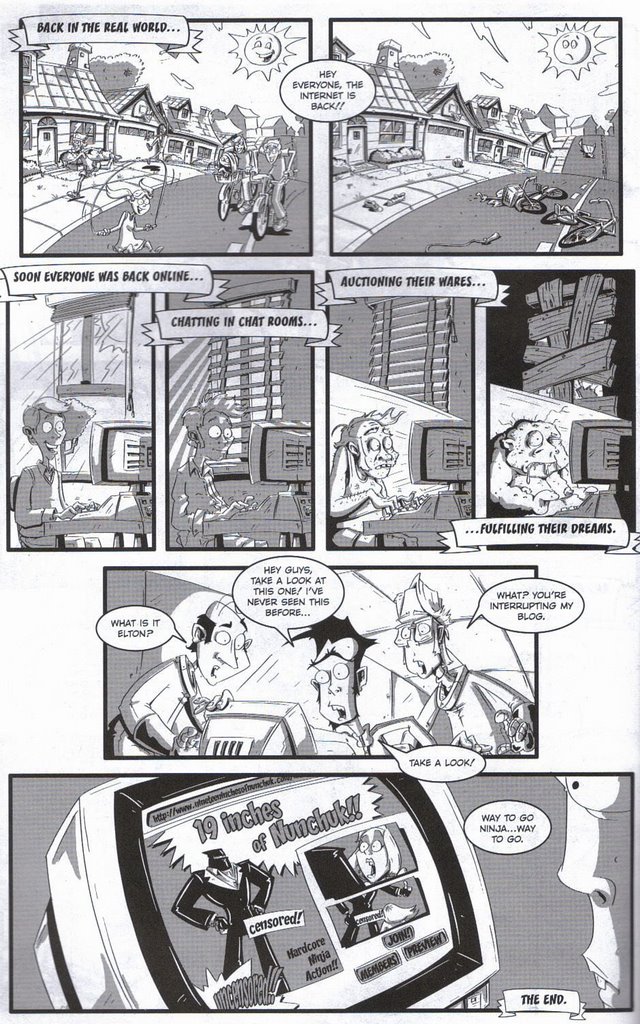
Nevertheless, creator Matt Mocarski is an obvious talent, and his characters are very eye-catching. His balance of cartooning and caricature makes for a visually entertaining read, and fortunately, he lets many of the panels do the talking with a minimal dose of dialogue. Other pages, however, are too text ridden . . . not that I don't like to read words, but I'm not sure how to classify stories like these. The Corporate Ninja's attempt to save the Internet by entering the world wide web is a cool enough concept, packed with adventure brimming with satiric potential, but many of the punchlines fall flat, skimming the surface of their true potential. Is Mocarski using humorous material to create an action-packed comic, or is it the other way around?
A few pages of sketches at the end of the issue rounded out a nice issue, with the exception of those technical typos. Nothing a spell check couldn't have fixed. Funny, an issue about the potential dangers of computers, and a computer could've polished off the package. Something a little more corporate might've helped this ninja.
creator: Matt Mocarski
letterer: Larissa Linn

I was going to praise this issue, particularly its distinctive, expressive visuals, but preparing the title/creator credits for this entry, I noticed "corporate" misspelled twice in the publication's fineprint, and despite the cover's #2, the inside cover indicated #3. So, I'm not sure what the title should look like (an intentionally misspelled title would be acceptable if the discrepancy was consistent), and I'm not sure what number this issue really is. You ask me, those elements are fairly critical in my first impression of any series.
Nevertheless, creator Matt Mocarski is an obvious talent, and his characters are very eye-catching. His balance of cartooning and caricature makes for a visually entertaining read, and fortunately, he lets many of the panels do the talking with a minimal dose of dialogue. Other pages, however, are too text ridden . . . not that I don't like to read words, but I'm not sure how to classify stories like these. The Corporate Ninja's attempt to save the Internet by entering the world wide web is a cool enough concept, packed with adventure brimming with satiric potential, but many of the punchlines fall flat, skimming the surface of their true potential. Is Mocarski using humorous material to create an action-packed comic, or is it the other way around?
A few pages of sketches at the end of the issue rounded out a nice issue, with the exception of those technical typos. Nothing a spell check couldn't have fixed. Funny, an issue about the potential dangers of computers, and a computer could've polished off the package. Something a little more corporate might've helped this ninja.
Thursday, January 04, 2007
Vengeance Squad #5
Vengeance Squad #5, 1975, Modern Comics
writers: Joe Gill & Nicola Cuti
artist: Joe Staton
editor: George Wildman

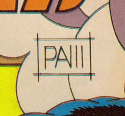
In an unplanned second part of a two-part "artist's initials" series, the only way to determine who illustrated the lead story in this reprinted issue of Vengeance Squad is the distinctive initials under the title on the cover, detailed here:

The unique signature reappears on the opening splash page, where only the writer and the editor are credited. Interesting.
Vengeance Squad #5 is an interesting issue, because the main character in the feature story is virtually unlikable, not so much by us readers, but by the character's very teammates. Eric Redd, Tulsa Coyle (Get it?), and Candy Orr are three parts of a James Bond-like special ops team, but Redd's grandstanding often takes centerstage to Coyle's and Orr's valiant but sophomoric efforts. In this adventure, the squad is after a hooded heroin dealer, and Redd sends Orr undercover after the suspect. Although we witness Redd's perilous car chase with the supposed drug pusher, it's Orr's predicament that proves more deadly -- in the fiend's clutches, bound to a chair, with a "massive bomb" hidden in the chair seat! Coyle expresses suitable concern for the potential damsel, but Redd dismisses him: "Candy is a fully qualified member of V-Squad! She'll be okay!" Sure enough, she escapes, but we don't get to see it; rather a caption casually explains, "Candy worked out of it herself . . ." What? No wonder Redd is so enamored with himself; even the writer doesn't give the supporting cast the credit their due!
A back-up story, "Michael Mauser, Private Eye," is entertaining enough, one part pulp, one part Mad Magazine strip, thanks to Joe Staton's cartoony style. I don't know if the segment had a real worthy place behind an old Vengeance Squad story, but the overall package is enjoyable enough to dodge potentially distracted contrast. Besides, after Redd's self-consumption, a little self-degradation was much needed. "Two-fisted Action" indeed!
So, considering the artist's initials and the V-Squad's spotlight hog, this issue is all about giving credit where credit is due . . . or making up for a lack thereof in the long run. Is there a better tangible example of vengeance in its purest form?
writers: Joe Gill & Nicola Cuti
artist: Joe Staton
editor: George Wildman
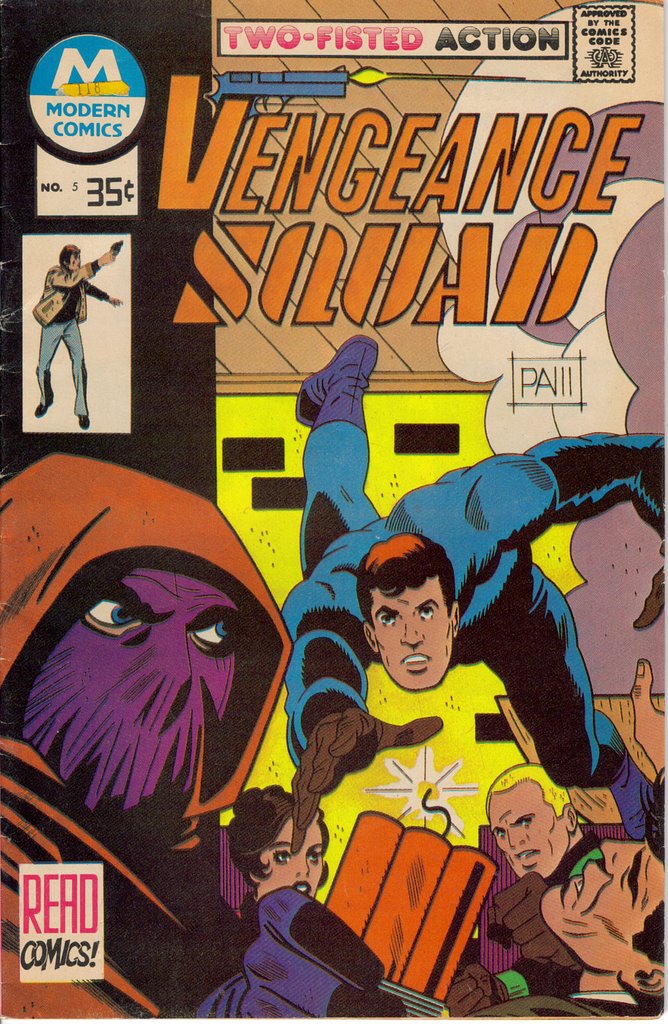
In an unplanned second part of a two-part "artist's initials" series, the only way to determine who illustrated the lead story in this reprinted issue of Vengeance Squad is the distinctive initials under the title on the cover, detailed here:
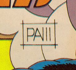
The unique signature reappears on the opening splash page, where only the writer and the editor are credited. Interesting.
Vengeance Squad #5 is an interesting issue, because the main character in the feature story is virtually unlikable, not so much by us readers, but by the character's very teammates. Eric Redd, Tulsa Coyle (Get it?), and Candy Orr are three parts of a James Bond-like special ops team, but Redd's grandstanding often takes centerstage to Coyle's and Orr's valiant but sophomoric efforts. In this adventure, the squad is after a hooded heroin dealer, and Redd sends Orr undercover after the suspect. Although we witness Redd's perilous car chase with the supposed drug pusher, it's Orr's predicament that proves more deadly -- in the fiend's clutches, bound to a chair, with a "massive bomb" hidden in the chair seat! Coyle expresses suitable concern for the potential damsel, but Redd dismisses him: "Candy is a fully qualified member of V-Squad! She'll be okay!" Sure enough, she escapes, but we don't get to see it; rather a caption casually explains, "Candy worked out of it herself . . ." What? No wonder Redd is so enamored with himself; even the writer doesn't give the supporting cast the credit their due!
A back-up story, "Michael Mauser, Private Eye," is entertaining enough, one part pulp, one part Mad Magazine strip, thanks to Joe Staton's cartoony style. I don't know if the segment had a real worthy place behind an old Vengeance Squad story, but the overall package is enjoyable enough to dodge potentially distracted contrast. Besides, after Redd's self-consumption, a little self-degradation was much needed. "Two-fisted Action" indeed!
So, considering the artist's initials and the V-Squad's spotlight hog, this issue is all about giving credit where credit is due . . . or making up for a lack thereof in the long run. Is there a better tangible example of vengeance in its purest form?
Wednesday, January 03, 2007
Whisper #30
Whisper # 30, November 1989, First Comics
writer: Steven Grant
artist: Steve Epting
letterer: David Weiss
colorist: Rich Powers
editor: Laurel Fitch

When I was shopping in downtown Glendale, Arizona last week, I was excited to find a dollar rack of old comic books at one of the district's signature antique shops, and I selected a few based solely on their cover appeal. (More on Glendale in my second quarterly report, due by this weekend.) First Comics' Whisper #30 boasts standard superhero fare, the vigilante rooftop crouch, but what struck me was this detail under artist Steve Epting's signature:
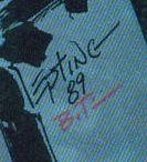
Could that "B.T." indicate that this issue contains some early Bruce Timm work, pre-Batman: The Animated Series? Alas, if Timm collaborated on this project in any way, his contribution ended with the cover. Still, for some, a dollar is worth the price of anything Timm has touched, especially before he became a pioneer in syndicated superhero animation.
In many ways, Whisper #30 read like a first issue, established the quirks and circumstances of each character with a natural freshness that made this second chapter in an ongoing story arc surprisingly easy to read. While Whisper, in her civilian identity, tries to escape the ghosts of her violent past by trying to start an artist colony, her enemies are rebuilding their villainous operations, and crime steadily rises in the city. Whisper stashes her costume in the future site of her co-op, but a helpless, homeless girl finds it and unwittingly bares the mantle. I assume she will find herself in a heap of trouble sooner than later. Meanwhile, Whisper stumbles into an arms smuggling ring, and . . . well, to be continued. I hate it when that happens.
Epting's visuals were really touch and go throughout this issue. Some panels resonated with a raw potential, a rough but appealing style that spoke to the strengths of Grant's script. Other pages seemed rushed, and the figure work reminded me of one of my favorite artists from that time, Norm Breyfogle. My cynical mind can't help but wonder if any of these guys were ghosting for each other, like the good old Golden Age days. More on Breyfogle in future posts, as well. This review is becoming less of a legitimate entry and more of a teaser for things to come . . .
In the grand scheme, Whisper may not have contributed much to the superhero landscape, but this issue spoke softly to me, albeit through two tiny letters on its cover. Sometimes, when wading through the sea of comics out there, that's all it takes.
writer: Steven Grant
artist: Steve Epting
letterer: David Weiss
colorist: Rich Powers
editor: Laurel Fitch

When I was shopping in downtown Glendale, Arizona last week, I was excited to find a dollar rack of old comic books at one of the district's signature antique shops, and I selected a few based solely on their cover appeal. (More on Glendale in my second quarterly report, due by this weekend.) First Comics' Whisper #30 boasts standard superhero fare, the vigilante rooftop crouch, but what struck me was this detail under artist Steve Epting's signature:
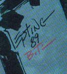
Could that "B.T." indicate that this issue contains some early Bruce Timm work, pre-Batman: The Animated Series? Alas, if Timm collaborated on this project in any way, his contribution ended with the cover. Still, for some, a dollar is worth the price of anything Timm has touched, especially before he became a pioneer in syndicated superhero animation.
In many ways, Whisper #30 read like a first issue, established the quirks and circumstances of each character with a natural freshness that made this second chapter in an ongoing story arc surprisingly easy to read. While Whisper, in her civilian identity, tries to escape the ghosts of her violent past by trying to start an artist colony, her enemies are rebuilding their villainous operations, and crime steadily rises in the city. Whisper stashes her costume in the future site of her co-op, but a helpless, homeless girl finds it and unwittingly bares the mantle. I assume she will find herself in a heap of trouble sooner than later. Meanwhile, Whisper stumbles into an arms smuggling ring, and . . . well, to be continued. I hate it when that happens.
Epting's visuals were really touch and go throughout this issue. Some panels resonated with a raw potential, a rough but appealing style that spoke to the strengths of Grant's script. Other pages seemed rushed, and the figure work reminded me of one of my favorite artists from that time, Norm Breyfogle. My cynical mind can't help but wonder if any of these guys were ghosting for each other, like the good old Golden Age days. More on Breyfogle in future posts, as well. This review is becoming less of a legitimate entry and more of a teaser for things to come . . .
In the grand scheme, Whisper may not have contributed much to the superhero landscape, but this issue spoke softly to me, albeit through two tiny letters on its cover. Sometimes, when wading through the sea of comics out there, that's all it takes.
Tuesday, January 02, 2007
Our Fighting Forces #86
Our Fighting Forces #86, August 1964, National Periodical Publications (DC Comics)
On New Year’s Day, when the world was united in celebrated the addition of a digit on our collective calendar, newspapers across the United States grieved the three-thousandth military casualty in Iraq. With Saddam Hussein’s execution now on-line for public consumption, and President Bush’s recent decision to “sit down and discuss” his plans with bipartisan strategists, the “War on Terror” is on everyone’s lips, or at least their minds. So, how do I deal with these consuming thoughts, with our national grief? Why, I read a comic book, of course! Fortunately, Our Fighting Forces #86 was among the hand-me-down stack my cousin gave me for Christmas and with its tattered, hanging-on-for-dear-life Joe Kubert cover is one of the oldest issues I’ve reviewed in this forum. Ironically, it’s also one of the most relevant.
First of all, the cover blurb poses a question that, forty-three years later, could be on the cover of next week’s Time magazine: “Is there more than one way of seeing the same battle?” The inquiry is darn near rhetorical nowadays. Yet, in the context of this issue’s feature story, the perspectives aren’t arguing the validity of the conflict, but rather its semantic from within. See, ongoing characters Gunner, Sarge, and Pooch (yes, a dog) often find themselves unwittingly among the enemy, and their languishing peers are jealous. With five days of leave at stake, the trio is assigned a seemingly uneventful beachfront, but from each of their perspectives we witness the soldiers encounter an enemy plane, tank, and submarine. Unfortunately, since each of the soldiers (Pooch included) defeat these onslaughts individually, without the confirmation of their partners, the battle doesn’t count toward the leave contest. Actually, Pooch doesn’t defeat the submarine single-handedly (pawedly?), but Sarge and Gunner are struck with a bout of amnesia after their successful counterattack, thereafter Pooch laments his inability to speak on their behalf. Fortunately, a rival group of their peers behold the fight, and the trio are duly rewarded. Thus, although this battle is perceived from three different perspectives, Sarge, Gunner, and Pooch’s misfortune is consistently hilariously and conversely antithetical to the war our boys are waging overseas today.
The second story in this issue, about a diver that also finds himself among the enemy as he volleys from various battlefields before the deadline for his mission strikes, is just as chuckle-worthy in its light-hearted take on war. These heroes are depicted as resourceful and cool-headed, which are traits we’d admire in any soldier if they weren’t so often too optimistic. Surely, not every young man or woman in the military becomes one part McGuyver, one part Bruce Willis from Die Hard! Yet, these tales wouldn’t be entertaining if they depicted the challenges and tragedies of war – we get enough of that on the evening news, which brings us back to the solemn circumstances surrounding my mentality picking up this issue in the first place. If a publisher produced “War on Terror” comics with the frivolity (and, you can’t deny, fun) of these old issues, critics would immediately express their outrage, using words like “glorification” or “insensitivity” to convey their opinion. Of course, both sides of the argument would exhibit some validity in their own context – so yes, comic book from 1964, not only is there more than one way of seeing a battle, but there’s more than one way of seeing every battle. War begets war, in all shapes and sizes.
I should mention that Our Fighting Forces is a well-packaged comic book, with the before-mentioned Kubert cover, and although the contributors aren’t credited, the legendary Gene Colan snuck a deserving signature in the second story. One can only assume that the issue as a whole was in such capable hands. Further, with the gravity of the media’s take on the war effort lately, with death literally at our fingertips, I appreciated Our Fighting Forces’ levity. Hey, war may be hell, but it makes a great comic book. What a way to kick off the new year, eh?
On New Year’s Day, when the world was united in celebrated the addition of a digit on our collective calendar, newspapers across the United States grieved the three-thousandth military casualty in Iraq. With Saddam Hussein’s execution now on-line for public consumption, and President Bush’s recent decision to “sit down and discuss” his plans with bipartisan strategists, the “War on Terror” is on everyone’s lips, or at least their minds. So, how do I deal with these consuming thoughts, with our national grief? Why, I read a comic book, of course! Fortunately, Our Fighting Forces #86 was among the hand-me-down stack my cousin gave me for Christmas and with its tattered, hanging-on-for-dear-life Joe Kubert cover is one of the oldest issues I’ve reviewed in this forum. Ironically, it’s also one of the most relevant.
First of all, the cover blurb poses a question that, forty-three years later, could be on the cover of next week’s Time magazine: “Is there more than one way of seeing the same battle?” The inquiry is darn near rhetorical nowadays. Yet, in the context of this issue’s feature story, the perspectives aren’t arguing the validity of the conflict, but rather its semantic from within. See, ongoing characters Gunner, Sarge, and Pooch (yes, a dog) often find themselves unwittingly among the enemy, and their languishing peers are jealous. With five days of leave at stake, the trio is assigned a seemingly uneventful beachfront, but from each of their perspectives we witness the soldiers encounter an enemy plane, tank, and submarine. Unfortunately, since each of the soldiers (Pooch included) defeat these onslaughts individually, without the confirmation of their partners, the battle doesn’t count toward the leave contest. Actually, Pooch doesn’t defeat the submarine single-handedly (pawedly?), but Sarge and Gunner are struck with a bout of amnesia after their successful counterattack, thereafter Pooch laments his inability to speak on their behalf. Fortunately, a rival group of their peers behold the fight, and the trio are duly rewarded. Thus, although this battle is perceived from three different perspectives, Sarge, Gunner, and Pooch’s misfortune is consistently hilariously and conversely antithetical to the war our boys are waging overseas today.
The second story in this issue, about a diver that also finds himself among the enemy as he volleys from various battlefields before the deadline for his mission strikes, is just as chuckle-worthy in its light-hearted take on war. These heroes are depicted as resourceful and cool-headed, which are traits we’d admire in any soldier if they weren’t so often too optimistic. Surely, not every young man or woman in the military becomes one part McGuyver, one part Bruce Willis from Die Hard! Yet, these tales wouldn’t be entertaining if they depicted the challenges and tragedies of war – we get enough of that on the evening news, which brings us back to the solemn circumstances surrounding my mentality picking up this issue in the first place. If a publisher produced “War on Terror” comics with the frivolity (and, you can’t deny, fun) of these old issues, critics would immediately express their outrage, using words like “glorification” or “insensitivity” to convey their opinion. Of course, both sides of the argument would exhibit some validity in their own context – so yes, comic book from 1964, not only is there more than one way of seeing a battle, but there’s more than one way of seeing every battle. War begets war, in all shapes and sizes.
I should mention that Our Fighting Forces is a well-packaged comic book, with the before-mentioned Kubert cover, and although the contributors aren’t credited, the legendary Gene Colan snuck a deserving signature in the second story. One can only assume that the issue as a whole was in such capable hands. Further, with the gravity of the media’s take on the war effort lately, with death literally at our fingertips, I appreciated Our Fighting Forces’ levity. Hey, war may be hell, but it makes a great comic book. What a way to kick off the new year, eh?
Monday, January 01, 2007
Spider-man: Reign #1
Spider-man: Reign #1, February 2007, Marvel Comics
writer/illustrator: Kaare Andrews
letterer: Chris Eliopoulos
assistant editor: Michael O’Connor
editor: Axel Andrews
EIC: Joe Quesada
My first comic book of the new year seems to be the first installment of Spider-man’s last adventure. I’ve been anticipating Spider-man: Reign for some time now. The Amazing Spider-man was the first series I collected on a monthly basis, thanks to the few issues that were in the box of comics my father gave me over fifteen years ago (see my review of Savage Dragon #0 for the whole story), and although I endured most of the original Clone Saga, my wallet couldn’t bare the commitment both Peter Parker and Ben Reilly demanded week after week. Things have changed since then, Spidey’s titles have relaunched seemingly doppelganger free, and I’ve check in on old Webhead from time to time, but I haven’t delved back into his books as I have more than once with Batman or the Justice League after their annual, multi-title crises. Spider-man’s clone-ridden crossover was my first financial crisis, and you know what they say: the first cut is the deepest. As a four-issue miniseries with its own Elseworlds-like continuity, Spider-man: Reign is free of that baggage. So, you can understand why I’ve been looking forward to it.
Also, Spider-man: Reign is inarguably The Dark Knight Returns for Spider-man. I can’t think of any other way to put it, and although I haven’t read any other reviews or message boards about the series, I’m sure the fanbase is buzzing about the blatant parallels. This first installment takes place ten years after superhero activity dominated the city, and our hero, raggedly aged and hiding behind a mess of uncharacteristic facial hair, is struggling between the tragedies of his past and an apathy onset by the circumstances of his future. The city is overrun by a mob of authoritative deviants who abuse their self-appointed power with reckless abandon, harassing youth and the elderly alike, and in the face of their rising terrorism, our hero is overcome by his sense of responsibility and dons his old costume again. Despite the years behind him, he perseveres and inspires a nostalgic hope . . . until he punches J. Jonah Jameson in the face. See, until that last detail, I was adequately describing the first chapter of The Dark Knight Returns and Spider-man: Reign. You didn’t even need me to tell you that writer/artist Kaare Andrews went so far as to name the derivative, outspoken news anchor Miller Janson – but I’ve mentioned it anyway, if only to highlight the similar use of media satire to drive the culminating subplots and to splash some much needed humor onto an otherwise dark and stormy landscape.
Of course, Spider-man: Reign is distinctly different from The Dark Knight Returns, as well, but only insomuch as Peter Parker is worlds apart from Bruce Wayne. Whereas Batman is a millionaire with all of the trappings such a lifestyle entails, i.e. racecar driving and horseback riding, Spider-man was always definitively poor, or at least “down on his luck,” and apparently his potential future offers a similarly unfortunate destiny. In fact, Parker makes the connection himself when his “little Napoleon” of a boss fires him from the flower shop: “No money. No job. No dignity. Just like old times.” Further, the deviants I referenced earlier are not traditional villains, like Frank Miller’s X-Men inspired teenaged mutants, but rather police officers, dubbed the Reign. When Jameson, who was old to begin with, gives Parker an old Spider-man mask (notably from his black costume) and subjects himself to some police brutality in an attempt to “resurrect” our friendly neighborhood hero, one of the crooked cops proclaims, “We chased your kind out of this city a long time ago!” The reader can only assume that this exclamation is a reference to the mysterious events of “ten years ago,” and that in future issues, the past will slowly but surely be unveiled.
In my opinion, the most disturbing difference between Dark Knight and Reign is the obvious absence of Spider-man’s diverse supporting cast. In the first issue of Dark Knight, Miller introduces almost all of the major players, including the then-sedated Joker, and although Bruce is a reclusive figure, he is by no means alone. Heck, Alfred is even still alive, albeit barely, seemingly clinging to his serving tray for dear life until his curtain call in the title’s final pages. Until Jameson shows up in Reign, Peter is the only character we actually know; the rest of the cast, including the sure-to-be-evil Mayor Waters, doesn’t even allude to a connection to characters from the past. (Yes, Mayor Osborn would have been too obvious, but Mayor Brant? Police Commissioner Felix Hardy? Get it?) The effort must have been intentional, because Jonah’s appearance warrants a splash page, as if Andrews is telling the reader, “Your patience will be rewarded. I know what I’m doing.” Now, Mary Jane is present, but briefly, and since Spider-man is clutching her gravestone on the cover of this issue, I assume her appearance is simply a ghost from the past, an echo of Peter’s true loneliness. Again, I’m looking forward to the rest of the miniseries with the assumption that all will be explained, and, unlike the Clone Saga, I know how long I need to commit.
I’ve never encountered the work of Kaare Andrews before, so I don’t know if the visual parallels to Frank Miller’s style is intentional, but the melodramatic narrative is both reminiscent of Dark Knight while masterfully retaining the essence of Spider-man’s character, including the scene in which Peter decides to don the mask, which is strikingly akin to Bruce’s climatic moments with The Mark of Zorro. (“The fabric . . . has eyes. I look into those eyes and all I see is myself.”) Aside from the line I quoted earlier, two others struck me, the first of which mentions Peter’s spider-skills in this story for the first time: “Do you hear that sound? The ringing in your ears? That high octane pitched whine? Like a siren? Doctors have a name for it. I’m not sure what they call it, but I have my own name.” Parker doesn’t say it, but we finish the thought for him; well done. Also, although I won’t quote it here, I must express an appreciation for the way Andrews establishes Spidey’s trademark banter. While beating up those meddling cops, the quips are flying as fast as the punches, but Peter’s woe-is-me monologue continues, insisting that he is watching the scene as we are, as if the mask were an entity in itself. It’s an interesting dichotomy and perhaps the ultimate difference between Batman and Spider-man; while Bruce Wayne was consumed with his quest for justice, Peter Parker sought a civilian life, meaningful existence inside and outside of the costume. I wonder which will reign at the end of this miniseries.
I’ve alluded to the point before, but Spider-man: Reign proves my theory: our generation of fanfolk is eager for another The Dark Knight Returns. We need a fresh take on the heroes of our youth to make them fun and relevant again. Every time they appear on the big screen, we wait in line to see them “for real.” Every time Frank Miller’s name is attached to a superhero project, we hope he recaptures that original magic, but even he is too consumed by his own hype to hold up that lightning rod. It won’t strike twice. Spider-man: Reign is close, and I think Andrews is onto something both nostalgic and new. (This is a clone saga of a different color, I suppose. I just hope we see what became of some of Spidey’sbad guys next issue!) Spider-man is the perfect character about whom to prophesy in this context. While the tragedy of his uncle’s death creates a Batman-like motivation, as the most popular and idealistic character of a major comic publishing company, Spidey is also very Superman-like, retaining a canonship with definitively global proportions. Yes, his future is a dark one, but Andrews uses the “Itsy Bitsy Spider” nursery rhyme to kick off this adventure, an element that is as haunting as it is hopeful. At the end of the day – or in this case, the beginning of the year – these heroes have and always will speak to the wide-eyed kid in all of us. The future can’t take that away.
writer/illustrator: Kaare Andrews
letterer: Chris Eliopoulos
assistant editor: Michael O’Connor
editor: Axel Andrews
EIC: Joe Quesada
My first comic book of the new year seems to be the first installment of Spider-man’s last adventure. I’ve been anticipating Spider-man: Reign for some time now. The Amazing Spider-man was the first series I collected on a monthly basis, thanks to the few issues that were in the box of comics my father gave me over fifteen years ago (see my review of Savage Dragon #0 for the whole story), and although I endured most of the original Clone Saga, my wallet couldn’t bare the commitment both Peter Parker and Ben Reilly demanded week after week. Things have changed since then, Spidey’s titles have relaunched seemingly doppelganger free, and I’ve check in on old Webhead from time to time, but I haven’t delved back into his books as I have more than once with Batman or the Justice League after their annual, multi-title crises. Spider-man’s clone-ridden crossover was my first financial crisis, and you know what they say: the first cut is the deepest. As a four-issue miniseries with its own Elseworlds-like continuity, Spider-man: Reign is free of that baggage. So, you can understand why I’ve been looking forward to it.
Also, Spider-man: Reign is inarguably The Dark Knight Returns for Spider-man. I can’t think of any other way to put it, and although I haven’t read any other reviews or message boards about the series, I’m sure the fanbase is buzzing about the blatant parallels. This first installment takes place ten years after superhero activity dominated the city, and our hero, raggedly aged and hiding behind a mess of uncharacteristic facial hair, is struggling between the tragedies of his past and an apathy onset by the circumstances of his future. The city is overrun by a mob of authoritative deviants who abuse their self-appointed power with reckless abandon, harassing youth and the elderly alike, and in the face of their rising terrorism, our hero is overcome by his sense of responsibility and dons his old costume again. Despite the years behind him, he perseveres and inspires a nostalgic hope . . . until he punches J. Jonah Jameson in the face. See, until that last detail, I was adequately describing the first chapter of The Dark Knight Returns and Spider-man: Reign. You didn’t even need me to tell you that writer/artist Kaare Andrews went so far as to name the derivative, outspoken news anchor Miller Janson – but I’ve mentioned it anyway, if only to highlight the similar use of media satire to drive the culminating subplots and to splash some much needed humor onto an otherwise dark and stormy landscape.
Of course, Spider-man: Reign is distinctly different from The Dark Knight Returns, as well, but only insomuch as Peter Parker is worlds apart from Bruce Wayne. Whereas Batman is a millionaire with all of the trappings such a lifestyle entails, i.e. racecar driving and horseback riding, Spider-man was always definitively poor, or at least “down on his luck,” and apparently his potential future offers a similarly unfortunate destiny. In fact, Parker makes the connection himself when his “little Napoleon” of a boss fires him from the flower shop: “No money. No job. No dignity. Just like old times.” Further, the deviants I referenced earlier are not traditional villains, like Frank Miller’s X-Men inspired teenaged mutants, but rather police officers, dubbed the Reign. When Jameson, who was old to begin with, gives Parker an old Spider-man mask (notably from his black costume) and subjects himself to some police brutality in an attempt to “resurrect” our friendly neighborhood hero, one of the crooked cops proclaims, “We chased your kind out of this city a long time ago!” The reader can only assume that this exclamation is a reference to the mysterious events of “ten years ago,” and that in future issues, the past will slowly but surely be unveiled.
In my opinion, the most disturbing difference between Dark Knight and Reign is the obvious absence of Spider-man’s diverse supporting cast. In the first issue of Dark Knight, Miller introduces almost all of the major players, including the then-sedated Joker, and although Bruce is a reclusive figure, he is by no means alone. Heck, Alfred is even still alive, albeit barely, seemingly clinging to his serving tray for dear life until his curtain call in the title’s final pages. Until Jameson shows up in Reign, Peter is the only character we actually know; the rest of the cast, including the sure-to-be-evil Mayor Waters, doesn’t even allude to a connection to characters from the past. (Yes, Mayor Osborn would have been too obvious, but Mayor Brant? Police Commissioner Felix Hardy? Get it?) The effort must have been intentional, because Jonah’s appearance warrants a splash page, as if Andrews is telling the reader, “Your patience will be rewarded. I know what I’m doing.” Now, Mary Jane is present, but briefly, and since Spider-man is clutching her gravestone on the cover of this issue, I assume her appearance is simply a ghost from the past, an echo of Peter’s true loneliness. Again, I’m looking forward to the rest of the miniseries with the assumption that all will be explained, and, unlike the Clone Saga, I know how long I need to commit.
I’ve never encountered the work of Kaare Andrews before, so I don’t know if the visual parallels to Frank Miller’s style is intentional, but the melodramatic narrative is both reminiscent of Dark Knight while masterfully retaining the essence of Spider-man’s character, including the scene in which Peter decides to don the mask, which is strikingly akin to Bruce’s climatic moments with The Mark of Zorro. (“The fabric . . . has eyes. I look into those eyes and all I see is myself.”) Aside from the line I quoted earlier, two others struck me, the first of which mentions Peter’s spider-skills in this story for the first time: “Do you hear that sound? The ringing in your ears? That high octane pitched whine? Like a siren? Doctors have a name for it. I’m not sure what they call it, but I have my own name.” Parker doesn’t say it, but we finish the thought for him; well done. Also, although I won’t quote it here, I must express an appreciation for the way Andrews establishes Spidey’s trademark banter. While beating up those meddling cops, the quips are flying as fast as the punches, but Peter’s woe-is-me monologue continues, insisting that he is watching the scene as we are, as if the mask were an entity in itself. It’s an interesting dichotomy and perhaps the ultimate difference between Batman and Spider-man; while Bruce Wayne was consumed with his quest for justice, Peter Parker sought a civilian life, meaningful existence inside and outside of the costume. I wonder which will reign at the end of this miniseries.
I’ve alluded to the point before, but Spider-man: Reign proves my theory: our generation of fanfolk is eager for another The Dark Knight Returns. We need a fresh take on the heroes of our youth to make them fun and relevant again. Every time they appear on the big screen, we wait in line to see them “for real.” Every time Frank Miller’s name is attached to a superhero project, we hope he recaptures that original magic, but even he is too consumed by his own hype to hold up that lightning rod. It won’t strike twice. Spider-man: Reign is close, and I think Andrews is onto something both nostalgic and new. (This is a clone saga of a different color, I suppose. I just hope we see what became of some of Spidey’sbad guys next issue!) Spider-man is the perfect character about whom to prophesy in this context. While the tragedy of his uncle’s death creates a Batman-like motivation, as the most popular and idealistic character of a major comic publishing company, Spidey is also very Superman-like, retaining a canonship with definitively global proportions. Yes, his future is a dark one, but Andrews uses the “Itsy Bitsy Spider” nursery rhyme to kick off this adventure, an element that is as haunting as it is hopeful. At the end of the day – or in this case, the beginning of the year – these heroes have and always will speak to the wide-eyed kid in all of us. The future can’t take that away.
Sunday, December 31, 2006
The Clock Maker #3
The Clock Maker #3, April 2003, Image Comics
writer: Jim Krueger
artist: Zach Howard & Michael Halbleib
colorist: Brett Weldele
letterer: John “Johnny Storm” Roberts
A few weeks ago, I saw a T-shirt that boasted, “Time is an invention.” I don’t know why, but I’ve been thinking about it ever since. Our standards for measuring time are indeed very arbitrary and in fact often outdated, as many of our chronological practices are based on a predominantly rural lifestyle. Yes, Julius Caesar may have started it, but farmers sealed the deal, and now we’re stuck with the twenty-four day, the three hundred and sixty-five day year (give or take a day every four years). I wonder how dramatically different our lives would be if we were so pigeonholed by these old ideas, if we perceived time in a broader way. Would we always feel so rushed? Would we sleep when the sun set? Would millions of people get drunk tonight simply to celebrate the coming of another digit on our collective calendar? The possibilities are endless.
The Clock Maker is unlike any standard newsstand comic book I have ever read. When I opened the front cover, I had to open the book again, not to the next page, but to the next crease, literally doubling the book’s size, not unlike when a larger poster is bound into an issue’s centerfold. Since this series is about the very rotation of the Earth, the format seems appropriate for such a grand topic. Yes. Commonplace twenty-something Astrid Bonn discovers that her father was the keeper of a giant clockwork hidden beneath our planet’s surface, and that his death entitles her to the responsibility. Writer Jim Krueger attempts to combine the spiritual and scientific origins of the Earth (and I use those terms in contrast of each other) to create a modern myth about an unwitting hero caught between the life she knew and the very well-being of all life as we know it. It’s a lofty goal, but in this issue of veritable talking heads, the large format is wasted. I don’t know if every issue was packaged like this, but next issue’s impending battle with Satan strikes me as more appropriate material.
I saw The Clock Maker an interesting opportunity to explore the semantics of tonight’s make-believe holiday, but ironically, time is against my efforts to go any deeper. My girlfriend and I hit the road back to California around midnight last night (was that Central/Mountain or Pacific Standard?) and we spent the afternoon sleeping off the lag. Now, with dinner to eat and parties to hit, I hope there are enough hours left in the day. If not, it’s not like I can make up a few more.
writer: Jim Krueger
artist: Zach Howard & Michael Halbleib
colorist: Brett Weldele
letterer: John “Johnny Storm” Roberts
A few weeks ago, I saw a T-shirt that boasted, “Time is an invention.” I don’t know why, but I’ve been thinking about it ever since. Our standards for measuring time are indeed very arbitrary and in fact often outdated, as many of our chronological practices are based on a predominantly rural lifestyle. Yes, Julius Caesar may have started it, but farmers sealed the deal, and now we’re stuck with the twenty-four day, the three hundred and sixty-five day year (give or take a day every four years). I wonder how dramatically different our lives would be if we were so pigeonholed by these old ideas, if we perceived time in a broader way. Would we always feel so rushed? Would we sleep when the sun set? Would millions of people get drunk tonight simply to celebrate the coming of another digit on our collective calendar? The possibilities are endless.
The Clock Maker is unlike any standard newsstand comic book I have ever read. When I opened the front cover, I had to open the book again, not to the next page, but to the next crease, literally doubling the book’s size, not unlike when a larger poster is bound into an issue’s centerfold. Since this series is about the very rotation of the Earth, the format seems appropriate for such a grand topic. Yes. Commonplace twenty-something Astrid Bonn discovers that her father was the keeper of a giant clockwork hidden beneath our planet’s surface, and that his death entitles her to the responsibility. Writer Jim Krueger attempts to combine the spiritual and scientific origins of the Earth (and I use those terms in contrast of each other) to create a modern myth about an unwitting hero caught between the life she knew and the very well-being of all life as we know it. It’s a lofty goal, but in this issue of veritable talking heads, the large format is wasted. I don’t know if every issue was packaged like this, but next issue’s impending battle with Satan strikes me as more appropriate material.
I saw The Clock Maker an interesting opportunity to explore the semantics of tonight’s make-believe holiday, but ironically, time is against my efforts to go any deeper. My girlfriend and I hit the road back to California around midnight last night (was that Central/Mountain or Pacific Standard?) and we spent the afternoon sleeping off the lag. Now, with dinner to eat and parties to hit, I hope there are enough hours left in the day. If not, it’s not like I can make up a few more.
Saturday, December 30, 2006
The X-Files #20
The X-Files #20, July 1996, Topps Comics
writer: Kevin J. Anderson
penciller: Gordon Purcell
inkers: Josef Rubinstein & Co.
letterer: John Workman
colorist: Digital Chameleon
editors: Jim Salicrup & Dwight Jon Zimmerman
I was an X-Files fanatic. I watched the first several seasons obsessively. Then, when the series jumped the shark and phased its two major players out, replacing Agents Mulder and Scully with the Liquid Terminator and what's-her-face, I let it go. Sometimes you have to do that, when an old friend changes so dramatically that you hardly even recognize them anymore. Fortunately, thanks to syndication, I've rediscovered The X-Files, and although I read a few of the Topps Comics back in the day, discovering this issue now is like taking a trip back in time and meeting that old friend again for the first time.
The X-Files #20 is the first in a two-part story called "Family Portrait," and although the death of a reclusive South Dakota photographer has perplexed Mulder and Scully, the author of this mystery has provided us the readers with enough information to figure it out on our own. Apparently, the photographer recovered an old haunted camera during World War II, which uses soul-hungry demons as makeshift film to suck the life from its unwitting subjects. The man the photographer swiped the camera from is still alive but ailing, and in this issue decides to find the device so he could reap its benefits once again. So, we can only assume that the second part of this story will be a collision of all of these elements, and that Mulder will be one step closer to convincing Scully that the truth is out there. And, in this case, you can carry a picture of it in your wallet.
Writer Kevin J. Anderson is hailed as a New York Times best-seller on this cover of this issue, which, like the Russ Manning Award, creates a premature expectation of excellence from its readers. Although Anderson nails the rapport between Mulder and Scully (sans sexual tension in this case, but they were friends first, I guess), his script makes more sense as a Law & Order narrative. In the face of death and potential serial murder, the quips just keep coming, something I'd expect from those cynical NYPD dicks over investigators of the paranormal. Even the final splash page, on which Mulder and Scully discover the bodies of more victims, boasts a punchline: "Funny, they looked a lot better in their photo." Funny, indeed. Maybe a little too funny . . .
I remember an interview I once read with David Duchovny. The interviewer had asked him how he approaches Mulder's character, with its facets of intensity and sarcasm and sorrow. (I may have just embellished the original question a bit, but you know what I mean.) Duchovny responded that he tries to interpret Mulder's behavior in any given episode based on the intensity of the case; naturally, the mysteries surrounding the ongoing alien conspiracy involved Mulder's complete concentration, for the sake of his lost sister. However, those episodes that were more peculiar offered the leniency for a joke or a quip, that "I believe in this stuff and I know what I'm doing" attitude that old Fox flaunted from time to time. I wonder if Anderson read this interview and took Duchovny's comments to heart. If so, he's exploited them here in spades.
Visually, The X-Files was always a standard comic book series, with the occasional eclectic short story from a noted artist offered in their digest series. Artists Purcell and Rubinstein do their best to capture the likenesses of Duchovny and Gillian Anderson while maintaining a natural fluidity to their designs; in other words, the characters aren't too stiff in spite of being caricatures of actors. In fact, some panels look quite good, and the artists implement a direction that is worthy of any X-Files episode. Reading a comic book inspired by a television show, it reminds me that pencillers are often like film directors, attempting to capture the most effective angle to convey a highlight in the story, or the mood of their "actors." What an underrated aspect of their skill. Sometimes the real mystery is how much work these guys put into each page.
So, will I seek out "Family Portrait" to see how it all ends? Unfortunately, no. Like I said, the author offered enough insight into the mystery to help me put the last pieces together myself, at least to my own satisfaction. Plus, I know nothing too dynamic could happen to Agents Mulder and Scully, since the TV show reserved the right to do that toward the end of its run. Yes, this was a nice glimpse into the past . . . but The X-Files itself has told us, you cannot fight the future.
writer: Kevin J. Anderson
penciller: Gordon Purcell
inkers: Josef Rubinstein & Co.
letterer: John Workman
colorist: Digital Chameleon
editors: Jim Salicrup & Dwight Jon Zimmerman
I was an X-Files fanatic. I watched the first several seasons obsessively. Then, when the series jumped the shark and phased its two major players out, replacing Agents Mulder and Scully with the Liquid Terminator and what's-her-face, I let it go. Sometimes you have to do that, when an old friend changes so dramatically that you hardly even recognize them anymore. Fortunately, thanks to syndication, I've rediscovered The X-Files, and although I read a few of the Topps Comics back in the day, discovering this issue now is like taking a trip back in time and meeting that old friend again for the first time.
The X-Files #20 is the first in a two-part story called "Family Portrait," and although the death of a reclusive South Dakota photographer has perplexed Mulder and Scully, the author of this mystery has provided us the readers with enough information to figure it out on our own. Apparently, the photographer recovered an old haunted camera during World War II, which uses soul-hungry demons as makeshift film to suck the life from its unwitting subjects. The man the photographer swiped the camera from is still alive but ailing, and in this issue decides to find the device so he could reap its benefits once again. So, we can only assume that the second part of this story will be a collision of all of these elements, and that Mulder will be one step closer to convincing Scully that the truth is out there. And, in this case, you can carry a picture of it in your wallet.
Writer Kevin J. Anderson is hailed as a New York Times best-seller on this cover of this issue, which, like the Russ Manning Award, creates a premature expectation of excellence from its readers. Although Anderson nails the rapport between Mulder and Scully (sans sexual tension in this case, but they were friends first, I guess), his script makes more sense as a Law & Order narrative. In the face of death and potential serial murder, the quips just keep coming, something I'd expect from those cynical NYPD dicks over investigators of the paranormal. Even the final splash page, on which Mulder and Scully discover the bodies of more victims, boasts a punchline: "Funny, they looked a lot better in their photo." Funny, indeed. Maybe a little too funny . . .
I remember an interview I once read with David Duchovny. The interviewer had asked him how he approaches Mulder's character, with its facets of intensity and sarcasm and sorrow. (I may have just embellished the original question a bit, but you know what I mean.) Duchovny responded that he tries to interpret Mulder's behavior in any given episode based on the intensity of the case; naturally, the mysteries surrounding the ongoing alien conspiracy involved Mulder's complete concentration, for the sake of his lost sister. However, those episodes that were more peculiar offered the leniency for a joke or a quip, that "I believe in this stuff and I know what I'm doing" attitude that old Fox flaunted from time to time. I wonder if Anderson read this interview and took Duchovny's comments to heart. If so, he's exploited them here in spades.
Visually, The X-Files was always a standard comic book series, with the occasional eclectic short story from a noted artist offered in their digest series. Artists Purcell and Rubinstein do their best to capture the likenesses of Duchovny and Gillian Anderson while maintaining a natural fluidity to their designs; in other words, the characters aren't too stiff in spite of being caricatures of actors. In fact, some panels look quite good, and the artists implement a direction that is worthy of any X-Files episode. Reading a comic book inspired by a television show, it reminds me that pencillers are often like film directors, attempting to capture the most effective angle to convey a highlight in the story, or the mood of their "actors." What an underrated aspect of their skill. Sometimes the real mystery is how much work these guys put into each page.
So, will I seek out "Family Portrait" to see how it all ends? Unfortunately, no. Like I said, the author offered enough insight into the mystery to help me put the last pieces together myself, at least to my own satisfaction. Plus, I know nothing too dynamic could happen to Agents Mulder and Scully, since the TV show reserved the right to do that toward the end of its run. Yes, this was a nice glimpse into the past . . . but The X-Files itself has told us, you cannot fight the future.
Friday, December 29, 2006
Lone #1
Lone #1, September 2003, Dark Horse Comics
writer: Stuart Moore
artist: Jerome Opena
colorist: Michelle Madsen
letterer: Sno Cone
My girlfriend and I started our penultimate day in Prescott, Arizona, where we spent last night enjoying a light snowfall and the warm, sweet treats popped, baked, and brewed on their historical Whiskey Row. Strolling the streets of historical downtown Prescott, I marveled at its architecture, seemingly unchanged since the necessary renovations following the fire of 1900. We ate in a restaurant that boasted charred bricks from the devastation, with over one hundred years of American legacy etched into its seams, and we walked past a saloon with a placard proudly proclaiming its opening year, 1897. I could imagine the stories that simmer beneath those paved roads, when the town was a veritable character in a Clint Eastwood movie. I picture the Hill Valley of Back to the Future III, probably because I just caught part of the flick on TBS a few days ago, but you catch my drift.
Lone takes places in a similar western frontier, not in the past, but rather in the future. Like more than a few comic books I've reviewed in this forum, Lone features a barren, post-war America, in which zombies roam and ravage surviving towns with slow but merciless precision, adding more to their undead ranks. In this first issue, Luke, perhaps the best shot left in the West, and her brother embark on a journey at their mother's behest for Lone, a legendary bounty hunter whose skills may hold the secret to their townfolks' survival. In typical recluse fashion, Lone initially refuses to help the kids, but when zombies breech his radiated home and suggest that they know a secret from Lone's past, the mercenary inexplicably offers to exchange his help for Luke's town's old newspapers. The question is, is Lone really interested in the history of print media, or is he trying to cover his tracks once and for all?
Lone is an attractive package, boasting the attractive work of Russ Manning Award-winning artist Jerome Opena. I know Jerome Opena won the Russ Manning Award because his success is credited above the title on the cover and three times on the letters page, which was probably two times too many. Still, Opena's visuals are beautiful capturing the Wild West-like wasteland of the post-war American landscape, the vile reality of the apocalyptic era's zombies and mutants, and most importantly the expressive dynamics of the story's characters. Lone is a powerful figure, but his gaunt frame reveals a vulnerability, not so much in his physical prowess, but symbolically, brewing beneath the surface, like the very land upon which he resides. Moore's mythology is built on a simple premise: an unnatural return of the days of cowboys, with a zombie twist. With books like Loveless and Marvel's zombie titles flying off the shelves this year, I wonder if Lone set the stage for their success. Based on this premiere effort, the book certainly stands on its own, its title indicative of its place on the shelves. Lone is one of a kind.
Thinking about my experience in Prescott, incorporating zombies into a post-modern western isn't too farfetched, as I explored the historical downtown with eyes that felt like they were gazing upon a city thriving despite its past. In the whole of the heart of Prescott, my girlfriend and I did not see a Starbucks, and although I'm sure one was hidden somewhere, its absence retained a dignity for those few square blocks that other cities Prescott's age have lost. In fact, a local art shop sold stickers mocking the Starbucks logo, with a Day of the Dead figure in the center of a green circle boasting "Starbones." Therein, I guess Prescott resonates the opposite of the Lone concept; the old town is still stumbling forth, vital in its old age, the cities beneath it lifeless in their concrete symmetry.
Speaking of art, Prescott offered an interesting interlude that bares some relevance to this project and much excitement to my bumbling fanboyishness. My girlfriend and I strolled into an art gallery co-op in the historic downtown, where I instantly recognized a small part of the exhibit displaying the work of Bret Blevins. Blevins illustrated The Legends of the Dark Knight #50, which I reviewed some months ago and has brought a number of hits to this site. Personally, Blevins also pencilled the first several Cloak & Dagger installments of the '80s' Strange Tales, which were included in the box of comics my dad acquired for me in my youth, and which sparked my passion for collecting. (Read my review of Savage Dragon #0 for the whole story.) Blevins lives in the Prescott area, and although he wasn't in the gallery during my first visit, he was there when I looked in again this morning, and he was nice enough to sketch my favorite mutant misadventurers with plenty of care, absolutely free. Blevins was a real gentleman, nice enough to chat while he meticulously sketched, recreating an image that could've been ripped from those old issues that inspired my fanaticism for Cloak, Dagger, and comics in general. When I'm back in California and at my scanner, I'll post the sketch in all of its glory. The encounter was as strange and unexpected as those tales, but a wonderful supplement to my near-complete Cloak & Dagger collection. Goes to show just that the West is still full of surprises . . .
writer: Stuart Moore
artist: Jerome Opena
colorist: Michelle Madsen
letterer: Sno Cone
My girlfriend and I started our penultimate day in Prescott, Arizona, where we spent last night enjoying a light snowfall and the warm, sweet treats popped, baked, and brewed on their historical Whiskey Row. Strolling the streets of historical downtown Prescott, I marveled at its architecture, seemingly unchanged since the necessary renovations following the fire of 1900. We ate in a restaurant that boasted charred bricks from the devastation, with over one hundred years of American legacy etched into its seams, and we walked past a saloon with a placard proudly proclaiming its opening year, 1897. I could imagine the stories that simmer beneath those paved roads, when the town was a veritable character in a Clint Eastwood movie. I picture the Hill Valley of Back to the Future III, probably because I just caught part of the flick on TBS a few days ago, but you catch my drift.
Lone takes places in a similar western frontier, not in the past, but rather in the future. Like more than a few comic books I've reviewed in this forum, Lone features a barren, post-war America, in which zombies roam and ravage surviving towns with slow but merciless precision, adding more to their undead ranks. In this first issue, Luke, perhaps the best shot left in the West, and her brother embark on a journey at their mother's behest for Lone, a legendary bounty hunter whose skills may hold the secret to their townfolks' survival. In typical recluse fashion, Lone initially refuses to help the kids, but when zombies breech his radiated home and suggest that they know a secret from Lone's past, the mercenary inexplicably offers to exchange his help for Luke's town's old newspapers. The question is, is Lone really interested in the history of print media, or is he trying to cover his tracks once and for all?
Lone is an attractive package, boasting the attractive work of Russ Manning Award-winning artist Jerome Opena. I know Jerome Opena won the Russ Manning Award because his success is credited above the title on the cover and three times on the letters page, which was probably two times too many. Still, Opena's visuals are beautiful capturing the Wild West-like wasteland of the post-war American landscape, the vile reality of the apocalyptic era's zombies and mutants, and most importantly the expressive dynamics of the story's characters. Lone is a powerful figure, but his gaunt frame reveals a vulnerability, not so much in his physical prowess, but symbolically, brewing beneath the surface, like the very land upon which he resides. Moore's mythology is built on a simple premise: an unnatural return of the days of cowboys, with a zombie twist. With books like Loveless and Marvel's zombie titles flying off the shelves this year, I wonder if Lone set the stage for their success. Based on this premiere effort, the book certainly stands on its own, its title indicative of its place on the shelves. Lone is one of a kind.
Thinking about my experience in Prescott, incorporating zombies into a post-modern western isn't too farfetched, as I explored the historical downtown with eyes that felt like they were gazing upon a city thriving despite its past. In the whole of the heart of Prescott, my girlfriend and I did not see a Starbucks, and although I'm sure one was hidden somewhere, its absence retained a dignity for those few square blocks that other cities Prescott's age have lost. In fact, a local art shop sold stickers mocking the Starbucks logo, with a Day of the Dead figure in the center of a green circle boasting "Starbones." Therein, I guess Prescott resonates the opposite of the Lone concept; the old town is still stumbling forth, vital in its old age, the cities beneath it lifeless in their concrete symmetry.
Speaking of art, Prescott offered an interesting interlude that bares some relevance to this project and much excitement to my bumbling fanboyishness. My girlfriend and I strolled into an art gallery co-op in the historic downtown, where I instantly recognized a small part of the exhibit displaying the work of Bret Blevins. Blevins illustrated The Legends of the Dark Knight #50, which I reviewed some months ago and has brought a number of hits to this site. Personally, Blevins also pencilled the first several Cloak & Dagger installments of the '80s' Strange Tales, which were included in the box of comics my dad acquired for me in my youth, and which sparked my passion for collecting. (Read my review of Savage Dragon #0 for the whole story.) Blevins lives in the Prescott area, and although he wasn't in the gallery during my first visit, he was there when I looked in again this morning, and he was nice enough to sketch my favorite mutant misadventurers with plenty of care, absolutely free. Blevins was a real gentleman, nice enough to chat while he meticulously sketched, recreating an image that could've been ripped from those old issues that inspired my fanaticism for Cloak, Dagger, and comics in general. When I'm back in California and at my scanner, I'll post the sketch in all of its glory. The encounter was as strange and unexpected as those tales, but a wonderful supplement to my near-complete Cloak & Dagger collection. Goes to show just that the West is still full of surprises . . .
Thursday, December 28, 2006
Heathcliff #11
Heathcliff #11, October 1986, Star Comics/Marvel Comics
writer: Michael Gallagher
penciller: Warren Kremer, Michael Knight
inker: Jacqueline Roettcher, Jon D'Agostinq
letterer: Grace Kremer
colorist: George Roussos
editor: Sid Jacobson
executive editor: Tom DeFalco
EIC: Jim Shooter
For the past few years, my older cousin has given me a small stack of comics for Christmas, presumably from his personal collection, which I suspect hasn't seen the light of day in quite some time. My cousin does have a son in the fifth grade, but I bet I appreciate his dad's generosity more -- especially in the context of today's contribution.
Now, if I were to ask you to think of a famous, smart-mouthed, orange comic strip cat, I'd bet good money that Garfield would be the first to come to mind. Not for me. When I was a kid, I devoured Heathcliff books, which were usually pocket-sized soft cover collections of his single panel daily strip, which can usually be found alongside the likes of Marmaduke and Family Circus. (On Sundays, Heathcliff stars in a tradition strip, but I'm speaking more of Geo Gately's daily work.) Something about the round, single panel's visual-gag-meets-punchline appealed to me more that the Jim Davis three panel punch; it seemed like more of an effort to evoke a chuckle from you audience with one image than with the luxury of a (albeit brief) set-up. I'm not saying Garfield isn't funny, but it's a different kind of funny than Heathcliff, both of whom have stood the test of time, which speaks to their respective and distinctive success.
Aside from the logistics of their individual strips, Heathcliff and Garfield are different on a personality level, as well, which may have attributed to my youthful preference for the former. Jim Davis made a conscious decision to keep Garfield domesticated, exploiting and translating the every-cat's laziness into a dry sarcasm. Heathcliff, on the other hand, is an adventurous creature, often leaving the comfort of his home to gallivant throughout the neighborhood, either bellowing a "meowpra" on a fence (I just made that term up) or romping with other cats through alleyways and garbage cans. Remember Heathcliff's cartoon series? His strips inspired those adventures, supporting cast not withstanding.
In Marvel's '80s for-kids imprint, Star Comics, which brought us such classics as Peter Porker and Hugga Bunch, Heathcliff finds himself in a wide variety of trouble. In just this issue, 'Cliff teams up with the Vice Mice to break up a ring of rat thieves, he experiences a re-interpretation of Gulliver's Travels to better understand the plight of smaller animals, and he ingests a bottle of disappearing ink and runs invisibly rampant around town for a spell. In the amount of time it takes Garfield to get out of bed, kick Odey off the counter, and eat some lasagna, Heathcliff has darn near saved the world. It's a different kind of humor, if you're into cat humor at all.
I mentioned the Star imprint to describe a phenomenon I've experienced with nearly every series from this line that I've read: Spider-man always pops his webbed head in there somewhere. In this issue, Iggy draws a picture of Spidey with his disappearing ink. In an ad for an upcoming issue of Top Dog, Spider-man actually teams up with the comical K-9. And let's not forget those Captain Crunch/Spider-man one-page ads I found remember from the Masters of the Universe issues I've collected over the years. I wonder, was Marvel trying to slowly but surely graduate its younger audience into its mainstream titles? Spider-man is the perfect bridge among all the characters in their canon, but if this was their intent, I've wasted nearly twenty-seven years figuring it out.
I can understand why. After all, sharing comics with kids is something I've grown to appreciate over the years. If it weren't for that, I wouldn't have my hands on this copy of Heathcliff tonight. What a different take on the "sequential" part of "sequential art," eh?
writer: Michael Gallagher
penciller: Warren Kremer, Michael Knight
inker: Jacqueline Roettcher, Jon D'Agostinq
letterer: Grace Kremer
colorist: George Roussos
editor: Sid Jacobson
executive editor: Tom DeFalco
EIC: Jim Shooter
For the past few years, my older cousin has given me a small stack of comics for Christmas, presumably from his personal collection, which I suspect hasn't seen the light of day in quite some time. My cousin does have a son in the fifth grade, but I bet I appreciate his dad's generosity more -- especially in the context of today's contribution.
Now, if I were to ask you to think of a famous, smart-mouthed, orange comic strip cat, I'd bet good money that Garfield would be the first to come to mind. Not for me. When I was a kid, I devoured Heathcliff books, which were usually pocket-sized soft cover collections of his single panel daily strip, which can usually be found alongside the likes of Marmaduke and Family Circus. (On Sundays, Heathcliff stars in a tradition strip, but I'm speaking more of Geo Gately's daily work.) Something about the round, single panel's visual-gag-meets-punchline appealed to me more that the Jim Davis three panel punch; it seemed like more of an effort to evoke a chuckle from you audience with one image than with the luxury of a (albeit brief) set-up. I'm not saying Garfield isn't funny, but it's a different kind of funny than Heathcliff, both of whom have stood the test of time, which speaks to their respective and distinctive success.
Aside from the logistics of their individual strips, Heathcliff and Garfield are different on a personality level, as well, which may have attributed to my youthful preference for the former. Jim Davis made a conscious decision to keep Garfield domesticated, exploiting and translating the every-cat's laziness into a dry sarcasm. Heathcliff, on the other hand, is an adventurous creature, often leaving the comfort of his home to gallivant throughout the neighborhood, either bellowing a "meowpra" on a fence (I just made that term up) or romping with other cats through alleyways and garbage cans. Remember Heathcliff's cartoon series? His strips inspired those adventures, supporting cast not withstanding.
In Marvel's '80s for-kids imprint, Star Comics, which brought us such classics as Peter Porker and Hugga Bunch, Heathcliff finds himself in a wide variety of trouble. In just this issue, 'Cliff teams up with the Vice Mice to break up a ring of rat thieves, he experiences a re-interpretation of Gulliver's Travels to better understand the plight of smaller animals, and he ingests a bottle of disappearing ink and runs invisibly rampant around town for a spell. In the amount of time it takes Garfield to get out of bed, kick Odey off the counter, and eat some lasagna, Heathcliff has darn near saved the world. It's a different kind of humor, if you're into cat humor at all.
I mentioned the Star imprint to describe a phenomenon I've experienced with nearly every series from this line that I've read: Spider-man always pops his webbed head in there somewhere. In this issue, Iggy draws a picture of Spidey with his disappearing ink. In an ad for an upcoming issue of Top Dog, Spider-man actually teams up with the comical K-9. And let's not forget those Captain Crunch/Spider-man one-page ads I found remember from the Masters of the Universe issues I've collected over the years. I wonder, was Marvel trying to slowly but surely graduate its younger audience into its mainstream titles? Spider-man is the perfect bridge among all the characters in their canon, but if this was their intent, I've wasted nearly twenty-seven years figuring it out.
I can understand why. After all, sharing comics with kids is something I've grown to appreciate over the years. If it weren't for that, I wouldn't have my hands on this copy of Heathcliff tonight. What a different take on the "sequential" part of "sequential art," eh?
Wednesday, December 27, 2006
Sugar Buzz #8
 Sugar Buzz #8, March 2002, Slave Labor Graphics
by Ian Carney & Woodrow Phoenix
With so many desserts left over from the holidays, cookies and cakes included, I thought that a comic book called Sugar Buzz would be the perfect pick for a post-Christmas examination. The phrase "sugar buzz" evokes the after-effects of an evening spent sizzling Smarties on one's tongue with Mountain Dew, or the jittery consequences of a terrible Fun Dip accident. The comic Sugar Buzz is as spastic, but in less of a physical way than a lingual, as the author spins a phrase with the vocabulary-bending enthusiasm of Snoop Dogg trying to describe his clothing line. What I'm saying is, it's weird, not a language in itself, but a manipulation of vernacular that makes the observant reader uncomfortable with actually understanding what these characters are saying. For example, when Happlejack forlornly proclaims, "Oh no! We have no mama-milk! We'll have to skip breakysnack and then we'll be tired and listless all day," one can easily deduce that the little critter is simply disappointed that they're out of milk for breakfast, and that consequently he'll be cranky for the rest of the day. Yeah, he can figure it out. Doesn't mean he has to like it . . . or himself for figuring it out.
The plot of this issue concerns a quest for the egg of felicity, the source of love in the world. The two Happy Tree Friends rejects brave a few obstacles before discovering that the evil Adult Male swiped it selfishly for himself. Alas, when love is released from the egg, in the form of a Marvin-the-Martian-faced fairy, she fulfills the Adult Male's secret wish: "He wants a domineering maternal mother! Every single adult male in the world secretly wants to be a baby girl! Kissy kissy!" If the creators are trying to make a statement, it's a bit lost by their comedic frivolity, and perhaps their own insecurities, but visually, the gag retains a chuckle-worthy integrity that ends the story with a bit more sense than its cutesy rambling beginnings. You can see some of the sharp character designs for yourself:
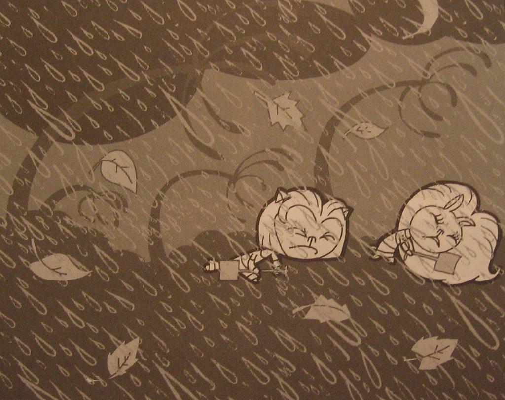
Interestingly, the issue is sprinkled with other humorous tidbits, including the "advertisement" at the top of this entry, a Dennis the Menace style strip featuring a mischievous young Jesus, and Mike Robot, Action Robot!, an interesting exploitation on the quirks of modern adventure strips, utilizing the Wile E. Coyote/Road Runner motif with a robot/jealous human brother twist. I enjoyed these supplementals more than the issue's feature story, but to each his own, I say. Hey, some like sizzling Smarties on their tongue with Mountain Dew. Others pop Bottle Caps and Sprite. In the end, the result is the same. Whether or not it was worth it, though, is another matter entirely . . .
Tuesday, December 26, 2006
Fables #56
Fables #56, February 2007, Vertigo/DC Comics
writer: Bill Willingham
penciller: Mark Buckingham
inker: Steve Leialoha, Mark Buckingham, & Andrew Depoy
colorist: Lee Loughridge
letterer: Todd Klein
assistant editor: Angela Rufino
editor: Stelly Bond
Tonight concludes my slew of Christmas-themed comic book reviews, a series that was initially difficult to initiate, as I usually scour back issue bins for A Comic A Day fodder. I know plenty of holiday comics exist, but for the issues I haven't read or own, their seasonal timeliness (and timelessness) hardly warrants abandonment in a quarter or dollar box. That's a fancy way of saying that people value Christmas comics, so they're usually quickly dubbed classics and snatched with a tenacity that will assure their rarity in later years. For instance, I know of a few '70s Detective Comics that took place around Christmastime, that placed the stark shadow of the "Darknight Detective" against a white-blanketed Gotham City, with a heart-warming twist (probably courtesy of Denny O'Neil) that made the read a worthy holiday offering. (A Batman companion book I have at home circa the late '80s/early '90s I have reprints a few pages from an old story that features the Caped Crusader singing carols with the Gotham PD while the city enjoys an uncharacteristic crime-free Christmas night.) If I hadn't picked up the recent holiday specials from Marvel and Johnny DC, I wouldn't have had even twelve days of Christmas comics, if I even did in the first place. Still, from what I found, from the Hulk to the Teen Titans, each issue was charming enough to satisfy my holiday-loving inner child, and as a fanboy, I was thrilled to realize that even the Justice League has its own seasonal traditions, just like my family. Still, in the context of these iconic fables, I dare not forget the most memorable and universal myth of December 25th, the character that captures the heart of every child whether they read comics or not. No, I'm not talking about the baby Jesus. Of course, I'm talking about:
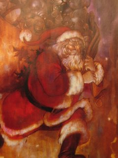
Yes, Santa Claus. This image is from the cover of Fables #56 by James Jean, a depiction so masterful that one could use if for a Christmas card, if family and friends didn't mind the subtle references to the series pouring out of St. Nick's sack. I haven't read much of Fables, but I have read plenty about it, and in fact, a non-comics-reading friend of mine recently commented that Fables was recommended to her by another fanboy. I was surprised that she knew another one, but also that this series was so highly acclaimed, particularly in the context of the other Vertigo classics cluttering the mainstream bookshelves out there. (Although, I must say because now is the time to do so, that I had a futile time finding the final Transmetropolitan trades for my brother at both Barnes & Noble and Borders, a surprising turn in my shopping adventures considering the collection's recent release and the other Vertigo books that make the cut for that coveted graphic novel shelf.) Anyway, this issue seems to stand as an interlude to the ongoing Fables saga, but these glimpses at the epic's major players was enough to tease any potential readers' tastebuds.
In this issue, we see Jack Horner for a snoop, Snow White for a housewife with a shady past desperate for normalcy, her sister Rose Red with Little Boy Blue (I presume) as mischievous twentysomethings that aren't afraid to act on impulse. Like I said, I haven't read the series, but the depictions are fairly transparent, unless Christmastime has thrown my impressions off completely. Of course, this issue features the most celebrated "fable" of all:
There he is again. (Pardon the crude image. I'm snapping stills without my scanner over here.) Of all of the holiday comics I've read, in the stories starring Santa, the jolly one is always treated with respect, even by the world's most powerful heroes. In Marvel handbook entry, Santa's "powers" are charted with the same consideration of their core characters, taking his speed and durability into account. In Fables, Willingham adds an interesting element to the myth; when one of Snow White's kids asks Santa how he accomplishes his one-night mission, Kringle essentially explains that he visits each deserving home simutaneously, as if for one night a multitude of Santas exist, not so much as dopplegangers, but as various aspects of the Santa persona, to fulfill all of his deliveries in as efficient a manner as possible. It's as good an explanation as any, especially in a world where childhood stories coexist with the humans that revere them. Santa is obviously serious about his mission, approaching the trespassing Jack Horner with a fire stoker like any old man would, but also retaining the jolliness and benevolence associated with his myth. Like any fable, Santa represents a story that has been told many times and many ways, but the result, the lesson, is always the same.
And what is the lesson of Santa Claus? Why are parents so insistent to convince their kids that a seemingly timeless character like Superman (who has at least existed as long as a majority of Earth's current population has lived, some 70 years) doesn't exist in a fantasyland called Metropolis, but yes, Virginia, St. Nick certainly lives in the North Pole, keeping tabs on your yearlong deeds to determine if you deserve toys on Jesus's birthday? Therein lies the answer, and coincidentally the point to our favorite comic book icons' vigilante heroism: as humans, we should be accountable for our actions, lest we threaten the safety and security of our fellow man. If you rob a bank, the Ben Grimm might shed his trechcoat and risk a chuckle or gasp from some rubbernecking onlooker to bring you to justice. If you lie to your parents, Santa might drop a lump of coal in your stocking. Different offenses, same concept. Really, Santa Claus predates Superman himself as Earth's mightiest superhero, avenging wrongdoing, and going beyond most Leaguers' or Titans' or Avengers' call of duty, actually rewarding good behavior. I mean, Santa travels from rooftop to rooftop -- which sounds pretty familiar to genre, if I do say so myself.
It's no wonder the big guy fits in so well with my childhood heroes. It's no wonder I don't think twice about Santa dwelling among the world's most renowned bedtime stories. Santa captures the best of both worlds with a story that will outlive them all. It's a shame his adventure is merely an annual one-shot . . .
Ho ho ho.
writer: Bill Willingham
penciller: Mark Buckingham
inker: Steve Leialoha, Mark Buckingham, & Andrew Depoy
colorist: Lee Loughridge
letterer: Todd Klein
assistant editor: Angela Rufino
editor: Stelly Bond
Tonight concludes my slew of Christmas-themed comic book reviews, a series that was initially difficult to initiate, as I usually scour back issue bins for A Comic A Day fodder. I know plenty of holiday comics exist, but for the issues I haven't read or own, their seasonal timeliness (and timelessness) hardly warrants abandonment in a quarter or dollar box. That's a fancy way of saying that people value Christmas comics, so they're usually quickly dubbed classics and snatched with a tenacity that will assure their rarity in later years. For instance, I know of a few '70s Detective Comics that took place around Christmastime, that placed the stark shadow of the "Darknight Detective" against a white-blanketed Gotham City, with a heart-warming twist (probably courtesy of Denny O'Neil) that made the read a worthy holiday offering. (A Batman companion book I have at home circa the late '80s/early '90s I have reprints a few pages from an old story that features the Caped Crusader singing carols with the Gotham PD while the city enjoys an uncharacteristic crime-free Christmas night.) If I hadn't picked up the recent holiday specials from Marvel and Johnny DC, I wouldn't have had even twelve days of Christmas comics, if I even did in the first place. Still, from what I found, from the Hulk to the Teen Titans, each issue was charming enough to satisfy my holiday-loving inner child, and as a fanboy, I was thrilled to realize that even the Justice League has its own seasonal traditions, just like my family. Still, in the context of these iconic fables, I dare not forget the most memorable and universal myth of December 25th, the character that captures the heart of every child whether they read comics or not. No, I'm not talking about the baby Jesus. Of course, I'm talking about:

Yes, Santa Claus. This image is from the cover of Fables #56 by James Jean, a depiction so masterful that one could use if for a Christmas card, if family and friends didn't mind the subtle references to the series pouring out of St. Nick's sack. I haven't read much of Fables, but I have read plenty about it, and in fact, a non-comics-reading friend of mine recently commented that Fables was recommended to her by another fanboy. I was surprised that she knew another one, but also that this series was so highly acclaimed, particularly in the context of the other Vertigo classics cluttering the mainstream bookshelves out there. (Although, I must say because now is the time to do so, that I had a futile time finding the final Transmetropolitan trades for my brother at both Barnes & Noble and Borders, a surprising turn in my shopping adventures considering the collection's recent release and the other Vertigo books that make the cut for that coveted graphic novel shelf.) Anyway, this issue seems to stand as an interlude to the ongoing Fables saga, but these glimpses at the epic's major players was enough to tease any potential readers' tastebuds.
In this issue, we see Jack Horner for a snoop, Snow White for a housewife with a shady past desperate for normalcy, her sister Rose Red with Little Boy Blue (I presume) as mischievous twentysomethings that aren't afraid to act on impulse. Like I said, I haven't read the series, but the depictions are fairly transparent, unless Christmastime has thrown my impressions off completely. Of course, this issue features the most celebrated "fable" of all:
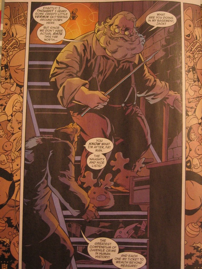
There he is again. (Pardon the crude image. I'm snapping stills without my scanner over here.) Of all of the holiday comics I've read, in the stories starring Santa, the jolly one is always treated with respect, even by the world's most powerful heroes. In Marvel handbook entry, Santa's "powers" are charted with the same consideration of their core characters, taking his speed and durability into account. In Fables, Willingham adds an interesting element to the myth; when one of Snow White's kids asks Santa how he accomplishes his one-night mission, Kringle essentially explains that he visits each deserving home simutaneously, as if for one night a multitude of Santas exist, not so much as dopplegangers, but as various aspects of the Santa persona, to fulfill all of his deliveries in as efficient a manner as possible. It's as good an explanation as any, especially in a world where childhood stories coexist with the humans that revere them. Santa is obviously serious about his mission, approaching the trespassing Jack Horner with a fire stoker like any old man would, but also retaining the jolliness and benevolence associated with his myth. Like any fable, Santa represents a story that has been told many times and many ways, but the result, the lesson, is always the same.
And what is the lesson of Santa Claus? Why are parents so insistent to convince their kids that a seemingly timeless character like Superman (who has at least existed as long as a majority of Earth's current population has lived, some 70 years) doesn't exist in a fantasyland called Metropolis, but yes, Virginia, St. Nick certainly lives in the North Pole, keeping tabs on your yearlong deeds to determine if you deserve toys on Jesus's birthday? Therein lies the answer, and coincidentally the point to our favorite comic book icons' vigilante heroism: as humans, we should be accountable for our actions, lest we threaten the safety and security of our fellow man. If you rob a bank, the Ben Grimm might shed his trechcoat and risk a chuckle or gasp from some rubbernecking onlooker to bring you to justice. If you lie to your parents, Santa might drop a lump of coal in your stocking. Different offenses, same concept. Really, Santa Claus predates Superman himself as Earth's mightiest superhero, avenging wrongdoing, and going beyond most Leaguers' or Titans' or Avengers' call of duty, actually rewarding good behavior. I mean, Santa travels from rooftop to rooftop -- which sounds pretty familiar to genre, if I do say so myself.
It's no wonder the big guy fits in so well with my childhood heroes. It's no wonder I don't think twice about Santa dwelling among the world's most renowned bedtime stories. Santa captures the best of both worlds with a story that will outlive them all. It's a shame his adventure is merely an annual one-shot . . .
Ho ho ho.
Monday, December 25, 2006
The Best of DC: Christmas with the Super Heroes, vol. 4 no. 22
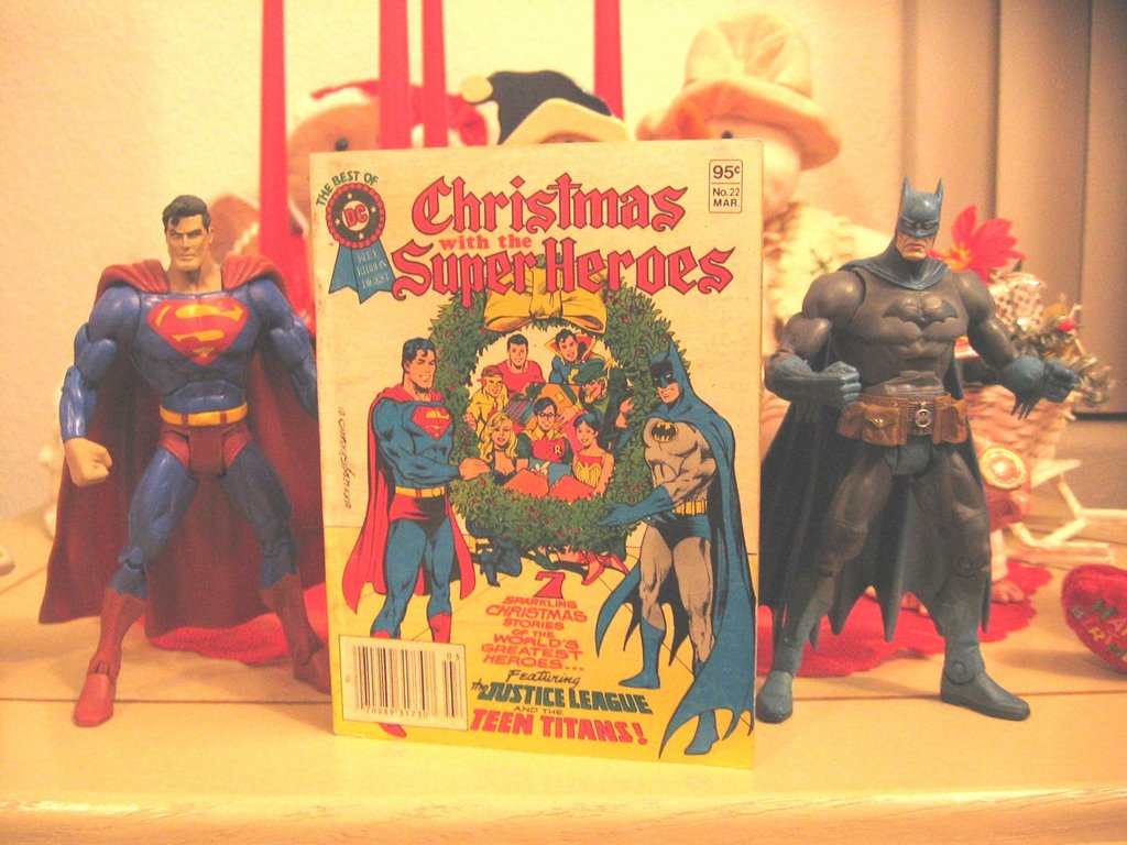
The Best of DC: Christmas with the Super Heroes, vol. 4 no. 22, March 1982
various contributors
editor: Julius Schwartz
Merry Christmas! Yesterday, I took a look at how Marvel celebrates the holidays. Today, I took a look at DC's yuletide offering from years past, starring the Teen Titans, the Justice League, Captain Marvel, Jr., and the Sandman. The collection features a never-before-published Jack Kirby tale, in which the classic Sandman saves Santa from a renegade band of Seal Men, and a Silver Age Batman story, in which the dynamic duo saves a young heir from future Scrooge-itis. Considering the recent JLU and Teen Titans Go! issues I read last week, this comprehensive look at a comics' Christmas was interesting and heart-warming. Simpler times, when superheroes fought to preserve the traditions we all secretly hope to maintain this time of year.
Tonight, we're starting a new tradition, with my second most compelling passion, aside from comics: karaoke. A Karaoke Christmas? I smell a LiveJournal entry brewing . . .
Sunday, December 24, 2006
Marvel Holiday Special 2006 #1
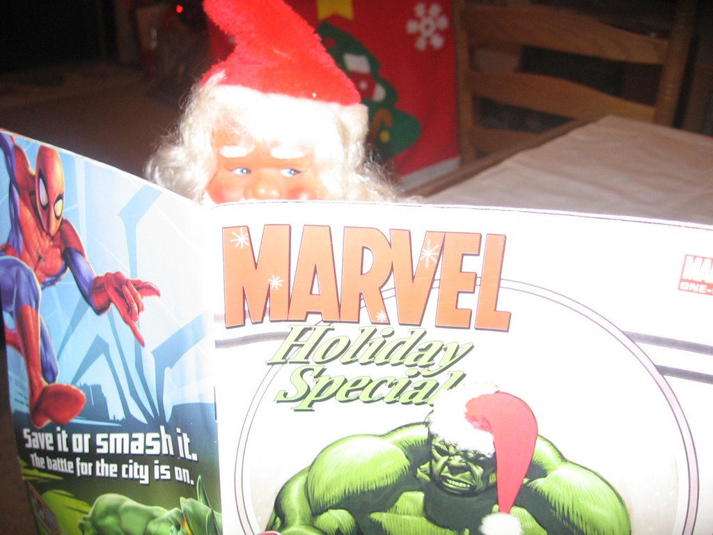 Marvel Holiday Special 2006 #1, February 2007, Marvel Comics
contributors: Andrew Farago, Shaenon Garrity, Ron Lim, Pat Davidson, Dave Lanphear, Scott Gray, Roger Landridge, Mike Carey, Mike Perkins, Jeff Christiansen, Sotocolor's A. Street & J. Brown
Thus far, my holiday trip to Arizona has been marvelous, in more ways than one. When I rolled into my native Peoria, I visited the 24-hour Wal-Mart Supercenter (a tradition I began quite a few years ago), and discovered several toy pegs full of brand new Spider-man Origins action figures. I haven't picked up my choices from the line yet (Dr. Octopus, Demogoblin, the Rhino, and Secret Wars Spider-man, if you must know), but the birthday money burning a hole in my pocket will soon make my Christmas wish come to pass, believe me. Despite popular opinion, it pays to have a birthday so close to the Christ's.
The other yuletide "marvel" I experienced today is the Marvel Holiday Special, depicted above with a certain rosy-cheeked saint. Even Santa has time to read a comic in the midst of his busy Christmas Eve schedule. This issue offered a nice variety of holiday offerings, from a tale starring Dr. Strange's assistant Wong and the humbled, embittered dragon lord Fin Fang Foom, who begrudgingly saves a winterland New York from a Hydra invasion, to a story featuring the Thing and Annihilus, written and drawn with the charm of a storybook fairy tale, and with an unlikely ending just as heart warming. The entire packaged is laced with brief chapters in an ongoing story about the Advanced Idea Mechanics (A.I.M.) New Year's party, and the unwitting date that suffers onslaughts from the Hulk for the sake of a mistletoe smooch from his peculiarly hot date. Talk about a Christmas miracle.
The Official Handbook of the Marvel Universe entry about Santa Claus was the icing on the cake of this holiday package, with cut-out ornaments and a past cover gallery to imply a sense of holiday history from the House of Ideas. I dug it. With most of their characters entrenched in the Civil War storyline, it was nice to approach these icons without that baggage, with the continuity of Christmas as the only -- albeit welcome -- consideration. With a few movies slated to hit the theaters in '07, next year is going to be a marvelous one, for sure. For me, it's started early.
Saturday, December 23, 2006
Betty & Veronica Spectacular #76
Betty & Veronica Spectacular #76, January 2007, Archie Comic Publications
writers: Dan Parent, Mike Pellowski
artists: Dan Parent, Rich Koslowski
letterer: Jack Morelli
colorist: Barry Grossman
editor: Victor Gorelick
EIC: Richard Goldwater
Reading this holiday issue of Betty & Veronica Spectacular, I realized just how dysfunctional the romantic concept in Archie comics have been. The girls seem to be the best of friends, walking the halls of Riverdale High and shopping together, but at the very mention of Archie, or at the sight of another cute boy, the “BFFs” are at each others’ throats in a treacherous quest for date night domination. Even Christmas couldn’t keep these vixens from their futile feud, as this installment reveals . . .
The two short stories in this issue are amusing enough, the first one more so than the second. In the first, a disgruntled elf boycotts Santa’s harsh working conditions by transforming himself into a cute Riverdale student to reap the benefits of Archie’s polygamist-like dating lifestyle. Sure enough, Betty and Veronica battle for the new student’s affections, and therein pushes the elf-turned-teen away, back to the North Pole, realizing that Archie’s life isn’t all it’s cracked up to be. In the second story, Betty and Veronica spot Archie at the mall and assume he’s Christmas shopping for them, but when the large portrait he picks up at the photo shop turns out to be for his mom, the girls are both relieved (the gift is egotistical, the girls ironically comment) but still zealous about what their respective gifts could be. If these stories weren’t so light-hearted, they’d be fodder for a Jerry Springer pay-per-view.
What amazed me about this issue is how much post-production went into the artwork. The pages were drawn decently, but the coloring utilizes the best technological techniques around, including the ability to transform the hues of inked lines to create a more lifelike look. The cover itself is nothing more than a sketch with a slew of clip art snowflakes and teaser blurbs, understandably creating the impression of a magazine for girls. The fashion and shopping pin-up pages obviously went over my head, not because of its content, but because of its appeal. Yeah, I think girls would best get this issue, not to mention the whole Betty and Veronica thing. This is a good example of how it takes one to know one.
Now, to hit the road to Arizona. Tomorrow: more holiday comic book goodness.
writers: Dan Parent, Mike Pellowski
artists: Dan Parent, Rich Koslowski
letterer: Jack Morelli
colorist: Barry Grossman
editor: Victor Gorelick
EIC: Richard Goldwater
Reading this holiday issue of Betty & Veronica Spectacular, I realized just how dysfunctional the romantic concept in Archie comics have been. The girls seem to be the best of friends, walking the halls of Riverdale High and shopping together, but at the very mention of Archie, or at the sight of another cute boy, the “BFFs” are at each others’ throats in a treacherous quest for date night domination. Even Christmas couldn’t keep these vixens from their futile feud, as this installment reveals . . .
The two short stories in this issue are amusing enough, the first one more so than the second. In the first, a disgruntled elf boycotts Santa’s harsh working conditions by transforming himself into a cute Riverdale student to reap the benefits of Archie’s polygamist-like dating lifestyle. Sure enough, Betty and Veronica battle for the new student’s affections, and therein pushes the elf-turned-teen away, back to the North Pole, realizing that Archie’s life isn’t all it’s cracked up to be. In the second story, Betty and Veronica spot Archie at the mall and assume he’s Christmas shopping for them, but when the large portrait he picks up at the photo shop turns out to be for his mom, the girls are both relieved (the gift is egotistical, the girls ironically comment) but still zealous about what their respective gifts could be. If these stories weren’t so light-hearted, they’d be fodder for a Jerry Springer pay-per-view.
What amazed me about this issue is how much post-production went into the artwork. The pages were drawn decently, but the coloring utilizes the best technological techniques around, including the ability to transform the hues of inked lines to create a more lifelike look. The cover itself is nothing more than a sketch with a slew of clip art snowflakes and teaser blurbs, understandably creating the impression of a magazine for girls. The fashion and shopping pin-up pages obviously went over my head, not because of its content, but because of its appeal. Yeah, I think girls would best get this issue, not to mention the whole Betty and Veronica thing. This is a good example of how it takes one to know one.
Now, to hit the road to Arizona. Tomorrow: more holiday comic book goodness.
Friday, December 22, 2006
Teen Titans Go! #37

Teen Titans Go! #37, January 2007, DC Comics
writer: J. Torres
artist: Sean Galloway
letterer: John J. Hill
editor: Tom Palmer, Jr.
The cover of Teen Titans Go! #37 really spoke to me. Really. Silkie, Starfire’s caterpillar-like alien pet, donning the magical villain Mumbo’s enchanted top hat, is happily exclaiming, “Happy Birthday,” and, well, today is my birthday. I picked up this issue a few weeks ago in anticipation of reading it today, and I must say, as a superhero fan and a general viewer of the now cancelled Teen Titans animated series, this story was a pleasant treat. First of all, any avid readers of A Comic A Day must know by now that I’m a holiday nut, and this story is narrated in rhythmic rhyme akin to The Night Before Christmas. Secondly, when Mumbo’s hat blows onto Silkie’s head, and the heretofore mute slug utters his happy birthday proclamation, Starfire, even in the face of her glee, doesn’t actually acknowledge that it is her birthday. In fact, as it’s the day the after Christmas, such a plot device is highly unlikely. So, to whom is Silkie sending his best wishes? Hmm? Like I said, Teen Titans Go! #37 really spoke to me.
Yesterday’s read, the similarly holiday themed Justice League Unlimited #28, also appealed to my childlike sensibilities with its clever cover blurb, “Deck the Hall . . . of Justice!” The combination of the Christmas catchphrase and the old Super Powers reference was a synthesis of utterly guiltily pleasurable proportions. Further, these two issues read back to back offer an insight into the Johnny DC imprint, DC’s attempt to target a younger audience primarily through the franchises that crossover with successful television series, i.e. Scooby-Doo, Looney Tunes, and their Cartoon Network anthology titles. These two issues feature single-issue stories, with little more than the readers’ interest in the characters as an incentive to drop in and out of the series.
Further, the artistic style utilized in these titles is sharp and distinctive, formatting the Bruce Timm standard into an expressionist explosion of graphic energy that only kids could follow without the scrutiny of a magnifying glass. The opening splash page of JLU #28 is a meticulous montage of Christmas paraphernalia, all in the wake of Clayface’s attack on the Flash. I didn’t realize the depth of this image until I reread the issue, and many panels throughout the issue offer similar detail. The artists’ use of varying line widths really emphasize the important elements in each panel, while conversely drawing the eye to the equally fervent but intentionally understated background. Teen Titans Go! implements a slightly different technique, actually experimenting with a rack focus filter, as if some particular panels were still-frames from a Teen Titans episode. Although the effect conveys depth, Sean Galloway’s minimalist but expressive art style is lost in the fuzz. Silkie could probably attest after his brief stint as a speaker, it doesn’t matter what you say if it isn’t spoken clearly enough for folks to understand.
Most importantly, cover blurbs and frivolous imprints aside, these issues have something else in common: both of them incorporate classical Christmas myths into the modern legend of our favorite animated heroes. In the JLU, the Phantom Stranger gives the Flash a Ghost-of-Christmas-Past-like tour of Batman’s troubled childhood, and in Teen Titans Go!, the magic top hat motif has Frosty the Snowman written all over it. One can only assume that some kid somewhere is experiencing these holiday mainstays for the first time, thanks to these issues. Each legend makes the other relevant, in their own charming, unique way. You know, when I purchased Justice League Unlimited #28, along with tomorrow’s Betty & Veronica holiday special, at Borders a few nights ago, the clerk smirked and asked if the comics were for me. I may be a year older, but I’ll never be too old for this stuff, even if Johnny DC speaks to kids. Hey, this time, he spoke to the kid in me. Christmastime can have that effect on people.
Thursday, December 21, 2006
Justice League Unlimited #28
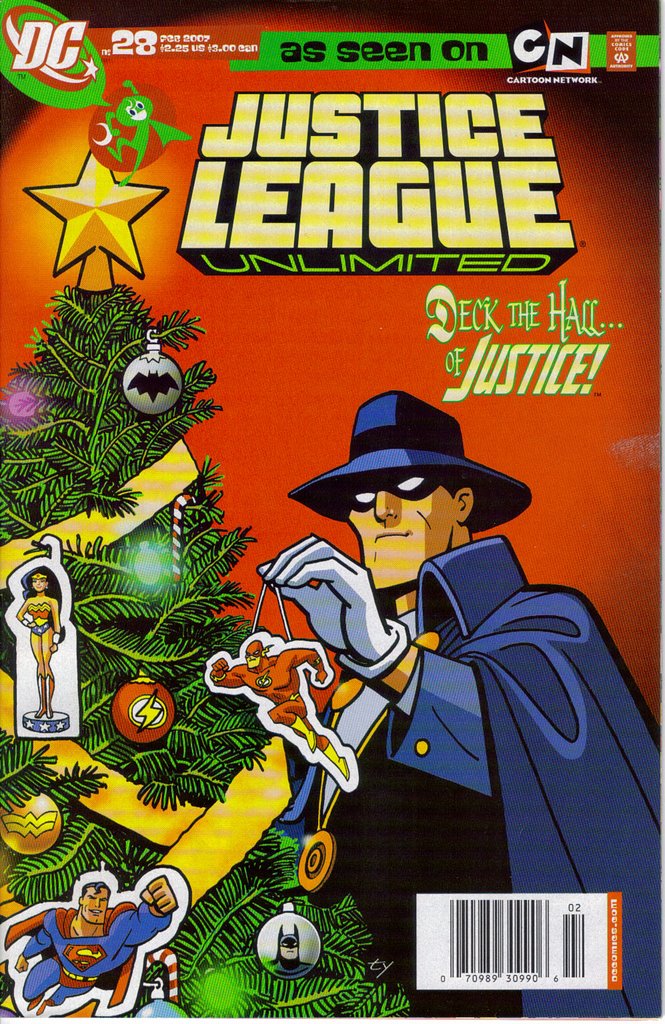
Justice League Unlimited #28, February 2007, DC Comics
writer: Mike McAvennie
penciller: Sanford Greene
inker: Nathan Messengill
colorist: Heroic Age
letterer: John J. Hill
editor: Michael Wright
In this Christmas adventure, the Flash gains valuable insight into Batman's "Scrooginess" thanks to the spectral guidance of the Phantom Stranger. This is a standard, heart-warming story that will stand on its own two legs when I compare it to other DCU holiday tales later this week. I will say that the Greene/Massengill team presents a crisp representation of my favorite heroes, particularly in their animated incarnations. That's a Christmas treat in itself!
Subscribe to:
Posts (Atom)