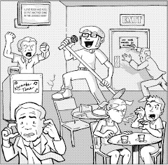
Knight Watchman #1, June 1998, Image Comics
writers: Chris Ecker& Gary Carlson
artists: Ben Torres & John Thompson with Mark Lewis
If superheroes have demonstrated any super power, it's endurance, not against bullets or laser beams but against the tumultuous trends of the entertainment industry. Superheroes have survived our country's Great Depression, a world war, a civil right revolution, and most recently, a saturation of pop culture in which fads or trends exist merely on a five day cycle, thanks in grand part to Vh-1's ability to succinctly summarize and subsequently dismiss mass media melees with the in-depth analysis of embittered comedians on their Friday night clip fest Best Week Ever. (I'm digressing; I actually like that show.) Unlike the flash-in-the-pan phenomena Michael Ian Black and company whine about weekly, Knight Watchman #1 attempts to establish a longevity, to lay down some roots and present a permanence with its readership that reflects the strength of its genre's endurance. Unfortunately, laying down roots doesn't automatically entail that the soil isn't too shallow to let them grow.
I'll explain what I mean. In Knight Watchman #1, the hero by the same name comes out of his five year retirement when his sidekick/successor and the city's mayor are injured in an assassination attempt, and the new acting mayor is entrenched in a political conspiracy with the duo's old nemesis the Pink Flamingo. The Watchman isn't aware of these events brewing behind the scenes yet, though, as he gets back into the swing of vigilantism by busting a few would-be muggers and rapists. When, in his fatigue, he decides to intercepts a gang of thieves after they swipe their victim's purse, he watches the helpless women get shot before he can react, a violent and tragic act that ignites his fury. Generally speaking, while this issue isn't the first appearance of these characters, who are alumni of Ecker and Carlson's Big Bang Comics (reviewed here back in late November), it successfully establishes their personalities, conflicts, and the general mood of the series.
Unfortunately, the extremely derivative visuals completely rob the story of any semblance of originality. In fact, for all of the titles I've reviewed that have blatantly swiped concepts, ideas, or illustration layouts from other series, this issue is the worst.
I don't have to tell you that the Knight Watchman is Batman, and that the circumstances surrounding his return mimic the concepts from the first act of Miller's The Dark Knight Returns. I could even appreciate a series that attempts to explore the comprehensive consequences of an old man acting as a superhero, especially when that honeymoon period is over and the thrill gives way to aching muscles and inevitable injury. Old men may not have the strength they boasted in their youth, but more importantly, they don't have the immunity systems they used to, either, and in my opinion for all of its diversity the superhero community has rarely included a legitimate senior citizen in its ranks. (Even original members of the Justice Society have experienced age-affecting phenomena to keep them younger than they ought to be!) While the writers of this series may have intended to take the Watchman in that direction, artist Ben Torres totally succumbs to the genre's overtones and obviously swipes artists' old layouts and designs for this issue. On more than one page, in more than one panel, I recognize layout and blocking techniques that look exactly like material from other comics! You can lay the panels on top of each other on a light desk and barely tell them apart! With all of the comics I've read during the A Comic A Day challenge, I've accepted that some character archetypes (Superman, Batman, and Captain America, mostly) are often the inspiration for future interpretations, but a blatant swipe of other artists' work? It seems unnecessary and inexcusable to me.
Erik Larson of Savage Dragon fame recently wrote an article about "swiping" for Comic Book Resources. Larson has worked with Carlson on many projects in the past, and I recognize some Dragon swipes in these pages. Does he know he's a victim of his own controversial convictions, presumably at the hands of a friend?
The line between homage and swipe is a fine one in today's competitive market. Many professionals have opted to write homages (rather than attempt to establish their own voice) because the source material is a proven success -- so why wouldn't modern interpretations experience similar success. Alas, I don't consider Savage Dragon #4 the kind of classic that warrants an homage; it was an entertaining issue, but the Knight Watchman leaping in the same pose as the Dragon is just a lazy swipe. See, the thing about the staying power of superheroes is that many of these iconic characters have stood the test of time on their own two feet. Heroes that try to ride the capes of their predecessors usually just can't hang on. Tomorrow's issue will help us explore this concept further, so I'll bite my tongue for now.
I wonder if these writers and artists thought to bite their proverbial tongues, too -- lest their mimicry invite this kind of critique.
Monday, April 09, 2007


Sunday, April 08, 2007
Concrete: Killer Smile #2
Concrete: Killer Smile #2, August 1994, Dark Horse Comics
writer/artist: Paul Chadwick
colorist: Elizabeth Chadwick
art assistance: Jed Hotchkiss
letterer: Bill Spicer
editor: Randy Stradley
"And behold, a severe earthquake had occurred, for an angel of the Lord descended from heaven and came and rolled away the stone and sat upon it." -- Matthew 28:2
While that tomb obstructing stone may be the most popular to ponder on a day like Easter, the comic book medium has a few rockin' characters of its own: the Thing, Cinderblock, Badrock (or whatever Liefeld's successors are calling that guy these days). However, none of them are as thought-provoking as Concrete, Paul Chadwick's behemoth-with-a-heart-of-gold indie comics darling. In this miniseries Killer Smile, Concrete's assistant Larry is a hostage in his own car, at the mercy of a gas station robber and his hapless girlfriend. In Chadwick's supplemental essay, he explains a kinship with this story, a sense of his vulnerability in an ever increasingly dangerous world. The minutia of this issue's plot is what infuses it with charm but undeniable "what would I do" introspection, as Larry spends a whole page wondering how to signal an adjacent cop with his hand, obscuring from his attacker's point of view. (Incidentally, he flips the cop off, which sparks the rest of the issue's tumultuous events. Beats my idea to tap the driver's side door with a Morse code SOS, if the officer would even recognize that!) Meanwhile, when Concrete catches wind of his friend's situation, he tries his best to defend his assistant with the police, who assume everyone in Larry's truck is a suspect, while attempting to find him, if only his girth didn't slow him down. Quite a message for Easter, to put a friend's life ahead of your own. Some rocks simply cannot be moved, no matter what day it is. Happy Easter.
writer/artist: Paul Chadwick
colorist: Elizabeth Chadwick
art assistance: Jed Hotchkiss
letterer: Bill Spicer
editor: Randy Stradley
"And behold, a severe earthquake had occurred, for an angel of the Lord descended from heaven and came and rolled away the stone and sat upon it." -- Matthew 28:2
While that tomb obstructing stone may be the most popular to ponder on a day like Easter, the comic book medium has a few rockin' characters of its own: the Thing, Cinderblock, Badrock (or whatever Liefeld's successors are calling that guy these days). However, none of them are as thought-provoking as Concrete, Paul Chadwick's behemoth-with-a-heart-of-gold indie comics darling. In this miniseries Killer Smile, Concrete's assistant Larry is a hostage in his own car, at the mercy of a gas station robber and his hapless girlfriend. In Chadwick's supplemental essay, he explains a kinship with this story, a sense of his vulnerability in an ever increasingly dangerous world. The minutia of this issue's plot is what infuses it with charm but undeniable "what would I do" introspection, as Larry spends a whole page wondering how to signal an adjacent cop with his hand, obscuring from his attacker's point of view. (Incidentally, he flips the cop off, which sparks the rest of the issue's tumultuous events. Beats my idea to tap the driver's side door with a Morse code SOS, if the officer would even recognize that!) Meanwhile, when Concrete catches wind of his friend's situation, he tries his best to defend his assistant with the police, who assume everyone in Larry's truck is a suspect, while attempting to find him, if only his girth didn't slow him down. Quite a message for Easter, to put a friend's life ahead of your own. Some rocks simply cannot be moved, no matter what day it is. Happy Easter.
Saturday, April 07, 2007
First World #2
First World #2, July 2001, Dragon Candy Productions
by Philip Bourassa
inker (pages 22-25): Andrew Strawder
producer/director: Binh Tran
On vacation for the Easter holiday, so First World #2 gets the "bottom line" treatment, which is fitting anyway, since its story is already entrenched in its own medieval continuity. With only one issue behind it, First World didn't hesitate to establish its plot's momentum, but its strongest element is by far the art. If Philip Bourassa isn't working for one of the bigger publishers by now (or didn't during this series), he soon will; his style looks like Mike Wieringo's, with cartoony expressionism and varied linework to highlight background details. When I'm back behind my scanner, I may post a page from this issue and a Wieringo work to compare, not that the similarities take away from the book. In fact, with such a "in" story, it was nice to have a referential point. First World truly starts from its own beginnings, with a presumably illustrious career in store for its creative team.
by Philip Bourassa
inker (pages 22-25): Andrew Strawder
producer/director: Binh Tran
On vacation for the Easter holiday, so First World #2 gets the "bottom line" treatment, which is fitting anyway, since its story is already entrenched in its own medieval continuity. With only one issue behind it, First World didn't hesitate to establish its plot's momentum, but its strongest element is by far the art. If Philip Bourassa isn't working for one of the bigger publishers by now (or didn't during this series), he soon will; his style looks like Mike Wieringo's, with cartoony expressionism and varied linework to highlight background details. When I'm back behind my scanner, I may post a page from this issue and a Wieringo work to compare, not that the similarities take away from the book. In fact, with such a "in" story, it was nice to have a referential point. First World truly starts from its own beginnings, with a presumably illustrious career in store for its creative team.
Friday, April 06, 2007
Painkiller Jane #0
Painkiller Jane #0, April 2007, Dynamite Entertainment
writer: Jimmy Palmiotti
artist: Lee Moder
colorist: Chris Garcia
letterer: Simon Bowland
creators: Jimmy Palmiotti & Joe Quesada
Priced at an irresistible twenty-five cents, Painkiller Jane #0 (volume 2) was published just for me: the comic book reader that has heard of the character, has been intrigued by the concept, but has had little motivation to pursue the title without more incentive. A quarter price tag is motivation enough -- a marketing concept that began with Batman's Ten Cent Adventure back when Bruce Wayne became a fugitive, then time and again for Superman, Daredevil, the Fantastic Four, and just recently Devil's Due Publishing's Sheena, Queen of the Jungle 99 Cent Special, another female character I wouldn't have pursued had the price not been right. This phenomenon evokes a nostalgia for when I first began collecting, when a fresh copy of Amazing Spider-man cost a dollar and venturing into new series wasn't the financial investment it is today. Were all comics really only twenty-five cents a mere thirty years ago? To think, our fanboy predecessors used to fondly remember the days of a dime!
Alas, like any addict, today's comic book fan usually doesn't think twice about coughing up his hard-earned cash for a fix, and in this case, it's nice to chase the drain with a little painkiller . . .
In my opinion, Dynamite Entertainment is on its way to becoming a significant contender in the comic book publishing industry, securing the rights to several hot properties, and most importantly handling and presenting them respectfully. Dynamite's The Lone Ranger series had me at "howdy," and I've never been a fan of Western comics, let alone the Lone Ranger character. While Painkiller Jane #0 didn't have as compelling an effect, I'm definitely more interested in the character than ever before, and I may even shell out the $2.99 for her first full fledged issue. (This post has become less of a review and more of a confession of my self-imposed poverty, but I digress . . .) Off the shelf, I had three covers to choose from, and I opted for Ron Adrian's, which betrays shades of George Perez through a Jim Lee lens. Also, I couldn't help but notice the "Now a Sci-Fi Original TV Series" brand, a project I've been casually following at Comic Book Resources, but that ultimately explains the character's relaunch. In her case, quite literally, it never hurts to try again.
This issue begins with (Spoiler alert! Skip this paragraph to spare yourself the details!) a gratuitous shot of Jane's rear end as she compromises her tattoo parlor stake-out to get some ink done, but more importantly a closer look at her quarry, apparently an undercover den of gun-dealing scum. Jane assures us that her tattoo isn't permanent, as her body rejects foreign agents like lead-based ink and, more commonly, lead-based bullets. Thanks to the inside cover's brief origin synopsis, I know that Jane was once a cop unwillingly subjected to an experimental drug that eventually imbued her with invulnerability to pain, which vaguely but fondly reminds me of my favorite Marvel B-listers Cloak & Dagger. (I'm onto you, Quesada.) Thus, when Jane gets caught in the crossfire between a tattoo-clamoring bank robber, the gun dealers, and the cops, I'm not too concerned for our heroine's safety. Nor does the parlor's explosion at the end of this issue (a cliffhanger for issue #1) grip me as intended; sure, the collateral damage is great, but ultimately, this #0 was just a set-up for the character and her new adventures. She's hot and invincible. I get it. Like every other chick I couldn't afford to date in high school.
Palmiotti's writing is briskly paced -- an eight page story would have to be to make some sort of connection with its readership. Still, since all eight pages take place in a tattoo shop, a presumably detail-oriented challenge for capable artist Lee Moder (who deserves but is denied as much cover credit as Palmiotti and Quesada) the extended sequence is deceptively episodic thanks to the periodic introduction of varied characters, each presumably representative of the usual cast Painkiller Jane encounters in her line of work. While Jane's narration is a bit tedious at times, embittered commentary laced with a no-duh narration, the insight reveals that her persona is just as tough to impress as her skin. A lifetime of getting shot and blown up kind of eases the tension of a precariously dangerous situation, I guess, therefore, the true challenge for her creators is established situations that make her jump. That widen her eyes with the wonder of "how will I get out of this one." As readers, we can't be too concerned for the hero if the hero is remotely concerned about himself (which is why I've enjoyed the first, Kryptonite-centric arc of Superman: Confidential.) Then again, if all of her forays are as propellant as this one, Painkiller Jane might not even have time to blink, let alone think of the trouble that often finds her.
Ah, and therein we find the solution to my initial dilemma. If a comic book series keeps you coming back for more, if it takes you on a rollercoaster ride that, at the end of every issue, makes you exclaim, "Let's go again," you will pay the price of admission irregardless. If Dynamite's Painkiller Jane is just beginning to chug up the tracks, I'll definitely check it out again, especially since this fresh start is the groundfloor of both her new comic book series and forthcoming TV show. Sure, spending twenties of dollars on comic books every week kind of hurts, but a good story is really the best painkiller . . . and a little inexpensive cross-promotion never hurt anybody.
writer: Jimmy Palmiotti
artist: Lee Moder
colorist: Chris Garcia
letterer: Simon Bowland
creators: Jimmy Palmiotti & Joe Quesada
Priced at an irresistible twenty-five cents, Painkiller Jane #0 (volume 2) was published just for me: the comic book reader that has heard of the character, has been intrigued by the concept, but has had little motivation to pursue the title without more incentive. A quarter price tag is motivation enough -- a marketing concept that began with Batman's Ten Cent Adventure back when Bruce Wayne became a fugitive, then time and again for Superman, Daredevil, the Fantastic Four, and just recently Devil's Due Publishing's Sheena, Queen of the Jungle 99 Cent Special, another female character I wouldn't have pursued had the price not been right. This phenomenon evokes a nostalgia for when I first began collecting, when a fresh copy of Amazing Spider-man cost a dollar and venturing into new series wasn't the financial investment it is today. Were all comics really only twenty-five cents a mere thirty years ago? To think, our fanboy predecessors used to fondly remember the days of a dime!
Alas, like any addict, today's comic book fan usually doesn't think twice about coughing up his hard-earned cash for a fix, and in this case, it's nice to chase the drain with a little painkiller . . .
In my opinion, Dynamite Entertainment is on its way to becoming a significant contender in the comic book publishing industry, securing the rights to several hot properties, and most importantly handling and presenting them respectfully. Dynamite's The Lone Ranger series had me at "howdy," and I've never been a fan of Western comics, let alone the Lone Ranger character. While Painkiller Jane #0 didn't have as compelling an effect, I'm definitely more interested in the character than ever before, and I may even shell out the $2.99 for her first full fledged issue. (This post has become less of a review and more of a confession of my self-imposed poverty, but I digress . . .) Off the shelf, I had three covers to choose from, and I opted for Ron Adrian's, which betrays shades of George Perez through a Jim Lee lens. Also, I couldn't help but notice the "Now a Sci-Fi Original TV Series" brand, a project I've been casually following at Comic Book Resources, but that ultimately explains the character's relaunch. In her case, quite literally, it never hurts to try again.
This issue begins with (Spoiler alert! Skip this paragraph to spare yourself the details!) a gratuitous shot of Jane's rear end as she compromises her tattoo parlor stake-out to get some ink done, but more importantly a closer look at her quarry, apparently an undercover den of gun-dealing scum. Jane assures us that her tattoo isn't permanent, as her body rejects foreign agents like lead-based ink and, more commonly, lead-based bullets. Thanks to the inside cover's brief origin synopsis, I know that Jane was once a cop unwillingly subjected to an experimental drug that eventually imbued her with invulnerability to pain, which vaguely but fondly reminds me of my favorite Marvel B-listers Cloak & Dagger. (I'm onto you, Quesada.) Thus, when Jane gets caught in the crossfire between a tattoo-clamoring bank robber, the gun dealers, and the cops, I'm not too concerned for our heroine's safety. Nor does the parlor's explosion at the end of this issue (a cliffhanger for issue #1) grip me as intended; sure, the collateral damage is great, but ultimately, this #0 was just a set-up for the character and her new adventures. She's hot and invincible. I get it. Like every other chick I couldn't afford to date in high school.
Palmiotti's writing is briskly paced -- an eight page story would have to be to make some sort of connection with its readership. Still, since all eight pages take place in a tattoo shop, a presumably detail-oriented challenge for capable artist Lee Moder (who deserves but is denied as much cover credit as Palmiotti and Quesada) the extended sequence is deceptively episodic thanks to the periodic introduction of varied characters, each presumably representative of the usual cast Painkiller Jane encounters in her line of work. While Jane's narration is a bit tedious at times, embittered commentary laced with a no-duh narration, the insight reveals that her persona is just as tough to impress as her skin. A lifetime of getting shot and blown up kind of eases the tension of a precariously dangerous situation, I guess, therefore, the true challenge for her creators is established situations that make her jump. That widen her eyes with the wonder of "how will I get out of this one." As readers, we can't be too concerned for the hero if the hero is remotely concerned about himself (which is why I've enjoyed the first, Kryptonite-centric arc of Superman: Confidential.) Then again, if all of her forays are as propellant as this one, Painkiller Jane might not even have time to blink, let alone think of the trouble that often finds her.
Ah, and therein we find the solution to my initial dilemma. If a comic book series keeps you coming back for more, if it takes you on a rollercoaster ride that, at the end of every issue, makes you exclaim, "Let's go again," you will pay the price of admission irregardless. If Dynamite's Painkiller Jane is just beginning to chug up the tracks, I'll definitely check it out again, especially since this fresh start is the groundfloor of both her new comic book series and forthcoming TV show. Sure, spending twenties of dollars on comic books every week kind of hurts, but a good story is really the best painkiller . . . and a little inexpensive cross-promotion never hurt anybody.
Thursday, April 05, 2007
The Masked Man #1
The Masked Man #1, December 1984, Eclipse Comics
by B.C. Boyer
From paper bags to Kevlar cowls, masks have played a critical role in superhero literature, which is an ironic characteristic as the founding father of the genre, Superman, didn't wear one. In fact, contrarily, Superman obscured his face in his civilian identity with Clark Kent's glasses, implying that his superhero identity is his primary mode, the one in which he feels the most natural and comfortable. The Man of Steel was certainly more public than Clark Kent, which explains the importance of obscuring one's identity in the first place; as proactive crimefighters, superheroes would be the inevitable target of attack, and subsequently their loved ones, as well. The mask offers a sense of safety -- the ability to save lives while preserving the sanctity of one's own.
The mask can have another effect, as well. If nobody know who you are, really, you can do anything you want. Wearing a mask (and getting away with it) is an instant all access pass for the id unleashed; therefore, the mask is also a test of your priorities. Do you wear the mask to fight crime, something you'd never do if folks knew it was you, or do you streak in the girls' locker room, something you probably shouldn't do either way. The Masked Man opts for the former, and in this first issue, we readers get a real sense of the white collar hero's integrity. Told from the perspective of a disillusioned fan/journalist, when this tale begins the Masked Man is introduced as a media pawn for a political hopeful. Interestingly, the Masked Man doesn't say a word throughout this issue, as the depressed fan recounts his first encounter with the vigilante, then we see the Man himself struggle with the mayor's lofty and manipulative plans. Finally, in that last culminating moment where the Masked Man has a decision to make, he speaks up, proclaiming a bold, inspiring war cry, "Suck . . . my . . . armpits!"
Okay, "Avengers Assemble!" it ain't, but it conjures just as much enthusiasm in the context of this story's tension. This issue reminded me of yesterday's anticlimactic Sheena adventure, rife with plenty of talking heads yet hardly any swinging fists. This issue's cover would lead one to believe that he's in for a modern swashbuckling wallop; alas, we don't even really see any armpit sucking. It's all captions and word balloons . . . which isn't a problem, mind, just an unexpected twist. If the Masked Man truly represents the common man, I wonder if the implication is that the common is more tough talk than anything.
This issue is not the first time we've seen the Masked Man in A Comic A Day. Like his appearance in Eclipse Monthly #1, this issue offers excellent insight into his company's mission in entertainment and his future as a hero of the people. Both the introductory and supplemental essays about the behind-the-scenes of the creative teams' inspirations reveals that, sometimes, the best practices in comics require no masks. Sometimes, we just want to read a comic book at face value. This comic book narrowly yet succinctly pulls it off . . . even with the mask on.
by B.C. Boyer
From paper bags to Kevlar cowls, masks have played a critical role in superhero literature, which is an ironic characteristic as the founding father of the genre, Superman, didn't wear one. In fact, contrarily, Superman obscured his face in his civilian identity with Clark Kent's glasses, implying that his superhero identity is his primary mode, the one in which he feels the most natural and comfortable. The Man of Steel was certainly more public than Clark Kent, which explains the importance of obscuring one's identity in the first place; as proactive crimefighters, superheroes would be the inevitable target of attack, and subsequently their loved ones, as well. The mask offers a sense of safety -- the ability to save lives while preserving the sanctity of one's own.
The mask can have another effect, as well. If nobody know who you are, really, you can do anything you want. Wearing a mask (and getting away with it) is an instant all access pass for the id unleashed; therefore, the mask is also a test of your priorities. Do you wear the mask to fight crime, something you'd never do if folks knew it was you, or do you streak in the girls' locker room, something you probably shouldn't do either way. The Masked Man opts for the former, and in this first issue, we readers get a real sense of the white collar hero's integrity. Told from the perspective of a disillusioned fan/journalist, when this tale begins the Masked Man is introduced as a media pawn for a political hopeful. Interestingly, the Masked Man doesn't say a word throughout this issue, as the depressed fan recounts his first encounter with the vigilante, then we see the Man himself struggle with the mayor's lofty and manipulative plans. Finally, in that last culminating moment where the Masked Man has a decision to make, he speaks up, proclaiming a bold, inspiring war cry, "Suck . . . my . . . armpits!"
Okay, "Avengers Assemble!" it ain't, but it conjures just as much enthusiasm in the context of this story's tension. This issue reminded me of yesterday's anticlimactic Sheena adventure, rife with plenty of talking heads yet hardly any swinging fists. This issue's cover would lead one to believe that he's in for a modern swashbuckling wallop; alas, we don't even really see any armpit sucking. It's all captions and word balloons . . . which isn't a problem, mind, just an unexpected twist. If the Masked Man truly represents the common man, I wonder if the implication is that the common is more tough talk than anything.
This issue is not the first time we've seen the Masked Man in A Comic A Day. Like his appearance in Eclipse Monthly #1, this issue offers excellent insight into his company's mission in entertainment and his future as a hero of the people. Both the introductory and supplemental essays about the behind-the-scenes of the creative teams' inspirations reveals that, sometimes, the best practices in comics require no masks. Sometimes, we just want to read a comic book at face value. This comic book narrowly yet succinctly pulls it off . . . even with the mask on.
Wednesday, April 04, 2007
Sheena, Queen of the Jungle 99 Cent Special
Sheena, Queen of the Jungle 99 Cent Special, March 2007, Devil's Due Publishing
writer: Robert Rodi
artist: Steve Cummings
colorist: Julie Collins-Rousseau
letterer: Brian J. Crowley
In Sheena, Queen of the Jungle 99 Cent Special, the "jungle witch" is established as a living contradiction, embodying the superstitions of primitives and industrialists alike. Similarly, this issue in itself possesses and displays various dichotomies, between Sheena's past and present incarnations, between her character's penchant for action yet writer Richard Rodi's talking head ridden introduction to her latest adventures, between her rich history as the first female character to earn her own series (beating Wonder Woman by four months) and this inexpensive opportunity to join her for another go 'round. Interestingly, this story reflects what I expected from yesterday's After the Cape, utilizing a news tabloid format (hosted by the satirical Reynoldo Herrera) that explores the phenomenon of a jungle woman in the modern world. Further, the essay about Will Eisner and S.M. Iger's creation of Sheena and her impact on varied media is as much introduction as it is history lesson, exploring her real life phenomenon with just as much vigor as Herrera. One part Tarzan, one part Paris Hilton, this new Sheena is something to behold, literally and physically . . . well, with that thin loin cloth, mostly visually. In the few panels in which Sheena actually appears, artist Steven Cummings puts her in a vicarious position or two, just by nature of perspective, but also by nature of interest. Hey, not all comic book readers are as impressed by a seven decade lineage and might need some other angle to jump aboard. Therein lies Sheena's ultimate dichotomy, that duality that has made her so successful over the years: as much as she has attained an iconic significance in the comic book medium, she is still just as a scantily clad adventurous -- historians and casual readers alike have a vested interest in her. She plays well in the concrete jungle and the real thing, to the sensible reader and the primal one. Simply put, she represents where comics have been and where they could be going, and for ninety-nine cents, I'm grateful for the insight.
writer: Robert Rodi
artist: Steve Cummings
colorist: Julie Collins-Rousseau
letterer: Brian J. Crowley
In Sheena, Queen of the Jungle 99 Cent Special, the "jungle witch" is established as a living contradiction, embodying the superstitions of primitives and industrialists alike. Similarly, this issue in itself possesses and displays various dichotomies, between Sheena's past and present incarnations, between her character's penchant for action yet writer Richard Rodi's talking head ridden introduction to her latest adventures, between her rich history as the first female character to earn her own series (beating Wonder Woman by four months) and this inexpensive opportunity to join her for another go 'round. Interestingly, this story reflects what I expected from yesterday's After the Cape, utilizing a news tabloid format (hosted by the satirical Reynoldo Herrera) that explores the phenomenon of a jungle woman in the modern world. Further, the essay about Will Eisner and S.M. Iger's creation of Sheena and her impact on varied media is as much introduction as it is history lesson, exploring her real life phenomenon with just as much vigor as Herrera. One part Tarzan, one part Paris Hilton, this new Sheena is something to behold, literally and physically . . . well, with that thin loin cloth, mostly visually. In the few panels in which Sheena actually appears, artist Steven Cummings puts her in a vicarious position or two, just by nature of perspective, but also by nature of interest. Hey, not all comic book readers are as impressed by a seven decade lineage and might need some other angle to jump aboard. Therein lies Sheena's ultimate dichotomy, that duality that has made her so successful over the years: as much as she has attained an iconic significance in the comic book medium, she is still just as a scantily clad adventurous -- historians and casual readers alike have a vested interest in her. She plays well in the concrete jungle and the real thing, to the sensible reader and the primal one. Simply put, she represents where comics have been and where they could be going, and for ninety-nine cents, I'm grateful for the insight.
Tuesday, April 03, 2007
After the Cape #1
After the Cape #1, March 2007, Image Comics
writers: Howard Wong & Jim Valentino
artist: Marco Rudy
letterer: Ed Dukeshire
editor: Kristen Simon
I've said it before, that the recent speculation around Anna Nicole Smith's untimely death represents an aspect of American celebrity that has pervaded our culture since the inception of mass media: our inherent need to punctuate those lives that have captured our fascination. Elvis is an excellent example of the inverse's repurcussions, of how an entire career can be adversely affected by a negative image in the declining years. Anna Nicole, and her proverbial predecessor Marilyn Monroe, inadvertently denied us that impression, thereby remaining perfect . . . at least, as perfect as they were. They certainly couldn't get any worse. Their careers, unarguably popular, are intact, and they'll always be that way.
After the Cape explores a similar phenomenon in the context of superheroes. Captain Gravity is an alcoholic and everybody knows it -- his wife, his children, the superhero and super-villain community, everybody . . . except himself. In a classic state of denial, his life has been on a downward spiral since his teammates' failed intervention, and when they kicked him off the team, he resorted to using his gravity defying powers to steal chump change with some opportunistic small time crooks. A big score instills him with a new sense of hope and he excitedly tells his wife that work has given him a raise, a short-lived celebration when those small-timers find a mastermind to frame Captain Gravity into an even deeper life of crime. Ironically, it's all pretty heavy material.
I've been looking forward to After the Cape since I read its solicitation at Comic Book Resources, and while this issue wasn't what I expected, I was nevertheless intrigued and entertained. Perhaps because of its title, I expected less of a standard, linear story and more of an expose on the concept -- a tale that explores this aspect of the superhero genre from a variety of perspectives. I expected a Behind the Music riff about Superman, what with the Kingdom Come-esque cover image. Instead, writers Jim Valentino and Howard Wong offer the idea from the inside out, setting the stage for Captain Gravity's big fall rather than introducing him at the bottom of the barrel. The culminating sense of false hope that drives his criminal activity, and his raw rejection of any help or invention, will undoubtedly result in a sympathetic, possibly tragic moment of truth.
Captain Gravity is Elvis just this side of the toilet.
Speaking of its cover, After the Cape boasts high contrast black and white art, which may be a budgetary restraint yet maintains a sense of drama and ambiance throughout the story. I assume artist Marco Rudy was inspired by the imagery of Alex Ross, specifically the sketchbook supplementals that have accompanied Kingdom Come and Earth X, as many of his characters betray similar features -- the furrowed brows, the hollowed eyes, the heavily shadowed fabrics, etc. The visual connection creates a more faithful connection to the superhero genre, although the Action Comics font styled logo seems a bit much considering a lack of any other connection to DC lore, even in satire. If anything, it's a gratuitous ploy to get folks to read the book. Hey, I shouldn't talk. I fell for it.
Then again, if you can control gravity, making someone fall for you is a small feat. Obviously, the real skill is in holding yourself up. While alcoholism has been explored in comics before, it's never been the primary catalyst for an entire series. Let's see if our hero can leapt a tall building in twelve steps.
writers: Howard Wong & Jim Valentino
artist: Marco Rudy
letterer: Ed Dukeshire
editor: Kristen Simon
I've said it before, that the recent speculation around Anna Nicole Smith's untimely death represents an aspect of American celebrity that has pervaded our culture since the inception of mass media: our inherent need to punctuate those lives that have captured our fascination. Elvis is an excellent example of the inverse's repurcussions, of how an entire career can be adversely affected by a negative image in the declining years. Anna Nicole, and her proverbial predecessor Marilyn Monroe, inadvertently denied us that impression, thereby remaining perfect . . . at least, as perfect as they were. They certainly couldn't get any worse. Their careers, unarguably popular, are intact, and they'll always be that way.
After the Cape explores a similar phenomenon in the context of superheroes. Captain Gravity is an alcoholic and everybody knows it -- his wife, his children, the superhero and super-villain community, everybody . . . except himself. In a classic state of denial, his life has been on a downward spiral since his teammates' failed intervention, and when they kicked him off the team, he resorted to using his gravity defying powers to steal chump change with some opportunistic small time crooks. A big score instills him with a new sense of hope and he excitedly tells his wife that work has given him a raise, a short-lived celebration when those small-timers find a mastermind to frame Captain Gravity into an even deeper life of crime. Ironically, it's all pretty heavy material.
I've been looking forward to After the Cape since I read its solicitation at Comic Book Resources, and while this issue wasn't what I expected, I was nevertheless intrigued and entertained. Perhaps because of its title, I expected less of a standard, linear story and more of an expose on the concept -- a tale that explores this aspect of the superhero genre from a variety of perspectives. I expected a Behind the Music riff about Superman, what with the Kingdom Come-esque cover image. Instead, writers Jim Valentino and Howard Wong offer the idea from the inside out, setting the stage for Captain Gravity's big fall rather than introducing him at the bottom of the barrel. The culminating sense of false hope that drives his criminal activity, and his raw rejection of any help or invention, will undoubtedly result in a sympathetic, possibly tragic moment of truth.
Captain Gravity is Elvis just this side of the toilet.
Speaking of its cover, After the Cape boasts high contrast black and white art, which may be a budgetary restraint yet maintains a sense of drama and ambiance throughout the story. I assume artist Marco Rudy was inspired by the imagery of Alex Ross, specifically the sketchbook supplementals that have accompanied Kingdom Come and Earth X, as many of his characters betray similar features -- the furrowed brows, the hollowed eyes, the heavily shadowed fabrics, etc. The visual connection creates a more faithful connection to the superhero genre, although the Action Comics font styled logo seems a bit much considering a lack of any other connection to DC lore, even in satire. If anything, it's a gratuitous ploy to get folks to read the book. Hey, I shouldn't talk. I fell for it.
Then again, if you can control gravity, making someone fall for you is a small feat. Obviously, the real skill is in holding yourself up. While alcoholism has been explored in comics before, it's never been the primary catalyst for an entire series. Let's see if our hero can leapt a tall building in twelve steps.
Monday, April 02, 2007
Laffin' Gas #9
Laffin' Gas #9, June 1987, Blackthorne Publishing
contributors: Hal Lane, Tim Tobolski, Willie Blyberg, Chas Gillen, Larry Juliano, Viktor Laszlo, & Emil Novak, Jr.
A few years ago, I thought of drafting a semi-autobiographical comic book about a geek that has grown up and decided to discard his comic book collection. Through some peculiar twist of fate, I -- I mean, the geek would suddenly find himself trapped within his diverse collection, establishing an allegorical coming of age story via the evolution of comics as a significant literary art form. Of course, such a series could never really exist, what with all of the copyright laws an adequate summary of the medium would violate. Further, thinly veiled spoofs or derivatives of these classic and beloved titles would only lessen the impact such an epic could have. I mean, Superior Man? Why even bother, right? Ah, the whole idea is probably pretty stupid, anyway.
Or so I thought until I read it in Laffin' Gas #9.
Based on its title, I presumed that Laffin' Gas was another Mad Magazine wanna-be, like Marvel's Spoof that I reviewed yesterday. I was surprised to find a linear story within its pages, yet quickly confused by what that story sought to accomplish. From what I can gather, this tale begins with a forlorn geek (Sound familiar?), celebrating his birthday shortly after the loss of a dear friend and fellow fanboy, who seemingly sends the birthday boy a mysterious video from beyond about his ethereal quest to preserve his youth by protecting "Cartoonland." Cartoonland is the tangible representation of the comic medium itself, and within this jaunt, the creators "treat" us readers to rip-offs of every favorite character imaginable -- from Dick Tracy to Gumby, from Beetle Bailey to Space Ghost, Mister Miracle to Astro Boy. It's a veritable who's who of the medium . . .
. . . and I can't discover any other reason for the creators to have made this issue other than the mere chance to draw these icons. While the story is linear, it is also incredibly shallow, with little incremental movement propelling the plot toward its end. Its a concept piece with satiric means, with little if any humor involved. I'm not laffin'.
I wonder what inspired me to come up with such a similar story just a few years ago. I can certainly understand the inherent need to write such a story -- as we fans grow older and wear titles like "geek" or "nerd" proudly, we nevertheless find it harder to reconcile our admittedly childish hobbies with our seemingly adult lifestyle. Perhaps the only way to make this transition most successful is to reinterpret our heroes, to make them applicable through the lens of . . . well, being grown up. Sometimes, in order to keep our comics, we need to think outside the long box.
contributors: Hal Lane, Tim Tobolski, Willie Blyberg, Chas Gillen, Larry Juliano, Viktor Laszlo, & Emil Novak, Jr.
A few years ago, I thought of drafting a semi-autobiographical comic book about a geek that has grown up and decided to discard his comic book collection. Through some peculiar twist of fate, I -- I mean, the geek would suddenly find himself trapped within his diverse collection, establishing an allegorical coming of age story via the evolution of comics as a significant literary art form. Of course, such a series could never really exist, what with all of the copyright laws an adequate summary of the medium would violate. Further, thinly veiled spoofs or derivatives of these classic and beloved titles would only lessen the impact such an epic could have. I mean, Superior Man? Why even bother, right? Ah, the whole idea is probably pretty stupid, anyway.
Or so I thought until I read it in Laffin' Gas #9.
Based on its title, I presumed that Laffin' Gas was another Mad Magazine wanna-be, like Marvel's Spoof that I reviewed yesterday. I was surprised to find a linear story within its pages, yet quickly confused by what that story sought to accomplish. From what I can gather, this tale begins with a forlorn geek (Sound familiar?), celebrating his birthday shortly after the loss of a dear friend and fellow fanboy, who seemingly sends the birthday boy a mysterious video from beyond about his ethereal quest to preserve his youth by protecting "Cartoonland." Cartoonland is the tangible representation of the comic medium itself, and within this jaunt, the creators "treat" us readers to rip-offs of every favorite character imaginable -- from Dick Tracy to Gumby, from Beetle Bailey to Space Ghost, Mister Miracle to Astro Boy. It's a veritable who's who of the medium . . .
. . . and I can't discover any other reason for the creators to have made this issue other than the mere chance to draw these icons. While the story is linear, it is also incredibly shallow, with little incremental movement propelling the plot toward its end. Its a concept piece with satiric means, with little if any humor involved. I'm not laffin'.
I wonder what inspired me to come up with such a similar story just a few years ago. I can certainly understand the inherent need to write such a story -- as we fans grow older and wear titles like "geek" or "nerd" proudly, we nevertheless find it harder to reconcile our admittedly childish hobbies with our seemingly adult lifestyle. Perhaps the only way to make this transition most successful is to reinterpret our heroes, to make them applicable through the lens of . . . well, being grown up. Sometimes, in order to keep our comics, we need to think outside the long box.
Sunday, April 01, 2007
Spoof #2
Spoof #2, November 1972, Marvel Comics
various contributors
Blogger's note: Check out my review of Unique #1 at Geek in the City!
Spoof #2 is the last of the comics I purchased at the San Diego Comic Con to read for the A Comic A Day challenge. Yes, I've been holding on to this one for that long. I'd intended to read it during my slew of reviews for Black History Month but simply couldn't squeeze it in, so, with its tellingly humorous title, coupled with the byline "The Lunatic Side of Life," I thought I'd save it for today, April Fool's Day. With its satirical All in the Family cover story (one of my favorite sitcoms of all time), I've been anxious to read this one. I'd anticipated an issue that incorporating those racial themes I explored back in February, not to mention the ongoing analysis of celebrity appearances in comics . . .
Turns out, the joke was on me.
Spoof #2 contains three stories, the first of which is absolutely forgettable. I can only assume "Tales from the Creep" is a riff on "Tales from the Crypt," but even the Crypt Keeper would recoil in horror at this one. In a nutshell, "Creep" is about three strangers lost in a haunted house, where some mysterious monk explores their demented pasts: the woman, a hot dog-poisoning hubby killer; the millionaire, whose monkey's paw blessed him only to curse him (monkey's paws do that), and some Hitler wanna-be whose students assault him with rock and roll. This story's punchlines are often inexplicable and flat, and although the artist tries to infuse some sight gags in the background, ultimately this contribution is a failed attempt to mimic the style and success of Mad Magazine. Heck, it isn't even Cracked . . . although that's what Marv Wolfman might've been on when he wrote it. Marv Wolfman? I glad you got better before you got worse, man.
The second story shows some promise, as it actually has a method to its madness. When Tarz (not Tarzan, but close enough) is duped by Jane into signing over complete ownership of his estate, the King of the Apes returns to "dark Africa" (his words, before you go all Gloria Allred on me) only to find it just as urbanized as the concrete jungle from which he just fled. I did chuckle when Tarz grasped a power line and tried to cut it like a vine, to get electrocuted. See, that sight gag has some parallel to reality, something that it was actually spoofing, rather than just spoofing for spoofing's sake. Writer Roy Thomas used both the elements of the unexpected and contrast to tell a relatively amusing tale. Then again, I wonder if this yarn seemed more funny than it really was because of the bad taste that first story left in my mouth.
The last story, "Archie Bunkum in Brawl in the Family," was the feature I've been waiting for, and fortunately, it did not disappoint. When Archie is forced to attend "Mikey and Glorier's" multi-racial party, he retreats into the newspaper's comics pages and daydreams how he would act in the worlds of Charlie Brown and Peanuts, Dick Tracy, and others. Unlike the other writers in this issue, Henry Scarpelli was smart to play out a concept rather than story, quickly introducing what we're going to see, then showing it off succinctly. "Hey, readers, what would your favorite classic comic strips be like if Archie Bunker was in 'em?" Then, boom, we see it, then we're out. I appreciated that, and, further, the timing was more effective in cooperation with the visual comedy. Even more so, the true genius of this installment is, while it spoofs All in the Family, the creative teams manages to sucker punch a few of their comic strip peers, as well. It's a spoof in a spoof . . . in Spoof!
Make no mistake, I completely understand that it is incredibly difficult to write comedy, and in comics, artists have the added challenge of drawing it, too. I wonder what the laugh-to-joke ratio is in comics like these -- something we discussed with Treehouse of Horror #12. Still, if you're going to put so much effort into setting up a joke, the punchline needs to hit hard. Archie Bunker was hilarious despite his shortcomings, so if you stick to the essence of the character you really can't fail. Tales from the Crypt and Tarzan have their vulnerabilities to satire, too, but using them in a failed attempt to make folks laugh isn't the same as merely exploiting them for a hearty chuckle. Obviously, I'd prefer the latter.
You know what? The disappointment that this issue evoked, after such a long wait to read it, has finally broken my spirit. With just three months left, I'm throwing in the towel on this A Comic A Day business. I've heard less than 40% of Americans read blogs anyway, and so how many in that minority are actually reading this one? What's the point of feeding my inner geek anymore than I already do, what with my weekly trips to the comic store and nearly daily jaunts to the Target toy aisle. Yeah, that's it. I'm finished. Done. This is KaraokeFanboy, signing off.
April Fools.
various contributors
Blogger's note: Check out my review of Unique #1 at Geek in the City!
Spoof #2 is the last of the comics I purchased at the San Diego Comic Con to read for the A Comic A Day challenge. Yes, I've been holding on to this one for that long. I'd intended to read it during my slew of reviews for Black History Month but simply couldn't squeeze it in, so, with its tellingly humorous title, coupled with the byline "The Lunatic Side of Life," I thought I'd save it for today, April Fool's Day. With its satirical All in the Family cover story (one of my favorite sitcoms of all time), I've been anxious to read this one. I'd anticipated an issue that incorporating those racial themes I explored back in February, not to mention the ongoing analysis of celebrity appearances in comics . . .
Turns out, the joke was on me.
Spoof #2 contains three stories, the first of which is absolutely forgettable. I can only assume "Tales from the Creep" is a riff on "Tales from the Crypt," but even the Crypt Keeper would recoil in horror at this one. In a nutshell, "Creep" is about three strangers lost in a haunted house, where some mysterious monk explores their demented pasts: the woman, a hot dog-poisoning hubby killer; the millionaire, whose monkey's paw blessed him only to curse him (monkey's paws do that), and some Hitler wanna-be whose students assault him with rock and roll. This story's punchlines are often inexplicable and flat, and although the artist tries to infuse some sight gags in the background, ultimately this contribution is a failed attempt to mimic the style and success of Mad Magazine. Heck, it isn't even Cracked . . . although that's what Marv Wolfman might've been on when he wrote it. Marv Wolfman? I glad you got better before you got worse, man.
The second story shows some promise, as it actually has a method to its madness. When Tarz (not Tarzan, but close enough) is duped by Jane into signing over complete ownership of his estate, the King of the Apes returns to "dark Africa" (his words, before you go all Gloria Allred on me) only to find it just as urbanized as the concrete jungle from which he just fled. I did chuckle when Tarz grasped a power line and tried to cut it like a vine, to get electrocuted. See, that sight gag has some parallel to reality, something that it was actually spoofing, rather than just spoofing for spoofing's sake. Writer Roy Thomas used both the elements of the unexpected and contrast to tell a relatively amusing tale. Then again, I wonder if this yarn seemed more funny than it really was because of the bad taste that first story left in my mouth.
The last story, "Archie Bunkum in Brawl in the Family," was the feature I've been waiting for, and fortunately, it did not disappoint. When Archie is forced to attend "Mikey and Glorier's" multi-racial party, he retreats into the newspaper's comics pages and daydreams how he would act in the worlds of Charlie Brown and Peanuts, Dick Tracy, and others. Unlike the other writers in this issue, Henry Scarpelli was smart to play out a concept rather than story, quickly introducing what we're going to see, then showing it off succinctly. "Hey, readers, what would your favorite classic comic strips be like if Archie Bunker was in 'em?" Then, boom, we see it, then we're out. I appreciated that, and, further, the timing was more effective in cooperation with the visual comedy. Even more so, the true genius of this installment is, while it spoofs All in the Family, the creative teams manages to sucker punch a few of their comic strip peers, as well. It's a spoof in a spoof . . . in Spoof!
Make no mistake, I completely understand that it is incredibly difficult to write comedy, and in comics, artists have the added challenge of drawing it, too. I wonder what the laugh-to-joke ratio is in comics like these -- something we discussed with Treehouse of Horror #12. Still, if you're going to put so much effort into setting up a joke, the punchline needs to hit hard. Archie Bunker was hilarious despite his shortcomings, so if you stick to the essence of the character you really can't fail. Tales from the Crypt and Tarzan have their vulnerabilities to satire, too, but using them in a failed attempt to make folks laugh isn't the same as merely exploiting them for a hearty chuckle. Obviously, I'd prefer the latter.
You know what? The disappointment that this issue evoked, after such a long wait to read it, has finally broken my spirit. With just three months left, I'm throwing in the towel on this A Comic A Day business. I've heard less than 40% of Americans read blogs anyway, and so how many in that minority are actually reading this one? What's the point of feeding my inner geek anymore than I already do, what with my weekly trips to the comic store and nearly daily jaunts to the Target toy aisle. Yeah, that's it. I'm finished. Done. This is KaraokeFanboy, signing off.
April Fools.
Saturday, March 31, 2007
The Lone Ranger #1 Director’s Cut, take 2
Blogger's note: A few weeks ago, this review was lost in the depths of Microsoft Word and assumed lost forever. Today, inexplicably, the document was miraculously recovered. So, excitedly, I offer this post to supplement the original, abbreviated The Lone Ranger #1 Director's Cut review posted on March 10, 2007.
The Lone Ranger #1 Director’s Cut, 2007, Dynamite Entertainment
writer: Brett Matthews
artist: Steve Cariello
colorist: Dean White
letterer: Simon Bowland
Comic book fans are fascinated with origins. For those characters that have endured for decades, whose origins were presented as proverbial pilot stories to test their potential success, their beginnings have become modern mythology, evoking both compelling motivation and universal wonder. From the explosion of a planet to a radioactive insect bite, in just a few pages a good origin story sums up the seemingly timeless essence of a character that has lasted generations. When a popular character bursts onto the scene sans this origins sequence, his appeal is equally inspiring simply and ironically because we do not know where he came from. Even if we figure out what makes him tick, we don’t know why. We make the lack of origin the origin itself, if only to satisfy our reading experience. This enduring element in the comic book medium sums up the success in this reprint of The Lone Ranger #1 Director’s Cut.
If we fans really revel in knowing where our heroes come from, then this Director’s Cut reminds us that even origins have origins . . .
. . . usually as a writer’s script and an artist’s sketches. While directors’ commentary has become an integral and expected part of any movie’s DVD release, the concept is still a relatively new addition to comic book reprints, yet a natural one, as the integration of words and pictures is what makes the comic a comic in the first place. Add another layer of text, and I assert that the printed comic page becomes an even more exclusive interactive pop culture experience, drawing the reader in first to the sequential story, then to the thoughts and inspirations behind it. Writer Brett Matthews offers a page-by-page account of his script’s intentions – why a certain character says this or a certain scene is blocked that way – and the actual “page-play” (What else would you call a comic book screenplay?) is provided as a supplemental for easy reference, revealing the origin of the origin of the legendary Lone Ranger.
Admittedly, I’m not familiar with Lone Ranger lore. I know of Tonto and Trigger, perhaps the most ironic characters in modern fiction as acknowledged companions to a guy dubbed the Lone Ranger, but that’s it. In this first issue, I learned that the Lone Ranger was first John Reid, son of a proud but introspective Texas ranger. John acquires some education in the city but returns to his western roots to ride alongside his father and brother as a full-fledged officer . . . until the rangers are ambushed and assassinated. John lives but is nearly killed again by a passing gang when a certain Indian comes to his rescue. To be continued. Lone Ranger #1 was a relatively quick read sans director’s cut extras, exploring less of the Ranger’s lineage than his character, establishing John Reid as a tough but sentimental gunslinger orphaned by old-fashioned old west law and order. Like the heroes I’m more familiar with, the Lone Ranger’s origins are touched by tragedy but driven by courage.
Thanks to Matthews’ commentary, each scene is established as a critical stepping stone toward the Lone Ranger’s destiny, notes that even the art team weren’t privy to in his original script. For example, when Reid is left for dead and awakens to the marauding gang, the significance to the leader’s burlap-sack-obscured is described as “the moment [he] understands the power of masks. Maybe not consciously, but fundamentally.” I wouldn’t have made such an inference in a scene that seemed more intended for Tonto’s dramatic entrance, but again, the layers of text here unravel the layers of inspiration throughout this story. Another insightful sequence lies in Reid’s childhood, when his father returns from hunting a bounty. When his father confirms that he killed the criminal because he “was a bad man. He had it coming. That doesn’t make it a good thing,” John spends nearly all night sitting on a tree stump to ponder what that means. Then, in a statement that I’m tempted to liken as the Ranger’s power/responsibility or criminals/cowardly lot mantra, John affirms with his dad, “You cut the tree down to build the house. It doesn’t mean you don’t miss the shade.” His family’s tragedy notwithstanding, Matthews implies that this sequence is the origin of the Lone Ranger, if not physically than spiritually . . . and honestly, it’s the moment he captured me as a faithful reader.
I’d be unjust not to mention and praise this issue’s art team, as well. In his script, Matthews suggests wide, horizontal panels because “the West was wide,” and having grown up in Arizona, I’m pleased that Cariello and White didn’t settle for the cactus and tumbleweed stereotype. Beautiful sunset and sepia tones wash Cariello’s detailed, dramatic page layouts perfectly, and White’s “old film” filter effect to distinguish flashbacks from real time sequences fit the Ranger’s roots both in the old pictures and the old West. With a sketchbook and supplemental covers including John Cassaday’s work in the back of this issue, it’s as much an insight into the narrative beginnings of a comic as it is the visual.
Generally, comic books are misclassified as juvenile literature, but everybody could read a director’s commentary like this one, any general audience would understand the passion and detail that gets poured into meaningful series like this one – and make no mistake, it is a meaningful series. The Lone Ranger may be an old franchise, but its themes of rule and justice in the old West are the very origins of those same concepts in modern America, assuring us that order can be maintained even by a lone, determined law keeper. Further, as I implied earlier, the comic book reading experience is similarly singular. Any group can gather to watch a DVD, but in the case of a comic book’s commentary, while you’re holding it in your hands, the writer is only talking to you. You’re as critical to the comic’s integrity as its very story. It’s the origin of a beautiful relationship.
The Lone Ranger #1 Director’s Cut, 2007, Dynamite Entertainment
writer: Brett Matthews
artist: Steve Cariello
colorist: Dean White
letterer: Simon Bowland
Comic book fans are fascinated with origins. For those characters that have endured for decades, whose origins were presented as proverbial pilot stories to test their potential success, their beginnings have become modern mythology, evoking both compelling motivation and universal wonder. From the explosion of a planet to a radioactive insect bite, in just a few pages a good origin story sums up the seemingly timeless essence of a character that has lasted generations. When a popular character bursts onto the scene sans this origins sequence, his appeal is equally inspiring simply and ironically because we do not know where he came from. Even if we figure out what makes him tick, we don’t know why. We make the lack of origin the origin itself, if only to satisfy our reading experience. This enduring element in the comic book medium sums up the success in this reprint of The Lone Ranger #1 Director’s Cut.
If we fans really revel in knowing where our heroes come from, then this Director’s Cut reminds us that even origins have origins . . .
. . . usually as a writer’s script and an artist’s sketches. While directors’ commentary has become an integral and expected part of any movie’s DVD release, the concept is still a relatively new addition to comic book reprints, yet a natural one, as the integration of words and pictures is what makes the comic a comic in the first place. Add another layer of text, and I assert that the printed comic page becomes an even more exclusive interactive pop culture experience, drawing the reader in first to the sequential story, then to the thoughts and inspirations behind it. Writer Brett Matthews offers a page-by-page account of his script’s intentions – why a certain character says this or a certain scene is blocked that way – and the actual “page-play” (What else would you call a comic book screenplay?) is provided as a supplemental for easy reference, revealing the origin of the origin of the legendary Lone Ranger.
Admittedly, I’m not familiar with Lone Ranger lore. I know of Tonto and Trigger, perhaps the most ironic characters in modern fiction as acknowledged companions to a guy dubbed the Lone Ranger, but that’s it. In this first issue, I learned that the Lone Ranger was first John Reid, son of a proud but introspective Texas ranger. John acquires some education in the city but returns to his western roots to ride alongside his father and brother as a full-fledged officer . . . until the rangers are ambushed and assassinated. John lives but is nearly killed again by a passing gang when a certain Indian comes to his rescue. To be continued. Lone Ranger #1 was a relatively quick read sans director’s cut extras, exploring less of the Ranger’s lineage than his character, establishing John Reid as a tough but sentimental gunslinger orphaned by old-fashioned old west law and order. Like the heroes I’m more familiar with, the Lone Ranger’s origins are touched by tragedy but driven by courage.
Thanks to Matthews’ commentary, each scene is established as a critical stepping stone toward the Lone Ranger’s destiny, notes that even the art team weren’t privy to in his original script. For example, when Reid is left for dead and awakens to the marauding gang, the significance to the leader’s burlap-sack-obscured is described as “the moment [he] understands the power of masks. Maybe not consciously, but fundamentally.” I wouldn’t have made such an inference in a scene that seemed more intended for Tonto’s dramatic entrance, but again, the layers of text here unravel the layers of inspiration throughout this story. Another insightful sequence lies in Reid’s childhood, when his father returns from hunting a bounty. When his father confirms that he killed the criminal because he “was a bad man. He had it coming. That doesn’t make it a good thing,” John spends nearly all night sitting on a tree stump to ponder what that means. Then, in a statement that I’m tempted to liken as the Ranger’s power/responsibility or criminals/cowardly lot mantra, John affirms with his dad, “You cut the tree down to build the house. It doesn’t mean you don’t miss the shade.” His family’s tragedy notwithstanding, Matthews implies that this sequence is the origin of the Lone Ranger, if not physically than spiritually . . . and honestly, it’s the moment he captured me as a faithful reader.
I’d be unjust not to mention and praise this issue’s art team, as well. In his script, Matthews suggests wide, horizontal panels because “the West was wide,” and having grown up in Arizona, I’m pleased that Cariello and White didn’t settle for the cactus and tumbleweed stereotype. Beautiful sunset and sepia tones wash Cariello’s detailed, dramatic page layouts perfectly, and White’s “old film” filter effect to distinguish flashbacks from real time sequences fit the Ranger’s roots both in the old pictures and the old West. With a sketchbook and supplemental covers including John Cassaday’s work in the back of this issue, it’s as much an insight into the narrative beginnings of a comic as it is the visual.
Generally, comic books are misclassified as juvenile literature, but everybody could read a director’s commentary like this one, any general audience would understand the passion and detail that gets poured into meaningful series like this one – and make no mistake, it is a meaningful series. The Lone Ranger may be an old franchise, but its themes of rule and justice in the old West are the very origins of those same concepts in modern America, assuring us that order can be maintained even by a lone, determined law keeper. Further, as I implied earlier, the comic book reading experience is similarly singular. Any group can gather to watch a DVD, but in the case of a comic book’s commentary, while you’re holding it in your hands, the writer is only talking to you. You’re as critical to the comic’s integrity as its very story. It’s the origin of a beautiful relationship.
Shark-Man #1
Shark-Man #1, 2006, Thrill-House Comics
writers: Ronald Shusett & Steve Pugh
artist/letterer: Steve Pugh
additional layouts/art assistant: Garry Leach
Appropriately, Shark-Man #1 is the “fin” of A Comic A Day’s third quarter, not to mention yet another comic book with an animal in its title – a long-standing theme this month to commemorate the release TMNT. Fortunately, unlike yesterday’s Destroyer Duck, this issue’s hero only dresses up as his bestial namesake, reminding us that the animal kingdom has been an inspiration for the superhero community since their inauguration nearly a century ago. I wonder, if that bat hadn’t flown through Bruce Wayne’s window, what would superheroes really be like today? Would we have the Teenage Mutant Ninja Turtles, let alone newer characters like Shark-Man.
All that is to say, I need not credit TMNT for these animal-oriented titles anymore.
Despite its eye-catching cover and action-packed opening act, Shark-Man is primarily a political comic book, an Aquaman-meets-Prison Break story about underwater urban espionage. Shark-Man, a.k.a. Alan Gaskill, is the founding father and benefactor of New Venice City, a modern Atlantis with a faithful populace until its governor accuses Gaskill of embezzling the city’s funds, and since we readers know Shark-Man is innocent, we can only assume that this conspiracy has trickled down from the government level. Gaskill’s secret “shark cave” is infiltrated and an entity calling itself the Shadow-King effortlessly kills the hero. Shortly thereafter, Gaskill’s son Tom (poorly established as an apathetic Jack Knight-like heir apparent to his father’s heroic legacy) finds his slain father just in time for the police to burst onto the scene and arrest him for the murder. Indeed, from the first few pages in which Shark-Man is too late to save a cruise ship from pirates to this last page frame job, this first issue is not this hero’s finest hour.
Perhaps that’s why I liked it so much. Shark-Man was left to the sharks from page one. The irony is absolutely delicious.
Normally, I would emphasize the obviously derivative nature of this story – in my synopsis I referenced both Batman imagery (I didn’t mention the Alfred-like character wearing the soothsaying helmet, did I?) and recent Starman lore in the critical propellants of the plot, a blatant sign that this series might write itself into a corner when it’s done ripping off other heroes’ dynamics. However, the fanboy in me is actually willing to discard these critical comments because . . . ah, I hate to admit it . . . Shark-Man has a cool costume. Yes, although I usually deconstruct my daily comic’s writing more so than its visuals, if only because of my inability to consistent scan my subject’s illustrations for reference, but this time, from the moment I pulled Shark-Man #1 from that fifty-cents bin, I was taken by the suit. The clothes make this hero, with its Rocketeer-esque shark helmet, shark jowls belt buckle, and shark-teeth talons, all menacing and super cool looking. Steve Pugh’s painting (perhaps with some digital filtering?) is in rare form, a solid cinematic story-telling style that captures the grand scope of this underwater adventure. Aqua-who? Namor the what? Those guys wear fancy swimsuits, nothing more. Shark-Man is a freakin’ superhero. ‘Nuff said.
Further, the political overtones of this book and the brief but compelling establishment of New Venice City’s legal infrastructure pose a more interesting potential for conflict than any superhero action offered in Shark-Man #1. Tom’s girlfriend is one of his father’s accountants, and the governor and police chief are both introduced as crucial characters we will undoubtedly see much more of in future issues. The Shadow-King is a special effect (and reminiscent of the Shade, another Starman reference) and nothing more, at least in the confines of these inaugural pages. If writers Shusett and Pugh dare to venture away from James Robinson’s Jack Knight and toward an allegorical Bush, Sr./George W. parable, what with the subtext of provincial legacy, this series could conversely pack quite a punch.
This issue’s dedication to Bill Finger explains the frequent illusions to DC’s canon, but further presents an opportunity to explore the phenomenon of comic’s founding fathers, those creators that established the superhero genre that thousands of fans know and love today. I’m specifically referring to the back-up story in yesterday’s Destroyer Duck comic, “The Starling” by Superman creator Jerry Siegel. When I saw Siegel’s name, I was instantly excited to read this story, to walk in on the ground floor of an idea by one of the pioneers of this industry. “The Starling” features an alien entity that comes to Earth, saves a woman from some rapists only to make passionate love to her himself, then leaves, calling his one-world-stand an “inconsequential tryst.” Yet, from the next issue blurb that teases “The Starling is Born,” we can only assume that the tryst was anything but inconsequential. Frankly, this first chapter was a glorified sex scene, the kind of erotic tableau that would’ve given Wertham a real run for his money, back in the day. I was unimpressed by how unimaginative the story was – although I can imagine that, when you’re the creator of Superman, your own shoes are too big to fill anymore. I wonder if new stories by the old masters are best left unpublished in favor of fresh takes like Shark-Man. Shark-Man is an old idea with contemporary twists – a true modern Bill Finger homage. Either way, this phenomenon reveals that creators from both yesterday and today are in an ongoing scramble for some semblance of an original idea. Oftentimes, when it comes to swiping one another’s inspirations, you can literally smell the blood in the water.
Again, with this review, the third quarter of A Comic A Day is complete, which means a quarterly report will be posted here sometime within the week. It’s the home stretch, now. April, May, June, then I’m done. Unlike Shark-Man, I don’t have anyone to receive my torch. I’m my own disgruntled heir, I guess. Is there anything fishy about that?
writers: Ronald Shusett & Steve Pugh
artist/letterer: Steve Pugh
additional layouts/art assistant: Garry Leach
Appropriately, Shark-Man #1 is the “fin” of A Comic A Day’s third quarter, not to mention yet another comic book with an animal in its title – a long-standing theme this month to commemorate the release TMNT. Fortunately, unlike yesterday’s Destroyer Duck, this issue’s hero only dresses up as his bestial namesake, reminding us that the animal kingdom has been an inspiration for the superhero community since their inauguration nearly a century ago. I wonder, if that bat hadn’t flown through Bruce Wayne’s window, what would superheroes really be like today? Would we have the Teenage Mutant Ninja Turtles, let alone newer characters like Shark-Man.
All that is to say, I need not credit TMNT for these animal-oriented titles anymore.
Despite its eye-catching cover and action-packed opening act, Shark-Man is primarily a political comic book, an Aquaman-meets-Prison Break story about underwater urban espionage. Shark-Man, a.k.a. Alan Gaskill, is the founding father and benefactor of New Venice City, a modern Atlantis with a faithful populace until its governor accuses Gaskill of embezzling the city’s funds, and since we readers know Shark-Man is innocent, we can only assume that this conspiracy has trickled down from the government level. Gaskill’s secret “shark cave” is infiltrated and an entity calling itself the Shadow-King effortlessly kills the hero. Shortly thereafter, Gaskill’s son Tom (poorly established as an apathetic Jack Knight-like heir apparent to his father’s heroic legacy) finds his slain father just in time for the police to burst onto the scene and arrest him for the murder. Indeed, from the first few pages in which Shark-Man is too late to save a cruise ship from pirates to this last page frame job, this first issue is not this hero’s finest hour.
Perhaps that’s why I liked it so much. Shark-Man was left to the sharks from page one. The irony is absolutely delicious.
Normally, I would emphasize the obviously derivative nature of this story – in my synopsis I referenced both Batman imagery (I didn’t mention the Alfred-like character wearing the soothsaying helmet, did I?) and recent Starman lore in the critical propellants of the plot, a blatant sign that this series might write itself into a corner when it’s done ripping off other heroes’ dynamics. However, the fanboy in me is actually willing to discard these critical comments because . . . ah, I hate to admit it . . . Shark-Man has a cool costume. Yes, although I usually deconstruct my daily comic’s writing more so than its visuals, if only because of my inability to consistent scan my subject’s illustrations for reference, but this time, from the moment I pulled Shark-Man #1 from that fifty-cents bin, I was taken by the suit. The clothes make this hero, with its Rocketeer-esque shark helmet, shark jowls belt buckle, and shark-teeth talons, all menacing and super cool looking. Steve Pugh’s painting (perhaps with some digital filtering?) is in rare form, a solid cinematic story-telling style that captures the grand scope of this underwater adventure. Aqua-who? Namor the what? Those guys wear fancy swimsuits, nothing more. Shark-Man is a freakin’ superhero. ‘Nuff said.
Further, the political overtones of this book and the brief but compelling establishment of New Venice City’s legal infrastructure pose a more interesting potential for conflict than any superhero action offered in Shark-Man #1. Tom’s girlfriend is one of his father’s accountants, and the governor and police chief are both introduced as crucial characters we will undoubtedly see much more of in future issues. The Shadow-King is a special effect (and reminiscent of the Shade, another Starman reference) and nothing more, at least in the confines of these inaugural pages. If writers Shusett and Pugh dare to venture away from James Robinson’s Jack Knight and toward an allegorical Bush, Sr./George W. parable, what with the subtext of provincial legacy, this series could conversely pack quite a punch.
This issue’s dedication to Bill Finger explains the frequent illusions to DC’s canon, but further presents an opportunity to explore the phenomenon of comic’s founding fathers, those creators that established the superhero genre that thousands of fans know and love today. I’m specifically referring to the back-up story in yesterday’s Destroyer Duck comic, “The Starling” by Superman creator Jerry Siegel. When I saw Siegel’s name, I was instantly excited to read this story, to walk in on the ground floor of an idea by one of the pioneers of this industry. “The Starling” features an alien entity that comes to Earth, saves a woman from some rapists only to make passionate love to her himself, then leaves, calling his one-world-stand an “inconsequential tryst.” Yet, from the next issue blurb that teases “The Starling is Born,” we can only assume that the tryst was anything but inconsequential. Frankly, this first chapter was a glorified sex scene, the kind of erotic tableau that would’ve given Wertham a real run for his money, back in the day. I was unimpressed by how unimaginative the story was – although I can imagine that, when you’re the creator of Superman, your own shoes are too big to fill anymore. I wonder if new stories by the old masters are best left unpublished in favor of fresh takes like Shark-Man. Shark-Man is an old idea with contemporary twists – a true modern Bill Finger homage. Either way, this phenomenon reveals that creators from both yesterday and today are in an ongoing scramble for some semblance of an original idea. Oftentimes, when it comes to swiping one another’s inspirations, you can literally smell the blood in the water.
Again, with this review, the third quarter of A Comic A Day is complete, which means a quarterly report will be posted here sometime within the week. It’s the home stretch, now. April, May, June, then I’m done. Unlike Shark-Man, I don’t have anyone to receive my torch. I’m my own disgruntled heir, I guess. Is there anything fishy about that?
Friday, March 30, 2007
Destroyer Duck #2
Destroyer Duck #2, January 1983, Eclipse Comics
Writer: Steve Gerber
Penciller: Jack Kirby
Inker: Alfredo Alcala
Letterer: Tom Orzechowsku
Colorist: Petra Goldberg
“beak consultant:” Thom Enriquez
I’d hate to give any “Kirby classic” the “bottom line” treatment, but I have a limited amount of time today, and, really, a series called Destroyer Duck isn’t a literary conundrum that requires in-depth analysis. Left over from my TMNT inspired reviews, in a nutshell, Destroyer Duck is a story about the individual versus the corporation – it’s just, in this case, that individual is a duck. See, “Duke’s” best friend was murdered by the CEO of a large corporation, who now has it out for our grim gray mallard. Duke best sums up the nature of this conflict when he exclaims, “An’ tell the bums in the executive suite – they’ll be applyin’ for entry-level jobs in hell if they try this again!” Nice! Gerber offers a worthy sophomore effort to his classic Howard the Duck series, and Kirby’s pencils actually pop off the page when inked respectfully by another artist. Sure, they lose a generation of that Golden Age appeal, but at the same time Kirby’s look becomes relevant and successful for a new generation of readers.
You know, this book does require some in-depth analysis! Good thing Destroyer Duck would understand the importance of critical time management. When the henchmen that attack you are required to attend a mandatory workshop on the subject, every second against them counts!
(I'll incorporate my thoughts on this issue's content with tomorrow's post . . . somehow! Just put it on my bill. Eh, sorry, Duke.)
Writer: Steve Gerber
Penciller: Jack Kirby
Inker: Alfredo Alcala
Letterer: Tom Orzechowsku
Colorist: Petra Goldberg
“beak consultant:” Thom Enriquez
I’d hate to give any “Kirby classic” the “bottom line” treatment, but I have a limited amount of time today, and, really, a series called Destroyer Duck isn’t a literary conundrum that requires in-depth analysis. Left over from my TMNT inspired reviews, in a nutshell, Destroyer Duck is a story about the individual versus the corporation – it’s just, in this case, that individual is a duck. See, “Duke’s” best friend was murdered by the CEO of a large corporation, who now has it out for our grim gray mallard. Duke best sums up the nature of this conflict when he exclaims, “An’ tell the bums in the executive suite – they’ll be applyin’ for entry-level jobs in hell if they try this again!” Nice! Gerber offers a worthy sophomore effort to his classic Howard the Duck series, and Kirby’s pencils actually pop off the page when inked respectfully by another artist. Sure, they lose a generation of that Golden Age appeal, but at the same time Kirby’s look becomes relevant and successful for a new generation of readers.
You know, this book does require some in-depth analysis! Good thing Destroyer Duck would understand the importance of critical time management. When the henchmen that attack you are required to attend a mandatory workshop on the subject, every second against them counts!
(I'll incorporate my thoughts on this issue's content with tomorrow's post . . . somehow! Just put it on my bill. Eh, sorry, Duke.)
Thursday, March 29, 2007
Unique #1
Unique #1, March 2007, Platinum Studios Comics
writer: Dean Motter
artist: Dennis Calero
letterer: Scott O. Brown
editors: Paul Cibis & Jim McLauchlin
Since childhood, we're told that we're unique. We're assured that we're one of a kind, that no one else on Earth is like us. You are a beautiful snowflake, and further you can grow up to be anything you want to be. Your uniqueness foreshadows your potential, and if you believe in yourself, you can change the world. We geeks know that this is not true. Sure, we may be one of a kind on this Earth, but, somewhere, our goatee-wearing doppelgangers are pursuing the urges we've consciously ignored. We've called them "what if stories" and elseworlds, but, really, they're just parallel universes, and as long as they exist, we'll never be unique. We'll never be anything than what this universe has relegated us to be.
Dean Motter knows this, and he's decided to do something about it.
Jon Geoffries is an insomniac that has been framed for embezzlement by his boss. His doctor has referred him for an experimental injection that will aid his condition, a peculiar temporary tattoo that will dissolve into his bloodstream and last ten sleep-filled days. Unfortunately, right after his first injection, authorities pursue Geoffries for those crimes he didn't commit, and just when they corner him, Jon . . . transfers. The scenery looks the same but the circumstances are different. In this new world, America's waking cycle is inverted; people wake and work at nighttime, and sleep during the day. Interestingly and somewhat humorously, Geoffries is arrested for curfew at four o'clock in the afternoon. When he sees his boss on television as a televangelist, then his boss's assistant as his legal counsel, he knows something is suspicious. Is he asleep, adrift in a dream world induced by his new medicine, or something else entirely?
Of course, it's something else entirely. A secret group of "timestream observers" (for lack of a better term) explains to Geoffries that different parallel worlds exist (duh, I said that already), and subsequently almost everybody has a varied incarnation on each of these worlds. Jon does not; therefore, Jon can exist in any of these worlds with little damage to the space-time continuum. (Motter doesn't explain the phenomenon quite like that, but that context makes the concept easier for we geeks accustomed to cybernetic mutants from the future or, ahem, Hypertime.) Apparently, Jon had sleepwalked through parallel worlds before, but now he's awake, presumably a side effect of his new tattoo. Suddenly, the authorities track Geoffries down and attack his new friends -- right before he transfers to yet another reality. For a three issue miniseries, Unique has an endless amount of potential.
Although I've summarized this forty-eight page issue rather comprehensively here (and for $2.99, that's not a bad deal), I didn't feel compelled to offer a spoiler alert, as much of this information has been leaked in promotional blurbs about the series anyway. This first issue is merely a concept piece, introducing readers to the idea and establishing characters' dynamics for two more issues of compelling plot . . . I hope. I've enjoyed Motter's past work -- Terminal City was really the first graphic novel I bought "cold," with no idea what it was about, and I was sold -- but I feel like he could've squeezed more story in this issue. Essentially, this issue is one long pursuit seasoned with plenty of ambiance, thanks to Calero's compelling visuals. Calero is one of a recent slew of artists that has successfully integrated line work with digital coloring to create a near cinematic effect in their panel design. Together, Motter and Calero have offered a character-intensive science fiction epic that dares to be unparalleled.
Still, if you're a geek like me, I know what you're thinking. Unique is just Sliders with a Quantum Leap sensibility. I'd understand your point, but while those old television series were primarily circumstance-driven, presenting viewers with different and engaging scenarios that vicariously challenged us through their protagonists, in Unique the protagonist is the challenge, a cosmic monkey wrench with the opportunity to change the world as we know it . . . and as our goatee-wearing doppelgangers know it. No matter what your mother told you, nobody else has that kind of potential. Nobody else is that unique. Yet, if this comic book can be compared to other works of media at all (even shows that can only be found on Sci-Fi Channel late night), ultimately, it isn't that unique, either. The next issue will truly tell.
writer: Dean Motter
artist: Dennis Calero
letterer: Scott O. Brown
editors: Paul Cibis & Jim McLauchlin
Since childhood, we're told that we're unique. We're assured that we're one of a kind, that no one else on Earth is like us. You are a beautiful snowflake, and further you can grow up to be anything you want to be. Your uniqueness foreshadows your potential, and if you believe in yourself, you can change the world. We geeks know that this is not true. Sure, we may be one of a kind on this Earth, but, somewhere, our goatee-wearing doppelgangers are pursuing the urges we've consciously ignored. We've called them "what if stories" and elseworlds, but, really, they're just parallel universes, and as long as they exist, we'll never be unique. We'll never be anything than what this universe has relegated us to be.
Dean Motter knows this, and he's decided to do something about it.
Jon Geoffries is an insomniac that has been framed for embezzlement by his boss. His doctor has referred him for an experimental injection that will aid his condition, a peculiar temporary tattoo that will dissolve into his bloodstream and last ten sleep-filled days. Unfortunately, right after his first injection, authorities pursue Geoffries for those crimes he didn't commit, and just when they corner him, Jon . . . transfers. The scenery looks the same but the circumstances are different. In this new world, America's waking cycle is inverted; people wake and work at nighttime, and sleep during the day. Interestingly and somewhat humorously, Geoffries is arrested for curfew at four o'clock in the afternoon. When he sees his boss on television as a televangelist, then his boss's assistant as his legal counsel, he knows something is suspicious. Is he asleep, adrift in a dream world induced by his new medicine, or something else entirely?
Of course, it's something else entirely. A secret group of "timestream observers" (for lack of a better term) explains to Geoffries that different parallel worlds exist (duh, I said that already), and subsequently almost everybody has a varied incarnation on each of these worlds. Jon does not; therefore, Jon can exist in any of these worlds with little damage to the space-time continuum. (Motter doesn't explain the phenomenon quite like that, but that context makes the concept easier for we geeks accustomed to cybernetic mutants from the future or, ahem, Hypertime.) Apparently, Jon had sleepwalked through parallel worlds before, but now he's awake, presumably a side effect of his new tattoo. Suddenly, the authorities track Geoffries down and attack his new friends -- right before he transfers to yet another reality. For a three issue miniseries, Unique has an endless amount of potential.
Although I've summarized this forty-eight page issue rather comprehensively here (and for $2.99, that's not a bad deal), I didn't feel compelled to offer a spoiler alert, as much of this information has been leaked in promotional blurbs about the series anyway. This first issue is merely a concept piece, introducing readers to the idea and establishing characters' dynamics for two more issues of compelling plot . . . I hope. I've enjoyed Motter's past work -- Terminal City was really the first graphic novel I bought "cold," with no idea what it was about, and I was sold -- but I feel like he could've squeezed more story in this issue. Essentially, this issue is one long pursuit seasoned with plenty of ambiance, thanks to Calero's compelling visuals. Calero is one of a recent slew of artists that has successfully integrated line work with digital coloring to create a near cinematic effect in their panel design. Together, Motter and Calero have offered a character-intensive science fiction epic that dares to be unparalleled.
Still, if you're a geek like me, I know what you're thinking. Unique is just Sliders with a Quantum Leap sensibility. I'd understand your point, but while those old television series were primarily circumstance-driven, presenting viewers with different and engaging scenarios that vicariously challenged us through their protagonists, in Unique the protagonist is the challenge, a cosmic monkey wrench with the opportunity to change the world as we know it . . . and as our goatee-wearing doppelgangers know it. No matter what your mother told you, nobody else has that kind of potential. Nobody else is that unique. Yet, if this comic book can be compared to other works of media at all (even shows that can only be found on Sci-Fi Channel late night), ultimately, it isn't that unique, either. The next issue will truly tell.
Wednesday, March 28, 2007
Captain Nauticus and the Ocean Force #1
Captain Nauticus and the Ocean Force #1, May 1994, The National Maritime Center Authority
contributors unknown
And now a public service announcement from the National Maritime Center.


Captain Nauticus and the Ocean Force #1 is Star Trek meets Aquaman, as the survivors of an apparently ravaged underwater world pursue their enemy through the depths of space, navigating the final frontier in ships that blatantly resemble Starfleet issue. In a twist right out of Voyager, the enemy, a Black Manta wanna-be called Fathom, tries to escape through a black hole, but the Ocean Force follows, and both ships end up in orbit of a mysterious planet called Earth. (A planet, according to the OF's science officer, that is populated by "hoomens." Almost clever, if the mistranslation wasn't by nature merely a written one.) Fathom finds asylum in Earth's seas and tries to conquer them as he did on their native planet, and when the Ocean Force finds an old ship and subsequently a young survivor, the kid's technology empowers Fathom toward a "to be continued" scenario. Indeed, just when the good guys were about to achieve victory, the tides were turned.
While one might assume that this issue would promote a pro-ocean sanitation message, the only real connection Captain Nauticus shares with Earth is his ancestors' potential occupation of Atlantis, a mystery vaguely established for future issues, I assume. The real danger in this issue is one man, Fathom, and his steadfast evil toward water. Did Fathom have a traumatic aquatic experience as a boy? Some "drinking out of the hose" incident gone wrong? Interestingly, the creators of this issue successfully established a parallel between the depths of our oceans and the vastness of space -- the introductory and climatic scenes, which took place in these settings respectively, were similar in their adventurous scope. Apparently, a pseudo Enterprise has just as much maneuverability as a dolphin . . . oh, I didn't mention that the Ocean Force can turn into different sea creatures? Yes, this issue was a whale of a good time.
A word search and some information about the abyssal red zone trap fish conclude this issue, which doesn't ooze with the "for your own good" tone that fueled the Eco Squad yet offers a sense of validity in contrast to an otherwise story of pure fantasy, a relevancy that betrays shades of The Scrapyard Detectives. They're light shades, but shades, nevertheless. Honestly, this interstellar trek could have been told in a shorter format, squeezing in more content, with an art style that wasn't so obvious in its desperation to look cool, but . . . Captain Nauticus can rest assured that his mission was accomplished. He'll get around to defeating Fathom next issue, but in the meantime, Earth's children know a little bit more about their world's undersea kingdom. That was the point, I presume? Corporations like the National Maritime Center use comic books to broach youth in a way they undoubtedly couldn't without the medium, plain and simple. While these efforts usually aren't the best examples of what comics have to offer, they are perfect examples of exactly what they can do.
contributors unknown
And now a public service announcement from the National Maritime Center.

When I saw Captain Nauticus #1, I had to have it. I've developed a fascination with corporate-sponsored comics, ever since I reviewed The Tandy Computer Whiz Kids and The Scrapyard Detectives back in August. Similarly, this month's Marvel/American Cancer Society comic book was a nonprofit blast from the past; however, my experience with issues like these precedes the A Comic A Day challenge. A few years ago, I received the first three issues of Chasm and the Eco Squad, a comic book published by the Grand Canyon Association. I lived in Arizona for ten years, but I've still never visited the Grand Canyon, so these crudely illustrated, ecologically minded issues were a vicarious visit, with a touch of superheroism with which ironically I'm all too familiar. Eco Squad was a fair balance of education and entertainment, just as The Scrapyard Detectives successfully shrouded a character-building message in a suburban jaunt akin to the classic Encyclopedia Brown series. So, the question is, does Captain Nauticus and his Ocean Force hold any water?

Captain Nauticus and the Ocean Force #1 is Star Trek meets Aquaman, as the survivors of an apparently ravaged underwater world pursue their enemy through the depths of space, navigating the final frontier in ships that blatantly resemble Starfleet issue. In a twist right out of Voyager, the enemy, a Black Manta wanna-be called Fathom, tries to escape through a black hole, but the Ocean Force follows, and both ships end up in orbit of a mysterious planet called Earth. (A planet, according to the OF's science officer, that is populated by "hoomens." Almost clever, if the mistranslation wasn't by nature merely a written one.) Fathom finds asylum in Earth's seas and tries to conquer them as he did on their native planet, and when the Ocean Force finds an old ship and subsequently a young survivor, the kid's technology empowers Fathom toward a "to be continued" scenario. Indeed, just when the good guys were about to achieve victory, the tides were turned.
While one might assume that this issue would promote a pro-ocean sanitation message, the only real connection Captain Nauticus shares with Earth is his ancestors' potential occupation of Atlantis, a mystery vaguely established for future issues, I assume. The real danger in this issue is one man, Fathom, and his steadfast evil toward water. Did Fathom have a traumatic aquatic experience as a boy? Some "drinking out of the hose" incident gone wrong? Interestingly, the creators of this issue successfully established a parallel between the depths of our oceans and the vastness of space -- the introductory and climatic scenes, which took place in these settings respectively, were similar in their adventurous scope. Apparently, a pseudo Enterprise has just as much maneuverability as a dolphin . . . oh, I didn't mention that the Ocean Force can turn into different sea creatures? Yes, this issue was a whale of a good time.
A word search and some information about the abyssal red zone trap fish conclude this issue, which doesn't ooze with the "for your own good" tone that fueled the Eco Squad yet offers a sense of validity in contrast to an otherwise story of pure fantasy, a relevancy that betrays shades of The Scrapyard Detectives. They're light shades, but shades, nevertheless. Honestly, this interstellar trek could have been told in a shorter format, squeezing in more content, with an art style that wasn't so obvious in its desperation to look cool, but . . . Captain Nauticus can rest assured that his mission was accomplished. He'll get around to defeating Fathom next issue, but in the meantime, Earth's children know a little bit more about their world's undersea kingdom. That was the point, I presume? Corporations like the National Maritime Center use comic books to broach youth in a way they undoubtedly couldn't without the medium, plain and simple. While these efforts usually aren't the best examples of what comics have to offer, they are perfect examples of exactly what they can do.
Tuesday, March 27, 2007
Iron Jaw #1
Iron Jaw #1, January 1975, Atlas Comics
writer: Michael Fleisher
penciller: Mike Sekowski
inker: Jack Abel
letterer: Alan Kupperberg
editor: Jeff Roven
writer: Michael Fleisher
penciller: Mike Sekowski
inker: Jack Abel
letterer: Alan Kupperberg
editor: Jeff Roven

"Iron jaw" isn't the unfortunate consequence of a regretful night in Amsterdam. Iron Jaw is the most macho comic book I've ever read. I'm not talking about tough guy macho, as I've recently analyzed in Cobb and The Fist of God, but barbarian macho -- the rare combination of strength and confidence one could only find in the heart of a warrior from a post-apocalyptic future. Meet Iron Jaw. He'll rescue your village from plunderers for the thrill of the battle and expect your women to thank him accordingly. He is the future of mankind.
In the spirit of The Mighty Samson, Iron Jaw takes place on a future Earth nearly destroyed by the recklessness of humanity. Tyrants rule with an iron fist, challenged by a band of rebels with steely resolve. Iron Jaw is in a class of his own, and from the first act of this introductory issue, in which he rescues a woman and her elderly father (who promptly dies anyway) from a band of marauders, one of whom escapes and tells his king of the warrior's skill, not to mention his distinctive birthmark that indicates his hidden royal lineage. When a young shepherd finds Iron Jaw and his new wench secluded in a cave, the kid reports the rebels' location to the king, who puts a bounty on their heads and soon sees them captured. Iron Jaw's sister visits him, and unaware of his origins, believes her to be a "last meal," and although she rejects his Luke/Leia-like advances, she leaves him a knife and he effortlessly escapes. Outside the castle walls, Iron Jaw remembers, "I knew I forgot something! My blond-haired wench is still imprisoned inside that dungeon! She is far too lovely for me to let her go so easily! I shall have to reenter the castle . . . and get her back!" Aw. What a hero, right?
Honestly, Iron Jaw #1 contains some of the best lines I've read in a comic book in a long time, and by "best" I mean "hard to believe they were ever really written." Dripping with savage hubris, seasoned with the kind of sexism that would only be acceptable in a future where survival trumps respect, Iron Jaw is a veritable fount of quotable wisdom, truly the stuff Seduction of the Innocent tried to dissuade. Here are a few of my favorite examples:
"It's a good thing I slew a deer this morning and ate its bloody heart . . . Nothing is as strong medicine for a warrior as the heart of a fresh-killed deer!"
WOMAN: D-Don't you even want to know why those soldiers were after us?
IRON JAW: No! But you are a woman, and so you will tell, because women are unable to keep silent!
"Freedom is a word used to recruit soldiers by those who have no gold to pay!"
"You are just like all women, never knowing what you really want!"
Finally, when sold out by the shepherd boy his woman's encouraged him to let live, "It is not your fault! It is mine! The fighter dies young who heeds the counsel of women!"
Yes! Obviously, the sharpest part of our hero's mouth is really is tongue! This guy would give even Dr. Phil a run for his money. "Man Camp" my iron jaw!
Seriously, this issue is attractively packaged as an inaugural Atlas Comic, with a beautiful cover by Neil Adams, fluid page layouts and art, and an informative pair of supplemental essays bringing up the rear, one about the future of Atlas and the other about Iron Jaw's future world. With big names like Adams, Mike Kaluta, Larry Hama, Klaus Janson, Steve Ditko, and Larry Leiber listed as contributors to the company, I wonder if Atlas preceded Image as the first Marvel splinter group, the publisher that sought its own identity on the backs of creators that carried other publishers for so long. Obviously, Atlas isn't around anymore -- perhaps the weight of the world was too much for them to handle -- but if Iron Jaw is any indication, they certainly tackled the effort like a man.
If you're going to bite off more than you can chew, you're going to need an iron jaw to do it.
Monday, March 26, 2007
Unearthly Spectaculars #1
Unearthly Spectaculars #1, October 1965, Harvey Picture Magazines
contributors unknown
A Comic A Day has reviewed several Silver Age anthologists, including Space Adventures, Our Fighting Forces, and The Gunsfighters, each of which spotlight a specific genre of fiction rather comprehensively. In fact, each of these issues has been so exploratory with the potential of their respective genres that I'm often amazed that they are part of an ongoing series. From deadly space bubbles to ape/cat alien monsters, what else can an issue of Space Adventures offer? Yet every issue in these series had the unyielding responsibility to top the one that came before it, to expand the potential of its genre from the inside out. However, this issue of Unearthly Spectaculars is different. It's the first issue, with no pretense or expectation on the reader's part. At the time, in itself, such a comic was indeed spectacular and, forty years later, still evokes an unmistakable awe from just its very first page.
However, from a purely logistical standpoint, this issue's first page represents its unfortunately fatal flaw. Depicting a strange prowler, the last caption on this inaugural page says, "What does he want here?!! Why, the same thing you do, dear reader -- he want to see how this story turns out! All you have to do is turn the page!" So, with trembling anticipation, I, the dear reader, turns the page and . . . finds a full page ad for Goodyear Tires. Further, the ad is a comic strip complete with a large title caption, not unlike the subsequent page which rightfully begins this issue's first story. Visually, it's poor page planning and blatantly confusing; symbolically, it represents the neutered suspense that pervades the first and every yarn of Unearthly Spectaculars #1.
For instance, the first tale, "The Visitor," presumably continues the story of that suspicious prowler, creeping around the grounds of one Frank Baldwin, who pursues the creep to the front steps of an unknown neighbor, a wheelchair bound woman embittered to the world. In an effort to protect her, Baldwin promptly falls in love with her and visits daily despite her blatant protests. Indeed, his trespasses would be safely classified as harassment nowadays, but when the stranger returns to torment them again, Baldwin's instinct to guard his forbidden love proves accurate, yet inadequate, as the prowler doubles back during pursuit and swipes the woman. When Baldwin returns to the home, he finds an ambiguous note that implies his love's effortless surrender and more mysteriously two sets of footprints outside her door. "Oh, no! Susan," Frank exclaims in horror, "Not you, too!" I'm not sure what the "too" means, as Susan's disappearance is the first real peculiarity of the story (Frank's instant infatuation not withstanding), and it's also the last. When Susan disappears, the story ends, with the crude explanation, "Will you ever see her? Perhaps, in another hundred years! That's how long it takes to journey to the star they call home!" Oh, she and the prowler were aliens of the same origin. How . . . spectacular.
The second story, boldly dubbed "Unbelievable Story," stars a stunt driver whose racecar reaches Mach 3 and is thus consumed by a black ooze, transporting the daredevil to an oddly plain yet heavily policed desert. The driver is arrested, tried for speeding, and sentenced to building a skyscraper in two days. Although the task is obviously impossible, the driver finishes the tower and continues to build, completing a New York-like skyline in mere days. Finally, consumed by fatigue, the driver plummets from a high support beam, watches his city disappear, then falls into a deep coma, during which he mutters this fantastic tale for others to behold. In the end, a reporter speculates whether or not the odd adventure is true: "I don't know! You see, his real vocation is architecture, and his firm is responsible for half the skyscrapers in Manhattan . . . his story, like his disappearance, is unexplainable!" If I had written this tale, I would've changed its title to "Unsatisfying Ending." 'Nuff said.
I should interrupt my page by page description of this issue to explain my critical tone. See, I enjoy these old anthologies for their nostalgic value, and oftentimes I enjoy the art, which, unlike today's works, seemingly have little to prove other than the validity of their story. Artists are anonynous and in it just to win it -- the minds of their readers, that is. However, in this issue's case, each peculiarity is initially introduced as a mystery that the reader may have the means to unravel if he studies the imagery and dialogue close enough, Encyclopedia Brown style. These last caption explanations are disillusioning, creating a sci-fi fable that almost isn't worth reading until that final moment of revelation.
I hoped the third yarn, this issue's cover story about the "Tiger Boy from Twilight" that "could be anything he wanted through incredible and mysterious will power," would offer a new hope. That awesome image of the tiger with a boy's face was the reason I purchased this issue in the first place. (Interestingly, I cannot find a #1 on the cover of this issue; that it is the first issue is a pleasant surprise!) Unfortunately, the Tiger Boy actually adopts that form in only a few panels, as the rest are dedicated to his mysterious ability to do anything he wants. While he accumulates wealth against his parents wishes (that's a red flag right there -- my kid would make me a throne made of Twinkies, for starters), he also saves the day, and in one moment proclaims a line that could trump my mainstay quote in the footer of this blog. Here's the scene:
SPECTATOR: The chimney stopped coming down! It's just hanging there -- in the air . . . defying the law of gravity, thank heaven!
TIGER BOY: No! Thank Paul Canfield! I saved your miserable lives!
Yes! Paul Canfield . . . oh, who is eventually revealed as an alien spawn banished from Jupiter and must choose between the flagrant use of his powers or a safe humble life on Earth. He choose the latter . . . but in the best last caption of this whole issue, we are promised further adventures of Tiger Boy. Wait, not Tiger Boy. Paul Canfield.
The last story is by far the best of the whole package. When an alien takeover grips the planet in terror, the wait staff at the Rex Cafe is wary of a stranger that swings by for a cup o' Joe. The new waitress seems quite taken by him and despite her coworkers' protests joins him on a taxi ride home. The waitresses call the cops, and when the authorities discover the twosome at the foot of a flying saucer, the man does indeed pull off a disguise . . . but not his! The damsel was actually the alien, playing dumb for conquering's sake, I presume! I enjoyed the campy twist and the final line, "I'm glad I didn't have to marry that creature! My wife would never have approved!"
So, despite all of the anthologies A Comic A Day has reviewed, Unearthly Spectaculars stands on its own in many ways. I'm not wondering what the next issue has to offer. I'm wondering why this issue didn't offer enough. Where these stories unearthly because of their alien roots, or because their writers just didn't have their feet on the ground?
contributors unknown
A Comic A Day has reviewed several Silver Age anthologists, including Space Adventures, Our Fighting Forces, and The Gunsfighters, each of which spotlight a specific genre of fiction rather comprehensively. In fact, each of these issues has been so exploratory with the potential of their respective genres that I'm often amazed that they are part of an ongoing series. From deadly space bubbles to ape/cat alien monsters, what else can an issue of Space Adventures offer? Yet every issue in these series had the unyielding responsibility to top the one that came before it, to expand the potential of its genre from the inside out. However, this issue of Unearthly Spectaculars is different. It's the first issue, with no pretense or expectation on the reader's part. At the time, in itself, such a comic was indeed spectacular and, forty years later, still evokes an unmistakable awe from just its very first page.
However, from a purely logistical standpoint, this issue's first page represents its unfortunately fatal flaw. Depicting a strange prowler, the last caption on this inaugural page says, "What does he want here?!! Why, the same thing you do, dear reader -- he want to see how this story turns out! All you have to do is turn the page!" So, with trembling anticipation, I, the dear reader, turns the page and . . . finds a full page ad for Goodyear Tires. Further, the ad is a comic strip complete with a large title caption, not unlike the subsequent page which rightfully begins this issue's first story. Visually, it's poor page planning and blatantly confusing; symbolically, it represents the neutered suspense that pervades the first and every yarn of Unearthly Spectaculars #1.
For instance, the first tale, "The Visitor," presumably continues the story of that suspicious prowler, creeping around the grounds of one Frank Baldwin, who pursues the creep to the front steps of an unknown neighbor, a wheelchair bound woman embittered to the world. In an effort to protect her, Baldwin promptly falls in love with her and visits daily despite her blatant protests. Indeed, his trespasses would be safely classified as harassment nowadays, but when the stranger returns to torment them again, Baldwin's instinct to guard his forbidden love proves accurate, yet inadequate, as the prowler doubles back during pursuit and swipes the woman. When Baldwin returns to the home, he finds an ambiguous note that implies his love's effortless surrender and more mysteriously two sets of footprints outside her door. "Oh, no! Susan," Frank exclaims in horror, "Not you, too!" I'm not sure what the "too" means, as Susan's disappearance is the first real peculiarity of the story (Frank's instant infatuation not withstanding), and it's also the last. When Susan disappears, the story ends, with the crude explanation, "Will you ever see her? Perhaps, in another hundred years! That's how long it takes to journey to the star they call home!" Oh, she and the prowler were aliens of the same origin. How . . . spectacular.
The second story, boldly dubbed "Unbelievable Story," stars a stunt driver whose racecar reaches Mach 3 and is thus consumed by a black ooze, transporting the daredevil to an oddly plain yet heavily policed desert. The driver is arrested, tried for speeding, and sentenced to building a skyscraper in two days. Although the task is obviously impossible, the driver finishes the tower and continues to build, completing a New York-like skyline in mere days. Finally, consumed by fatigue, the driver plummets from a high support beam, watches his city disappear, then falls into a deep coma, during which he mutters this fantastic tale for others to behold. In the end, a reporter speculates whether or not the odd adventure is true: "I don't know! You see, his real vocation is architecture, and his firm is responsible for half the skyscrapers in Manhattan . . . his story, like his disappearance, is unexplainable!" If I had written this tale, I would've changed its title to "Unsatisfying Ending." 'Nuff said.
I should interrupt my page by page description of this issue to explain my critical tone. See, I enjoy these old anthologies for their nostalgic value, and oftentimes I enjoy the art, which, unlike today's works, seemingly have little to prove other than the validity of their story. Artists are anonynous and in it just to win it -- the minds of their readers, that is. However, in this issue's case, each peculiarity is initially introduced as a mystery that the reader may have the means to unravel if he studies the imagery and dialogue close enough, Encyclopedia Brown style. These last caption explanations are disillusioning, creating a sci-fi fable that almost isn't worth reading until that final moment of revelation.
I hoped the third yarn, this issue's cover story about the "Tiger Boy from Twilight" that "could be anything he wanted through incredible and mysterious will power," would offer a new hope. That awesome image of the tiger with a boy's face was the reason I purchased this issue in the first place. (Interestingly, I cannot find a #1 on the cover of this issue; that it is the first issue is a pleasant surprise!) Unfortunately, the Tiger Boy actually adopts that form in only a few panels, as the rest are dedicated to his mysterious ability to do anything he wants. While he accumulates wealth against his parents wishes (that's a red flag right there -- my kid would make me a throne made of Twinkies, for starters), he also saves the day, and in one moment proclaims a line that could trump my mainstay quote in the footer of this blog. Here's the scene:
SPECTATOR: The chimney stopped coming down! It's just hanging there -- in the air . . . defying the law of gravity, thank heaven!
TIGER BOY: No! Thank Paul Canfield! I saved your miserable lives!
Yes! Paul Canfield . . . oh, who is eventually revealed as an alien spawn banished from Jupiter and must choose between the flagrant use of his powers or a safe humble life on Earth. He choose the latter . . . but in the best last caption of this whole issue, we are promised further adventures of Tiger Boy. Wait, not Tiger Boy. Paul Canfield.
The last story is by far the best of the whole package. When an alien takeover grips the planet in terror, the wait staff at the Rex Cafe is wary of a stranger that swings by for a cup o' Joe. The new waitress seems quite taken by him and despite her coworkers' protests joins him on a taxi ride home. The waitresses call the cops, and when the authorities discover the twosome at the foot of a flying saucer, the man does indeed pull off a disguise . . . but not his! The damsel was actually the alien, playing dumb for conquering's sake, I presume! I enjoyed the campy twist and the final line, "I'm glad I didn't have to marry that creature! My wife would never have approved!"
So, despite all of the anthologies A Comic A Day has reviewed, Unearthly Spectaculars stands on its own in many ways. I'm not wondering what the next issue has to offer. I'm wondering why this issue didn't offer enough. Where these stories unearthly because of their alien roots, or because their writers just didn't have their feet on the ground?
Sunday, March 25, 2007
The Fist of God #4
The Fist of God #4, January 1989, Eternity Comics
writer: R.A. Jones
artist: Butch Burcham
letterer: Debbie Burcham
cover colorist: Bruce Timm
The Fist of God #4 evokes two past contributions to A Comic A Day, the first and most notable of which is the inclusion of two little letters on its front cover: "B.T." Yes, long-time readers may recall, back in January, I reviewed First Comics' Whisper #30, which I purchased simply because those familiar initials led me to believe that Bruce Timm may have played a more significant role in the production of that issue. Of course, he didn't, and like this issue, he simply colored the cover . . . but, hey, any Timm work pre-Batman: The Animated Series is worth discovering if only for its nostalgic value. (I'm still rummaging through my childhood keepsakes for those Masters of the Universe mini-comics he drew . . . Incidentally, I picked up Justice League Unlimited season two at Target for an affordable twenty bucks this weekend, and his interview of the series' inspirations with Mark Hamill is down right charming. But I digress.) As I've said before, you can really appreciate where someone is once you know where they've come from.
The second element of this issue that reminded me of ACAD's past is its starring character, Mick Taggert, an unapologetic tough guy. We analyzed the tough guy with Cobb #2, and while I'd rather not repeat myself, Taggert's story does offer a different aspect of the phenomenon: the hypocrisy of the tough guy. In the series synopsis on this final issue's inside front cover, Taggert is described as a "professional fighter -- until he killed a man." The implication to this statement is a modicum of personal guilt, a feeling of remorse that withstands the law but retains the solemn integrity of Taggert himself. Either way, dubbed the Fist of God, this issue finds Mick in Persia, where a false magician tricks a village into believing that their 200-year-dead king has risen from the grave. This magician has Taggert's girlfriend (who is also his brother's wife, but we're getting to that) hostage, so the observant Fist notices when the mystic switches the mummified king's body with a stand-in; the thin veil of smoke and mirrors is just enough to convince the desperate populace. Still, they watch with stunned immobility when Mick swings in, saves the girl, and beheads the fraud. Alas, though he saves her, he doesn't keep her; Taggert bravely remains behind when his brother's plane is too heavy to lift off. Truly, he's a tough guy to the end, when a caption reveals that letting her go is the "hardest battle he's ever fought."
Where's the hypocrisy, you ask? Well, admittedly, I don't know the entire story here, but assuming my presumption about Mick's origins are correct, and he regrets the initial murder that made him a fugitive, why would he so willingly and easily kill again? Even if the concept isn't true in this context, oftentimes the tough guy laments an accidental death when conversely he is too eager to act as judge, jury, and executioner toward his own enemies. While such wanton violence is an accepted staple in pulp fiction like The Fist of God, I'm merely confused by the ambiguity of morality on the part of our supposed hero. In the end, Taggert's capture betrays a touch of tragedy, as if the good guy should get to ride into the sunset, but if this guy's truly a hero, why shouldn't he boldly face the consequences of his actions, however just? Unfortunately, social justice isn't always the equivalent to the letter of the law. Perhaps the toughest part about being a tough guy is the tough decisions they have to make.
In this issue's letters column, writer R.A. Jones highlights a negative review of The Fist of God, and while I find its analysis to be a bit too critical, I did appreciate its observation of the unnecessary narration of nearly every scene -- heck, nearly every panel. The bold sequence in which Mick swings in to save the girl via a chandelier's rope (yes, like right out of an old movie) is neutered by the literal lingual play by play in each panel. The action clearly spoke for itself and the captions just took up space. In fact, the lofty narration struck me as indicative of a writer that couldn't let his creation go, that needed some fingerprint in every aspect of the storytelling process . . . like a mother with empty nest syndrome. Sometimes, the kid needs to learn those lessons on his own, or, in this case, sometimes the artists can cut their storytelling chops on a few silent panels, if you let them. Is Taggert the Fist of God so much as Jones is holding on to this work white-knuckled or what?
Generally, The Fist of God #4 was an enjoyable issue with shades of Indiana Jones adventure. While I was reminded of previously reviewed comics through this issue's logistics, the story stood on its own as entertaining, and further Burcham's art was very well developed in many scenes, evoking similarities to the classic Marvel masters like Romita, Sr. or Buscema. I'd recommend it, but I'd also warn potential readers to remember the big picture. When God makes a fist, you better believe it'll pack a wallop.
writer: R.A. Jones
artist: Butch Burcham
letterer: Debbie Burcham
cover colorist: Bruce Timm
The Fist of God #4 evokes two past contributions to A Comic A Day, the first and most notable of which is the inclusion of two little letters on its front cover: "B.T." Yes, long-time readers may recall, back in January, I reviewed First Comics' Whisper #30, which I purchased simply because those familiar initials led me to believe that Bruce Timm may have played a more significant role in the production of that issue. Of course, he didn't, and like this issue, he simply colored the cover . . . but, hey, any Timm work pre-Batman: The Animated Series is worth discovering if only for its nostalgic value. (I'm still rummaging through my childhood keepsakes for those Masters of the Universe mini-comics he drew . . . Incidentally, I picked up Justice League Unlimited season two at Target for an affordable twenty bucks this weekend, and his interview of the series' inspirations with Mark Hamill is down right charming. But I digress.) As I've said before, you can really appreciate where someone is once you know where they've come from.
The second element of this issue that reminded me of ACAD's past is its starring character, Mick Taggert, an unapologetic tough guy. We analyzed the tough guy with Cobb #2, and while I'd rather not repeat myself, Taggert's story does offer a different aspect of the phenomenon: the hypocrisy of the tough guy. In the series synopsis on this final issue's inside front cover, Taggert is described as a "professional fighter -- until he killed a man." The implication to this statement is a modicum of personal guilt, a feeling of remorse that withstands the law but retains the solemn integrity of Taggert himself. Either way, dubbed the Fist of God, this issue finds Mick in Persia, where a false magician tricks a village into believing that their 200-year-dead king has risen from the grave. This magician has Taggert's girlfriend (who is also his brother's wife, but we're getting to that) hostage, so the observant Fist notices when the mystic switches the mummified king's body with a stand-in; the thin veil of smoke and mirrors is just enough to convince the desperate populace. Still, they watch with stunned immobility when Mick swings in, saves the girl, and beheads the fraud. Alas, though he saves her, he doesn't keep her; Taggert bravely remains behind when his brother's plane is too heavy to lift off. Truly, he's a tough guy to the end, when a caption reveals that letting her go is the "hardest battle he's ever fought."
Where's the hypocrisy, you ask? Well, admittedly, I don't know the entire story here, but assuming my presumption about Mick's origins are correct, and he regrets the initial murder that made him a fugitive, why would he so willingly and easily kill again? Even if the concept isn't true in this context, oftentimes the tough guy laments an accidental death when conversely he is too eager to act as judge, jury, and executioner toward his own enemies. While such wanton violence is an accepted staple in pulp fiction like The Fist of God, I'm merely confused by the ambiguity of morality on the part of our supposed hero. In the end, Taggert's capture betrays a touch of tragedy, as if the good guy should get to ride into the sunset, but if this guy's truly a hero, why shouldn't he boldly face the consequences of his actions, however just? Unfortunately, social justice isn't always the equivalent to the letter of the law. Perhaps the toughest part about being a tough guy is the tough decisions they have to make.
In this issue's letters column, writer R.A. Jones highlights a negative review of The Fist of God, and while I find its analysis to be a bit too critical, I did appreciate its observation of the unnecessary narration of nearly every scene -- heck, nearly every panel. The bold sequence in which Mick swings in to save the girl via a chandelier's rope (yes, like right out of an old movie) is neutered by the literal lingual play by play in each panel. The action clearly spoke for itself and the captions just took up space. In fact, the lofty narration struck me as indicative of a writer that couldn't let his creation go, that needed some fingerprint in every aspect of the storytelling process . . . like a mother with empty nest syndrome. Sometimes, the kid needs to learn those lessons on his own, or, in this case, sometimes the artists can cut their storytelling chops on a few silent panels, if you let them. Is Taggert the Fist of God so much as Jones is holding on to this work white-knuckled or what?
Generally, The Fist of God #4 was an enjoyable issue with shades of Indiana Jones adventure. While I was reminded of previously reviewed comics through this issue's logistics, the story stood on its own as entertaining, and further Burcham's art was very well developed in many scenes, evoking similarities to the classic Marvel masters like Romita, Sr. or Buscema. I'd recommend it, but I'd also warn potential readers to remember the big picture. When God makes a fist, you better believe it'll pack a wallop.
Saturday, March 24, 2007
Johnny the Homicidal Maniac #6
Johnny the Homicidal Maniac #6, March 2003, SLG Publishing
by Jhonen Vasquez
I've always been frustrated with the fact that mainstream beliefs in the afterlife only offer two options: heaven, or hell. Real life isn't as black and white, rife with choices and opportunities that present a multitude of subjective consequences, so why would the afterlife be so condensed? The implication is that death makes things easier. Of course, we'll never really know until it's too late.
Unless you're Johnny the Homicidal Maniac.
In this issue, Johnny is dead and inexplicably ends up in heaven, where he's treated to a guided tour of the paradise. Interestingly, whereas most would assume that the heavenbound would exude excitement, Johnny discovers a proverbial parking lot of complacency, of people just sitting, just staring. His guide (on loan labor from hell) assures him that these faithful are content, perhaps for the first time in their lives, as they've finally achieved an existence void of nagging desires and needs. Sure, they've achieved a "super-human" status, but ironically they feel no urge to use these powers. They're happy enough. Unfortunately, just by virtue of being in heaven, Johnny has these powers, too, and he instigates a head-exploding contest that rouses the dead if only for some moments. When God fails to answer Johnny's introspective questions, the dissatisfied homicidal maniac plummets to hell . . .
Where he's even more dissatisfied. The hellbent are in torment, but thanks to licking flames, rather the constant impression that they are being watched, and that they should look good. Further, hell is an ever-developing metropolis where the discontentment of mankind is in action; whole city blocks are abandoned and others are unnaturally congested. The devil offers Johnny some insight into his existence but promptly sends him back to life; apparently, it wasn't Johnny's time yet, and, after swinging by both options, such a time isn't much to look forward to either way.
I was surprised by how much I liked Vasquez's jagged little visuals. His page layouts seem intentional despite their cramped confinements, and while other artists that dabble in this kind of material often just surf their stream of consciousness, Johnny's creator has a direction, a method to all of this homicidal madness. Therein lies the potential of an otherwise mere "goth" book; while goth punks can enjoy its disturbed visuals and dark, quirky behavior, more casual readers like me can "get" its philosophical subtext. Vasquez tells his story in chapters, with weird little interludes that star characters reminiscent of Tim Burton's Oyster Boy book, and the breaks contribute to a suspenseful momentum that establishes the desired effect of interest. This could be a book for the ADD generation, tricking kids into investing in a larger story. While Johnny certainly isn't Dante, this issue told on a mythical scope that would help readers understand The Inferno more so than they might before the read.
Death is a mystery, especially to those that revel in it so, like homicidal maniacs. You would think that guys like Johnny would be experts, that they would know where they're sending their victims. I don't know if this realization comforts me . . . or scares the hell out of me.
by Jhonen Vasquez
I've always been frustrated with the fact that mainstream beliefs in the afterlife only offer two options: heaven, or hell. Real life isn't as black and white, rife with choices and opportunities that present a multitude of subjective consequences, so why would the afterlife be so condensed? The implication is that death makes things easier. Of course, we'll never really know until it's too late.
Unless you're Johnny the Homicidal Maniac.
In this issue, Johnny is dead and inexplicably ends up in heaven, where he's treated to a guided tour of the paradise. Interestingly, whereas most would assume that the heavenbound would exude excitement, Johnny discovers a proverbial parking lot of complacency, of people just sitting, just staring. His guide (on loan labor from hell) assures him that these faithful are content, perhaps for the first time in their lives, as they've finally achieved an existence void of nagging desires and needs. Sure, they've achieved a "super-human" status, but ironically they feel no urge to use these powers. They're happy enough. Unfortunately, just by virtue of being in heaven, Johnny has these powers, too, and he instigates a head-exploding contest that rouses the dead if only for some moments. When God fails to answer Johnny's introspective questions, the dissatisfied homicidal maniac plummets to hell . . .
Where he's even more dissatisfied. The hellbent are in torment, but thanks to licking flames, rather the constant impression that they are being watched, and that they should look good. Further, hell is an ever-developing metropolis where the discontentment of mankind is in action; whole city blocks are abandoned and others are unnaturally congested. The devil offers Johnny some insight into his existence but promptly sends him back to life; apparently, it wasn't Johnny's time yet, and, after swinging by both options, such a time isn't much to look forward to either way.
I was surprised by how much I liked Vasquez's jagged little visuals. His page layouts seem intentional despite their cramped confinements, and while other artists that dabble in this kind of material often just surf their stream of consciousness, Johnny's creator has a direction, a method to all of this homicidal madness. Therein lies the potential of an otherwise mere "goth" book; while goth punks can enjoy its disturbed visuals and dark, quirky behavior, more casual readers like me can "get" its philosophical subtext. Vasquez tells his story in chapters, with weird little interludes that star characters reminiscent of Tim Burton's Oyster Boy book, and the breaks contribute to a suspenseful momentum that establishes the desired effect of interest. This could be a book for the ADD generation, tricking kids into investing in a larger story. While Johnny certainly isn't Dante, this issue told on a mythical scope that would help readers understand The Inferno more so than they might before the read.
Death is a mystery, especially to those that revel in it so, like homicidal maniacs. You would think that guys like Johnny would be experts, that they would know where they're sending their victims. I don't know if this realization comforts me . . . or scares the hell out of me.
Friday, March 23, 2007
Raphael: Teenage Mutant Ninja Turtle #1
Raphael: Teenage Mutant Ninja Turtle #1, November 1987, Mirage Studios
by Kevin Eastman and Peter Laird with Lavigne
I think my Teenage Mutant Ninja Turtle fever has finally broken. With a week's worth of Turtle-related comic books under my belt, mostly titles inspired by the lean, green fighting machines' success, and this morning's midnight premiere, I've shelled out all of the enthusiasm my inner child can muster for this beloved franchise. Oh, I'm not over the Turtles, mind, and in fact I may see TMNT again soon, but today's issue, an appropriate follow-up to yesterday's review, is the sheer icing on the cake of this week's culminating theme. The Turtles came, saw, and conquered . . . again. Sure, my fever broke, but these guys will always be hot.
The "Turtles Tracks" column in this issue of Raphael #1 is practically prophetic, and pop culturally ironic, as Eastman and Laird announce their brand new association with Palladium Books, who, as the new agency in charge of their characters' licencing, had just secured an action figure deal with Playmates Toys and the production of an animated series through Murakami/Wolf/Swenson. Yes, this admittedly excited editorial is indeed the threshold into the ground floor of the Turtles' inevitable mainstream success . . . Could Eastman and Laird have anticipated that a feature film wasn't too far ahead? That their humble half-shell heroes would burst from the pages of their respected independent comics to become household names, a veritable voice for a new generation? That, twenty years later, hordes of people pushing thirty-years-old would excitedly line up at midnight to see their creations computer-animated on the silver screen? They'd be shell shocked.
by Kevin Eastman and Peter Laird with Lavigne
I think my Teenage Mutant Ninja Turtle fever has finally broken. With a week's worth of Turtle-related comic books under my belt, mostly titles inspired by the lean, green fighting machines' success, and this morning's midnight premiere, I've shelled out all of the enthusiasm my inner child can muster for this beloved franchise. Oh, I'm not over the Turtles, mind, and in fact I may see TMNT again soon, but today's issue, an appropriate follow-up to yesterday's review, is the sheer icing on the cake of this week's culminating theme. The Turtles came, saw, and conquered . . . again. Sure, my fever broke, but these guys will always be hot.
The "Turtles Tracks" column in this issue of Raphael #1 is practically prophetic, and pop culturally ironic, as Eastman and Laird announce their brand new association with Palladium Books, who, as the new agency in charge of their characters' licencing, had just secured an action figure deal with Playmates Toys and the production of an animated series through Murakami/Wolf/Swenson. Yes, this admittedly excited editorial is indeed the threshold into the ground floor of the Turtles' inevitable mainstream success . . . Could Eastman and Laird have anticipated that a feature film wasn't too far ahead? That their humble half-shell heroes would burst from the pages of their respected independent comics to become household names, a veritable voice for a new generation? That, twenty years later, hordes of people pushing thirty-years-old would excitedly line up at midnight to see their creations computer-animated on the silver screen? They'd be shell shocked.


Even if they did, this issue, which I was thrilled to find in a dollar box a month ago and have been cherishing for this very day, the opening day of the Turtles' triumphant return to the big screen, is the last gasp of their grim 'n gritty graphics, a pre-Cowabunga classic that, decades later, still captures and conveys the carefree attitude these creators infused into their cutting edge comics. Their prophetic introduction aside, this issue sets the stage for the very concepts that fuel TMNT lore and establishes the imbalance of Raphael's inherent rage. In fact, interestingly, the cover of this issue parallels the first and last pages of Raphael TMNT Movie Prequel #1 . . . Coincidence? Further, in the lead story, Raph pursues one Casey Jones, who the Turtle dubs a violent vigilante -- the very role he adopts in yesterday's read. Apparently, these concepts have been brewing behind those bandanna-shrouded eyes for years. Finally, they've come to fruition.
Yes, the lead story introduces Jones, and after a slugfest in the park, he and Raphael form an alliance that, in my opinion, is the beginning of one of the most beautiful friendships in comics. Although Casey is initially bewildered by Raph's peculiar appearance, their hot-headedness and unquenchable thirst for justice bind them together even more than the love Casey shares with April. By the end of this issue, when, in an Eastman exclusive story, Jones and Raph defeat an organized gang of bank robbers, the two are comparing war wounds back at the pad, two friends bound by a battlefield camaraderie to which even the other Turtles aren't privy. I'm grateful this relationship was preserved in the latest feature film incarnation of the franchise. It's grounding -- as the gang's human buddy, Casey is the guy we really want to be.
Incidentally, I've always preferred Eastman's pencils over Laird's. While Laird's interpretation of their half-shell heroes is perhaps the most classic, the most cited when comparing the characters' to their more modern designs, Eastman's seemed to stem from a Miller/Simonson school, utilizing thin ink lines, and over the top pulp drama to maximize even the silliest story's tension. This issue's back-up yarn is a perfect example, even more so because of the Daredevil posters hanging in Raphael's room. Apparently, he's a fan, too.
I've said it before, and I'll say it again: Raphael is my favorite of the Turtles. Although all of their bandannas were red in the beginning, as a kid, since red was my favorite color, I was drawn to Raph over the others, and I felt like the short range of his sai weapons must've meant that he was the most skilled (and, at the risk of spilling a spoiler, I think TMNT reveals that I was right). Alas, a little older and a little wiser now, I realize that, without the contrast of the other Turtles, I might not have realized how awesome Raph really is. Therein, I truly like them all. Further, in contrast to the other titles I've read this week, theirs is the only franchise that has stood the test of time. Even before the toys and cartoons, the parodies and spin-offs paled in comparison to the Eastman and Laird library. Michelangelo has said it before: they love being turtles . . . and we love them for it.
Supplemental notes: Check out yesterday's review re-posted at Geek in the City, and tomorrow, my review of the TMNT film. Further, this month's Comic Buyers' Guide features an excellent artist about the titles inspired by the Teenage Mutant Ninja Turtles' initial success, some of which I read this week. Now get to reading!
Subscribe to:
Posts (Atom)