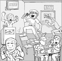
Tomb of Darkness #14, May 1975, Marvel Comics Group
When I pulled Tomb of Darkness #14 out of the dollar comics bin at a downtown hobby shop several weeks ago, something about its cover griped me to purchase the issue and save it for Halloween. The cover image exudes a Neil Adams vibe, depicting a lumbering stitch-ridden monster reaching toward a frightened, helpless blonde. The fluidity of the illustration – the monster’s visage is reflected in a mirror over his victim’s shoulder – and its perfect snapshot of macabre terror struck as pure Halloween, on that classic Universal horror movie scale. So determined was I to preserve this reading experience for All Hallow’s Eve that Tomb of Darkness found its own tomb in my culturally cluttered bedroom, until I unearthed it late last night for this morning’s eager celebration.
I settled on the bus for the fifteen minute ride to work and was surprised to discover that Tomb of Darkness was a compilation of early Marvel reprints, which only heightened my enthusiasm for the reading experience, as during this month’s worth of Halloween-themed reviews I’ve been disappointed with recent many of the issues have been. (‘Tis the price of scavenging in those quarter bins at comic shops and exhibitor conventions, I suppose, not to mention my limited budget.) I figured that the speedy ride to work would offer plenty of time to read one or two of this issue’s four short stories, ranging from a meager four to six pages in length. I would’ve been right, had I not sat in front of an old comic book enthusiast, who interpreted my page turning as an exhibitionist invitation to discuss the current state of the medium.
These past few weeks I’ve mused that Halloween is the one holiday everybody celebrates (even devout Christians usually offer their youth an alternative) without the benefit of a vacation. Today may be a Tuesday, perhaps the one night during the week that is guaranteed peace as it’s wedged between the end and the beginning of anyone’s prolonged weekend antics, but today is also Halloween, a free pass from nighttime domesticity and an open permit for late night shenanigans. This morning I learned that comics are the Halloween of media; everyone celebrates them sometime, and everything when someone brings it up, or brings one out. The usual, “Oh, my brother collected comics when we were kids,” or, “My mom threw out all of my comics when I was a kid,” oftentimes starts a snowball of oddball comments about a form of literature everyone has touched by so few understand and appreciate. The latter type of comment began this morning’s brief discussion, which in a matter of minutes spanning such topics as Frank Miller’s career, DC versus Marvel, whatever happened to Sad Sack, the mythological importance of Beta Ray Bill, and the corporate ploy of multi-title crossovers like “Civil War” and “Infinite Crisis.” Mind you, this came from a man years my senior and who claimed that he hadn’t touched a comic in as much time. The spirits of Halloween move in mysterious ways.
More than twelve hours later, after a full day of building, facilitating, and tearing down a haunted house for a hundred kids in the community – all in a day’s work – I finally get around to raiding the Tomb of Darkness, to finishing the story I began this morning. These four tales may seem dramatically different, but the essence of the era in which they were published assures a few minor but significant similarities. First of all, despite their short page span, each story is quite meaty, like a fun-sized Snickers bar. It’s tiny, but there’s a lot to chew. In fact, in one or two of the tales, a panel is completely abandoned for a full sized caption of text, which although is almost completely unnecessary to the plot, establishes a character for this genre of sequential art. Further, each of these stories offer a teaser, either an image or a statement designed to suck me, the reader, in before the action (or lack thereof) really starts. Consider this tease: “He had a certain amount of talent as an artist, but Franz was careless about details! And then one day he left out the most important item of all!” Well, what is?! See? Even if the yarn is about a greeting card artist – a job so blah Maxwell Smart used it as a cover for his spy games – my appetite has been whetted for more. Finally, what brings these stories together under one title, the ominous Tomb of Darkness, is their connection to the unknown, the mysterious and oftentimes evil side of life. Therein is where the tales diverge, each depicting a different dimension of mankind’s inner darkness. Let the autopsy of Halloween commence:
1. The first story, simply entitled “Vampire,” stars a man sentenced to death row for murdering his freshly vampire-bitten brother before the transformation curses them both forever. Ironically, the convicted brother’s fascination with vampire bats is what initiated the tragedy in the first place. Now, Christmas has Santa, snowmen, and reindeer (excluding Jesus and co. for secularism’s sake), Easter has a bunny (see previous Jesus comment), and Halloween has a slew of mascot monsters, with vampires at the forefront of the horrible herd. As cool as vampires appear in books and on TV, the idea of anyone thirsting for blood and brainwashing innocents for some supernatural underground agenda is terrifying (sans President Bush and co. for secularism’s sake). The fright here isn’t what the monsters can do, but how far we must go, i.e. condemning oneself to the electric chair for the murder of one’s own brother, to stop them.
2. The second story, “Trap,” gives a man a month’s glimpse into the future, revealing that he scores his dream job only to launder money from the company to pay off gambling debts, then kill his boss and go to the chair for the crime. (Again with the capital punishment!) With a chance to change his course, the man doesn’t, and we’re led to believe that he ends up where he gravely foresaw. Did he think things would change or be different this time? He was the same man, unchanged by the foreshadowing of his own fate. Despite all of Halloween’s monsters, sometimes our worst enemies are ourselves.
3. Isn’t that right, Franz? Yes, I’m looking at you, you greeting card artist, you. When Franz decides to forge an old timer’s art for his own, the codger’s “get well” and “wish you were here” cards actually come true, healing ailing men and transporting folks from one spot to, well, here. So, Franz masters the secret of the old man’s ink and sends himself a “wish you were here” card with an illustration of himself in a room with wealth and riches. His card comes true, but remember, “Franz was careless about details!” He forgot to include a door in his drawing, so his Scrooge McDuck-like treasure tower becomes his terrifying tomb. Anyone assembling a successful haunted house will tell, the devil is in the details. Literally, in this case.
4. Finally, the last story stars a carnival barker that takes in a seemingly helpless hobo, who tinkers with beakers in his spare time The barker’s selflessness grates against the judgment of others and pits him against some muggers, but when the hobo drinks a self-made concoction and becomes the size of a small skyscraper, not only vanquishing the would-be thieves but reviving the carnival to success, the old timer’s problems are solved. Oh-kay. This tale is strange but by no means macabre, unless one counts the way our scientific community carelessly dismisses a colleague’s claims that he can make a get-big-quick potion. I get junk e-mails about getting big quick all the time. Why isn’t anyone throwing these people into the arms of a warm-hearted ringleader?
Interestingly, as you may have noticed by now, none of these stories features a lumbering stitch-ridden monster reaching toward a frightened, helpless blonde. The cover was a ploy, and a deserving one. Still, I am by no means disappointed in today’s anticipated read. Halloween isn’t just ghosts and goblins, tricks and treating – something about this day compels folks to celebrate in ways unlike any other holiday. Something about Halloween brings out the strangeness in men (especially ex-fanboys on the bus), the stuff we usually keep in our own tombs of darkness. Despite its title, this issue pointed a spotlight at everything I dig about the thirty-first of October. Now, I can roll the stone and close the tomb. The wait was worth it . . . but I’d rather endure only once a year.
Tuesday, October 31, 2006
Monday, October 30, 2006
Tomb of Darkness #14 prelude
I found it! It was in the noisiest plastic bag ever, but I found it! My Halloween just became a little happier. Stay tuned . . .
Kilroy Is Here #4
Kilroy Is Here #4, 1995, Caliber Comics
writer: Joe Pruett
artist: Mike Perkins
letterer: Roxanne Starr
You’ll have to forgive me. My mind isn’t all here. With nearly an entire month’s worth of Halloween themed or related comics under my belt, I was really looking forward to the coup de grace, the issue I purchased weeks ago specifically to read on All Hallow’s Eve. Now, amongst the hundreds of comics scattered across my bedroom floor, I can’t find it. What’s worse, my girlfriend is already fast asleep, preventing my eager and frustrated hands from tearing apart my leaning towers of geekdom with the noisy desperation my troubled heart yearns to let loose. Of course, this has nothing to do with today’s read, but with the sacred celebration mere hours away, you can imagine my aggravation.
Kilroy Is Here is an independent effort from the mid-90s with a rich backstory and an even richer context in the comics realm. A few times throughout this tale, the author references a comic called Negative Burn, where the title character Kilroy must’ve appeared before scoring his own series. The characters’ interactions and feelings toward each other definitely imply a tapestry of past events. From what I can gather, Kilroy is an eternal driven by mankind’s penchant for evil and his corresponding instinct to avenge it, even at the protest of angelic agents. He looks like the Crow, all goth and trenchcoated, muttering more about his plight than actually fulfilling it, at least in this issue. A few reporters pursue Kilroy to the Lincoln Memorial, where all parties converge for what’s bound to be a battle royale. Alas, that’s where this installment ends, which is always my luck with these random picks. Sigh.
Still, I must admit, the writer pours enough grief and melodrama into his characters to create the illusion of action, if only through the tension of his hero’s dilemma, which made this issue a fairly enjoyable read. Artistically, I wasn’t sold, but Perkins demonstrates a promise that could’ve benefited from some masterful coloring or an alternate inker (alternate to himself, is what I’m saying). His blocking was cinematic enough to pack the punch the writer intended, which is good enough for me, and his heavy inks created a mood that was befitting the day before Halloween – dark . . . a little too dark. Again, if Perkins concentrated solely on his pencil work here, I could’ve been more impressed. Kilroy is here, but I don’t see him going anywhere.
I mentioned this issue’s context in the comics realm. The supplement material in this issue mentioned Caliber Comics’ contributors, including Phil Hester, Bendis with his acclaimed piece AKA Goldfish, and David Mack’s Kabuki. Who would’ve thought that these indie efforts would become the darlings of the medium in the 21st century? Back issues offer this rare retrospective from time to time, reminding us that the names that grace the cover of Wizard Magazine every month were still struggling artists at one time or another. Like Kilroy, they may be here now, but back then, no one knew who they were, let alone where.
I’m going to venture into the fray one more time, hoping I find the comic with which I’ve been hoping to celebrate Halloween. If not, I have a poor plan B. I feel like someone’s dropped an apple in my goodie bag.
Sunday, October 29, 2006
Toe Tags featuring George A. Romero #3
Toe Tags featuring George A. Romero #3, February 2005, DC Comics
writer: George Romero
penciller: Tommy Castillo
inker: Rodney Ramos
letterer: Pat Brosseau
colorist: Lee Loughridge
associate editor: Michael Wright
editor: Bob Schreck
When a writer’s name is almost as large as the title on the cover of a comic book, as is the case in Toe Tags featuring George A. Romero, you can safely assume that the author’s reputation precedes him. Whereas others undoubtedly sought this series with the completist fervor that convicts niche collectors like horror fans, I did a quick Google search to remind myself of Romero’s rich cinematic reputation. His IMDb entry extensively lists Romero’s film credits as a director, screenplay writer, and an editor, but despite all of his recent achievements, 1968’s Night of the Living Dead is by far his most celebrated. (Although I would be interested in the 1974 O.J. Simpson: Juice on the Loose television movie he directed, as well.) Ironically, a few nights ago, I tuned in to an AMC late night showing of Night of the Living Dead, only to fall asleep before I could develop a real appreciation for Romero’s work. I hoped that Toe Tags would make up for the difference.
I didn’t. The first act of this book features a gory “the living versus the dead” sequence, during which a horde of zombies flood a town in search of, as they excitedly exclaim, “Food! Food!” Remember, zombies eat living flesh, so they certainly aren’t storming the local Burger King. If zombies have a mentality, one of the undead mutter their mission statement perfectly, “How can anyone stop us when we are already dead?” Therein lies the challenge, eh? The second act elaborates on this theme, by revisiting a dying Professor that has developed a serum to help mend a zombies’ intelligence. The Professor endears the serum to an undead confidant and kills himself, then soon after we’re introduced to the other parties in search of this zombie cure – the government, I assume, or some shadow agency that would really benefit from folks impervious to death. This issue is a good example of how dropping into the middle of a story isn’t always the best way to acquaint oneself with an author’s work.
To their credit, Castillo and Ramos balance their depictions of the living and the dead well, blanketing the whole world of Toe Tags with a shadow of desperation. In the zombies’ case, they want human flesh. In the livings’ case, they want freedom from this terror, either by killing the zombies completely (my natural reaction, I tell you what), or by smartening them up with that serum, which is an interesting premise that undoubtedly has mixed results. I think my problem with this book is the assumption that Romero wrote it with the nature of a screenplay in mind; the sheer propulsion of this issue, sans the usual backstory synopsis, left me at a loss. I remember having a similar bias with Bruce Campbell’s Man With the Screaming Brain, which was billed as a discarded screenplay, but Dark Horse retained the identity of a comic with that series enough to make me feel comfortable. Perhaps DC was so excited to score Romero, they forgot to maintain the essence of the publication on their end. Maybe, like the zombies with their penchant for brains, I’m just a needy reader.
Toe Tags was a definitely a lesson in pop culture that was long overdue for a narrow-minded geek like me. I like what I like, and that’s it, but exercises like A Comic A Day are intended to broaden my horizons as a comic book fanboy. This is my zombie serum, my attempt to enhance my intelligence a bit. With Halloween right around the corner, I feel like I’m getting closer to what this scary celebration is all about. Romero is a modern architect of Halloween’s renewed significance to pop culture, and he’s a decent teacher, too. I just need to do a little more homework.
Saturday, October 28, 2006
Scratch #2
Scratch #2, September 2004, DC Comics
writer/artist: Sam Keith
letterer: Phil Balsman
colorist: Alex Sinclair
editor: Joey Cavalieri
assistant editor: Harvey Richards
My mother would be the first to tell you – just as she was the first to tell any girl I’ve ever brought home – that nothing scared me more as a child than these three things: the Barney Miller theme song, our mechanical bell-ringing Santa Claus doll, and Michael Jackson’s Thriller video. Like many boys before and unfortunately since, I was a Michael Jackson fan, and to see the King of Pop transform into a werewolf at the touch of a pretty woman was foreboding and foreshadowing, but the latter point is for another forum. Thriller was my first haunting encounter with werewolves and zombies, but despite all of the encounters since, it’s the first cut that is always the deepest, right?
With this werewolf-centric issue, Sam Keith has managed to scratch at those mental scars. Thanks a bunch, buddy.
Scratch is the proverbial Hulk to lead character Zack’s puny Banner, yet, unlike other stereotypical “monster within” stories, Zack is an uncommonly courageous fifteen-year-old that, and he actually longs for his beastly alter ego to emerge and save the day. Like yesterday’s issue, the cover of this issue is somewhat deceptive, because it’s the only time we actually see the title character. Despite his pursuit of a multi-eyed monster that has kidnapped a little girl, his tumble with dozens of gnarly-toothed, freakish midgets, and the revelation that his galpal might be in a proactive war against some bigoted villagers, the best Zack can muster of Scratch is a werewolf-ish arm which his better judgment dissuades him from swinging lest he seriously hurt someone. Zack’s inner conflict is inching to the surface, and I was actually more amused with his plight than I would’ve been had Scratch made a complete appearance. Keith implements a sense of anticipation and suspense that propels into the following issue, which, as we’ve discussed in previous posts, makes for an effective horror comic.
However, Keith’s strength has always been his unique art style that, unlike his fellow Image founders, has rarely been imitated. I’m not sure how it could be. Since with early work on Marvel Presents with Wolverine, then later with his creator-owned work The Maxx, Keith’s work has always had a bestial and brutal nature about it, starring massive characters that are as characteristically massive as they are unexpectedly vulnerable. His inks are often as sketchy as any other artist’s pencils, but with a solidity that pulls even the most complex page layout together. In contrast to his huge heroes, Keith’s stories usually feature diminutive characters, as well – usually children, with well defined but scrawny little bodies, and this case, Zack’s frailty only emphasizes Scratch’s powerful presence . . . if we ever actually saw it, that is. I remember this consistency in his work was controversial during Keith’s run on The Maxx, particularly with the Maxx’s surprisingly endowed and compromisingly positioned teenage girlfriends. Were similar concerns ever really pressed about Lee’s or Liefeld’s scantily clad heroines? I’m just asking. The problem with such a unique style as Keith’s is that it usually stands out from the rest.
I should mention that this issue was superbly colored, as well. Most of the story takes place in a dark cave, but Sinclair’s effects with ambient light not only add a level of realism to the book, but also an aura of creepiness with makes Keith’s intentionally twisted visuals a little more horrific. Coloring is really only noticed when its good or bad. Fortunately, in this case, it’s the former and not the latter.
I’ll conclude by asserting that Scratch definitely leaves its mark, and its second issue picks up flawlessly where the first left off, and strikes a cord of interest for the next one. As a five issue miniseries, I wonder if this story was a successful highlight of Keith’s career, or just a tale he had to purge from his undoubtedly creative mind. I’d honestly never heard of it until I found this ish in the quarter bin at a local comics shop. Even still, some of the scariest stories are usually in the darkest corners, or perhaps the recesses of our minds, as were my memories of Thriller, until Keith clawed them up to the surface. I guess some scratches never heal.
If only Michael had genuinely been a werewolf. It would be less scary than what he’s really turned into!
Friday, October 27, 2006
Espers #1
Espers #1, 1997, Halloween Comics
writer: James D. Hudnall
artist: Greg Horn
letterer: Roxanne Starr
If one judged this book by its cover, one would assume that Espers #1 is just like any other Greg Horn vehicle, starring a beautifully detailed and masterfully colored female lead that inevitably finds herself in many suspenseful yet compromising positions. Horn’s cover work on Elektra is the first and prominently mainstream example that comes to mind. Yet, when one opens this issue, he may be surprised to discover that Horn is responsible for the interior artwork, as well. Further, he may be surprised to discover that it’s not all that great. Like many bar bands, Greg Horn is at his best in the covers department.
Seriously, Espers #1 is the perfect example that every notable artist must start somewhere. Halloween Comics – appropriately dubbed in the context of this weekend’s spooky celebration – was a self-publishing effort that was promptly incorporated into Image Comics, and Espers was Greg Horn’s first professional, consistent comic book work, which explains the distinction from his current, critically acclaimed career. The apparent juggernaut behind the project, writer James D. Hudnall, obviously didn’t anticipate his partner’s future success, as his complimentary essay boasts about his accomplishments in the comics industry, and really, how great Espers is. Unlike yesterday’s read, I’m glad I didn’t hit this essay first. I would’ve been even more disappointed in the story than I already am.
Although this issue of Espers is a first, this is the second volume, picking up with subplots and characters established in an earlier run. Hudnall does right by the reader by introducing a new character, a proverbial muse to guide frustrated fans through the Espers experience, but Skye’s potential as an intriguing lead character ends there. Her psychic abilities are a burden, not only in practice, but also in premise, as her own mother doesn’t even believe in her skills. The height of this issue’s action is when Skye’s fatal dream nearly comes true, as supernatural bounty hunters almost kill her before the Espers (pronounced ess-pers, as the inside cover makes clear) arrive and insist that she join them in their cooperative quest to save the world. Yes, the premise of this issue is that a young woman with inexplicable psychic skills is recruited by a band of similarly powered citizens to help society embrace their kind. You don’t have to be a mind reader to know how Hudnall came up with this one.
I don’t have many other thoughts on this issue, save one: the success of a comic book series should depend on the easy pronunciation of its title. Until the inside front cover’s backstory blurb corrected me, I had no idea how to say “Espers.” I was tempted to say ESP-ers, to emphasize the power over the people involved. I was wrong, just as I was wrong to expect the kind of interior art that reflects Horn’s efforts on the surface. Halloween Comics certainly lived up to its name, specifically in the “tricks over treats” department. Just like the Espers corporate move, Halloween Comics was all about image.
Thursday, October 26, 2006
Criminal #1
Criminal #1, October 2006, Icon/Marvel Publishing
writer: Ed Brubaker
artist: Sean Phillips
colorist: Val Staples
Appropriately, this review is going to be a drive-by of bullet points, since I have a surprise going away party for a co-worker to attend later tonight. Hold on:
I've never understood why anyone would read a comic's essay/letters page first, but I know many do, and in this rare instance, I'm glad I did, because the writer's apparent enthusiasm about this series fueled my interest in the story. I recognized the creators' deliberate implementation of the characters' motives and subplots, and how they will inevitably pull together in an emotional and exciting climax. Sometimes, you never know if the writer knew what he really started. In this case, Brubaker has an end in his sights.
This issue read like an episode of Law & Order: Criminal Intent, without the law and order part, which is a-okay by me. Brubaker's character study of the career criminal pulled into a diamond heist against his better judgment is interesting on many levels, and Leo's commitment to his unspoken "rules" (i.e. "I don't work with junkies. It's a rule.") implies a sense of integrity that maintains a twisted moral compass, even if north is south or eastside gets you ten to twenty. The associate that claims respect for Leo's skills, a criminal legacy inspired by his father and the old, ailing partner that Leo still cares for, establishes a sense of honor among thieves, an element I'm sure Brubaker will exploit throughout this initial arc. Criminals are "evil," but mighty fun to watch.
In this case, the criminals are fun to watch because Phillips illustrates them so well. The characters are expressive and dynamically choreographed; this issue read like a well directed TV drama. Kudos.
It's actually criminal that I don't have enough time to elaborate on this issue, but nothing speaks true volumes like the real thing. Put down some honestly earned cash for this one. The irony won't escape you, and neither will Criminal's potential.
Wednesday, October 25, 2006
Ghostly Tales #135
Ghostly Tales #135, May 1979, Charlton Publications
With Halloween less than a week away, I hoped that Ghostly Tales, a classic horror comic compared to the contemporary quarter bin fodder I’ve been reading lately, would crank up the creepiness. Although this issue was unsatisfying – I’ve grown to appreciate these old Charlton jam titles and it’s been too long since I’ve read one – I was disappointed that these self-proclaimed Ghostly Tales weren’t more . . . well, ghostly. Only one of the three stories actually featured a ghost, and while the others were promisingly disturbing, their respective resolutions were so affected by odd twists that I was left with a sour aftertaste, if that illusion makes sense. What’s it take for a comic book to actually scare me out of my skin?
The first story, “Throne of Power,” wasn’t a paranormal chiller, but rather a political thriller, as an Oriental lord strategies the fall of his niece, a mystical empress, by replacing her with an impoverished look-alike. In the end, the empress transforms into a fox and her devious doppelganger is ironically assassinated instead. Four of the eight pages in this strange tale are dedicated to the look-alike’s training, a six month process to assure that her ascension to the throne as a puppet empress is successful, yet her carelessness in the end is more disappointing than the real ruler’s completely unexpected metamorphosis. The writer implies with a line or two that the empress has a connection to nature, and I feel that some elaboration of that element would have been both more ethereal for the book’s general theme of ghostliness and more satisfying from a storytelling perspective. This story was more haunted by its potential than anything.
The second story, “Laffey’s Tombstone,” actually stars the ghost of this issue, specifically the specter of an Irish hero with whom this tale’s heroine’s grandmother had an affair. Visiting Laffey’s grave, the hero mistakes the introspective woman for her departed relative, and in a too predicable and unnecessarily sappy ending, a kiss brings the lad back to life, so he can pick up where he can left off with his lover’s granddaughter, we’re more than led to believe. Just my luck, the only real ghost story here is a romance, but this woman’s contentment to live happily ever after with her grammy’s dead lover is eerie enough for me. Nice to know that if chivalry really is dead, someday it’ll come back to life.
The final yarn, the issue’s cover story called “A Lovely Night in Paris,” stars a woman abducted by a band of zombie children and offered to their large underground rat god as a sacrifice. A valiant patrolman, with whom the woman share a brief salutation at the beginning of the story, races to save her, and for eight pages we’re led to believe that the cop will face supernatural odds way over his head – literally, at least, considering the size of the deistic vermin. In fact, when the woman’s shriek echoes in the sewer tunnel, the wayward hero proclaims, “It is the girl . . . She is terrified! So am I!” A very human and vulnerable moment, I marveled. Then, when the cop bursts into the creatures’ chamber, he pops off two shots, boasting, “A bullet in the brain . . . another in the heart . . .that does it!” Hunh? That easy, eh? I’ve seen regular rats put up a bigger fight than that! To make matters worse, in the end, the lady and her champion lock lips, as if their single panel’s worth of how-do-you-do was enough to bring them together. Only a story starring a big rat could end with so much cheese.
Even if this comic wasn’t scary in the classical sense, I enjoyed these brief, fun stories, and I wonder why horror anthologies aren’t popular anymore. I know Vertigo tried their hand with Flinch several years ago, but its popularity waned like a scream in the night. Could it be that mainstream comic book readers have been too conditioned by the thralls of continuity to really appreciate short story anthologies? Do comics have to be a part of something bigger, a thread in a larger tapestry if you will, to be embraced and appreciated, or at least to fly off the shelves with any considerable, marketable success? I know some anthologies are thriving out there, like Image’s Flight series, but I can’t imagine that enough new material exists for fans of horror comics to thrive. They’re the dying ones. The real ghosts in the ether.
Tuesday, October 24, 2006
The Possessed #1
The Possessed #1, September 2003, WildStorm Productions
writers: Geoff Johns & Kris Grimminger
artist: Liam Sharp
colorist: David Baron
letterer: John Layman
assistant editor: Kristy Quinn
editor: Ben Abernathy
Finally, a comic book about demon possession. Surely, decades after the infamous pea soup scene from The Exorcist, Johns, Grimminger, and Sharp would offer a fresh perspective on an intriguing but weary social and spiritual phenomenon. The Possessed #1 may have been inhabited by something, but certainly, unfortunately not any new ideas. The opening scene, which lasts longer than it should have, is full of contradictions and contrived character introductions. On one hand, one of the Possessed, a militant team of formerly possessed demon vanquishers, drives a devil from a little girl’s tormented body, then on the other hand, his teammates use bullets to drive the demon back to hell. Last time I checked, demons weren’t (or at least shouldn’t be) vulnerable to physical weapons. I guess a herd of pigs was nowhere in sight.
The Possessed as a unit is quite a herd itself, forsaking the spiritual overtones that would permeate a true battle with demonic forces for gun-toting, good old fashioned American bravado, affecting the team’s female member as much as its almost indistinguishable males. I’ve been discussing the themes of duality and balance in comics lately, and although the premise of this series could have easily and successfully reflected this paradigm, the creative team as a whole opts for the brawns over the brains, the fight over the philosophical. Sharp’s artwork at its best parallels Sam Keith’s ability to exaggerate reality with a visually appealing, macabre effect, and at its worst twists the human form to look like an overstuffed potato sack, with muscles on nonexistent muscles and melodramatic shading to obscure his poor background work. Guess which aspect surfaces in this issue. Even the touches that could’ve been clever, like the cross-shaped crosshairs at the end of the teams automatic weaponry, comes off as silly . . . or, to maintain the pig analogy, sloppy.
Interestingly, my impressions of this book began when I noticed the creative team’s names on the cover. I remember Sharp from his brief run on The Incredible Hulk. His work complemented the height of Peter David’s fan favorite run, following the eye-catching (and Image founding) work of Dale Keown and Gary Frank, so naturally, expectations were high. He didn’t meet them and was quickly removed from the book. His proportions were terrible and his atmospheric work inconsistent, blatantly halted the momentum of David’s building legacy with ol’ Jade Jaws. So, I didn’t expect excellence from him here, and although this story plays more to his strengths, he forsakes any real potential for rather standard page layouts, with minimal paneling making way for gratuitous action shots and splashes. Speaking of the story, Johns is a critically acclaimed writer, a modern architect of the DC Universe’s streamlined future, and this series (I wonder how long it lasted) is the miss to his most recent run of hits. Nice to know that he purged these demons before they affected the world’s greatest heroes.
Frankly, tonight’s rerun of Law & Order: Criminal Intent, about a crack whore-turned-nun whose past sins result in the murder of her mentor, offered more spiritual insight than The Possessed #1, which actually features spiritual creatures dwelling among us. Demon possession may still be an unspoken, underground phenomenon in the Catholic church, but the idea has been so used in pop culture that I actually hoped to encounter a different perspective here. Instead, the best we get is a play on the word itself, implying that these formerly demon possessed victims are now so consumed with the quest to rid the world of these body-snatching devils, they’ve become possessed by their mission. The writers wanted to make sure the reader understood this pun by awkwardly inserting a Marvel-esque origin caption on the title page. We get it, guys. What I do not get is, what could’ve possessed these artists to produce such trite material? Devil take it, I suppose.
What’s worse, it wasn’t even scary! It’s Halloweentime, people! With these inexplicably high autumn temperatures in Southern California, I need a chill or two over here!
Monday, October 23, 2006
Resurrection Man #4
Resurrection Man #4, August 1997, DC Comics
writers: Dan Abnett & Andy Lanning
penciller: Butch Guice
inkers: John Stanisci & Ray Kryssing
colorist: Carla Feeny
letterer: Ken Lopez
associate editor: Dana Kurtin
editor: Eddie Berganza
Since yesterday's review was about a man that can raise himself from the dead, and A Comic A Day was effectively inoperable for a few hours (right at the cusp of a new review day, no less), I thought today's read, Resurrection Man, would be an appropriate follow-up. Resurrection Man is certainly more domestic than The Damned; whereas Eddie was grappling with demonic forces (however mundane as a modern day mob), Mitch Shelley's nemeses are his wife and her boyfriend, whose connection to crime are apparently documented on a mysterious set of disks that Mitch doesn't even know he has. I guess dying that many times has that affect on you. Sometimes you'd lose your head if it wasn't attached.
Except, in Mitch's case, he does lose his head. In this issue alone, the Resurrection Man is poisoned, stabbed, shot, beheaded, clubbed, and blown up, and every time (except that last one, which is where the issue leaves off), he bounces back within just a few panels' time. Butch Guice, whose work I've enjoyed in titles like Birds of Prey, captures this cycle with the right balance of realism and creepiness, and although the letter col implies that Guice had been inking his own pages, this issue's inking responsibilities are divided between two artists, and the book suffers for it. Guice is his own best inker, and with twelve pages between these two fill-ins, the issue loses a self-contained continuity and the overtone of mood necessary for such subject matter. Hopefully Guice bounced back as quickly as our hero, or I can see why this series took a one-way trip to the cancellation grave.
I enjoyed this issue because, like The Damned, our main character didn't accept his situation lightly to make way for more unnecessary plot. I can see a writer instilling an, "Oh, I can come back from the dead? Uhm, okay," mentality in their lead to pave a shortcut toward more storylines, but in his fourth issue, the Resurrection Man still isn't sure why he'd been blessed (cursed?), and to what ends he can use this ability other than self-preservation. In fact, one scene is extremely familiar, in which Mitch finds some solace as his journey takes a leap in the right direction. "For the first time, I feel like something is happening," he think. "After all of today's madness, something like a resolution is in sight." We've all had those thoughts before in the midst of a hardship or a challenge. Of course, things take a turn for the worse, but his name is the Resurrection Man. Whatever doesn't kill him . . .
. . . will try harder until it does, I suppose. In yesterday's ill-fated review, I spoke of duality, and the Resurrection Man is all about it. When he's on his feet, alive, he's an average Joe. Yet, in those moments just post-resurrection, he's an animal, almost like a vampire, clawing his way back into existence with a strength and determination he may not even remember when the life-thirst leaves him. If only we were so desperate for meaning, but I don't think that what Mitch's story is about. No wife, no friends, no idea who he is. He's in it alone. That's something to which we can relate.
The Damned #1 (revisited)
The Damned #1, October 2006, Oni Press
writer: Cullen Bunn
artist/letterer: Brian Hurtt
editor: Randal C. Jarrell
[Blogger’s Note: I have two regular on-ramps to the Information Superhighway: a fancy T1 connection at work, and a 19th century dial-up at home. As much as I’d like to post from work daily, my nine-to-five (which starts earlier than nine and ends later than five) offers little time to type a comprehensive review, so I usually write the analysis as a word doc and paste it into A Comic A Day at home. This time, it didn’t work. I saved the essay to a disk and rushed to work, for naught, as 3 ½ inch floppies are as compatible with the modern computer as Whitney is to Bobby nowadays. So, here we go again, because I won’t sleep soundly knowing this thread – pardon the Internet pun – is dangling. The first, hasty review was decent, but here is the essay in its original entirety. Next time, I’ll post it via smoke signal. Watch the skies.]
Before Mel Gibson was getting you-know-what-faced and blaming the Jews for all the wars in the world, he was painting his face blue and proclaiming, “Every man dies, but not every man lives,” a declaration that has become as timeless as making fun of celebrities and their haphazard vices. The Damned has put Braveheart’s battle cry to the test, with a hero that certainly dies, but indefinitely comes back to life. Even if he lives a futile existence, he gets more than a few chances to do it right. That’s a few more than the rest of us, eh?
Fortunately, the way I read The Damned, Eddie isn’t living a futile life, just an odd one. This issue, fresh off the new release rack with a nice aura for my Halloween-themed review, passed my flip test; as I may have described before, with any new issue I contemplate buying, I usually read the first page, flip through the meat of the book to assure that the artwork is consistent, then I read the last page, to analyze if the plot ends poignantly enough to capture me. So, ironically, The Damned wasn’t. The illustration isn’t remarkable, but the style, brushed with gray tone and lettered with what I can only describe as Tim Sale’s gothic font, compliments the supernatural tones of the story, and Eddie’s visible scars act as a distinguishing trait that keeps him recognizable in the thick of the other black-haired Caucasians throughout the rest of the issue. Yes, in a comic also rife with demons, I’m thinking some diversity would’ve helped. Maybe affirmative action doesn’t affect the underworld.
Regarding the issue’s story, Eddie’s gift (curse?) to rise from the dead has placed him at the beck and call of the godfather (devil-father?) Big Al, who hires the resurrection man to find a demon bookkeeper who was assigned to broker a peace deal between two warring hellish mobs. Despite Eddie’s supernatural ties, this issue is hardly scary, and in fact our undead hero’s struggle with his death(s) is surprisingly human, played with a melodrama befitting a mob story. His first moves post-assignment is to track down his love interest and her boyfriend, his killer. A dream featuring a ghost-like demon hungering for his soul is another sobering reminder of Eddie’s condition – as much as we’d like to cheat death, the hurdle would come with its fair share of spiritual and psychological baggage. In this case, Eddie is literally damned if he does and damned if he doesn’t. His last line, the one that sealed the deal for me with this series, sums it up best, “Ain’t that always the way? Lucky to be alive. Better off dead.” Well put.
Since I saw The Departed this weekend, another cops and robbers drama, I can’t help but draw some comparisons between these two stories and to the general themes dominating comics altogether. In The Departed (which I’m sure I’ll review in my LiveJournal in due time), an undercover cop and a mobster’s surrogate son infiltrating the police department struggle with the duality of their missions, enjoying the respective benefits of their positions while crushed by the responsibilities instilled by their masters and respective upbringing. Eddie’s predicament is fairly similar; imagine trying to live a meaningful life with the thought that you were already, and might as well still be, dead. What you are versus what you should be, that kind of thing. Comics revel in the duality of their protagonists, from the secret identities of superheroes to the smoldering bravado versus self-imposed humility of indie/autobiographical books. Some stories end to the hero’s benefit, achieving a balance that harmonizes the internal struggle with the external circumstances of his life. Based on this comic’s pessimistic title, I assume things won’t end well with Eddie. Oddly, and technically, things have ended badly for him already.
One of the movie previews before The Departed impressed a similar theme to Braveheart’s inspirational statement, asking (and I paraphrase), “I want to help change things so when my children speak of their father they can say that I tried to make things right. What will your children say about you?” When we talk about life and death, we’re really discussing the concept of legacy. In The Damned, the idea subtlety lingers, particularly in the context of spiritual consequence. At the end of the day, do you want be among the fortunate . . . or the damned? Eddie embodies the quandary, but you don’t need a comic to tell you, it’s an easy answer.
Sunday, October 22, 2006
The Damned #1
The Damned #1, October 2006, Oni Press
Experiencing serious technical difficulties. This review is written, but much like its subject matter, appears to be damned. I blame the spirits of Halloween for this one. Since I'm down to the wire, I have to post something, so I'll take my friend's advice and offer a bottom line overview, in the hopes of fixing my disk drives and Internet connections so I can post the review in its entirety tomorrow.
BOTTOM LINE: The Damned #1 is an entertaining read that offers insight into the legitimate struggle that comes with life after death, as our hero with an odd ability to raise from the dead is at the beck and call of a demonic mob, which, although isn't illustrated as scary in a supernatural sense, retains the dignity of the old cops-and-robbers genre, instilling a true sense of chilling consequence if the proverbial resurrection man doesn't succeed. Well drawn, well written, worth digging up, much like its lead character. Ha. Even with seconds to spare, I get the jab in.
But I'm still pissed.
[Blogger’s Note: Original review finally posted on October 23, 2006, approximately 2 a.m. I’ll be damned.]
Saturday, October 21, 2006
The Twilight Zone #68
The Twilight Zone #68, January 1976, Western Publishing Company
Yesterday’s brief review featured a comic book providing supplemental material for a popular toy franchise. Today’s review tackles a comic book providing supplemental material for a successful television series. These adaptations aren’t as different as they seem. Children are attracted to the Bionicle Lego product because of its well marketing mythology, freely embellished by its comic counterpart. The Twilight Zone is a cult phenomenon with unlimited, open-ended potential and unlike other TV show adaptations – like Star Trek: The Next Generation, which I reviewed last month – is free of continuity concerns, so writers don’t have to dance around what’s been or will be aired during any given month. This episodic nature is perfect for the comic book format, especially in this Gold Key incarnation which features four short Rod Serling narrated tales. I dropped into this issue as easily as one can turn into any episode of The Twilight Zone during its annual Labor Day marathon . . . but what holiday benefits more from a twilight trip than Halloween, eh? I mean, really . . .
So, what are these four eerie tales ripped from the ether of the Twilight Zone? Interestingly, the stories aren’t very long and make for fun, brief reads, ranging from three to seven pages each. The first tale, called “The Second Will,” stars a man suffering from a bout of astral projection, during which he meets his dead uncle who reveals the location of his second, revised will. The uncle’s greedy brother and sister demand to see this will, anxious for their inheritance and eager to cover-up their responsibility for the secret murder, only to be murdered themselves by a bomb in the will’s safe box. Serling assures us that our hero’s astral episodes cease, and now “he’s counting the fortune he inherited in the Twilight Zone.”
The second and third tales, presumably by different but anonymous creative teams, are about obscure prison breaks. In the first, “A Lease of Death,” a stranger aids a convicted murderer in an escape, then promptly drugs him with an agent that instigates paralysis. The stranger is revealed to be a wax museum curator, and the convict lives on as his latest attraction, “if,” according to Serling, “you can calling that ‘living’ – in the Twilight Zone!” The third tale, “Wide Open Spaces,” is a bit more galactic in nature, an element I assumed this issue would feature more abundantly, since the franchise could more easily afford an illustrator’s skills in recreating space than a crew building a film set. Anyway, in this case, a cosmic convict from second-class planet known as Earth organizes a crafty prison break because of his nostalgic penchant for personal space, something apparently hard to find in the claustrophobic future. The man is successful, but his prison isn’t a gravity-heavy planet as he’d hoped, but a satellite where escapees burst through the hatch to meet a free-floating fate in space. Oh, the irony is too rich to resist.
The final tale, “Discovery,” is intriguing enough but my least favorite in the issue. Whereas the other yarns explore the peculiarity of human nature, this is the only story that is actually supernatural in nature, but the para-normality isn’t complex enough to really make my skin crawl. In fact, the story is a heart-warming one, in which a rich, idle college graduate meets her futuristic counterpart not once but twice – in one incarnation, the older doppelganger is a bored airhead, the other a successful vibrant marine biologist. In the end, the student graduates with the hopes of pursuing her formerly dormant skills in science. Her introspective journey may have seemed spectral, but, according to Serling in his final appearance, “not for us who travel in – the Twilight Zone!” Well put, if not completely inspiring.
As I implied, three of out of the four stories in this issue dealt more with the more macabre dimensions of human nature than with the mystical. Sans a few fantastic elements, like a paralytic drug that can sustain a man to old age, these circumstances can actually come to pass, given the right players and suspension of reality. The issue is certainly drawn realistically, with the formality of a drawing instruction book. From what I can tell, the first and last stories were illustrated by the same artist, but the lack of creative credits offer this issue’s true mystery. These contributors deserve a pat on the back for keeping this sci-fi franchise so accessible in a comic book format. Unlike the Bionicle book, which was so confusingly written and illustrated that I’ll consciously avoid the Lego aisle at Toys ‘R Us from now on, I feel inspired to scroll my DirecTV menu, so sometime soon I can take another enigmatic trip to . . . the Twilight Zone. Hey, why should Serling have all the fun?
Friday, October 20, 2006
Bionicle #6
Bionicle #6, May 2002, DC Comics
writer: Greg Farshtey
penciller: Carlos D’Anda
inker: Randy Elliot
letterer: Ken Lopez
colorst: Peter Pantazis
I swear, when I’m in a rush, I pick the worst comics to read. Today’s offering, Bionicle, was discovered at the bottom of a box of donated books at work, and while I thought the issue would offer further insight into the realm of promotional comics – a topic we’ve analyzed here from time to time – I just find myself confused and frustrated, wondering why any kid would like this popular Lego franchise after such shoddy work at this. Not to mention that I expected any comic about toys to be a light read, like the Lego Batman: Secret Files and Origins from a few months ago, which was admittedly fluff but undeniably fun. Just consider this excerpt from a few panels’ worth of text:
CAPTIONS: “The Matoran have learned that the Bohrok do not truly live. They are artificial life . . . biomechanical creations,” Onua explains. “The villagers salvaged parts from fallen Bohrok to build the Boxor vehicles.”
BIONICLE SOLDIER: We muct act now, Onua, or nothing will be left of Mata Nui!
Uhm, God bless you? Do you need a tissue? I think the writer – another hapless chap shacked with an impossible but necessary assignment, I assume – managed to squeeze a statement about Lego accessories in there somewhere, but the consonant heavy proper names makes the excerpt read more like a KGB file than a comic book about Legos. (Also reminds me of Warriors of Plasm from last week, and not in a good way. I was trying to forget that book.) So, with an evening of work ahead – our nonprofit organization is hosting its annual auction gala fundraiser – I was thinking that a comic book about toys would seem like I’d be getting in a little playtime before business. Sheesh. I feel like I’ve already clocked in.
Tomorrow, back to Halloween.
Thursday, October 19, 2006
Route 666 #3
Route 666 #3, September 2002, CrossGen Entertainment
writer: Tony Bedard
penciller: Karl Moline
inker: John Dell
colorist: Nick Bell
letterer: Troy Peteri
When you think about it, doctors can be pretty scary people. Their intimate knowledge of the human body gives them an upper hand over the common man’s sense of their own well-being, and society’s general acceptance of their wherewithal to tamper with our health and physique places them in a rather powerful position. Who can say that the several years of education a doctor must endure truly qualifies an individual as one with the moral compass or grasp of responsibility required to comprehensively fulfill the oath to preserve life? In other words, book learnin’ doesn’t guarantee that any given doctor isn’t a nut ready to crack and wreak havoc on their fellow man through the privilege bestowed them as a physician. From what station did this train of thought chug, you ask? Well, since yesterday’s review of Supernatural Freak Machine was completed so haphazardly, I wanted to compare the issue with today’s read, Route 666 #3, and coincidentally, both have a deranged doctor character in common. Go figure.
Route 666 #3 opens with a startling scene, as one Doctor Waterman falls prey to a nasty vampire bite. Our shock-stick wielding hero/ghost-seeing asylum patient Cassie bursts onto the scene seconds too late to save the good doctor but in time to put a pen through his assailant’s eye, a fellow doctor (turned vampire) with ties to a demonic underworld hell bent on swiping innocent souls at death. The introductory scene, which actually consumes the entire first half of the issue, is superbly suspenseful, drawing in a new reader like me with action, intrigue, and most importantly, sympathy for the lead character. In Supernatural Freak Machine #1, writer Steve Niles uses a similar technique kicking off the issue with a suspenseful scene that demands your attention and empathy, in this case for a prison warden back from vacation only to find the medical lab transformed into an experimental breeding ground for Frankenstein-like monstrosities at the hands of the eerie Dr. Polynice. Both of these scenes are darkly colored and rapidly paced for dramatic effect. It works. In both cases, I was affected.
Then, both writers offer a twist, a dramatic scene change that further establishes the stories’ major players while maintaining an edge-of-your-seat sensibility for the involved reader. In Cal McDonald’s case, the supernatural detective of the Niles/Kelly Jones tale, he and his friend are literally on the edge – of the “H” in the Hollywood sign. Jones shows off his chops as an artist here; his run on Batman involved many urban backdrops and tight action sequences, but McDonald lets him take a step back and let his work breath a bit. Kelly can draw monsters, but he can also masterfully reflect the environments that breed them. 666 scribe Tony Bedard takes a similar approach, as Cassie flees the asylum by bus and disembarks in a rural area, where the local sheriff quickly recognizes her from the rapidly released news reports of the doctors’ murders. Unlike the intro pages, these panels are wider, earth-toned images, giving us solid environment shots of the country and diner in which Cassie seeks refuge. From a bloody lab to the American landscape, these artists can capture true horror in any cranny of the country.
I can imagine that comics are difficult venues for true horror fiction. In any scary story, the element surprise is key to its success, but when the eye can scan seven or eight panels’ worth of information on any given page, a sense of shock can easily be lost. Pacing is critical, particularly in page transitions. The reader’s interaction with the comic as a book of sequential art is truly put to the test; without the mystery of what the next page might bring, offering something really scary would be a great feat for any author and artist. Route 666 accomplishes this with its last pages, as Cassie’s stolen cop car and the Sheriff’s son’s truck collide in a two-page spread surprisingly detailed with shattered glass, fiery engines, and characters crashing through windows into the open air. Full force, pure action, as if someone pressed pause at that critical moment in the movie when the explosion means everything. Two page spreads rarely conclude an issue, since most comics end on an even page, but the artists sacrificed that last page for their credits, utilizing the inside front cover for supplemental material (an insightful letter from Cass to Waterman) to catch up the reader to current events. Well played, I say. Now if someone could press the fast forward button to next issue . . .
Interestingly, Cal McDonald’s story ends similarly, with a haunted car running him down in a dead-end alley. McDonald takes a leap toward the barreling vehicle, then . . . to be continued? The suspense from one issue to the next is definitely more exhilarating (and irritating) than the mere seconds that pass in a movie.
So, I doctored this review to make up for yesterday’s phone-in. I’m pleased with the results. Both issues had more in common than I thought. Perhaps the horror genre depends on certain character types or plot elements to thrive, or certain horror stories have parallel points upon which success is assured. Perhaps I’m dissecting this idea too much, like any mad doctor would. Who knows if doctors are mentally qualified? Who knows if comic book reviewers are? Therein lies another commonality. If both types of person aren’t careful, their self-imposed sense of power and importance could consume them.
Bwah ha ha ha ha ha ha!
Wednesday, October 18, 2006
Supernatual Freak Machine: A Cal McDonald Mystery #1
Supernatual Freak Machine: A Cal McDonald Mystery #1, March 2005, IDW Publishing
writer: Steve Niles
artist: Kelly Jones
colorist: Michelle Stewart
letterer: Tom B. Long
editor: Chris Ryall
Getting this one in right under the wire. It’s been a long day in a long week that isn’t near over yet, and I’m beat, but I have to log something about today’s read. Three quick thoughts that I can embellish later:
1. Supernatural Freak Machine: perhaps the coolest title for a comic book I’ve seen in a long time.
2. Steve Niles: the definitive writer of weird. In my attempt to review comics with a connection to Halloween, his name has come up four times with titles from at least two different companies. His rep precedes him. In this case, his supernatural detective Cal McDonald takes on a haunted car and a demented prison doctor that seems to use inmates in macabre Frankenstein-like experiments. I wonder if Niles has a cauldron of key words, i.e. “haunted,” “car,” “prison,” and “doctor,” and he just pulls a few slips to come up with an idea every time he gets an assignment.
3. Kelly Jones: I’ve missed him. I dug his run on Batman, and as near as I can tell, he’s the only artist that can tackle this story with any real efficiency. I wonder how the prison doctor’s splash page was described in the original script: “Dr. Polynice turns to face the warden, his smock covered in blood, dozens of failed experiments standing behind him, mostly humanoid creatures with additional heads and limbs sewn on in various places – generally appalling to the unprepared eye?” You have to see it to believe it.
The lesson: Horror comics are certainly a specialty that not just any artist can master. Niles and Jones have honed the genre into a mad science just as Lee and Kirby became experts in the superhero department. Really. They’ve created a monster.
More tomorrow.
Tuesday, October 17, 2006
Dark Days #2
Dark Days #2, August 2003, IDW Publishing
writer: Steve Niles
artist: Ben Templesmith
letterer: Robbie Robbins
editor: Jeff Mariotte
So many vampire stories imply that a secret bloodsucking network lurks beneath our commonplace society that if such a conspiracy was ever exposed in real life, I wouldn’t be surprised. Buffy the Vampire Slayer, Blade, and 30 Days of Night are all excellent examples of this complex and intriguing yet gory and frightening genre, not to mention franchises that I have a casual awareness of, at best. So much so, that when I began reading Dark Days #2, I had no idea that this six issue miniseries was a sequel to the Niles/Templesmith vampire epic. Fortunately, with the exception of the characters’ motivations, which were undoubtedly established in the previous chapter, this issue stood well enough alone as an insightful glimpse into the world of vampires among us. Actually, the tale struck closer to home than I would’ve suspected.
See, Buffy and Blade were definitely vampire hunters, and they essentially dwelled in the underworld to stalk their bloodthirsty prey. In Dark Days, our hero is an author that has penned an autobiographical chronicle of her experience with vampires, including her husband’s untimely death. In this issue, vampires attack her during an appearance at a college campus – UCLA, to be specific – then later, she and her gun-toting friends (bodyguards?) take a room at the Standard, a trendy hotel on Sunset Blvd. First of all, since I live in a college town in Southern California, I found Niles’s choice of setting realistic and unsettling. To see Templesmith’s rendition of the Standard, an establishment I’ve frequented and see about once a month when I venture to Hollywood – drove the nail a little deeper into my brain. This isn’t some New York subway system, an environment glamorized in horror fiction like this (although just as tangible to many, I understand). In Dark Days, the vampires are in my proverbial backyard! I’m not sure a writer is my warrior of choice – unless her pen is made of pure silver and her canvas is somewhere over that nasty neck-biter’s heart.
A point of criticism: I enjoy Templesmith’s style and am relatively new to his work, as an avid reader of his Warren Ellis coop Fell. However, since so many of these scenes took place in settings with which I can relate, some of his renditions were too dark to be believed. The only real similarity his incarnation of the Standard shares with the real thing is its mod upside down marquee. His gray tones and sepias bear little resemblance to the hotel’s pastels, and the neon contrast might have made for some visually appealing ambiance. I don’t want to dub Templesmith a one-trick pony, but in this issue especially, I say his background details need work. Now diehard fans are reading this somewhere and snarling their fangs at me, I imagine. Great.
What is it about vampires that intrigues us so? Vampires defy the mystery of death, and in a dreadful way, offer a glimmer of purpose to the afterlife – the thirst for blood. Of course, no one wants to thirst for blood, but if something is truly better than nothing, then this perspective of death beats the alternative. Perhaps this is why most vampire franchises, like Buffy or the cult film Innocent Blood, offer a lighter side to an otherwise ghastly genre. Or maybe this conclusion explains why other epics, like Blade and 30 Days of Night, imply that pseudo-political structure to the vampirism underworld – politics is an evil we can easily understand. Either way, if vampires are really among us, I think they’re best kept after dark. The daylight greets enough freaks as it is.
Monday, October 16, 2006
Rob Zombie’s Spookshow International #5
Rob Zombie’s Spookshow International #5, February 2004, MVCreations
writer: Rob Zombie
artists: Matt Tyree, Val Staples, Will Conrad, Pat Boutin, Kieron Dwyer
colorists: Kevin Senet, Michael Kelleher, Jeremy Roberts
I never thought I would type this: I enjoyed a comic book by Rob Zombie. Who is Rob Zombie, anyway? Is he a musician, a horror filmmaker, or a just some pop subculture phenomenon that we would’ve eventually created anyway if he never existed? I’ll confess, aside from the freaky commercials for his movie House of 1000 Corpses I couldn’t avoid a few years ago – even during TV programming as innocent as The Snorkels Visit Fraggle Rock, if such a program were ever made – I’m not familiar with his work. I don’t know if Spookshow International brings me any closer to an understanding of the man’s career, but I find myself enjoying this singular achievement, which may be what he wanted in the first place.
Spookshow International is ironically neither spooky nor international. In fact, this comic book represents everything that’s deviant about Western culture – ghoulish violence, gratuitous nudity, and gutter-mouth comedy. Somehow, Zombie injects these otherwise repulsive elements with a shot of steamy, cheesy camp, creating a Tales from the Crypt-meets-Stan Lee hybrid that epitomizes what comics would’ve been in the ‘60s had the Comics Code Authority never existed. Seriously, if Kirby and the Crypt Keeper had a baby, it’s Rob Zombie behind the keyboard of a comic book script; his sense of horror isn’t without a sense of humor, both self-depreciating and layered with subtle social satire. Yes. I’m still talking about Rob Zombie.
Enough colloquialism; time to split this issue like a frog on a hotplate. (Oh no! I think I’ve been Zombie-fied!) Zombie’s effort here isn’t a wonton display of blood and babes, as a first impression flip test of the issue may imply. Zombie has actually established a comic book universe complete with core characters and their respective complexities. (By “complexities,” I don’t intend to assert that these characters have any real Freudian depth; rather, antiheroes like Mexican wrestler El Superbeasto have consistent traits all their own, similar to Kevin Smith’s eccentric View Askew personas. The author created them with intent, however sophomoric on the surface.) The first of three tales in this issue features heroine Baby and the macabre Professor from House of 1000 Corpses pitted against the cranially gifted Mr. Brains McButt in a pop culture game show. Questions like, “Name the one hit wonder band who recorded the song Afternoon Delight” establish a contrast with the ghouls in the game show’s audience, a visual treat for pop culture fans of obscure trivial and obtrusive horror. Of course, in the end, it was all just a dream. Makes sense.
The following two tales star El Superbeasto, Suzi X, and Marvin the robot, who seem to be super-agents for some supernatural crime-fighting outfit. Speaking of outfits, in the second tale, Suzi X loses hers, earning the issue its “Mature Readers Only” disclaimer on the cover – if the crude language hadn’t already – as she battles a small band of mutant sharks topless. I’ll confess, as a mature reader, I wasn’t sure how to interpret this admittedly unnecessary nudity. As a kid, I’m sure I would’ve enjoyed it, flipping through these pages under my Smurfs sheets with my Bat-signal flashlight until my mother told me to go to bed. As the mature reader this issue targets, I don’t see the point. This isn’t a real woman. The artist isn’t particularly talented enough to distract me from the sobering fact that I’m reading a still life porno. Call me a wet blanket (which could’ve been the fate of those Smurfs sheets years ago), but this type of tale simply isn’t my cup of tea.
I enjoyed Suzi X’s second appearance more, as she stood steadfast behind El Superbeasto in a wedding gone terribly wrong. Surprisingly poorly illustrated by Kieron Dwyer – the only artist I recognized in the credits – this adventure pits Zombie’s terrible trio on the world of Vulcan, a move that must violate some copyright infringement law, but that also pits these obnoxious heroes in the midst of a tight-lipped horde of conversely rational creatures. Zombie has fun with this and the Star Trek jokes that result, which makes me wonder if that was his initial intention all along. With a caption that proclaims, “Well, kids, the geek factor on this issue just went up to warp nine. Hold steady, Mr. Sulu, this ain’t over yet.” You can come to your own conclusions on that one.
I assume that someone somewhere is a legitimate Rob Zombie fan, and that Spookshow International is the holy grail they’ve been waiting for. I don’t know how many issues this series lasted – I’m fairly certain MVCreations, which also helmed the Masters of the Universe renaissance, went belly up a year or two ago – but if each installment was as rich as this one, Zombie fans have plenty of material to pick out of their well-filed fangs for years to come. (The supplemental material in this book, like the El Superbeasto’s Guide to Picking Up Chicks, reads like a demented Mad Magazine sound byte.) These creeps know who Rob Zombie really is. Me? I think he’s a decent adult comic book author. Again, I never thought I’d actually type that. That’s the spookiest part of all.
Sunday, October 15, 2006
The Gray Area #1
The Gray Area #1, June 2004, Image Comics
writer: Glen Brunswick
penciller: John Romita, Jr.
inker: Klaus Janson
letterer: John Workman
colorist: Bill Crabtree
On the other hand, some creators, like John Romita, Jr., deserve a little credit. While Jim Lee, Rob Liefeld, Todd McFarlane, and all of their imitators stole the headlines in the early ‘90s, John Romita, Jr. kept the home fires burning, illustrating nearly every character in the Marvel Universe at one time or another, maintaining a standard that may not have sold out titles but certainly kept companies afloat. Ads boasting “John Romita, Jr.’s first creator-owned series,” as the ads for The Gray Area proudly proclaim, truly have something to tout, firstly because Romita waited so long, and secondly because his effort wasn’t a career move, but an opportunity to stretch his creative chops, and nothing more. I know this thanks to Brunswick’s essay at the end of this issue, explaining that The Gray Area was originally intended for Marvel’s Epic line of creator-driven titles, an imprint that went belly up as quickly as it was shoved down our throats. According to Brunswick, Marvel EIC Joe Quesada recommended that Romita shop his work around, something companies rarely suggest to their bread-and-butter artists (which is what made Image’s origins so controversial in the first place). Romita’s faithfulness to his roots earned him the right to fly from the nest, not to mix metaphors, and the results are something to behold.
This first issue of The Gray Area is a hefty read, with thirty-two pages of solid story and sixteen pages of supplemental material, packaged (and priced) like a mini-graphic novel. Although Brunswick and Romita are obviously setting the stage for a supernatural thriller, this issue plays like an episode of The Shield, featuring a corrupt but likeable cop by the name of Rudy Chance. Like Romita’s black-and-white cover homage to Scarface, Rudy’s life is a delicate balance of right and wrong; he’s a successful narcotics officer that profits from his connects with the drug trade, and he’s a happily married family man with a hooker on the side, one that doesn’t hesitate to tell him she’d want something more from their business relationship. Tragically, Rudy’s worlds collide when drug runners kill his family in brutal retaliation, and in his quest for vengeance, Chance unwittingly puts his straight edge partner Patty in harm’s way, and consequently in a coma. As for Chance, well, he dies. Don’t worry, though – this is where his story begins. Befriended by a fellow specter named Jordan, Rudy is led into the gray area, where ghosts seem to dwell in an agonistic purgatory. End of issue one. Yeah, I’d like to know more, too.
The supplemental material adds an interesting layer to the issue and offers a unique behind-the-scenes insight into the creators’ process, much to my fanboy delight. In a thorough sketchbook section that reveals character model sheets and some pages’ pencils, Romita’s work pops with an enthusiasm on par with his better-known Marvel work, if not more so. Admittedly, the issue itself isn’t his A-game – which can be found in Punisher: War Journal if you ask me – but his sense of pacing and blocking is masterful, presumably a talent that runs through the family. I don’t know how much experience Romita has with the supernatural, and therein lies the breadth of his creative chops – it’s not often an artist will cut his teeth with a creative-owned property that contains foreign material. Many of Image’s founders admittedly recreated the X-Men for their inaugural efforts, from storylines to character designs. Romita did recruit Brunswick’s help, and the writer’s humility and confidence with this project shines in his narrative throughout the supplemental material. In a plot with undertones about balance, this issue demonstrates a true sense of the concept, particularly because of this peek behind the curtain.
Unfortunately, I found The Gray Area #1 in the same place I’ve found Image’s other flagship titles: in the quarter bin at a warehouse convention. With all of the superfluous Scarface paraphernalia I’ve seen in stores lately, I wonder why a comic book with apparent ties or inspiration to this film didn’t really take off. Or, I wonder if Romita’s commitment to the company-owned superhero material his peers abandoned in the early ‘90s sealed his fate. Unlike his father, one of the founding fathers of the modern superhero genre, Romita, Jr. is perhaps simply perceived as an illustrator, nothing more. At least he’s a hard-working one. He’s stuck to his guns, unlike some other hailed artists who have dropped off of the map in the last decade. There’s nothing gray about Romita’s career. In my opinion, the guy simply has class, and I’ll buy his stuff anytime. Especially when the price is right.
Saturday, October 14, 2006
Warriors of Plasm #1
Warriors of Plasm #1, August 1993, Defiant Comics
writer: Jim Shooter
penciller: David Lapham
inker: Michael Witherby
painters: Janet Jackson, James Brown, & Tom Ziuko
letterer: George Roberts
editor: Deborah Purcell
From time to time, like in yesterday’s review for example, I’ve coined the term ‘90s fluff to describe any given issue from that decade, assuming that you, my readers, know what I mean. It’s time I define the concept, if not for future reference, than for myself, if only to refrain from using such vague critical terms in the future. See, I remember the ‘90s boom, when a slew of talented artists departed from the mainstream companies that assured their success and sought their own independent success. Believe me, the sight of titles like Spawn, Wildcats, and Youngblood was revolutionary in my young eyes, an impression fueled by the retailers’ hype that we were in the midst of an industry renaissance. My fellow collectors and I were eager and grateful to be on the ground floor. Then, just a few years later – which is not long in collectors’ terms – something startling happened.
The hype was abruptly halted as quickly as some of the titles that instigated it. The issues that we were certain would fund our kids’ college careers were demoted to the dollar bins, and dozens of other independent companies popped up – each with less clout than the one before it. The new release shelves that were once peppered with these “hot new titles” now looked just like they did before, with a different generation of slowly aging material. Some of the concepts behind those new comics – and consequently behind those new companies – were so high end, new young readers like me were lost when we had barely begun the journey. (The Topps titles that didn’t capitalize on preexisting franchises, like The X-Files, are good examples, like the sloppily adapted Satan’s Six I reviewed yesterday.) Honestly, until I began to dabble in the comic book creating process myself, I shunned many independent titles with a mild case of collectors’ trauma. In many ways, the A Comic A Day challenge has become an effort to make up for that lost time.
Then I read issues like Warriors of Plasm #1 and I wonder if I should stick to the superheroes of my youth. Warriors of Plasm is the first title of the Defiant comics line, as thoroughly described in the self-aggrandizing essay written by writer Jim Shooter at the end of this issue. I can’t remember how many essays I’ve read like this, chronicling the beginnings of a publishing company in the wake of some creator’s overwhelming sense of victimization at the hands of the industry. I can’t remember how many essays I’ve read like this by Rob Liefeld. This is what I mean by ‘90s fluff. When the rights of the creator to assert himself as an artist dominate the rights of the reader to enjoy a comic book as a piece of art, it’s fluff, nothing more. When I look at the Mona Lisa, I don’t scan the edges of the canvas for Leonardo’s signature. He let the artwork speak for itself.
Warriors of Plasm does a lot talking, but I have no idea what it’s trying to say. Literally. Within the first dozen pages, every speech balloon contains at least one word or phrase completely foreign to the human language, an in-vernacular readers must decipher to understand the intricate, alien world Shooter has created. Consider this passage from page six that serves as a simple narrative transition:
CHARACTER A: Entry pore open, Sir.
CHARACTER B: By the org’s grace, enter!
CHARACTER A: We have arrived at the Plexus Cavity, Sir.
CHARACTER B: Ask the ship to alight at the Mooring Node.
Huh? What makes matters worse, this exchange is made between characters that are off panel while we watch their ship enter the, uhm, cavity, so it’s difficult to determine who is saying what. The high-concept fantasy element of this tale reminded me of the Epic issue I read way back in July. In fact, if I dig up that issue, I wouldn’t be surprised to find Shooter’s name somewhere in the credits . . .
Once this elaborate language is stripped away, we are left with a story about an alien leader, Lorca, celebrated by his people as a hero, who does not believe in his government’s philosophy and practices and who plans a revolt by recruiting soldiers from “a world of bold, willful, self-reliant people, unlike the slugs of the Plasbaths.” Ah, we almost made it through an entire quote without giving my spell check a heart attack. Anyway, this mysterious world is, you guessed it, Earth, and Lorca abducts ten thousand random, unwitting earthlings who unfortunately fail to survive his transportation process, save five seemingly chosen warriors. Transformed by the plasm that fuels Lorca’s org (I’m getting the hang of this), these humans fight a Zom army (maybe not), and their mettle convinces Lorca that he must destroy Earth to cover up his failed treasonous plot. From here, I’m sure the adventure continues, but even with the lingual relief offered by the presence of some fellow humans, I’d have better luck understanding a medical dictionary . . . and it might be more entertaining to read.
Alas, it wouldn’t be as fun to look at. Another aspect of ‘90s fluff: as terrible as some of the stories were, these comics were often masterfully illustrated, and Warriors of Plasm is no exception. Latham’s pencils are solid and Witherby’s inks capture the original line work with an artistic integrity that captures the eye from panel to panel. The painting pops the artwork right off the page, creating a depth becoming of a cosmic adventure and a fantastic aspect befitting a story that takes place on an alien planet. Humorously, two of the three painters credited in this issue are Janet Jackson and James Brown. Never let it be said that comics are a soulful business.
Such a statement offers an appropriate transition to conclude this review: The creators of the ‘90s boom would undoubtedly lead you to believe that they poured their soul into their work from that era, but conversely, the saturation of the market at that time may have robbed the industry of its soul altogether. The “indies” aren’t the only ones to blame. During the ‘90s, DC killed Superman and broke Batman’s back, and Marvel had more Spider-men and Hulks running around than ants at a picnic. These epic crossovers were the mainstream companies’ attempt to keep their core readership while attracting that fanatic collectors’ market, but the results were the same: the white-bagged Superman resurrection issue can often be found in the dollar bin, too, right before Liefeld’s Supreme #1. Of course, I’m not the first to write about this forsaken era; in fact, I’m sure fans and creators alike are just plain sick of talking about it by now. Too bad, I say. As long as I find these issues in the back issue bins, I won’t drop my opinion, or the insistence that it’s all just fluff. Trudging through these old titles is like wading through plasm – it’s a sticky business. Maybe, if we keep bringing it up from time to time, the lessons learned from that era will stick, too.
Friday, October 13, 2006
Satan's Six #1
Satan's Six #1, April 1993, Topps Comics
writers: Jack Kirby & Tony Isabella
pencillers: Jack Kirby & John Cleary
inkers: Terry Austin, Steve Ditko, Frank Miller, Mike Royer, Joe Sinnot, Armando Gil
letterer: Lois Buhalis
colorist: Tom Smith
editor: Jim Salicrup
Friday the 13th. I wanted today's review to be something special. It is. But not in the way I intended.
Simply put, some of this issue is classic Kirby, some of this issue is standard, early '90s fluff, which to me epitomizes the relevance of today's date -- something good gone terribly bad. I haven't done the research, so I don't know if Satan's Six is a concept Kirby didn't get to finish or if he willing subjected his work to this failed experiment, but either way, the book strikes me as schizophrenic and indicative of its era. It overstates its own hype, from the horrible McFarlane inks over the Kirby penciled cover, to the supplemental work that pays "homage" to the King by mocking his alliterative prowess. Remember, this is the criticism that's simply put. I could easily digress.
But I won't. I will confess, Satan's Six features a few characters that I like, and the very premise -- a band of "evil-doers" sent to Earth as agents of Satan that inadvertently save the day -- is a promising one for both serious and comedic subject matter. A few characters offered as slapstick fodder could easily support a few others that delve into the brevity of their spiritual situation. No. Instead, we get sheer ridiculous, beyond the standard Kirby camp. Writer Tony Isabella pads Kirby's story with narrative from the characters' guardian angel, whose muse-like monologue actually identifies the characters as stars of a comic book, belittling their plight completely. Although this idea could be utilized as an interesting plot device (a concept my friend and I are hoping to exploit though one of our K.O. Comix projects), in the context of these anti-heroes, why should I care about the consequences of their actions when they're blatantly dubbed fiction?
This issue is "special" alright. I should've known when I pulled it out of the polymer bag; it was shrink-wrapped with a holo-foil card. Not surprising from a comic by Topps, but surely the proverbial black cat in one's path in terms of a decent read. Bad luck.
Thursday, October 12, 2006
Blood Stream #4
Blood Stream #4, December 1004, Image Comics
writers: Adam Shaw & Penny Register
artist: Adam Shaw
I work with kids, so I see blood all the time. Just a few hours ago, a coworker and I tended to a boy with a massive nosebleed, and a few minutes later, another boy lost one of his wisdom tooth and was quick to show me the disconnected chomper, tipping with a bit of fresh crimson. The sight just doesn't bother me anymore. I did cringe a bit at last night's news when they reported that a limited run of the Saw III movie poster will actually contain blood in its ink -- a fundraiser for the Red Cross -- but my distaste was less with the use of the blood and more at the thought of how low we will go for publicity. All that said, I was ready for Blood Stream #4. I don't know why, but I was ready for a violent tale of gore.
Perhaps the thought of the issue's painted interiors led me to believe that an intense blood bath was simmered beneath the comic's covers. Adam Shaw's strokes are masterful; although my first instinct is to compare the work with the well-known Alex Ross, I resisted and discovered an appreciation for Shaw's style. Some of his figure work could use more balanced proportion, and in several panels the characters' hands lose realization, but those fine points are mere gripes at an otherwise beautiful piece of work. Our hero, Amber, delivers some action-packed moves with a true sense of fluidity, and many scenes are effectively moody thanks to the heavy use of a particular shade or hue. The artwork definitely propelled me through this story . . .
. . . which wasn't the bloodbath I expected. In fact, despite the scenes of high violence, very little blood is spilled. The "blood stream" of this comic's namesake is the result of an experiment, specifically, an experiment on the protagonist Amber and her sister, Saran. In this issue, Amber uses the abilities bestowed within her through this experimental blood -- which apparently creates a new height of self-awareness by making the body's subconscious processes, like breathing and pumping blood, conscious, with superpowered results -- to save her sister from future experimentation. A few touching flashbacks make this mission more meaningful for the reader, and her success in the end more satisfying. Except for the lengthy scientific diatribes, I enjoyed this issue. No blood, but plenty of guts.
I must admit, I've been pleased with my selection of Halloween-oriented reviews, thus far. Monsters, ghosts, bloods -- all staples of this hallowed holiday. Tomorrow, a special Friday the 13th installment. Watch my Internet connection completely crash. Perhaps a bout with bad luck would be more appropriate . . .
Wednesday, October 11, 2006
Man With the Screaming Brain #3
Man With the Screaming Brain #3, June 2005, Dark Horse Comics
writers: Bruce Campbell & David Goodman
penciller: Rick Remender
background assistance: Chris Carmen
inker: Hilary Barta
colorist: Michelle Madsen
letterer: Nate Piekos for Blambot
editor: Scott Allie
In past reviews, we’ve discussed the phenomenon of celebrities appearing in comics. (In its three short months, A Comic A Day has been treated to appearances by KISS, Don Rickles, and Mr. T.) We have yet to examine when celebrities decide to write comics . . . until today. Man With the Screaming Brain is, according to this issue’s title page, “based on the motion picture screenplay Man With the Screaming Brain by Bruce Campbell and David Goodman.” Perhaps best known for his role in the Evil Dead film series, Bruce Campbell is a living cult spectacle, a fan favorite in many circles of geekdom. (Personally, I enjoyed his work in the short-lived The Adventures of Brisco County, Jr., but I digress.) Of course, with a comic book based on a screenplay, the elephant of a question in the room is, “Is this story just not good enough to make it to the silver screen?”
As I’m not an executive producer, I’m not qualified to wrestle that elephant, but as a frequent comic reviewer, I can say that Man With the Screaming Brain makes for a decent miniseries. In this third of four issues, our hero – who bears a striking resemblance to a certain B-movie actor – awakens with amnesia and a voice in his head that can occasionally commandeer his body, punch him with his own fist, and force his hand in panhandling for money to buy something to eat. A few bucks later, our conflicted protagonist settles at a diner over a scotch, a vodka, and a newspaper, in which an image jogs both persona’s memories – our hero appears to be Col-Mart executive William Cole, and his gray matter amigo is the gun-toting Yegor. I don’t know how these men knew each other, but now on the same page, they vow to find the woman that murdered them. Elsewhere, Cole’s wife’s brain is placed in a robot host, and she too vows to find her hubby’s killer. The characters collide on the last page, promising a final issue of mind-blowing proportions . . . literally, perhaps.
The concept driving Man With the Screaming Brain is a blatantly visual one, and with the comedic potential of a man wrestling himself, one primarily intended and best suited for film. The first few pages of this issue are merely graphic echoes of what Bruce Campbell would endure in the role, and although the humor of the situation is brewing beneath the surface of each painstaking panel, the scene lack that certain something and impresses more as a storyboard for a bit to come. The rest of the issue reads well, and in fact, when the robot is introduced, perhaps better captured as a comic book creation. In the context of the rest of the plot’s concepts, i.e. Frankenstein-esque brain surgery, the imagery makes sense, whereas in a film – even on the USA Network – the twist could be too outrageous to believe. Maybe the real benefit of filtering a screenplay through this graphic format is to visually study what would translate into reality, and what’s best left on the page. If Bruce Campbell tested this process at the beginning of his career, something tells me he’d have plenty of comics to his credit today.
Man With the Screaming Brain is my first encounter with Rick Remender’s work, but his style straddles the fence between caricature and cartoon, the perfect compliment to a story that bounces from a mad scientist’s laboratory on one page to a humble coffee shop café on another. The letterer does an adequate job distinguishing Cole’s two mentalities through the strategic use of fonts and stylized speech balloons. The coloring could use some filters; darker, perhaps more pastel hues could’ve emphasized the story’s cinematic appeal, and perhaps have created a parallel with the Tarantino/Rodriguez genre that best matches this off-the-wall screenplay. In the text-intensive supplements at the end of this issue, Man With the Screaming Brain is compared with Hellboy and The Goon in Dark Horse’s canon of horror titles, yet this series has a look that contrasts those mythology-driven titles entirely. Although the story fits the comic book format, the art would have benefited from a deviation of the norm.
So, if Campbell actually pulls it off and turns this concept into a feature film, will the introductory credits describe the flick as “A Motion Picture Based on the Comic Book Based on the Original Motion Picture Screenplay?” I don’t have a screaming brain, but the very idea simply makes my head hurt. Besides, didn’t Steve Martin and Lily Tomlin star in a movie with a similar premise? Stick to the funnybooks, Mr. Campbell. Your ideas are embraced here.
Tuesday, October 10, 2006
Klarion the Witchboy #4
Klarion the Witchboy #4, December 2005, DC Comics
writer: Grant Morrison
artist: Frazer Irving
letterer: Pat Brosseau
associate editor: Michael Siglain
editor: Peter Tomasi
Klarion the Witchboy is just one of several miniseries penned by Grant Morrison at the end of 2005 in his ambitious Seven Soldiers crossover, featuring B-list characters from DC Comics' rich past. Indeed, Klarion the Witchboy is an established character, but this issue, the last in his spotlight miniseries, is my first encounter with him. I like him. He's quite pleasant . . . for a witchboy.
This character strikes me as the perfect outlet for Morrison's dark sense of humor and penchant for the fantastic as commonplace, since Klarion seems to live in a village of Amish witches. At the beginning of this issue, Klarion is set to burn at the stake at the hands of his own mother and her kin -- the women are under a spell by wand not their own. Of course, they snap out of it in plenty of time for Klarion to save the day -- at his mother's beckoning, Klarion rings the Bell of Sabbat nine times, raising the village's dead to fight their enemy's well-armed henchmen. Nothing like zombies and witchboys to make for a good Halloween read, but it's Morrison's macabre wit that steals the show:
KLARION: Don't look so sad, Mother. I'll try to overlook that you led the chorus to my execution.
MOTHER: Even mothers can make mistakes, Klarion.
Ha! Artist Frazer Irving helps tell this gothic tale with class; since a colorist isn't credited, I assume Irving handled that responsibility himself. When an artist colors his own material, he has complete ownership of the page, and Irving handles the responsibility masterfully. The character's subtle blue skin tones and the heavy use of inks and shadow create a mood that carries the issue, a real sense of the supernatural. I think girls would really like this style. Alan Davis meets the Emily stuff I see at Hot Topic. Solid.
Ultimately, Morrison's efforts didn't make too many waves, especially since this story was quickly eclipsed by DC's latest crisis. However, the epic is a testament to a company's faith in a writer, to trust him with seven distinct properties, none of which were really bearing fruit, and to combine them in a storytelling exercise that may please some readership. With just one issue under my belt, I say these soldiers accomplished their mission. Klarion the Witchboy was a superb addition to my Halloween-themed reviews!
Monday, October 09, 2006
Bigfoot #1
Bigfoot #1, February 2005, IDW Publishing
writers: Steve Niles & Rob Zombie
artist: Richard Corben
colorist: Martin Breccia & Nester Pereyra
letterer: Robbie Robbins
editor: Chris Ryall
When I reviewed an issue of Ripley’s Believe It or Not! last month, I mentioned the Childcraft encyclopedia series I’ve had since my youth, specifically the Mysteries and Fantasies annual, with its chapters on aliens, monsters, and global anomalies. My favorite section in that volume has always been the Bigfoot chapter, and since I first read that entry decades ago, I’ve been fascinated with the creature. I’m not planning any expeditions into the woodlands of Washington anytime soon, but every time the National Geographic Channel airs its Bigfoot special, I watch it enthusiastically. I’ve watched the Patterson footage and I’ve heard the creepy Sasquatch “yelp” recording. Now, I’ve read the Bigfoot comic book. My research is nearly complete.
Now, this is the Steve Niles comic book I was looking for. Yesterday’s Freaks of the Heartland was certainly touched, but it was also touching, lacking the fright I expected from the author of the acclaimed vampire series 30 Days of Night. Bigfoot, which was coincidentally the next book on my pile of purchases from Saturday, is a simple, linear teaser, building to a climax of fright, violence, and gore, descending rapidly in a gruesome promise of more to come. Bigfoot #1 begins in the Blackwood Mountain National Park, in 1973, with a couple and their son traveling to the Happy Trails Campground for a rugged vacation of fishing and the like. For six pages, we get the idea that this is a regular family, and when night falls, the parents decide to take advantage of their cabin’s seclusion, if you know what I mean. Their foreplay is interrupted when a creature crashes into the bedroom, and as quickly as it brutally murders Billy’s father, it injures and disappears with Billy’s mother, leaving the boy stunned and horribly alone.
Interestingly, the crime is attributed to a bear, and when one of the sheriffs spies a pair of patented footprints, he quickly obscures them and dismisses claims that any Bigfoot was involved. In the end, we the readers are treated to an adult Billy’s macabre nightmare, featuring a Bigfoot mounting his deformed but seemingly content mother. I guess the dream makes sense through the perspective of a five-year-old who not only saw his parents nude for the first time, but also brutalized at the hands of a Sasquatch. Niles has a real handle on disturbed childhood, and with Rob Zombie credited as a co-writer, I’m sure he had some help. Yet, like Freaks of the Heartland, what strikes me as the driving force behind this issue’s storytelling is its art. Corben is accredited as an acclaimed horror illustrator, and his unique style is definitely moody and dramatic enough to capture Bigfoot’s animal nature. The splash page depicting what Billy sees when he stumbles into his parent’s bedroom is enough to scar anybody’s mind, if they don’t see it coming first. At that point in the issue, words are secondary. The true crime isn’t even the parents’ murder, but that Billy had to see it.
Therein lies the premise to this series, I assume. If Niles, Zombie, and Corben simply intended to tell a Bigfoot story, this issue could have stood alone and accomplished that goal. Something Billy’s father says will undoubtedly resurface later in the story: “The fish aren’t gonna shoot out of the water and land on your hook . . . It’s a waiting game. You have to show those fish you are willing to wait longer than they are. That’s the key to hunting any animal.” Well put. This casual lesson from father to son will become our hero’s mission statement, I reckon. I appreciate the pacing here, that the creators took an entire issue to tell this essential backstory, rather than drag it out through flashbacks or dreams, as other artists might have done. This isn’t a mystery. We know Bigfoot exists, we know what he’s capable of, and we know he must be stopped.
Bigfoot is why I like comic books. The assumption of the enigma is completely abandoned, and we see Sasquatch as clear as day. No grainy film footage here – just broad, bloody strokes of fantasy meets reality, of brutality meets shattered innocence. When I was a kid, I met Bigfoot in an encyclopedia, and I had the luxury of wondering if he was real. Now, with the evidence before me, I have to assume this behemoth is dwelling somewhere, if not as a half-man/half-ape creature, then as a campfire tale, creeping its way into the open minds of suspicious and frightened children. I pity them . . . and I envy them.
Subscribe to:
Posts (Atom)