The Clock Maker #3, April 2003, Image Comics
writer: Jim Krueger
artist: Zach Howard & Michael Halbleib
colorist: Brett Weldele
letterer: John “Johnny Storm” Roberts
A few weeks ago, I saw a T-shirt that boasted, “Time is an invention.” I don’t know why, but I’ve been thinking about it ever since. Our standards for measuring time are indeed very arbitrary and in fact often outdated, as many of our chronological practices are based on a predominantly rural lifestyle. Yes, Julius Caesar may have started it, but farmers sealed the deal, and now we’re stuck with the twenty-four day, the three hundred and sixty-five day year (give or take a day every four years). I wonder how dramatically different our lives would be if we were so pigeonholed by these old ideas, if we perceived time in a broader way. Would we always feel so rushed? Would we sleep when the sun set? Would millions of people get drunk tonight simply to celebrate the coming of another digit on our collective calendar? The possibilities are endless.
The Clock Maker is unlike any standard newsstand comic book I have ever read. When I opened the front cover, I had to open the book again, not to the next page, but to the next crease, literally doubling the book’s size, not unlike when a larger poster is bound into an issue’s centerfold. Since this series is about the very rotation of the Earth, the format seems appropriate for such a grand topic. Yes. Commonplace twenty-something Astrid Bonn discovers that her father was the keeper of a giant clockwork hidden beneath our planet’s surface, and that his death entitles her to the responsibility. Writer Jim Krueger attempts to combine the spiritual and scientific origins of the Earth (and I use those terms in contrast of each other) to create a modern myth about an unwitting hero caught between the life she knew and the very well-being of all life as we know it. It’s a lofty goal, but in this issue of veritable talking heads, the large format is wasted. I don’t know if every issue was packaged like this, but next issue’s impending battle with Satan strikes me as more appropriate material.
I saw The Clock Maker an interesting opportunity to explore the semantics of tonight’s make-believe holiday, but ironically, time is against my efforts to go any deeper. My girlfriend and I hit the road back to California around midnight last night (was that Central/Mountain or Pacific Standard?) and we spent the afternoon sleeping off the lag. Now, with dinner to eat and parties to hit, I hope there are enough hours left in the day. If not, it’s not like I can make up a few more.
Sunday, December 31, 2006
Saturday, December 30, 2006
The X-Files #20
The X-Files #20, July 1996, Topps Comics
writer: Kevin J. Anderson
penciller: Gordon Purcell
inkers: Josef Rubinstein & Co.
letterer: John Workman
colorist: Digital Chameleon
editors: Jim Salicrup & Dwight Jon Zimmerman
I was an X-Files fanatic. I watched the first several seasons obsessively. Then, when the series jumped the shark and phased its two major players out, replacing Agents Mulder and Scully with the Liquid Terminator and what's-her-face, I let it go. Sometimes you have to do that, when an old friend changes so dramatically that you hardly even recognize them anymore. Fortunately, thanks to syndication, I've rediscovered The X-Files, and although I read a few of the Topps Comics back in the day, discovering this issue now is like taking a trip back in time and meeting that old friend again for the first time.
The X-Files #20 is the first in a two-part story called "Family Portrait," and although the death of a reclusive South Dakota photographer has perplexed Mulder and Scully, the author of this mystery has provided us the readers with enough information to figure it out on our own. Apparently, the photographer recovered an old haunted camera during World War II, which uses soul-hungry demons as makeshift film to suck the life from its unwitting subjects. The man the photographer swiped the camera from is still alive but ailing, and in this issue decides to find the device so he could reap its benefits once again. So, we can only assume that the second part of this story will be a collision of all of these elements, and that Mulder will be one step closer to convincing Scully that the truth is out there. And, in this case, you can carry a picture of it in your wallet.
Writer Kevin J. Anderson is hailed as a New York Times best-seller on this cover of this issue, which, like the Russ Manning Award, creates a premature expectation of excellence from its readers. Although Anderson nails the rapport between Mulder and Scully (sans sexual tension in this case, but they were friends first, I guess), his script makes more sense as a Law & Order narrative. In the face of death and potential serial murder, the quips just keep coming, something I'd expect from those cynical NYPD dicks over investigators of the paranormal. Even the final splash page, on which Mulder and Scully discover the bodies of more victims, boasts a punchline: "Funny, they looked a lot better in their photo." Funny, indeed. Maybe a little too funny . . .
I remember an interview I once read with David Duchovny. The interviewer had asked him how he approaches Mulder's character, with its facets of intensity and sarcasm and sorrow. (I may have just embellished the original question a bit, but you know what I mean.) Duchovny responded that he tries to interpret Mulder's behavior in any given episode based on the intensity of the case; naturally, the mysteries surrounding the ongoing alien conspiracy involved Mulder's complete concentration, for the sake of his lost sister. However, those episodes that were more peculiar offered the leniency for a joke or a quip, that "I believe in this stuff and I know what I'm doing" attitude that old Fox flaunted from time to time. I wonder if Anderson read this interview and took Duchovny's comments to heart. If so, he's exploited them here in spades.
Visually, The X-Files was always a standard comic book series, with the occasional eclectic short story from a noted artist offered in their digest series. Artists Purcell and Rubinstein do their best to capture the likenesses of Duchovny and Gillian Anderson while maintaining a natural fluidity to their designs; in other words, the characters aren't too stiff in spite of being caricatures of actors. In fact, some panels look quite good, and the artists implement a direction that is worthy of any X-Files episode. Reading a comic book inspired by a television show, it reminds me that pencillers are often like film directors, attempting to capture the most effective angle to convey a highlight in the story, or the mood of their "actors." What an underrated aspect of their skill. Sometimes the real mystery is how much work these guys put into each page.
So, will I seek out "Family Portrait" to see how it all ends? Unfortunately, no. Like I said, the author offered enough insight into the mystery to help me put the last pieces together myself, at least to my own satisfaction. Plus, I know nothing too dynamic could happen to Agents Mulder and Scully, since the TV show reserved the right to do that toward the end of its run. Yes, this was a nice glimpse into the past . . . but The X-Files itself has told us, you cannot fight the future.
Friday, December 29, 2006
Lone #1
Lone #1, September 2003, Dark Horse Comics
writer: Stuart Moore
artist: Jerome Opena
colorist: Michelle Madsen
letterer: Sno Cone
My girlfriend and I started our penultimate day in Prescott, Arizona, where we spent last night enjoying a light snowfall and the warm, sweet treats popped, baked, and brewed on their historical Whiskey Row. Strolling the streets of historical downtown Prescott, I marveled at its architecture, seemingly unchanged since the necessary renovations following the fire of 1900. We ate in a restaurant that boasted charred bricks from the devastation, with over one hundred years of American legacy etched into its seams, and we walked past a saloon with a placard proudly proclaiming its opening year, 1897. I could imagine the stories that simmer beneath those paved roads, when the town was a veritable character in a Clint Eastwood movie. I picture the Hill Valley of Back to the Future III, probably because I just caught part of the flick on TBS a few days ago, but you catch my drift.
Lone takes places in a similar western frontier, not in the past, but rather in the future. Like more than a few comic books I've reviewed in this forum, Lone features a barren, post-war America, in which zombies roam and ravage surviving towns with slow but merciless precision, adding more to their undead ranks. In this first issue, Luke, perhaps the best shot left in the West, and her brother embark on a journey at their mother's behest for Lone, a legendary bounty hunter whose skills may hold the secret to their townfolks' survival. In typical recluse fashion, Lone initially refuses to help the kids, but when zombies breech his radiated home and suggest that they know a secret from Lone's past, the mercenary inexplicably offers to exchange his help for Luke's town's old newspapers. The question is, is Lone really interested in the history of print media, or is he trying to cover his tracks once and for all?
Lone is an attractive package, boasting the attractive work of Russ Manning Award-winning artist Jerome Opena. I know Jerome Opena won the Russ Manning Award because his success is credited above the title on the cover and three times on the letters page, which was probably two times too many. Still, Opena's visuals are beautiful capturing the Wild West-like wasteland of the post-war American landscape, the vile reality of the apocalyptic era's zombies and mutants, and most importantly the expressive dynamics of the story's characters. Lone is a powerful figure, but his gaunt frame reveals a vulnerability, not so much in his physical prowess, but symbolically, brewing beneath the surface, like the very land upon which he resides. Moore's mythology is built on a simple premise: an unnatural return of the days of cowboys, with a zombie twist. With books like Loveless and Marvel's zombie titles flying off the shelves this year, I wonder if Lone set the stage for their success. Based on this premiere effort, the book certainly stands on its own, its title indicative of its place on the shelves. Lone is one of a kind.
Thinking about my experience in Prescott, incorporating zombies into a post-modern western isn't too farfetched, as I explored the historical downtown with eyes that felt like they were gazing upon a city thriving despite its past. In the whole of the heart of Prescott, my girlfriend and I did not see a Starbucks, and although I'm sure one was hidden somewhere, its absence retained a dignity for those few square blocks that other cities Prescott's age have lost. In fact, a local art shop sold stickers mocking the Starbucks logo, with a Day of the Dead figure in the center of a green circle boasting "Starbones." Therein, I guess Prescott resonates the opposite of the Lone concept; the old town is still stumbling forth, vital in its old age, the cities beneath it lifeless in their concrete symmetry.
Speaking of art, Prescott offered an interesting interlude that bares some relevance to this project and much excitement to my bumbling fanboyishness. My girlfriend and I strolled into an art gallery co-op in the historic downtown, where I instantly recognized a small part of the exhibit displaying the work of Bret Blevins. Blevins illustrated The Legends of the Dark Knight #50, which I reviewed some months ago and has brought a number of hits to this site. Personally, Blevins also pencilled the first several Cloak & Dagger installments of the '80s' Strange Tales, which were included in the box of comics my dad acquired for me in my youth, and which sparked my passion for collecting. (Read my review of Savage Dragon #0 for the whole story.) Blevins lives in the Prescott area, and although he wasn't in the gallery during my first visit, he was there when I looked in again this morning, and he was nice enough to sketch my favorite mutant misadventurers with plenty of care, absolutely free. Blevins was a real gentleman, nice enough to chat while he meticulously sketched, recreating an image that could've been ripped from those old issues that inspired my fanaticism for Cloak, Dagger, and comics in general. When I'm back in California and at my scanner, I'll post the sketch in all of its glory. The encounter was as strange and unexpected as those tales, but a wonderful supplement to my near-complete Cloak & Dagger collection. Goes to show just that the West is still full of surprises . . .
Thursday, December 28, 2006
Heathcliff #11
Heathcliff #11, October 1986, Star Comics/Marvel Comics
writer: Michael Gallagher
penciller: Warren Kremer, Michael Knight
inker: Jacqueline Roettcher, Jon D'Agostinq
letterer: Grace Kremer
colorist: George Roussos
editor: Sid Jacobson
executive editor: Tom DeFalco
EIC: Jim Shooter
For the past few years, my older cousin has given me a small stack of comics for Christmas, presumably from his personal collection, which I suspect hasn't seen the light of day in quite some time. My cousin does have a son in the fifth grade, but I bet I appreciate his dad's generosity more -- especially in the context of today's contribution.
Now, if I were to ask you to think of a famous, smart-mouthed, orange comic strip cat, I'd bet good money that Garfield would be the first to come to mind. Not for me. When I was a kid, I devoured Heathcliff books, which were usually pocket-sized soft cover collections of his single panel daily strip, which can usually be found alongside the likes of Marmaduke and Family Circus. (On Sundays, Heathcliff stars in a tradition strip, but I'm speaking more of Geo Gately's daily work.) Something about the round, single panel's visual-gag-meets-punchline appealed to me more that the Jim Davis three panel punch; it seemed like more of an effort to evoke a chuckle from you audience with one image than with the luxury of a (albeit brief) set-up. I'm not saying Garfield isn't funny, but it's a different kind of funny than Heathcliff, both of whom have stood the test of time, which speaks to their respective and distinctive success.
Aside from the logistics of their individual strips, Heathcliff and Garfield are different on a personality level, as well, which may have attributed to my youthful preference for the former. Jim Davis made a conscious decision to keep Garfield domesticated, exploiting and translating the every-cat's laziness into a dry sarcasm. Heathcliff, on the other hand, is an adventurous creature, often leaving the comfort of his home to gallivant throughout the neighborhood, either bellowing a "meowpra" on a fence (I just made that term up) or romping with other cats through alleyways and garbage cans. Remember Heathcliff's cartoon series? His strips inspired those adventures, supporting cast not withstanding.
In Marvel's '80s for-kids imprint, Star Comics, which brought us such classics as Peter Porker and Hugga Bunch, Heathcliff finds himself in a wide variety of trouble. In just this issue, 'Cliff teams up with the Vice Mice to break up a ring of rat thieves, he experiences a re-interpretation of Gulliver's Travels to better understand the plight of smaller animals, and he ingests a bottle of disappearing ink and runs invisibly rampant around town for a spell. In the amount of time it takes Garfield to get out of bed, kick Odey off the counter, and eat some lasagna, Heathcliff has darn near saved the world. It's a different kind of humor, if you're into cat humor at all.
I mentioned the Star imprint to describe a phenomenon I've experienced with nearly every series from this line that I've read: Spider-man always pops his webbed head in there somewhere. In this issue, Iggy draws a picture of Spidey with his disappearing ink. In an ad for an upcoming issue of Top Dog, Spider-man actually teams up with the comical K-9. And let's not forget those Captain Crunch/Spider-man one-page ads I found remember from the Masters of the Universe issues I've collected over the years. I wonder, was Marvel trying to slowly but surely graduate its younger audience into its mainstream titles? Spider-man is the perfect bridge among all the characters in their canon, but if this was their intent, I've wasted nearly twenty-seven years figuring it out.
I can understand why. After all, sharing comics with kids is something I've grown to appreciate over the years. If it weren't for that, I wouldn't have my hands on this copy of Heathcliff tonight. What a different take on the "sequential" part of "sequential art," eh?
Wednesday, December 27, 2006
Sugar Buzz #8
 Sugar Buzz #8, March 2002, Slave Labor Graphics
by Ian Carney & Woodrow Phoenix
With so many desserts left over from the holidays, cookies and cakes included, I thought that a comic book called Sugar Buzz would be the perfect pick for a post-Christmas examination. The phrase "sugar buzz" evokes the after-effects of an evening spent sizzling Smarties on one's tongue with Mountain Dew, or the jittery consequences of a terrible Fun Dip accident. The comic Sugar Buzz is as spastic, but in less of a physical way than a lingual, as the author spins a phrase with the vocabulary-bending enthusiasm of Snoop Dogg trying to describe his clothing line. What I'm saying is, it's weird, not a language in itself, but a manipulation of vernacular that makes the observant reader uncomfortable with actually understanding what these characters are saying. For example, when Happlejack forlornly proclaims, "Oh no! We have no mama-milk! We'll have to skip breakysnack and then we'll be tired and listless all day," one can easily deduce that the little critter is simply disappointed that they're out of milk for breakfast, and that consequently he'll be cranky for the rest of the day. Yeah, he can figure it out. Doesn't mean he has to like it . . . or himself for figuring it out.
The plot of this issue concerns a quest for the egg of felicity, the source of love in the world. The two Happy Tree Friends rejects brave a few obstacles before discovering that the evil Adult Male swiped it selfishly for himself. Alas, when love is released from the egg, in the form of a Marvin-the-Martian-faced fairy, she fulfills the Adult Male's secret wish: "He wants a domineering maternal mother! Every single adult male in the world secretly wants to be a baby girl! Kissy kissy!" If the creators are trying to make a statement, it's a bit lost by their comedic frivolity, and perhaps their own insecurities, but visually, the gag retains a chuckle-worthy integrity that ends the story with a bit more sense than its cutesy rambling beginnings. You can see some of the sharp character designs for yourself:
Interestingly, the issue is sprinkled with other humorous tidbits, including the "advertisement" at the top of this entry, a Dennis the Menace style strip featuring a mischievous young Jesus, and Mike Robot, Action Robot!, an interesting exploitation on the quirks of modern adventure strips, utilizing the Wile E. Coyote/Road Runner motif with a robot/jealous human brother twist. I enjoyed these supplementals more than the issue's feature story, but to each his own, I say. Hey, some like sizzling Smarties on their tongue with Mountain Dew. Others pop Bottle Caps and Sprite. In the end, the result is the same. Whether or not it was worth it, though, is another matter entirely . . .
Tuesday, December 26, 2006
Fables #56
Fables #56, February 2007, Vertigo/DC Comics
writer: Bill Willingham
penciller: Mark Buckingham
inker: Steve Leialoha, Mark Buckingham, & Andrew Depoy
colorist: Lee Loughridge
letterer: Todd Klein
assistant editor: Angela Rufino
editor: Stelly Bond
Tonight concludes my slew of Christmas-themed comic book reviews, a series that was initially difficult to initiate, as I usually scour back issue bins for A Comic A Day fodder. I know plenty of holiday comics exist, but for the issues I haven't read or own, their seasonal timeliness (and timelessness) hardly warrants abandonment in a quarter or dollar box. That's a fancy way of saying that people value Christmas comics, so they're usually quickly dubbed classics and snatched with a tenacity that will assure their rarity in later years. For instance, I know of a few '70s Detective Comics that took place around Christmastime, that placed the stark shadow of the "Darknight Detective" against a white-blanketed Gotham City, with a heart-warming twist (probably courtesy of Denny O'Neil) that made the read a worthy holiday offering. (A Batman companion book I have at home circa the late '80s/early '90s I have reprints a few pages from an old story that features the Caped Crusader singing carols with the Gotham PD while the city enjoys an uncharacteristic crime-free Christmas night.) If I hadn't picked up the recent holiday specials from Marvel and Johnny DC, I wouldn't have had even twelve days of Christmas comics, if I even did in the first place. Still, from what I found, from the Hulk to the Teen Titans, each issue was charming enough to satisfy my holiday-loving inner child, and as a fanboy, I was thrilled to realize that even the Justice League has its own seasonal traditions, just like my family. Still, in the context of these iconic fables, I dare not forget the most memorable and universal myth of December 25th, the character that captures the heart of every child whether they read comics or not. No, I'm not talking about the baby Jesus. Of course, I'm talking about:

Yes, Santa Claus. This image is from the cover of Fables #56 by James Jean, a depiction so masterful that one could use if for a Christmas card, if family and friends didn't mind the subtle references to the series pouring out of St. Nick's sack. I haven't read much of Fables, but I have read plenty about it, and in fact, a non-comics-reading friend of mine recently commented that Fables was recommended to her by another fanboy. I was surprised that she knew another one, but also that this series was so highly acclaimed, particularly in the context of the other Vertigo classics cluttering the mainstream bookshelves out there. (Although, I must say because now is the time to do so, that I had a futile time finding the final Transmetropolitan trades for my brother at both Barnes & Noble and Borders, a surprising turn in my shopping adventures considering the collection's recent release and the other Vertigo books that make the cut for that coveted graphic novel shelf.) Anyway, this issue seems to stand as an interlude to the ongoing Fables saga, but these glimpses at the epic's major players was enough to tease any potential readers' tastebuds.
In this issue, we see Jack Horner for a snoop, Snow White for a housewife with a shady past desperate for normalcy, her sister Rose Red with Little Boy Blue (I presume) as mischievous twentysomethings that aren't afraid to act on impulse. Like I said, I haven't read the series, but the depictions are fairly transparent, unless Christmastime has thrown my impressions off completely. Of course, this issue features the most celebrated "fable" of all:

There he is again. (Pardon the crude image. I'm snapping stills without my scanner over here.) Of all of the holiday comics I've read, in the stories starring Santa, the jolly one is always treated with respect, even by the world's most powerful heroes. In Marvel handbook entry, Santa's "powers" are charted with the same consideration of their core characters, taking his speed and durability into account. In Fables, Willingham adds an interesting element to the myth; when one of Snow White's kids asks Santa how he accomplishes his one-night mission, Kringle essentially explains that he visits each deserving home simutaneously, as if for one night a multitude of Santas exist, not so much as dopplegangers, but as various aspects of the Santa persona, to fulfill all of his deliveries in as efficient a manner as possible. It's as good an explanation as any, especially in a world where childhood stories coexist with the humans that revere them. Santa is obviously serious about his mission, approaching the trespassing Jack Horner with a fire stoker like any old man would, but also retaining the jolliness and benevolence associated with his myth. Like any fable, Santa represents a story that has been told many times and many ways, but the result, the lesson, is always the same.
And what is the lesson of Santa Claus? Why are parents so insistent to convince their kids that a seemingly timeless character like Superman (who has at least existed as long as a majority of Earth's current population has lived, some 70 years) doesn't exist in a fantasyland called Metropolis, but yes, Virginia, St. Nick certainly lives in the North Pole, keeping tabs on your yearlong deeds to determine if you deserve toys on Jesus's birthday? Therein lies the answer, and coincidentally the point to our favorite comic book icons' vigilante heroism: as humans, we should be accountable for our actions, lest we threaten the safety and security of our fellow man. If you rob a bank, the Ben Grimm might shed his trechcoat and risk a chuckle or gasp from some rubbernecking onlooker to bring you to justice. If you lie to your parents, Santa might drop a lump of coal in your stocking. Different offenses, same concept. Really, Santa Claus predates Superman himself as Earth's mightiest superhero, avenging wrongdoing, and going beyond most Leaguers' or Titans' or Avengers' call of duty, actually rewarding good behavior. I mean, Santa travels from rooftop to rooftop -- which sounds pretty familiar to genre, if I do say so myself.
It's no wonder the big guy fits in so well with my childhood heroes. It's no wonder I don't think twice about Santa dwelling among the world's most renowned bedtime stories. Santa captures the best of both worlds with a story that will outlive them all. It's a shame his adventure is merely an annual one-shot . . .
Ho ho ho.
writer: Bill Willingham
penciller: Mark Buckingham
inker: Steve Leialoha, Mark Buckingham, & Andrew Depoy
colorist: Lee Loughridge
letterer: Todd Klein
assistant editor: Angela Rufino
editor: Stelly Bond
Tonight concludes my slew of Christmas-themed comic book reviews, a series that was initially difficult to initiate, as I usually scour back issue bins for A Comic A Day fodder. I know plenty of holiday comics exist, but for the issues I haven't read or own, their seasonal timeliness (and timelessness) hardly warrants abandonment in a quarter or dollar box. That's a fancy way of saying that people value Christmas comics, so they're usually quickly dubbed classics and snatched with a tenacity that will assure their rarity in later years. For instance, I know of a few '70s Detective Comics that took place around Christmastime, that placed the stark shadow of the "Darknight Detective" against a white-blanketed Gotham City, with a heart-warming twist (probably courtesy of Denny O'Neil) that made the read a worthy holiday offering. (A Batman companion book I have at home circa the late '80s/early '90s I have reprints a few pages from an old story that features the Caped Crusader singing carols with the Gotham PD while the city enjoys an uncharacteristic crime-free Christmas night.) If I hadn't picked up the recent holiday specials from Marvel and Johnny DC, I wouldn't have had even twelve days of Christmas comics, if I even did in the first place. Still, from what I found, from the Hulk to the Teen Titans, each issue was charming enough to satisfy my holiday-loving inner child, and as a fanboy, I was thrilled to realize that even the Justice League has its own seasonal traditions, just like my family. Still, in the context of these iconic fables, I dare not forget the most memorable and universal myth of December 25th, the character that captures the heart of every child whether they read comics or not. No, I'm not talking about the baby Jesus. Of course, I'm talking about:

Yes, Santa Claus. This image is from the cover of Fables #56 by James Jean, a depiction so masterful that one could use if for a Christmas card, if family and friends didn't mind the subtle references to the series pouring out of St. Nick's sack. I haven't read much of Fables, but I have read plenty about it, and in fact, a non-comics-reading friend of mine recently commented that Fables was recommended to her by another fanboy. I was surprised that she knew another one, but also that this series was so highly acclaimed, particularly in the context of the other Vertigo classics cluttering the mainstream bookshelves out there. (Although, I must say because now is the time to do so, that I had a futile time finding the final Transmetropolitan trades for my brother at both Barnes & Noble and Borders, a surprising turn in my shopping adventures considering the collection's recent release and the other Vertigo books that make the cut for that coveted graphic novel shelf.) Anyway, this issue seems to stand as an interlude to the ongoing Fables saga, but these glimpses at the epic's major players was enough to tease any potential readers' tastebuds.
In this issue, we see Jack Horner for a snoop, Snow White for a housewife with a shady past desperate for normalcy, her sister Rose Red with Little Boy Blue (I presume) as mischievous twentysomethings that aren't afraid to act on impulse. Like I said, I haven't read the series, but the depictions are fairly transparent, unless Christmastime has thrown my impressions off completely. Of course, this issue features the most celebrated "fable" of all:
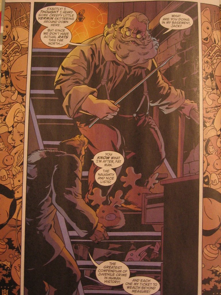
There he is again. (Pardon the crude image. I'm snapping stills without my scanner over here.) Of all of the holiday comics I've read, in the stories starring Santa, the jolly one is always treated with respect, even by the world's most powerful heroes. In Marvel handbook entry, Santa's "powers" are charted with the same consideration of their core characters, taking his speed and durability into account. In Fables, Willingham adds an interesting element to the myth; when one of Snow White's kids asks Santa how he accomplishes his one-night mission, Kringle essentially explains that he visits each deserving home simutaneously, as if for one night a multitude of Santas exist, not so much as dopplegangers, but as various aspects of the Santa persona, to fulfill all of his deliveries in as efficient a manner as possible. It's as good an explanation as any, especially in a world where childhood stories coexist with the humans that revere them. Santa is obviously serious about his mission, approaching the trespassing Jack Horner with a fire stoker like any old man would, but also retaining the jolliness and benevolence associated with his myth. Like any fable, Santa represents a story that has been told many times and many ways, but the result, the lesson, is always the same.
And what is the lesson of Santa Claus? Why are parents so insistent to convince their kids that a seemingly timeless character like Superman (who has at least existed as long as a majority of Earth's current population has lived, some 70 years) doesn't exist in a fantasyland called Metropolis, but yes, Virginia, St. Nick certainly lives in the North Pole, keeping tabs on your yearlong deeds to determine if you deserve toys on Jesus's birthday? Therein lies the answer, and coincidentally the point to our favorite comic book icons' vigilante heroism: as humans, we should be accountable for our actions, lest we threaten the safety and security of our fellow man. If you rob a bank, the Ben Grimm might shed his trechcoat and risk a chuckle or gasp from some rubbernecking onlooker to bring you to justice. If you lie to your parents, Santa might drop a lump of coal in your stocking. Different offenses, same concept. Really, Santa Claus predates Superman himself as Earth's mightiest superhero, avenging wrongdoing, and going beyond most Leaguers' or Titans' or Avengers' call of duty, actually rewarding good behavior. I mean, Santa travels from rooftop to rooftop -- which sounds pretty familiar to genre, if I do say so myself.
It's no wonder the big guy fits in so well with my childhood heroes. It's no wonder I don't think twice about Santa dwelling among the world's most renowned bedtime stories. Santa captures the best of both worlds with a story that will outlive them all. It's a shame his adventure is merely an annual one-shot . . .
Ho ho ho.
Monday, December 25, 2006
The Best of DC: Christmas with the Super Heroes, vol. 4 no. 22
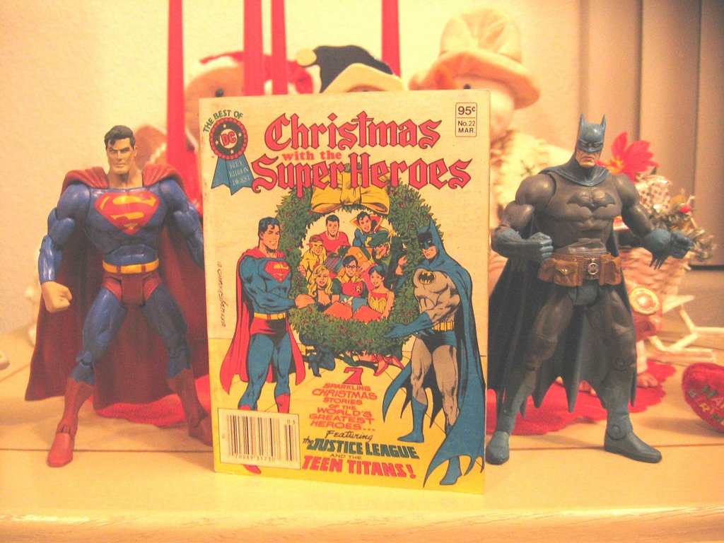
The Best of DC: Christmas with the Super Heroes, vol. 4 no. 22, March 1982
various contributors
editor: Julius Schwartz
Merry Christmas! Yesterday, I took a look at how Marvel celebrates the holidays. Today, I took a look at DC's yuletide offering from years past, starring the Teen Titans, the Justice League, Captain Marvel, Jr., and the Sandman. The collection features a never-before-published Jack Kirby tale, in which the classic Sandman saves Santa from a renegade band of Seal Men, and a Silver Age Batman story, in which the dynamic duo saves a young heir from future Scrooge-itis. Considering the recent JLU and Teen Titans Go! issues I read last week, this comprehensive look at a comics' Christmas was interesting and heart-warming. Simpler times, when superheroes fought to preserve the traditions we all secretly hope to maintain this time of year.
Tonight, we're starting a new tradition, with my second most compelling passion, aside from comics: karaoke. A Karaoke Christmas? I smell a LiveJournal entry brewing . . .
Sunday, December 24, 2006
Marvel Holiday Special 2006 #1
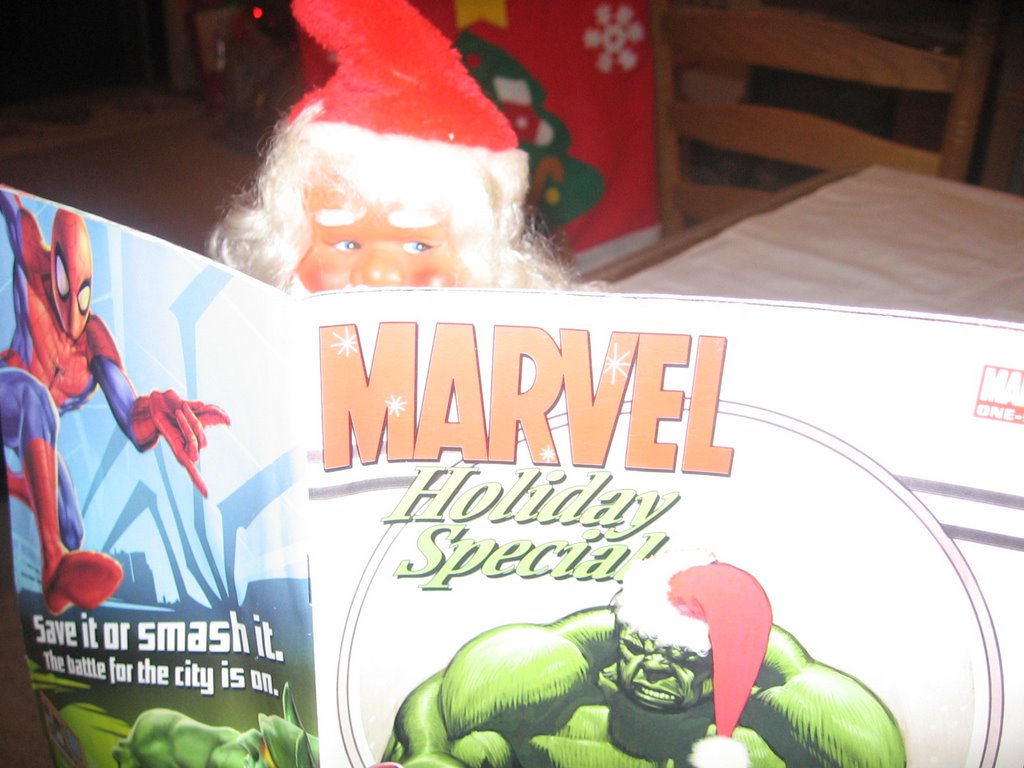 Marvel Holiday Special 2006 #1, February 2007, Marvel Comics
contributors: Andrew Farago, Shaenon Garrity, Ron Lim, Pat Davidson, Dave Lanphear, Scott Gray, Roger Landridge, Mike Carey, Mike Perkins, Jeff Christiansen, Sotocolor's A. Street & J. Brown
Thus far, my holiday trip to Arizona has been marvelous, in more ways than one. When I rolled into my native Peoria, I visited the 24-hour Wal-Mart Supercenter (a tradition I began quite a few years ago), and discovered several toy pegs full of brand new Spider-man Origins action figures. I haven't picked up my choices from the line yet (Dr. Octopus, Demogoblin, the Rhino, and Secret Wars Spider-man, if you must know), but the birthday money burning a hole in my pocket will soon make my Christmas wish come to pass, believe me. Despite popular opinion, it pays to have a birthday so close to the Christ's.
The other yuletide "marvel" I experienced today is the Marvel Holiday Special, depicted above with a certain rosy-cheeked saint. Even Santa has time to read a comic in the midst of his busy Christmas Eve schedule. This issue offered a nice variety of holiday offerings, from a tale starring Dr. Strange's assistant Wong and the humbled, embittered dragon lord Fin Fang Foom, who begrudgingly saves a winterland New York from a Hydra invasion, to a story featuring the Thing and Annihilus, written and drawn with the charm of a storybook fairy tale, and with an unlikely ending just as heart warming. The entire packaged is laced with brief chapters in an ongoing story about the Advanced Idea Mechanics (A.I.M.) New Year's party, and the unwitting date that suffers onslaughts from the Hulk for the sake of a mistletoe smooch from his peculiarly hot date. Talk about a Christmas miracle.
The Official Handbook of the Marvel Universe entry about Santa Claus was the icing on the cake of this holiday package, with cut-out ornaments and a past cover gallery to imply a sense of holiday history from the House of Ideas. I dug it. With most of their characters entrenched in the Civil War storyline, it was nice to approach these icons without that baggage, with the continuity of Christmas as the only -- albeit welcome -- consideration. With a few movies slated to hit the theaters in '07, next year is going to be a marvelous one, for sure. For me, it's started early.
Saturday, December 23, 2006
Betty & Veronica Spectacular #76
Betty & Veronica Spectacular #76, January 2007, Archie Comic Publications
writers: Dan Parent, Mike Pellowski
artists: Dan Parent, Rich Koslowski
letterer: Jack Morelli
colorist: Barry Grossman
editor: Victor Gorelick
EIC: Richard Goldwater
Reading this holiday issue of Betty & Veronica Spectacular, I realized just how dysfunctional the romantic concept in Archie comics have been. The girls seem to be the best of friends, walking the halls of Riverdale High and shopping together, but at the very mention of Archie, or at the sight of another cute boy, the “BFFs” are at each others’ throats in a treacherous quest for date night domination. Even Christmas couldn’t keep these vixens from their futile feud, as this installment reveals . . .
The two short stories in this issue are amusing enough, the first one more so than the second. In the first, a disgruntled elf boycotts Santa’s harsh working conditions by transforming himself into a cute Riverdale student to reap the benefits of Archie’s polygamist-like dating lifestyle. Sure enough, Betty and Veronica battle for the new student’s affections, and therein pushes the elf-turned-teen away, back to the North Pole, realizing that Archie’s life isn’t all it’s cracked up to be. In the second story, Betty and Veronica spot Archie at the mall and assume he’s Christmas shopping for them, but when the large portrait he picks up at the photo shop turns out to be for his mom, the girls are both relieved (the gift is egotistical, the girls ironically comment) but still zealous about what their respective gifts could be. If these stories weren’t so light-hearted, they’d be fodder for a Jerry Springer pay-per-view.
What amazed me about this issue is how much post-production went into the artwork. The pages were drawn decently, but the coloring utilizes the best technological techniques around, including the ability to transform the hues of inked lines to create a more lifelike look. The cover itself is nothing more than a sketch with a slew of clip art snowflakes and teaser blurbs, understandably creating the impression of a magazine for girls. The fashion and shopping pin-up pages obviously went over my head, not because of its content, but because of its appeal. Yeah, I think girls would best get this issue, not to mention the whole Betty and Veronica thing. This is a good example of how it takes one to know one.
Now, to hit the road to Arizona. Tomorrow: more holiday comic book goodness.
Friday, December 22, 2006
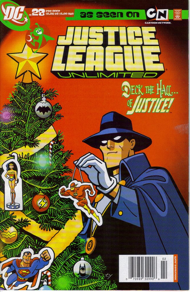
Teen Titans Go! #37

Teen Titans Go! #37, January 2007, DC Comics
writer: J. Torres
artist: Sean Galloway
letterer: John J. Hill
editor: Tom Palmer, Jr.
The cover of Teen Titans Go! #37 really spoke to me. Really. Silkie, Starfire’s caterpillar-like alien pet, donning the magical villain Mumbo’s enchanted top hat, is happily exclaiming, “Happy Birthday,” and, well, today is my birthday. I picked up this issue a few weeks ago in anticipation of reading it today, and I must say, as a superhero fan and a general viewer of the now cancelled Teen Titans animated series, this story was a pleasant treat. First of all, any avid readers of A Comic A Day must know by now that I’m a holiday nut, and this story is narrated in rhythmic rhyme akin to The Night Before Christmas. Secondly, when Mumbo’s hat blows onto Silkie’s head, and the heretofore mute slug utters his happy birthday proclamation, Starfire, even in the face of her glee, doesn’t actually acknowledge that it is her birthday. In fact, as it’s the day the after Christmas, such a plot device is highly unlikely. So, to whom is Silkie sending his best wishes? Hmm? Like I said, Teen Titans Go! #37 really spoke to me.
Yesterday’s read, the similarly holiday themed Justice League Unlimited #28, also appealed to my childlike sensibilities with its clever cover blurb, “Deck the Hall . . . of Justice!” The combination of the Christmas catchphrase and the old Super Powers reference was a synthesis of utterly guiltily pleasurable proportions. Further, these two issues read back to back offer an insight into the Johnny DC imprint, DC’s attempt to target a younger audience primarily through the franchises that crossover with successful television series, i.e. Scooby-Doo, Looney Tunes, and their Cartoon Network anthology titles. These two issues feature single-issue stories, with little more than the readers’ interest in the characters as an incentive to drop in and out of the series.
Further, the artistic style utilized in these titles is sharp and distinctive, formatting the Bruce Timm standard into an expressionist explosion of graphic energy that only kids could follow without the scrutiny of a magnifying glass. The opening splash page of JLU #28 is a meticulous montage of Christmas paraphernalia, all in the wake of Clayface’s attack on the Flash. I didn’t realize the depth of this image until I reread the issue, and many panels throughout the issue offer similar detail. The artists’ use of varying line widths really emphasize the important elements in each panel, while conversely drawing the eye to the equally fervent but intentionally understated background. Teen Titans Go! implements a slightly different technique, actually experimenting with a rack focus filter, as if some particular panels were still-frames from a Teen Titans episode. Although the effect conveys depth, Sean Galloway’s minimalist but expressive art style is lost in the fuzz. Silkie could probably attest after his brief stint as a speaker, it doesn’t matter what you say if it isn’t spoken clearly enough for folks to understand.
Most importantly, cover blurbs and frivolous imprints aside, these issues have something else in common: both of them incorporate classical Christmas myths into the modern legend of our favorite animated heroes. In the JLU, the Phantom Stranger gives the Flash a Ghost-of-Christmas-Past-like tour of Batman’s troubled childhood, and in Teen Titans Go!, the magic top hat motif has Frosty the Snowman written all over it. One can only assume that some kid somewhere is experiencing these holiday mainstays for the first time, thanks to these issues. Each legend makes the other relevant, in their own charming, unique way. You know, when I purchased Justice League Unlimited #28, along with tomorrow’s Betty & Veronica holiday special, at Borders a few nights ago, the clerk smirked and asked if the comics were for me. I may be a year older, but I’ll never be too old for this stuff, even if Johnny DC speaks to kids. Hey, this time, he spoke to the kid in me. Christmastime can have that effect on people.
Thursday, December 21, 2006
Justice League Unlimited #28
Justice League Unlimited #28, February 2007, DC Comics
writer: Mike McAvennie
penciller: Sanford Greene
inker: Nathan Messengill
colorist: Heroic Age
letterer: John J. Hill
editor: Michael Wright
In this Christmas adventure, the Flash gains valuable insight into Batman's "Scrooginess" thanks to the spectral guidance of the Phantom Stranger. This is a standard, heart-warming story that will stand on its own two legs when I compare it to other DCU holiday tales later this week. I will say that the Greene/Massengill team presents a crisp representation of my favorite heroes, particularly in their animated incarnations. That's a Christmas treat in itself!
Wednesday, December 20, 2006
The Shade #4

The Shade #4, July 1997, DC Comics
writer: James Robinson
artist: Michael Zulli
colorist: Pat Garrahy
letterer: Chris Eliopoulos
editor: Chuck Kim
The winter solstice is upon us. Tomorrow is the last day of autumn, and as such, I thought that this issue of The Shade, boasting the cover blurb “Harvest’s End,” would be appropriate. As a spin-off of James Robinson’s critically acclaimed Starman series, The Shade features Robinson’s usual dose of literary sophistication, however, I didn’t except this story to pack an emotional punch – which is an ironic phrase for it, as no blows are actually exchanged on-panel during the breadth of this issue. Some comics, like yesterday’s Star Slammers #1, are excellent reads that warrant a kind review, but rarely ripple into their genre like this issue. I need to spend some time picking it apart, if only to commemorate the changing of the seasons.
In fact, if The Shade #4 was less of a miniseries finale and more of a stand-alone story, perhaps in an annual or one-shot form, it may have had a more prominent effect on the superhero genre in its time. I don’t know if The Shade miniseries was a four-part epic or an issue-by-issue experience, but either way, this installment’s story isn’t difficult to understand with the other issues’ context: When Craig Ludlow’s presumed dead brother Gary returns with his generations-deep hatred for the villainous Shade intact, Craig’s wife writes the Shade and begs that he befriend the brothers before their plots for vengeance consume them. Her peaceful intentions result in Gary’s death – in the Shade’s defense, Gary was the first to lunge – and a hasty confrontation with Craig. Does the otherwise peaceful farmer avenge his brother’s death and fulfill a legacy of hatred toward the dark and listless fiend?
No. Instead the Shade and Craig discuss literature and part ways friends.
What?
In a twist that only Robinson can pull off, the climax of this story is Ludlow’s decision to law down his arms, unlike the many men in his family before him, all of whom fell to the Shade’s power. Indeed, had Craig risen his scythe against the Shade, he would have been defeated, but this inevitability isn’t what propels the man toward peace. The Shade’s long life of murder enabled a moment of vulnerability here, in which Craig seemingly recognized the villain as a man, and from there, they communicated as such, the baggage of their generations’ worth of antagonism as changed as the autumn leaves. Of course, if the men’s conversation wasn’t genuinely compelling, the climax would have been plain boring. Again, Robinson’s sophistication is as evident as his ability to pen colloquial vernacular. Just as a simple farmer and a villain worthy of the Justice Society can share a stoop, Robinson blends their speech patterns into a memorable dialogue that stands as a confrontation of sorts in itself.
Now, why did I go on about this issue’s potential impact on its genre? I’ve made it clear through this forum that I am a superhero fan, and examining the genre, the primary motivation behind many of the iconic heroes’ vigilant efforts can be summarized by one word: revenge. Batman, the Punisher, Spawn, and dozens of classic and contemporary characters are driven to heroism by a tragedy that they subconsciously seek to undo, and in that cause’s futility, instead perpetually punish the criminal element that inspired said tragedy to come to pass. If issues like The Shade #4 were not the exception but the rule, with conversation as a cause for resolution to a family’s need for vengeance, would the superhero genre as we know it continue to exist, or at least remain as vital? John Kerry recently reclaimed his position that diplomacy is the most effective way to resolve our nation’s tumultuous position in Iraq – Has he read The Shade #4? This issue is a veritable peace pamphlet, and although the “War on Terror” situation is too complicated for any single comic to solve, a potential model resides here. Who knows how many heroes could benefit from this story?
In the meantime, the wind blows a bit more bitterly. In some parts of our country, snow has already begun to fall. The leaves we raked into playful piles have disintegrated or disappeared . . . but come spring, they will appear again. Orange and brown gives way to white which gives way to green – this is the circle of life, at least on a seasonal level. The Shade may have once stood for peace, but come Christmastime, I’ll be scouring the pegs at Target, looking for his action figure incarnation, a tangible depiction of his villainous role in the Justice League Unlimited animated series. Conversation is all well and good as a climatic solution to conflict, but as the Shade himself muses at the end of this issue, how long can such a resolution last? Can such a harvest truly bear everlasting fruit?
Tuesday, December 19, 2006
Star Slammers #1
Star Slammers #1, May 1994, Malibu Comics
writer/illustrator: Walter Simonson
letterer: John Workman
colorist: Electric Prism with Nanette Malher & Catie Jellinghaus
Star Slammers is an excellent example of Walt Simonson’s masterful storytelling, both as a writer and an illustrator, with enough visual twists and turns even in just this issue that the reading experience is exciting and enjoyable. This arc begins with a Star Slammer in their enemies’ custody, his mind at the whim of a thirteen-year-old psychic hacker, until a mysterious figure sets the soldier free in a bloody mess that warrants investigation. Although we never see the Star Slammer in action, Simonson’s narrative creates a lasting impression of the warrior’s potential, leaving the real capabilities of this issue’s namesake up to our imagination. If this issue is the first act of a space opera, as one could be led to believe, I’m not holding my breath for the fat lady to sing. This is one star that can take its time getting slammed, assured that we’re hanging on for the ride.
Monday, December 18, 2006
Flare Adventures #18
Flare Adventures #18, January 2007, Heroic Publishing
writers: Wilson Hill, Dennis Mallonee
artists: Rob Jones, Dick Giordano, Mark Propst, Tim Burgard, Stan Sakai
colorists: Michael Kelleher, Heebink, Meyer, and Salibu (full names unlisted)
letterers: ComiCraft’s Albert Dschesne and Stan Sakai
When I purchased Flare #18, I expected to read a light-hearted action-packed Christmas story. Characters with names like Chrissie Claus, Cernunnos the Anti-Claus, and Sigma-Chi Master of Claus Fu strike me more as the one-time gag type, exploiting the lighter elements of the holiday to tell a pseudo-superhero story inspired by the yuletide season. I couldn’t have been more wrong. In the first of two short stories, the Chrissie Claus installment was the last in a multipart epic, so entrenched in its own back story that past events required a synopsis on the inside front cover and through the narrative of the comic itself, culminating in a fight sequence so laden with dialogue that the action might as well have not happened. This story’s saving grace is the cameo of Santa Claus, whose role in this tale was too brief for my tastes. Forget these other characters; the creators throw so many shapely chicks at us that in the end I can scarcely tell them apart. Put the big guy in for a few rounds. No matter how much continuity surrounds the story, nothing would draw in a general audience like good old St. Nick.
The second story in this issue was just as perplexing, if not completely pointless. Starring Flare, the namesake for this series, this short tale depicts the heroine visiting a library, reading children a tale she and her sister wrote in their childhood. She confesses that her lead character, a stick-boy, is stupid and explains his futile relationship with wildlife, until he stumbles upon a bound princess whose sexually suggestive solution to her predicament is way too inappropriate for Flare’s young audience. When the troll that captured the princess emerges and pursues the clumsy hero, the stick-boy defeats the brute by outrunning him – the troll literally topples over, asleep! It’s an odd little story that would’ve been funny except it wasn’t, and I perceive it as simply another opportunity to depict a female character in a skimpy costume. Perusing the ad featuring back issues’ covers, that seems to be all that Flare Adventures really has to offer. For some, I guess that’s enough of Christmas treat. This geek needs a little more stuffing for his stocking.
Sunday, December 17, 2006
Heavy Metal Magazine, January 2007
Heavy Metal Magazine, January 2007, Metal Mammoth, Inc.
contributors: Claudio Aboy, Karl Kofoed, Chris Spollen, S.C. Ringgenberg, Billy Martinez, Bernd Frenz, Oliver Ferreira, Claudia Kern, Patrick Baggatta, Victor Kalvachev, Eddie Wilson, Jeff Pittarelli, Weisfeld/Koch*, Von Eeden*, Tacito*, Angleraud*, Guenet*
* complete name unlisted
Last weekend, I reviewed the all-comics issue of Nick Mag Presents, an interesting experience that exposed the essence of the modern anthology while exploring the nature of contemporary youth-oriented comics. In a nutshell, we learned that kids like fart jokes. Today’s material, the latest Heavy Metal Magazine, offers a look at the other side of the coin: adult-oriented fantasy. While the magazine offers a gracious lack of flatulence, it does feature another male-friendly vice: the highly flexible female form.
On the surface, Heavy Metal uses the science-fiction/fantasy genre as a clever disguise to exploit the female body, utilizing any opportunity to display women in as many sexually suggestive poses as possible. However, an in depth study of the magazine reveals a level of sophistication behind each contribution, a notable measure of advancement in the realm of fiction and graphic storytelling . . . while utilizing any opportunity to display women in as many sexually suggestive poses as possible. Don’t misunderstand: I am not identifying this device as a detraction to the overall package. In fact, by boasting the bi-line “World’s Foremost Adult Illustrated Fantasy Magazine,” Heavy Metal is embracing what many artists have tried to decline for years: that the sci-fi fantasy genre is an adult one, and since it targets a primarily male audience, why not sprinkle a few hot chicks in the mix? Come on, you and I both know many of those early Image books featured obscenely proportioned women and would have been best shelved with the adult material. Heavy Metal seizes the opportunity and runs with it.
Heavy Metal also has the distinct power of history behind it. I don’t know how long it’s been around, but the publication exudes a sophistication that surpasses its content. The artistic galleries of Chris Spollen and Jeff Pittarelli, which star naked demon-women and the like, are presented with the style they deserve, with bios and exposes on the artists that offer insight into their inspirations. Also, the short story pieces, the sections to which I paid the most attention, offer diverse artistic techniques, from tradition pen and ink to detailed watercolors, from cartoony to realistic. The works may not be to everyone’s liking, but there is something for everyone, if page-turners took the time to read the words that come with the pretty pictures. Of course, one could always pay exclusive attention to the advertisements throughout the issue, promoting the best pornographic comics around today. To each his own, I suppose.
A majority of this issue was dedicated to the third installment of Magika, a tale about a renegade female cop that I simply could not get into. The adult elements are bubbling above the surface of a futuristic cyberpunk adventures, and the implementation of both simply didn’t appeal to me. A few of the one-shot short stories made the read worthwhile, however, like Joe in the Future, about a guy trying to score a pack of smokes (a commodity in the future, apparently) while dodging a collections robot that hounds him in public. The six-page story was so entertaining it read like a 12-page tale, which satire on the visual and narrative level so dense the concept itself couldn’t exist without it. Another story, A Deadly Mission, had more of a medieval context, as a band of high priests send a trickster into a rival kingdom to bring down its monarchy, and in a twist of an ending, the antihero realizes that he’s been manipulated into an unwitting Kamikaze mission. It’s an interesting enough tale with dynamic characters and epic potential, but told in exactly the amount of pages needed to tell such a story. I can appreciate a dense page layout rather than a drawn out adventure told simply for length’s sake.
Pherone is the stand-out story of the issue, with the most Western appeal. Seemingly ripped right out of a Vertigo crime series, Pherone stars a working girl for hire that overcomes the smarmy charms of her target and her own hesitations enough to kill him. The ten-pager has a decent narrative, but what distinguishes this story is its art, one part Dave Johnson sharpness, one part Eduardo Risso ambiance, the essence is very 100 Bullets-like, with strategic use of color to emphasis the environment as it benefits the visual sequence. I expect we’ll see this story or its contributors in a more mainstream forum in the near future; this magazine simply cannot contain this tale’s potential in quarterly 10-page installments.
Finally, I should mention Stickboy and Wildflower, two different kinds of stories that feature a title character. The efforts are interesting but they fall short, perhaps because of their respective abrupt endings. In Wildflower’s case, the Elektra-looking leading lady, in a mountain-climbing quest to meet her maker, literally encounters a caricature of the strip’s creator, who reluctantly agrees to consider drawing her with more clothes on. It’s a funny climax but a pointless one, lacking something that would’ve made the device an effective satire or self-exploitation. Stickboy, on the other hand, tells a meaningful allegory of a boy longing for rough and tumble play, but whose pacifist mother keeps his nose in the books. Suddenly, the boy, as an intergalactic agent, encounters a child that reminds him of himself, until the kid effortlessly kills him. I understand the moral, the risk pacifism raises in the face of self-preservation, but again, the rapid resolution through sudden injection of science-fiction makes no sense and loses a novice reader like me. Both characters have potential, as do both contributors. I just wonder if these efforts were flukes to the overall tapestry of their work.
Nick Mag Presents may not have featured a gun-toting prostitute hit woman in her underwear, but last week’s juvenile read and Heavy Metal Magazine have a few things in common, most recognizably, their openness to a variety of visual and storytelling styles, creating a comprehensive package for a very specific audience. In the case of Heavy Metal, I would continue reading the series for its elements of intrigue and social commentary, and in the meanwhile, perhaps the more fantasy-laden segments would grow on me. Such is the nature and intention of anthology. Throw enough balls at a chain-link fence, surely one of them will stick between the coils. Depending on how thick, or heavy, the metal is, anyway.
And with some of these illustrations, you don’t want to know what kind of balls I’m talking about.
Saturday, December 16, 2006
Punisher: Xmas Special
Punisher: Xmas Special, January 2007, Marvel Comics
writer: Stuart Moore
artist: CP Smith
colorist: Dean White
letterer: VC’s Joe Caramagna
assistant editor: Michael O’Connor
editor: Axel Alonso
EIC: Joe Quesada
Different people have different holiday traditions. Every Christmas morning, for example, after opening our gifts, my mother and I enjoy a breakfast of cold shrimp from the previous evening’s dinner, a tradition she and her father began decades ago, and that also included cookies, until my grandmother quit baking her dozens of varieties a few years back. The Punisher, on the other hand, makes a naughty list and spends the waking hours of Christmas Day executing the figureheads of New York’s criminal underworld. Yeah, it’s a little different.
In this Christmas special, the Punisher is depressed because many of his “naughty” targets have innocent family visiting for the holidays, so his initial plans for punishment are aborted by thoughts of unnecessary collateral damage. Instead, Mr. Castle decides to pursue a few small fish before they get any bigger. At the top of his list, Jimmy Nouveau, an oddly religious crook running a small crime-cult in the back of a strip club, connected to a cop’s murder just the night before. A majority of this issue is spent in pursuit of Nouveau, and when the Punisher finds him, a mystery unfolds that I didn’t expect, and that almost got the better of me. Indeed, writer Stuart Moore slips a clever twist into this tale that I won’t spoil here, other than to note that I was pleased with the literary Christmas treat. Any Punisher story with an extra level of sophistication is a-okay by me.
Smith’s artwork is befitting the tale, and the Punisher is so often obscured by shadow that he actually rarely appears in the story. Between his stark silhouette and Moore’s weighty monologue the Punisher is more of a force of nature in this context, an anti-Santa that befriends both the naughty and the nice and does his work quickly, in the cloak of darkness. Although I don’t collect the Punisher series anymore, I have followed it enough to know that many artists are approaching the material with similar results: strikingly dark foregrounds, with finely detailed urban backgrounds, creating a ghost-like essence for stories that usually feature soon-to-be dead men anyway. Christmas may be about lights and hope, but for the Punisher, his hope comes from dwelling in those corners where light doesn’t always reach. His is a kind of coal you don’t want in your stocking.
What makes for a good Christmas comic book? Surely, I won’t be reading this one to the kids, but at the same time, I was left with a satisfying feeling, having experienced the holiday through a familiar character’s eyes. For mainstream superhero/vigilante books especially, this is perhaps the best outcome. A Spider-man or a Batman Christmas story, no matter how optimistic, would never rank up there with the Burt Ives Rudolph saga, that’s for sure, but if we as fans understand the holiday just a little better thanks to our heroes’ input, that may be enough. I get how the Punisher feels on Christmas night, now. Fortunately, after years of miring the Punisher in multi-title story arcs, of “cameoing” the character to death, we’re in an era that knows how to use him right, through simple stories with seasonal significance. True to the character and true to the holiday, in this issue’s case. ‘Nuff said.
I spoke to my mother earlier today. She’s made some of the cookies she and her father used to eat those many Christmas mornings ago. I know we can never recreate the childhood experiences she had, but we can try. Christmas is, after all, about doing what you know. Tradition. In this case, the Punisher hit the bull’s eye.
Friday, December 15, 2006
The Nightly News #1
The Nightly News #1, November 2006, Image Comics
writer/illustrator: Jonathan Hickman
As I was reading The Nightly News #1, I could hear the ABC’s 20/20 on the television in the next room, which created an interesting and appropriate soundtrack for a comic book about the mechanisms and manipulations of the media. I couldn’t hear the words, per say, rather the lilt – the melodic rhythm of the reporters’ voices, each rife with conviction, compassion, and a pinch of condemnation, not for their audiences’ ignorance, but for their apathy. “Department stores are trying to rip you off during the holidays! On-line shopping isn’t the discount safe haven you think it is! Why don’t you care?” (Okay, maybe I did hear a word or two.) Such seasonal doom and gloom is just a part of what The Nightly News conveys about the television media. Based on The Nightly News, if viewers really cared enough, they would pick up a gun and shoot Elizabeth Vargas in the head.
Huh? Well, let me start with the comic book. The Nightly News #1, for all of its complex, computer-generated imagery (which we’ll discuss shortly), is a simple story about a social sect determined to expose the hypocrisy of the news media, or perhaps to eradicate the façade of the “news media” altogether, what with its world-changing ties to global government. An individual calling himself “the Hand,” working on behalf of an unseen force known as “the Voice,” executes dozens of reporters, and the police cannot locate or contain the sharpshooter in time to prevent this issue’s “to be continued.” Although Hickman insists that his is not a political book, the issue is littered with political satire and commentary that places this series in the categories of “relevant” and “informative.” I would venture to add the word “entertaining,” as well, as the author’s tone maintains a balance of humor in the face of the serious subject matter. Who ever said conspiracies couldn’t be fun?
The imagery I mentioned immediately elicits thoughts of Brian Wood’s Channel Zero, coincidentally another work about media manipulation. Hickman litters his book with small captions or comments that make each page a makeshift Where’s Waldo? of information, not with the frivolousness of Wood’s Channel Zero, but with a similar zeal. Hickman has a restraint about his format; his captions are noticeably meticulously placed, lines parallel with one another and the like, to imply a true sense of purpose to every visual aspect of the page. His hand drawn art isn’t phenomenal, but through computer-coloring and a consistent black/white/sepia tone, the package pulls together nicely. Nice to know that a comic book about media would utilize itself as a form of said media so effectively.
What interests me is the immediate draw to violence, which is often the crutch of the very media Hickman dissects in The Nightly News. Despite the Hand’s insistence that his is a mission of vengeance, in the end, I wonder if he will become the media darling he hates, the villainous superstar vilified and profiled and finally “caught on film” as a makeshift celebrity in spite of the public’s well established, justified prejudice and hate. By picking up the gun, isn’t the Hand doing exactly what the media told him that he, as a vengeance-obsessed elitist, should do? Maybe that will be his downfall.
The 11 o’clock news is on soon, and I don’t know how to feel about a few of the headlines leading us into the weekend. Christmastime makes for delicious vulnerability . . .
Thursday, December 14, 2006
Batman: Confidential #1
Batman: Confidential #1, February 2007, DC Comics
writer: Andy Diggle
penciller: Whilce Portacio
inker: Richard Friend
colorist: David Baron
letterer: Travis Lanham
associate editor: Tom Palmer, Jr.
editor: Mike Carlin
Batman: Year One. Batman: Year Two. Batman: The Long Halloween. Legends of the Dark Knight. Batman: Journey Into Knight. The Untold Legend of the Batman. Batman freaking Begins. What can possibly be confidential about Batman’s past?
Apparently, the origins of Bruce Wayne’s corporate rivalry with Lex Luthor, and the heretofore untold story of the Waynetech robot dubbed O.G.R.E. Huh?
The launch of the Superman and Batman “Confidential” titles implies that their respective histories have some pressing unanswered questions begging to be addressed. I’ve read the first two issues of the Superman series, and thus far I’ve been impressed, not so much with the logistics of the story about the introduction of Kryptonite, but with the insight into Kal-El’s character, and how each of his early adventures presented a different challenge that he feared would be the one to end him. In issue #2, Superman is disoriented in a lava flow, and when his lungs instinctively breathe in the hot molten rock, he panics that his insides may not be as invulnerable as his skin. It’s an interesting thought in the context of the Man of Steel’s humble beginnings. How Bruce Wayne and Lex Luthor almost collaborated on a robot-based project with piqued government interest . . . isn’t.
Further, it’s derivative. The “World’s Finest” crossover episodes of the characters’ animated series uses a similar concept, with far more entertaining results. In fact, every aspect of this issue is derivative of the Batman mythos in some way, not answering any questions but in fact generating a few new ones. In one scene, Bruce is holding the gun that apparently killed his parents, and claims he “took it from the G.C.P.D. evidence depository last year.” In Year Two, we specifically see presumed Wayne murderer Joe Chill toss the gun in a nearby bush, where a young Bruce later recovers the weapon and hides it in the foundation of Wayne Tower. Was this minor detail really worth an alternate explanation? Would Batman really have to steal evidence when he could easily lie to Gordon and swipe the gun under some bogus pretense? It’s uncharacteristic, yet indicative of the reckless abandon writers take when tackling these mythos. Let’s stop treading the past, and write some stories about the future, eh?
Then again, that could be the problem. Frank Miller’s chilling and highly entertaining vision of Batman’s future in The Dark Knight Returns was less of a benchmark in the character’s lore than it has become a challenge for writers to best the effort. Miller’s Batman was so unlike anything readers had read before, yet Frank managed to keep the hero’s essence and integrity intact. Aspiring impersonators are so consumed with stamping the context with their voice that they’re forgetting, Batman already has a voice. Sure, it’s gruff, but it’s clear, and with so much source material available, it should be harder to mess up than it is. But it is.
And, I’m sorry, but Whilce Portacio’s artwork was just plain sloppy. Bruce never looked the same from one panel to the next, and he never looked handsome (at the risk of how that sounds, but you know what I mean). I’ve seen him do better, and with Lee on the All-Star series (if it still exists, thanks to Frank falling victim to the curse he initiated) and the Kuberts on the flagship title, he has some worthy company to keep. Even the cover kind of stinks. I’m just not that impressed.
I’m a Batman fan. Yes, I can like other kinds of comics, too, you anti-superhero blowhards. But I’ve been having a hard time finding him lately. He certainly isn’t in this issue. Batman himself is what’s been kept confidential these past few years . . .
Wednesday, December 13, 2006
newuniversal #1
newuniversal #1, February 2007, Marvel Comics
writer: Warren Ellis
artist: Salvador Larroca
colorist: Jason Keith
letterer: VC’s Rus Wooton
assistant editor: Daniel Ketchum
editor: Axel Alonso
EIC: Joe Quesada
I admit, I didn’t give The Disciples a fair shake yesterday. I can blame it on my fever, but the more I think about it, the more I blame my closed-mindedness. See, recently, an old friend asked me what kinds of comics I’ve been reading lately, and, thanks to this on-line experiment, my initial reaction was, “Well, everything!” Alas, that can’t be true. For the variety of comic books I’ve read for the past (nearly) six months – all of them have had something in common: they’ve all had covers that have intrigued me. Either the title of the series or the cover image of each issue I’ve reviewed has either appealed to my personal tastes or to my vision of what A Comic A Day should explore. As much as I’ve enjoyed experiencing comics I never would have experienced otherwise, I’m still searching for “the next read” through a filter. Unfortunately, The Disciples didn’t sift through.
Of course, I’m not taking my review back (I can’t, because I need to preserve the timestamp for this blog’s daily integrity), nor am I apologizing for it. Every kind of artwork, from painting to music, is subject to the tastes of its audience; everybody is not going to like everything. Somewhere, someone is looking at the Mona Lisa and thinking, “Well, it alright, I guess . . .” As I’ve explored before, at best, an artist can hope to create a connection-point with his/her audience, a window at which the creator and the connoisseur can meet each other, albeit briefly, and nod to one another in acknowledgement. A quick, “You exist, and I respect that,” and that’s it. For The Disciples, I failed to mention the scene that featured a young lady haunted by her toys. As a geek that has had a bedroom littered with action figures for as long as I can remember, I can understand the feeling. Believe me, when an Etch-a-Sketch starts writing you death threats on its own, that’s a feeling you want to shake in more ways than one.
Justice #1 was another comic book I read with my fanboy goggles firmly in place. (You can search the archives for that one.) Despite Archie Goodwin’s credentials, Justice, and the whole Marvel/New Universe concept, simply didn’t appeal to me. (All right, I confess, I owned an issue of DP7 as a kid. You got me.) The New Universe imprint only lasted for three years, but its impact has rippled into the 21st century, with its flagship characters appearing sporadically in various titles throughout the last decade (Peter David has a hard time letting go) and, just earlier this year, some commemorative specials revisiting the seemingly forsaken continuity. Those issues were obviously testing the waters for newuniversal, the Warren Ellis/Salvador Larroca vehicle that revamps the concept for a modern audience. An “Ultimate New Universe,” if you will. I can only assume the intended readership is a new one. If the New Universe titles had so many faithful followers, wouldn’t it still be around? The power of nostalgia, and the crafty combination of the Ellis/Larroca team, will sell this book right off the stands, all prejudgments aside. After all, I picked up. Willingly.
And boy, am I glad I did. First of all, I don’t know if I’ve seen Larroca’s work before, and this issue is an excellent example of his work with both the human form and architectural structure, as his pencils grace such well-known sites as the Golden Gate Bridge, the Empire State Building, and the Twin Towers. Yes, in this world, the Twin Towers still stand, and Paul McCartney was the Beatle squashed by a bullet, lamented by a living, breathing John Lennon. Prior to “the White Event” that changes everything, the main characters in this series are introduced with the usual Ellis realism, each either mortally wounded, drunk, or generally embittered. I would imagine that old fans of the New Universe would welcome these reintroductions knowingly, but at the same time, Ellis breathes new life into them so that new readers, like me, can understand or relate to them effortlessly. After the White Event, each of these characters are effected physically by the star brand that distinguishes the New Universe imprint, a symbol that becomes a tangible catalyst for events to come. That’s how you market a brand.
newuniversal (which I assume was intended to remain in the lower case) has very little in common with The Disciples, except for their roots in the paranormal – a strong enough connection, I suppose. I mention the two together only to elaborate: newuniversal begins with characters I can understand, with a foundation in a reality to which I relate. The Disciples is a high-end concept that, even by the second issue, was too steeped in its own lore for a newbie like me to comprehend. With an anchor to the real world (albeit a parallel one), I care about the changes brought about by forces unexplained. This is why magicians have hot assistants – so when all else fails, at least we had something nice to see. This is why science-fiction starts with the science – so when the fiction stretches the bounds of imagination, at least its inspiration was something proven within the realm of possibility.
Transition: Is it possible for me to pry my fanboy goggles off? I’ll explore this aspiration in my secondly quarterly report, due out at the beginning of next year. Until then, I can’t promise that I won’t dismiss a few more books, even if only inadvertently. If anyone out there is actually reading this, maybe they can suggest a few titles of interest . . .? When this experiment started, I mentioned that the effort would be a two-way street, and now, more than ever, I need your help. The topic of today’s review proves, not every concept can be universal, but when broached from a different perspective, it can appear new. If I can breath new life into an old comic book with my pigeonholed perspective, I’ve done something right.
Tuesday, December 12, 2006
The Disciples #2
The Disciples #2, June 2001, Image Comics
writers: Colin Clayton & Chris Dows
penciller: Laurence Campbell
inker: Larry Shuput
letterer: Nate Pride
colorists: Jon Proctor & Nick Dragotta
When I read the positive reviews on the back cover of The Disciples #2, I anticipated a solid read. Just a few pages into the experience, I was disappointed. I just don’t get it. The book didn’t even strike me as coherent, like Dr. Strange on acid. This could be my fever talking, however. Remember, I’m sick. Time for some sleeping pills.
Monday, December 11, 2006
American Century #17
American Century #17, September 2002, Vertigo/DC Comics
writers: Howard Chaykin & David Tischman
penciller: Marc Laming
inker/letterer: Digital Chameleon
colorist: Pam Rambo & Digital Chameleon
assistant editor: Mariah Huehner
editor: Shelly Bond
My throat hurts. My back feels twisted. I have the chills. Classic symptoms of the household flu. I never got sick. Now, this makes three times in the past five months.
I read American Century #17 because the character on the cover looked as cold as I feel. The ongoing narration throughout the issue confirms the chill in the snowy air of Chicago, as Harry Kraft returns to the city he abandoned under the pretense that he had died. Excluding the subplots, which consumed a lot of page space but featured characters with intriguing quirks all their own, this issue is about a man with no place in the world other than the one place he told himself he would revisit again; it’s an interesting dilemma rife with regret and melodramatic introspection, a defense mechanism Kraft undoubtedly implements to hide his latent vulnerability. I enjoyed the issue.
But I’ll enjoy bed even more, now.
Sunday, December 10, 2006
Pirate Club #1
Pirate Club #1, February 2004, Slave Labor Graphics
writer/illustrator: Derek Hunter
co-writer: Elias Pate
Pirates are in this year. Kids were dressing up as pirates on Halloween, and they’re now asking for pirate gear for Christmas. Of course, we have Disney’s The Pirates of the Caribbean to thank. Children across the country are brushing their teeth with little plastic Orlando Blooms and wearing the likeness of Johnny Depp in their collective butt. Disturbed is hardly the word for it.
Still, as a guy, I confess an inherent fascination with pirates, as well. (In fact, I’ve recently used this fascination to my professional advantage, a project that I will exploit through this forum next year, I reckon.) Something about their seaward fraternity appeals to the base nature of every man; the idea of hanging out with the guys, seeking adventure, and plundering women from port to port is perhaps the first historical record we have of the modern phenomenon known as a “dudes’ night out.” We mustn’t forget that pirates were also terrorists of the trade routes that kept the concept early global economy in peril, as well. But . . . they have parrots on their shoulders! They’re so cool!
So, you can imagine my excitement when I discovered Pirate Club #1 in the quarter bin at the comics shop today, where I picked up a veritable treasure chest of Christmas-themed comics soon to pop up in these postings. I figured Pirate Club, its cover depicting the makeshift adventures of a few undoubtedly geeky kids, would stir my inner child as only pirates and the holidays can. These characters obviously aren’t pirates, but the title itself creates an expectation that elicits thoughts of Calvin & Hobbes-like imaginary exploits – you know, youthful frivolity with ironically realistic consequences. I figured wrong.
Don’t misunderstand. This issue captures the characteristics of youth rather poignantly, as its lead characters, one a stickler for formality and the other a more go-with-the-flow kind of guy, blandly search and test potential new recruits for the Pirate Club. In fact, it’s the creators’ decision to dwell more in the characters’ mundane behaviors – we spend more time discussing the worthless politics of Pirate Club than we do pretending to be pirates – that makes the climatic moments in this issue fall flat. In those moments, the real world consequences I mentioned actually kick in, as the nerdiest of their recruits is tossed overboard and apparently drowns as the others argue who should rescue him. The scene’s punchline, and the last line of this issue, “Well, you’re gonna have to tell him mom,” makes me wonder what the writers intended. With such a relatable build-up, should we genuinely consider the weight of this kid’s possible demise? Or, like South Park’s Kenny, will he appear in the next installment to continue the pretend voyages of Pirate Club? I may never know.
This issue has many strengths, and Derek Hunter’s visuals is one of them. His characters’ expressions are minimalist but expressive, and his ink work is consistent, with thicker lines around his heroes to make them pop off of his fantastic background work. It’s a style I’m seeing more and more, especially in material like yesterday’s Nick Mag Presents or the Disney Channel Digest. In those cases, the line work benefits from pinpoint computer coloring, and if this issue’s interiors could reflect the multicolored style of its front and back covers, Hunter’s work would be comparable to those mainstream publications. Kids would really dig it.
Speaking of yesterday’s read, I had intended to cover the holiday issue of Heavy Metal magazine today, to contrast a youth-oriented anthology with a definitely adult one. Unfortunately, the time I’d need to read the issue escaped me this evening, so anticipate that review to usher in our Christmas-intensive slew of reviews. Pirates are a worthy second choice. As much as guys like reading magazines like Heavy Metal, the child in them still likes pirates. If not . . . well, they don’t know what they’re missing. They should join the club.
Saturday, December 09, 2006
Nick Mag Presents: The Best of Nickelodeon Magazine
Nick Mag Presents: The Best of Nickelodeon Magazine
display date: until November 28, 2006
various contributors
I have reviewed many anthology or multi-story comic books in the breadth of the A Comic A Day challenge, but after last night’s brief and perplexing experience with Zoot!, I’ve decided to analyze the subject completely once and for all. The issue of Nick Mag Presents in question is a perfect window of opportunity to broach this topic, as it features the best comic strips Nickelodeon Magazine’s notable ten-year run. (An “All-Comics Issue” counts by my A Comic A Day standards, as it contains a single issue’s worth of sequential art.) I purchased this issue a few weeks before Thanksgiving, in an effort to see if a local drug store carried comic books on their magazine racks (they don’t), and because of its length, I’ve waited for an adequate day to read this compilation with the effort and attention it deserves. Consistent readers of this blog know that recent entries have been brief, thanks in part to my hectic work schedule, and admittedly, I’ve deviated from the dedication A Comic A Day deserves. Thankfully, with the exception of escorting a few deserving kids on a shopping spree early this morning, today’s rainy weather offered the time and the inspiration I needed to settle down with Nick Mag Presents. We’re slowly but surely getting back on track.
Flipping through this issue of Nick Mag Presents, my initial impression is awe at the sheer amount of varied artistic talent that brings this package together. Starring characters as well known as Spongebob Squarepants, and other strips as exclusive to Nickelodeon Magazine as Impy & Wormer, featuring respected talents like Scott McCloud, Stuart Immonen, and Kieron Dwyer, this project is a veritable who’s who for fans of children’s comics, and the medium of comics altogether. From the experimental sequentialism of Craig Thompson’s “Tediously Detailed Adventures of Juanita & Clem” and John Accurso’s “Walk This Way” to the minimalist “footer” strips that run along the bottom of several pages throughout the issue, the format is utilized to the height of its potential and is a visual treat for readers of all ages. I wonder if the artistic cleverness of some of these strips would be lost on a younger audience, but at the same time, where else would budding illustrators first experience these experimentations? Even without the words (which we’re getting to soon, I promise), Nick Mag Presents stands on its own as a perfect jam piece of the latest and greatest styles in comics today.
Regarding this issue’s content, I profess an admiration for the subtle educational slant the editors imbued throughout, instilling an appreciation for comics as a vehicle for humor and sophisticated modern pop art. (I mention the editors because I happen to know one. Dave Roman is a fellow small press exhibitor, the writer of Quicken Forbidden and the cartoonist behind Astronaut Elementary, and a very pleasant acquaintance to bump into every year. The guy is a gentleman and a scholar, but I don’t know him well enough that to affect this review, only to recall the Nick Mag panel I attended at SDCC last year, featuring among others the charming James Kochalka.) Look no further than Scott McCloud’s “Drawn to Comics” supplement, one-part education/one-part encouragement to aspiring artists, for proof of an academic intent; additionally, the provoking inclusion of The Terrors of the Tiny Tads, a newspaper strip that ran more than one hundred years ago, is a historical lesson in the founding fathers of modern Sunday comics. The brief but hilarious interviews with regular contributors to the magazine rounds out a comprehensive look at the process, just short of taking pictures of the artists at their drawing desks. And how funny is that anyway?
Now, I work with kids, part of the reason why my schedule is often consumed with extracurricular activities, and I wonder if the length of this issue would be a deterrent for their stereotypically short attention spans. Then again, considering I read parts of this issue at a time throughout today’s rainy afternoon, and that none of the strips exceed four pages in length, children can presumably come and go from the material at their leisure. In fact, the length invites the possibly and explains why this issue is justifiably displayed on the magazine racks for so long. This stuff is timeless. Further, anyone interested in what makes kids laugh need look no further than these artists’ separate but cooperative efforts. (Separate in their individual styles, but cooperative in their attempt and desire to create an entertaining youth-oriented product.) Fart jokes abound, that’s for sure. Also, at least two strips deal with characters losing their noses; if that’s more than a coincidence, I don’t know. Boy/girl relations are addressed gently, more as subplots than catalysts in and of themselves, and bullying, pranking, tattling are all frequent issues that kids can obviously, easily understand. Summarizing these strips would take too long and be counterproductive to their crucial visual interplay, so I won’t bore you and butcher the material any more than necessary. I’ll simply conclude by noting that this was the most entertaining anthology of any I’ve read in recent memory, and the most inspiring. Print cartoons are a long-way from extinction, as some cyber-purists may believe.
As I’ve referenced before, during another panel discussion at last year’s Comic Con, Danny Fingeroth (or one of his peers, I forget now) mentioned old anthology comics, like some of the sci-fi or western works I’ve reviewed in months past, as the proverbial training grounds for that era’s up and coming talent. With just a few pages’ worth of story to worry about, with characters less popular or engrained as mainstream superheroes, young artists need only worry about honing their craft. Although this format has been mostly lost in contemporary comics (even yesterday’s Zott! was only a cooperative brotherly effort), Nick Mag Presents keep the concept alive with jam issues like this, and their monthly “The Comic Book” insert in the regular Nickelodeon Magazine. Further, with material blatantly intended for kids, a fond fanboy can’t help but wonder if this reading experience is what comics were like in their earliest days, when they were stereotypically “for children.” (And corrupting them, right, Dr. Wertham? I know after reading this issue, I farted more!) The seemingly simplest material that the A Comics A Day challenge reviews strikes me as the purest, the most intensive to the overall spirit and potential of the medium as a whole. Coincidence? At the risk of getting slimed, I confess, I don’t know.
Friday, December 08, 2006
Zoot #1
Zoot #1, November 1992, Fantagraphics Books
by Andrew & Roger Langridge
I'm trying to understand Zoot. I really am. A combination of short stories not unlike Night fuits, the book I read on Thanksgiving, Zoot features a series of bad jokes and existential conversations, like The Kings of Queens meets Waiting for Godot with a touch of Men are from Mars, Women are from Venus. Some of the contributions are insightful, like The Derek Seals Story, but most of them fall flat, like the page dedicated to a news report communicated through animal-oriented puns. I don't know. I've worked a fifteen hour day and comics are the furthest thing on my mind. Hopefully tomorrow will be a more fruitful day, blog-wise.
Thursday, December 07, 2006
Read This Book and Die (Laughing)
Read This Book and Die (Laughing), Art & Soul Comics
by Marc Hempel & Mark Wheatley
Even as a flipbook, this issue is too schizophrenic for me to understand. The title story -- that is, the story placed on the cover designated for right-to-left consumption -- is billed as simply hilarious, yet the nature of its hilarity is a joke that outlives its premise, and a punchline that fall as flat as the short tale's anticlimactic ending. The tale, starring Tug, a silent "he-man type" and his pipsqueak admirer Buster, is a decent study in flagrant sidekick-fueled adulation, but that's it.
The second tale is a bit more complex, its artwork a bit more intricate. The first in a series, "Radical Dancer" features a futuristic world in which dreams are the driving force of media, and the human mind can be as easily pirated as a cable cord. It's an interesting concept that too contrasts the issue's leading story to remain effective or relevant. Based on past A Comic A Day fodder, a story like this is better suited in a forum like the old Epic magazine, or Dan Dare's anthology comic.
This issue wasn't all bad. Visually, Hempel's cartoony style was amusing enough to maintain his story's momentum, and while Wheatley's work would have benefited from color, its airy black and white format maintained its ethereal nature. I just feel that, if a book is going to feature two stories, the flip shouldn't be so dramatic. How can you appeal to a general audience, how can I as a consumer feel like my money was well spent, when both tales exist as a hit or miss?
Wednesday, December 06, 2006
Blood: A Tale #1
Blood: A Tale #1, November 1996, Vertigo/DC Comics
writer: J.M. DeMatteis
illustrator: Kent Williams
letterer: Gasper Salading
Despite the cover’s November 1996 publication date, when I flipped through Blood: A Tale, I felt compelled to double check the inside cover’s fine print, where my suspicions were confirmed – this material was originally copyrighted in 1987. Like Stray Toasters, Blood: A Tale boasts a fully painted interior which, unfortunately, hasn’t stood the test of time; that is to say, the nature of the artwork and its reprinted resolution is indicative of its era. Its dark, shadowy hues, coupled with its uber-melodramatic story, is just what transitioned mainstream comics from its campy roots to its angst driven, soap-operatic branches of the early ‘90s. But don’t worry; I won’t go off on that tangent again.
I will, however, address another issue that has permeated the comics industry – specifically, the validity of comics as a legitimate influence in modern pop culture. An article at Comic Book Resources is just the latest in a slew of exclusive editorials that claim the importance of the comics medium as an art form, a stance I would normally embrace and argue to no end, until I read Blood: A Tale. I’ll warn you, this train of thought is potentially a long one, but hear me out. Regarding Blood’s plot, DeMatteis crafts an intricate tale that begins as a short story, in which an old, lifeless king is visited by a virginal, virtuous girl that tells the story unfolded through Williams’ graphics. That element is intriguing enough, but the core of this issue is truly perplexing, not as a body of work, but as an intentional effort from its creators.
See, if I thought Mora was symbolic and ethereal, I obviously hadn’t read Blood yet. A majority of this story is told through lofty narrative, written with the eloquence of the diary of a Victorian heiress, or something. Interestingly, the beginning of this issue isn’t unlike the beloved Christmas story, as an unwitting woman inexplicably, perhaps divinely, becomes a mother, only to watch her son become consumed by a seemingly more holy way of life. However, the tale deviates when our protagonist discovers that his monastery is a ruse, and an act of murder is followed by an aimless existence. Suddenly, in the end, the man is bitten by and becomes a vampire. Yes, vampires arrive in this story with a similar severity to their first appearance in the film From Dusk ‘Til Dawn, but with less cinematic gore, I reckon. You just don’t see it coming, and as much as I thought it would cheapen the work’s integrity, it actually added a macabre relevance. Blood: A Tale is an allegory for something; I just don’t know what yet.
And that’s the thing. Blood is written with a grace befitting a mythological work, which is exactly what industry professionals boast when defending the significance of comic books. We’ve heard it all by now: comics are the modern cave etchings, our superheroes are the modern Pantheon, et al. Two things cynically flutter to mind in the face of these claims. Firstly, when those cave dwellers told stories via chisel, how could they have known their tales would become historical legend? How could they know they would become the forefathers of art and literature as we know it? Those ancient Egyptian vases were the proverbial “this just in” headlines of their day! This is to say, the authors of any given fiction have no right to claim that their contemporary works are mythological in nature. That’s for the test of time to decide.
Secondly, and most importantly, when I studied Greek and Roman mythology in junior high school, I was fascinated by its grandiose tales, by the heroics of its characters, by the supernatural overtones of their cultures. Furthermore, although some stories shared characters, many of these epics were self-contained adventures, episodic through makeshift chapter headings but otherwise complete in and of themselves. Therein, what does Superman and Hercules really have in common? On a very practical level, through a mundane pedestrian fanboy perspective, I can’t help but wonder if Homer ever tried to retract the origins of Achilles, if the whole weakness-in-the-heel thing was something he ret-conned after years’ worth of pre-established continuity and other creators’ legacies. What I’m getting at is, if these characters actually are our culture’s modern mythological heroes, so consuming to our global landscape that their legends spread in various languages and media, why do their contributors treat them with such reckless abandon? Why is our modern Hercules at the apparent whim of any Hollywood hotshot that decides to moonlight as a comic book writer for a month or two? Hey, I’m a fan of Morrison’s Batman, but hold the last thirty years’ worth of Detective Comics to the first thirty years of its lore, and those old Kane/Finger books look our cave etchings, sans the reverence. Who would dare scratch out those old stories to tell it as “they really must’ve intended?”
Yes, I know this review reads like an embittered fanboy’s dissatisfied rant, but I hope whoever reads these thoughts considers them in the scope of modern, relevant pop culture. Blood: A Tale is an excellently written piece of work, just as Stray Toasters struck many a literary cord, but where does a story like this fit in the contemporary scheme of things? It’s not enough to write a mythological tale anymore; a comic book can (and perhaps must) too easily become a franchise, selling movie, video games, and merchandising rights to the highest bidder. Blood: A Tale isn’t a superhero comic, nor is it a quirky indie tale with potential Hot Topic appeal. It’s just a good old-fashioned story of high-concept proportions. It’s the life’s blood of what comics used to be, before corporatism took a vampire-bite out of its neck and . . .
Wait a minute . . .
Tuesday, December 05, 2006
Mora #4

 Mora #4, October 2005, Image Comics
by Paul Harmon
Nearly six months later, the A Comic A Day project’s greatest nemesis hasn’t been variability in comics, or the availability of variability in comics, so much as it has been plain old fatigue – case in point, last night’s brief review of Pigtale, a comic that deserves more than a single line worth of commentary, the shortest entry in this blog’s almost-half-a-year history. Fortunately, to the credit of the medium’s artistic integrity, whenever I’ve offered a regrettably feeble review, the next day’s read allows for some compensation to make up for the phoned in effort . . . some window to revisit the material, either in the context of a contrast or a comparison. A flip test may impress that Mora #4 and Pigtale #4 are vastly different literary experiences, but for my selfish reasons, I find a connection. See . . . the good guy always bests the nemesis.
First of all, and most notably, Pigtale and Mora both star talking animals. Pigtale’s take of bestial personification is rooted in science and reinforced by dry wit; Mira’s talking animals are seeped in pure magic. Further, Pigtale is more pedestrian, while Mira seems quite ethereal. I should confess that I purchased Pigtale #1 when it first hit the shelves, and although I was attracted to Ovi Nedelcu’s story and art, I didn’t pursue the rest of the miniseries until I happened across this final issue in a quarter bin. So, I vaguely remember how the story began, and now that I am aware of its conclusion, I assume this pig really is the other white meat, as this action-packed installment is all climax with little real story. I couldn’t really place the circumstances, then again, I haven’t revisited Pigtale #1 since its original release. Mora, on the other hand, is pure narrative, with a grandiose verbiage that implies universal consequences, as if the very sanctity of the world is a stake through the paranormal clash of these purely earthly creatures (sans the Medusa wanna-be in the page sampled above). The issue wasn’t as easy to follow, especially since I didn’t have a previous impression to rely on, but still just as compelling. Talking animals have that effect on people, I suppose.
Secondly, both of these Image books were created by a singular artist, a virtual no-name (at least by my pedestrian standards) that receive cover credit and that implement a black and white format differently, and masterfully. Pigtale strikes me as pure Micron pen, with computerized gray scales, each panel effectively expressing the characters’ actions and emotions, and page pulling the eye from one panel to the next with a sense of suspense and anticipation. Featuring a rhinoceros henchmen and a Hulk-like pig transformation, Nedelcu illustrates his bestial characters with limbs that could crack a tree in half; the sheer girth of these characters’ proportions express their power with little exhibition necessary, although we get plenty of that, too. Mora’s heavy inks imply the use of the ink and brush, and its characters appear nimble and agile, a fluidity that speaks to the magical and natural elements in this tale. The bat creatures at the beginning of this issue come to mind, as well as the images in the page below– sleek, shadowy, and intriguingly demanding to the eye. The inclusion of a small sketchbook section in the back of both of these issues is appropriate, and as a new reader to both creators, more so than these specific titles, I’m curious to see more from them.
On more than one occasion, this forum has explored the nature of animal personification (pardon the pun), and these two issue contrast the effective use of this device – animal characters that talk, to put it simply, are either easy to understand, or beyond the scope of our comprehension. Pigtale is the former, Mora is the latter, by design, I reckon. I may sympathize with these characters, but I must say, I’m not going vegetarian overnight. Honestly, at best, I’ll try harder to understand the animal world, thanks to more than a few channels dedicated to that cause on my DirecTV. Heck, I’ll find the time. A Comic A Day has proven, I have so much of it to offer.
Sarcasm intended.
That’s the fatigue talking.
Subscribe to:
Posts (Atom)