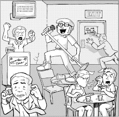
Cemetery Blues #1, January 2007, Image Comics
writers: Ryan Rubio & Thomas Boatwright
artist: Thomas Boatwright
letterer: Jason Hanley
editor: Kristen Simon
Blogger's note: Entry for Tuesday, March 4, 2008.
Have you ever heard of "the flip test?"
If you shop for comics even half as frequently as I do, then you probably put many issues through the flip test whether you realize it or not. See, every time I see a number one on the stands (and last week, there were plenty, hence my recent reviews of Kick-ass, Urban Monsters, and Megas, not to mention the Gravel and Zorro issues I haven't gotten around to yet), I usually pick up, examine its cover, flip it over to see if the publisher included any promotional material on the back, then thumb through its contents. Yes, the cover alone usually isn't the best indicator for what the interior art will look like, since "cover artist" has become a legitimate credit in many series of late. If the art jives with me, I'll read a few random lines of dialogue to see if the characterization betrays any depth, or if the plot is intriguing. Sometimes, I'll read the issue's last line -- a valuable lesson I learned from Garth Ennis' Preacher. He always left us wanting more. If a comic book can do that for me seconds after I grab it, it's usually a keeper.
Maybe your flip test abides by different criteria, but c'mon . . . You know you do it, too. It's the only way to shop frugally in these financially trying times. Conversely, nobody is stopping the comics industry from cranking out product. Do they know what they're doing to me, burying me in debt?
Speaking of burying something, enter Cemetery Blues. Thomas Boatwright's art sealed the deal for me from this issue's first page, and the twenty-two page story that follows is so dynamic that I thought it was a little longer. Ridley and Falstaff are zombie hunters in the employ of the spectral Mr. Lear, who has sought these capable but drunken sops to kill the archnemesis he couldn't. When Ridley and Falstaff futilely steak the heart of a corpse in the middle of the poor soul's burial, a couple of opportunistic priests enlist them to combat the real evil lurking in their town's neighboring forest. Of course, it appears that Lear's enemy is involved. As Ridley stares down a few seemingly possessed deer, his last line is what ensured I'd come back for more:
"Well. This should be brilliant."
Anybody that could pull of sarcasm in print is a winner in my book.
Drinking, the undead, a small town mystery, a supernatural conspiracy, all in one issue? Like I said, I was very pleased with this issue's density, thanks in large part to Boatwright's artwork. His style combines sketchy ink lines with seemingly photographic background work, balancing cartoony characters with lush realistic graytones, establishing the perfect mood for a book that primarily takes place in a cemetery. Ironically, Boatwright's work comes alive via his heroes' palpable expressions and personalities, and he certainly doesn't waste any space on the page. I've read quite a few comics in Image's Shadowline imprint now (After the Cape, Gutwrencher, Urban Monsters) and I think Cemetery Blues is the best yet. If the imprint runs with this supernatural theme (forget that drunken superhero shtick, man -- been there, done that with Tony Stark years ago), I bet Cemetery Blues can easily become its flagship title.
See, the flip test doesn't necessarily refer to how one peruses a potential purchase so much as it implies how the reader might react to a great book. Needless to say, I flipped for it.
Supplemental: A quick Google search uncovered Thomas Boatwright's blog, so until I get a scan or two up here, check it out and behold his art! Hey, I agree with your thoughts about the Cookie Monter, man . . .)
Subscribe to:
Post Comments (Atom)


1 comment:
Thanks for the review! :) So glad you enjoyed it!
Post a Comment