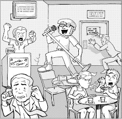
Knight Watchman #1, June 1998, Image Comics
writers: Chris Ecker& Gary Carlson
artists: Ben Torres & John Thompson with Mark Lewis
If superheroes have demonstrated any super power, it's endurance, not against bullets or laser beams but against the tumultuous trends of the entertainment industry. Superheroes have survived our country's Great Depression, a world war, a civil right revolution, and most recently, a saturation of pop culture in which fads or trends exist merely on a five day cycle, thanks in grand part to Vh-1's ability to succinctly summarize and subsequently dismiss mass media melees with the in-depth analysis of embittered comedians on their Friday night clip fest Best Week Ever. (I'm digressing; I actually like that show.) Unlike the flash-in-the-pan phenomena Michael Ian Black and company whine about weekly, Knight Watchman #1 attempts to establish a longevity, to lay down some roots and present a permanence with its readership that reflects the strength of its genre's endurance. Unfortunately, laying down roots doesn't automatically entail that the soil isn't too shallow to let them grow.
I'll explain what I mean. In Knight Watchman #1, the hero by the same name comes out of his five year retirement when his sidekick/successor and the city's mayor are injured in an assassination attempt, and the new acting mayor is entrenched in a political conspiracy with the duo's old nemesis the Pink Flamingo. The Watchman isn't aware of these events brewing behind the scenes yet, though, as he gets back into the swing of vigilantism by busting a few would-be muggers and rapists. When, in his fatigue, he decides to intercepts a gang of thieves after they swipe their victim's purse, he watches the helpless women get shot before he can react, a violent and tragic act that ignites his fury. Generally speaking, while this issue isn't the first appearance of these characters, who are alumni of Ecker and Carlson's Big Bang Comics (reviewed here back in late November), it successfully establishes their personalities, conflicts, and the general mood of the series.
Unfortunately, the extremely derivative visuals completely rob the story of any semblance of originality. In fact, for all of the titles I've reviewed that have blatantly swiped concepts, ideas, or illustration layouts from other series, this issue is the worst.
I don't have to tell you that the Knight Watchman is Batman, and that the circumstances surrounding his return mimic the concepts from the first act of Miller's The Dark Knight Returns. I could even appreciate a series that attempts to explore the comprehensive consequences of an old man acting as a superhero, especially when that honeymoon period is over and the thrill gives way to aching muscles and inevitable injury. Old men may not have the strength they boasted in their youth, but more importantly, they don't have the immunity systems they used to, either, and in my opinion for all of its diversity the superhero community has rarely included a legitimate senior citizen in its ranks. (Even original members of the Justice Society have experienced age-affecting phenomena to keep them younger than they ought to be!) While the writers of this series may have intended to take the Watchman in that direction, artist Ben Torres totally succumbs to the genre's overtones and obviously swipes artists' old layouts and designs for this issue. On more than one page, in more than one panel, I recognize layout and blocking techniques that look exactly like material from other comics! You can lay the panels on top of each other on a light desk and barely tell them apart! With all of the comics I've read during the A Comic A Day challenge, I've accepted that some character archetypes (Superman, Batman, and Captain America, mostly) are often the inspiration for future interpretations, but a blatant swipe of other artists' work? It seems unnecessary and inexcusable to me.
Erik Larson of Savage Dragon fame recently wrote an article about "swiping" for Comic Book Resources. Larson has worked with Carlson on many projects in the past, and I recognize some Dragon swipes in these pages. Does he know he's a victim of his own controversial convictions, presumably at the hands of a friend?
The line between homage and swipe is a fine one in today's competitive market. Many professionals have opted to write homages (rather than attempt to establish their own voice) because the source material is a proven success -- so why wouldn't modern interpretations experience similar success. Alas, I don't consider Savage Dragon #4 the kind of classic that warrants an homage; it was an entertaining issue, but the Knight Watchman leaping in the same pose as the Dragon is just a lazy swipe. See, the thing about the staying power of superheroes is that many of these iconic characters have stood the test of time on their own two feet. Heroes that try to ride the capes of their predecessors usually just can't hang on. Tomorrow's issue will help us explore this concept further, so I'll bite my tongue for now.
I wonder if these writers and artists thought to bite their proverbial tongues, too -- lest their mimicry invite this kind of critique.
Monday, April 09, 2007
Subscribe to:
Post Comments (Atom)


1 comment:
Knight Watchman might be a heavy-handed "homage" to the Batman of yore, but Big Bang Comics (at least the ones set in the soi-disant Golden & Silver Ages) are about the only place you'll get a comic book read that isn't depressing.
Post a Comment