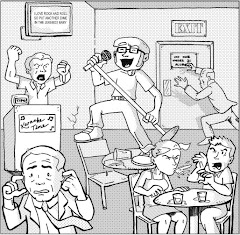
Usagi Yojimbo #76, June 2004, Dark Horse Comics
by Stan Sakai
Living the devout lifestyle of a geek is not without its spiritual experiences.
Devout readers of my blogs know by now that my recent acquisition of a DirecTV DVR has enabled me to become a faithful fan of Star Trek: Voyager, which airs at least twice daily on the Spike network. I’m several episodes into season four now, and I just hope that they continue to air the series chronologically and comprehensively until its end. The episode I watched yesterday, “The Omega Directive,” ended with former Borg Seven of Nine having her first spiritual epiphany, which I registered as an interesting (and potentially not entirely coincidental) story to see on the Wednesday before Easter.
Enter Usagi Yojimbo #76, my first comic book experience with Stan Sakai’s famous long-eared samurai. Like Panda Khan, my only significant experience with Usagi Yojimbo is his action figure incarnation from the ‘90’s Playmates Teenage Mutant Ninja Turtles line. I actually have both the original figure and his space gear-wearing version, which even as a kid struck me as peculiar. Still, I didn’t learn until much later that Usagi (whose first name is actually Miyamoto) starred in his own comic book as a land-dwelling samurai -- nowhere near space.* Indeed, the first wave of TMNT mania truly made some significant strides in introducing independent comic characters to the mainstream, particularly of the anthropomorphic variety.
(Side note: Special thanks to the Rabbit Valley Comic Shop ad on the back of this issue for using that word, “anthropomorphic.” I’ve reviewed dozens of comics starring personified animals now, and that word has been on the top of my brain for just as long!)
So, I thought, what better time to review an issue of Usagi Yojimbo than the week of Easter, when I can place a special emphasis on anthropomorphic comics specially starring rabbits? I certainly didn’t expect the experience to achieve spiritual significance, especially since this issue was a random buy from a twenty-five cent back issue bin. The cover was simple and iconic enough for me to assume that the story inside was self-inclusive enough for a novice like me to understand. With twenty years of continuity behind Usagi, I think such a concern is legitimate. Fortunately, judging this book by its cover paid off, in more ways than one.
In this issue, Yojimbo encounters a dying doctor whose last wish is for the samurai to deliver a mysterious package to his daughter Ayane. Ayane explains that her father was a doctor assigned to an eclectic port city, where he discovered “a cure . . . for all the people.” Unfortunately, the authorities have dubbed this package illegal contraband and are right on their tail (pardon the pun), until Ayane creates a fatal diversion so Yojimbo can get the package to the next link in her subversive group’s underground chain. He is successful, and when he hands off the package to the kindly fish merchant, he comments, “That -- whatever it is -- has caused enough pain.” The merchant replies, “It is not pain that this brings, Samurai . . . but, rather, salvation.” He unwraps the package, and there it is -- a crucifix. I really didn’t see that one coming.
So you can understand my sense of wonder regarding this issue, as my intent was to read it in pseudo celebration of Easter. Now, if only Sakai could explain the whole painted eggs part . . .
Seriously, I really enjoyed reading this issue. Although Yojimbo doesn’t actually battle anyone, the suspense he and Ayane experience during their flight from the authorities infuses this issue with an exciting sense of adventure and intrigue. Sakai’s use of dialogue is simple and insightful; character development isn’t an aside to the story but a natural result of its context, though after twenty years with Miyamoto, I’m sure he’s pretty familiar with the ol’ hare by now. Interestingly, his line work isn’t perfect and in some cases betrays hints of hurriedness or shortsightedness, yet in its imperfections this issue’s art tells its tale rather comprehensively. I frequently had to remember that these pages are even void of any gray tones, as Sakai uses crosshatching and stippling so effectively, the backgrounds are rich with depth and texture. He has mastered his craft, yet with a story like this, also reveals his potential to surprise and continually entertain.
But what does it all mean? A former Borg, a rabbit samurai . . . are they conspiring to tell me something? Or is this convergence of spiritual themes simply a cosmic coincidence? For now, I’ll embrace this mystery and see if it unfolds in my other pop culture indulgences this week. Of course, I’ll be sure to fill this space with all of the details.
Is it possible? Can man surely not live on comics alone?
* I looked it up. Stan Sakai actually created “Space Usagi,” as well. Here I thought Bucky O’Hare was the only star trekking rabbit out there . . .
Thursday, March 20, 2008


WWWednesday: The World of Mr. Toast
WWWednesday: The World of Mr. Toast
website: http://theimaginaryworld.com/
by Dan Goodsell
I keep everything. Specifically, I have an ever-expanding collection of cards, stickers, and miscellaneous promotional items from the many comic book conventions I've attended over the past eight years. If you were a small press or independent exhibitor at Comic Con in 2001 (like I was) and I liked the look or layout of that postcard you printed and distributed to promote your comic or website, I still have it. I'm pretty obsessive about it, actually, and since my girlfriend and I recently moved and I now have a place for all of this junk, I've actually begun to file these things, as if they were comics themselves. Hey, they're still little pieces of art, okay? Heck, even more so than the comic they promote, these little cards and stickers are attempting to make a connection with their audience. "There's a comic book over here you'll really like, if you just give it a chance!" they plead. They're proverbial middle men. They deserve some attention, too.
The folks that spend hundreds of dollars on those throwaway freebies would agree. I've been in their shoes.
One such item that I've saved for a few years now is poster for Mr. Toast. I don't remember when or where I picked it up, if I paid for it or not, but as I was recently decorating this comic book storage room/personal museum of collectibles and mementos/man-cave of mine (I'm still thinking of a good name for it, and I'm leaning toward my "ready room," yes, from Star Trek), I decided I liked the simple, chuckle-worthy image enough to display. Here it is, right below my Scrapyard Detectives poster, a Bipolar cover proof, and a Buenaventura one-sheet:
 .
.
I confess, I've been afraid to look up Mr. Toast on-line. What if I didn't like what I found? What if this poster was just an anomalous piece of promotional art, honestly, like many of those other pieces I've acquired over the years? Well, I bit the bullet today and Googled my crusted friend. I'm glad I did. The World of Mr. Toast is a beautiful, brilliant body of work that includes one-panel comics and "gags," the cutest flash animations you'll ever see, and an eclectic collection of pop culture Americana. In fact, the option between Dan Goodsell's Mr. Toast work and Tick Tock Toys gallery is a perfect combination of inspiration-meets-result, as his on-line archive of old toys, food containers, campy comics, and peculiar vacation destinations is an homage to/museum of a bygone era, with the innocence and good humor of Mr. Toast its obvious, natural by-product. Consider this gag panel:
 .
.
In one simple frame, Goodsell captures and combines four of my favorite childhood pastimes: forts, toilet paper, eggs, and toast. My friends and I built forts all the time! When we got a little older, we toilet-papered each others' houses! As an adult, I still love breakfast the most! See what I mean?
The secret to Goodsell's eye-catching art is absurdly simple: draw two eyes and a mouth onto everything. His cast of characters is a virtual delight, and while he infuses each with an irrefutable sense of personality, the familiarity of each personified item (some of them coupled with props, like "Sr. Cork") evokes a charming instant reaction from the back of the mind, as well. I don't have to read a strip or gag starring Prof. Encyclopedia to remember those old dusty volumes my family had when I was a kid, those scientific journals that are probably so wrong by now that they'd make better science fiction than anything else. It's a precious memory, actually -- and yes, undoubtedly like Goodsell, I still have those encyclopedias. They're in the ready room, right around the corner from Mr. Toast, coincidentally.
Needless to say, I'm happy Mr. Toast made his way to the wall. He is a modern acquisition that celebrates the keepsakes of the past, the trinkets I've maniacally kept and preserved over the years. The world needs more Mr. Toast. Without him, we'd feel our age much sooner, I imagine. We'd all become that much more . . . crusty.
website: http://theimaginaryworld.com/
by Dan Goodsell
I keep everything. Specifically, I have an ever-expanding collection of cards, stickers, and miscellaneous promotional items from the many comic book conventions I've attended over the past eight years. If you were a small press or independent exhibitor at Comic Con in 2001 (like I was) and I liked the look or layout of that postcard you printed and distributed to promote your comic or website, I still have it. I'm pretty obsessive about it, actually, and since my girlfriend and I recently moved and I now have a place for all of this junk, I've actually begun to file these things, as if they were comics themselves. Hey, they're still little pieces of art, okay? Heck, even more so than the comic they promote, these little cards and stickers are attempting to make a connection with their audience. "There's a comic book over here you'll really like, if you just give it a chance!" they plead. They're proverbial middle men. They deserve some attention, too.
The folks that spend hundreds of dollars on those throwaway freebies would agree. I've been in their shoes.
One such item that I've saved for a few years now is poster for Mr. Toast. I don't remember when or where I picked it up, if I paid for it or not, but as I was recently decorating this comic book storage room/personal museum of collectibles and mementos/man-cave of mine (I'm still thinking of a good name for it, and I'm leaning toward my "ready room," yes, from Star Trek), I decided I liked the simple, chuckle-worthy image enough to display. Here it is, right below my Scrapyard Detectives poster, a Bipolar cover proof, and a Buenaventura one-sheet:
 .
.I confess, I've been afraid to look up Mr. Toast on-line. What if I didn't like what I found? What if this poster was just an anomalous piece of promotional art, honestly, like many of those other pieces I've acquired over the years? Well, I bit the bullet today and Googled my crusted friend. I'm glad I did. The World of Mr. Toast is a beautiful, brilliant body of work that includes one-panel comics and "gags," the cutest flash animations you'll ever see, and an eclectic collection of pop culture Americana. In fact, the option between Dan Goodsell's Mr. Toast work and Tick Tock Toys gallery is a perfect combination of inspiration-meets-result, as his on-line archive of old toys, food containers, campy comics, and peculiar vacation destinations is an homage to/museum of a bygone era, with the innocence and good humor of Mr. Toast its obvious, natural by-product. Consider this gag panel:
 .
.In one simple frame, Goodsell captures and combines four of my favorite childhood pastimes: forts, toilet paper, eggs, and toast. My friends and I built forts all the time! When we got a little older, we toilet-papered each others' houses! As an adult, I still love breakfast the most! See what I mean?
The secret to Goodsell's eye-catching art is absurdly simple: draw two eyes and a mouth onto everything. His cast of characters is a virtual delight, and while he infuses each with an irrefutable sense of personality, the familiarity of each personified item (some of them coupled with props, like "Sr. Cork") evokes a charming instant reaction from the back of the mind, as well. I don't have to read a strip or gag starring Prof. Encyclopedia to remember those old dusty volumes my family had when I was a kid, those scientific journals that are probably so wrong by now that they'd make better science fiction than anything else. It's a precious memory, actually -- and yes, undoubtedly like Goodsell, I still have those encyclopedias. They're in the ready room, right around the corner from Mr. Toast, coincidentally.
Needless to say, I'm happy Mr. Toast made his way to the wall. He is a modern acquisition that celebrates the keepsakes of the past, the trinkets I've maniacally kept and preserved over the years. The world needs more Mr. Toast. Without him, we'd feel our age much sooner, I imagine. We'd all become that much more . . . crusty.
Tuesday, March 18, 2008
Wildgirl #1
Wildgirl #1, January 2005, WildStorm Productions
writers: Leah Moore & John Reppion
artists: Shawn McManus with J.H. Williams III
colorists: Jeremy Cox & Carrie Strachan
letterer: Phil Balsman
assistant editor: Kristy Quinn
editor: Alex Sinclair
I judged this book by its cover. With a title like Wildgirl, I thought that this issue would be the perfect bridge between my look at comics starring prominent women and my upcoming second series of reviews about animal comics, specifically titles starring or featuring bunnies, since Easter is right around the corner. Oh, I wasn’t wrong about that. Wildgirl stars a young woman in her formative years with a peculiar connection to nature. That was essentially what I expected. How this story is told is a different matter entirely.
In short, Wildgirl is one of the strangest comic books I’ve read in awhile, and that’s saying a lot, I think. What I can’t put my finger on is why. The answer must lie in this issue’s imbalance. The story itself is a convergence settings, as our young protagonist Rosa flees her inner city apartment to sleep outside a department store for nearly three months, until a stranger guides her to a secluded house in the woods. The story also battles with its convergence of themes, as the seemingly natural struggles of an adolescent become a supernatural fight for survival when the stranger goes nuts and tries to capture her. In this issue’s eerie climax, the stranger’s dogs become his inanimate coat, then back to ravenous beasts that pursue Rosa back to the outskirts of the city, where another, friendlier dog “says” to her, “We need to talk.” Indeed!
I think the very production of this issue, namely the writers’ dialogue and pacing along with the artists’ styles, also threw me for a loop. On the first page, Rosa madly and inexplicably asks her mom, “Can I be wild girl?” While the reader quickly learns that Rosa suffers from delusions tied to the animal kingdom and Greek mythology, that opening sequence is as potentially important as it is forgettable. Did Rosa ask for this ethereal connection? Further, this issue’s dialogue is so sparse, I could actually do without it. McManus’ art is perfectly linear and abundantly expressive; I wonder how the story’s subtexts might have benefitted from a more open-ended possibility for interpretation. Finally, McManus’ art is so capable, this issue might have flourished with a colorless format. McManus’ line work seems restrained, and with a style that would benefit any indie comic, I’d like to see him implement a wider brushstroke. The J.H. Williams III vignette depicting Rosa’s dream was brilliantly executed, as well, and would’ve been much more poignant as the only splash of color in the whole piece.
Interestingly, criticism usually demands more of an issue. In this case, I’m demanding less. No words, no color? I never thought I’d see the day . . .
Also, this issue made me wish for one more less thing: ads. When the stranger appears “wearing” his dogs, the image is presented as a suspenseful left-handed splash page with an ad on the right, which is typical of a cliffhanger ending. I almost closed the book for good, until the next page just happened to open and reveal more story. I’ve never really thought about it before, but are these ad pages placed randomly, or is an editor assigned the task of strategically dispersing them throughout the issue? Surely, Wildgirl wasn’t meant to be that wild . . .
That’s it. If I could parallel this issue’s presentation with its content, I dare say that both are an unbridled expression of the creative teams’ intentions. Utilizing different art styles, volleying between long, silent sequences and more dialogue-intensive scenes -- Wildgirl #1 refuses to be tamed by anyone’s expectations or conventions. Such is the fine line between woman and animal, I suppose.
writers: Leah Moore & John Reppion
artists: Shawn McManus with J.H. Williams III
colorists: Jeremy Cox & Carrie Strachan
letterer: Phil Balsman
assistant editor: Kristy Quinn
editor: Alex Sinclair
I judged this book by its cover. With a title like Wildgirl, I thought that this issue would be the perfect bridge between my look at comics starring prominent women and my upcoming second series of reviews about animal comics, specifically titles starring or featuring bunnies, since Easter is right around the corner. Oh, I wasn’t wrong about that. Wildgirl stars a young woman in her formative years with a peculiar connection to nature. That was essentially what I expected. How this story is told is a different matter entirely.
In short, Wildgirl is one of the strangest comic books I’ve read in awhile, and that’s saying a lot, I think. What I can’t put my finger on is why. The answer must lie in this issue’s imbalance. The story itself is a convergence settings, as our young protagonist Rosa flees her inner city apartment to sleep outside a department store for nearly three months, until a stranger guides her to a secluded house in the woods. The story also battles with its convergence of themes, as the seemingly natural struggles of an adolescent become a supernatural fight for survival when the stranger goes nuts and tries to capture her. In this issue’s eerie climax, the stranger’s dogs become his inanimate coat, then back to ravenous beasts that pursue Rosa back to the outskirts of the city, where another, friendlier dog “says” to her, “We need to talk.” Indeed!
I think the very production of this issue, namely the writers’ dialogue and pacing along with the artists’ styles, also threw me for a loop. On the first page, Rosa madly and inexplicably asks her mom, “Can I be wild girl?” While the reader quickly learns that Rosa suffers from delusions tied to the animal kingdom and Greek mythology, that opening sequence is as potentially important as it is forgettable. Did Rosa ask for this ethereal connection? Further, this issue’s dialogue is so sparse, I could actually do without it. McManus’ art is perfectly linear and abundantly expressive; I wonder how the story’s subtexts might have benefitted from a more open-ended possibility for interpretation. Finally, McManus’ art is so capable, this issue might have flourished with a colorless format. McManus’ line work seems restrained, and with a style that would benefit any indie comic, I’d like to see him implement a wider brushstroke. The J.H. Williams III vignette depicting Rosa’s dream was brilliantly executed, as well, and would’ve been much more poignant as the only splash of color in the whole piece.
Interestingly, criticism usually demands more of an issue. In this case, I’m demanding less. No words, no color? I never thought I’d see the day . . .
Also, this issue made me wish for one more less thing: ads. When the stranger appears “wearing” his dogs, the image is presented as a suspenseful left-handed splash page with an ad on the right, which is typical of a cliffhanger ending. I almost closed the book for good, until the next page just happened to open and reveal more story. I’ve never really thought about it before, but are these ad pages placed randomly, or is an editor assigned the task of strategically dispersing them throughout the issue? Surely, Wildgirl wasn’t meant to be that wild . . .
That’s it. If I could parallel this issue’s presentation with its content, I dare say that both are an unbridled expression of the creative teams’ intentions. Utilizing different art styles, volleying between long, silent sequences and more dialogue-intensive scenes -- Wildgirl #1 refuses to be tamed by anyone’s expectations or conventions. Such is the fine line between woman and animal, I suppose.
Monday, March 17, 2008
The Sensational She-Hulk #1
The Sensational She-Hulk #1, May 1989, Marvel Comics
writer/penciller: John Byrne
inker: Bob Wiacek
colorist: Glynis Oliver
letterer: John Workman
editor: Bobbie Chase
EIC: Tom DeFalco
Women’s History Month + St. Patrick’s Day + Random Comic Book Reviews = The Sensational She-Hulk! ‘Nuff said, right?
You know She-Hulk doesn’t have to worry about wearing green on St. Patrick’s Day, not that anyone would try to pinch her if she wasn’t. Ironically, in this first issue of her second series, her emerald complexion is obscured by a flesh tone when the Ringmaster and his travelling Circus of Crime brainwash her, disguise her, and commandeer her strength to rob their unsuspecting audiences of their loose change. Their plan? When the Ringmaster stupefies the crowd, She-Hulk picks up the bleachers and shakes loose their valuables like a bully flipping over the local nerd for his lunch money.
“Nearly thirty-seven hundred bucks in cash plus some jewelry . . . pocket watches . . .,” a clown proudly reports to the Ringmaster.
Thirty-seven hundred bucks? You need the She-Hulk for that? Hey, I’ve been to the circus, okay? Between admission, carnival games, the outrageously priced snack bar, and maybe a dollar petting zoo, a regular circus gets away with more highway robbery!
Since this is a first issue, and John Byrne is at the reigns, an origin sequence is inevitable, for which I’m actually grateful since I know little of She-Hulk beside the fact that she’s Bruce Banner’s cousin. Of course, Byrne manages to mention this twice, which was three less times than I expected, what with his reputation for, uhm, thorough storytelling. I also vaguely remembered reading somewhere that She-Hulk frequently broke the fourth wall and talked to the reader, a phenomenon I dismissed as a psychologically-angled subplot until I actually experienced it here. When She-Hulk realizes that her abduction by the Circus of Crime was actually one part in a mysterious master mind’s grander scheme, she muses, “I know how these things work! It’ll be at least my third issue before I find out who it is! Although you readers will probably find out on the next page . . .” This gimmick takes the concept of the classic Marvel caption that addresses its audience (or “True Believers,” as we were frequently called) to a wholly different level. Those captions were third person, uninvolved narrative elements -- proverbial Shakespearean muses that established mood or plot. In this case, as much as the idea is meant to pull the reader into the story, sharing that private joke with She-Hulk, it took me out of the tale, as I wondered if John Byrne really sought to experiment with his narrative, or just had an inordinate amount of space to fill. I don’t know if She-Hulk enjoys being watched, but I felt a little violated, and . . .
Sigh. I was reading this issue on the toilet, okay? The last thing I need is a hot superhero barging in on me in my own Fortress of Solitude, okay?
I might be the only comic book fanboy that actually straddles the fence about John Byrne. You either love him or you hate him, plain and simple. (My friend Aaron at Geek in the City boasts the latter category, but admittedly I haven’t thoroughly examined his undoubtedly well thought out opinion in favor of separating the art from the artist. I’m afraid that if I examined the lives or perspectives of my favorite -- or even casually appreciated -- comic book contributors I’d end up burning half of my collection in protest! ) I find Byrne’s superhero storytelling techniques a little dated and formulaic, and his artwork so consistent it’s almost redundant, but his issues aren’t not entertaining. They retain a certain camp-factor that most writers and artists abandoned a long time ago; yes, Byrne suffers from “reliable dog syndrome,” as introduced to pop culture (or at least my mentality) by this season of American Idol. Still, She-Hulk herself confesses on page three of this very issue that she’s capable of bench-pressing seventy-five tons, and Byrne exhibits this strength by having her lift a couple of elephants, then punching out a runaway circus cart. What’s really so “sensational” about that?
So, despite my seemingly foolproof equation at the beginning of this review, The Sensational She-Hulk #1 does little for the cause of St. Patrick’s Day or Women’s History Month. For half of this issue, She-Hulk isn’t even green! Further, and more importantly, any viability she might have had as a remarkable female figure in comicdom is vanquished by her inability to exhibit any real strength, both physically and mentally against the Ringmaster’s attack. Emotionally, heck, she can barely endure one adventure without mentioning her more famous cousin, and, in the end, that whole talking-to-the-audience thing just makes her look a little nuts. You’d think women would be green with envy toward a powerhouse like She-Hulk, but if this issue was their only impression of the character, they’d just walk away jaded.
writer/penciller: John Byrne
inker: Bob Wiacek
colorist: Glynis Oliver
letterer: John Workman
editor: Bobbie Chase
EIC: Tom DeFalco
Women’s History Month + St. Patrick’s Day + Random Comic Book Reviews = The Sensational She-Hulk! ‘Nuff said, right?
You know She-Hulk doesn’t have to worry about wearing green on St. Patrick’s Day, not that anyone would try to pinch her if she wasn’t. Ironically, in this first issue of her second series, her emerald complexion is obscured by a flesh tone when the Ringmaster and his travelling Circus of Crime brainwash her, disguise her, and commandeer her strength to rob their unsuspecting audiences of their loose change. Their plan? When the Ringmaster stupefies the crowd, She-Hulk picks up the bleachers and shakes loose their valuables like a bully flipping over the local nerd for his lunch money.
“Nearly thirty-seven hundred bucks in cash plus some jewelry . . . pocket watches . . .,” a clown proudly reports to the Ringmaster.
Thirty-seven hundred bucks? You need the She-Hulk for that? Hey, I’ve been to the circus, okay? Between admission, carnival games, the outrageously priced snack bar, and maybe a dollar petting zoo, a regular circus gets away with more highway robbery!
Since this is a first issue, and John Byrne is at the reigns, an origin sequence is inevitable, for which I’m actually grateful since I know little of She-Hulk beside the fact that she’s Bruce Banner’s cousin. Of course, Byrne manages to mention this twice, which was three less times than I expected, what with his reputation for, uhm, thorough storytelling. I also vaguely remembered reading somewhere that She-Hulk frequently broke the fourth wall and talked to the reader, a phenomenon I dismissed as a psychologically-angled subplot until I actually experienced it here. When She-Hulk realizes that her abduction by the Circus of Crime was actually one part in a mysterious master mind’s grander scheme, she muses, “I know how these things work! It’ll be at least my third issue before I find out who it is! Although you readers will probably find out on the next page . . .” This gimmick takes the concept of the classic Marvel caption that addresses its audience (or “True Believers,” as we were frequently called) to a wholly different level. Those captions were third person, uninvolved narrative elements -- proverbial Shakespearean muses that established mood or plot. In this case, as much as the idea is meant to pull the reader into the story, sharing that private joke with She-Hulk, it took me out of the tale, as I wondered if John Byrne really sought to experiment with his narrative, or just had an inordinate amount of space to fill. I don’t know if She-Hulk enjoys being watched, but I felt a little violated, and . . .
Sigh. I was reading this issue on the toilet, okay? The last thing I need is a hot superhero barging in on me in my own Fortress of Solitude, okay?
I might be the only comic book fanboy that actually straddles the fence about John Byrne. You either love him or you hate him, plain and simple. (My friend Aaron at Geek in the City boasts the latter category, but admittedly I haven’t thoroughly examined his undoubtedly well thought out opinion in favor of separating the art from the artist. I’m afraid that if I examined the lives or perspectives of my favorite -- or even casually appreciated -- comic book contributors I’d end up burning half of my collection in protest! ) I find Byrne’s superhero storytelling techniques a little dated and formulaic, and his artwork so consistent it’s almost redundant, but his issues aren’t not entertaining. They retain a certain camp-factor that most writers and artists abandoned a long time ago; yes, Byrne suffers from “reliable dog syndrome,” as introduced to pop culture (or at least my mentality) by this season of American Idol. Still, She-Hulk herself confesses on page three of this very issue that she’s capable of bench-pressing seventy-five tons, and Byrne exhibits this strength by having her lift a couple of elephants, then punching out a runaway circus cart. What’s really so “sensational” about that?
So, despite my seemingly foolproof equation at the beginning of this review, The Sensational She-Hulk #1 does little for the cause of St. Patrick’s Day or Women’s History Month. For half of this issue, She-Hulk isn’t even green! Further, and more importantly, any viability she might have had as a remarkable female figure in comicdom is vanquished by her inability to exhibit any real strength, both physically and mentally against the Ringmaster’s attack. Emotionally, heck, she can barely endure one adventure without mentioning her more famous cousin, and, in the end, that whole talking-to-the-audience thing just makes her look a little nuts. You’d think women would be green with envy toward a powerhouse like She-Hulk, but if this issue was their only impression of the character, they’d just walk away jaded.
Sunday, March 16, 2008
Girls #10

Girls #10, February 2006, Image Comics
by Joshua and Jonathan Luna
This St. Patrick’s Day, men across the country, perhaps even around the world, will take to the streets in search of forbidden treasure. No, I’m not talking about a leprechaun’s pot of gold at the end of the rainbow . . . I’m talking about the affections of a woman. Sure, chugging green beer has become a holiday tradition (though the practice really offers no real insight into Irish culture), but some three or four beers into the evening, St. Patrick’s Day becomes just another night at the bar, and therefore just another attempt to score a woman’s phone number, or more. Is this why St. Patrick’s Day lands within Women’s History Month? To remind us that, even on a day where heavy drinking is encouraged and celebrated, women are more than potential treasures to be scored and spent?
The torrid universal relationship between men and women has become a perpetual subplot in all of comicdom, and no one comic book has gone to such great lengths to draw the line in the sand as much as the Luna Brothers’ Girls. I mentioned yesterday that I’d read Girls #1 before, in the Image First compilation, and I really enjoyed the Lunas’ use of candor and raw (albeit drunken -- sigh, those libations will be the death of us men) emotion to establish conflict and the cast of characters in their rural setting of Pennystown. Nine issues later, the plights of these diverse personalities have taken a distinctly different turn; whereas before these townsfolk merely sought to pass away their idle lives in Midwestern bliss, they now strive simply to survive . . . against an odd army of freshly hatched, naked, flesh-eating women. Yes, you read that right.
In this issue, a majority of Pennystown’s (which isn’t really a lot) have congregated and sheltered themselves in a secluded mansion. Unfortunately, the youngest children have recklessly wandered outside into the surrounding forest, and a brave group decides to search of them. The kids are found but only when a gang of the naked women emerge from the wood, and the survivors rush back to the mansion with those flesh-hungry chicks practically nipping at their heels. In the house, the power goes out, and the folks inside scramble to gather a flashlight and some weapons as they hear their friends hastily return. The Luna Brothers’ ability to infuse this climactic scene with a palpable sense of suspense is brilliant and impressive, as the second to last page is simply a series of black panels and frightened dialogue, proving that a horror comic can really accomplish a lot with a little.
Of course, this issue’s fright factor is laced with relationship-ridden subplots, but trying to summarize them here wouldn’t do them justice. It’s enough that these core characters are pursued by freshly hatched, naked, flesh-eating women, right?
Needless to say, although I don’t know the ultimate outcome of this series, I can safely assume that the Lunas managed to spin the zombie genre on its ear with Girls. Rather than terrorize their simple townsfolk with decrepit undead, they unleashed a band of beautiful women, and while these ladies are obviously much easier to look at, they aren’t any less ruthless in their methods or madness. Women often claim that men are shallow in their attraction to pure physicality, but what if this physicality could be harnessed as a weapon? What if those moments of paralysis at the sight of beautiful and surprisingly naked woman were all those women needed to feast and survive? Wouldn’t our superficiality become a valuable asset? Of course, I know plenty of chicks that really do use their looks to score a free meal, just not one of flesh, so maybe the Lunas weren’t too far off with this potentially allegorical tale of gender-based horror and romance.
Indeed, from the recent ethereal dissolution of Spider-man’s marriage in One More Day to the likes of introspective independent artists like Jeffery Brown, such romantic inclinations are often the most grounding elements throughout any genre of comicdom. While the average fanboy cannot train his mind and body to the pinnacle of human perfection like Batman, they can at least relate to his inability to commit to any one woman . . . or maybe envy it. Similarly, older readers can appreciate the complexities more stable relationships like the Storms’ or Wally and Linda Wests’ offer. From fawning over Lana in Smallville to the classic love triangle from Superman tales of old, readers could revel that even the Man of Steel gets butterflies in his stomach around the special little lady. Hey, maybe you’ve never been pursued by freshly hatched, naked, flesh-eating women, but you’ve broken up with a girlfriend before, right? You’ve thought you were flirting with a girl only to learn that her intentions were strictly platonic? In this context, what does a series like Girls teach us?
Men, beware. They can be more than they appear to be. You’re better off looking for that leprechaun. That little guy’s almost more believable than the concept of the perfect woman . . . at least when you’re looking through the bottom of a bottle.
Saturday, March 15, 2008
Ultra #7

Ultra #7, February 2005, Image Comics
by Joshua & Jonathan Luna
For as many comic books liter our apartment on any given day, nearly as many tabloids and magazines are scattered about, as well. My girlfriend loves ‘em. She buys those rags weekly as faithfully as I visit the comic book store. So, when I threw Ultra #7 onto a pile of her just-reads earlier today, I almost couldn’t tell it apart. The cover of the Luna Brothers’ Ultra #7 mimics the cover of a People Magazine, and while I’ve seen comics try to satirize other print media before, this is the best example of subtle effectiveness. Further, since Ultra’s title character is caught in the crosshairs of a sex scandal in and around this issue, the motif fits perfectly. It isn’t just a sales gimmick . . . like most pictures on the covers of those real magazines.
What do I mean? Well, I have a fanboy goal to collect every comic book appearance of Cloak and Dagger. Now, is there a teenybopper somewhere with similar ambitions to collect every tabloid appearance of Britney, or Lindsay? I mean, does Britney deserve the cover of these weekly magazines for shortchanging a gas station attendant, or something? At this point, it’s like giving Aunt May the cover for baking Peter a pie. It always happens, yet it only really appeals to a fraction of that title’s core readership. It’s a sales gimmick -- an attempt to remain relevant. But I digress.
I picked up Ultra #7 several weeks ago with the intention of including in this week’s Women’s History Month series, because my brief experience with the Luna Brothers’ work has led me to conclude that they are extremely capable of capturing the female condition in any supernatural context. For instance, their most recent series, The Sword, is a fine balance of science fiction and twenty-something strife; the reader experiences the lead character’s frustration and disbelief right along with her. The single issue of Girls I’d read before (the second issue will come tomorrow) was a memorable look at relationships through a similar lens of dark fantasy. So, when I picked up Ultra #7, its cover not withstanding, I had some high hopes about its story.
Boy, were those high hopes ever met.
Ultra #7 is the perfect issue for a new reader like me, as it effectively concludes an obvious integral storyline and focuses more on its eclectic cast’s relationships. After recovering from an arsonist’s attack, which cost the lives of many innocents, Ultra’s public image continues to suffer thanks to the release of a compromising picture. At first, this controversy affects her arrival to the 77th Annual Superhero Awards -- a brilliant enough concept in itself -- until a fan reminds the condemning crowd of Ultra’s selflessness. Though Ultra doesn’t win the Best Superheroine award, her associate Cowgirl does, and during an after party, the two share a tender moment that implies a romantic overtone to their relationship. To the Lunas’ credit, the sequence isn’t overtly homosexual as it is tragically romantic -- their relationship isn’t necessarily forbidden because of social taboo, but because of its potential interference in their respective heroic careers. If only everyone with power felt such noble restraint when it came to their romantic urges.
No, Ultra has nothing to do with former Governor Spitzer. I’m just saying.
What I don’t know how to articulate is an adequate description of Jonathan Luna’s artwork. His characters appear almost photographic in appearance, with such a natural grace and expressionism that one almost forgets he’s actually reading a comic book. Every panel is practically cinematic in scope, with character blocking and background effects working together to establish and reflect the mood of the characters’ dialogue. The line work is crisp, the colors are effective and dynamic. ‘Nuff said.
Of all of the issues I’ve read so far this week, Ultra strikes me as the best example of depicting strong women in comics. At least in this chapter, these superheroines aren’t facing archnemeses, but rather their own roles in society. In the face of controversy, scandal, and conflicting romantic emotions, these women still emerge as powerful, competent protagonists -- not victims to desperation, but determined to resolve their respective plights only so that they can continue to contribute to the betterment of said society. If only the young starlets that graced the covers of real tabloids adopted the same mentality . . . How much better would the world be, if only in the quality of our entertainment?
by Joshua & Jonathan Luna
For as many comic books liter our apartment on any given day, nearly as many tabloids and magazines are scattered about, as well. My girlfriend loves ‘em. She buys those rags weekly as faithfully as I visit the comic book store. So, when I threw Ultra #7 onto a pile of her just-reads earlier today, I almost couldn’t tell it apart. The cover of the Luna Brothers’ Ultra #7 mimics the cover of a People Magazine, and while I’ve seen comics try to satirize other print media before, this is the best example of subtle effectiveness. Further, since Ultra’s title character is caught in the crosshairs of a sex scandal in and around this issue, the motif fits perfectly. It isn’t just a sales gimmick . . . like most pictures on the covers of those real magazines.
What do I mean? Well, I have a fanboy goal to collect every comic book appearance of Cloak and Dagger. Now, is there a teenybopper somewhere with similar ambitions to collect every tabloid appearance of Britney, or Lindsay? I mean, does Britney deserve the cover of these weekly magazines for shortchanging a gas station attendant, or something? At this point, it’s like giving Aunt May the cover for baking Peter a pie. It always happens, yet it only really appeals to a fraction of that title’s core readership. It’s a sales gimmick -- an attempt to remain relevant. But I digress.
I picked up Ultra #7 several weeks ago with the intention of including in this week’s Women’s History Month series, because my brief experience with the Luna Brothers’ work has led me to conclude that they are extremely capable of capturing the female condition in any supernatural context. For instance, their most recent series, The Sword, is a fine balance of science fiction and twenty-something strife; the reader experiences the lead character’s frustration and disbelief right along with her. The single issue of Girls I’d read before (the second issue will come tomorrow) was a memorable look at relationships through a similar lens of dark fantasy. So, when I picked up Ultra #7, its cover not withstanding, I had some high hopes about its story.
Boy, were those high hopes ever met.
Ultra #7 is the perfect issue for a new reader like me, as it effectively concludes an obvious integral storyline and focuses more on its eclectic cast’s relationships. After recovering from an arsonist’s attack, which cost the lives of many innocents, Ultra’s public image continues to suffer thanks to the release of a compromising picture. At first, this controversy affects her arrival to the 77th Annual Superhero Awards -- a brilliant enough concept in itself -- until a fan reminds the condemning crowd of Ultra’s selflessness. Though Ultra doesn’t win the Best Superheroine award, her associate Cowgirl does, and during an after party, the two share a tender moment that implies a romantic overtone to their relationship. To the Lunas’ credit, the sequence isn’t overtly homosexual as it is tragically romantic -- their relationship isn’t necessarily forbidden because of social taboo, but because of its potential interference in their respective heroic careers. If only everyone with power felt such noble restraint when it came to their romantic urges.
No, Ultra has nothing to do with former Governor Spitzer. I’m just saying.
What I don’t know how to articulate is an adequate description of Jonathan Luna’s artwork. His characters appear almost photographic in appearance, with such a natural grace and expressionism that one almost forgets he’s actually reading a comic book. Every panel is practically cinematic in scope, with character blocking and background effects working together to establish and reflect the mood of the characters’ dialogue. The line work is crisp, the colors are effective and dynamic. ‘Nuff said.
Of all of the issues I’ve read so far this week, Ultra strikes me as the best example of depicting strong women in comics. At least in this chapter, these superheroines aren’t facing archnemeses, but rather their own roles in society. In the face of controversy, scandal, and conflicting romantic emotions, these women still emerge as powerful, competent protagonists -- not victims to desperation, but determined to resolve their respective plights only so that they can continue to contribute to the betterment of said society. If only the young starlets that graced the covers of real tabloids adopted the same mentality . . . How much better would the world be, if only in the quality of our entertainment?
Beware the Creeper #2

Beware the Creeper #2, July 2003, Vertigo/DC Comics
writer: Jason Hall
artist: Cliff Chiang
colorist: Dave Stewart
letterer: John Workman
assistant editor: Zachary Rau
editor: Will Dennis
Blogger's note: Entry for Friday, March 14, 2008.
I’ve come to the conclusion that I’ll read anything Cliff Chiang draws. I became a fan during his run on Vertigo’s The Human Target, which was already then and still is today at the top of my favorite series. In The Human Target, Chiang (and fellow rotating artist Javier Pulido) were challenged to balance protagonist Christopher Chance’s internal struggles of identity with his external adventures of sociopolitical intrigue and espionage. Needless to say, both artists rose to the challenge, but while Pulido’s art was a bit more minimalist, Chiang’s work was very substantial and down to earth. I’ve managed to acquire some of his contributions to the Batman books since then, and his brushstroke consistently captures the grace of the superhuman form with the solidity of their respective environments. Chance’s Los Angeles, Batman’s Gotham -- in under Chiang’s pen, they’re viable characters as much as the real characters are.
So, you can imagine how I’d feel about the cover on Beware the Creeper #2. On it, a new, feminine Creeper stands tall over the Paris skyline. I don’t know much about the Creeper, nor have I ever been to Paris, but both are now inviting thanks to this absolute visual interpretation.
writer: Jason Hall
artist: Cliff Chiang
colorist: Dave Stewart
letterer: John Workman
assistant editor: Zachary Rau
editor: Will Dennis
Blogger's note: Entry for Friday, March 14, 2008.
I’ve come to the conclusion that I’ll read anything Cliff Chiang draws. I became a fan during his run on Vertigo’s The Human Target, which was already then and still is today at the top of my favorite series. In The Human Target, Chiang (and fellow rotating artist Javier Pulido) were challenged to balance protagonist Christopher Chance’s internal struggles of identity with his external adventures of sociopolitical intrigue and espionage. Needless to say, both artists rose to the challenge, but while Pulido’s art was a bit more minimalist, Chiang’s work was very substantial and down to earth. I’ve managed to acquire some of his contributions to the Batman books since then, and his brushstroke consistently captures the grace of the superhuman form with the solidity of their respective environments. Chance’s Los Angeles, Batman’s Gotham -- in under Chiang’s pen, they’re viable characters as much as the real characters are.
So, you can imagine how I’d feel about the cover on Beware the Creeper #2. On it, a new, feminine Creeper stands tall over the Paris skyline. I don’t know much about the Creeper, nor have I ever been to Paris, but both are now inviting thanks to this absolute visual interpretation.
If only the story were as easy to behold. This issue is the second of a five issue miniseries, and I must have missed the fluid introduction of its significant players, because this chapter proceeds full throttle. The opening act is entertaining enough, as the Creeper creeps into a museum and steals the Arbogast family jewels, only to toss them in the river. What follows is a multi-scene diatribe about the Arbogasts’ terrible reign over Paris, a veritable anarchist discourse about class warfare and everyman vigilantism. The Creeper is perceived as one part terrorist, one part performance artist, praised by the likes of Andre Breton and Tsuguharu Foujita. (Ernest Hemingway, Pablo Picasso, and Gertrude Stein also make cameo appearances, all in good measure.) If writer Jason Hall’s intent was to establish the Creeper’s legacy as a kooky monkey wrench in historical, global affairs, I consider his mission accomplished.
The real mystery seems to be in who the Creeper actually is; since I don’t know if her secret identity was established in the first issue, I’m torn here between one of two sisters (of course each boasting an opposing side of the political argument, thus each boasting their own legitimate motives for vigilantism) and a little girl with a fascination for the creepy heroine. The little girl has the same reddish hair as this new Creeper, so I’m wondering if the artists intended this as a red herring (pardon the pun) or a genuine clue. Either way, through this re-establishment of the Creeper’s character, she has inadvertently become a thrilling and capable heroine. Her body is totally garbed, and her figure isn’t cookie-cut by comics’ usually outrageous proportions. What I’m saying is, she isn’t overtly sexual, and the allure isn’t about who she is, but what she’s about -- a message I wish more stories about heroines emphasized.
So, yes, I would dare say you should beware the Creeper. The fact that I can’t tell which of the prominent female figures she really is in this issue implies that every woman has a little Creeper inside of them. Further, if all of them were as eye-catching as this version by Cliff Chiang, you’d never see the danger coming. I guess that’s what creeping is all about.
The real mystery seems to be in who the Creeper actually is; since I don’t know if her secret identity was established in the first issue, I’m torn here between one of two sisters (of course each boasting an opposing side of the political argument, thus each boasting their own legitimate motives for vigilantism) and a little girl with a fascination for the creepy heroine. The little girl has the same reddish hair as this new Creeper, so I’m wondering if the artists intended this as a red herring (pardon the pun) or a genuine clue. Either way, through this re-establishment of the Creeper’s character, she has inadvertently become a thrilling and capable heroine. Her body is totally garbed, and her figure isn’t cookie-cut by comics’ usually outrageous proportions. What I’m saying is, she isn’t overtly sexual, and the allure isn’t about who she is, but what she’s about -- a message I wish more stories about heroines emphasized.
So, yes, I would dare say you should beware the Creeper. The fact that I can’t tell which of the prominent female figures she really is in this issue implies that every woman has a little Creeper inside of them. Further, if all of them were as eye-catching as this version by Cliff Chiang, you’d never see the danger coming. I guess that’s what creeping is all about.
Friday, March 14, 2008
Arana: The Heart of the Spider #1

Arana: The Heart of the Spider #1, March 2005, Marvel Comics
writer: Fiona Avery
penciller: Roger Cruz
inker: Victor Olazaba
letterer: VC’s Rus Wootan
colorist: Udon
editor: Jennifer Lee
EIC: Joe Quesada
creative consultant: J. Michael Straczynski
Blogger’s note: Entry for Thursday, March 13, 2008.
“Who would have believed that the next hunter of the Spider Society would be a little girl from Brooklyn?”
Honestly? It isn’t too great a stretch of the imagination.
I remember when Arana was introduced in the pages of Amazing Fantasy volume 2, number 1. Oh, I didn’t buy it, and I still haven’t read it, but I thought that her creation was a bold move on Marvel’s part, an arguably vain attempt to catch lightning in a bottle a second time. You might remember the last time a spider-powered superhero was introduced in a comic book called Amazing Fantasy. Marvel certainly does. The results have reverberated into every aspect of pop culture imaginable, from multimedia entertainment to a crisis of infinite franchising. When Kirby drew that iconic cover of Amazing Fantasy, did he suspect that his webbed hero would grace underroos for year and years to come?
Did the creators of Arana hope for the same success?
Based on this first issue of her self-titled series, writer Fiona Avery certainly utilized the same formula. No, Arana isn’t trying out for the Fantastic Four or battling masks super-villains like the Chameleon. Instead, she’s the primary warrior for a spider-themed cult of do-gooders who, in this issue, are on the trail of a corrupt judge. A majority of this issue is consumed with the pursuit and capture of their quarry, a task easier said than done considering the “Wasp” soldiers he’s paid off to protect him. Political and supernatural suspicions and implications abound in the midst of Arana’s good old-fashioned slugfest with these enemy agents, and when she emerges victorious, she sheds the superhero gear, has dinner with her dad, and goes to sleep. All in a day’s work, I suppose.
So, on the surface, the correlations to Stan Lee and Steve Ditko’s Spider-man seem to be in name only. Right . . .?
Well, since Avery tickles the hard-luck hero concept, I’m guessing that her intentions imply that the spider mantle comes with much more than just a goggle-eyed mask. In the opening act, as Arana prowls upon some potential informants, she blows her element of surprise with a sneeze. Then, throughout the issue, she reminds us that she’s got the flu. While this element adds a touch of realism to her adventure, it throws the enigmatic tone of her Spider Society roots into disharmony; further, in this twenty-two page story, eighteen pages are dedicated to the pursuit of the corrupt judge. The final four pages are purely domestic, as Arana spends quality time with her father while her mentor, who I’ll get to in a minute, muses about the direness of their mission. Supporting characters are mentioned by name but never introduced (I assume they appeared in Arana’s Amazing Fantasy run), and the whole secret identity shtick is so rushed it barely registers as relevant. See, I can tell that Avery wanted us to feel for this adolescent girl and her single father, just as we felt for Peter and his single aunt, but since Arana’s worlds weren’t interwoven, the connection is never really made.
Remember, I’m looking Arana #1 as a first issue, not a continuation of a previous title starring the same character. Consider the second episode of the Kids’ WB! Spectacular Spider-man cartoon series; sure, we never saw Aunt May, but Peter’s 10 p.m. reminders to check in offer a funny (enough) tether to his secret identity. That’s all I’m asking for from this issue, too.
Another quick gripe: Arana’s Spider Society mentor is named Miguel. Now, I’ve read some issues of Spider-man 2099 (yes, I’m the only one), and I vividly remembered that his civilian name was Miguel. Considering her mentor’s role in a group called the Spider Society, I thought that these characters might be one in the same. I would’ve appreciated the foundation in something familiar, the link between successors to the spider-throne. Alas, a quick Wikipedia search revealed that these characters are remarkably different. Sigh. Do we really need two Miguels in the spider-verse? Didn’t an editor realize how potentially confusing that might be, or am the only one (er, again)? Incidentally, this Miguel is responsible for this review’s introductory quote. Indeed, who knew?
Don’t get me wrong; Arana: The Heart of the Spider wasn’t a terrible issue. It was a nice infiltration story regarding the judge’s corruptions and subsequent capture, but overall the story’s multiple subtexts were just too disjointed for me. I still sense a smoldering homage to Marvel’s original swinging superhero, especially considering that both characters can be summarized by the following pitch: “Adolescent receives spider-like powers and must balance private life with undeniable responsibility to do good.” Unfortunately, only one character’s synopsis can continue to include: “Becomes comic book and pop culture icon with multiple multimedia and franchised incarnations.” I’ll give you a guess which one.
writer: Fiona Avery
penciller: Roger Cruz
inker: Victor Olazaba
letterer: VC’s Rus Wootan
colorist: Udon
editor: Jennifer Lee
EIC: Joe Quesada
creative consultant: J. Michael Straczynski
Blogger’s note: Entry for Thursday, March 13, 2008.
“Who would have believed that the next hunter of the Spider Society would be a little girl from Brooklyn?”
Honestly? It isn’t too great a stretch of the imagination.
I remember when Arana was introduced in the pages of Amazing Fantasy volume 2, number 1. Oh, I didn’t buy it, and I still haven’t read it, but I thought that her creation was a bold move on Marvel’s part, an arguably vain attempt to catch lightning in a bottle a second time. You might remember the last time a spider-powered superhero was introduced in a comic book called Amazing Fantasy. Marvel certainly does. The results have reverberated into every aspect of pop culture imaginable, from multimedia entertainment to a crisis of infinite franchising. When Kirby drew that iconic cover of Amazing Fantasy, did he suspect that his webbed hero would grace underroos for year and years to come?
Did the creators of Arana hope for the same success?
Based on this first issue of her self-titled series, writer Fiona Avery certainly utilized the same formula. No, Arana isn’t trying out for the Fantastic Four or battling masks super-villains like the Chameleon. Instead, she’s the primary warrior for a spider-themed cult of do-gooders who, in this issue, are on the trail of a corrupt judge. A majority of this issue is consumed with the pursuit and capture of their quarry, a task easier said than done considering the “Wasp” soldiers he’s paid off to protect him. Political and supernatural suspicions and implications abound in the midst of Arana’s good old-fashioned slugfest with these enemy agents, and when she emerges victorious, she sheds the superhero gear, has dinner with her dad, and goes to sleep. All in a day’s work, I suppose.
So, on the surface, the correlations to Stan Lee and Steve Ditko’s Spider-man seem to be in name only. Right . . .?
Well, since Avery tickles the hard-luck hero concept, I’m guessing that her intentions imply that the spider mantle comes with much more than just a goggle-eyed mask. In the opening act, as Arana prowls upon some potential informants, she blows her element of surprise with a sneeze. Then, throughout the issue, she reminds us that she’s got the flu. While this element adds a touch of realism to her adventure, it throws the enigmatic tone of her Spider Society roots into disharmony; further, in this twenty-two page story, eighteen pages are dedicated to the pursuit of the corrupt judge. The final four pages are purely domestic, as Arana spends quality time with her father while her mentor, who I’ll get to in a minute, muses about the direness of their mission. Supporting characters are mentioned by name but never introduced (I assume they appeared in Arana’s Amazing Fantasy run), and the whole secret identity shtick is so rushed it barely registers as relevant. See, I can tell that Avery wanted us to feel for this adolescent girl and her single father, just as we felt for Peter and his single aunt, but since Arana’s worlds weren’t interwoven, the connection is never really made.
Remember, I’m looking Arana #1 as a first issue, not a continuation of a previous title starring the same character. Consider the second episode of the Kids’ WB! Spectacular Spider-man cartoon series; sure, we never saw Aunt May, but Peter’s 10 p.m. reminders to check in offer a funny (enough) tether to his secret identity. That’s all I’m asking for from this issue, too.
Another quick gripe: Arana’s Spider Society mentor is named Miguel. Now, I’ve read some issues of Spider-man 2099 (yes, I’m the only one), and I vividly remembered that his civilian name was Miguel. Considering her mentor’s role in a group called the Spider Society, I thought that these characters might be one in the same. I would’ve appreciated the foundation in something familiar, the link between successors to the spider-throne. Alas, a quick Wikipedia search revealed that these characters are remarkably different. Sigh. Do we really need two Miguels in the spider-verse? Didn’t an editor realize how potentially confusing that might be, or am the only one (er, again)? Incidentally, this Miguel is responsible for this review’s introductory quote. Indeed, who knew?
Don’t get me wrong; Arana: The Heart of the Spider wasn’t a terrible issue. It was a nice infiltration story regarding the judge’s corruptions and subsequent capture, but overall the story’s multiple subtexts were just too disjointed for me. I still sense a smoldering homage to Marvel’s original swinging superhero, especially considering that both characters can be summarized by the following pitch: “Adolescent receives spider-like powers and must balance private life with undeniable responsibility to do good.” Unfortunately, only one character’s synopsis can continue to include: “Becomes comic book and pop culture icon with multiple multimedia and franchised incarnations.” I’ll give you a guess which one.
Wednesday, March 12, 2008
WWWednesday: Freakangels
WWWednesday: Freakangels
website: http://www.freakangels.com/
writer: Warren Ellis
artist: Paul Duffield
I thought that my WWWednesday review of the new Avatar-hosted webcomic Freakangels would offer an interlude in my weeklong look at women in comics, but writer Warren Ellis never fails to impress or amaze with his ability to pen an eclectic cast. In fact, I dare say that he prefers to write the female protagonist; Spider Jerusalem’s “filthy assistants” in Transmetropolitan, the prolific Jenny Sparks, and his upcoming Anna Mercury series (presumably) are all excellent examples of strong, assertive, but most importantly realistic women. (Even his goofy Nextwave team for Marvel had a 3:2 female to male ratio, and one of those males was Aaron Stack, the Machine Man, so he might not even count!) As expected, then, Freakangels is no different, as the first four six-page installments star “KK” in an attempt to recruit her fellow freaks against a mutual nemesis.
Of course, I can’t imagine that Ellis’ hardcore fanbase (myself among them) buy his comics exclusively for the diverse characterization. No, Ellis’ misfits are usually just bit players compared to the lofty concepts he’s willing to throw at the industry, almost daring comics not to let some of them stick. Consider Black Summer: a superhero assassinates the President for causes he believes right and just. While subsequent issues have explored his teammates’ respective predicaments and presented some conspiratorial subplots, the series’ action-packed momentum has all been a result of that simple idea. That’s what I really like about Ellis’ work. Despite his lofty diversions into the science fiction and fantasy realms, he really keeps it simple. Consider his 60 issue opus, Transmetropolitan: Gonzo reporter uses any means necessary to expose the evils of the nation’s political system, particularly the President of the United States, at great cost to his health and career. Does it get any simpler than that?
Heck, I could probably even trim that summation down a little bit more: Crazy reporter versus the corrupt government, plus futuristic genetic manipulation and lots and lots of pills. Am I right, people?
No, I’m not digressing. I have a point! I think Ellis has realized the strength of “the pitch” as “the promotion.” The first page of Freakangels is pure conceptual thesis: “Twenty-three years ago, twelve strange children were born in England at exactly the same moment. Six years later, the world ended. This is the story of what happened next.” Ads for Anna Mercury are just as cut and dry, but I’ll save that one for another review.
Paul Duffield’s art is top notch, too. His character designs are futuristic but down to earth, and his depiction of the dilapidated city is chilling yet appealingly gothic. He excels at both the expressive headshot and the wide angel establishing splash, and Ellis obviously plays to these strengths. Interestingly, these four six-pagers would equivocate to a single twenty-four page comic (I can do math!), yet while little actually happens other than establishing character dynamic, the interactive aspect of the medium creates a brisk, acceptable pace to the piece. Since the series is updated weekly with no definitive “to be continued”-based month-long wait, the reader gets a real sense that this thing could go on forever. If Avatar has its way, I bet it will.
I mean, this thing is totally and utterly free, and the pages aren’t clogged with ads for cell phones or insurance companies. Heck, not even a Suicide Girls ad, and I don’t even really mind those. Between his $1.99-an-ish Fell series at Image and this, Warren Ellis is becoming the most affordable writer in comics. No wonder his cast of characters is so diverse. At this point in his career, practically anybody can access his work . . . you’d have to keep the door open for everybody.
website: http://www.freakangels.com/
writer: Warren Ellis
artist: Paul Duffield
I thought that my WWWednesday review of the new Avatar-hosted webcomic Freakangels would offer an interlude in my weeklong look at women in comics, but writer Warren Ellis never fails to impress or amaze with his ability to pen an eclectic cast. In fact, I dare say that he prefers to write the female protagonist; Spider Jerusalem’s “filthy assistants” in Transmetropolitan, the prolific Jenny Sparks, and his upcoming Anna Mercury series (presumably) are all excellent examples of strong, assertive, but most importantly realistic women. (Even his goofy Nextwave team for Marvel had a 3:2 female to male ratio, and one of those males was Aaron Stack, the Machine Man, so he might not even count!) As expected, then, Freakangels is no different, as the first four six-page installments star “KK” in an attempt to recruit her fellow freaks against a mutual nemesis.
Of course, I can’t imagine that Ellis’ hardcore fanbase (myself among them) buy his comics exclusively for the diverse characterization. No, Ellis’ misfits are usually just bit players compared to the lofty concepts he’s willing to throw at the industry, almost daring comics not to let some of them stick. Consider Black Summer: a superhero assassinates the President for causes he believes right and just. While subsequent issues have explored his teammates’ respective predicaments and presented some conspiratorial subplots, the series’ action-packed momentum has all been a result of that simple idea. That’s what I really like about Ellis’ work. Despite his lofty diversions into the science fiction and fantasy realms, he really keeps it simple. Consider his 60 issue opus, Transmetropolitan: Gonzo reporter uses any means necessary to expose the evils of the nation’s political system, particularly the President of the United States, at great cost to his health and career. Does it get any simpler than that?
Heck, I could probably even trim that summation down a little bit more: Crazy reporter versus the corrupt government, plus futuristic genetic manipulation and lots and lots of pills. Am I right, people?
No, I’m not digressing. I have a point! I think Ellis has realized the strength of “the pitch” as “the promotion.” The first page of Freakangels is pure conceptual thesis: “Twenty-three years ago, twelve strange children were born in England at exactly the same moment. Six years later, the world ended. This is the story of what happened next.” Ads for Anna Mercury are just as cut and dry, but I’ll save that one for another review.
Paul Duffield’s art is top notch, too. His character designs are futuristic but down to earth, and his depiction of the dilapidated city is chilling yet appealingly gothic. He excels at both the expressive headshot and the wide angel establishing splash, and Ellis obviously plays to these strengths. Interestingly, these four six-pagers would equivocate to a single twenty-four page comic (I can do math!), yet while little actually happens other than establishing character dynamic, the interactive aspect of the medium creates a brisk, acceptable pace to the piece. Since the series is updated weekly with no definitive “to be continued”-based month-long wait, the reader gets a real sense that this thing could go on forever. If Avatar has its way, I bet it will.
I mean, this thing is totally and utterly free, and the pages aren’t clogged with ads for cell phones or insurance companies. Heck, not even a Suicide Girls ad, and I don’t even really mind those. Between his $1.99-an-ish Fell series at Image and this, Warren Ellis is becoming the most affordable writer in comics. No wonder his cast of characters is so diverse. At this point in his career, practically anybody can access his work . . . you’d have to keep the door open for everybody.
Shadow Hunter #0
Shadow Hunter #0, December 2007, Virgin Comics
writers: Jenna Jameson & Christina Z
artist: Mukesh Singh
letterer: Nilesh S. Mahadik
project manager: S.P. Karthikeyan
assistant editor: Sara Amanat
editor: Mariah Huehner
Blogger’s note: Entry for Tuesday, March 11, 2008.
I picked up this free preview issue of Shadow Hunter a few months ago and intentionally saved it for Women’s History Month, since a comic book starring Jenna Jameson should have something to say about female archetypes in the medium, intentionally or not. Well, according to Jameson’s introduction, the theme of female empowerment was actually one of the contributing inspirations for this series . . . that, and the adult film star’s love of horror films. “[W]hen other folks go back to their hotel rooms at night and watch me, I go back and watch horror films,” she explains.
I don’t blame her. The horror films are cheaper.
Of course, the potential to lob this series with juvenile potshots about sex and promiscuity is off the charts, considering its creator’s illustrious career. In fact, Virgin bigwigs Gotham Chopra and Sharad Devarajan exhaust a significant portion of their introductory essay claiming some of the best one-liners -- regarding her work ethic, that Jenna’s “really flexible” is one of my favorites -- but then instantly discrediting them by exploring Jameson’s intelligence and artistic integrity. I’m willing to bet that someone picking up a comic book created by and/or starring Jenna Jameson doesn’t need the disclaimer. Long time comics readers have seen all kinds of celebrities contribute to the medium, from directors to actors to athletes. Our tolerance for this unique brand of personal franchising is high, and our appreciation of beautiful women is just a little bit higher. Shadow Hunter just mashes ‘em together.
Besides, pornography is a primarily visual medium that buries some semblance of a story beneath imagery primarily targeting a male audience, though, sometimes, if you’re lucky, you’ll find a woman that likes it just as much. In this case, pornography is just like comics.
So, what does Shadow Hunter contribute to the vast tapestry that is Women in Literature? No much, I’m afraid. Though this zero issue offers only six pages of story, Jameson’s and Chopra’s essays offer enough insight into the story’s context to expose it as little more than a Witchblade rip-off. The interview with writer Christina Z, Witchblade co-creator, at the end of this issue reveals as much: troubled girl wields mysterious magical sword against the demons she’s seen all her life. The connection to a more obscure character in Greek mythology is interesting, and Mukesh Singh’s artwork is absolutely amazing, but I don’t see either of these factors contributing to the success of this series. This zero issue is a great supplemental piece with a great cover gallery and conceptual art section, but at the end of the day, I think Jameson’s name alone will keep Shadow Hunter afloat.
I also think that she really doesn’t have a problem with that. Something tells me she likes to be on top.
(C’mon . . . I couldn’t resist.)
writers: Jenna Jameson & Christina Z
artist: Mukesh Singh
letterer: Nilesh S. Mahadik
project manager: S.P. Karthikeyan
assistant editor: Sara Amanat
editor: Mariah Huehner
Blogger’s note: Entry for Tuesday, March 11, 2008.
I picked up this free preview issue of Shadow Hunter a few months ago and intentionally saved it for Women’s History Month, since a comic book starring Jenna Jameson should have something to say about female archetypes in the medium, intentionally or not. Well, according to Jameson’s introduction, the theme of female empowerment was actually one of the contributing inspirations for this series . . . that, and the adult film star’s love of horror films. “[W]hen other folks go back to their hotel rooms at night and watch me, I go back and watch horror films,” she explains.
I don’t blame her. The horror films are cheaper.
Of course, the potential to lob this series with juvenile potshots about sex and promiscuity is off the charts, considering its creator’s illustrious career. In fact, Virgin bigwigs Gotham Chopra and Sharad Devarajan exhaust a significant portion of their introductory essay claiming some of the best one-liners -- regarding her work ethic, that Jenna’s “really flexible” is one of my favorites -- but then instantly discrediting them by exploring Jameson’s intelligence and artistic integrity. I’m willing to bet that someone picking up a comic book created by and/or starring Jenna Jameson doesn’t need the disclaimer. Long time comics readers have seen all kinds of celebrities contribute to the medium, from directors to actors to athletes. Our tolerance for this unique brand of personal franchising is high, and our appreciation of beautiful women is just a little bit higher. Shadow Hunter just mashes ‘em together.
Besides, pornography is a primarily visual medium that buries some semblance of a story beneath imagery primarily targeting a male audience, though, sometimes, if you’re lucky, you’ll find a woman that likes it just as much. In this case, pornography is just like comics.
So, what does Shadow Hunter contribute to the vast tapestry that is Women in Literature? No much, I’m afraid. Though this zero issue offers only six pages of story, Jameson’s and Chopra’s essays offer enough insight into the story’s context to expose it as little more than a Witchblade rip-off. The interview with writer Christina Z, Witchblade co-creator, at the end of this issue reveals as much: troubled girl wields mysterious magical sword against the demons she’s seen all her life. The connection to a more obscure character in Greek mythology is interesting, and Mukesh Singh’s artwork is absolutely amazing, but I don’t see either of these factors contributing to the success of this series. This zero issue is a great supplemental piece with a great cover gallery and conceptual art section, but at the end of the day, I think Jameson’s name alone will keep Shadow Hunter afloat.
I also think that she really doesn’t have a problem with that. Something tells me she likes to be on top.
(C’mon . . . I couldn’t resist.)
Tuesday, March 11, 2008
Warrior Nun Areala #1
Warrior Nun Areala #1, July 1999, Antarctic Press
writer: Brian Farrens
artist: Ben Dunn
colorist: Nathan Lumm
Blogger’s note: Entry for Monday, March 10, 2008.
I don’t remember the last time I saw a nun, excluding when Showtime aired Sister Act 2 a few months ago. No, I’d imagine that the life of a nun is a rather ironic one; in order to effectively serve her fellow man, a nun must be immersed in society, potentially interacting with some of the most corrupted or disturbed specimens of humanity. At the same time, she must resist most earthly ties and temptations, including a woman’s natural need to procreate and mother a child. The challenge seems almost impossible to fathom, let alone actually experience. Is prayer enough to take a nun’s mind off of the dichotomy of her spiritual service?
If not, how about some good old fashioned sword-welding combat with international terrorists? Yeah, that usually takes my mind off of the little things.
Warrior Nun Areala is one of an order that has accepted the call of “the angel of war,” defending the church and consequently the world against supernatural threats and terrorism. In this first issue (which is actually the beginning of her third volume), Areala and her fellow warrior nun Sarah infiltrate the stronghold of a Liberian despot and discover the enormity of his reign’s violence, along with a gauntlet that belongs to the armor of God -- ah, the source of the tyrant’s hold on his people. When Areala expresses melancholy about the number of lives that were lost in their quest to recover the gauntlet, her superiors decide that she needs more training, and as Areala is whisked away, the reader is led to believe that a conspiracy is brewing behind the scenes.
A conspiracy in the Catholic church? No way!
Although this issue marks the third series for Areala, Warrior Nun, it effectively introduces the reader to her plight sans lengthy (and unnecessary) origin-oriented flashbacks. Heck, even the three splash pages that take the time to explain the source and scope of our heroine’s power are superfluous and intrusive to this story’s otherwise action-packed opening act; I would’ve preferred them more as an interlude between the adventurous terrorist fight sequence and the more character-oriented scenes that follow. Further, I think writer Brian Farrens could’ve done more with the pages at his disposal, but this issue sets up the rest of the series like any dutiful first issue should. Had I purchased it right off the new release rack, I would’ve instantly wanted more. Mission accomplished.
Ben Dunn’s art is puzzling to me at best. His style boasts heavy manga influence, but not enough to satisfy me that this is meant to be a full-fledged manga series. His inking is almost inconsistent; his more detail-oriented panels would benefit from a varied brushstroke or different pen widths, yet he seems to use the same utensil throughout the book, both muddying the smaller images and minimizing the larger ones. Still, when the proportions of his ink line and his characters’ blocking align, his competence is obvious and really quite impressive. Nathan Lumm’s palate is really rich considering this issue’s subject matter, as well; a story that takes us from the gore of the Middle East to the starkness of the church really shouldn’t be this vibrant, and I say that as a compliment.
March is Women’s History Month, and as such, I am dedicating this week to a brief look at various portrayals of women in comics. (Incidentally, from this series, we march into another stint of comics starring animals -- specifically, in honor of Easter, rabbits. For a whole week? You better believe it!) If I was a comic book novice (which I pretend to be for many of these reviews, to objectify my opinion of the industry as a whole), and Warrior Nun Areala was my first impression of how women are depicted in this graphic medium, I’d say: with much conflict. On one hand, Areala has embraced her responsibility and spirituality and is obviously willing to defend it, yet her compassion for humanity conflicts with her calling’s preferred methods, instantly infusing her character with sympathetic internal strife. Further, she’s a nun, yet she’s pretty, uhm, shapely, and under that habit she’s really wearing leather, metal, and thigh-high boots. She may have the fortitude to fight temptation, but what of the men around her?
Think about the female comic book characters you like. One part nun, one part warrior . . . from the likes of superheroes like Wonder Woman to the indie annals of Strangers in Paradise, doesn’t that describe them all? We’ll see.
writer: Brian Farrens
artist: Ben Dunn
colorist: Nathan Lumm
Blogger’s note: Entry for Monday, March 10, 2008.
I don’t remember the last time I saw a nun, excluding when Showtime aired Sister Act 2 a few months ago. No, I’d imagine that the life of a nun is a rather ironic one; in order to effectively serve her fellow man, a nun must be immersed in society, potentially interacting with some of the most corrupted or disturbed specimens of humanity. At the same time, she must resist most earthly ties and temptations, including a woman’s natural need to procreate and mother a child. The challenge seems almost impossible to fathom, let alone actually experience. Is prayer enough to take a nun’s mind off of the dichotomy of her spiritual service?
If not, how about some good old fashioned sword-welding combat with international terrorists? Yeah, that usually takes my mind off of the little things.
Warrior Nun Areala is one of an order that has accepted the call of “the angel of war,” defending the church and consequently the world against supernatural threats and terrorism. In this first issue (which is actually the beginning of her third volume), Areala and her fellow warrior nun Sarah infiltrate the stronghold of a Liberian despot and discover the enormity of his reign’s violence, along with a gauntlet that belongs to the armor of God -- ah, the source of the tyrant’s hold on his people. When Areala expresses melancholy about the number of lives that were lost in their quest to recover the gauntlet, her superiors decide that she needs more training, and as Areala is whisked away, the reader is led to believe that a conspiracy is brewing behind the scenes.
A conspiracy in the Catholic church? No way!
Although this issue marks the third series for Areala, Warrior Nun, it effectively introduces the reader to her plight sans lengthy (and unnecessary) origin-oriented flashbacks. Heck, even the three splash pages that take the time to explain the source and scope of our heroine’s power are superfluous and intrusive to this story’s otherwise action-packed opening act; I would’ve preferred them more as an interlude between the adventurous terrorist fight sequence and the more character-oriented scenes that follow. Further, I think writer Brian Farrens could’ve done more with the pages at his disposal, but this issue sets up the rest of the series like any dutiful first issue should. Had I purchased it right off the new release rack, I would’ve instantly wanted more. Mission accomplished.
Ben Dunn’s art is puzzling to me at best. His style boasts heavy manga influence, but not enough to satisfy me that this is meant to be a full-fledged manga series. His inking is almost inconsistent; his more detail-oriented panels would benefit from a varied brushstroke or different pen widths, yet he seems to use the same utensil throughout the book, both muddying the smaller images and minimizing the larger ones. Still, when the proportions of his ink line and his characters’ blocking align, his competence is obvious and really quite impressive. Nathan Lumm’s palate is really rich considering this issue’s subject matter, as well; a story that takes us from the gore of the Middle East to the starkness of the church really shouldn’t be this vibrant, and I say that as a compliment.
March is Women’s History Month, and as such, I am dedicating this week to a brief look at various portrayals of women in comics. (Incidentally, from this series, we march into another stint of comics starring animals -- specifically, in honor of Easter, rabbits. For a whole week? You better believe it!) If I was a comic book novice (which I pretend to be for many of these reviews, to objectify my opinion of the industry as a whole), and Warrior Nun Areala was my first impression of how women are depicted in this graphic medium, I’d say: with much conflict. On one hand, Areala has embraced her responsibility and spirituality and is obviously willing to defend it, yet her compassion for humanity conflicts with her calling’s preferred methods, instantly infusing her character with sympathetic internal strife. Further, she’s a nun, yet she’s pretty, uhm, shapely, and under that habit she’s really wearing leather, metal, and thigh-high boots. She may have the fortitude to fight temptation, but what of the men around her?
Think about the female comic book characters you like. One part nun, one part warrior . . . from the likes of superheroes like Wonder Woman to the indie annals of Strangers in Paradise, doesn’t that describe them all? We’ll see.
Monday, March 10, 2008
Carpal Tunnel Syndrome minicomic
Carpal Tunnel Syndrome insert mini-comic, 2000, Ninja Tune Records
by Kid Koala
Blogger's note: Entry for Sunday, March 9, 2008.
When's the last time you bought a CD? I don't mean bought a CD's worth of music off of iTunes, either. I mean, when was the last time you purchased a CD by an artist or band you'd never heard before, just to see if you'd dig it? C'mon, I know "the kids" used to do it all the time, before MySpace and iTunes made rock stars out of any garage band with a dial-up connection, when "sampling" a song meant listening to a track or two through those big puffy headphones in the record store. I'm very set in my ways and musical tastes, but I try to go out on a lyrical limb once or twice a year, if only to test the bounds of my patience and consumerism. When my girlfriend and I were in uptown Whittier, California this weekend, and I found Kid Koala's debut CD for $1.99, I decided to take such a gamble. I really couldn't remember the last time I'd purchased a CD . . . let alone a CD with an enclosed mini-comic!
Indeed, Kid Koala is one part DJ, one part comic book artist, whose scratchy style in both fields creates a multimedia experience that inspires connoisseurs of one to become an instant fan of the other. In the Carpel Tunnel Syndrome mini-comic, the corporation behind the Disco Flakes cereal kidnap a little DJ (we'll call him Kid Koala for now, assuming this stream-of-consciousness tale is allegorical to the author's life or experiences), miniaturize him, and sell him as the prize in one of their cereal boxes. Koala breaks free, and before he can enjoy the record his guardian had given him and that he'd hit under a birds nest, a bully confronts him and breaks it. A hooded stranger points him toward the Ninja Training Academy, where he masters the art of spinning records and gets his revenge. The hooded stranger again comes to his aid and unmasks herself -- it's Koala's old guardian! Apparently, Koala's victory is purely Pyrrhic, though, for while he wins the adoration of the crowd, his lady love rejects his mixed tape.
Kid Koala's style reminds me of a combination between frequent Con Small Press attendee Bumperboy and the works of Jim Mahfood, whose comics have often boasted their influence from hip hop culture. The Carpal Tunnel Syndrome comic exudes raw creativity; artistically, it starts much stronger than it ends, but that last page of romantic rejection actually packed more of a punch than I expected. Koala uses the black and white contrast to his advantage, though this little comic is printed on brown (recycled?) paper. Much like his music, this story is void of narrative, relying heavily on the art, consequently making this booklet a quick and effortless read. From what I've read on Koala's website, he has continued the tradition of incorporating these two art forms, completing a 350-page volume for his next recording, and based on this fleeting first impression, I'm genuinely interested in seeing more. In short, Kid Koala made every creative effort he could to share his love of music with his audience, and the assault on my senses was successful.
So, did I like the album? I'm generally not a fan of music devoid of lyrics, since I like to shamelessly sing along with almost anything I hear, but the Carpel Tunnel Syndrome record makes for complex ambient music. It flirts with sociopolitical commentary but remains an impressively simple soundtrack for the novice fan of such mixology. Of course, for a geek like me, comics speak louder than music -- but I'm grateful the two are so easily intertwined.
by Kid Koala
Blogger's note: Entry for Sunday, March 9, 2008.
When's the last time you bought a CD? I don't mean bought a CD's worth of music off of iTunes, either. I mean, when was the last time you purchased a CD by an artist or band you'd never heard before, just to see if you'd dig it? C'mon, I know "the kids" used to do it all the time, before MySpace and iTunes made rock stars out of any garage band with a dial-up connection, when "sampling" a song meant listening to a track or two through those big puffy headphones in the record store. I'm very set in my ways and musical tastes, but I try to go out on a lyrical limb once or twice a year, if only to test the bounds of my patience and consumerism. When my girlfriend and I were in uptown Whittier, California this weekend, and I found Kid Koala's debut CD for $1.99, I decided to take such a gamble. I really couldn't remember the last time I'd purchased a CD . . . let alone a CD with an enclosed mini-comic!
Indeed, Kid Koala is one part DJ, one part comic book artist, whose scratchy style in both fields creates a multimedia experience that inspires connoisseurs of one to become an instant fan of the other. In the Carpel Tunnel Syndrome mini-comic, the corporation behind the Disco Flakes cereal kidnap a little DJ (we'll call him Kid Koala for now, assuming this stream-of-consciousness tale is allegorical to the author's life or experiences), miniaturize him, and sell him as the prize in one of their cereal boxes. Koala breaks free, and before he can enjoy the record his guardian had given him and that he'd hit under a birds nest, a bully confronts him and breaks it. A hooded stranger points him toward the Ninja Training Academy, where he masters the art of spinning records and gets his revenge. The hooded stranger again comes to his aid and unmasks herself -- it's Koala's old guardian! Apparently, Koala's victory is purely Pyrrhic, though, for while he wins the adoration of the crowd, his lady love rejects his mixed tape.
Kid Koala's style reminds me of a combination between frequent Con Small Press attendee Bumperboy and the works of Jim Mahfood, whose comics have often boasted their influence from hip hop culture. The Carpal Tunnel Syndrome comic exudes raw creativity; artistically, it starts much stronger than it ends, but that last page of romantic rejection actually packed more of a punch than I expected. Koala uses the black and white contrast to his advantage, though this little comic is printed on brown (recycled?) paper. Much like his music, this story is void of narrative, relying heavily on the art, consequently making this booklet a quick and effortless read. From what I've read on Koala's website, he has continued the tradition of incorporating these two art forms, completing a 350-page volume for his next recording, and based on this fleeting first impression, I'm genuinely interested in seeing more. In short, Kid Koala made every creative effort he could to share his love of music with his audience, and the assault on my senses was successful.
So, did I like the album? I'm generally not a fan of music devoid of lyrics, since I like to shamelessly sing along with almost anything I hear, but the Carpel Tunnel Syndrome record makes for complex ambient music. It flirts with sociopolitical commentary but remains an impressively simple soundtrack for the novice fan of such mixology. Of course, for a geek like me, comics speak louder than music -- but I'm grateful the two are so easily intertwined.
Sunday, March 09, 2008
Zorro #1
Zorro #1, 2008, Dynamite Entertainment
writer/art director: Matt Wagner
artist: Francesco Francavilla
colorist: Adriano Lucas
letterer: Simon Bowland
Blogger's note: Entry for Saturday, March 8, 2008.
When I saw Neil Gaiman discuss Beowolf at last year's San Diego Comic Con, I remember his describing the film's sheer improbability. Though I don't recall his comments word for word, I vividly remember his pride and good humor when he explained that producers often joked, "Oh, yeah, my next film is Beowolf," as if the mere thought was enough to evoke mockery and disbelief. Indeed, while the task of translating the oldest known work of fiction was undoubtedly daunting, it surely (and obviously) wasn't impossible thanks to today's technological innovations in grandiose movie making. The project really just needed someone to utter that claim despite the doubt that followed, and Neil Gaiman was the man.
I'd imagine that comics also boast their own similar Beowolves, too. Just consider Zorro. Zorro actually predates the Golden Age of comics and can be co-credited (alongside the likes of Robin Hood, the Scarlet Pimpernel, and the Shadow) with establishing the masked crimefighter motif. His story has been interpreted by every form of media conceivable, from the printed page, to radio, to film, to various video games. (Zorro has even starred in a few niche stage productions, just like Superman and Spider-man.) In comics, Dell, Gold Key, Topps, and Marvel have all tried and unfortunately failed to present a timeless incarnation of old California's most beloved hero. Unlike the Supermen that have sprung from the page to master these multi-media facets, perhaps Zorro's legend is simply too big for the confinements of narrative sequential art.
Ah, thankfully, Dynamite Entertainment is willing to challenge that assertion and boldly reintroduce Zorro to a contemporary comic book audience! Interestingly, the key to this series' success isn't Zorro's iconic status, though his name alone will undoubtedly push a great deal of paper; rather, Dynamite's decision to earmark their loftier projects with big name "art directors" has proven itself an effective and successful marketing effort. For instance, Alex Ross is the art director for Dynamite's reincarnation of the Golden Age's forgotten, public domain stars of Project Superpowers, just as John Cassaday is the art director for The Lone Ranger (one of my favorite series of 2007). These artists are undeniable fan favorites, and consequently they ground these franchises' pasts with a fresh, continuity-free foundation in the present. Therefore, by giving Matt Wagner a sense of renewed ownership in Zorro's future, we fans of Wagner's share in that ownership and can move forward with him freely.
Further, if you're a Zorro novice like me, your only real exposure to the nearly 100-year-old character is the Antonio Banderas 1998 film The Mask of Zorro, which, while adventurous, is presumably a shallow representation of the hero at best. Fortunately, like Dynamite's Lone Ranger, Zorro #1 begins at, well, the beginning, telling the story of Diego de la Vega from two unique flashback perspectives: one from his faithful friend Bernardo's perspective when they were children, and the other much later from a corrupted, defeated soldier's view. In Bernardo's yarn, Diego learns the nature honor and dignity from his wealthy father, formerly of the king's guard, and he learns the essence of justice and spirituality from his mother, a Native American. The soldier's story allows the reader his only true glimpse at Zorro this entire issue, as the hero swiftly and ruthlessly thwarts the officials from intimidating an "uppity" sheep farmer. The two tales weave into an excellent first chapter, as a reader like me sees where Zorro's passion for justice begins, and how it reaches practical fruition. Of course, this revelation isn't over, which is half of the joy in watching it begin in the first place.
If Francesco Francavilla is really under the direction of Matt Wagner, both artists are in rare form in this issue, as neither buckle under the pressure previous incarnations of Zorro might've presented. Rather, they rise to the challenge, capturing an old west that boasts a seedy political underbelly and a rich spiritual vastness that both set the stage for the America we know well today. I knew I recognized Francavilla's art from somewhere, and a quick visit to his website reminded me of his work on Image's recent horror miniseries Sorrow, and while that title addresses dark spirituality through charcoal-like graytones, Francavilla's art thrives under Adriano Lucas' colors. The sequences featuring Diego and Bernardo are especially memorable, as the colors breathe a youthful exuberance that must've been prevalent in those open desert days. Essentially, all of this issue's visual elements come together and both contribute to the previous legends of Zorro and instantly make their own mark on the hero's longstanding tradition.
I only hope this incarnation lasts a little longer than Zorro's previous comic book adventures. While his brand is the last letter in the alphabet, Zorro was ironically one of the first to don a mask and fight crime. He deserves mainstream attention, and Dynamite is obviously willing and able to give it to him. Wagner and company have slashed their swords, and it's safe to say they've already left their mark!
writer/art director: Matt Wagner
artist: Francesco Francavilla
colorist: Adriano Lucas
letterer: Simon Bowland
Blogger's note: Entry for Saturday, March 8, 2008.
When I saw Neil Gaiman discuss Beowolf at last year's San Diego Comic Con, I remember his describing the film's sheer improbability. Though I don't recall his comments word for word, I vividly remember his pride and good humor when he explained that producers often joked, "Oh, yeah, my next film is Beowolf," as if the mere thought was enough to evoke mockery and disbelief. Indeed, while the task of translating the oldest known work of fiction was undoubtedly daunting, it surely (and obviously) wasn't impossible thanks to today's technological innovations in grandiose movie making. The project really just needed someone to utter that claim despite the doubt that followed, and Neil Gaiman was the man.
I'd imagine that comics also boast their own similar Beowolves, too. Just consider Zorro. Zorro actually predates the Golden Age of comics and can be co-credited (alongside the likes of Robin Hood, the Scarlet Pimpernel, and the Shadow) with establishing the masked crimefighter motif. His story has been interpreted by every form of media conceivable, from the printed page, to radio, to film, to various video games. (Zorro has even starred in a few niche stage productions, just like Superman and Spider-man.) In comics, Dell, Gold Key, Topps, and Marvel have all tried and unfortunately failed to present a timeless incarnation of old California's most beloved hero. Unlike the Supermen that have sprung from the page to master these multi-media facets, perhaps Zorro's legend is simply too big for the confinements of narrative sequential art.
Ah, thankfully, Dynamite Entertainment is willing to challenge that assertion and boldly reintroduce Zorro to a contemporary comic book audience! Interestingly, the key to this series' success isn't Zorro's iconic status, though his name alone will undoubtedly push a great deal of paper; rather, Dynamite's decision to earmark their loftier projects with big name "art directors" has proven itself an effective and successful marketing effort. For instance, Alex Ross is the art director for Dynamite's reincarnation of the Golden Age's forgotten, public domain stars of Project Superpowers, just as John Cassaday is the art director for The Lone Ranger (one of my favorite series of 2007). These artists are undeniable fan favorites, and consequently they ground these franchises' pasts with a fresh, continuity-free foundation in the present. Therefore, by giving Matt Wagner a sense of renewed ownership in Zorro's future, we fans of Wagner's share in that ownership and can move forward with him freely.
Further, if you're a Zorro novice like me, your only real exposure to the nearly 100-year-old character is the Antonio Banderas 1998 film The Mask of Zorro, which, while adventurous, is presumably a shallow representation of the hero at best. Fortunately, like Dynamite's Lone Ranger, Zorro #1 begins at, well, the beginning, telling the story of Diego de la Vega from two unique flashback perspectives: one from his faithful friend Bernardo's perspective when they were children, and the other much later from a corrupted, defeated soldier's view. In Bernardo's yarn, Diego learns the nature honor and dignity from his wealthy father, formerly of the king's guard, and he learns the essence of justice and spirituality from his mother, a Native American. The soldier's story allows the reader his only true glimpse at Zorro this entire issue, as the hero swiftly and ruthlessly thwarts the officials from intimidating an "uppity" sheep farmer. The two tales weave into an excellent first chapter, as a reader like me sees where Zorro's passion for justice begins, and how it reaches practical fruition. Of course, this revelation isn't over, which is half of the joy in watching it begin in the first place.
If Francesco Francavilla is really under the direction of Matt Wagner, both artists are in rare form in this issue, as neither buckle under the pressure previous incarnations of Zorro might've presented. Rather, they rise to the challenge, capturing an old west that boasts a seedy political underbelly and a rich spiritual vastness that both set the stage for the America we know well today. I knew I recognized Francavilla's art from somewhere, and a quick visit to his website reminded me of his work on Image's recent horror miniseries Sorrow, and while that title addresses dark spirituality through charcoal-like graytones, Francavilla's art thrives under Adriano Lucas' colors. The sequences featuring Diego and Bernardo are especially memorable, as the colors breathe a youthful exuberance that must've been prevalent in those open desert days. Essentially, all of this issue's visual elements come together and both contribute to the previous legends of Zorro and instantly make their own mark on the hero's longstanding tradition.
I only hope this incarnation lasts a little longer than Zorro's previous comic book adventures. While his brand is the last letter in the alphabet, Zorro was ironically one of the first to don a mask and fight crime. He deserves mainstream attention, and Dynamite is obviously willing and able to give it to him. Wagner and company have slashed their swords, and it's safe to say they've already left their mark!
Easy Way #1
Easy Way #1, April 2005, IDW Publishing
writer: Christopher E. Long
artist: Andy Kuhn
duotone colorist: Bill Crabtree
letterer: Robbie Robbins
editor: Chris Ryall
Blogger's note: Entry for Friday, March 7, 2008.
I've been playing catch up all week.
Last weekend, my girlfriend and I took a road trip to visit my family in Arizona, and I've been behind on my A Comic A Day duties ever since. Fortunately, the Wednesday preceding our trip offered a few interesting new releases, hence my reviews of the industry's latest offerings, including All-Star Batman & Robin, the Boys Wonder, Megas, and Kick-ass. While each of these issues offered the opportunity to explore different themes and trends in contemporary comics, I've ignored the nagging from the back of my brain that relying on these fresh issues, and posting reviews less frequently than every day, negates the novelty of my challenge, not to mention the difference between this blog and the hundreds that also review eclectic comic book selections. Still, I press on in the hopes that my mere insight is enough until I can get back track with daily entries about peculiar comics.
Yes, what I'm trying to say is, I've been taking the easy way out, so today's selection is the perfect scapegoat.
Alas, Duncan's struggle is a little bit more complicated than simply reading a comic a day. In Easy Way, Duncan is trying to stay clean and win back his wife and daughter, though circumstances certainly are not making the process easy for him. After eight years of sadness and betrayal, Duncan's wife is ready to move on. What's worse, the guys Duncan bunks with in a sober living home are hatching a scheme to steal and sell other dealers' drugs, which isn't the ideal plan for a former coke-head that's managed to avoid arrest like him. Still, he goes along with the haphazard scheme assured that the money will help him get his life back together -- a scheme which is rather simple and ingenious on writer Christopher E. Long's part. The foursome dog-nap a drug-sniffing K9 and hit up San Diego storage units in the hopes of discovering a cartel in transition between Mexico and the States. They hit pay dirt, but based on his issue's cliffhanger, the proverbial waters ahead are anything but smooth sailing for Duncan and his crew.
Like I said, Long's story is a succinct exploration of drug rehabilitation and petty crime, particularly since Duncan and the three guys he works with aren't underworld kingpins. In fact, Long plays them like Bizarro Jay and Silent Bob types -- drug-addicted goofballs that have retained their personality and sense of humor yet have actually faced consequences for their actions. (At least, I don't think Kevin Smith has a Jay and Silent Bob Do Rehab movie or comic book in works . . .) Andy Kuhn's artwork keeps this issue well grounded with crisp, expressive character interactions and appropriately moody shadow work, though Bill Crabtree's "duotones" are the best use of color I've seen in a comic like this in a long time. Simple black and white wouldn't have captured the complexities of this issue's plot, but a full palate might have made light of the characters' frivolous interplay; yes, a single, shadowy tone creates just the right mood, implying a sense of impending doom while maintaining a visual ebb and flow. Interestingly, the severed thumb on this issue's cover is raised slightly off the page, an entirely unnecessary feature that only emphasizes the image's gore and starkness. Still, this minimalist first impression is an excellent way to wrap up this package, creating a sense of intrigue that dares potential readers, "Pick me up and see what I'm all about."
When dealing with themes of crime or drug abuse, a creative team can easily choose one of two ways to proceed: the story can either reflect the dark underbelly of chemical addiction, with little to no room for levity, or it dodge these themes completely, as Kevin Smith has done, and emphasize the light-hearted frivolity of the drug users' lifestyle. Long, Kuhn, and company have found a successfully way to blend the two approaches in a dramatic and effective way. While I've never lived Duncan's life, I can understand his mentality and the dual desperation either to face his challenges head on or to jump through any back door that presents itself. I'm just grateful that, in telling his story, the creators behind Easy Way opted not to take it.
writer: Christopher E. Long
artist: Andy Kuhn
duotone colorist: Bill Crabtree
letterer: Robbie Robbins
editor: Chris Ryall
Blogger's note: Entry for Friday, March 7, 2008.
I've been playing catch up all week.
Last weekend, my girlfriend and I took a road trip to visit my family in Arizona, and I've been behind on my A Comic A Day duties ever since. Fortunately, the Wednesday preceding our trip offered a few interesting new releases, hence my reviews of the industry's latest offerings, including All-Star Batman & Robin, the Boys Wonder, Megas, and Kick-ass. While each of these issues offered the opportunity to explore different themes and trends in contemporary comics, I've ignored the nagging from the back of my brain that relying on these fresh issues, and posting reviews less frequently than every day, negates the novelty of my challenge, not to mention the difference between this blog and the hundreds that also review eclectic comic book selections. Still, I press on in the hopes that my mere insight is enough until I can get back track with daily entries about peculiar comics.
Yes, what I'm trying to say is, I've been taking the easy way out, so today's selection is the perfect scapegoat.
Alas, Duncan's struggle is a little bit more complicated than simply reading a comic a day. In Easy Way, Duncan is trying to stay clean and win back his wife and daughter, though circumstances certainly are not making the process easy for him. After eight years of sadness and betrayal, Duncan's wife is ready to move on. What's worse, the guys Duncan bunks with in a sober living home are hatching a scheme to steal and sell other dealers' drugs, which isn't the ideal plan for a former coke-head that's managed to avoid arrest like him. Still, he goes along with the haphazard scheme assured that the money will help him get his life back together -- a scheme which is rather simple and ingenious on writer Christopher E. Long's part. The foursome dog-nap a drug-sniffing K9 and hit up San Diego storage units in the hopes of discovering a cartel in transition between Mexico and the States. They hit pay dirt, but based on his issue's cliffhanger, the proverbial waters ahead are anything but smooth sailing for Duncan and his crew.
Like I said, Long's story is a succinct exploration of drug rehabilitation and petty crime, particularly since Duncan and the three guys he works with aren't underworld kingpins. In fact, Long plays them like Bizarro Jay and Silent Bob types -- drug-addicted goofballs that have retained their personality and sense of humor yet have actually faced consequences for their actions. (At least, I don't think Kevin Smith has a Jay and Silent Bob Do Rehab movie or comic book in works . . .) Andy Kuhn's artwork keeps this issue well grounded with crisp, expressive character interactions and appropriately moody shadow work, though Bill Crabtree's "duotones" are the best use of color I've seen in a comic like this in a long time. Simple black and white wouldn't have captured the complexities of this issue's plot, but a full palate might have made light of the characters' frivolous interplay; yes, a single, shadowy tone creates just the right mood, implying a sense of impending doom while maintaining a visual ebb and flow. Interestingly, the severed thumb on this issue's cover is raised slightly off the page, an entirely unnecessary feature that only emphasizes the image's gore and starkness. Still, this minimalist first impression is an excellent way to wrap up this package, creating a sense of intrigue that dares potential readers, "Pick me up and see what I'm all about."
When dealing with themes of crime or drug abuse, a creative team can easily choose one of two ways to proceed: the story can either reflect the dark underbelly of chemical addiction, with little to no room for levity, or it dodge these themes completely, as Kevin Smith has done, and emphasize the light-hearted frivolity of the drug users' lifestyle. Long, Kuhn, and company have found a successfully way to blend the two approaches in a dramatic and effective way. While I've never lived Duncan's life, I can understand his mentality and the dual desperation either to face his challenges head on or to jump through any back door that presents itself. I'm just grateful that, in telling his story, the creators behind Easy Way opted not to take it.
Friday, March 07, 2008
All-Star Batman & Robin, the Boy Wonder #9
All-Star Batman & Robin, the Boy Wonder #9, April 2008, DC Comics
writer: Frank Miller
penciller: Jim Lee
inker: Scott Williams
colorist: Alex Sinclair
letterer: Jared K. Fletcher
assistant editor: Brandon Montclair
editor: Bob Shreck
Blogger's note: Entry for Thursday, March 6, 2008.
I’ve been on the fence about reviewing All-Star Batman & Robin, the Boy Wonder #9, just as I’ve been on the fence about whether or not I’ve enjoyed this series thus far. Well, I must be enjoying it, because I’ve faithfully bought every issue, though I’d be lying if I said each purchase was without hesitation. I’ve finally begun to understand the method to writer Frank Miller’s madness; his success with 1986’s The Dark Knight Returns hinged on his presenting the caped crusader in a way previously unimagined. Then, decades later, when his impression of Batman saturated every facet of the character and he had the chance to revisit the Dark Knight, he abandoned his previous conventions, including DKR’s distinctive sixteen-panel page layouts, for a more pervasive perspective, incorporating many of DC’s enduring heroes and villains. Miller’s subtle political commentary became blatant satire and his art style became more erratic (“with all the confidence of an arrogant teenager,” to paraphrase a review I’ve read), but he retained an unavoidable focus on attitude-ridden adventure.
So, it makes sense that All Star Batman & Robin, the Boys Wonder would go to some lengths to abandon those concepts for yet another initially unrecognizable incarnation of the Dark Knight.
While DKR and The Dark Knight Strikes Again wove several subplots into an overarching adventure about vigilantism in a superhero’s world, ASBR stretches the limits of what passes as a plot in favor of the relationships that result from a twenty-something, eccentric, masked crime-fighter adopted a twelve-year-old as a sidekick. For the first few issues, little actually happens behind our hero’s gritty narrative. Further, Batman’s mental instability can easily be explained as the result of his incredible intellect at war with his emotionally handicapped need for/fear of family. Bruce Wayne’s kinship with Dick Grayson is undeniable, but Batman has nothing in common with a child that hasn’t donned a secret identity. Enter Robin. Of course the superhero community would respond with outrage; even if they trusted Batman’s skill as a surrogate parent, they could never condone his willingness to put a child in danger, at least as long as society rejects the concept, too. So, while some might disagree with Miller’s depiction of Superman or Green Lantern as ranting nitwits, I can easily understand this direction in the context that sidekicks have yet to exist in the All-Star Batman & Robin universe.
Sounds like I have a pretty solid handle on this series, right? So what’s my problem, right?
My problem is, I don’t know if any of my interpretation is even close to what Frank Miller has intended.
If Miller’s extremely gradual development of these characters is the result of his wanting to thoroughly explore the ramifications of inviting a child into one’s vengeance-driven life of heretofore loneliness, All-Star Batman & Robin is the best modern interpretation of the Dark Knight to date. On the other hand, if he’s flying by the seat of his pants here, writing with the vigor of an aimless adolescent, I feel like a fool for dropping thirty bucks into this wet dream of a superhero comic. ASBR #9 is the closest hope I have for this series’ focus on the former, not the latter.
In ASBR #9, Green Lantern confronts Batman on his crime-fighting philosophy and technique, but obviously the Dark Knight chose the forum for their discussion, since the room, not to mention Batman and Robin themselves, are dripping from a fresh coat of yellow paint. I’ve read fellow fans’ impressions of The Yellow Room on various message boards and have learned that I must’ve been the only one that didn’t laugh out loud -- not to say that I wasn’t amused by the idea, but I really simply digested it as a natural precaution this no nonsense Batman would take. Also, painting the room is the perfect test of his new sidekick’s patience, similar to Mr. Miyagi’s wax on/wax off exercise. What ensues for the majority of this issue is an insightful debate on the nature of super-heroics in a world where alien invasions are just as common as rape or murder, and Batman’s opinion seems relatively simply: the brightly dressed superheroes can handle the multicolored problems, while he’ll use fear and vigilantism to combat the evils that stalk and terrorize the common man. (My summary is a little more sophisticated than their argument, and I’ve spared you a few offers of lemonade. Yeah, don’t ask.) Batman might’ve gotten away with his perspective had he not involved a child, so while Hal Jordan comes off as a doofus, he actually a valiant point.
Then he throws an angry punch and ruins everything.
First of all, I think a Batman/Green Lantern confrontation makes perfect sense. While Superman is usually hailed Batman’s polar opposite, GL’s origins are closer to Batman’s, in that both are regular men. One worked his entire life to achieve a modicum of humanity’s utmost power and influence, while the other was merely bequeathed a cosmic weapon that can seemingly do anything. I mean, if Abin Sur gave a young Bruce Wayne that power ring, and Hal Jordan’s parents were murdered before his very eyes, wouldn’t their situations be exactly reversed? Alas, take Hal’s ring away, and he’s just a guy in tights . . . that almost chokes to death by the skilled but unrelenting hands of a child. Yeah, if you haven’t read this issue, beware this spoiler: Robin almost kills Green Lantern. In the moments Batman and Robin share trying to save Jordan’s life, and in the rainy hours that follow, they emotionally connect in way Miller took eight issues to avoid. Batman takes Robin to the Graysons’ graves to say good-bye, and they share an unspoken determination never to behold death again.
If only Batman had said that, perhaps Green Lantern would’ve been more sympathetic.
Enough about the plot -- How does this issue look, eh? Well, while Miller is an unpredictable storyteller, shifting between sarcastic and tender moods, Jim Lee is always Jim Lee, with beautifully rendered if not sometimes overly stylized page layouts and character designs. Unfortunately, ASBR has basically been Jim Lee drawing Frank Miller’s DCU, so we haven’t seen him really cut lose with any of his own ideas, but I’m hoping a more complicated confrontation or battle sequence with either another Justice Leaguer or even the Joker will give Lee the room he needs to show off his real chops. At this point in his career, though, he’s like a “reliable dog,” to quote Simon Cowell. No, though, I won’t say he can draw the phone book and I’d buy it, but you get the point.
Now, if Miller resumes the slow-paced, arrogantly narrated tone from issues one through eight in the next issue, number ten, I’ll feel like the perfect patsy. If Batman hasn’t realized that his standoffish approach with Robin has been the greatest failure of his crime-fighting career to date, and if he hasn’t adopted a more sympathetic approach if not in tone than at least in body language, then I won’t know what to make of the whole thing. I mean, will Batman always be at odds with the other superheroes in this All-Star universe? If so, I think he’ll always be a little at odds with me, as well.
writer: Frank Miller
penciller: Jim Lee
inker: Scott Williams
colorist: Alex Sinclair
letterer: Jared K. Fletcher
assistant editor: Brandon Montclair
editor: Bob Shreck
Blogger's note: Entry for Thursday, March 6, 2008.
I’ve been on the fence about reviewing All-Star Batman & Robin, the Boy Wonder #9, just as I’ve been on the fence about whether or not I’ve enjoyed this series thus far. Well, I must be enjoying it, because I’ve faithfully bought every issue, though I’d be lying if I said each purchase was without hesitation. I’ve finally begun to understand the method to writer Frank Miller’s madness; his success with 1986’s The Dark Knight Returns hinged on his presenting the caped crusader in a way previously unimagined. Then, decades later, when his impression of Batman saturated every facet of the character and he had the chance to revisit the Dark Knight, he abandoned his previous conventions, including DKR’s distinctive sixteen-panel page layouts, for a more pervasive perspective, incorporating many of DC’s enduring heroes and villains. Miller’s subtle political commentary became blatant satire and his art style became more erratic (“with all the confidence of an arrogant teenager,” to paraphrase a review I’ve read), but he retained an unavoidable focus on attitude-ridden adventure.
So, it makes sense that All Star Batman & Robin, the Boys Wonder would go to some lengths to abandon those concepts for yet another initially unrecognizable incarnation of the Dark Knight.
While DKR and The Dark Knight Strikes Again wove several subplots into an overarching adventure about vigilantism in a superhero’s world, ASBR stretches the limits of what passes as a plot in favor of the relationships that result from a twenty-something, eccentric, masked crime-fighter adopted a twelve-year-old as a sidekick. For the first few issues, little actually happens behind our hero’s gritty narrative. Further, Batman’s mental instability can easily be explained as the result of his incredible intellect at war with his emotionally handicapped need for/fear of family. Bruce Wayne’s kinship with Dick Grayson is undeniable, but Batman has nothing in common with a child that hasn’t donned a secret identity. Enter Robin. Of course the superhero community would respond with outrage; even if they trusted Batman’s skill as a surrogate parent, they could never condone his willingness to put a child in danger, at least as long as society rejects the concept, too. So, while some might disagree with Miller’s depiction of Superman or Green Lantern as ranting nitwits, I can easily understand this direction in the context that sidekicks have yet to exist in the All-Star Batman & Robin universe.
Sounds like I have a pretty solid handle on this series, right? So what’s my problem, right?
My problem is, I don’t know if any of my interpretation is even close to what Frank Miller has intended.
If Miller’s extremely gradual development of these characters is the result of his wanting to thoroughly explore the ramifications of inviting a child into one’s vengeance-driven life of heretofore loneliness, All-Star Batman & Robin is the best modern interpretation of the Dark Knight to date. On the other hand, if he’s flying by the seat of his pants here, writing with the vigor of an aimless adolescent, I feel like a fool for dropping thirty bucks into this wet dream of a superhero comic. ASBR #9 is the closest hope I have for this series’ focus on the former, not the latter.
In ASBR #9, Green Lantern confronts Batman on his crime-fighting philosophy and technique, but obviously the Dark Knight chose the forum for their discussion, since the room, not to mention Batman and Robin themselves, are dripping from a fresh coat of yellow paint. I’ve read fellow fans’ impressions of The Yellow Room on various message boards and have learned that I must’ve been the only one that didn’t laugh out loud -- not to say that I wasn’t amused by the idea, but I really simply digested it as a natural precaution this no nonsense Batman would take. Also, painting the room is the perfect test of his new sidekick’s patience, similar to Mr. Miyagi’s wax on/wax off exercise. What ensues for the majority of this issue is an insightful debate on the nature of super-heroics in a world where alien invasions are just as common as rape or murder, and Batman’s opinion seems relatively simply: the brightly dressed superheroes can handle the multicolored problems, while he’ll use fear and vigilantism to combat the evils that stalk and terrorize the common man. (My summary is a little more sophisticated than their argument, and I’ve spared you a few offers of lemonade. Yeah, don’t ask.) Batman might’ve gotten away with his perspective had he not involved a child, so while Hal Jordan comes off as a doofus, he actually a valiant point.
Then he throws an angry punch and ruins everything.
First of all, I think a Batman/Green Lantern confrontation makes perfect sense. While Superman is usually hailed Batman’s polar opposite, GL’s origins are closer to Batman’s, in that both are regular men. One worked his entire life to achieve a modicum of humanity’s utmost power and influence, while the other was merely bequeathed a cosmic weapon that can seemingly do anything. I mean, if Abin Sur gave a young Bruce Wayne that power ring, and Hal Jordan’s parents were murdered before his very eyes, wouldn’t their situations be exactly reversed? Alas, take Hal’s ring away, and he’s just a guy in tights . . . that almost chokes to death by the skilled but unrelenting hands of a child. Yeah, if you haven’t read this issue, beware this spoiler: Robin almost kills Green Lantern. In the moments Batman and Robin share trying to save Jordan’s life, and in the rainy hours that follow, they emotionally connect in way Miller took eight issues to avoid. Batman takes Robin to the Graysons’ graves to say good-bye, and they share an unspoken determination never to behold death again.
If only Batman had said that, perhaps Green Lantern would’ve been more sympathetic.
Enough about the plot -- How does this issue look, eh? Well, while Miller is an unpredictable storyteller, shifting between sarcastic and tender moods, Jim Lee is always Jim Lee, with beautifully rendered if not sometimes overly stylized page layouts and character designs. Unfortunately, ASBR has basically been Jim Lee drawing Frank Miller’s DCU, so we haven’t seen him really cut lose with any of his own ideas, but I’m hoping a more complicated confrontation or battle sequence with either another Justice Leaguer or even the Joker will give Lee the room he needs to show off his real chops. At this point in his career, though, he’s like a “reliable dog,” to quote Simon Cowell. No, though, I won’t say he can draw the phone book and I’d buy it, but you get the point.
Now, if Miller resumes the slow-paced, arrogantly narrated tone from issues one through eight in the next issue, number ten, I’ll feel like the perfect patsy. If Batman hasn’t realized that his standoffish approach with Robin has been the greatest failure of his crime-fighting career to date, and if he hasn’t adopted a more sympathetic approach if not in tone than at least in body language, then I won’t know what to make of the whole thing. I mean, will Batman always be at odds with the other superheroes in this All-Star universe? If so, I think he’ll always be a little at odds with me, as well.
WWWednesday: The Surreal Adventures of Edgar Allan Poo
WWWednesday: The Surreal Adventures of Edgar Allan Poo
website: http://www.drunkduck.com/The_Surreal_Adventures_of_Edgar_Allan_Poo/index.php
writer: Dwight L. MacPhearson
artist: Thomas Boatwright
letterer: Thomas Mauer
Since I became so enamored with Thomas Boatwright’s work in Cemetary Blues, and I watched the Star Trek: Voyager episode “The Raven” last night, I thought I’d have no better reason to look up his The Surreal Adventures of Edgar Allan Poo for this week’s WWWednesday.
The first few pages actually lead the reader to believe that this comic’s title character is a little Poe poo, flushed down the toilet and thrust into an adventure with a few wise sewer rats. Before long, though, Poo and the reader begin to understand the enormity of his situation, despite Irving the rat’s cryptic help; apparently, when Poe lost his wife, he prayed he would never dream again, as the sight of her was too much to bear. Therefore, God extracted the author’s imagination in the form of this little Poe poo, who, upon, uhm, expulsion, has begun his journey to return home. This adventure takes Poo through a few mystical lands and introduces him to new friends along the way, in a The Odyssey-meets-The Wizard of Oz fashion. The result is a highly entertaining epic of gothic proportions, infused with enough humor and suspense to keep the reader clicking his mouse for more.
Of course, I can’t praise Boatwright’s art enough, though his style is still obviously in development compared to the carefully crafted page layouts in Cemetery Blues. The bottom line is, his projects perfectly suit his style, as his cartoony characters are exaggerated enough to boast the expressions one might expect from these extreme situations, yet they retain an element of traceable humanity that makes them incredibly sympathetic, as well. His airy graytones capture the spirituality of the piece; the reader is challenged to remember that Poo’s adventure is essentially all imaginary -- rather, in fact, the epitome of imagination. In a realm where anything is possible, Boatwright helps us believe it. MacPherson's dialogue is rich, as well, sucking the reader into the story's depths without drowning him in the complexities of these mythical events. I felt invested, but not digested, if that makes any sense.
Sixty pages deep, and this series appears far from over. With such rich subject matter, including the endless despair of Poe himself, I bet the sky’s the limit with a concept like this. I never thought I’d actually envy Poe; for all of his demons, I wish I could meet a little incarnation of my imagination unleashed. I’d love to know what it’s really capable of.
website: http://www.drunkduck.com/The_Surreal_Adventures_of_Edgar_Allan_Poo/index.php
writer: Dwight L. MacPhearson
artist: Thomas Boatwright
letterer: Thomas Mauer
Since I became so enamored with Thomas Boatwright’s work in Cemetary Blues, and I watched the Star Trek: Voyager episode “The Raven” last night, I thought I’d have no better reason to look up his The Surreal Adventures of Edgar Allan Poo for this week’s WWWednesday.
The first few pages actually lead the reader to believe that this comic’s title character is a little Poe poo, flushed down the toilet and thrust into an adventure with a few wise sewer rats. Before long, though, Poo and the reader begin to understand the enormity of his situation, despite Irving the rat’s cryptic help; apparently, when Poe lost his wife, he prayed he would never dream again, as the sight of her was too much to bear. Therefore, God extracted the author’s imagination in the form of this little Poe poo, who, upon, uhm, expulsion, has begun his journey to return home. This adventure takes Poo through a few mystical lands and introduces him to new friends along the way, in a The Odyssey-meets-The Wizard of Oz fashion. The result is a highly entertaining epic of gothic proportions, infused with enough humor and suspense to keep the reader clicking his mouse for more.
Of course, I can’t praise Boatwright’s art enough, though his style is still obviously in development compared to the carefully crafted page layouts in Cemetery Blues. The bottom line is, his projects perfectly suit his style, as his cartoony characters are exaggerated enough to boast the expressions one might expect from these extreme situations, yet they retain an element of traceable humanity that makes them incredibly sympathetic, as well. His airy graytones capture the spirituality of the piece; the reader is challenged to remember that Poo’s adventure is essentially all imaginary -- rather, in fact, the epitome of imagination. In a realm where anything is possible, Boatwright helps us believe it. MacPherson's dialogue is rich, as well, sucking the reader into the story's depths without drowning him in the complexities of these mythical events. I felt invested, but not digested, if that makes any sense.
Sixty pages deep, and this series appears far from over. With such rich subject matter, including the endless despair of Poe himself, I bet the sky’s the limit with a concept like this. I never thought I’d actually envy Poe; for all of his demons, I wish I could meet a little incarnation of my imagination unleashed. I’d love to know what it’s really capable of.
Thursday, March 06, 2008
Cemetery Blues #1
Cemetery Blues #1, January 2007, Image Comics
writers: Ryan Rubio & Thomas Boatwright
artist: Thomas Boatwright
letterer: Jason Hanley
editor: Kristen Simon
Blogger's note: Entry for Tuesday, March 4, 2008.
Have you ever heard of "the flip test?"
If you shop for comics even half as frequently as I do, then you probably put many issues through the flip test whether you realize it or not. See, every time I see a number one on the stands (and last week, there were plenty, hence my recent reviews of Kick-ass, Urban Monsters, and Megas, not to mention the Gravel and Zorro issues I haven't gotten around to yet), I usually pick up, examine its cover, flip it over to see if the publisher included any promotional material on the back, then thumb through its contents. Yes, the cover alone usually isn't the best indicator for what the interior art will look like, since "cover artist" has become a legitimate credit in many series of late. If the art jives with me, I'll read a few random lines of dialogue to see if the characterization betrays any depth, or if the plot is intriguing. Sometimes, I'll read the issue's last line -- a valuable lesson I learned from Garth Ennis' Preacher. He always left us wanting more. If a comic book can do that for me seconds after I grab it, it's usually a keeper.
Maybe your flip test abides by different criteria, but c'mon . . . You know you do it, too. It's the only way to shop frugally in these financially trying times. Conversely, nobody is stopping the comics industry from cranking out product. Do they know what they're doing to me, burying me in debt?
Speaking of burying something, enter Cemetery Blues. Thomas Boatwright's art sealed the deal for me from this issue's first page, and the twenty-two page story that follows is so dynamic that I thought it was a little longer. Ridley and Falstaff are zombie hunters in the employ of the spectral Mr. Lear, who has sought these capable but drunken sops to kill the archnemesis he couldn't. When Ridley and Falstaff futilely steak the heart of a corpse in the middle of the poor soul's burial, a couple of opportunistic priests enlist them to combat the real evil lurking in their town's neighboring forest. Of course, it appears that Lear's enemy is involved. As Ridley stares down a few seemingly possessed deer, his last line is what ensured I'd come back for more:
"Well. This should be brilliant."
Anybody that could pull of sarcasm in print is a winner in my book.
Drinking, the undead, a small town mystery, a supernatural conspiracy, all in one issue? Like I said, I was very pleased with this issue's density, thanks in large part to Boatwright's artwork. His style combines sketchy ink lines with seemingly photographic background work, balancing cartoony characters with lush realistic graytones, establishing the perfect mood for a book that primarily takes place in a cemetery. Ironically, Boatwright's work comes alive via his heroes' palpable expressions and personalities, and he certainly doesn't waste any space on the page. I've read quite a few comics in Image's Shadowline imprint now (After the Cape, Gutwrencher, Urban Monsters) and I think Cemetery Blues is the best yet. If the imprint runs with this supernatural theme (forget that drunken superhero shtick, man -- been there, done that with Tony Stark years ago), I bet Cemetery Blues can easily become its flagship title.
See, the flip test doesn't necessarily refer to how one peruses a potential purchase so much as it implies how the reader might react to a great book. Needless to say, I flipped for it.
Supplemental: A quick Google search uncovered Thomas Boatwright's blog, so until I get a scan or two up here, check it out and behold his art! Hey, I agree with your thoughts about the Cookie Monter, man . . .)
writers: Ryan Rubio & Thomas Boatwright
artist: Thomas Boatwright
letterer: Jason Hanley
editor: Kristen Simon
Blogger's note: Entry for Tuesday, March 4, 2008.
Have you ever heard of "the flip test?"
If you shop for comics even half as frequently as I do, then you probably put many issues through the flip test whether you realize it or not. See, every time I see a number one on the stands (and last week, there were plenty, hence my recent reviews of Kick-ass, Urban Monsters, and Megas, not to mention the Gravel and Zorro issues I haven't gotten around to yet), I usually pick up, examine its cover, flip it over to see if the publisher included any promotional material on the back, then thumb through its contents. Yes, the cover alone usually isn't the best indicator for what the interior art will look like, since "cover artist" has become a legitimate credit in many series of late. If the art jives with me, I'll read a few random lines of dialogue to see if the characterization betrays any depth, or if the plot is intriguing. Sometimes, I'll read the issue's last line -- a valuable lesson I learned from Garth Ennis' Preacher. He always left us wanting more. If a comic book can do that for me seconds after I grab it, it's usually a keeper.
Maybe your flip test abides by different criteria, but c'mon . . . You know you do it, too. It's the only way to shop frugally in these financially trying times. Conversely, nobody is stopping the comics industry from cranking out product. Do they know what they're doing to me, burying me in debt?
Speaking of burying something, enter Cemetery Blues. Thomas Boatwright's art sealed the deal for me from this issue's first page, and the twenty-two page story that follows is so dynamic that I thought it was a little longer. Ridley and Falstaff are zombie hunters in the employ of the spectral Mr. Lear, who has sought these capable but drunken sops to kill the archnemesis he couldn't. When Ridley and Falstaff futilely steak the heart of a corpse in the middle of the poor soul's burial, a couple of opportunistic priests enlist them to combat the real evil lurking in their town's neighboring forest. Of course, it appears that Lear's enemy is involved. As Ridley stares down a few seemingly possessed deer, his last line is what ensured I'd come back for more:
"Well. This should be brilliant."
Anybody that could pull of sarcasm in print is a winner in my book.
Drinking, the undead, a small town mystery, a supernatural conspiracy, all in one issue? Like I said, I was very pleased with this issue's density, thanks in large part to Boatwright's artwork. His style combines sketchy ink lines with seemingly photographic background work, balancing cartoony characters with lush realistic graytones, establishing the perfect mood for a book that primarily takes place in a cemetery. Ironically, Boatwright's work comes alive via his heroes' palpable expressions and personalities, and he certainly doesn't waste any space on the page. I've read quite a few comics in Image's Shadowline imprint now (After the Cape, Gutwrencher, Urban Monsters) and I think Cemetery Blues is the best yet. If the imprint runs with this supernatural theme (forget that drunken superhero shtick, man -- been there, done that with Tony Stark years ago), I bet Cemetery Blues can easily become its flagship title.
See, the flip test doesn't necessarily refer to how one peruses a potential purchase so much as it implies how the reader might react to a great book. Needless to say, I flipped for it.
Supplemental: A quick Google search uncovered Thomas Boatwright's blog, so until I get a scan or two up here, check it out and behold his art! Hey, I agree with your thoughts about the Cookie Monter, man . . .)
Wednesday, March 05, 2008
Megas #1
Megas #1, February 2008, Virgin Comics

writers: Jonathan Mostow & John Harrison
artist: Peter Rubin
colorist: S. Periaswamy
letterers: Rakesh B. Mahadik & Nilesh P. Kudale
letterers: Rakesh B. Mahadik & Nilesh P. Kudale
assistant editor: Charlie Beckerman
editor: Mariah Huehner
Blogger's note: Entry for Monday, March 3, 2008.
Can you separate the art from the artist? When Stan Lee decided to become Marvel Comics' mascot with his behind-the-scenes "Soapbox" every month, he effectively answered that question for you, at least in regards to comics. Furthered by the ever blossoming convention circuit, cross-media franchising, and the Internet, the comic book industry has become as infused with the culture of celebrity as has television and film. Sure, Jim Lee doesn't make as much money as, say, Brad Pitt, but when his name graces a comic book cover, it's often as large or logistically prominent as the very series' title or lead characters. Just look at the cover of the Justice League of America: Tornado's Path hardcover collection. Who can boast top billing? I rest my case.

Megas is another example, though thankfully a bit more subtle. Jonathan Mostow's name isn't emblazoned across this inaugural issue's cover, but I count at least three places throughout entire issue where his name is followed by the prestigious credential "Director of U-571 and Terminator 3: Rise of the Machines. (Never mind that Fox's recent smash hit Terminator: The Sarah Conner Chronicles effectively eliminates the events of T3 in Terminator continuity . . . but I digress.) Once would have been enough. Such posturing evokes an impression of desperation to me, as if the comic book industry as a whole has something to prove by courting already accomplished writers and actors to its ranks. Sure, drop the cred on the cover or credits page, but every time we see his name? Look, I bought the book, okay? And I haven't seen either of those films.
I'd hate to consider the alternative: that these writers are actually that pompous. I'd hate to think that Mr. Mostow actually introduces himself this way, that the Starbucks barista calls his drink with, "A caramel macchiato for Jon, director of U-571 and Terminator 3: Rise of the Machines!"
I bring this up because my copy of Megas is the so-called "director's cut," which includes an introductory essay and a few supplemental sketch book pages. I was disappointed in these supposed extras, since contemporary first issues usually contain these elements anyway (though, granted, the introduction is usually disguised as lettercol filler, but, as I said, Stan Lee paved the way for a little aggrandizing, which is a-okay by me). My Lone Ranger #1 director's cut edition by Dynamite Entertainment actually included some page-by-page commentary, which I ignored during my initial read and completely enjoyed the second time 'round. I thought a "director's cut" penned by a director would at least be on par. We were only told that the guy's a director some three times.
In his introduction, Mostow presents the premise to Megas -- that, the more the American government talks about spreading democracy, the more he's wondered what America would be like if it never was a democracy. What is our founding father brought the tenants of the motherland to America with them? Just as I thought that these thoughts make for a cool comics "what if" scenario, Mostow is quick to tell me that Megas is more than a cool "what if" scenario -- that it's actually a metaphor "for the America we live in today."
"Think about it," he explains, "Aren't there two classes in our society -- the privileged few and . . . everybody else? CEOs and celebrities reap fame and riches while the rest of us toil away in our anonymous daily grinds."
Wait a minute. "We?" I've already read twice by page one that you're the director of U-571 and Terminator 3: Rise of the Machines. Doesn't that mean you've worked alongside the likes of Matthew McConaughey, Bill Paxton, Harvey Keitel, and Arnold Schwarzenegger? Hardly sounds like a daily grind to me. As I said, I understand that these actors make incomparable salaries . . . more for one film than most two income households make in a lifetime. Still, sitting in the director's chair can't be too shabby. Putting words in McConaughey's mouth, moving Arnold around like an action figure on set . . . that sounds like "reaping fame" to me, even if it is an extension of legitimate art.
So, in this case, I really couldn't distinguish the art from the artist. He made it impossible to ignore his connection to this material, what with his transparent, futile attempt to connect with me, the reader. If Mostow had said, "Working in Hollywood has taught me that [insert previous quotation here]," at least I could've rest assured that he recognized the sociological dividing line between his lifestyle and mine.
What did I think of the issue itself, you ask? Meh. With a murdered (and apparently open-minded, what with all of the hookers laying around) prince and a dying king on his hands, Agent Jack Madison has a whopper of a case on his hands, and the prejudice between classes certainly isn't helping him get to the bottom of things. When a night club is bombed with laughing gas and scraps of paper conveying an anarchist message from the Dada theater troupe, Madison is the only one that isn't laughing as he realizes the seriousness of his quarry. The story is paced well enough, with a fair balance of political and pop cultural intrigue, as Mostow and Harrison explore how such a tyranny would really play out in our celebrity-oriented culture. I only wish they had taken their "what if" scenario to the extreme with caricatures of real life politicians and debutantes. Could Paris Hilton survive in this new world? Could George W. Bush? Does tweaking America's political past negate their existence entirely?
Interestingly, Peter Ruben's art and colorist S. Periaswamy depict the Megas' hair as stark white, regardless of age. The homage to our founding fathers' penchant for wigs with this touch of seemingly divine heritage is an inspired move that elevates otherwise standard interior art to a higher plane of interaction with its script. The Megas are distinguished visually, and historically. Keeping it real.
The metaphor for America as we know it today is as obvious as Jonathan Mostow describes it. Just as his Megas cannot separate their private lives from their professional status, as it goes with all royalty, so too I simply cannot distinguish this piece from the first impression Mostow's essay left with me. Had it been in the back somewhere, I wonder if I would've even noticed the dichotomy. That's the thing Stan Lee established so well -- his Soapbox page used to be in the midst of the issue, on random pages every month. He'd pull you out of the story only to drop you right back in, so even if you didn't like the peek behind the curtain, you either overlook it or eventually forget about it entirely. Today's artists need a little bit more fulfillment than that, I suppose. I suppose it's the only true reward that comes from the toil of their daily grind.
Kick-ass #1
Kick-ass #1, April 2008, Marvel Comics
writer: Mark Millar
penciller: John Romita, Jr.
inker: Tom Palmer
colorist: Dean White
letterer: Chris Eliopoulos
cover inks: Klaus Janson
editor: John Barber
Blogger's note: Entry for Sunday, March 2, 2008.
Kick-ass #1. Let's talk about it.
Kick-ass #1 is the elephant in the room. Any superhero fanboy (like me) that doesn't admit to daydreaming about becoming a superhero himself is a liar. Maybe he doesn't go so far as to design his own costume and plot his criminal surveillance (like me), but the modern superhero genre was founded on the premise of people becoming more than they really are, from training one's body and mind to its pinnacle to evolving thanks to a radioactive spider bite. (That the genre began with not a man but an alien disguised as a human is the ultimate irony, as if the superhero concept actually began in reverse to its true social significance.) To couple these fantastic narratives with the vivid imagery characteristic of comic books is escapism in its most perfect form, for while comics aren't as perpetual as film, they still drop the audience into the middle of the action, allowing for that space between panels to inspire more adventure and a sense of time and perspective, if the reader so chooses. Who could read a comic book and not want to fly alongside the Human Torch, or explore Earth's underbelly with Hellboy, or leap rooftop to rooftop with Shadowhawk?
So Kick-ass makes it happen. Just as Hamlet adopted the "play within a play" motif, or Seinfeld boasted "a show about nothing in a show about nothing" subplot, so too Kick-ass envisions an escapist fantasy within an escapist fantasy. Dave Lizewski insists that he's a regular high school -- he likes Scrubs and the Goo Goo Dolls, he fantasizes about his moderately attractive but irresistibly dominating biology teacher, and he is an old child raised by a single, hard-working father, since his mother died of an aneurysm. He and his friends like comics, too, and they swear like sailors. So, toss all of these incredibly mundane, relatively commonplace elements into the blender that is the adolescent mind via Mark Millar and John Romita, Jr., and we get a kid that buys a wet suit and walks on rooftops.
So where does the "kick ass" part come in? How 'bout when our young hero finally decides to engage the enemy, who is, in this case, some kids spraypainting the side of a building. For a few panels, I actually thought Lizewski was going to pull it off, that his self-fueled training and high protein diet would result in the skills necessary to take down three seemingly harmless punks. The knife to his gut, and the hit-and-run driver that smacked his already bloody frame across the street, quickly brought me back down to Earth. We already know that Dave will survive these injuries and experience further adventures, since this issue begins with a grim look into his crimefighting future, but these final seven pages do more harm to this series' title character than some superheroes experience in years' worth of stories.
For which I'm a little grateful, in case some kid picked up this book because of its eye-catching name and almost perceived it as a how-to guide for adolescent vigilantism.
So, yes, Millar tells an incredible story, though with a tagline like the one on this issue's cover, he has a little bit more work to do: "The Greatest Superhero Book of All Time is Finally Here!" John Romita, Jr., fresh from his stint on World War Hulk, is in incredible form, and Tom Palmer's inks capture Romita's characteristic cross-hatching, depth, and detail just as capably as longtime collaborator Klaus Janson. (Romita is obviously at his best when he shares a creative investment in the series, i.e. The Gray Area.) Heck, Romita has made his mark on almost all of Marvel's superhero stable, so it makes sense that he finally draws us, the fans, projected into the form of this Dave Lizewski kid. I couldn't help but notice Dean White's colors, too -- his work has a watercolor quality to it, creating a dreamy, almost filtered essence to every page. The hues are realistic and rich, yet also ethereal, as if this is the escapist fantasy we've all been having all along.
Well, except for the part where Kick-ass gets his ass kicked. At the end of my superhero fantasy I make out with the chick from church camp and get home in time for dinner. That wouldn't make much a comic, though, would it? Besides, without Millar's twist of the real world ramifications of superhero vigilantism, Kick-ass #1 would just be a comic we've all seen before anyway. In our own mind's eye.
C'mon . . . you know it's true!
writer: Mark Millar
penciller: John Romita, Jr.
inker: Tom Palmer
colorist: Dean White
letterer: Chris Eliopoulos
cover inks: Klaus Janson
editor: John Barber
Blogger's note: Entry for Sunday, March 2, 2008.
Kick-ass #1. Let's talk about it.
Kick-ass #1 is the elephant in the room. Any superhero fanboy (like me) that doesn't admit to daydreaming about becoming a superhero himself is a liar. Maybe he doesn't go so far as to design his own costume and plot his criminal surveillance (like me), but the modern superhero genre was founded on the premise of people becoming more than they really are, from training one's body and mind to its pinnacle to evolving thanks to a radioactive spider bite. (That the genre began with not a man but an alien disguised as a human is the ultimate irony, as if the superhero concept actually began in reverse to its true social significance.) To couple these fantastic narratives with the vivid imagery characteristic of comic books is escapism in its most perfect form, for while comics aren't as perpetual as film, they still drop the audience into the middle of the action, allowing for that space between panels to inspire more adventure and a sense of time and perspective, if the reader so chooses. Who could read a comic book and not want to fly alongside the Human Torch, or explore Earth's underbelly with Hellboy, or leap rooftop to rooftop with Shadowhawk?
So Kick-ass makes it happen. Just as Hamlet adopted the "play within a play" motif, or Seinfeld boasted "a show about nothing in a show about nothing" subplot, so too Kick-ass envisions an escapist fantasy within an escapist fantasy. Dave Lizewski insists that he's a regular high school -- he likes Scrubs and the Goo Goo Dolls, he fantasizes about his moderately attractive but irresistibly dominating biology teacher, and he is an old child raised by a single, hard-working father, since his mother died of an aneurysm. He and his friends like comics, too, and they swear like sailors. So, toss all of these incredibly mundane, relatively commonplace elements into the blender that is the adolescent mind via Mark Millar and John Romita, Jr., and we get a kid that buys a wet suit and walks on rooftops.
So where does the "kick ass" part come in? How 'bout when our young hero finally decides to engage the enemy, who is, in this case, some kids spraypainting the side of a building. For a few panels, I actually thought Lizewski was going to pull it off, that his self-fueled training and high protein diet would result in the skills necessary to take down three seemingly harmless punks. The knife to his gut, and the hit-and-run driver that smacked his already bloody frame across the street, quickly brought me back down to Earth. We already know that Dave will survive these injuries and experience further adventures, since this issue begins with a grim look into his crimefighting future, but these final seven pages do more harm to this series' title character than some superheroes experience in years' worth of stories.
For which I'm a little grateful, in case some kid picked up this book because of its eye-catching name and almost perceived it as a how-to guide for adolescent vigilantism.
So, yes, Millar tells an incredible story, though with a tagline like the one on this issue's cover, he has a little bit more work to do: "The Greatest Superhero Book of All Time is Finally Here!" John Romita, Jr., fresh from his stint on World War Hulk, is in incredible form, and Tom Palmer's inks capture Romita's characteristic cross-hatching, depth, and detail just as capably as longtime collaborator Klaus Janson. (Romita is obviously at his best when he shares a creative investment in the series, i.e. The Gray Area.) Heck, Romita has made his mark on almost all of Marvel's superhero stable, so it makes sense that he finally draws us, the fans, projected into the form of this Dave Lizewski kid. I couldn't help but notice Dean White's colors, too -- his work has a watercolor quality to it, creating a dreamy, almost filtered essence to every page. The hues are realistic and rich, yet also ethereal, as if this is the escapist fantasy we've all been having all along.
Well, except for the part where Kick-ass gets his ass kicked. At the end of my superhero fantasy I make out with the chick from church camp and get home in time for dinner. That wouldn't make much a comic, though, would it? Besides, without Millar's twist of the real world ramifications of superhero vigilantism, Kick-ass #1 would just be a comic we've all seen before anyway. In our own mind's eye.
C'mon . . . you know it's true!
Urban Monsters #1
Urban Monsters #1, February 2008, Image Comics
creator: Andrew Stroscher
writers: Will Wilson & Joanne Moore
artists: Tone Rodriguez & Rick Ross
colorist: Nei Ruffino
letterer: Bryan Senka
editor: Kristen Simon
Blogger's note: Entry for Saturday, March 1, 2008.
Bigfoot is in, baby. I’ve been a fan for as long as I can remember, ever since the 1986 Childcraft Mysteries & Legends annual introduced me to the Sasquatchean lore when I was a kid. The thought of a creature that size eluding capture for so long appealed to my inner recluse, not to mention my blossoming sense of wonder for the fantastic and unknown. I suppose the mysteries of the real world were a gateway for me to embrace the more incredible tenants of science fiction and comic books.
Apparently, I wasn’t the only one. These recent years are well on their way to becoming comics’ Bigfoot Age, what with the big guy appearing in IDW’s 2005 Steve Niles/Rob Zombie/Richard Corben horror miniseries by the same name, to Viper Comics’ anthology Josh Howard Presents: Sasquatch, to Image’s Proof and The Perhapnauts, and now, Urban Monsters. Fortunately, avoiding Sasquatch saturation (Sasquatchuration? I called it!), Bigfoot is only one of four players in this dark comedy, joining a fish man, a satyr (half man/half goat), and a zombie on a road trip to Hollywood for an open monster casting call. Talk about your unconventional buddy story.
The premise of Urban Monsters is actually quite enthralling and frankly I wonder why it hasn’t been done before (at least, it hasn’t to my knowledge). The pitch must have been easy enough: “Imagine a world where monsters and creatures of fantasy exist openly alongside mankind!” From there, tales of horror, social inadequacy, and prejudice naturally unfold, and Urban Monsters manages to weave these themes into a very charming first issue. Indeed, each of our freakish foursome boasts unique motivations that bring them together and push them toward the road to Hollywood, from the Fishman and the Goatman’s passion to act, to the zombie’s impromptu predicament against law enforcement, to Bigfoot’s . . . well, Biggie’s really just along for the ride. He’s actually quite a lady’s man. I wonder why.
The issue takes a peculiar turn in its final few pages, as if, after the characters and their motives were sufficiently introduced, the writers had more story they wanted to cram into these inaugural pages. An ill-paced punchline about the zombie’s past created a few moments of confusion for me until I realized that it was supposed to be funny, but the pratfallish flashback panel about his unwillingness to eat brains with his zombie fraternity wasn’t distinct enough for me (i.e. no coloring or border change to indicate a different moment in time) to realize that it wasn’t a part of the page’s mainstream sequence. Suddenly, our gang is abducted by an inbred batch of werewolves that want Bigfoot to help further their race. The life of a monster really ain’t all it’s cracked up to be.
Which is why I can understand their reclusiveness. If you the paparazzi invade Britney’s life, and consequently ours with her manic runs to Starbucks and the gas station, imagine how they would treat Sasquatch or the Loch Ness Monster! I mean, the few pictures of these phenomena that we actually have are published so often it’s a wonder Bigfoot hasn’t finally come forward just to collect the residuals. He must look at urban world and, compared to his native terrain, think, “Man, it’s a jungle out there.”
creator: Andrew Stroscher
writers: Will Wilson & Joanne Moore
artists: Tone Rodriguez & Rick Ross
colorist: Nei Ruffino
letterer: Bryan Senka
editor: Kristen Simon
Blogger's note: Entry for Saturday, March 1, 2008.
Bigfoot is in, baby. I’ve been a fan for as long as I can remember, ever since the 1986 Childcraft Mysteries & Legends annual introduced me to the Sasquatchean lore when I was a kid. The thought of a creature that size eluding capture for so long appealed to my inner recluse, not to mention my blossoming sense of wonder for the fantastic and unknown. I suppose the mysteries of the real world were a gateway for me to embrace the more incredible tenants of science fiction and comic books.
Apparently, I wasn’t the only one. These recent years are well on their way to becoming comics’ Bigfoot Age, what with the big guy appearing in IDW’s 2005 Steve Niles/Rob Zombie/Richard Corben horror miniseries by the same name, to Viper Comics’ anthology Josh Howard Presents: Sasquatch, to Image’s Proof and The Perhapnauts, and now, Urban Monsters. Fortunately, avoiding Sasquatch saturation (Sasquatchuration? I called it!), Bigfoot is only one of four players in this dark comedy, joining a fish man, a satyr (half man/half goat), and a zombie on a road trip to Hollywood for an open monster casting call. Talk about your unconventional buddy story.
The premise of Urban Monsters is actually quite enthralling and frankly I wonder why it hasn’t been done before (at least, it hasn’t to my knowledge). The pitch must have been easy enough: “Imagine a world where monsters and creatures of fantasy exist openly alongside mankind!” From there, tales of horror, social inadequacy, and prejudice naturally unfold, and Urban Monsters manages to weave these themes into a very charming first issue. Indeed, each of our freakish foursome boasts unique motivations that bring them together and push them toward the road to Hollywood, from the Fishman and the Goatman’s passion to act, to the zombie’s impromptu predicament against law enforcement, to Bigfoot’s . . . well, Biggie’s really just along for the ride. He’s actually quite a lady’s man. I wonder why.
The issue takes a peculiar turn in its final few pages, as if, after the characters and their motives were sufficiently introduced, the writers had more story they wanted to cram into these inaugural pages. An ill-paced punchline about the zombie’s past created a few moments of confusion for me until I realized that it was supposed to be funny, but the pratfallish flashback panel about his unwillingness to eat brains with his zombie fraternity wasn’t distinct enough for me (i.e. no coloring or border change to indicate a different moment in time) to realize that it wasn’t a part of the page’s mainstream sequence. Suddenly, our gang is abducted by an inbred batch of werewolves that want Bigfoot to help further their race. The life of a monster really ain’t all it’s cracked up to be.
Which is why I can understand their reclusiveness. If you the paparazzi invade Britney’s life, and consequently ours with her manic runs to Starbucks and the gas station, imagine how they would treat Sasquatch or the Loch Ness Monster! I mean, the few pictures of these phenomena that we actually have are published so often it’s a wonder Bigfoot hasn’t finally come forward just to collect the residuals. He must look at urban world and, compared to his native terrain, think, “Man, it’s a jungle out there.”
Tuesday, March 04, 2008
Mora #1
Mora #1, February 2005, Image Comics
by Paul Harmon
Blogger's note: Entry for Friday, February 29, 2008.
Well, I won't be doing that again.
When I first decided to end the second month of the second year of A Comic A Day with a second look at the some of the series I've reviewed in the past, I thought thatI was pretty darn clever I would be able to simply leap back into the title's story with just my knowledge of that single previous issue I'd read. Yes, the issues I read over a year ago. I have a hard enough time remembering what's happened in the series I collect month to month, and those are the books I've chosen to read! If I can't recall the Savage Dragon's exploits, a series I've been collecting for a decade, what kind of investment could I make in a title like Mora?
Fortunately, February's final sophomore effort comes a little easier than its predecessors this week, because I'm taking a step backward in the story -- back to its very beginnings. When this issue came out, obviously, Mora #4, which I reviewed in December 2006, hadn't been released yet, so my impressions of that installment practically don't even count! Have I effectively erased my review from the annals of history, Marty McFly-in-2015 style?
Time traveling paradoxes aside, Mora #1 is a definitive "first issue" any way you cut it. The story of Mora, a young witch that converses with animals, begins with a harrowing scream that cuts across the dark night sky. Our heroine is in the clutches of a hungry, lion-like beast, and then . . . a turtle and a hare welcome the audience? Huh? While my description of the opening act might paint it as ill-paced, Paul Harmon actually combines these methods of introduction into a seamless immersion of fantasy and suspense. The tortoise and the hare act like Shakespearean muses throughout the issue, narrating events from a subjective, sympathetic perspective. Just as Mora elicits the readers' sympathy, the rabbit warns us, "That pretty face belongs to no woman . . . She is a witch, the greatest witch." Well, rabbit, tell me more!
As Mora's lonely childhood unfolds, during which she converses with fairies, we also behold the growth of a lion cub, who develops an almost Oedipal fascination with his mother's prowess and hunting skill. When she accidentally claws him in the midst of the hunt, the lion's bestial side emerges, implying a coming storm of dire consequences. The way Harmon effectively establishes the lion's character, I expected this king of the jungle to mutter, "There's a competition in me . . . I want no one else to succeed!" Yet, no, Mora strikes me as a completely original work, perhaps deriving inspiration from the likes of the Brothers Grimm and L. Frank Baum, but weaving a mythology all its own.
Paul Harmon's rich artwork definitely helps lay this foundation, perhaps even more so that the narrative or dialogue. His graytones are so rich one almost forgets that the interior art is void of color. His brushstroke captures both the innocence of young Mora's gaze and the richness of the forest setting through varied line widths and shadow techniques, infusing a consistent sense mood and wonder in almost every panel. I bet Mora would make an excellent digest-sized collection, the kind of comic book you could take to the park and read on a summer day . . . or curl up with under the blankets on a rainy one.
Interestingly, I left Mora laying around the other day and my girlfriend gave it a flip-through, commenting, "This comic is ridiculous." Indeed, it certainly isn't what one might expect from a comic book. I think it's better than that, offering the essence of an old fairy tale via the seemingly unlimited potential of modern sequential art. Leap into this story, no matter where or when you are.
by Paul Harmon
Blogger's note: Entry for Friday, February 29, 2008.
Well, I won't be doing that again.
When I first decided to end the second month of the second year of A Comic A Day with a second look at the some of the series I've reviewed in the past, I thought that
Fortunately, February's final sophomore effort comes a little easier than its predecessors this week, because I'm taking a step backward in the story -- back to its very beginnings. When this issue came out, obviously, Mora #4, which I reviewed in December 2006, hadn't been released yet, so my impressions of that installment practically don't even count! Have I effectively erased my review from the annals of history, Marty McFly-in-2015 style?
Time traveling paradoxes aside, Mora #1 is a definitive "first issue" any way you cut it. The story of Mora, a young witch that converses with animals, begins with a harrowing scream that cuts across the dark night sky. Our heroine is in the clutches of a hungry, lion-like beast, and then . . . a turtle and a hare welcome the audience? Huh? While my description of the opening act might paint it as ill-paced, Paul Harmon actually combines these methods of introduction into a seamless immersion of fantasy and suspense. The tortoise and the hare act like Shakespearean muses throughout the issue, narrating events from a subjective, sympathetic perspective. Just as Mora elicits the readers' sympathy, the rabbit warns us, "That pretty face belongs to no woman . . . She is a witch, the greatest witch." Well, rabbit, tell me more!
As Mora's lonely childhood unfolds, during which she converses with fairies, we also behold the growth of a lion cub, who develops an almost Oedipal fascination with his mother's prowess and hunting skill. When she accidentally claws him in the midst of the hunt, the lion's bestial side emerges, implying a coming storm of dire consequences. The way Harmon effectively establishes the lion's character, I expected this king of the jungle to mutter, "There's a competition in me . . . I want no one else to succeed!" Yet, no, Mora strikes me as a completely original work, perhaps deriving inspiration from the likes of the Brothers Grimm and L. Frank Baum, but weaving a mythology all its own.
Paul Harmon's rich artwork definitely helps lay this foundation, perhaps even more so that the narrative or dialogue. His graytones are so rich one almost forgets that the interior art is void of color. His brushstroke captures both the innocence of young Mora's gaze and the richness of the forest setting through varied line widths and shadow techniques, infusing a consistent sense mood and wonder in almost every panel. I bet Mora would make an excellent digest-sized collection, the kind of comic book you could take to the park and read on a summer day . . . or curl up with under the blankets on a rainy one.
Interestingly, I left Mora laying around the other day and my girlfriend gave it a flip-through, commenting, "This comic is ridiculous." Indeed, it certainly isn't what one might expect from a comic book. I think it's better than that, offering the essence of an old fairy tale via the seemingly unlimited potential of modern sequential art. Leap into this story, no matter where or when you are.
Subscribe to:
Posts (Atom)