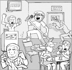
Batman: Death Mask #1, June 2008, DC Comics
writer/artist: Yoshinori Natsume
cover colorist: Jonny Rench
letterer: Rob Leigh
Blogger's note: Entry for Monday, April 14, 2008.
I received an e-mail from Allan Cypes, Media Manager for Harvey Dent's District Attorney campaign in Gotham City, last Sunday. I was too late to view Mr. Dent's live press conference on his website, IBelieveinHarveyDent.com, but I imagine that the candidate was quick to respond to recent allegations of corruption and malice. He seems like a very proactive politician, not one that would leave his political career up to, say, the flip of a coin.
Yes, the viral marketing campaign for this summer's The Dark Knight has been innovative, entertaining, and interactive, from the Joker's gang recruitment to Harvey Dent's run for D.A., which, though a deter to respect Heath Ledger's untimely passing in light of the marketing's Joker-heavy imagery, is a sly parallel with the real world's current controversy-ridden American Presidential election. As with any year Batman makes his way to the big screen, Warner Brothers is making the usual multi-media, cross-franchising rounds, from this pre-release Internet presence, to a new DVD anime Batman film and proposed The Brave and the Bold Cartoon Network series, to this, Batman: Death Mask, a continuity-free manga comic book adventure readers of all ages can enjoy. Yes, the manga/anime niche seems to be the way to go to assert Batman's approachability and relevance, considering how mainstream Japanese-inspired entertainment has become.
I don't want to say that I've been resistant to this insurgence of manga and anime in the Western world; indeed, comic book stores now have as much manga as anything else, thanks to the sheer volume of material available. Therein lies my point -- I'm intimidated by the medium. (I was going to call it a "genre," but surely manga is a medium in itself just as a traditional "comic book" differs from a "graphic novel" in the scope it conveys its content, or mediates, to the reader.) I wouldn't know where to begin! I assume that manga and anime have their own sub-genres, just like comics. So, while some fanboys would insist that The Dark Knight Returns or The Watcnmen are the best starters for newbies (if only to prove that those caped types are all camp and can be sophisticated, too), those less dedicated to the superhero shtick might suggest Strangers in Paradise or Preacher. Does manga have its own equivalents? Is there a Manga for Dummies or Anime 101 course I can take?
I thought that Batman: Death Mask would be my bridge. I was sadly mistaken. I have problems with this issue on both a technical and creative level, and while neither facet actually consumes me enough to completely dislike this inaugural issue, that both co-exist is cumulatively bothersome. First of all, Death Mask retains the traditional manga right-to-left format, but it also retains the traditional American comic book size, which, in my opinion, is an unfair compromise. If DC sought to publish a fresh manga Batman story, I would have preferred the complete experience, specifically a digest-sized manga volume. This might have meant including the entire story arc in a single offering, since a twenty-two page single's worth of content would make for a very thin digest, but if you're going to go manga, go manga. As this issue stands, I will file it with my other, regular Batman comics. If it were truly manga-sized, it would most likely end up on a bookshelf, where I might revisit it more often.
Remember, this is the size kids like -- the kind of thing they can put in the front pocket of their backpacks (where mom, dad, or their teacher might not suspect to look for a "funnybook") or roll up into their back pants pocket. It's portable, relevant, and more suitable for their little hands -- I'm serious.
So, since I felt a bit of a disconnect with this issue's format, I thought I'd find some solace in its story . . . for naught. Unfortunately, Death Mask is one of the least original Batman stories I've read in a long time. Oh, visually it's beautiful; Yoshinori Natusme is a very accomplished comic book artist and successfully combines iconic stature with fluid motion and character expression, which is what most folks like about manga, myself included. No, it was the plot was just too vapid for me, a veritable piecemeal of concepts we've seen in plenty of Batman comics already. Here's this first issue's summary: As our hero wonders which is his true identity, Batman or Bruce Wayne, a rash of gruesome murders plagues Gotham City, and when Wayne Industries' latest negotiations with a visiting Japanese corporation culminates in a cultural exhibit of masks, Bruce is confronted with a mysterious woman from his years of training and a dark version of his vigilante self. When you put it that way, Batman fans should realize, we've seen it all before.
If you need tangible examples, this is what readily comes to mind: Death Mask is Shaman (from Legends of the Dark Knight #1-5) meets Darwyn Cooke's Batman: Ego, with the potential for a Year Two or Mask of the Phantasm connection if this woman from Bruce's past becomes a significant player in the mystery.
Still, the first few pages of this issue betray this series' real intent: to show the world what a manga Batman adventure looks like, and probably to prime the audience for this summer's Gotham Knight anime DVD release. Those first few pages recapture the Waynes' murder and boast a two-page spread of Bats' most classic villains, and, really, the whole issue could've ended right there. Of course, I'm going to pick up issue #2, in the hopes that I'll be proven wrong -- in the hopes that I'll find something new. Like I said, I'm not resistant to manga, but instead I'm merely intimidated . . . especially now, as I begin to think that the sheer mass of material available might just regurgitate the same thing over and over . . .
Sunday, April 20, 2008


Saturday, April 19, 2008
Mega Man #3
Mega Man #3, November 2003, Dreamwave Productions
writer: Brian Augustyn
artist: Mic Fong
backgrounds: Pak Lok & Ching
colorists: Stuart Ng & Susan Luo
letterer: Paul Villafuerte
Blogger's Note: Entry for Sunday, April 13, 2008.
Mega Man was the first video game that ever made me forsake the open air of a beautiful summer day and shut myself up indoors to fiddle my thumbs over a handheld controller and mutate my eyes into the radiated pools of barely functioning optical sensors that they are today. Actually, I take that back. Berserk for my Atari 2600 was the first, and though I haven’t researched it on-line, I’m certain that Berserk was a game that had no end. Like the robotic apocalypse itself, Berserk was a perpetual onslaught of 8-bit eternal adventure -- during which the only hope was a deceptively dangerous bouncing happy face. No, Mega Man was the first multi-level “boss”-driven video game that captured my attention, complete with transitional story sequences and a subconscious sense of fledgling identity founded on overwhelming daddy issues. What adolescent child of a single mom wouldn’t dig it?
So, I picked up Dreamwave’s Mega Man #3 with both enthusiasm and caution. See, as much as I fondly remember “the Blue Bomber,” I haven’t indulged in his latest incarnations, thanks in large part to my impatience for and inability to operate today’s newfangled gaming systems, and frankly I was afraid that reading this issue would have been like watching somebody play a current Mega Man over his shoulder. In other words, I was afraid that it would be confusing, and even if I got a turn I wouldn’t know what I was doing. Fortunately, this issue boasts fluid, linear storytelling and crisp, manga-inspired art, so while it boasts a very definitive genre, it isn’t mired in continuity (yet) to forsake old school fans looking for a graphic Mega Man fix. It’s a comic book first, then a video game adaptation. Thank goodness.
This issue’s inside front cover “previously” blurb must have been a misprint, because, rather than explain what had happened in the first issues, it summarized the story to follow. I guess I didn’t mind -- it was like an instruction manual for this different kind of interactive experience. (The arcade game design was much appreciated, too.) In this version, Mega Man is in high school, and after an intense battle with Multiple Man, his highly anticipated night at the dance is interrupted by some boom box bot that may or may not be from a Mega Man game I haven’t played yet. Unfortunately, the attack was a distraction, as the Blue Bomber discovers when he goes home, and Dr. Light is gone. It’s actually very much the Splinter-is-kidnapped moment from the first Teenage Mutant Ninja Turtles arc (a series also adapted by Dreamwave at one point), and the emotional connection elevates Mega Man’s plight from multi-level cosmic adventure to multi-dimensional personal quest.
Interestingly, though Mega Man’s purpose has always been to conquer Dr. Wiley’s evil “men,” becoming a man is this little hero’s greatest challenge. Like all of us, the ultimate boss at the game is Who-Will-I-Be Man. Yeah, and you though Shadow Man was tough. Fortunately, if I remember correctly, the greater the villain, the greater reward.
writer: Brian Augustyn
artist: Mic Fong
backgrounds: Pak Lok & Ching
colorists: Stuart Ng & Susan Luo
letterer: Paul Villafuerte
Blogger's Note: Entry for Sunday, April 13, 2008.
Mega Man was the first video game that ever made me forsake the open air of a beautiful summer day and shut myself up indoors to fiddle my thumbs over a handheld controller and mutate my eyes into the radiated pools of barely functioning optical sensors that they are today. Actually, I take that back. Berserk for my Atari 2600 was the first, and though I haven’t researched it on-line, I’m certain that Berserk was a game that had no end. Like the robotic apocalypse itself, Berserk was a perpetual onslaught of 8-bit eternal adventure -- during which the only hope was a deceptively dangerous bouncing happy face. No, Mega Man was the first multi-level “boss”-driven video game that captured my attention, complete with transitional story sequences and a subconscious sense of fledgling identity founded on overwhelming daddy issues. What adolescent child of a single mom wouldn’t dig it?
So, I picked up Dreamwave’s Mega Man #3 with both enthusiasm and caution. See, as much as I fondly remember “the Blue Bomber,” I haven’t indulged in his latest incarnations, thanks in large part to my impatience for and inability to operate today’s newfangled gaming systems, and frankly I was afraid that reading this issue would have been like watching somebody play a current Mega Man over his shoulder. In other words, I was afraid that it would be confusing, and even if I got a turn I wouldn’t know what I was doing. Fortunately, this issue boasts fluid, linear storytelling and crisp, manga-inspired art, so while it boasts a very definitive genre, it isn’t mired in continuity (yet) to forsake old school fans looking for a graphic Mega Man fix. It’s a comic book first, then a video game adaptation. Thank goodness.
This issue’s inside front cover “previously” blurb must have been a misprint, because, rather than explain what had happened in the first issues, it summarized the story to follow. I guess I didn’t mind -- it was like an instruction manual for this different kind of interactive experience. (The arcade game design was much appreciated, too.) In this version, Mega Man is in high school, and after an intense battle with Multiple Man, his highly anticipated night at the dance is interrupted by some boom box bot that may or may not be from a Mega Man game I haven’t played yet. Unfortunately, the attack was a distraction, as the Blue Bomber discovers when he goes home, and Dr. Light is gone. It’s actually very much the Splinter-is-kidnapped moment from the first Teenage Mutant Ninja Turtles arc (a series also adapted by Dreamwave at one point), and the emotional connection elevates Mega Man’s plight from multi-level cosmic adventure to multi-dimensional personal quest.
Interestingly, though Mega Man’s purpose has always been to conquer Dr. Wiley’s evil “men,” becoming a man is this little hero’s greatest challenge. Like all of us, the ultimate boss at the game is Who-Will-I-Be Man. Yeah, and you though Shadow Man was tough. Fortunately, if I remember correctly, the greater the villain, the greater reward.
Tuesday, April 15, 2008
Dr. Blink: Superhero Shrink #0
Dr. Blink: Superhero Shrink #0, June 2004, Dork Storm Press
by John Kovalic and Christopher Jones
Blogger's note: Entry for Saturday, April 12, 2008.
If superheroes truly dwelt among us, I believe they would all share one mutual, deadly foe -- one bald, wealthy man that has managed to secure public affection via a false philanthropic persona yet secretly contribute to the downfall of society's elite, thus, society itself. No, I'm not talking about Lex Luthor -- I said if superheroes dwelt among us, not their archnemeses. No, the man I'm talking about if more nefarious than any evil enemy fiction can create.
I'm talking about Dr. Phil.
In recent months, Dr. Phil has meddled in some of America's most prominent headlines, from the Britney Spears debacle to the most recent "epidemic" of teen girl beatings. (If you haven't heard, Dr. Phil paid the bail for one of the bullies in the hopes of landing her for his show. When the news of his, uhm, helpfulness hit watchdog websites like TMZ, Dr. Phil quickly retracted his intentions.
So, you can only imagine how Dr. Phil would react if the superheroes we know and loved actually existed. Would he speak out against rampant sidekick-ism? Would he comment upon why female superheroes seem to save the day only three-fourths of the times male superheroes do? When Batman goes undercover in Arkham Asylum, would Dr. Phil blow his cover and try to spring him in the hopes of having the Dark Knight on his show? Yes, the possibilities are endless . . .
Fortunately, we don't really have to imagine it anymore. John Kovalic and Christopher Jones have already explored the possibilities with Dr. Blink: Superhero Shrink. This #0 issue introduces Dr. Blink, a struggling psychologist that was reduced to shrinking pets before a superhero battle smashed through his office and gave him an epiphany: Superheroes are people, too! They must have problems! His book on the subject elevated him to best author status and in turn opened the floodgates for more superheroes knocking down his door -- but, this time, they want his help. Featuring the likes of "Captain Omnipotent," "Nocturne," and "Speed Freak," Dr. Blink essentially explores the potential for emotional instability that must come with anonymously fighting crime, often with hilarious, sometime pratfallish results.
Unfortunately, considering the relatively short time I've decided to indulge myself a different comic book every day, I’ve become tired of these frequent satiric imitators, which is no fault of Kovalic and Jones, especially since their concept is a natural extension of the superhero genre’s integration into mainstream society and pop culture. We've become a nation of pop psychologists, diagnosing problems based on the snippets of the science we've actually experienced, either via our own time on the couch or through the likes of celebrities like Dr. Phil and Dr. Drew. (I don't know about you, but any doctor that prefers you follow his official title with his first name can't be the real deal. Dr. Strange has more credibility. At least that's really his last name.) At this point in such satirical works, the real creativity comes from renaming the characters we've known for years -- "Captain Omnipotent," for example, is a pretty decent moniker, or at least more inventive than Astonishman in The End League. Isn't the End League’s Batman simply named "Black?" Makes you wonder where his sidekick is: Grayscale.
Fortunately, Kovalic and Jones present a decent enough product to overlook just how close to the line of plagiarism it treads. Kovalic's writing style is well-paced, and he doesn't dwell on any one gag for too long, which is a good thing. Jones' art boasts heavy Bruce Timm influences, which may be what he thought was best for such an exaggerated interpretation of pre-existing characters, but some panels betray a fledgling sense of individuality that may rear its head again in future issues. Fortunately, both writer and artist understand that the characters must come first, so while plenty of psychobabble makes the page, its pure comedy fodder for the development of Dr. Blink as a straight man with real motivation in a world of outrageously powered nutcases.
Hey, we fanboys can relate. We have plenty of issues.
by John Kovalic and Christopher Jones
Blogger's note: Entry for Saturday, April 12, 2008.
If superheroes truly dwelt among us, I believe they would all share one mutual, deadly foe -- one bald, wealthy man that has managed to secure public affection via a false philanthropic persona yet secretly contribute to the downfall of society's elite, thus, society itself. No, I'm not talking about Lex Luthor -- I said if superheroes dwelt among us, not their archnemeses. No, the man I'm talking about if more nefarious than any evil enemy fiction can create.
I'm talking about Dr. Phil.
In recent months, Dr. Phil has meddled in some of America's most prominent headlines, from the Britney Spears debacle to the most recent "epidemic" of teen girl beatings. (If you haven't heard, Dr. Phil paid the bail for one of the bullies in the hopes of landing her for his show. When the news of his, uhm, helpfulness hit watchdog websites like TMZ, Dr. Phil quickly retracted his intentions.
So, you can only imagine how Dr. Phil would react if the superheroes we know and loved actually existed. Would he speak out against rampant sidekick-ism? Would he comment upon why female superheroes seem to save the day only three-fourths of the times male superheroes do? When Batman goes undercover in Arkham Asylum, would Dr. Phil blow his cover and try to spring him in the hopes of having the Dark Knight on his show? Yes, the possibilities are endless . . .
Fortunately, we don't really have to imagine it anymore. John Kovalic and Christopher Jones have already explored the possibilities with Dr. Blink: Superhero Shrink. This #0 issue introduces Dr. Blink, a struggling psychologist that was reduced to shrinking pets before a superhero battle smashed through his office and gave him an epiphany: Superheroes are people, too! They must have problems! His book on the subject elevated him to best author status and in turn opened the floodgates for more superheroes knocking down his door -- but, this time, they want his help. Featuring the likes of "Captain Omnipotent," "Nocturne," and "Speed Freak," Dr. Blink essentially explores the potential for emotional instability that must come with anonymously fighting crime, often with hilarious, sometime pratfallish results.
Unfortunately, considering the relatively short time I've decided to indulge myself a different comic book every day, I’ve become tired of these frequent satiric imitators, which is no fault of Kovalic and Jones, especially since their concept is a natural extension of the superhero genre’s integration into mainstream society and pop culture. We've become a nation of pop psychologists, diagnosing problems based on the snippets of the science we've actually experienced, either via our own time on the couch or through the likes of celebrities like Dr. Phil and Dr. Drew. (I don't know about you, but any doctor that prefers you follow his official title with his first name can't be the real deal. Dr. Strange has more credibility. At least that's really his last name.) At this point in such satirical works, the real creativity comes from renaming the characters we've known for years -- "Captain Omnipotent," for example, is a pretty decent moniker, or at least more inventive than Astonishman in The End League. Isn't the End League’s Batman simply named "Black?" Makes you wonder where his sidekick is: Grayscale.
Fortunately, Kovalic and Jones present a decent enough product to overlook just how close to the line of plagiarism it treads. Kovalic's writing style is well-paced, and he doesn't dwell on any one gag for too long, which is a good thing. Jones' art boasts heavy Bruce Timm influences, which may be what he thought was best for such an exaggerated interpretation of pre-existing characters, but some panels betray a fledgling sense of individuality that may rear its head again in future issues. Fortunately, both writer and artist understand that the characters must come first, so while plenty of psychobabble makes the page, its pure comedy fodder for the development of Dr. Blink as a straight man with real motivation in a world of outrageously powered nutcases.
Hey, we fanboys can relate. We have plenty of issues.
Monday, April 14, 2008
World’s Finest #279
World’s Finest #279, May 1982, DC Comics
writers: Keith Pollard, Joey Cavalieri, Bob Rozakis, E. Nelson Bridwell
artists: Keith Pollard, Mike DeCarlo, Trevor Von Eeden, Larry Mahlstedt, Alex Savuik, Frank Chiaramonte, Don Newton
letterers: John Costanza, Adam Kubert, Phil Felix, Milt Snapinn
colorists: Gene D’Angelo, Tony Zuiko, Jerry Serpe, Adrienne Roy
editor: Mike W. Barr
Blogger's note: Entry for Friday, April 11, 2008.
If I’d been born ten years earlier, I’m convinced that World’s Finest would’ve been my favorite comic book series. If I remember correctly, it was on a sunny summer morning and I was eleven years old when I first began taking comics seriously -- as a habitual lifestyle rather than a casual hobby -- so, had I been born in ’69 instead of ’79, I would’ve encountered World’s Finest #279 very early into my collecting career. Think about it: four stories starring five of DC’s stable superheroes, only for a dollar. (Of course, I say only for a dollar now, recognizing the fortune a buck would’ve been to a kid in ’82. Still, when I started collecting in the early ‘90s, regular thirty-pagers cost a dollar and usually only featured one story, and managed to find the 100 cents then. What would I have scrounged together for a monthly anthology? Ah, but I digress . . .)
The best part of World’s Finest is its characters’ campy camaraderie. Consider the first page, which shows Batman training Superman in hand-to-hand combat. When a crime alarm interrupts their session and Supes asks to tag along, Batman replies, “Superman, old buddy, I was hoping you’d join me!” Now, I understand that these corny colloquialisms are what inspired Frank Miller to take the world’s finest heroes’ relationship in a different direction, but I don’t see the harm in maintaining this light-hearted fare, particularly since the divisiveness of Miller’s Dark Knight continuity is arguably responsible for the dark state of DC’s current direction. (Seriously, if headliners like Superman and Batman always got along, would writers even consider subversive tactics by the likes of second-stringers like Zatanna? Or, since mind-wiping really is as old school as Bats calling Supes “buddy,” would the Justice League even throw a fit over it?) Incidentally, the newly organized “Army of Crime,” boasting a roster of villains with inherent ranks like Major Disaster and Captain Cutlass, have been abducted Gotham’s elite so Bruce Wayne and his spit-curled bodyguard go undercover to crack the kidnapping ring. You see, that’s friendship.
Speaking of mind-wiping, in this issue’s second story, Green Arrow tackles a religious cult that has brainwashed his friend’s daughter. The Emerald Archer first confronts the zealots on the street, but when Ollie Queen decides to take them on legitimately, he discovers that the counter-group he befriends is actually a front to weed out the cult’s enemies. This tale has interesting roots in current events, as authorities attempt to sift through the facts surrounding pedophilic polygamist cults in Texas and Arizona, and while I don’t find Cavalieri’s script as socially demanding as Denny O’Neil’s take on the character, the consistency of civil consciousness is an appreciated thematic vein that runs through this era of Green Arrow’s history. (When the mess with Connor Hawke is finally cleared, an Arrow/Black Canary sojourn across America would be fantastic, considering our country’s current challenges. You listening, Winick?) I mean, I know it’s rude to point, but that’s basically Green Arrow’s super-power. Only fitting that he points that thing toward the folks that really need to hear the point.
(Still, this social servitude is Arrow’s only real distinction at this point in his evolution. Think about it -- he works at the Daily Star, and he has an Arrow-cave, an Arrow-mobile, etc. He even comments on his new lock-pick, “It may be arrow-shaped, but at least that’s all it is . . . Batman probably named his the Batpick, or the Bat-lock-debolter . . .” Considering these two vices, Ollie is the world’s finest all rolled into one!)
Hawkman’s adventure this issue is a swash-buckling space romp, as his search for Shayera lands him in the crosshairs of alien pirates! He almost takes the foursome out single-handedly, but they trick him with a projection of his beloved Hawkgirl -- dastardly fiends! The Marvel Family’s story is a little more grounded, as Captain Marvel, Mary Marvel, and Captain Marvel, Jr. deal with an old man determined to live as long as possible. In fact, he has attached a device to his cardiac and respiratory functions, so that if either fail, respective missiles are launched either into the atmosphere or into the very Earth’s core. Of course, the speed of Mercury and the wisdom of Solomon help the Marvel men thrust these WMDs on a collision course in space, while Mary actually saves the old codger with CPR -- oh, and a visit from Asklepios, the Greek god of healing. Yes, writer E. Nelson Bridwell manages to convert a Golden Age Captain Marvel, Jr. classic starring Sherlock Holmes into a mystery about the varied appearances of “impossible people,” culminating in a guest spot from Kid Eternity. Although this twist seems mired in a little (undoubtedly retconned by now) continuity, I appreciated the mention of that old campy yarn. It reminded me of what Morrison’s trying to do in Batman right now.
Yes, it is possible to make the old seem new again. It is possible to make an embittered old geek like me feel like it was his first day of collecting comics all over again. It actually isn’t that hard, which is probably why many of DC’s and Marvel’s attempts at “innovative,” well marketing storylines seem so labored nowadays. They aren’t called the world’s finest for nothing . . . if only we on this side of the printed product weren’t the only ones to remember that.
writers: Keith Pollard, Joey Cavalieri, Bob Rozakis, E. Nelson Bridwell
artists: Keith Pollard, Mike DeCarlo, Trevor Von Eeden, Larry Mahlstedt, Alex Savuik, Frank Chiaramonte, Don Newton
letterers: John Costanza, Adam Kubert, Phil Felix, Milt Snapinn
colorists: Gene D’Angelo, Tony Zuiko, Jerry Serpe, Adrienne Roy
editor: Mike W. Barr
Blogger's note: Entry for Friday, April 11, 2008.
If I’d been born ten years earlier, I’m convinced that World’s Finest would’ve been my favorite comic book series. If I remember correctly, it was on a sunny summer morning and I was eleven years old when I first began taking comics seriously -- as a habitual lifestyle rather than a casual hobby -- so, had I been born in ’69 instead of ’79, I would’ve encountered World’s Finest #279 very early into my collecting career. Think about it: four stories starring five of DC’s stable superheroes, only for a dollar. (Of course, I say only for a dollar now, recognizing the fortune a buck would’ve been to a kid in ’82. Still, when I started collecting in the early ‘90s, regular thirty-pagers cost a dollar and usually only featured one story, and managed to find the 100 cents then. What would I have scrounged together for a monthly anthology? Ah, but I digress . . .)
The best part of World’s Finest is its characters’ campy camaraderie. Consider the first page, which shows Batman training Superman in hand-to-hand combat. When a crime alarm interrupts their session and Supes asks to tag along, Batman replies, “Superman, old buddy, I was hoping you’d join me!” Now, I understand that these corny colloquialisms are what inspired Frank Miller to take the world’s finest heroes’ relationship in a different direction, but I don’t see the harm in maintaining this light-hearted fare, particularly since the divisiveness of Miller’s Dark Knight continuity is arguably responsible for the dark state of DC’s current direction. (Seriously, if headliners like Superman and Batman always got along, would writers even consider subversive tactics by the likes of second-stringers like Zatanna? Or, since mind-wiping really is as old school as Bats calling Supes “buddy,” would the Justice League even throw a fit over it?) Incidentally, the newly organized “Army of Crime,” boasting a roster of villains with inherent ranks like Major Disaster and Captain Cutlass, have been abducted Gotham’s elite so Bruce Wayne and his spit-curled bodyguard go undercover to crack the kidnapping ring. You see, that’s friendship.
Speaking of mind-wiping, in this issue’s second story, Green Arrow tackles a religious cult that has brainwashed his friend’s daughter. The Emerald Archer first confronts the zealots on the street, but when Ollie Queen decides to take them on legitimately, he discovers that the counter-group he befriends is actually a front to weed out the cult’s enemies. This tale has interesting roots in current events, as authorities attempt to sift through the facts surrounding pedophilic polygamist cults in Texas and Arizona, and while I don’t find Cavalieri’s script as socially demanding as Denny O’Neil’s take on the character, the consistency of civil consciousness is an appreciated thematic vein that runs through this era of Green Arrow’s history. (When the mess with Connor Hawke is finally cleared, an Arrow/Black Canary sojourn across America would be fantastic, considering our country’s current challenges. You listening, Winick?) I mean, I know it’s rude to point, but that’s basically Green Arrow’s super-power. Only fitting that he points that thing toward the folks that really need to hear the point.
(Still, this social servitude is Arrow’s only real distinction at this point in his evolution. Think about it -- he works at the Daily Star, and he has an Arrow-cave, an Arrow-mobile, etc. He even comments on his new lock-pick, “It may be arrow-shaped, but at least that’s all it is . . . Batman probably named his the Batpick, or the Bat-lock-debolter . . .” Considering these two vices, Ollie is the world’s finest all rolled into one!)
Hawkman’s adventure this issue is a swash-buckling space romp, as his search for Shayera lands him in the crosshairs of alien pirates! He almost takes the foursome out single-handedly, but they trick him with a projection of his beloved Hawkgirl -- dastardly fiends! The Marvel Family’s story is a little more grounded, as Captain Marvel, Mary Marvel, and Captain Marvel, Jr. deal with an old man determined to live as long as possible. In fact, he has attached a device to his cardiac and respiratory functions, so that if either fail, respective missiles are launched either into the atmosphere or into the very Earth’s core. Of course, the speed of Mercury and the wisdom of Solomon help the Marvel men thrust these WMDs on a collision course in space, while Mary actually saves the old codger with CPR -- oh, and a visit from Asklepios, the Greek god of healing. Yes, writer E. Nelson Bridwell manages to convert a Golden Age Captain Marvel, Jr. classic starring Sherlock Holmes into a mystery about the varied appearances of “impossible people,” culminating in a guest spot from Kid Eternity. Although this twist seems mired in a little (undoubtedly retconned by now) continuity, I appreciated the mention of that old campy yarn. It reminded me of what Morrison’s trying to do in Batman right now.
Yes, it is possible to make the old seem new again. It is possible to make an embittered old geek like me feel like it was his first day of collecting comics all over again. It actually isn’t that hard, which is probably why many of DC’s and Marvel’s attempts at “innovative,” well marketing storylines seem so labored nowadays. They aren’t called the world’s finest for nothing . . . if only we on this side of the printed product weren’t the only ones to remember that.
Sunday, April 13, 2008
Pop Life #2
Pop Life #2, March 1999, Fantagraphics Books
by Ho Che Anderson & Wilfred Santiago
Blogger's note: Entry for Thursday, April 10, 2008.
I picked up a few issues of Pop Life a few months ago at the Los Angeles Comic Book and Science Fiction Convention, and while I don't regret the decision I wonder if these issues are appropriate for the A Comic A Day challenge. For several personal reasons, I've made a conscious effort to keep the material I review all-ages appropriate, and though He Che Anderson's writing boasts many universal themes, his stories strike me as sexually charged and definitively adult. There's nothing wrong with that. Pop Life is an obvious and tender labor of love, by an adult for fellow adults, but I simply feel compelled to note its uniqueness in the context of the hundreds of comic books I've reviewed over these past few years. Yes, it certainly pops.
And what is it about? Well, I'm having a difficult time with that one, too. Granted, I read issues #2 and #5, which are vastly distinct in both design and content, but both feature an array of uniquely crafted, introspective stories, which either explore the realms of music, sexuality, social inadequacy, or all three. Consider the lead story in issue #2, which features Danny and his band trying to score a suitable practice space. Unfortunately, their respective homes just can't cut it, considering the protests of their significant others. In the meantime, Danny spends the day hooking up with his wife and his mistress, and chatting with his mom. I'd imagine it the real life of a struggling musician -- the one most of us envy. The following tale, "Miles From Home," is the continuing exploration of a young woman's newfound independence, though in this second chapter, Mo is struggling a bit with loneliness and a sense of impending responsibility. It's a slow bit interesting yarn with a particularly sympathetic scene in a coffee shop, in which one of the kindly townsfolk tries to spark up a conversation with Mo. The sequence reveals that, as much as she wants to find a place in the world, she needs times to herself, as well, and the two hopes aren't necessarily getting along. Dichotomy reigns supreme in Pop Life.
From what I can tell of this issue's design and themes, Anderson with artist Santiago sought to established a "mixed tape" feel to this work, as if the various stories each represented a different track on the same homemade album. Their art styles are vastly different but remarkably cohesive in this series -- Santiago has a confident brushstroke, while Anderson incorporates photography and creates a really textured reading experience. I liked the monotone of "Miles From Home," as it turned a relatively down to earth urban allegory into a vibrant pop art experience. Again, the artists' love for the work exudes from the page.
Which makes issue #5 a bittersweet read, as it's unexpectedly their last. Still, Anderson has experienced quite a bit of success since Pop Life, with his biographical King the recipient of rave reviews. Goes to show where having a dream can really get you -- something someone at any age can easily understand.
by Ho Che Anderson & Wilfred Santiago
Blogger's note: Entry for Thursday, April 10, 2008.
I picked up a few issues of Pop Life a few months ago at the Los Angeles Comic Book and Science Fiction Convention, and while I don't regret the decision I wonder if these issues are appropriate for the A Comic A Day challenge. For several personal reasons, I've made a conscious effort to keep the material I review all-ages appropriate, and though He Che Anderson's writing boasts many universal themes, his stories strike me as sexually charged and definitively adult. There's nothing wrong with that. Pop Life is an obvious and tender labor of love, by an adult for fellow adults, but I simply feel compelled to note its uniqueness in the context of the hundreds of comic books I've reviewed over these past few years. Yes, it certainly pops.
And what is it about? Well, I'm having a difficult time with that one, too. Granted, I read issues #2 and #5, which are vastly distinct in both design and content, but both feature an array of uniquely crafted, introspective stories, which either explore the realms of music, sexuality, social inadequacy, or all three. Consider the lead story in issue #2, which features Danny and his band trying to score a suitable practice space. Unfortunately, their respective homes just can't cut it, considering the protests of their significant others. In the meantime, Danny spends the day hooking up with his wife and his mistress, and chatting with his mom. I'd imagine it the real life of a struggling musician -- the one most of us envy. The following tale, "Miles From Home," is the continuing exploration of a young woman's newfound independence, though in this second chapter, Mo is struggling a bit with loneliness and a sense of impending responsibility. It's a slow bit interesting yarn with a particularly sympathetic scene in a coffee shop, in which one of the kindly townsfolk tries to spark up a conversation with Mo. The sequence reveals that, as much as she wants to find a place in the world, she needs times to herself, as well, and the two hopes aren't necessarily getting along. Dichotomy reigns supreme in Pop Life.
From what I can tell of this issue's design and themes, Anderson with artist Santiago sought to established a "mixed tape" feel to this work, as if the various stories each represented a different track on the same homemade album. Their art styles are vastly different but remarkably cohesive in this series -- Santiago has a confident brushstroke, while Anderson incorporates photography and creates a really textured reading experience. I liked the monotone of "Miles From Home," as it turned a relatively down to earth urban allegory into a vibrant pop art experience. Again, the artists' love for the work exudes from the page.
Which makes issue #5 a bittersweet read, as it's unexpectedly their last. Still, Anderson has experienced quite a bit of success since Pop Life, with his biographical King the recipient of rave reviews. Goes to show where having a dream can really get you -- something someone at any age can easily understand.
WWWednesday: Bee Power
WWWednesday: Bee Power
website: http://comicswithoutviolence.com/
by K.C. Green
With Free Comic Book Day right around the corner, I remembered past Keenspot anthology compilations I've acquired on a few of those frugal funnybook festivals and finally decided to look up the webcomics compendium. I quickly selected Bee Power for its potential Mr. Toast quality, and I was not disappointed in its absurd surrealism. For the past five years, K. C. Green has commented on life's quirkiest characteristics, beginning with squiggly talk heads on notebook paper to fully colored sequential allegories. Indeed, his webcomics career (if indeed it began with Bee Power) mimics the margins of every high school nerds' notebooks across America. The question is, does he have the sense of humor to match? Two words: "Dog bong." I'm not sure where the bees come in, but if you're in the mood to let the darkest parts of your inner adolescent chuckle, nothing comes sweeter than Bee Power.
website: http://comicswithoutviolence.com/
by K.C. Green
With Free Comic Book Day right around the corner, I remembered past Keenspot anthology compilations I've acquired on a few of those frugal funnybook festivals and finally decided to look up the webcomics compendium. I quickly selected Bee Power for its potential Mr. Toast quality, and I was not disappointed in its absurd surrealism. For the past five years, K. C. Green has commented on life's quirkiest characteristics, beginning with squiggly talk heads on notebook paper to fully colored sequential allegories. Indeed, his webcomics career (if indeed it began with Bee Power) mimics the margins of every high school nerds' notebooks across America. The question is, does he have the sense of humor to match? Two words: "Dog bong." I'm not sure where the bees come in, but if you're in the mood to let the darkest parts of your inner adolescent chuckle, nothing comes sweeter than Bee Power.
Tuesday, April 08, 2008
Loaded Bible 2: Blood of Christ
Loaded Bible 2: Blood of Christ, May 2007, Image Comics
writer: Tim Seeley
penciller: Mike Norton
finisher: Mark Englert
colorist: Rex Justice
letterer: Brian Crowley
Frankly, I don't know why we don't see Jesus in comics more often.
Never mind that he may be the redeemer of all mankind. Consider Jesus simply as the star of the best selling book of all time. Consider what he, as a hero in the context of his story, is capable of: transforming matter, healing illness, conquering death, just to name a few. Why aren't more writers drawn to this potential? Why hasn't Jesus joined the likes of Frankenstein and Bigfoot as one of the most frequently used icons of mystery in all of comics?
The three have enough in common. Jesus and Frankenstein have both conquered death, and Jesus and Bigfoot are often "seen" by delusional mid-westerners, if not in the forest, than on a tortilla.
Well, Loaded Bible still doesn't technically star Jesus, but rather his clone, who endures a Bourne-like quest for his identity in the midst of an apocalyptic invasion of vampires. Walking on water, no problem, but holding his own against a blood-thirsty army growing their own purebreds Blade II-style? No so much. Still, Christ's sympathy for his fellow man is his greatest power, as he temporary cares for a vampire infant despite its status as atrocity-to-all-that-is-holy.
Norton and Englert's artwork is what propels this issue to greatness, as their crisp renditions of Jesus, vampires, and all things Vatican conspiracy make even the slowest talking head sequences compelling. A conspiracy brews behind the scenes of this perpetual battle, and with cowboy-like bounty hunters in the mix, Loaded Bible's next book is sure to rival a certain revelation of the apostle John.
This is why Jesus should be in comics more. He knows how to bring the pain! It's almost like he lives for it . . .
writer: Tim Seeley
penciller: Mike Norton
finisher: Mark Englert
colorist: Rex Justice
letterer: Brian Crowley
Frankly, I don't know why we don't see Jesus in comics more often.
Never mind that he may be the redeemer of all mankind. Consider Jesus simply as the star of the best selling book of all time. Consider what he, as a hero in the context of his story, is capable of: transforming matter, healing illness, conquering death, just to name a few. Why aren't more writers drawn to this potential? Why hasn't Jesus joined the likes of Frankenstein and Bigfoot as one of the most frequently used icons of mystery in all of comics?
The three have enough in common. Jesus and Frankenstein have both conquered death, and Jesus and Bigfoot are often "seen" by delusional mid-westerners, if not in the forest, than on a tortilla.
Well, Loaded Bible still doesn't technically star Jesus, but rather his clone, who endures a Bourne-like quest for his identity in the midst of an apocalyptic invasion of vampires. Walking on water, no problem, but holding his own against a blood-thirsty army growing their own purebreds Blade II-style? No so much. Still, Christ's sympathy for his fellow man is his greatest power, as he temporary cares for a vampire infant despite its status as atrocity-to-all-that-is-holy.
Norton and Englert's artwork is what propels this issue to greatness, as their crisp renditions of Jesus, vampires, and all things Vatican conspiracy make even the slowest talking head sequences compelling. A conspiracy brews behind the scenes of this perpetual battle, and with cowboy-like bounty hunters in the mix, Loaded Bible's next book is sure to rival a certain revelation of the apostle John.
This is why Jesus should be in comics more. He knows how to bring the pain! It's almost like he lives for it . . .
Monday, April 07, 2008
Noah's Ark
Noah's Ark, 1975, Spire Comics
by Al Hartley
They say April showers bring May flowers, so I can't think of a better month to review a comic book adaptation of the story of Noah's Ark. Interestingly, Al Hartley's take on this Biblical tale places Noah and his family in an inexplicably contemporary context -- well, as contemporary as 1975, anyway. With the exception of this modern imagery, the pacing and play-out of this issue's plot is familiar to anyone that has spent any time in Sunday school; Noah builds an ark, is mocked by his neighbors, gathers two of every animal, and watches them drown as God cleanses the Earth with forty days and nights of rain. I'm assuming the contemporary context is a mere feeble avoidance of drawing these characters in the ragtag wardrobe of Old Testament times, to make the tale more approachable to youth. Such vivid imagery certainly could be enough, as Hartley is obviously a very capable cartoonist. His pages are colorful and expressive, to be sure, but by the middle of this issue, every other sentence out of Noah's mouth amounts to "Shut up, guys, God knows what He's doing." As much as this may be true, the repetition became counterproductive, and if I was a younger reader, might even strike me as boring. Therein lies the ultimate challenge when adapting any material of a faith-based nature; as much you want to convey your message, you want to tell an entertaining story, lest you lose the audience before your point is fully realized. Heck, Jesus himself understood this, since his sermons were rife with imaginative imagery to maintain the attention of his audience. Otherwise, he would've drowned the crowd with his message like, well, forty days and nights of rain.
Will this Noah's Ark make a believer out of you? If you want to know my religious convictions about the whole thing, feel free to e-mail me. (Hint: Read Preacher.) Above all else, this issue maintained my faith in comics, which was the only reason I picked it up. The medium is really capable of preserving any message, like an ark in itself. Hallelujah!
Supplemental: Irony -- this issue's cover price? In fact, the original cover price of all of Spire's "Kiddies Christian Comics?" 69 cents. Hilarious!
by Al Hartley
They say April showers bring May flowers, so I can't think of a better month to review a comic book adaptation of the story of Noah's Ark. Interestingly, Al Hartley's take on this Biblical tale places Noah and his family in an inexplicably contemporary context -- well, as contemporary as 1975, anyway. With the exception of this modern imagery, the pacing and play-out of this issue's plot is familiar to anyone that has spent any time in Sunday school; Noah builds an ark, is mocked by his neighbors, gathers two of every animal, and watches them drown as God cleanses the Earth with forty days and nights of rain. I'm assuming the contemporary context is a mere feeble avoidance of drawing these characters in the ragtag wardrobe of Old Testament times, to make the tale more approachable to youth. Such vivid imagery certainly could be enough, as Hartley is obviously a very capable cartoonist. His pages are colorful and expressive, to be sure, but by the middle of this issue, every other sentence out of Noah's mouth amounts to "Shut up, guys, God knows what He's doing." As much as this may be true, the repetition became counterproductive, and if I was a younger reader, might even strike me as boring. Therein lies the ultimate challenge when adapting any material of a faith-based nature; as much you want to convey your message, you want to tell an entertaining story, lest you lose the audience before your point is fully realized. Heck, Jesus himself understood this, since his sermons were rife with imaginative imagery to maintain the attention of his audience. Otherwise, he would've drowned the crowd with his message like, well, forty days and nights of rain.
Will this Noah's Ark make a believer out of you? If you want to know my religious convictions about the whole thing, feel free to e-mail me. (Hint: Read Preacher.) Above all else, this issue maintained my faith in comics, which was the only reason I picked it up. The medium is really capable of preserving any message, like an ark in itself. Hallelujah!
Supplemental: Irony -- this issue's cover price? In fact, the original cover price of all of Spire's "Kiddies Christian Comics?" 69 cents. Hilarious!
Sunday, April 06, 2008
The Mighty Thor #138
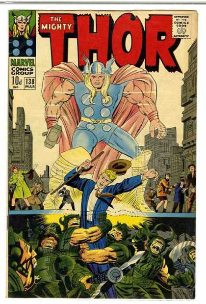
The Mighty Thor #138, March 1967, Marvel Comics
writer: Stan Lee
penciller: Jack Kirby
inker: Vince Colletta
letterer: Artie Simek
I've said it before, and I'll say it again: when you review a different comic book every day, sometimes the stars align and offer an uncanny insight into the medium's undeniable synchronicities. Consider The Mighty Thor #138 and The Last of the Viking Heroes #5. I found both issues in the same dusty old box in an antique store in Pomona, California. Both issues feature the work of Jack Kirby in some way or another, and both star Norse warriors. Most specifically, both issues feature a villain using a damsel in distress to bait the ever-suffering hero, so much so that I'm now wondering if Michael Thibodeaux was inspired by this titanic tale by Stan "the Man" Lee. By Odin's beard, indeed!
Yes, in The Mighty Thor #138, the god of thunder must rescue the goddess Suf from Ulik, "deadliest and most powerful of all the trolls!" While Thor and Ulik rumble in the streets, the troll king Gierrordur summons the power of the demonic Orikal to strengthen his forces against Asgard, where Odin himself must take up arms for battle. This issue's cliffhanger is incredibly perilous, as all seems lost on the Asgardian front, and, what's worse, Thor has lost his hammer and will resume his human form any second! Fortunately, an adventurous back-up story lightens the mood, as Thor, Fandral, and Hogun battle Ogur, the one-eyed guardian of the cave of Wazir, the Prophet, whom our heroes seek to learn the location of the Mystic Mountain. This issue is a Marvel masterpiece, plain and simple, boasting Stan Lee's consonant-cornering creature creations, Jack Kirby and Vince Colletta's dynamic drawings, and Marvel Comic's frivolous faithfulness to its frantic fanbase. 'Nuff said.
(Why even bother running a spell check on this review, I wonder.)
Reading and reviewing this issue reminds me an anecdote I've been meaning to share for a few months now. Several weeks ago, I attended a comic book convention in Yorba Linda, California, a small affair with an emphasis on retailers selling Golden through Bronze Age back issues. I found a few tattered "reading copies" of World's Finest, Justice League, and some other strange titles, but more importantly I wore a Mighty Thor T-shirt I'd purchased from Steve & Barry's, an excellent source for such inexpensive geek wear. While I was flipping through a back issue bin, an older gentleman approached me and asked, "So, what do you think about Thor coming back?" Now, I know he was referring to Thor's recent resurrection and the new title written by J. Michael Straczynski, but that's it, so I sheepishly answered, "Oh, I don't read Thor, so I don't really know . . ."
"I see," the guy responded flatly. "You just wear the shirt." He promptly turned heel and walked away.
I wanted to call out, "Wait a minute, Sir! I've been reading comics for over fifteen years! I just haven't gotten around to Thor yet! Please! I read and review a different comic a day! I'm not a poser . . .!"
I thought wearing a Kirby-drawn Thor shirt was solidarity enough. I was wrong. Hopefully this weekend's immersion in Nordic mythology begins to make up for it. Maybe someday I'll finally become a real fan, based on that critical gentleman's judgment. He certainly dropped the gavel and rendered a hasty verdict, 'tis for sure. Zounds, hath the hammer of Thor no mercy for e'en the lowliest of mortals?!
The Last of the Viking Heroes #5
The Last of the Viking Heroes #5, June 1988, Genesis West Comics
by Michael Thibodeaux with Mike Royer, Trisha French, Linda Yamasaki, Joe Sinnot, and Palle Jensen
Blogger’s note: Entry for Saturday, April 5, 2008.
If you haven’t noticed, I’ve been playing catch-up this week. Last weekend, I became surprisingly and pleasantly distracted by the unexpected reunion of my favorite punk band Face to Face, and I attended their first show in four years last Thursday night. (Feel free to check out my comic strip leading up to the concert here.) I’d never been to Pomona, California’s Glass House before, and before the show I wandered its surrounding Antique District a bit, and since the shops were already closed for the night I was determined to return and search for fanboy treasure. Sure enough, I dragged my girlfriend back there this very weekend and found a few old comics worth buying and reviewing. The Last of the Viking Heroes #5 is foremost among them.
Honestly, I purchased The Last of the Viking Heroes #5 for its cover alone. Its interior could’ve stunk to high heaven (it didn’t, but we’ll get to that in a minute) and I still would’ve been completely satisfied sinking a measly dollar into this issue, namely because of its cover’s collaborative effort. Five words: Jack Kirby and Dave Stevens. ‘Nuff said, right? It looks like Stevens inks Kirby’s pencils for this issue’s dramatic cover, starring some Vikings (duh) mourning the death of their warrior prince, and, man, is it classic comic book goodness. The traditional Kirby characteristics are present and accounted for, from the square-jawed faces to the round, bubbly muscles to that squiggly-line fore-shading, but Stevens’ inks help it all pop more than usual, with a reverence for both the style and genre they represent. Greg Theakston’s colors bring the piece home with a royal brilliance, heavy on the blues and purples. The more I look at this thing, the more I’m glad it’s a part of my collection.
Fortunately, Michael Thibodeaux’s story lives up to its cover’s hype, which is probably why esteemed artists like Kirby and Stevens decided to contribute in the first place. (An ad later in this issue reveals that Arthur Adams crafts an alternate cover to #7. Great company!) Basically, this issue tragically continues the tale of Prince Sven’s attempt to save his beloved Embla from the demonic Marik, and despite his orders to the contrary his three loyal friends follow close behind to help. When Sven finds Marik, he’s tricked into gruesomely severing his left hand so that one of Marik’s men could mystically inhabit his body, and though Sven’s friends arrive and vanquish their foes, they’re sadly too late to save their prince. Thibodeaux’s storytelling style is truly merciless, yet he balances the violent subtexts of this issue’s events with humorously campy divergences, perhaps in an attempt to explore the duality of Vikings’ harshness and hubris.
In one particular sequence, Tomgar, the brute of the bunch, forbids Jon the Magician from using his “powers” to fight their enemies, despite the fact that Jon is really getting his butt kicked. “You’re going to learn to fight if it kills you!” he commands. Such dialogue reminded me of the candor in Iron Jaw, a delicious exercise in unadulterated old world masculinity. Here, when Tomgar finally secedes, the sage’s skills ironically amount to smashing a smoke bomb and hitting his attacker in the head from behind. This comedic scene precedes the horrible revelation of Sven’s death and adds a moment of well-deserved levity in the midst of battle. Thibodeaux widely builds the reader up only to let him down, making the tragedy of these warriors’ loss all the more palpable.
His art is a bit less consistent, though at its best is certainly a joy to behold. The inking might have something to do with it, as Thibodeaux shares credit with Mike Royer and Joe Sinnott, and who does what is really kind of vague here. Still, The Last of the Viking Heroes #5 is a well paced issue with fluid, brutal, action-packed adventure and suspense, and every panel seems to offer something by way of mood or character to contribute to the greatness of the whole. I was afraid this issue would suffer from some Prince Valiant-style blandness, but I was sorely and gratefully mistaken.
I don’t think The Last of the Viking Heroes #5 will be the last I see of this series. Kirby, Stevens, Ditko (according to his letter on the letters page!) and a slew of other artists seemed to dig it, so I guess I’ll have to dig for it, like the buried treasure it seems to be. Like a favorite band’s reunion, or the patient search for back issues, some things are worth the wait . . . and therefore really never end.
by Michael Thibodeaux with Mike Royer, Trisha French, Linda Yamasaki, Joe Sinnot, and Palle Jensen
Blogger’s note: Entry for Saturday, April 5, 2008.
If you haven’t noticed, I’ve been playing catch-up this week. Last weekend, I became surprisingly and pleasantly distracted by the unexpected reunion of my favorite punk band Face to Face, and I attended their first show in four years last Thursday night. (Feel free to check out my comic strip leading up to the concert here.) I’d never been to Pomona, California’s Glass House before, and before the show I wandered its surrounding Antique District a bit, and since the shops were already closed for the night I was determined to return and search for fanboy treasure. Sure enough, I dragged my girlfriend back there this very weekend and found a few old comics worth buying and reviewing. The Last of the Viking Heroes #5 is foremost among them.
Honestly, I purchased The Last of the Viking Heroes #5 for its cover alone. Its interior could’ve stunk to high heaven (it didn’t, but we’ll get to that in a minute) and I still would’ve been completely satisfied sinking a measly dollar into this issue, namely because of its cover’s collaborative effort. Five words: Jack Kirby and Dave Stevens. ‘Nuff said, right? It looks like Stevens inks Kirby’s pencils for this issue’s dramatic cover, starring some Vikings (duh) mourning the death of their warrior prince, and, man, is it classic comic book goodness. The traditional Kirby characteristics are present and accounted for, from the square-jawed faces to the round, bubbly muscles to that squiggly-line fore-shading, but Stevens’ inks help it all pop more than usual, with a reverence for both the style and genre they represent. Greg Theakston’s colors bring the piece home with a royal brilliance, heavy on the blues and purples. The more I look at this thing, the more I’m glad it’s a part of my collection.
Fortunately, Michael Thibodeaux’s story lives up to its cover’s hype, which is probably why esteemed artists like Kirby and Stevens decided to contribute in the first place. (An ad later in this issue reveals that Arthur Adams crafts an alternate cover to #7. Great company!) Basically, this issue tragically continues the tale of Prince Sven’s attempt to save his beloved Embla from the demonic Marik, and despite his orders to the contrary his three loyal friends follow close behind to help. When Sven finds Marik, he’s tricked into gruesomely severing his left hand so that one of Marik’s men could mystically inhabit his body, and though Sven’s friends arrive and vanquish their foes, they’re sadly too late to save their prince. Thibodeaux’s storytelling style is truly merciless, yet he balances the violent subtexts of this issue’s events with humorously campy divergences, perhaps in an attempt to explore the duality of Vikings’ harshness and hubris.
In one particular sequence, Tomgar, the brute of the bunch, forbids Jon the Magician from using his “powers” to fight their enemies, despite the fact that Jon is really getting his butt kicked. “You’re going to learn to fight if it kills you!” he commands. Such dialogue reminded me of the candor in Iron Jaw, a delicious exercise in unadulterated old world masculinity. Here, when Tomgar finally secedes, the sage’s skills ironically amount to smashing a smoke bomb and hitting his attacker in the head from behind. This comedic scene precedes the horrible revelation of Sven’s death and adds a moment of well-deserved levity in the midst of battle. Thibodeaux widely builds the reader up only to let him down, making the tragedy of these warriors’ loss all the more palpable.
His art is a bit less consistent, though at its best is certainly a joy to behold. The inking might have something to do with it, as Thibodeaux shares credit with Mike Royer and Joe Sinnott, and who does what is really kind of vague here. Still, The Last of the Viking Heroes #5 is a well paced issue with fluid, brutal, action-packed adventure and suspense, and every panel seems to offer something by way of mood or character to contribute to the greatness of the whole. I was afraid this issue would suffer from some Prince Valiant-style blandness, but I was sorely and gratefully mistaken.
I don’t think The Last of the Viking Heroes #5 will be the last I see of this series. Kirby, Stevens, Ditko (according to his letter on the letters page!) and a slew of other artists seemed to dig it, so I guess I’ll have to dig for it, like the buried treasure it seems to be. Like a favorite band’s reunion, or the patient search for back issues, some things are worth the wait . . . and therefore really never end.
Saturday, April 05, 2008
The Tale of One Bad Rat #1

The Tale of One Bad Rat #1, October 1994, Dark Horse Comics
by Bryan Talbot
by Bryan Talbot
Blogger's note: Entry for Friday, April 4, 2008.
I purchased The Tale of One Bad Rat #1 because of its stark, simple cover, which, I didn't realize at the time, mimics the look of Beatrice Potter's classic collection right down to the font. (Thank you for the observation, Comics Worth Reading.) I hadn't realized plenty of things about The Tale of One Bad Rat #1 before I read it -- namely, that I've been a fool to have waiting this long. The Official Bryan Talbot Fanpage notes that this series is the second most requested graphic novel after Maus, which makes me wonder why I've never heard of it before. For all of the comics that I've read in- and outside of this A Comic A Day challenge, am I still that out of touch with this medium as a whole?
Fortunately, the best comics make sure it's never too late to catch up. Bryan Talbot's Beatrice Potter inspired urban fairy tale about a suicidal, delusional, homeless young woman is as viable today, fourteen years after its original publication, as it was then, when Neil Gaiman described it as "a story of strength and pain and survival." One Bad Rat is definitely a vivid portrayal of homelessness, as Helen, its protagonist, wanders the streets of London, feeding and protecting her pet rat from the cold while fending off seedy offers from street evangelists and recruiting prostitutes. Interestingly, through Helen's paranoia, we the readers perceive these characters in the same light, as potential offenders that strive her exploit her vulnerability. When a band of streetwise ruffians rescue Helen from yet another grabby transgressor, she takes a risk and trusts them enough to board with them, where her peculiar visions and painful memories prevent her from positive social interaction. By the end of this first issue, one wonders if Helen will ever find a place that feels like home.
Well, what can I say about this story that Neil Gaiman and Alan Moore haven't? It's obviously a masterful, insightful piece of graphic storytelling, with narrative skill that matches fluid, expressive illustration. What I appreciated most about One Bad Rat was its ability to capture the determination of adolescence even in the face of abandonment and dire circumstance. Helen's relationship with her rat is reflective of her own need for acceptance, as she undoubtedly projects her own shortcomings onto the supposed grotesqueness of a rat. In this issue's first act, a child reaches to pet Helen's rat until her mother dissuades her in disgust, a physical manifestation for how many of us feel when we encounter a homeless person, whether we admit it or not. The dangers of the world are more apparent to these people -- the spheres of stability that surround us have been stripped away from these people. In many ways, their lives are like fairy tales, but in all the wrong ways. Even the smallest of threats could have some serious consequences.
Which is why it might just take one bad right to survive it.
Friday, April 04, 2008
Har Har Comics #1
Har Har Comics #1, March 1990, Fantagraphics Books
by Mike Kazaleh
Blogger’s note: Entry for Thursday, April 3, 2008.
I decided to follow up on Tuesday’s theme of general hilarity with Har Har Comics #1, yet while Wha . . .Huh? satirized long-established subject matter, Har Har Comics creates its own cartoony characters with a decidedly Looney Tunes motif. Mike Kazaleh’s vignettes starring Hyper Al are the comic strip equivalent of a Bugs Bunny Merry Melody (which, I’m ashamed to admit, I’ve just now realized was Warner Brothers’ way of mimicking Disney’s Silly Symphonies, if only in name), though Al’s adventures are more self-depreciating and almost tragic, depending on your sensitivity to comics’ ability to utilize real life as a source terrible humor.
Consider this issue’s lead story, which depicts the monotony of Hyper Al’s day, beginning with the long line he has to endure in his buildings communal bathroom. “Will today be a day unlike all others? I think not . . .,” he tells himself. What he doesn’t know is that a spaceship has arrived and is looking for the perfect Earthen specimen for their zoo. They find Al and abduct him in his sleep, then, in his exhibit, they decide to mimic his native environment. So, when Al wakes up, he finds himself behind cardboard cutouts of his neighbors . . . in the bathroom line. It’s a great visual gag, but it’s also absolutely terrible to relate to. And many of us can.
The recreation of Al’s native environment reminds of a line uttered by Mitch Hedberg in his stand-up, about capturing a frog in a box with a stick and leaf, because “that’s what he’s used to.” I’m sure you can YouTube it.
This issue’s longest story is called, “Hey! Suppose All Our Pets Were Anthropomorphic!” There’s that word again. Longtime A Comic A Day readers know that I pursued anthropomorphic themes last year to coincide with the theatrical release of TMNT, then again this year for Groundhog Day and Easter. For most of those reviews, I couldn’t put my finger on the word I needed to describe that animal-centric genre, but the revelation that Fantagraphics was practically founded on it, what with series like Critters and Usagi Yojimbo, finally jogged the term. This story, about a man simply walking his dog, explores the concept in a highly animated yet completely realistic context. The dog walks and talks like a man, but he still acts like a dog, panting for his master’s attention and whimpering when he doesn’t get it. This little yarn is an excellent exploration of the human/pet dynamic, one that even a cat lover like me can understand.
What sells this issue in its entirety is the consistency of Mike Kazaleh’s artwork. His style varies a bit depending on his strips’ characters or circumstances, but his brushstroke is solid and confident, rife with motion and feeling. These pages could be storyboards for animated features, but in this case the story is complete, from set-up to unmitigated punchline. If a comic book is going to parallel these humdrum aspects of real life, at least it pads those punches with an appreciated kid glove. Otherwise, the joke . . . is on us.
by Mike Kazaleh
Blogger’s note: Entry for Thursday, April 3, 2008.
I decided to follow up on Tuesday’s theme of general hilarity with Har Har Comics #1, yet while Wha . . .Huh? satirized long-established subject matter, Har Har Comics creates its own cartoony characters with a decidedly Looney Tunes motif. Mike Kazaleh’s vignettes starring Hyper Al are the comic strip equivalent of a Bugs Bunny Merry Melody (which, I’m ashamed to admit, I’ve just now realized was Warner Brothers’ way of mimicking Disney’s Silly Symphonies, if only in name), though Al’s adventures are more self-depreciating and almost tragic, depending on your sensitivity to comics’ ability to utilize real life as a source terrible humor.
Consider this issue’s lead story, which depicts the monotony of Hyper Al’s day, beginning with the long line he has to endure in his buildings communal bathroom. “Will today be a day unlike all others? I think not . . .,” he tells himself. What he doesn’t know is that a spaceship has arrived and is looking for the perfect Earthen specimen for their zoo. They find Al and abduct him in his sleep, then, in his exhibit, they decide to mimic his native environment. So, when Al wakes up, he finds himself behind cardboard cutouts of his neighbors . . . in the bathroom line. It’s a great visual gag, but it’s also absolutely terrible to relate to. And many of us can.
The recreation of Al’s native environment reminds of a line uttered by Mitch Hedberg in his stand-up, about capturing a frog in a box with a stick and leaf, because “that’s what he’s used to.” I’m sure you can YouTube it.
This issue’s longest story is called, “Hey! Suppose All Our Pets Were Anthropomorphic!” There’s that word again. Longtime A Comic A Day readers know that I pursued anthropomorphic themes last year to coincide with the theatrical release of TMNT, then again this year for Groundhog Day and Easter. For most of those reviews, I couldn’t put my finger on the word I needed to describe that animal-centric genre, but the revelation that Fantagraphics was practically founded on it, what with series like Critters and Usagi Yojimbo, finally jogged the term. This story, about a man simply walking his dog, explores the concept in a highly animated yet completely realistic context. The dog walks and talks like a man, but he still acts like a dog, panting for his master’s attention and whimpering when he doesn’t get it. This little yarn is an excellent exploration of the human/pet dynamic, one that even a cat lover like me can understand.
What sells this issue in its entirety is the consistency of Mike Kazaleh’s artwork. His style varies a bit depending on his strips’ characters or circumstances, but his brushstroke is solid and confident, rife with motion and feeling. These pages could be storyboards for animated features, but in this case the story is complete, from set-up to unmitigated punchline. If a comic book is going to parallel these humdrum aspects of real life, at least it pads those punches with an appreciated kid glove. Otherwise, the joke . . . is on us.
WWWednesday: The Trek Life
WWWednesday: The Trek Life
website: http://www.startrek.com/startrek/view/features/treklife.html
by David Reddick
"I'm just a Red Shirt in the Star Trek episode of life."
When I read that line, I became a fan of David Reddick's The Trek Life. I've confessed in many previous posts now that I'm a Trekkie, but I must elaborate that I'm a very selective Trekkie. I've yet to embrace Deep Space Nine, and I have't seen every episode of Enterprise yet. While these confessions may seem sacrilegious to my more faithful Trekkie peers, I insist that they make me the better fan. Some facets of the Trek Universe are still unexplored to me! Don't you remember when you watched those episodes or read those books for the first time? I'm still there, man, and since Trek has become a finite franchise for the time being (at least on the air), I'm stretching out the experience for as long as I can.
Similarly, I hadn't read much of The Trek Life before today. I'd read a strip here or there on StarTrek.com, but I found many of the strips pandering to the fanbase. I mean, yes, Klingons are perpetually angry and Orion slave girls are perpetually hot, so does that makes them perpetual punchlines? This was my first impression, and I was wrong to jump to such a hasty conclusion. I took the time to read The Trek Life in significant chunks today, and I've developed an appreciation for writer/artist David Reddick's commitment to source material, specifically in regards to its applications to real life. His Trekkie protagonist, Carl, is in some strips a fanboy's Dilbert, balancing his obsessions in the workplace, and in other strips a fanboy's Charlie Brown, suffering from the fair share of hard luck that comes with such a, er, focused lifestyle. Star Trek is really used as the fulcrum for a grander scheme, with a frontier as boundless as space itself.
Hence, my appreciation for that line: "I'm just a Red Shirt in the Star Trek episode of life." While one would have to be a Trekkie to understand Carl's sentiment, a layman could use context clues to determine its oppressed (albeit fatal) undertone, and thus relate to it. The beauty of Trek's more familiar alien races is that each of them represent a facet of humanity, perhaps in a way that Gene Roddenberry sought to exploit in his own fable-oriented way. In one strip, when Carl decides to dress up like a Tribble for Halloween, his purpose is clear: like the Tribbles, his desire is simply to be there, to immerse himself in all that is the Enterprise. Hey, I can relate, buddy. I've been on the bridge of the Enterprise. The chair has power.
But I digress. Ultimately, The Trek Life is a palpable exploration of obsession in its finest form, which is something everyone can relate to whether they admit it or not. For one, it's a Trek life. For another, it's a football life. For me, for today, it's a Trek Life life. Such are the perks of boldly going where I haven't before.
website: http://www.startrek.com/startrek/view/features/treklife.html
by David Reddick
"I'm just a Red Shirt in the Star Trek episode of life."
When I read that line, I became a fan of David Reddick's The Trek Life. I've confessed in many previous posts now that I'm a Trekkie, but I must elaborate that I'm a very selective Trekkie. I've yet to embrace Deep Space Nine, and I have't seen every episode of Enterprise yet. While these confessions may seem sacrilegious to my more faithful Trekkie peers, I insist that they make me the better fan. Some facets of the Trek Universe are still unexplored to me! Don't you remember when you watched those episodes or read those books for the first time? I'm still there, man, and since Trek has become a finite franchise for the time being (at least on the air), I'm stretching out the experience for as long as I can.
Similarly, I hadn't read much of The Trek Life before today. I'd read a strip here or there on StarTrek.com, but I found many of the strips pandering to the fanbase. I mean, yes, Klingons are perpetually angry and Orion slave girls are perpetually hot, so does that makes them perpetual punchlines? This was my first impression, and I was wrong to jump to such a hasty conclusion. I took the time to read The Trek Life in significant chunks today, and I've developed an appreciation for writer/artist David Reddick's commitment to source material, specifically in regards to its applications to real life. His Trekkie protagonist, Carl, is in some strips a fanboy's Dilbert, balancing his obsessions in the workplace, and in other strips a fanboy's Charlie Brown, suffering from the fair share of hard luck that comes with such a, er, focused lifestyle. Star Trek is really used as the fulcrum for a grander scheme, with a frontier as boundless as space itself.
Hence, my appreciation for that line: "I'm just a Red Shirt in the Star Trek episode of life." While one would have to be a Trekkie to understand Carl's sentiment, a layman could use context clues to determine its oppressed (albeit fatal) undertone, and thus relate to it. The beauty of Trek's more familiar alien races is that each of them represent a facet of humanity, perhaps in a way that Gene Roddenberry sought to exploit in his own fable-oriented way. In one strip, when Carl decides to dress up like a Tribble for Halloween, his purpose is clear: like the Tribbles, his desire is simply to be there, to immerse himself in all that is the Enterprise. Hey, I can relate, buddy. I've been on the bridge of the Enterprise. The chair has power.
But I digress. Ultimately, The Trek Life is a palpable exploration of obsession in its finest form, which is something everyone can relate to whether they admit it or not. For one, it's a Trek life. For another, it's a football life. For me, for today, it's a Trek Life life. Such are the perks of boldly going where I haven't before.
Tuesday, April 01, 2008
Wha . . . Huh? #1
Wha . . . Huh? #1, 2005, Marvel Comics
writers: Brian Bendis, Mark Millar, Ed Brubaker, Brian K. Vaughn, Marc Andreyko, Nick Thompson, Mark Waid, Tom Peyer, & Stan Lee
artist: Jim Mahfood
colorist: Shaughn Struble
letterer: Chris Eliopoulos
associate editor: MacKenzie Cadenhead
editor: C.B. Cebulski
EIC: Joe Quesada
publisher: Dan Buckley
That’s it. What . . . Huh? #1 is the most self-indulgent comic book I’ve ever read, and its shameless sense of self-promotion and indulgence, which takes the concept of “comics contributor celebrity” and elevates the industry’s biggest names to unapologetic divas, has turned me off to the medium altogether. That’s right. I’m finished with comics. This blog is officially over.
Happy April Fools.
After some of the garbage I’ve subjected myself (and consequently, you) to over the past year and three months, did you actually think that a little Marvel mayhem would be responsible for my throwing in the towel? Oh, don’t get me wrong -- I meant what I said in my description of this issue, but fortunately the writers retained just enough self-degradation and satire to keep What . . . Huh? just this side of literary decadence. Actually, it’s Jim Mahfood’s art that sweetens this pill, and he’s the reason I picked up this issue in the first place. Only he could pull off what these writers sought to accomplish. After all, Mahfood’s hip hop sensibilities are already engrained with a sense of self-promotion, so a comic book that stars the very writers that dabble in comic books is the perfect project for him (aside from Image’s Felt, which sucked me into his career in the first place).
Uhm, the thing about reviewing Wha . . . Huh? is, there’s no right way to do it. Imagine every train of thought your favorite contemporary comic book writer has ever had, completely derailed into the ditch of Bronze Age Marvel camp. Most of the issue explores such critical inquiries and subsequent alternate realities as “What if Black Panther were actually white?” and “What if the Avengers all had beards?” and “What if M.O.D.O.K. had an itch?” A few of the concepts are interesting, like “What if the Identity Crisis happened in the Marvel Universe?” in which, midway through, many heroes realize they didn’t know the Thing’s Aunt Petunia that well anyway. The most ambitious gag in the whole ish is “What if Stan Lee was the writer of Ultimate Spider-man?” Spoiler alert: What follows is the beginning of a straight Amazing Fantasy #15 reprint. Great gag, man, and indicative of the lack of originality plaguing many mainstream comics today.
Well, if this blog has proven anything, it’s that I’m in this whole comic book thing for the long haul. My girlfriend can attest to that. In the meantime, if your faith in comics ever wavers, find What . . . Huh? It’ll remind you of everything you love to hate.
You’d be a fool to feel any different.
writers: Brian Bendis, Mark Millar, Ed Brubaker, Brian K. Vaughn, Marc Andreyko, Nick Thompson, Mark Waid, Tom Peyer, & Stan Lee
artist: Jim Mahfood
colorist: Shaughn Struble
letterer: Chris Eliopoulos
associate editor: MacKenzie Cadenhead
editor: C.B. Cebulski
EIC: Joe Quesada
publisher: Dan Buckley
That’s it. What . . . Huh? #1 is the most self-indulgent comic book I’ve ever read, and its shameless sense of self-promotion and indulgence, which takes the concept of “comics contributor celebrity” and elevates the industry’s biggest names to unapologetic divas, has turned me off to the medium altogether. That’s right. I’m finished with comics. This blog is officially over.
Happy April Fools.
After some of the garbage I’ve subjected myself (and consequently, you) to over the past year and three months, did you actually think that a little Marvel mayhem would be responsible for my throwing in the towel? Oh, don’t get me wrong -- I meant what I said in my description of this issue, but fortunately the writers retained just enough self-degradation and satire to keep What . . . Huh? just this side of literary decadence. Actually, it’s Jim Mahfood’s art that sweetens this pill, and he’s the reason I picked up this issue in the first place. Only he could pull off what these writers sought to accomplish. After all, Mahfood’s hip hop sensibilities are already engrained with a sense of self-promotion, so a comic book that stars the very writers that dabble in comic books is the perfect project for him (aside from Image’s Felt, which sucked me into his career in the first place).
Uhm, the thing about reviewing Wha . . . Huh? is, there’s no right way to do it. Imagine every train of thought your favorite contemporary comic book writer has ever had, completely derailed into the ditch of Bronze Age Marvel camp. Most of the issue explores such critical inquiries and subsequent alternate realities as “What if Black Panther were actually white?” and “What if the Avengers all had beards?” and “What if M.O.D.O.K. had an itch?” A few of the concepts are interesting, like “What if the Identity Crisis happened in the Marvel Universe?” in which, midway through, many heroes realize they didn’t know the Thing’s Aunt Petunia that well anyway. The most ambitious gag in the whole ish is “What if Stan Lee was the writer of Ultimate Spider-man?” Spoiler alert: What follows is the beginning of a straight Amazing Fantasy #15 reprint. Great gag, man, and indicative of the lack of originality plaguing many mainstream comics today.
Well, if this blog has proven anything, it’s that I’m in this whole comic book thing for the long haul. My girlfriend can attest to that. In the meantime, if your faith in comics ever wavers, find What . . . Huh? It’ll remind you of everything you love to hate.
You’d be a fool to feel any different.
Tony Millionaire’s Sock Monkey #1 (volume 3)
Tony Millionaire’s Sock Monkey #1 (volume 3), November 2000, Dark Horse Comics
by Tony Millionaire
designer: Cary Grazzini
editor: Philip D. Amara
publisher: Mike Richardson
Blogger’s note: Entry for Monday, March 31, 2008.
Tony Millionaire’s Sock Monkey is another one of those series I wonder if I would’ve ever read if I wasn’t proactively seeking an eclectic batch of comics to read every day. The idea of toys come to life certainly isn’t unappealing; in fact, I reckon every geek has at one time or another fantasized about his little plastic menagerie coming to life at one point or another. Yes, I mean to say every geek in his or her adulthood. Busy schedules and a judgmental society may prevent us from sprawling on the bedroom floor with our action figures, creating hours’ worth of adventurous stories and battles, but those toys still unlock a corner of the imagination that projects the personalities of our favorite icons on to these little plastic incarnations. Remember The Indian and the Cupboard? Toy Story? Even Marvel’s upcoming 1985 threatens to blur the line between those fantasies and our reality.
Tony Millionaire’s Sock Monkey appears to be ahead of the game. Its star characters, the Monkey and his buddy Mr. Crow, strike me as the Winnie the Pooh and Piglet for today’s youth, sans the human muse older audiences had in Christopher Robin. No, Sock Monkey and Mr. Crow are capable of pursuing their own adventures, and in this first issue, a trophy-ridden hunter’s house inspires them to acquire and mount some specimens of their own. Because of their diminutive size, they opt to hunt insects and lizards, but they quickly sympathize for the little critters and their tiny community, and together they decide to pick flowers. When Sock Monkey realizes that plants are alive, too, they settle for a rock collection. For an anthropomorphic comic book starring stuffed toys, this first issue (in the character’s third volume, but, still) is an appropriate and sensitive exploration of the quality of life -- not matter how small, not matter how seemingly mundane or insignificant.
Regarding the busybody bugs, here’s a hilarious snippet of dialogue and an excellent example of the reverence of Millionaire’s work as vaudevillian graphic goodness:
LADY MOTH: That Molly Titmouse was flitting around under the bluebells last week with Ed Wasp . . .
LADYBUG: Gracious!
LADY MOTH: . . .and when the woodpecker found out about it, he was so jealous, he pecked his own heart out!
LADYBUG: Tch! These birds and bees!
Wouldn’t it be great if that’s where the expression really came from? From the infamously torrid love affairs of birds with bees?
Sock Monkey encourages these childlike thoughts, not through the lens of immaturity, but with legitimate wonder and an imaginative sense of exploration. Of course, Millioanaire’s artwork makes it easy; his detailed use of crosshatching and shading offers a sense of depth and expressionism that gives these otherwise inanimate objects real personality. The bugs are true to nature’s design, but Millionaire’s expert implementation of gothic, illustrative animation makes their personification as natural and believable as the more humanized animals that have gabbed their way through comics through the years. The way these insects gossip over a tea party, I’m surprised Animal Planet hasn’t considered a pilot for The Desperate Houseflies of Orange County or something.
Wait! No! It’s mine, I say! Miiiine!
Millionaire’s famous strip Maakies makes an appearance in the supplemental art section of this issue, confirming my philosophy with a cameo from Raggedy Ann and Andy. When Mr. Crow inquires about Ann’s perpetual smile, Andy attributes it to mushrooms. Yes, the staples of our childhood can coexist with an adult sense of humor, if the world was more to such a synthesis. Sure, the programs on Adult Swim and similar dark comedy comic strips published in urban progressive newspapers across the country venture into this realm, but it is by no means mainstream. Again, the best of pop culture seems reserved for geeks like us. When will the rest of the world get down with us -- down on the floor, where our Secret Wars Tower of Doom is set up and ready for an all-out action figure war?
Okay, I’ll settle for their reading comics like this. Millionaire’s monkey can really sock it to ‘em.
Addendum: Here's an interesting, somewhat related story regarding the "lives" of stuffed animals. On the same day I posted this review? Coincidence?
by Tony Millionaire
designer: Cary Grazzini
editor: Philip D. Amara
publisher: Mike Richardson
Blogger’s note: Entry for Monday, March 31, 2008.
Tony Millionaire’s Sock Monkey is another one of those series I wonder if I would’ve ever read if I wasn’t proactively seeking an eclectic batch of comics to read every day. The idea of toys come to life certainly isn’t unappealing; in fact, I reckon every geek has at one time or another fantasized about his little plastic menagerie coming to life at one point or another. Yes, I mean to say every geek in his or her adulthood. Busy schedules and a judgmental society may prevent us from sprawling on the bedroom floor with our action figures, creating hours’ worth of adventurous stories and battles, but those toys still unlock a corner of the imagination that projects the personalities of our favorite icons on to these little plastic incarnations. Remember The Indian and the Cupboard? Toy Story? Even Marvel’s upcoming 1985 threatens to blur the line between those fantasies and our reality.
Tony Millionaire’s Sock Monkey appears to be ahead of the game. Its star characters, the Monkey and his buddy Mr. Crow, strike me as the Winnie the Pooh and Piglet for today’s youth, sans the human muse older audiences had in Christopher Robin. No, Sock Monkey and Mr. Crow are capable of pursuing their own adventures, and in this first issue, a trophy-ridden hunter’s house inspires them to acquire and mount some specimens of their own. Because of their diminutive size, they opt to hunt insects and lizards, but they quickly sympathize for the little critters and their tiny community, and together they decide to pick flowers. When Sock Monkey realizes that plants are alive, too, they settle for a rock collection. For an anthropomorphic comic book starring stuffed toys, this first issue (in the character’s third volume, but, still) is an appropriate and sensitive exploration of the quality of life -- not matter how small, not matter how seemingly mundane or insignificant.
Regarding the busybody bugs, here’s a hilarious snippet of dialogue and an excellent example of the reverence of Millionaire’s work as vaudevillian graphic goodness:
LADY MOTH: That Molly Titmouse was flitting around under the bluebells last week with Ed Wasp . . .
LADYBUG: Gracious!
LADY MOTH: . . .and when the woodpecker found out about it, he was so jealous, he pecked his own heart out!
LADYBUG: Tch! These birds and bees!
Wouldn’t it be great if that’s where the expression really came from? From the infamously torrid love affairs of birds with bees?
Sock Monkey encourages these childlike thoughts, not through the lens of immaturity, but with legitimate wonder and an imaginative sense of exploration. Of course, Millioanaire’s artwork makes it easy; his detailed use of crosshatching and shading offers a sense of depth and expressionism that gives these otherwise inanimate objects real personality. The bugs are true to nature’s design, but Millionaire’s expert implementation of gothic, illustrative animation makes their personification as natural and believable as the more humanized animals that have gabbed their way through comics through the years. The way these insects gossip over a tea party, I’m surprised Animal Planet hasn’t considered a pilot for The Desperate Houseflies of Orange County or something.
Wait! No! It’s mine, I say! Miiiine!
Millionaire’s famous strip Maakies makes an appearance in the supplemental art section of this issue, confirming my philosophy with a cameo from Raggedy Ann and Andy. When Mr. Crow inquires about Ann’s perpetual smile, Andy attributes it to mushrooms. Yes, the staples of our childhood can coexist with an adult sense of humor, if the world was more to such a synthesis. Sure, the programs on Adult Swim and similar dark comedy comic strips published in urban progressive newspapers across the country venture into this realm, but it is by no means mainstream. Again, the best of pop culture seems reserved for geeks like us. When will the rest of the world get down with us -- down on the floor, where our Secret Wars Tower of Doom is set up and ready for an all-out action figure war?
Okay, I’ll settle for their reading comics like this. Millionaire’s monkey can really sock it to ‘em.
Addendum: Here's an interesting, somewhat related story regarding the "lives" of stuffed animals. On the same day I posted this review? Coincidence?
Nobody #1
Nobody #1, November 1998, Oni Press
writers: Alex Amado & Sharon Cho
artist: Charlie Adlard
letterer: Sean Konot
editors: Bob Shreck & Jamie S. Rich
Blogger’s note: Entry for Sunday, March 30, 2008.
I was sitting in a local café when I wrote Saturday’s review of Superheroes Battle Super-Gorillas #1. I’d ordered a vanilla latte, and the barista (I assume they’re called baristas anywhere they work) told me that the espresso machine needed a few minutes to warm up. A few minutes turned into twenty, and as more customers came in and received their frozen yogurt before I received my order, I wondered if the guy even remembered that I was there. Several times, I was the only customer in the store, and he was in the back, presumably prepping for the day. I stood at the counter a few moments to no avail. I began to wonder if I was even there.
Of course, finally, the guy apologetically whipped up my drink and throughout the rest of my hour-long visit tried to smooth things over by showering me with offers of free samples. I went from feeling like a nobody to feeling like a somebody again.
This example is a rather mundane (albeit recent!), definitely spoiled instance of feeling like a nobody. Thousands, if not millions of similar instances plague our planet every day, ranging from the dull to the dire, and it seems Oni’s Nobody wants to explore them all. Based on this first issue, Nobody is a spy thriller starring a shape-shifter that infiltrates a Satanic sacrifice and stumbles onto a supernatural conspiracy. Yet, based on writer Sharon Cho’s supplemental essay at the end of this inaugural chapter, this series’ concept is much more than that. The Nobody identity adapted by its shape-shifting protagonist is actually a grander exploitation of colloquialisms attached to that anonymous identity. Cho asks, “What is ‘nobody’ wants to die? What if ‘nobody’ can do the impossible? What if you trusted ‘nobody’?”
In short, what if every time you said “nobody this” or “nobody that,” you were actually talking about somebody?
Assuming Nobody explores the bottomless theme of identity confusion, I will proactively pursue it -- I’ve enjoyed this subtext in comics ever since I read Vertigo’s Human Target series a few years ago. (You know, J.M. DeMatteis’ “Shrieking” story arc in Amazing Spider-man was actually my first exposure to the depths comics could explore regarding identity confusion and frustration. “Shrieking” is a dark story, wedged between Aunt May’s eventual death and the Clone Saga, but it’s worth a peak if only for DeMatteis’ exposition and Mark Bagley’s pre-Ultimate take on the ol’ Webhead.) Artist Charlie Adlard’s art is big draw, too (pardon the pun). His balance of thin, finely detailed pen work and stark dark/light contrast truly utilize the black and white format to the fullest, also complementing the suspense and supernaturalism of this issue’s opening sequences.
So, with its fair share of spy intrigue, mysticism, and character introspection, Nobody should have a little something for everybody.
writers: Alex Amado & Sharon Cho
artist: Charlie Adlard
letterer: Sean Konot
editors: Bob Shreck & Jamie S. Rich
Blogger’s note: Entry for Sunday, March 30, 2008.
I was sitting in a local café when I wrote Saturday’s review of Superheroes Battle Super-Gorillas #1. I’d ordered a vanilla latte, and the barista (I assume they’re called baristas anywhere they work) told me that the espresso machine needed a few minutes to warm up. A few minutes turned into twenty, and as more customers came in and received their frozen yogurt before I received my order, I wondered if the guy even remembered that I was there. Several times, I was the only customer in the store, and he was in the back, presumably prepping for the day. I stood at the counter a few moments to no avail. I began to wonder if I was even there.
Of course, finally, the guy apologetically whipped up my drink and throughout the rest of my hour-long visit tried to smooth things over by showering me with offers of free samples. I went from feeling like a nobody to feeling like a somebody again.
This example is a rather mundane (albeit recent!), definitely spoiled instance of feeling like a nobody. Thousands, if not millions of similar instances plague our planet every day, ranging from the dull to the dire, and it seems Oni’s Nobody wants to explore them all. Based on this first issue, Nobody is a spy thriller starring a shape-shifter that infiltrates a Satanic sacrifice and stumbles onto a supernatural conspiracy. Yet, based on writer Sharon Cho’s supplemental essay at the end of this inaugural chapter, this series’ concept is much more than that. The Nobody identity adapted by its shape-shifting protagonist is actually a grander exploitation of colloquialisms attached to that anonymous identity. Cho asks, “What is ‘nobody’ wants to die? What if ‘nobody’ can do the impossible? What if you trusted ‘nobody’?”
In short, what if every time you said “nobody this” or “nobody that,” you were actually talking about somebody?
Assuming Nobody explores the bottomless theme of identity confusion, I will proactively pursue it -- I’ve enjoyed this subtext in comics ever since I read Vertigo’s Human Target series a few years ago. (You know, J.M. DeMatteis’ “Shrieking” story arc in Amazing Spider-man was actually my first exposure to the depths comics could explore regarding identity confusion and frustration. “Shrieking” is a dark story, wedged between Aunt May’s eventual death and the Clone Saga, but it’s worth a peak if only for DeMatteis’ exposition and Mark Bagley’s pre-Ultimate take on the ol’ Webhead.) Artist Charlie Adlard’s art is big draw, too (pardon the pun). His balance of thin, finely detailed pen work and stark dark/light contrast truly utilize the black and white format to the fullest, also complementing the suspense and supernaturalism of this issue’s opening sequences.
So, with its fair share of spy intrigue, mysticism, and character introspection, Nobody should have a little something for everybody.
Monday, March 31, 2008
Superheroes Battle Super-Gorillas #1
Superheroes Battle Super-Gorillas #1, Winter 1976, DC Comics
by Wayne Boring, John Broome, Carmine Infantino, Sid Greene, and other anonymous contributors
Blogger's note: Entry for Saturday, March 29, 2008.
When you see a comic book called Superheroes Battle Super-Gorillas, you buy it. It's a rule.
Superheroes Battles Super-Gorillas #1 reprints three classic stories starring DC's most popular characters fighting -- you guessed it, super-gorillas. These Silver Age yarns are campy and perfectly outrageous, though in each instance, the circumstances are undeniably dire, if you're to believe the cover's suspenseful proclamation, anyway: "Superman, the Flash, Batman and Robin in life-or-death action against the mightiest beasts of all!" Sure, they're the world's finest heroes, but have you ever fought a super-gorilla? Me, either, but I reckon they're formidable foes! Let's see . . .
In "The Super-Gorilla From Krypton," Jimmy Olsen discovers a super-gorilla while on assignment in South Africa. When Superman arrives to help, the beast mimics the Man of Steel's powers and even manages to commandeer and wear the hero's cape! When Superman finds a shuttle similar to the ship that rocketed him to Earth, he concludes that Kryptonian scientists must have experimented with monkeys and space travel like humans do, and that, since the big ape is from Krypton, it must be vulnerable to Kryptonite, too. Fortunately, a huge chunk of the green stuff is handy, and it exposes the gorilla as a de-evolved scientist that was coincidentally sent to space seconds before the ill-fated planet exploded! In the end, the poor monkey man shelters Superman from the Kryptonite and dies from exposure. This story really had everything fans should expect from these campy classics -- a foreign environment (seems Supes and Batman spent more time in the jungle than in their respective cities during the Silver Age!), a super-animal, angry natives, and a twist ending. Still, I don't think "King Krypton," as Jimmy called the gorilla, be be making an appearance in Smallville anytime soon.
"Grodd Puts the Squeeze on Flash" is a much more formulaic tale of the hero versus villain variety. When the inhabitants of Central City speed up around him, the Flash can only keep up with his super-speed, until his nemesis Gorilla Grodd telepathically contacts him and takes credit for the crime. The psychic Simeon promises not to do it again if Flash releases him from prison, and the Scarlet Speedster chooses the lesser of two evils and unleashes Grodd upon the world. Fortunately, Flash's scientist buddy Dr. Torrence discovers that Grodd was not responsible for the phenomenon and was merely taking advantage of it -- turns out the whole thing was caused by intense solar radiation! Flash battles Grodd, who, as the title of this tale suggests, gets our quick-footed hero in a bear, er, gorilla grip, until the Flash slips out of his uniform and punches the villain out! Don't worry, Barry had this civilian clothes on. It wasn't that kind of wild monkey dance.
Finally, in "The Gorilla Boss of Gotham City," death row inmate Mob Boss Dyke arranges to have his brain transplanted into a huge gorilla after his short stint in the gas chamber, and, though the mob's mad scientist agrees, the Doc has doubts when Dyke explains that he then would like to swap brains with the Batman! Batman and Robin take a little too long than I thought was necessary to realize that there's something strange about the big gorilla robbing banks in Gotham, and Batman manages to elude Dyke's plan and slay the monstrous mob monkey. He used the old "dress up the doctor with the spare Batman suit he keeps in his utility belt and make everyone think that the bad guy's plan succeeded until the time to strike presents itself" trick. I think Morrison is planning on reviving it for his latest run.
Hey, you can't take these stories that seriously, which is why they're a blast to read and review. The Hostess ad about the Joker eluding a police barricade with fruit pies makes more sense in modern continuity! Comics need more super-gorillas, man. They might help alleviate the weight of all of those monkeys on our backs.
by Wayne Boring, John Broome, Carmine Infantino, Sid Greene, and other anonymous contributors
Blogger's note: Entry for Saturday, March 29, 2008.
When you see a comic book called Superheroes Battle Super-Gorillas, you buy it. It's a rule.
Superheroes Battles Super-Gorillas #1 reprints three classic stories starring DC's most popular characters fighting -- you guessed it, super-gorillas. These Silver Age yarns are campy and perfectly outrageous, though in each instance, the circumstances are undeniably dire, if you're to believe the cover's suspenseful proclamation, anyway: "Superman, the Flash, Batman and Robin in life-or-death action against the mightiest beasts of all!" Sure, they're the world's finest heroes, but have you ever fought a super-gorilla? Me, either, but I reckon they're formidable foes! Let's see . . .
In "The Super-Gorilla From Krypton," Jimmy Olsen discovers a super-gorilla while on assignment in South Africa. When Superman arrives to help, the beast mimics the Man of Steel's powers and even manages to commandeer and wear the hero's cape! When Superman finds a shuttle similar to the ship that rocketed him to Earth, he concludes that Kryptonian scientists must have experimented with monkeys and space travel like humans do, and that, since the big ape is from Krypton, it must be vulnerable to Kryptonite, too. Fortunately, a huge chunk of the green stuff is handy, and it exposes the gorilla as a de-evolved scientist that was coincidentally sent to space seconds before the ill-fated planet exploded! In the end, the poor monkey man shelters Superman from the Kryptonite and dies from exposure. This story really had everything fans should expect from these campy classics -- a foreign environment (seems Supes and Batman spent more time in the jungle than in their respective cities during the Silver Age!), a super-animal, angry natives, and a twist ending. Still, I don't think "King Krypton," as Jimmy called the gorilla, be be making an appearance in Smallville anytime soon.
"Grodd Puts the Squeeze on Flash" is a much more formulaic tale of the hero versus villain variety. When the inhabitants of Central City speed up around him, the Flash can only keep up with his super-speed, until his nemesis Gorilla Grodd telepathically contacts him and takes credit for the crime. The psychic Simeon promises not to do it again if Flash releases him from prison, and the Scarlet Speedster chooses the lesser of two evils and unleashes Grodd upon the world. Fortunately, Flash's scientist buddy Dr. Torrence discovers that Grodd was not responsible for the phenomenon and was merely taking advantage of it -- turns out the whole thing was caused by intense solar radiation! Flash battles Grodd, who, as the title of this tale suggests, gets our quick-footed hero in a bear, er, gorilla grip, until the Flash slips out of his uniform and punches the villain out! Don't worry, Barry had this civilian clothes on. It wasn't that kind of wild monkey dance.
Finally, in "The Gorilla Boss of Gotham City," death row inmate Mob Boss Dyke arranges to have his brain transplanted into a huge gorilla after his short stint in the gas chamber, and, though the mob's mad scientist agrees, the Doc has doubts when Dyke explains that he then would like to swap brains with the Batman! Batman and Robin take a little too long than I thought was necessary to realize that there's something strange about the big gorilla robbing banks in Gotham, and Batman manages to elude Dyke's plan and slay the monstrous mob monkey. He used the old "dress up the doctor with the spare Batman suit he keeps in his utility belt and make everyone think that the bad guy's plan succeeded until the time to strike presents itself" trick. I think Morrison is planning on reviving it for his latest run.
Hey, you can't take these stories that seriously, which is why they're a blast to read and review. The Hostess ad about the Joker eluding a police barricade with fruit pies makes more sense in modern continuity! Comics need more super-gorillas, man. They might help alleviate the weight of all of those monkeys on our backs.
Sunday, March 30, 2008
Savage Dragon #135

Savage Dragon #135, March 2008, Image Comics
by Erik Larsen
letterer: John Workman
Blogger's note: Entry for Friday, March 28, 2008.
You have to hand it to Erik Larsen. Not only is he the only Image Comics founder still working on the creator-owned series he began fifteen years ago, but he does so even after achieving the title of Image Comics, Inc. Publisher! While his peers all abandoned their titles and returned to mainstream company-owned properties, Larsen managed to accomplish both, juggling the artistic reigns of his native Savage Dragon while at various times handling Marvel's Wolverine and The Defenders and DC's Aquaman. Now, he supervises an entire company's worth of titles, writes articles for Comic Book Resources, frequently touches base with fans on his message board, tours the Con circuit . . . and did I mention toil away at his own comic, Savage Dragon? Yes. I'm a fan.
Then again, you might've already known that, if you read my review of Savage Dragon #0 during A Comic A Day: Year One.
While "Fin-addicts" may not appreciate Savage Dragon's inconsistent schedule over the past few years, the result of Larsen's extensive workload, I actually revel in the series' infrequent release. The irregularity has actually encouraged me to purchase Dragon regularly again. Larsen has adapted his storytelling style to suit a more episodic pace, and though he maintains multi-issues arcs and subplots, they aren't nearly as complicated or micromanaged as they used to be. For instance, anybody can pick up Savage Dragon #135 and within pages know exactly what's going on. Dragon's wife is missing, and since she's recently lost her superpowers, Dragon believes that she's gone to see the Power Broker, a Seattle-based meta-maker. The action ensues when Dragon teams up with local heroes Prism and the Centurions to combat a horde of the Broker's minions.
Yet this issue is much more than the latest installment in Larsen's fifteen-year opus. Savage Dragon #135 reprints Graphic Fantasy #1, the first, self-published appearances of Prism and the Dragon from 1982. Larsen reprints his work on Prism "warts and all," a bold move considering that the comic book industry's contributors have become as popular as its most iconic characters. What I'm saying is, I don't think many artists would be so willing or eager to reprint their earliest, most amateurish work. This is why Erik Larsen is different. Sure, he describes the inclusion as "self-indulgent," but Graphic Fantasy reflects more than just the humble beginnings of his career. Graphic Fantasy reflects the raw enthusiasm of young artists trying to make a contribution, and offers a hope that even fanzines can become more than just arduous late night investments at Kinko's. Think about it -- Savage Dragon, a founding Image title, began in a fanzine published out of a comic shop in Bellingham, Washington! That's one graphic fantasy that came true!
This issue's lead Dragon story is also above average because of Larsen's artistic prowess. Some might say his art has been sloppy of late, as he's attempted to meet his deadlines, and others may say he's simply experimenting with different art styles. Either way, this issue seemed more solid and linear than previous installments, perhaps because of his reverence in reintroducing Prism to the world. Hey, I appreciated the clarity. A prism is an accurate description for it, narrowing a broadband to something narrow and piercing.
One hundred and thirty-five issues later, Erik Larsen does it again. His flagship character may have experienced a few different incarnations over the years, but he has remained Larsen's most prized possession, and like a parent that shows off his child's awkward early grade school photos, he isn't afraid to boast about these earliest appearances. Hey, I'll be the first to say, they aren't perfect . . . but that's what makes them so.
by Erik Larsen
letterer: John Workman
Blogger's note: Entry for Friday, March 28, 2008.
You have to hand it to Erik Larsen. Not only is he the only Image Comics founder still working on the creator-owned series he began fifteen years ago, but he does so even after achieving the title of Image Comics, Inc. Publisher! While his peers all abandoned their titles and returned to mainstream company-owned properties, Larsen managed to accomplish both, juggling the artistic reigns of his native Savage Dragon while at various times handling Marvel's Wolverine and The Defenders and DC's Aquaman. Now, he supervises an entire company's worth of titles, writes articles for Comic Book Resources, frequently touches base with fans on his message board, tours the Con circuit . . . and did I mention toil away at his own comic, Savage Dragon? Yes. I'm a fan.
Then again, you might've already known that, if you read my review of Savage Dragon #0 during A Comic A Day: Year One.
While "Fin-addicts" may not appreciate Savage Dragon's inconsistent schedule over the past few years, the result of Larsen's extensive workload, I actually revel in the series' infrequent release. The irregularity has actually encouraged me to purchase Dragon regularly again. Larsen has adapted his storytelling style to suit a more episodic pace, and though he maintains multi-issues arcs and subplots, they aren't nearly as complicated or micromanaged as they used to be. For instance, anybody can pick up Savage Dragon #135 and within pages know exactly what's going on. Dragon's wife is missing, and since she's recently lost her superpowers, Dragon believes that she's gone to see the Power Broker, a Seattle-based meta-maker. The action ensues when Dragon teams up with local heroes Prism and the Centurions to combat a horde of the Broker's minions.
Yet this issue is much more than the latest installment in Larsen's fifteen-year opus. Savage Dragon #135 reprints Graphic Fantasy #1, the first, self-published appearances of Prism and the Dragon from 1982. Larsen reprints his work on Prism "warts and all," a bold move considering that the comic book industry's contributors have become as popular as its most iconic characters. What I'm saying is, I don't think many artists would be so willing or eager to reprint their earliest, most amateurish work. This is why Erik Larsen is different. Sure, he describes the inclusion as "self-indulgent," but Graphic Fantasy reflects more than just the humble beginnings of his career. Graphic Fantasy reflects the raw enthusiasm of young artists trying to make a contribution, and offers a hope that even fanzines can become more than just arduous late night investments at Kinko's. Think about it -- Savage Dragon, a founding Image title, began in a fanzine published out of a comic shop in Bellingham, Washington! That's one graphic fantasy that came true!
This issue's lead Dragon story is also above average because of Larsen's artistic prowess. Some might say his art has been sloppy of late, as he's attempted to meet his deadlines, and others may say he's simply experimenting with different art styles. Either way, this issue seemed more solid and linear than previous installments, perhaps because of his reverence in reintroducing Prism to the world. Hey, I appreciated the clarity. A prism is an accurate description for it, narrowing a broadband to something narrow and piercing.
One hundred and thirty-five issues later, Erik Larsen does it again. His flagship character may have experienced a few different incarnations over the years, but he has remained Larsen's most prized possession, and like a parent that shows off his child's awkward early grade school photos, he isn't afraid to boast about these earliest appearances. Hey, I'll be the first to say, they aren't perfect . . . but that's what makes them so.
Thursday, March 27, 2008
Optic Nerve #1
Optic Nerve #1, April 1995, Drawn & Quarterly Publications
by Adrian Tomine
Optic Nerve is the saddest comic book I’ve ever been happy to read. Its five short stories range from melancholy to macabre to tragic, but despite their varied subjects, they all have one thing in common: they end way too soon for their own good. I’d call them “slice of life” tales, but I think a sliver would be more accurate, since, just when Tomine gives you a taste of his storytelling strength, he pulls the wool back over your eyes. It’s bad enough that his peculiar vignettes inspire instant sympathy for their characters, but they also leave you wondering what’s happened to them. Have you ever seen an old friend across the room at a party, and he leaves unannounced before you get a chance to catch up with him? Optic Nerve is the comic book equivalent.
This inaugural issue’s five stories range from a single page to eleven pages in length, but Tomine has mastered the synthesis of narrative, page layout, and illustrative choreography to make even the briefest of tales impactful. Consider the single-paged “Drop,” in which a son explains his father’s accidental death in Japan. The poor fellow had car trouble, and the pitch blackness of night, stepped off of an overpass. The last panel, which traces the poor man’s hand with just a touch of white light, is as poignant as it is tragic, describing the cruelty of death with an ironic touch of grace. A mere four panels later, and I’m sad to see the guy go.
The issue’s lead story, “Sleepwalk,” is meatier yet just as succinct in its characterization. When Mark’s ex-girlfriend invites him to dinner for his twenty-fourth birthday, the two share a night reminiscent of the heights in the relationship. At the end of the night, Mark leans in for a kiss, but Carrie rejects him and explains that she wanted to rekindle their friendship. On the emotional drive home, Mark nearly falls asleep and crashes into a truck, whose strangely understanding driver decides to leave the scene and avoid confronting the authorities. At the end of this story, Mark is left alone, next to his totaled car, waiting for a pick-up truck in the dark. Any fan of John Cusack could relate to and appreciate this story, and it plays as the most successful contemporary romantic yarn I’ve ever read. If those old romance comics continued today, this is what they would be, or should be, like.
“Echo Ave.” boasts a more macabre undertone, when a couple spies their new neighbor participating in some lurid sexual acts, including licking his partner’s feet. When the woman of the house goes to get some refreshments for the “show,” the man yelps in surprise and frantically dissuades her from looking out the window again. What did he see? Was it violent or overwhelming graphic? We never find out. I wonder if even Tomine knows, or rather if his point was for the audience to explore their innermost derelictions. What would make you turn away? What sight wouldn’t you wish upon a loved one?
In “Long Distance,” an out-of-town boyfriend pushes his girlfriend to talk dirty to him over the phone. She continually refuses until he sends her a script to read, and she finally gives in, perhaps to their relationship’s detriment. “I’m saying the words,” she describes, “but my mind is somewhere else, far away.” Simple, elegant, and sad -- yet, a feeling we can all relate to, perhaps not circumstantially, but sympathetically. “Lunch Break” evokes a similar feeling, as an elderly lady makes herself a sandwich and eats it in a beat-up classic car, wherein she remembers having lunch with her lover when they were younger. Five pages, a lifetime’s worth of romance. When I read this last issue, I literally thought, “Well, Tomine did it again.”
I assume that this issue of Optic Nerve set the tone for the entire series, and if this first effort is any indication, Tomine produces consistently introspective, elegantly executed visual prose every time. His brushstroke represents the independent genre at its best, with expressive characterization, detail-oriented backdrops, and an overarching simplicity that makes you think anyone can make comics as much as it shames you into putting away from drawing pens for good. We all have these feelings, but who among us can put them down on paper so effectively, so seemingly effortlessly? Who can remove these emotions and embody them into vignettes with just enough objectivity to solidify these feelings as entities in and of themselves. Yes, these stories strike a nerve, alright. I encourage you to see for yourself.
by Adrian Tomine
Optic Nerve is the saddest comic book I’ve ever been happy to read. Its five short stories range from melancholy to macabre to tragic, but despite their varied subjects, they all have one thing in common: they end way too soon for their own good. I’d call them “slice of life” tales, but I think a sliver would be more accurate, since, just when Tomine gives you a taste of his storytelling strength, he pulls the wool back over your eyes. It’s bad enough that his peculiar vignettes inspire instant sympathy for their characters, but they also leave you wondering what’s happened to them. Have you ever seen an old friend across the room at a party, and he leaves unannounced before you get a chance to catch up with him? Optic Nerve is the comic book equivalent.
This inaugural issue’s five stories range from a single page to eleven pages in length, but Tomine has mastered the synthesis of narrative, page layout, and illustrative choreography to make even the briefest of tales impactful. Consider the single-paged “Drop,” in which a son explains his father’s accidental death in Japan. The poor fellow had car trouble, and the pitch blackness of night, stepped off of an overpass. The last panel, which traces the poor man’s hand with just a touch of white light, is as poignant as it is tragic, describing the cruelty of death with an ironic touch of grace. A mere four panels later, and I’m sad to see the guy go.
The issue’s lead story, “Sleepwalk,” is meatier yet just as succinct in its characterization. When Mark’s ex-girlfriend invites him to dinner for his twenty-fourth birthday, the two share a night reminiscent of the heights in the relationship. At the end of the night, Mark leans in for a kiss, but Carrie rejects him and explains that she wanted to rekindle their friendship. On the emotional drive home, Mark nearly falls asleep and crashes into a truck, whose strangely understanding driver decides to leave the scene and avoid confronting the authorities. At the end of this story, Mark is left alone, next to his totaled car, waiting for a pick-up truck in the dark. Any fan of John Cusack could relate to and appreciate this story, and it plays as the most successful contemporary romantic yarn I’ve ever read. If those old romance comics continued today, this is what they would be, or should be, like.
“Echo Ave.” boasts a more macabre undertone, when a couple spies their new neighbor participating in some lurid sexual acts, including licking his partner’s feet. When the woman of the house goes to get some refreshments for the “show,” the man yelps in surprise and frantically dissuades her from looking out the window again. What did he see? Was it violent or overwhelming graphic? We never find out. I wonder if even Tomine knows, or rather if his point was for the audience to explore their innermost derelictions. What would make you turn away? What sight wouldn’t you wish upon a loved one?
In “Long Distance,” an out-of-town boyfriend pushes his girlfriend to talk dirty to him over the phone. She continually refuses until he sends her a script to read, and she finally gives in, perhaps to their relationship’s detriment. “I’m saying the words,” she describes, “but my mind is somewhere else, far away.” Simple, elegant, and sad -- yet, a feeling we can all relate to, perhaps not circumstantially, but sympathetically. “Lunch Break” evokes a similar feeling, as an elderly lady makes herself a sandwich and eats it in a beat-up classic car, wherein she remembers having lunch with her lover when they were younger. Five pages, a lifetime’s worth of romance. When I read this last issue, I literally thought, “Well, Tomine did it again.”
I assume that this issue of Optic Nerve set the tone for the entire series, and if this first effort is any indication, Tomine produces consistently introspective, elegantly executed visual prose every time. His brushstroke represents the independent genre at its best, with expressive characterization, detail-oriented backdrops, and an overarching simplicity that makes you think anyone can make comics as much as it shames you into putting away from drawing pens for good. We all have these feelings, but who among us can put them down on paper so effectively, so seemingly effortlessly? Who can remove these emotions and embody them into vignettes with just enough objectivity to solidify these feelings as entities in and of themselves. Yes, these stories strike a nerve, alright. I encourage you to see for yourself.
WWWednesday: BodyWorld
WWWednesday: BodyWorld
website: http://www.dashshaw.com/
by Dash Shaw
Dash Shaw's BodyWorld is a psychedelic explosion of cyber sequential storytelling the likes of which I've never seen. Many of the webcomics I've read for my WWWednesday installments have been highly entertaining, but until I read BodyWorld, I hadn't realized how one dimensional they were. Some of them are daily or weekly strips like you'd see in the Sunday newspaper, and some of them are episodic installments of an ongoing story arc, the equivalent of pages' worth of material in a comic book. Bodyworld is closest to the latter category, but its three-panels-a-row format is bottomless in its potential, not confined by dimension so much as the plot's natural pacing. Further, Shaw's balance of crisp, organic line work and vibrant, high contrast neon colors exhibit the best that the high definitions of the Internet can allow. Needless to say, it's as addictive as the Internet itself.
Fortunately, addiction is a highly potent theme throughout BodyWorld, if you'll pardon the pun. In BodyWorld, a suicidal, drug-addicted botanist, Professor Panther, visits a high school campus to investigate the discovery of a new plant species, where he crosses paths with Pearl Peach, your typical small town girl with big city dreams, and her boyfriend Billy Borg, the homecoming king and resident Dieball star. Yes, I said "Dieball." Perhaps even more so than his ability to establish a dynamic cast of characters, Shaw has established a complex community and culture around them, going so far as to provide a color-coded map of Boney Borough, and to diagram the town's key recreational export, the aforementioned Dieball. In the three and half chapters of BodyWorld that have been posted, Professor Panther has attempted to kill himself a few times or has otherwise been in some sort of physical danger, all with hilarious if gruesome results, and Pearl and Billy have experienced the plights and sexual anxieties that comes with adolescence. I'm curious to see how these characters' smoldering inadequacies collide to realize the world that Shaw's been building. I'm thinking that I'll be checking out his website every Tuesday for my next BodyWorld fix.
By eliciting this dependence from his readers, has Shaw inadvertently sucked us into his world? Perhaps BodyWorld is only as psychedelic as its reader perceives it . . .
website: http://www.dashshaw.com/
by Dash Shaw
Dash Shaw's BodyWorld is a psychedelic explosion of cyber sequential storytelling the likes of which I've never seen. Many of the webcomics I've read for my WWWednesday installments have been highly entertaining, but until I read BodyWorld, I hadn't realized how one dimensional they were. Some of them are daily or weekly strips like you'd see in the Sunday newspaper, and some of them are episodic installments of an ongoing story arc, the equivalent of pages' worth of material in a comic book. Bodyworld is closest to the latter category, but its three-panels-a-row format is bottomless in its potential, not confined by dimension so much as the plot's natural pacing. Further, Shaw's balance of crisp, organic line work and vibrant, high contrast neon colors exhibit the best that the high definitions of the Internet can allow. Needless to say, it's as addictive as the Internet itself.
Fortunately, addiction is a highly potent theme throughout BodyWorld, if you'll pardon the pun. In BodyWorld, a suicidal, drug-addicted botanist, Professor Panther, visits a high school campus to investigate the discovery of a new plant species, where he crosses paths with Pearl Peach, your typical small town girl with big city dreams, and her boyfriend Billy Borg, the homecoming king and resident Dieball star. Yes, I said "Dieball." Perhaps even more so than his ability to establish a dynamic cast of characters, Shaw has established a complex community and culture around them, going so far as to provide a color-coded map of Boney Borough, and to diagram the town's key recreational export, the aforementioned Dieball. In the three and half chapters of BodyWorld that have been posted, Professor Panther has attempted to kill himself a few times or has otherwise been in some sort of physical danger, all with hilarious if gruesome results, and Pearl and Billy have experienced the plights and sexual anxieties that comes with adolescence. I'm curious to see how these characters' smoldering inadequacies collide to realize the world that Shaw's been building. I'm thinking that I'll be checking out his website every Tuesday for my next BodyWorld fix.
By eliciting this dependence from his readers, has Shaw inadvertently sucked us into his world? Perhaps BodyWorld is only as psychedelic as its reader perceives it . . .
Wednesday, March 26, 2008
Screamland #1
Screamland #1, March 2008, Image Comics
writer: Harold Sipe
artist: Hector Casanova
Blogger’s note: Entry for Tuesday, March 25, 2008.
I was just talking to a friend of mine about visiting Universal Studios later this spring before I read Screamland #1 which happens to star some of those classic Universal monsters -- you know, Frankenstein, the wolf man, the mummy. Sure, I’m as excited as the next geek for the new Simpsons ride opening at Universal this year, but the likes of those old creature features are what put that park, heck, that whole name brand, on the map. Rides and attractions will come and go, but nothing can touch the foundation of those monsters’ timelessness. They evoke a primal fear and fascination that’s as universal as the name of their native theme park.
Specifically, Frankenstein himself has risen to significant notoriety in comics lately. He’s one of Grant Morrison’s Seven Soldiers at DC Comics, and he’s a tragic, super-smart secret agent in the hands of the Warchowski Brothers over at their Burlyman Entertainment. I have an issue of the simply titled Frank in the wings for review later this year, probably around Halloween time, with no doubt that other comic book appearances will pop up between now and December. Like Bigfoot, Frankenstein’s monster is one of those characters in the public domain to which I don’t mind dedicating a few days’ worth of analysis. Obviously, something about him has gripped writers to utilize and decompress him over and over again.
I see Frankenstein (who, as we all know, is actually Frankenstein’s monster, but suffering from paternal identity issues is really the least of his problems, so pardon the misnomer) as the epitome of two of mankind’s inherent insecurities, hence his timeless appeal: he represents our fear of death, and our fear of rejection. Ironically, this gruesomely stitched outcast should be mankind’s hero -- living proof that death might not be the end of us, if we’re willing to swap body parts and subject our mish-mashed corpses to a few bolts of lightning. Yet that frightening vision of our potentially undead future is abhorrent enough to reject even the hope of everlasting life; in other words, we’d rather live finitely in a body that assures social acceptance than embrace a longer existence as an ugly monster. If only we realized that everyone would look as repulsive if society as a whole embraced Dr. Frankenstein’s option . . . or, at least, if you don’t light as many torches, that our ugliness would be harder to see.
So, what does Screamland do for Frankenstein that hasn’t been done before? In this incarnation, Frank and his fellow monsters are has-been actors, perhaps presuming that their heyday was in the ‘50s when Universal’s creature features were more groundbreaking than the blood-‘n-gore fests that pass as horror films today. Indeed, against today’s computerized special effects, what hope does a natural, not to mention elderly monster have for getting work? Fortunately, Frank has a good agent, and while he considers rejecting the offer of starring as the hunted monster yet again, he accepts the all-or-none project for the sake of his peers’ careers. The underlying tone that these monsters are in dire need of a new image is a reflection of this issue itself, and its quirky interpretation of Frankenstein monster as a has-been from a washed up Hollywood of yesterday.
Of course, a more realistic project for such a pseudo-celebrity would be their own VH1 reality show -- something along the lines of Monster of Love, or The Real World: Transylvania, but I digress . . .
I enjoyed this issue’s opening sequences, establishing Frankenstein as an embittered old actor, but I found a few of its devices too gimmicky to be considered as legitimate pivots of character development, specifically, when Frankenstein and the Wolf Man are working on a porno flick, and when the director dresses Frankie up in a dress after the women hastily quit. The gag plays about two pages too long. Further, the climatic scene in Frankenstein’s agent’s office consumes the latter half of this issue and essentially suffers from talking heads syndrome. Dracula (dubbed “the Count” here) makes a sudden, dramatic appearance, but overall I actually got bored with the monotony of the office setting. Matt Fraction praised Screamland as “brilliantly hilarious and hilariously brutal,” according to the quote on this issue’s cover. I’ll agree with that last part, but not in the way he intended, I’m sure.
Artistically, Hector Casanova (cool name) makes strides that dance just this side of Ben Templesmith. His watercolor Los Angeles reminded me of Phil Noto’s apocalyptic interpretation in Black Bull’s The New West, and I liked the parallel between these blended, washed out colors and the drunken, washed-uppedness of this issue’s lead character. The next issue blurb implies that the following installment of this story will focus more on the Mummy, and if that’s the case, I wonder if the art style will adapt accordingly. If the story retains the slow pace of its characters’ careers, the art may be my only incentive to continue with Screamland. Otherwise, like the Mummy, I’ll call it a wrap.
Still, you can’t go wrong with Frankenstein’s monster, if you remember those classic themes I discussed earlier. Writer Harold Sipe maintains a stroke of conceptual genius by reinterpreting the universal fear of death as a former celebrity’s desperate attempts to keep his career alive. Also, what more terrible form of rejection is there than actually once tasting fame and then forever being denied it afterward? At least when the villagers chased Frankenstein’s monster out of town with pitchforks, they didn’t invite him to dinner first. Perhaps the lesson here is that Frankenstein and his peers aren’t the real monsters, after all. Yes, the Universal Studios back lot is undoubtedly full of slimy, scary agents, too.
writer: Harold Sipe
artist: Hector Casanova
Blogger’s note: Entry for Tuesday, March 25, 2008.
I was just talking to a friend of mine about visiting Universal Studios later this spring before I read Screamland #1 which happens to star some of those classic Universal monsters -- you know, Frankenstein, the wolf man, the mummy. Sure, I’m as excited as the next geek for the new Simpsons ride opening at Universal this year, but the likes of those old creature features are what put that park, heck, that whole name brand, on the map. Rides and attractions will come and go, but nothing can touch the foundation of those monsters’ timelessness. They evoke a primal fear and fascination that’s as universal as the name of their native theme park.
Specifically, Frankenstein himself has risen to significant notoriety in comics lately. He’s one of Grant Morrison’s Seven Soldiers at DC Comics, and he’s a tragic, super-smart secret agent in the hands of the Warchowski Brothers over at their Burlyman Entertainment. I have an issue of the simply titled Frank in the wings for review later this year, probably around Halloween time, with no doubt that other comic book appearances will pop up between now and December. Like Bigfoot, Frankenstein’s monster is one of those characters in the public domain to which I don’t mind dedicating a few days’ worth of analysis. Obviously, something about him has gripped writers to utilize and decompress him over and over again.
I see Frankenstein (who, as we all know, is actually Frankenstein’s monster, but suffering from paternal identity issues is really the least of his problems, so pardon the misnomer) as the epitome of two of mankind’s inherent insecurities, hence his timeless appeal: he represents our fear of death, and our fear of rejection. Ironically, this gruesomely stitched outcast should be mankind’s hero -- living proof that death might not be the end of us, if we’re willing to swap body parts and subject our mish-mashed corpses to a few bolts of lightning. Yet that frightening vision of our potentially undead future is abhorrent enough to reject even the hope of everlasting life; in other words, we’d rather live finitely in a body that assures social acceptance than embrace a longer existence as an ugly monster. If only we realized that everyone would look as repulsive if society as a whole embraced Dr. Frankenstein’s option . . . or, at least, if you don’t light as many torches, that our ugliness would be harder to see.
So, what does Screamland do for Frankenstein that hasn’t been done before? In this incarnation, Frank and his fellow monsters are has-been actors, perhaps presuming that their heyday was in the ‘50s when Universal’s creature features were more groundbreaking than the blood-‘n-gore fests that pass as horror films today. Indeed, against today’s computerized special effects, what hope does a natural, not to mention elderly monster have for getting work? Fortunately, Frank has a good agent, and while he considers rejecting the offer of starring as the hunted monster yet again, he accepts the all-or-none project for the sake of his peers’ careers. The underlying tone that these monsters are in dire need of a new image is a reflection of this issue itself, and its quirky interpretation of Frankenstein monster as a has-been from a washed up Hollywood of yesterday.
Of course, a more realistic project for such a pseudo-celebrity would be their own VH1 reality show -- something along the lines of Monster of Love, or The Real World: Transylvania, but I digress . . .
I enjoyed this issue’s opening sequences, establishing Frankenstein as an embittered old actor, but I found a few of its devices too gimmicky to be considered as legitimate pivots of character development, specifically, when Frankenstein and the Wolf Man are working on a porno flick, and when the director dresses Frankie up in a dress after the women hastily quit. The gag plays about two pages too long. Further, the climatic scene in Frankenstein’s agent’s office consumes the latter half of this issue and essentially suffers from talking heads syndrome. Dracula (dubbed “the Count” here) makes a sudden, dramatic appearance, but overall I actually got bored with the monotony of the office setting. Matt Fraction praised Screamland as “brilliantly hilarious and hilariously brutal,” according to the quote on this issue’s cover. I’ll agree with that last part, but not in the way he intended, I’m sure.
Artistically, Hector Casanova (cool name) makes strides that dance just this side of Ben Templesmith. His watercolor Los Angeles reminded me of Phil Noto’s apocalyptic interpretation in Black Bull’s The New West, and I liked the parallel between these blended, washed out colors and the drunken, washed-uppedness of this issue’s lead character. The next issue blurb implies that the following installment of this story will focus more on the Mummy, and if that’s the case, I wonder if the art style will adapt accordingly. If the story retains the slow pace of its characters’ careers, the art may be my only incentive to continue with Screamland. Otherwise, like the Mummy, I’ll call it a wrap.
Still, you can’t go wrong with Frankenstein’s monster, if you remember those classic themes I discussed earlier. Writer Harold Sipe maintains a stroke of conceptual genius by reinterpreting the universal fear of death as a former celebrity’s desperate attempts to keep his career alive. Also, what more terrible form of rejection is there than actually once tasting fame and then forever being denied it afterward? At least when the villagers chased Frankenstein’s monster out of town with pitchforks, they didn’t invite him to dinner first. Perhaps the lesson here is that Frankenstein and his peers aren’t the real monsters, after all. Yes, the Universal Studios back lot is undoubtedly full of slimy, scary agents, too.
Atomic Robo #1
Atomic Robo #1, October 2007, Red 5 Comics
writer: Brian Clevinger
artist: Scott Wegener
colorist: Ronda Pattison
letterer: Jeff Powell
Blogger’s note: Entry for Monday, March 24, 2008.
For a fan of pulp science fiction, Michael Avon Oeming’s cover for Atomic Robo #1 is hard to resist. I mean, if robots existed and fought during World War II, surely they’d look like this: as wide-eyed as a naval ensign, as cocky as the sergeants that approved his design. When I read the inside front cover’s description of this character, I became excited with this series potential. Robo, created by Nikola Tesla, lives an eclectic, influential life, from “his youth spent with some of the greatest scientific minds of the century; to his days fighting in the Second World War; to his sometimes-secret participation in the space program; to his role in the civil rights movement . . .” Robo sounds like the Forrest Gump of robotic pulp comics. I was ready for the journey.
I was disappointed by the destination. In this first issue, Atomic Robo fights Nazis in 1938 and confronts their leader, Helsingard, who has subjected himself to an operation that he bequeathed him superpowers. The evil genius is defeated, but in the end, we’re led to believe that his brain was saved . . . or that a fellow evil Nazi genius has had his brain removed and transplanted into a robot body to exact revenge. Talk about staying ahead of the game.
Don’t get me wrong: I found Atomic Robo #1 very entertaining. Scott Wegener’s art is crisp and reminded me of a Stuart Immonen meets White Picket Fences’ Micah Farritor. This inaugural adventure is action-packed and briskly paced, with its fair share of campy melodrama, which, in my opinion, is the only way tell an adequate Nazi story and sensitively avoid the atrocities they really caused. Make them the bumbling henchmen of history, I say, with talking brains and absurd super-science! Since this issue is so recent (I remember picking it up from the new release stand and debating its purchase just a few months ago), I will look for the second issue, but only to see if the series debunks my criticisms. Which are, you ask?
Well, Atomic Robo is Hellboy. Yes, Atomic Robo is Hellboy in a robot’s body, man. Considering this synopsis: an inhuman, wise-cracking secret agent rights the quirky, unspoken wrongs of history, including supernatural Nazism. I’ve read enough Hellboy to know that this summation applies. What I want to see in future issues of Atomic Robo is his handling of more civil or domestic issues, as that synopsis I quoted implies. Did Robo play a part during the race riots of the ‘60s? Was he at Woodstock? Was he an agent during the Cold War or Desert Storm? World War II makes for a fun backdrop now that its gravity is far enough behind us to permit its place as light-hearted fare, but does Robo retain his campiness in the face of more contemporary conflict? While Hellboy is off fighting monsters, is Atomic Robo really dwelling among men?
Perhaps you’re a fan, and you already know.
Me, I’m jumping onboard a few months too late, and I’m thinking, am I demanding too much from a comic book like this? As I said, this issue’s cover captures the imagery of a simpler era of storytelling, when good guys were good, and bad guys were putting their brains into otherwise mindless killing machines. Even with the sociopolitical depth this issue’s conceptual synopsis describes, Atomic Robo is surely making a difference, fighting Nazis and whatnot -- but I’ve seen it done before. Making a difference is great, but being different is better.
writer: Brian Clevinger
artist: Scott Wegener
colorist: Ronda Pattison
letterer: Jeff Powell
Blogger’s note: Entry for Monday, March 24, 2008.
For a fan of pulp science fiction, Michael Avon Oeming’s cover for Atomic Robo #1 is hard to resist. I mean, if robots existed and fought during World War II, surely they’d look like this: as wide-eyed as a naval ensign, as cocky as the sergeants that approved his design. When I read the inside front cover’s description of this character, I became excited with this series potential. Robo, created by Nikola Tesla, lives an eclectic, influential life, from “his youth spent with some of the greatest scientific minds of the century; to his days fighting in the Second World War; to his sometimes-secret participation in the space program; to his role in the civil rights movement . . .” Robo sounds like the Forrest Gump of robotic pulp comics. I was ready for the journey.
I was disappointed by the destination. In this first issue, Atomic Robo fights Nazis in 1938 and confronts their leader, Helsingard, who has subjected himself to an operation that he bequeathed him superpowers. The evil genius is defeated, but in the end, we’re led to believe that his brain was saved . . . or that a fellow evil Nazi genius has had his brain removed and transplanted into a robot body to exact revenge. Talk about staying ahead of the game.
Don’t get me wrong: I found Atomic Robo #1 very entertaining. Scott Wegener’s art is crisp and reminded me of a Stuart Immonen meets White Picket Fences’ Micah Farritor. This inaugural adventure is action-packed and briskly paced, with its fair share of campy melodrama, which, in my opinion, is the only way tell an adequate Nazi story and sensitively avoid the atrocities they really caused. Make them the bumbling henchmen of history, I say, with talking brains and absurd super-science! Since this issue is so recent (I remember picking it up from the new release stand and debating its purchase just a few months ago), I will look for the second issue, but only to see if the series debunks my criticisms. Which are, you ask?
Well, Atomic Robo is Hellboy. Yes, Atomic Robo is Hellboy in a robot’s body, man. Considering this synopsis: an inhuman, wise-cracking secret agent rights the quirky, unspoken wrongs of history, including supernatural Nazism. I’ve read enough Hellboy to know that this summation applies. What I want to see in future issues of Atomic Robo is his handling of more civil or domestic issues, as that synopsis I quoted implies. Did Robo play a part during the race riots of the ‘60s? Was he at Woodstock? Was he an agent during the Cold War or Desert Storm? World War II makes for a fun backdrop now that its gravity is far enough behind us to permit its place as light-hearted fare, but does Robo retain his campiness in the face of more contemporary conflict? While Hellboy is off fighting monsters, is Atomic Robo really dwelling among men?
Perhaps you’re a fan, and you already know.
Me, I’m jumping onboard a few months too late, and I’m thinking, am I demanding too much from a comic book like this? As I said, this issue’s cover captures the imagery of a simpler era of storytelling, when good guys were good, and bad guys were putting their brains into otherwise mindless killing machines. Even with the sociopolitical depth this issue’s conceptual synopsis describes, Atomic Robo is surely making a difference, fighting Nazis and whatnot -- but I’ve seen it done before. Making a difference is great, but being different is better.
Tuesday, March 25, 2008
Bugs Bunny #136
Bugs Bunny #136, July 1971, Western Publishing Company
Blogger’s note: Entry for Sunday, March 23, 2008.
What better way to conclude my Easter-oriented rabbit-centric comic book series than with an issue starring the world’s most famous rascally rabbit, Bugs Bunny? Every geek has a soft spot for Bugs Bunny. After all, we discovered our inherent disrespect for authority and developed our wily sense of humor toward mundane social norms and sexuality at Bugs’ knee. Every time Bugs stuck his finger in Elmer Fudd’s shotgun barrel, he was effectively “sticking it to the man,” and every time he wore a dress to distract his enemy, he made blue humor appropriate and hilarious for a younger audience. Think about it -- Bugs cross-dressed for comedy before Robin Williams or the Kids in the Hall practically made it the norm of the ‘90s. Needless to say, Bugs Bunny broke ground even when he wasn’t digging tunnels to Albuquerque.
Unfortunately, Bugs’ comic book incarnation isn’t as dynamic as his animated incarnation, at least based on my impression of Gold Key’s Bugs Bunny #136. This issue contains an original lead story and two reprinted back-up tales, all of which boast cartoony art reminiscent of their respective eras, but each of which also lack the unavoidable energy of their silver screen counterparts. The first tale is a perfect slice of life from the ‘70s, as Elmer Fudd, Porky Pig, and Cicero the pig (I don’t remember him, either) form a rock band and attempt to impress a visiting promoter. The promoter almost dismisses them, but when Bugs drops a flower pot on his foot, his yelps of pain become the group’s hot, definitive sound. Unfortunately, Bugs cannot recreate the sound without someone stomping his foot, until he innovatively sees a hypnotist that trains that rascally rabbit to howl at the sight of carrots. Although the band scores a gig, Elmer laments the loss of his carrot garden . . . and ironically proves that fame does not buy happiness!
I have one significant issue with this introductory story: Porky doesn’t stutter. The writer missed a great opportunity to satirize the music of the day by making Porky alter lyrics to accommodate with lingual handicap. Elmer’s impediment is there, hilariously implemented when he tried to defend his musical endeavor, “We’re going to be the gweatest gwoup since The Insufferwubles!” This oversight is more distracting than one would think; it’s the equivalent of denying Superman flight or Mr. T his Mohawk. Without Porky’s stutter, his famous catchphrase is moot, yet I dare say it would be more appropriate for his career than ever: “Th-Th-Th-That’s all, folks!”
However, the yelling-in-pain-as-meaningful-pop-music-of-the-‘70s undertone of this whole yarn is rife commentary enough, reminiscent of the Hollywood-oriented spoofs of the Looney Tunes’ past. I’m sure there’s an American Idol joke in here somewhere, too, but I’ll avoid it. Not that I wouldn’t mind seeing someone stomp on some of those contestants’ feet . . .
I guess I didn’t really avoid it, then. Ain’t I a stinker?
The two back-up tales are a bit more timeless and reflect the classic Warner Brothers’ conflicts from those old animated shorts. In “The Un-Circus Clown,” Bugs exploits Elmer Fudd’s love of the circus and tries to sign the hunter up as a clown so his carrot garden could go unprotected while he was on the road. Of course, the story takes an unexpected, slapsticky turn when a crooked wrestling ring mistakes Elmer for the real thing and hires him to cheer up their champ “Gloomy” Gooch. Before you know it, Bugs, Elmer, and Sylvester are accused of stealing the boxing manager’s diamond tiepin and are on the run from both Gooch’s gang and the circus clan. The inevitable pie fight solves everything, as the tiepin is recovered, the circus’ name is cleared, and Gooch finally finds the whole thing hilarious. I’m glad somebody did.
In the other reprinted back-up, Sylvester is stranded on a desert island, and Tweety Bird happens to wash ashore just in time to satiate the cat’s appetite. Tweety convinces Sylvester that he’s too skinny to make for even a good mouthful and that a coconut would help fatten him up. At the top of the coconut tree, Sylvester encounters a territorial monkey, and between the two critters, the poor, hungry cat accepts his defeat. Now we know what Lost really needs: an angry, coconut throwing monkey.
Yes, despite the lackluster tomfoolery of this issue, the worst of Bugs Bunny is still better than many other comic book cartoon adaptations, so I’m grateful to conclude these rabid rabbit-themed reviews with a legend. The best part about Bugs and his fellow Looney Tunes is their timeless ability to combine wit and pratfallish humor with social subtexts and basic human emotions -- and in his peak performances, you don’t even remember that Bugs really is a bunny. That these classic cartoon icons are anthropomorphic is secondary to the fact that they’re established as incredible performers and comedians, right up there with human icons like the Three Stooges or Lucille Ball. The irony is that many old televisions needed “rabbit ears” to broadcast these gems.
Connect that to Easter however you like.
Blogger’s note: Entry for Sunday, March 23, 2008.
What better way to conclude my Easter-oriented rabbit-centric comic book series than with an issue starring the world’s most famous rascally rabbit, Bugs Bunny? Every geek has a soft spot for Bugs Bunny. After all, we discovered our inherent disrespect for authority and developed our wily sense of humor toward mundane social norms and sexuality at Bugs’ knee. Every time Bugs stuck his finger in Elmer Fudd’s shotgun barrel, he was effectively “sticking it to the man,” and every time he wore a dress to distract his enemy, he made blue humor appropriate and hilarious for a younger audience. Think about it -- Bugs cross-dressed for comedy before Robin Williams or the Kids in the Hall practically made it the norm of the ‘90s. Needless to say, Bugs Bunny broke ground even when he wasn’t digging tunnels to Albuquerque.
Unfortunately, Bugs’ comic book incarnation isn’t as dynamic as his animated incarnation, at least based on my impression of Gold Key’s Bugs Bunny #136. This issue contains an original lead story and two reprinted back-up tales, all of which boast cartoony art reminiscent of their respective eras, but each of which also lack the unavoidable energy of their silver screen counterparts. The first tale is a perfect slice of life from the ‘70s, as Elmer Fudd, Porky Pig, and Cicero the pig (I don’t remember him, either) form a rock band and attempt to impress a visiting promoter. The promoter almost dismisses them, but when Bugs drops a flower pot on his foot, his yelps of pain become the group’s hot, definitive sound. Unfortunately, Bugs cannot recreate the sound without someone stomping his foot, until he innovatively sees a hypnotist that trains that rascally rabbit to howl at the sight of carrots. Although the band scores a gig, Elmer laments the loss of his carrot garden . . . and ironically proves that fame does not buy happiness!
I have one significant issue with this introductory story: Porky doesn’t stutter. The writer missed a great opportunity to satirize the music of the day by making Porky alter lyrics to accommodate with lingual handicap. Elmer’s impediment is there, hilariously implemented when he tried to defend his musical endeavor, “We’re going to be the gweatest gwoup since The Insufferwubles!” This oversight is more distracting than one would think; it’s the equivalent of denying Superman flight or Mr. T his Mohawk. Without Porky’s stutter, his famous catchphrase is moot, yet I dare say it would be more appropriate for his career than ever: “Th-Th-Th-That’s all, folks!”
However, the yelling-in-pain-as-meaningful-pop-music-of-the-‘70s undertone of this whole yarn is rife commentary enough, reminiscent of the Hollywood-oriented spoofs of the Looney Tunes’ past. I’m sure there’s an American Idol joke in here somewhere, too, but I’ll avoid it. Not that I wouldn’t mind seeing someone stomp on some of those contestants’ feet . . .
I guess I didn’t really avoid it, then. Ain’t I a stinker?
The two back-up tales are a bit more timeless and reflect the classic Warner Brothers’ conflicts from those old animated shorts. In “The Un-Circus Clown,” Bugs exploits Elmer Fudd’s love of the circus and tries to sign the hunter up as a clown so his carrot garden could go unprotected while he was on the road. Of course, the story takes an unexpected, slapsticky turn when a crooked wrestling ring mistakes Elmer for the real thing and hires him to cheer up their champ “Gloomy” Gooch. Before you know it, Bugs, Elmer, and Sylvester are accused of stealing the boxing manager’s diamond tiepin and are on the run from both Gooch’s gang and the circus clan. The inevitable pie fight solves everything, as the tiepin is recovered, the circus’ name is cleared, and Gooch finally finds the whole thing hilarious. I’m glad somebody did.
In the other reprinted back-up, Sylvester is stranded on a desert island, and Tweety Bird happens to wash ashore just in time to satiate the cat’s appetite. Tweety convinces Sylvester that he’s too skinny to make for even a good mouthful and that a coconut would help fatten him up. At the top of the coconut tree, Sylvester encounters a territorial monkey, and between the two critters, the poor, hungry cat accepts his defeat. Now we know what Lost really needs: an angry, coconut throwing monkey.
Yes, despite the lackluster tomfoolery of this issue, the worst of Bugs Bunny is still better than many other comic book cartoon adaptations, so I’m grateful to conclude these rabid rabbit-themed reviews with a legend. The best part about Bugs and his fellow Looney Tunes is their timeless ability to combine wit and pratfallish humor with social subtexts and basic human emotions -- and in his peak performances, you don’t even remember that Bugs really is a bunny. That these classic cartoon icons are anthropomorphic is secondary to the fact that they’re established as incredible performers and comedians, right up there with human icons like the Three Stooges or Lucille Ball. The irony is that many old televisions needed “rabbit ears” to broadcast these gems.
Connect that to Easter however you like.
Sunday, March 23, 2008
Varmints #1
Varmints #1, 1987, Blue Comet Press
by C.A. Stormon, Glenn Wong, Jim Miller, Manuel Villalovos, Hiner
Blogger's note: Entry for Saturday, March 22, 2008.
I've been a huge fan of the Rocketeer since Disney brought Cliff Secord to the big screen in 1991. I have a small but honorable Rocketeer memorabilia collection, and since last year's Comic Con I have managed to acquire the multi-part, multi-publisher original comic book adventure that started it all, part of which I reviewed last February. So, you can imagine my shock and melancholy when I learned that Rocketeer creator Dave Stevens died earlier this month. His contributions to the comic book industry were surprisingly minimal in quantity considering the impact made by his work's quality, and while he will undoubtedly become best known for the Rocketeer, I have had the privilege of purchasing and enjoying his work in Pacific Comics' Alien Worlds and on the cover of Sheena: Queen of the Desert 3-D Special (which is waiting in the wings for a review later this year). The guy loved comics almost as much as he loved the ladies, and though his life was brief, it was a celebrated by a combination of these two passions that fans like me will adore for a long, long time.
One of the more peculiar aspects of Stevens' work with the Rocketeer are the parodies that resulted from his innovative jetpack-wearing hero. Around the time I posted that review last February, I found an interesting, limited list of "Goofeteer" collectibles on-line, including this pin featuring Goofy as the Rocketeer. I also read of a "Rabbiteer" somewhere, and recently I found him for myself in an issue of Varmints #1, published by Blue Comet Press. Now, I'm developing the bad habit of looking up many of these more obscure comics before I post my review about them, undoubtedly often skewing my impression, but sometimes, like this time, I just can't help it. Sometimes I really want to know if I'm not the only person that has read the obscure comic in question. When it came to uncovering proof of the Rabbiteer's existence, I was hard pressed to find anything except for an eBay auction for this very issue, which, at the starting bid of a dollar, is seventy-five more cents that I paid.
Ah, yet this week, all roads lead to Usagi Yojimbo, and I found this pin-up by Stan Sakai when I sought this rabbit's likeness in an almost futile image search:
 .
.
As you can see, the Rabbiteer shares the Rocketeer's basic costume design, though he seems a bit more eager to dive ear-first into battle. In Varmints #1, he, alongside Nails the mobster-like beaver and Ninja Duck (also pictured above) fight the dastardly Doctor Death (not related to the classic Batman villain of the same name, I presume) for the prize of a highly coveted ruby. The trio manage to defeat the Doctor's samurai robot, but in the end "Lucky" the Rabbiteer proves the irony of his name when a passing bird snags the jewels in its talons. It's really a whole lot of adventure for one weak visual gag, yet Glenn Wong's artwork actually grows on you considering the cartoony nature of his subject matter. Now, I need to get my hands on that Varmints special for which Sakai drew that back cover pin-up. If Yojimbo's involved, you can rest assured that issue is hide and hare above the rest.
Ugh. Sorry 'bout that one, too.
Varmints also features a pulp detective story starring a hippopotamus. Though this back-up tale ended too briefly for my tastes, the concept is interesting enough: basically, think Spawn, but with a hippo. Literally. When a police officer is killed in a zoo before his time, his spirit is sent back to Earth but accidentally lands in an adjacent hippopotamus. That's pretty much it, thus far. This story features a psychedelic afterlife sequence, but I'm curious to see if this hippo makes more of a splash in other issues. I mean, Spawn-meets-Hip Flask? How cool is that?
Also, interestingly, this odd issue's context about conquering death is quite appropriate for Easter, all things considered. Jesus was actually somewhat anthropomorphic at least in metaphor, as He was dubbed "the lamb of God" that was effectively led to the slaughter, if you believe in that sort of thing. When you strip all of the spiritual supplications away from the story of Jesus, one is left simply with a mythology about legacy, about preserving one's place in existence. Jesus sought to make a dynamic impact, and he gave His life to enable others' beliefs. In a much, much lesser way, Dave Stevens contributed to the world of comics and his work remains a testament to his talent. In both cases, whether or not you're a fan, some time should be set aside to tip the proverbial hat.
Hmm, I wonder, now . . . Does that make the Rabbiteer a false prophet . . .?
by C.A. Stormon, Glenn Wong, Jim Miller, Manuel Villalovos, Hiner
Blogger's note: Entry for Saturday, March 22, 2008.
I've been a huge fan of the Rocketeer since Disney brought Cliff Secord to the big screen in 1991. I have a small but honorable Rocketeer memorabilia collection, and since last year's Comic Con I have managed to acquire the multi-part, multi-publisher original comic book adventure that started it all, part of which I reviewed last February. So, you can imagine my shock and melancholy when I learned that Rocketeer creator Dave Stevens died earlier this month. His contributions to the comic book industry were surprisingly minimal in quantity considering the impact made by his work's quality, and while he will undoubtedly become best known for the Rocketeer, I have had the privilege of purchasing and enjoying his work in Pacific Comics' Alien Worlds and on the cover of Sheena: Queen of the Desert 3-D Special (which is waiting in the wings for a review later this year). The guy loved comics almost as much as he loved the ladies, and though his life was brief, it was a celebrated by a combination of these two passions that fans like me will adore for a long, long time.
One of the more peculiar aspects of Stevens' work with the Rocketeer are the parodies that resulted from his innovative jetpack-wearing hero. Around the time I posted that review last February, I found an interesting, limited list of "Goofeteer" collectibles on-line, including this pin featuring Goofy as the Rocketeer. I also read of a "Rabbiteer" somewhere, and recently I found him for myself in an issue of Varmints #1, published by Blue Comet Press. Now, I'm developing the bad habit of looking up many of these more obscure comics before I post my review about them, undoubtedly often skewing my impression, but sometimes, like this time, I just can't help it. Sometimes I really want to know if I'm not the only person that has read the obscure comic in question. When it came to uncovering proof of the Rabbiteer's existence, I was hard pressed to find anything except for an eBay auction for this very issue, which, at the starting bid of a dollar, is seventy-five more cents that I paid.
Ah, yet this week, all roads lead to Usagi Yojimbo, and I found this pin-up by Stan Sakai when I sought this rabbit's likeness in an almost futile image search:
 .
.As you can see, the Rabbiteer shares the Rocketeer's basic costume design, though he seems a bit more eager to dive ear-first into battle. In Varmints #1, he, alongside Nails the mobster-like beaver and Ninja Duck (also pictured above) fight the dastardly Doctor Death (not related to the classic Batman villain of the same name, I presume) for the prize of a highly coveted ruby. The trio manage to defeat the Doctor's samurai robot, but in the end "Lucky" the Rabbiteer proves the irony of his name when a passing bird snags the jewels in its talons. It's really a whole lot of adventure for one weak visual gag, yet Glenn Wong's artwork actually grows on you considering the cartoony nature of his subject matter. Now, I need to get my hands on that Varmints special for which Sakai drew that back cover pin-up. If Yojimbo's involved, you can rest assured that issue is hide and hare above the rest.
Ugh. Sorry 'bout that one, too.
Varmints also features a pulp detective story starring a hippopotamus. Though this back-up tale ended too briefly for my tastes, the concept is interesting enough: basically, think Spawn, but with a hippo. Literally. When a police officer is killed in a zoo before his time, his spirit is sent back to Earth but accidentally lands in an adjacent hippopotamus. That's pretty much it, thus far. This story features a psychedelic afterlife sequence, but I'm curious to see if this hippo makes more of a splash in other issues. I mean, Spawn-meets-Hip Flask? How cool is that?
Also, interestingly, this odd issue's context about conquering death is quite appropriate for Easter, all things considered. Jesus was actually somewhat anthropomorphic at least in metaphor, as He was dubbed "the lamb of God" that was effectively led to the slaughter, if you believe in that sort of thing. When you strip all of the spiritual supplications away from the story of Jesus, one is left simply with a mythology about legacy, about preserving one's place in existence. Jesus sought to make a dynamic impact, and he gave His life to enable others' beliefs. In a much, much lesser way, Dave Stevens contributed to the world of comics and his work remains a testament to his talent. In both cases, whether or not you're a fan, some time should be set aside to tip the proverbial hat.
Hmm, I wonder, now . . . Does that make the Rabbiteer a false prophet . . .?
Critters #14
Critters #14, July 1987, Fantagraphics Books
by Stan Sakai, Freddy Milton, Dwight R. Decker, Steven A. Gallacci, & Monika Livingstone
Blogger's note: Entry for Friday, March 21, 2008.
Critters is anthropomorphic anthology series, which is the best use of alliteration I've had the pleasure to write in a long time! More notably, Critters chronicles some of the earliest adventures of Stan Sakai's Usagi Yojimbo, the flagship subject of my Easter-oriented reviews of comics starring rabbits. This issue's ten page adventure isn't as spiritually profound as Thursday's experience, but it is equally entertaining and just as suspenseful considering its length. Yojimbo is recruited by an old acquaintance ("friend" wouldn't be an adequate term, as the two share a begrudging-at-best respect for each other) to retrieve a stolen religious statue, a simple enough job as the samurai rhino explains that he intends to provide the distraction so Yojimbo can easily make the grab. Of course, when the dastardly rhino blows our hero's cover, the distraction ends up being Yojimbo himself, but in the end, this hare wins their race of wits when he walks away with half of the statue's reward and sticks his old "buddy" with the bar tab.
Like Thursday's issue, Sakai's simple, expressive art tells the tale almost as effectively as his consice, character-rich dialogue, and these two first impressions have convinced me to pursue more of Yojimbo's adventures in the future. To think, I've had two Usagi Yojimbo action figures (the first edition and space gear variant from the '90s Playmates TMNT line) for nearly eighteen years now, yet I've waited this long to see what the old fellow's really like. Shame on me.
The second story in Critters #14 could relate to the concept of catching up with old acquaintances. In Freddy Milton's Gnuff, a family of dragons has won the rights to build their home on a coveted piece of land, and in this flashback of their earliest days building their cabin, Gnellie, the lady of the house, recounts her attempt to reconnect with fellow travellers the O'Gators. Though Gulliver protests her departure in light of their construction work, Gnellie treks to the O'Gators' plot, only to find their cabin half finished, too. Their rival Harry Hancock (an appropriate name for a rooster!) startles her and tries to have his way with her, but fortunately Gnellie slips through his grasp and makes it home safely. Gulliver's gruff ways eventually get the better of Gnellie and she plays the field to feel better about herself, playing with the hearts of suitors until they made fools of themselves. Her story ends prematurely, undoubtedly to be continued for another issue, which, if it weren't for the fact that she was remembering this tale from an obviously much better point in the future, would make for a rather depressing ending.
I'm torn on Gnuff, though its charm may simply be lost in translation. When I noticed a small "translated by Dwight R. Decker" credit in the corner of this story's first page, I felt compelled to look Gnuff up and learn that Milton is actually a Danish cartoonish, and I presume his strips are simply reprinted for an American audience here in Critters. Still, some of the subtexts are potentially controversial; first of all, Harry Hancock's assault on Gnellie is borderline molestation, which is disturbing enough, but when it's a rooster coming on to a dragon? Further, Gnellie basically explains that she willingly became the town whore to compensate for Gulliver's lack of affection . . . oh, and if I didn't mention it earlier, this tale is a flashback as she tells it to her son. Gnellie's story ends when she remembers to check on the pies she put in oven, to which her son replies, "Okay, that's just as important!" Uhm, what's Danish for, "Hey, after you put the pies on the sill to cool, could you finish the one about when you slept with every guy in town?"
Birthright II was the most peculiar tale of them all, as a team of personified foxes in combat with an anarchistic rebellion while at the same time on the hunt for their lost, possibly captured or dead, prince. Leading the charge is the prince's fiancee, and in this chapter she oversees the construction of a new starship. I couldn't really get into this brief eight pager, as it focused less on the action of these characters' conflict and more on the logistics of their multi-pronged strategy. Steve Gallacci and Monika Livingstone's art was quite impressive, what with its varied brushstroke and watercolor-like graytones, but I can only assume that this installment was a bridge between more explosive plot points. I know foxes are sly, but they have to make their move sometime.
As I was researching the backgrounds of these respective strips, I learned that Critters was Fantagraphics' longest running anthropomorphic (or "furry," as it was called) anthologies, running fifty years for five issues. Goes to show, when it comes to animals like this, there are obviously plenty of tales to be wagged.
Yeah, I know. Sorry 'bout that.
by Stan Sakai, Freddy Milton, Dwight R. Decker, Steven A. Gallacci, & Monika Livingstone
Blogger's note: Entry for Friday, March 21, 2008.
Critters is anthropomorphic anthology series, which is the best use of alliteration I've had the pleasure to write in a long time! More notably, Critters chronicles some of the earliest adventures of Stan Sakai's Usagi Yojimbo, the flagship subject of my Easter-oriented reviews of comics starring rabbits. This issue's ten page adventure isn't as spiritually profound as Thursday's experience, but it is equally entertaining and just as suspenseful considering its length. Yojimbo is recruited by an old acquaintance ("friend" wouldn't be an adequate term, as the two share a begrudging-at-best respect for each other) to retrieve a stolen religious statue, a simple enough job as the samurai rhino explains that he intends to provide the distraction so Yojimbo can easily make the grab. Of course, when the dastardly rhino blows our hero's cover, the distraction ends up being Yojimbo himself, but in the end, this hare wins their race of wits when he walks away with half of the statue's reward and sticks his old "buddy" with the bar tab.
Like Thursday's issue, Sakai's simple, expressive art tells the tale almost as effectively as his consice, character-rich dialogue, and these two first impressions have convinced me to pursue more of Yojimbo's adventures in the future. To think, I've had two Usagi Yojimbo action figures (the first edition and space gear variant from the '90s Playmates TMNT line) for nearly eighteen years now, yet I've waited this long to see what the old fellow's really like. Shame on me.
The second story in Critters #14 could relate to the concept of catching up with old acquaintances. In Freddy Milton's Gnuff, a family of dragons has won the rights to build their home on a coveted piece of land, and in this flashback of their earliest days building their cabin, Gnellie, the lady of the house, recounts her attempt to reconnect with fellow travellers the O'Gators. Though Gulliver protests her departure in light of their construction work, Gnellie treks to the O'Gators' plot, only to find their cabin half finished, too. Their rival Harry Hancock (an appropriate name for a rooster!) startles her and tries to have his way with her, but fortunately Gnellie slips through his grasp and makes it home safely. Gulliver's gruff ways eventually get the better of Gnellie and she plays the field to feel better about herself, playing with the hearts of suitors until they made fools of themselves. Her story ends prematurely, undoubtedly to be continued for another issue, which, if it weren't for the fact that she was remembering this tale from an obviously much better point in the future, would make for a rather depressing ending.
I'm torn on Gnuff, though its charm may simply be lost in translation. When I noticed a small "translated by Dwight R. Decker" credit in the corner of this story's first page, I felt compelled to look Gnuff up and learn that Milton is actually a Danish cartoonish, and I presume his strips are simply reprinted for an American audience here in Critters. Still, some of the subtexts are potentially controversial; first of all, Harry Hancock's assault on Gnellie is borderline molestation, which is disturbing enough, but when it's a rooster coming on to a dragon? Further, Gnellie basically explains that she willingly became the town whore to compensate for Gulliver's lack of affection . . . oh, and if I didn't mention it earlier, this tale is a flashback as she tells it to her son. Gnellie's story ends when she remembers to check on the pies she put in oven, to which her son replies, "Okay, that's just as important!" Uhm, what's Danish for, "Hey, after you put the pies on the sill to cool, could you finish the one about when you slept with every guy in town?"
Birthright II was the most peculiar tale of them all, as a team of personified foxes in combat with an anarchistic rebellion while at the same time on the hunt for their lost, possibly captured or dead, prince. Leading the charge is the prince's fiancee, and in this chapter she oversees the construction of a new starship. I couldn't really get into this brief eight pager, as it focused less on the action of these characters' conflict and more on the logistics of their multi-pronged strategy. Steve Gallacci and Monika Livingstone's art was quite impressive, what with its varied brushstroke and watercolor-like graytones, but I can only assume that this installment was a bridge between more explosive plot points. I know foxes are sly, but they have to make their move sometime.
As I was researching the backgrounds of these respective strips, I learned that Critters was Fantagraphics' longest running anthropomorphic (or "furry," as it was called) anthologies, running fifty years for five issues. Goes to show, when it comes to animals like this, there are obviously plenty of tales to be wagged.
Yeah, I know. Sorry 'bout that.
Subscribe to:
Posts (Atom)