Friday, February 19, 2010

Tiger Woods, Steampunk Art, and Remembering Batman

A quick rundown of My Life in Comics, the past twenty-four hours:

Steampunk at ArtSpace

My girlfriend and I went to a steampunk art exhibit at ArtSpace in Scottsdale, where we saw cool faux weapons like this by Ed Schenck, and other images of mankind's potential metalpocalypse:


My girlfriend was picture-happy, so more images to come (with her permission, of course).

Remembering Batman

Upon spotting the Justice League Unlimited Batman action figure on my desk, a coworker excitedly recounted the memory of winning a contest when she was five-years-old and watching a show in Mexico, where Batman and Robin descended live from a helicopter. The light in her eyes as she remembered seeing the heroes in real life was brighter than any Bat-signal could be.

Tiger's Wood

Finally, I drew this comic strip last night/this morning to commemorate Tiger Woods' press conference.


This strip is one of five "Versus Current Events" I've drawn over the past year or so. Check out the rest here.

So, I sought the influence of comic book culture, and listened to it come to me, and made a little of my own in the last twenty-four hours. Where was your comic a day?

Thursday, February 18, 2010

Paul Pope's Car Crash


Car Crash by Paul Pope, lettered by Gary Kato (published in Oni Double Feature #2-3)

Boy meets girl. Boy gets in car crash. When you strip everything else away from Paul Pope's Car Crash, that's the body of the tale -- but, trust me, you don't want to strip anything away. You want every painstakingly water-colored panel, every dancing dark shadow stain, every emotive thought that comes through Pope's ongoing inner monologue. See, I really just discovered the wonder that is Paul Pope. Frustrated with the countless crossovers plaguing my favorite superhero comics, I've begun looking elsewhere in the comics medium for entertainment, and I'm finding it in the works of Paul Pope and Mike Allred. Both obviously appreciate comics' campy roots (see their respective Solo issues from DC Comics), but Pope takes the autobio trend to the next level in this brief tale of love, lust, recklessness, and regret. Car Crash is both transcendent and down to earth, both epic and mundane. Frankly, that he trusts us with this part of his life is an honor. I guess that's what comics are all about -- from the mainstream superhero books on the rack alongside indies like this, to stories ripped from personal experience, it's all about sharing . . . finding a meaningful collision.

Wednesday, February 17, 2010

Superheroes Tees Galore

Wal-Mart has a large variety of superhero T-shirts, so even the non-comics reader can buy and proudly wear a power-mad Hal Jordan. The question is, would they? Dig that foil-embossed application, too! Now that I'm in the professional apparel business, I can appreciate the innovation . . . and speaking of which, we've made a few steps forward ourselves (YouTube "QR barcode embroidery"). I guess we're all mad sometimes.

Tuesday, February 16, 2010

Too Fat to Fly

Kevin Smith's debacle with Southwest Airlines doesn't involve comic books directly, but in this context Smith's well established love of and contributions to the comics industry beg the question, "Are all fanboys just fat, embittered slobs?" The Simpsons have succeeded in painting that picture for a mainstream audience with Comic Book Guy, but is it true? My average build proves otherwise . . . but when I look at my ever expanding collection, my obsessive need to visit the Target toy aisle every time I'm running errands, heck, this blog and its pining for at least a comic a day -- I see I'm gluttonous in other ways. I'm cool with that, because, like the brilliant Kevin Smith, I'm comfortable in my own skin. I'll squeeze into my place in this world when I have to. We geeks are so grounded, we're all too fat to fly.

Monday, February 15, 2010

Four More Years . . . Or Just 15 Fifteen More Minutes?

The celebrity of Barack Obama during last year's Presidential election enticed the attention of the comic book industry more than any other real world event in history. While I persist that Erik Larsen first used Obama in Savage Dragon, rather naturally since his series has always been set in Chicago, so many other comics exploited the President-elect's likeness that the line between fantasy and reality became blurred -- and just Google old CNN headlines during the Amazing Spider-man cameo ruckus to prove it. Fortunately, DC Comics' avoidance of ties to reality dodged the Obama gravy train, but they still took advantage of the election to explore a corner of their universe oft untouched -- their heroes' politics.

In DC Universe Decisions, when the Justice League endeavors to protect Presidential candidates in the crosshairs of assassination, the media twists their varied public statements into endorsements for the election. The Green Arrow/Green Lantern dynamic established in the "hard travelling heroes" era propels the series, with Superman's tight-lipped perspective billed as a bigger mystery than the killer. In the end, little more is confirmed than the obvious -- that superheroes are both celebrities and vigilantes, so while their opinions are coveted, they're ineffective in their legal hypocrisy -- but at least it was entertaining to watch.

Wedged between Final Crisis and Blackest Night, Decisions hasn't carried much if any weight in the DC Universe, but its parallel to pop culture happenings is still important in our world as the line between politician and celebrity becomes more and more blurry. This Presidents' Day, as Obama still appears in comics if only now as a barbarian (thank you, Larry Hama), the question persists: Which is a more reliable Washington news source, CNN or TMZ? The decision really is yours.

Sunday, February 14, 2010

World's Finest Statues

Couples around the country are celebrating Valentine's Day this weekend by taking in a movie, and my galpal and I are no exception. Last night at the Pollack Theaters in Tempe, Arizona, we were on a double date . . . with the world's finest statues.

Saturday, February 13, 2010

Happy Chinese New Year!


My girlfriend and I went to a Chinese festival to celebrate tomorrow's New Year's Day, and I spotted this Spider-man balloon. Too bad it isn't the year of the arachnid!

Friday, February 12, 2010

Weekly Haul: Batman and Robin #8

Batman and Robin #8, published by DC Comics, by Grant Morrison, Cameron Stewart, Tony Avila, Jared K. Fletcher.

The snippet of exuberant conversation I overheard between two kids in the Target toy aisle became an inadvertent prologue to a train of thought I rode last night on the heels of reading Batman and Robin #8. In the second of a presumably three-part story arc, Dick Grayson fights his crazed resurrected mentor, or at least a clone thereof, after discovering the existence of and immersing "Batman's" rotting corpse in the last Lazarus Pit.

If you don't know, for the better part of a year, Dick Grayson, the first Robin, has been Batman, as Bruce Wayne was supposedly killed by Darkseid during DC Comics' latest cosmic crisis. Wayne's son, Damion, has become the latest Robin, and the dynamic between Batman's surrogate and biological children has been an interesting relationship to witness. Basically, both proteges are trying to out bad ass each other in transparent homage to their father, and while Dick has the experience, Damion has the blood, so it's hard to tell who wins. Ironically, in this latest issue, writer Grant Morrison unravels those leaps forward in character to betray just how much all of us need the Batman.

See, Dick Grayson has adopted the Batman mantle before -- back in the '90s, when Bane broke Bruce Wayne's back -- so this direction isn't new and different, at all. Damion is the wild card, as the constant reminder that Dick is only Bruce's adopted son, and now another prince is the eventual rightful heir to the throne. If only Grayson had some guts to be a headlining hero rather than a sidekick with big boots to fill; his years as the defiant Nightwing are practically undone in these two sequences from Batman and Robin #7 and #8, respectively, depicting Dick in grief.


Admittedly, DC Comics's core characters are founded on grief and tragedy, from the destruction of Superman's homeworld, to the murder of the Waynes, to countless other atrocities that made would-be heroes vow the pursuit of justice. Dick's recklessness in the face of mourning show how emotionally stunted DC's heroes are, how none of them can live with change (like so many of the geeks that love them, but continuity is a topic for another day). When he realizes that this Batman clone isn't his resurrected mentor, will he actually take the time to grieve, or instead find some miracle cure for the apparently temporary condition that is death?

In the meantime, just like that action figure at Target yesterday, no child can pick up this issue of Batman and Robin and find the Dark Knight they know from mainstream media, assuming that Batman is much more than a costume, anyway. What makes a good Batman? Is it his tireless pursuit for justice? Is it fighting skills and immeasurable smarts? Is it just perpetual brokenhearted youth? If so, then maybe Dick Grayson isn't too far off after all.

Thursday, February 11, 2010

Overheard in the Target Toy Aisle . . .

. . . two boys looking at a Batman: The Brave and the Bold variant action figure:

BOY 1: Mommy, Batman isn't red!
BOY 2: Maybe that's the hot Batman!

Classic.

Wednesday, February 10, 2010

Faux Laser Gun

I found this artifact at a coffeeshop in Phoenix tonight. It's reminiscent of sci-fi pulp comics -- not to mention all kinds of cool.

Tuesday, February 09, 2010

Talk About a Dented Package

You don't have to be a fanboy to know that ain't Two-Face! Either a greedy collector snuck a faux return under some Target jockey's nose, or somebody at Mattel needs to pick up a comic book.

Monday, February 08, 2010

DC Universe Classics Eclipso


I hope the first week of A Comic A Day was indicative of this year's direction, what with mini reviews of issues old and new, a little superhero TV, reflections of comics' parallel with current events (a la the Superbowl), and of course the random merch that thrusts comics in our faces every day. This week starts a little differently, furthering the eclectic flair with a glimpse of my extensive action figure collection!

A few weeks ago, I had an apartment warming party at my new digs in Arizona, and a fellow fanboy friend of mine gifted me a Mattel DC Universe Classics Eclipso. I opened the figure tonight, and despite my general apathy toward the character as a whole I'm pleased to add him to the shelves in my living room. First of all, he's a bad guy, and I learned to appreciate villains when my grandparents first gave me my Super Powers Superman and Batman back in the day, and they had nobody to fight. Had Eclipso been a part of the picture, he could've turned them against each other with his evil black diamond . . . before defeating the true baddie together, of course!


Secondly, Eclipso is a well sculpted figure, and though I'm usually against props built into the character (think Two-Face's coin), this one makes sense, especially since it's so small and critical to his persona. If children are actually still playing with toys like this, they need that diamond to make Eclipso the formative foe he was meant to be.

Alas, if Eclipso clouds my collection in any way, it's in his driving me to collect the rest of the figures in his wave and complete the Darkseid their respective loose parts build. Aw, who am I kidding . . . Even without Eclipso, I'd still be a man possessed.

Sunday, February 07, 2010

Putting the Super Back in Superbowl Sunday


DC Comics Presents Superman #1, by Stan Lee, Paul Levitz, Darwyn Cooke, J. Bone, Al Milgrom, Dave Stewart, Jared K. Fletcher, Ken Lopez, and Lovern Kindzierski

Continuing the Superbowl Sunday tradition I kicked off (heh heh) with my reviews of NFL Superpro #3 and Strange Sports Stories, I'm pleased to review DC Comics Presents Superman #1, a football-oriented comic book remembering the dearly departed Julius Schwartz's impact on the medium. In this issue, a dream team of writers and artists tells two tales inspired by the Schwartz-helmed cover of Superman #264 originally illustrated by Nick Cardy.


Firstly, Stan Lee, Darwyn Cooke, and J. Bone tell the story of Professor Harold Gorky, who, fed up with society's glorification of muscleheads like superstar quarterback Tank Torgan and charitable-guest referree Superman, creates an invisible robotic football player to best them both in the field and win the heart of his secretary Tiffany. He succeeds, and when Superman gets to the bottom of things, he decides no punishment is better for the borderline mad professor than letting him win the vapid vixen of his dreams. Darwyn and Bone's definitively retro art is the perfect compliment to Lee's cooky script, creating a nostalgic yarn that respects the power of the mind -- in the midst of a game that celebrates getting one's skull bashed in.


The second story is pretty heavy by comparison, as a washed up football player ups his dose of experimental steroids to become an energy-crackling juggernaut, but fortunately Superman is in the neighborhood and uses his cosmic treadmill to run the wayward runner's energy out. Levitz and Giffen tell an engaging tale, with campy Silver Age staples that shine under an otherwise potentially dark fable about faded glory. I suppose any of us are just a washed up career away from becoming the phantom quarterback.

In conclusion, Wanda Sykes mentioned me on her Fox talk show last night, describing folks like me that watch the Superbowl for the commercials "like someone that orders pizza for the box." Hey, the game itself is really just one long commercial for spandex-clad team-ups . . . and we comic books geeks certainly understand that.

Saturday, February 06, 2010

Smallville Does Justice to the JSA

Last night's television debut of the JSA on Smallville was just campy enough to dissuade superhero naysayers, and just reverent enough to make fanboys like me absolutely ecstatic with the sweeps-snagging episode. Consider Stargirl, the babe (in youth and looks) of the veteran group, one moment swinging her predecessor's gaudy light staff with the straightest of faces, and the next claiming that "Stripesy" is indeed the worst sidekick name ever. If that doesn't represent a realistic portrayal of the superhero myth, I don't know what does. The Justice Society saved the CW's Friday night ratings, too, a responsibility Smallville has grown accustomed to carrying. In fact, writer Geoff Johns might've symbolized both the mantle of heroism and the weight of supporting a whole TV network when Green Arrow said of Hawkman's mace, "It's heavier than it looks."

The winged warrior responded, "You get used to it."

My only criticism was the length of the episode -- not that I minded two hours of superhero TV, but that the reverence of the whole thing demanded so much of its own screen time. Clark soaking in the JSA brownstone, its trophies . . . I guess since the show took the time to make the props, producers didn't want to relegate them to mere background Easter egg fodder. Further, the final showdown was a bittersweet moment, a perfect slow motion panorama of what could've only been 30 real-time seconds of battle. Still, to see Superman, Martian Manhunter, Hawkman, and Green Arrow fight the Icicle wearing Dr. Fate's helmet . . . it reminded me of the days spent on my bedroom floor enacting similar scenes with my Super Powers action figures.

Like the JSA themselves, it reminded me of earlier, better days. It did those old superhero fantasies justice.

Friday, February 05, 2010

Superman, Tights and Flights

Daniel Tosh's Comedy Central special reran for the umpteenth time last night, in which he jokes (and I paraphrase):

"How does Superman fly faster? I get that he flies, but how does he do it faster? Is it just more -- (extends hands outward)? I know some geek will come up to me after the show and explain, 'You see when the planet exploded . . .' Then I'll describe to him what a vagina feels like."

Ha ha.

Well, folks flipping through prime time tonight will see the Justice Society's television debut on Smallville, complete in their costumes, a niche the WB has avoided in their attempt to attract a mainstream audience. I'm pretty excited about it -- a feeling Tosh would never understand.

Thursday, February 04, 2010

Weekly Haul: The Lone Ranger #20 & Savage Dragon #157

For decades, three little words have haunted avid comic book readers everywhere: "To be continued." Nothing inspires more fist-pounding frustration than reading twenty-two to thirty pages of nail-biting action and drama only to discover you'll have to wait another four weeks to see how it all ends. Thanks to my experience as a longtime reader, I've oftentimes accurately predicted the next issue's events, essentially reconciling the story before I've even read its conclusion. This helps me sleep at night.

Alas, every now and then, issues like The Lone Ranger #20 and Savage Dragon#157 come along and totally disrupt this delicate balance.


The Lone Ranger and Savage Dragon are two of my most favorite titles and among the chosen few ongoing series I collect monthly, and when they come out the same week, it's a good week, indeed . . . but this week, I'm not so sure. See, at the end of The Lone Ranger #19, John confronted Linda about her hidden feelings, and Linda rebutted . . . by kissing Tonto. Now, I expected this issue to open with her using the P.D.A. as a means of exposing John's love via jealousy, but it turns out Linda and Tonto are really an item. So, this issue's first page definitely wins The Most Painful Page to Read Award, as John stammers, "Right. I knew that. I mean, I knew about him. That it's him you've been wanting to talk about. That you wanted . . . Right." Artist Sergio Cariello so captures the twisted face of a broken heart, I can't stand to look at it. Still, this issue also wins The Bros Before Hos Award, as the Lone Ranger and Tonto refuse to end their partnership, especially now, on the run from the feds and on the heels of their worst enemy. Writer Brett Matthews pulls no punches, to the heart or the head.


Now, longtime readers of A Comic A Day know how I feel about Erik Larsen and Savage Dragon, and just when I think I have that book figured out, Larsen takes his title character on another point of seemingly no return. In the thick of his "Dragon War" story arc, two Dragons from parallel dimensions are battling over the title, but the one we know and love already isn't himself, as his brain had been eaten by a monster (long story) and has regenerated sans memories of his current life. At last issue's end, with the mindset of alien despot, Dragon was eating the brain of his other-dimensional doppelganger (to prevent it from growing back like his did, of course), when his son showed up. Now, I anticipated a slugfest, with perhaps a climactic emotional plea to Dragon's suppressed psyche, but instead, father clobbers son, who then hides in the sewer (as I suppose a frightened boy would do). Meanwhile, one-time archnemesis Overlord has become an advocate for freak rights, infusing his once-villainous Vicious Circle with Dragon blood and mutating them into proverbial citizens on patrol. At this point, I don't know who to root for -- and either way a Dragon will win! Larsen is the only writer/artist I know capable of slaughtering his sacred cows so effortlessly.

Sometimes, comics can rip your heart out, or leaving you standing beside yourself. So, why keep reading 'em? Why endure thirty days of cliffhanging torture? Sure, they aren't always predictable -- but the feelings of wonder and excitement they inspire are reliable. They're absolutely consistent in their potential to be as inconsistent as possible, and isn't that the point of escapism? Those three little words are as fist-poundingly frustrating as they are promisingly reliable: "To be continued!"

The Lone Ranger, published by Dynamite Entertainment, written by Brett Matthews, illustrated by Sergio Cariello, colored by Marcelo Pinto of Impacto Studios, and lettered by Simon Bowland.

Savage Dragon, published by Image Comics, by Erik Larsen, lettered by Tom Orzechowski, and colored by Steve Oliff.

Wednesday, February 03, 2010

Dubble Bubble Tee

Another Wal-Mart find, one of their "cool" screen-printed tees. When I started collecting comics in 1991, an issue of Amazing Spider-man cost $1 a month. Now, I'd cough up $3.99, and it comes out weekly! Can you ever imagine a time when comics -- even three-panel, muddily-printed-on-wax-paper comics -- only cost a penny? Blows my mind -- and my gum right outta my ears.

Tuesday, February 02, 2010

Marvel Briefs

That's what I'm talkin' about! No less than a day after relaunching this blog with the focus of finding a comic a day, I discover that Wal-Mart gives you the chance to wear one . . . in your pants. Now, when your girlfriend says, "What's that thing?" -- she's really talking about the Thing!

Monday, February 01, 2010

Fantastic Four Klik Candy Dispensers


Here we go again.

Today A Comic A Day begins its third incarnation, as a study of comics' influence on every day life. Fortunately for me, the blundering blogger responsible for this mess, that direction is open interpretation, from the way comics shape pop culture, to the comics I'm reading on any given day, to the comics-inspired merchandise one might find just shopping at the 99 Cents Store -- like these Fantastic Four Klik candy dispensers. If you look hard enough, surely you can find a comic a day.

BONUS MINI-REVIEW!

"Tall Tale" by Paul Pope, colored by Lee Loughridge, lettered by Clem Robins
originally published in Weird Western Tales #1, Vertigo/DC Comics

Keen comic book enthusiasts might appreciate my using the Fantastic Four (albeit in candy dispenser form) in a new year's inaugural post, since they're often dubbed the first family of funnybooks and in fact launched the brand we know today as Marvel Comics. Similarly, this weird western short by Paul Pope explores the origins of heroes as a whole, but in a genre we often underestimate as the beginning of such things. The first few panels in this eight-page yarn explain that tall tales about Paul Bunyon and John Henry were the first superhero stories, and their compilation in spaghetti western pulp magazines, the ancestor of the comic book.

Now, when a drunken sop decides to call out a homely bartender he believes to be Wild Bill Hickok . . .


He discovers that some tall tales have pretty short fuses.


Paul Pope's style befits a short, weird western tale like this, and his premise that folks in the Old West were just as mystified as these tales then as we are now is a great way to breach the proverbial fourth wall . . . and make a simple Bronze Age title relaunch amazingly relevant.

One can only hope it's as effective with a certain blog. Giddy up!

Monday, December 14, 2009

Upcoming Poetry Feature


I'll be the poetry feature at the Ugly Mug's Two Idiots Peddling Poetry this coming Wednesday, December 16. While that may not seem comics related, the guys (who are far from idiots in real life) are quite the fanboys themselves and have agreed to let my reading double as an action figure drive for the Boys & Girls Clubs of Fullerton this holiday season. I'll also be selling some of my self-published comics. So, if you're in Orange County, California, come get your geek on poetry style this Wednesday night! The info is on this flyer.

Thursday, October 29, 2009

Twisted Tales


Halloween has long been my favorite holiday, so I’ve decided to return to reviewing comic books with some regularity this month. Every week this month, I’ll post at least one special Halloween-oriented review, criticizing the issue based on its reverence for this hallowed holiday season through four distinct categories worth up to five points each. The comic that earns the total possible 20 points could be one of the best Halloween issues ever!

Twisted Tales, November 1987, Eclipse Comics
writer: Bruce Jones
artists: Rick Stasi, Jim Mooney, Scott Saavedra, Henry Mayo
letterers: Mike Worley, Kurt Hathaway, Carrie Spiegle
colorists: Marcus David, Barbara Marker, Henry Mayo

PREMISE: Twisted Tales is a compilation of, well, twisted tales by favorite comics horror writer Bruce Jones. While I wouldn’t call this a definitive collection of work, it is a diverse collection of psychologically-slated stories of macabre intrigue. For someone like me, unfamiliar with Jones’ work past his run on The Incredible Hulk a few years ago, this collection offers insight into the way a mastermind spins yarns, and his skills in characterization and surprising plot twists certainly make it easy to get tangled up. As a proverbial graphic Twilight Zone experience, Twisted Tales earns three out of five points.

STORY: This issue contains three twisted tales, and to be honest the lead story is my least favorite. “Termites from Mars” is a Goonies-esque adventure, taking place in the 1956 suburban town of Crystal Falls. Jones takes his sweet time establishing his four major players, pre-teens all fulfilling some stereotypical role as the burgeoning adolescent; one plays peeping tom to one of the older girls from school as she changes in front of her bedroom window, another loves racing model trains in the basement, another is the fat, unfortunate comic foil. The lead character, Brian, loves science fiction and is drawn to the premiere of the film Termites from Mars at their local beloved Rialto theater. When the fat kid gets his friends thrown out of the picture, Brian vows to reclaim his stolen pocket knife from their angry, old reclusive neighbor. When the kids run into some gangsters along the way, a cemetery romp results in the lead thug getting mysteriously devoured by, you guessed it, rabid termites. Jones must’ve delighted in the details here, but the story ultimately fell flat with me, as the “twisted” part was severely stunted by the kids’ perpetually innocent perspective, and the overall blissfully average setting.


“Fraternity” is much more engaging; Mr. Soames is a petty, ugly little man that just wants the affection of a woman and flails in the face of constant rejection. When he uses a tragic newspaper headline to elicit the sympathy of a lady, claiming a slain victim was in fact his brother, he finds a modicum of success and develops his strategy into a lucky streak. Unfortunately, he quickly feels that someone is watching him, and when he confronts the shadowy figure, his ghoulish new “brothers” consume him! Short and sweet, I liked this tale for its tongue-in-cheek woe-is-me vibe . . . and it goes to show just how scary the world was before the Internet!


Finally, in “Night Dive,” a down-and-out boat keeper runs into an old high school acquaintance, and in a bid to appear more successful feigns a lifestyle worthy of the local yacht club. When an old man approaches them about finding a sunken treasure, they jump at the chance, and when our boatman kills his acquaintance to claim the treasure for himself, he finds himself a part of another exclusive club, where he does indeed have his own locker . . . right next to Davy Jones’! Hey, I’d take any hell that involves doting mermaids, though, as our anti-hero himself claims, even if they are “frustrating on a date.”

These three twisted tales are so diverse in their subject matter, even if I didn’t like one, I was sure to like one of the others -- which is perhaps exactly what Jones and Eclipse Comics intended with this compilation. For their sheer variety in style and psychological horror, I’m giving this issue a full five points.

ART: Twisted Tales is a writer spotlight, but fortunately the art isn’t too shabby, either, each tale drawn in the way the author might’ve intended, considering the subject matter. “Termites” has a very traditional style, and “Night Dive” is a bit more flamboyant, but “Fraternity” stands out the most, as Scott Saavedra’s pencils are wild, angular, and almost satirical in their flexibility, while still retaining the solid expressionism needed to sympathize with the main character. Honestly, it saves the whole collection from an otherwise unfortunately standard look, so I’ll give the issue as a whole three out of five points.


PACKAGING: Ah, the reason I picked up this issue in the first is its awesome cover by Dave Stevens -- yes, that Dave Stevens, of Rocketeer fame. Just look at that ghoul leaning into some Pat Benatar lookalike -- I was totally intrigued as to what their story might be, but unfortunately this doesn’t reflect any of the issue’s content. Still, the thing is bound in a prestige format, very durable and for the original cover price of $3.95 is a steal, even in 1987. Thanks to Stevens, Twisted Tales earns four out of five points.

TOTAL: Fifteen points, with a solid third of them awarded to the plots themselves -- what else would one expect from a writer’s spotlight? Further, what better way to celebrate Halloween than with the concept of the horror story? I mean, kids can just as easily dress up as pretty princesses and brightly colored superheroes for this hallowed holiday, but many prefer ghouls, monsters, witches, and ghosts. Bruce Jones holds up that mirror and proves, we’re all a little twisted sometimes.
Wednesday, October 28, 2009

Gone South #1

Halloween has long been my favorite holiday, so I’ve decided to return to reviewing comic books with some regularity this month. Every week this month, I’ll post at least one special Halloween-oriented review, criticizing the issue based on its reverence for this hallowed holiday season through four distinct categories worth up to five points each. The comic that earns the total possible 20 points could be one of the best Halloween issues ever!
Gone South #1, July 2003, Atomic Basement Entertainment
writer: Mike Wellman
pencils: Marc Sandroni
inks: Larry Welch
ink assists: Christi Fischer
lettering/production: Johnny Lowe
cover colors/logo design: Jeff Parker
panel effects: Jon St. John


PREMISE: Spoiler alert! You wouldn’t know it by this issue’s cover, which is also effectively the story’s first panel, but Gone South is about vampires. Rest assured, though, it was about vampires before everything was about vampires, so it’s still cool. Victoria and Sylvia are two good-looking brunettes hiding out in some Podunk southern town -- from what or who, we don’t know yet. I admit, the premise seems a little shaky to sustain this issue as a legitimate focus for Halloween, but hang in there with me as I award Gone South three out of five points here.

STORY: I think writer Mike Wellman knows what he’s doing. The first half of this issue keeps things quiet -- a little too quiet -- as suspense builds around Victoria’s need for “getting some,” despite this backwoods towns’ slim pickings. She accepts the company of a local yokel, Clyde, who despite her insinuations to be alone takes her to his buddy’s house, where “Drunk Dave” and a group of horny hicks drug up a wayward wanna-be actress. Victoria accepts their drugged drinks and drags the ring leader behind closed doors, only to emerge alone and rescue the damsel in distress. She almost spares Clyde for his ignorance but her needs get the better of her, and just when the fangs come out -- Sylvia comes to his rescue! She wipes his mind of the day’s memories, hopefully assuring their privacy. At its best moments, this issue plays like an old Trauma film, its dark comedy exposing the flaws of man so we actually don’t mind seeing a few of them slain just to satiate some creature’s bloodlust. Four out five points!


ART: The art team of Sandori, Welch, and Fischer pull off a very effective black and white issue, with clean lines emphasizing all the right details. The panels are well paced and hit all the right beats. The art is consistent, characteristic of this kind of independent work, and appropriately goth when necessary. Still, mainstream audiences would be drawn to its crisp commercial appeal, as well. Another four out of five points.


PACKAGING: This is a nicely produced independent comic; I remember buying it from Mike at a book fair in Los Angeles a few years ago (along with an issue of his Mac Afro), and I’ve been waiting for the right time to read it. Although the cover would benefit from some more dressing, perhaps to exploit the current vampire trend, the supplemental “vampire glossary” in the back of the issue, defining the physical and psychological class structure of vampires in Wellman’s world, is a nice touch. I’ll mention that my copy has a few off-printed pages, but I know that often isn’t the creators’ intention, so it won’t affect their score of three out of five points.

TOTAL: At fourteen points, I assure you that Gone South #1 is an excellent read all year ‘round. That I only chose to read it now more emphasizes my ridiculous mania with the holiday season (and my inability to flip to the end of an issue so I know what it’s about ahead of time)! Also, considering the mad trend of vampirism in pop culture lately (from the Twilight series to the WB’s The Vampire Diaries to that latest ‘tween-friendly flick The Vampire’s Assistant), I just had to include a vampire-exclusive story in this Halloween series. Fortunately, unlike vampires themselves, it didn’t suck!

Tuesday, October 27, 2009

Death, Jr. #1

Halloween has long been my favorite holiday, so I’ve decided to return to reviewing comic books with some regularity this month. Every week this month, I’ll post at least one special Halloween-oriented review, criticizing the issue based on its reverence for this hallowed holiday season through four distinct categories worth up to five points each. The comic that earns the total possible 20 points could be one of the best Halloween issues ever!

Death, Jr. #1, April 2005, Image Comics
writer: Gary Whitta
illustrator: Ted Naifeh
editor: Terri Selting

PREMISE: The Grim Reaper has a family. If that isn’t a strong enough pitch for a comic book, television series, or movie, I don’t know what is. In this case, Death, Jr. is a cute little skeleton boy, ignorant of his father’s gritty work and taught to appreciate people for what’s on the inside. This contrast makes for some great conflict in the future, and this initial issue establishes the story’s premise with sharp wit and charm. As an all-ages Halloween concept, I’m giving Death, Jr. a full five points.

STORY: This inaugural issue is Death, Jr.’s first day of school, and, boy, is he excited! I was initially curious how writer Gary Whitta would establish such a strange little character like Death, Jr. in a supposedly “real” world, but at school D.J. meets other odd children, like Pandora, the hollow-eyed girl with a penchant for opening things, Smith and Weston, the conjoined twins that share a brain, and Stigmartha, who bleeds from her hands when she gets nervous. Over half of this first issue is pure character-building and clever wordplay, as D.J. steps out of his comfort zone and learns to “live a little.” Sure, his touch kills the classroom goldfish and withers a bold bully’s good punching hand, but that’s life -- or in this case the life of Death, I suppose! Anyway, I was satisfied with D.J.’s first week of school as the plot, but Whitta kicks it up a notch when the kids go on a field trip to the Museum of Supernatural History and Pandora opens the Necronomicube, a box that releases Moloch, an old nemesis of Death himself. When Moloch discovers his old foe has a child, he hatches a revenge scheme. While I understand the need for a cliffhanger ending, this issue had the potential to be a charming one-shot/teaser for more, so I grant it four out of five points.


ART: In a word, Naifeh’s art is perfect for this issue. His character designs are simple (and would easily translate into animation, which may have been the point) and expressive, reflecting the writer’s both wry and tender tones. Further, he balances the nuances of a regular world with this tale’s more macabre aspects most effectively, from D.J.’s blissful Mrs. Cleaver-ish mother, to a basketball game at the school playground, to Pandora’s visit to Death’s house, which isn’t nearly as “Munsteresque” as she thought. Kids would dig it, and I was enthralled by it. Naifeh’s art earns four points.


PACKAGING: Death, Jr. #1 is a prestige format book (if they still call them that), with a whopping 48 ad-free pages of pure comics goodness, so its original $4.99 price tag isn’t outrageous, especially since some standard singles push that now. The issue definitely didn’t seem to take longer to read than most, either, because the story is so entertaining, especially in the beginning as well paced, more episodic moments establish D.J.’s character and the world around him. However, I take issue (no pun intended) with the cover art. I don’t know if Naifeh is responsible, but for some reason the characters on the cover look more like concept pieces or colored excerpts from a sketchbook, in no way reflecting the charm of the interiors. I wonder if these minimalist images were meant to attract a younger audience; if so, it’s a disservice, because Naifeh’s regular style is surely all age-friendly. Anyway, this discontinuity compels me to award this issue only three points . . .


TOTAL: . . . giving Death, Jr. #1 a total of 17 points! That’s my highest ranked issue so far! Considering the Halloween holiday celebrates kids dressing up in creepy costumes for candy, Death, Jr. just cuts out the costume part, featuring strange little kids that really act no differently than your average brutal youngster. Still, the fact that Death, Jr. must’ve inherited his father’s ability to affect humanity’s mortality . . . its subtly spine-chilling. Uh, just don’t tell his dad I said that.

Monday, October 26, 2009

Goin' APE!

A special thanks to John Parkin from the blog Robot 6 for his detailed article about this year's Alternative Press Expo at Comic Book Resources, and for including some quotes from yours truly! Not to brag, but one of my quotes was actually used as the article's headline!

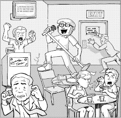
If anyone is checking out my humble little blog as a result of that article, drop me a line, and I'll happily send you a complimentary copy of my first solo self-published comic, Karaoke Comics #1. Otherwise, the rest of my self-published work can be found at KaraokeFanboy Press -- and don't forget to check out my K.O. Comix buddy Brent's new dogs vs. cats apocalyptic western, Dog Town, too!

Saturday, October 24, 2009

APE '09: The Portrait of Two Ladies & The Bourgeois Blues

The Portrait of Two Ladies by Marvin Jackson
The Bourgeois Blues by Ja Liebe

A zine is a many splendored thing, because it has the potential to be or do anything. Some of them analyze pop culture or contribute to the arts by interviewing musicians, reviewing the latest albums and books, or offering editorials on political or social developments. Others are simply multi-faceted pictorial stories and comics, oftentimes using the page or some other canvas as a means for telling a tale more dynamically than the average mainstream funnybook. I’ve seen all of this done effectively, and terribly. When it’s the latter, it’s just a waste of office supplies, but when it’s the former, it’s like a spike strip in the road that unexpectedly throws you off course. In a good way.


The Portrait of Two Ladies and The Bourgeois Blues are two such examples of mind-shaping material, but, I warn you, you have to let it sink in a bit. I’ve picked up material by these authors before at the now defunct Edge of LA Comic Con in Claremont, California, and I was pleased to find them at this year’s Alternative Press Expo -- and even more delighted to chat with them a bit over morning coffee that Sunday morning. Two warm-hearted guys passionate about their craft, Marvin and Ja keep traditional zine making alive with some contemporary analysis of life, liberty, and society, and their zines might either make you really happy to be alive in America, or really angry that the everyman has the right to challenge you about this stuff in the first place.

Now, like with Mike Rios’ War Is Gay, Marvin and Ja assure me that these random smatterings of images are actually linear and coherently connected, so I tried to read the zines that way, versus the temptation to randomly flip through them and enjoy each page like disjointed works of art in some cutting edge museum. I’ll confess, The Portrait of Two Ladies makes more sense to me, as it uses newspaper headlines and pictures to create a consistent contrast that challenges the mind to analyze both concepts differently than their original context intended. I’m particularly drawn to the collage of various newspaper headlines that, when combined, read:

“Do you wish you could walk around in your backyard NAKED? You could amid the stench of death.”

The implications of this Frankenstein headline are truly thought-provoking, as Marvin takes what must’ve been some Life & Times fluff piece and sews it to a serious piece about some sort of international strife. Could such wanton destruction be the only way to achieve such correspondingly visceral freedom? Would it be worth such a high cost? Frankly, I’ll just close the window and wear my birthday suit inside, thank you very much.


The Bourgeois Blues is a combination of similarly displaced headlines and crude drawings -- some of which might make Tim Burton proud, or make even his skin crawl with these little characters’ creepiness. At the very least, one can only imagine the amount of work journalists and graphic designers put into the wording and placement of these headlines in the first place, so for someone like Ja to couple them with sketches of goblins or devil-horned little creatures spins the reverence of the mainstream media on its ear a little bit. These sacred cows are certainly the elephant in the room of these zines.


I look forward to seeing more of these guys’ work around town in the coming months, if the comic con circuit permits. A zine is indeed a many splendored thing, especially when it takes willfully strips away all of the splendor to show you the underbelly of existence.

Friday, October 23, 2009

Superboy #189

Halloween has long been my favorite holiday, so I’ve decided to return to reviewing comic books with some regularity this month. Every week this month, I’ll post at least one special Halloween-oriented review, criticizing the issue based on its reverence for this hallowed holiday season through four distinct categories worth up to five points each. The comic that earns the total possible 20 points could be one of the best Halloween issues ever!

Superboy #189, August 1972, DC Comics

creators uncredited


PREMISE: Just before the planet Krypton exploded, scientist Jor-El rocketed his son to Earth safely, where . . . Oh, everybody knows the “premise” behind Superman. Now, this issue of Superboy (about Superman’s teenaged years, of course) isn’t a Halloween issue per se, but it does feature a curse on the Kent household that retains a definitive creepiness appropriate for this hallowed holiday season. Sure, ghosts and monsters are tangible mascots for Halloween, but let’s not forget the importance of those strange forces in the universe that have it out for man -- the intangible curses and oddities that made The Twilight Zone and The Outer Limits so endearing. Still, I’ll give this issue an average three out of five points, until you’re convinced . . .

STORY: Shortly after Superboy receives and extra-sensory projector that allows folks nearby to send mental messages, his father Jonathan is attacked by a noose. Of course, the Boy of Steel saves his dad, who explains that the Kent family was cursed when their ancestor, Judge Julian Kent, was gallows-happy with anyone brought before him in court. Every 50 years, the man of the Kent household is mysteriously hung, so Superboy decides to protect his family to thwart the curse. Unfortunately, other global disasters distract our young hero, though he returns just in time to save Jonathan from a villainous garden hose and an ivy vine, until he realizes that General Zod and the other Kryptonian convicts in the Phantom Zone are using his new extra-sensory projector to manipulate things in the real world. (Ghosts! That’s Halloween-y, right?) The curse is lifted when Superboy destroys the alien device . . . or is it? When a wayward roll of cable wire almost takes out Jonathan at the end of tale, Clark realizes, “. . . there may be dark forces in this world not even I can understand!” “Dark forces” that render even the world’s greatest superhero helpless? Are you scared yet? I give this issue four out of five points for making my fanboy skin crawl.


ART: This issue is drawn is all the campy goodness one might expect from a ‘70s issue of Superboy. I failed to mention the back-up Superbaby story in this issue, which is more notable for its art anyway, as it takes itself a little less seriously than the feature and strikes me as just this side of Mad magazine caliber. I’ll give this issue a three out of five points for the sheer variety.

PACKAGING: This issue’s cover is what inspired me to consider Superboy #189 as a potential Halloween issue in the first place. The silhouette of a hanging Jonathan Kent is frightening -- just take a gander at Superboy’s horrified face. Anything that can freak out the Boy of Steel is worthy of Halloween holiday, don’t you think? Four out of five points, I say!

TOTAL: Superboy leaps the tall expectations of the Halloween season in a single bound with fourteen points, dutifully earned by the creators’ undoubtedly challenging call to generate compelling stories from the hero’s youth that didn’t affect the Superman titles too direly. What, you don’t see it? Just picture an episode of Smallville dedicated to the “Curse of the Hangman’s Noose!” A special Halloween episode starring Tom Welling wrestling with a garden hose? Okay, now that’s scary . . .

Thursday, October 22, 2009

APE '09: Will You Marry Me ___?

Will You Marry Me ___? by Nathan Carter

Admittedly, I’ve been making stupid little zines infrequently for years, and what keeps me from embracing the art and hobby whole hog is my ignorance of zine and mini-comics distribution. I’ve dared distribute zines by hand at war protests before, where I thought a charged political crowd would be open to such fringe material, but as suspected they were too consumed with their own cause to consider anyone else’s. When I search on-line, many zine distributors’ sites seem out of date, perhaps folded entirely (no pun intended). It’s enough to give up the practice all together.


Enter Nathan Carter and his zine Will You Marry Me ___?

Nathan takes the bull by the horns and mails you his zines, and all you the reader have to do is send him the stamps. Sure, the zines are single sheets of regular letter-sized paper, but Nathan uses the folds as proverbial page turns so you get at least two little works of art -- again, all for the price of a stamp. I was taken by two of his latest zines at the Alternative Press Expo, and Nathan was kind enough to let me take them both; one is a traditional newspaper/photography collage, the other a little more text-intensive. I appreciate the transparency of both media, as the author expresses feelings of inadequacy and adaptation, though admittedly the former sadly takes less to consume than the latter. Interestingly and ironically, I bet it takes more time to make . . .


. . . which brings me to the final point. Did I mention these zines cost the meager price of a stamp? Yes, for the price of postage, Nathan would mail you a little piece of his soul every month -- and I’m not being melodramatic. That’s what it is, on colored paper, to boot. When he recommended them, you could tell he favored some over others, like any self-criticizing artist, but the consistency is in their availably, and I hope Nathan’s inspiration to continue producing them. I’m excited to think, in this small way, APE will arrive in my mailbox all year long.

And I may consider sending some of it out myself someday . . .

Wednesday, October 21, 2009

Reese's Pieces

Halloween has long been my favorite holiday, so I’ve decided to return to reviewing comic books with some regularity this month. Every week this month, I’ll post at least one special Halloween-oriented review, criticizing the issue based on its reverence for this hallowed holiday season through four distinct categories worth up to five points each. The comic that earns the total possible 20 points could be one of the best Halloween issues ever!

Reese's Pieces #1 & 2, October 1985, Eclipse Comics
writers: Otto Binder, Michael Cahlin, Chuck McNaughton, Jerry Siegal, Bill Pearson, Terry Bisson
artist: Ralph Reese
colorists: Denis McFarling, Tim Smith, Teresa Bieri, Philip DeWalt


PREMISE: A comic book named after candy with covers promising grotesque horror? What says Halloween better than that? In this case, “Reese” is Ralph Reese, contemporary horror comic artist, and Eclipse Comics compiled some of his most notable work into these two single issues. It’s a reverent miniseries, tipping a hat to a master craftsman, and admittedly had I not bought and read it, I would never have known who Ralph Reese is. For its sheer educational value alone, I’ll give these issues four out of five points.

STORY: These two issues contain four stories each, ranging from Twilight Zone-like weirdness to straightforward horror and gore, and interestingly some of them repeat the same thematic concept or macabre twist -- which, admittedly, over the course of Reese’s career, may not have been apparent, but is strikingly obvious when compiled in a mere two issue miniseries. For instance, in the first issue, when his girlfriend is eaten by a band of sewer dwelling mutant cannibals, the guy’s wanton rage turns him into one of the creatures. Similarly, in the second issue, a greedy hunter tracks and kills a Yeti within the beast’s sacred circle and eventually turns into a Yeti himself. Greed as a justification for violence or horrific transformation is actually a common thread throughout, as is the weirdo-with-a-conspiracy-theory shtick. Because some tales are more thought-provoking than others, these issues earn three out of five points.

ART: If Eclipse Comics sought to expose Reese’s work to fans that may never have heard of him otherwise, mission accomplished . . . and I’m sold. Why this guy never achieved Brian Bolland status is beyond me, because his detail-oriented line work and intricate cross-hatching remind me of Bolland’s. The style does vary somewhat with the subject matter, too; the two-page story “Midnight Muse” has a strong photographic quality to its realism, whereas “The Skin-Eaters” is drawn in a Conan the Barbarian style, appropriate considering the subject matter deals with aliens versus humans in a barren wasteland. I have to give this series five out of five points in the art department, since it’s a virtual portfolio of a single man’s brilliantly frightening work -- a graphic haunted house with just one man pulling the strings.

PACKAGING: Okay, here’s the problem. A few significant printing errors throw off this otherwise enthralling compilation of work. First of all, the covers are reprints of interior panels, which is fine, but issue two’s quality pales in comparison to issue one, probably because the panel selected was more of a frontispiece and isn’t as intricate. When expanded to cover size, some detail is lacking and makes the initial impression of the entire issue less favorable. More notably, though, is the “Midnight Muse” story from issue #1. Obviously intended to be a two-page spread, the story is printed on a page turn, so panels are literally cut in half, and I actually read the story wrong before I realized the error. For such a serious oversight, this series gets a mere two out of five packaging points.

TOTAL: Thirteen may seem like a low score with twenty points possible, but thirteen is also the creepiest of numbers, so considering Reese’s artwork earned the full five points possible in that category, I hope he’d be strangely satisfied. Oh, well, it’s just like a sack of Halloween candy, isn’t it? A mixed bag . . . but in this case, the Reese’s pieces are pretty sweet.

Tuesday, October 20, 2009

APE '09: The Magic Yo-Yo

The Magic Yo-Yo by Oke Rosgana

I was beckoned to Doctor Popular’s booth at the Alternative Press Expo by his quarter-sheet silk screenings of a Pac-Man headed Ghostbuster. Yes, Doc Popular had managed to combine two of my favorite things from childhood, and he was happily giving it away with the purchase of a comic from his table. For the little print alone, I had to take him up on it.


My eyes were drawn to The Magic Yo-Yo, starring Doc Pop but lovingly drawn by fellow artist and yo-yo enthusiast Oke Rosgana. As a 24-hour comic (if you haven’t heard of Scott McCloud’s 24-hour comics challenge, check it out here), this little comic is impressive, and the story is linear and charming. Basically, The Magic Yo-Yo is Doctor Popular’s ethereal origin as a yo-yo master and how he uses his skills to better the world around him. If Sam Raimi has decided to give Peter Parker a yo-yo instead of organic webshooters, this comic is what the first 20 minutes of the Spider-man movie would’ve looked like.

Unfortunately, as with most 24-hour comics, some panels are better drawn than others, but the passion is apparent on every page, and the lines are bold enough to reproduce clearly -- a challenge for every independent comics artist, especially if they’re hurriedly using the copy machine at work or something. The pivotal panels really pop off the page, propelling the story like any good yo-yo trick, and most importantly Doctor Popular’s caricature is consistent, keeping the whole issue visually grounded. In the best way possible, Rosgana proves that anyone and everyone should consider the 24-hour challenge. He makes it look like a blast!


Finally, my brief conversation with Doctor Popular (who was kind enough to sketch a karaoke-singin’ Pac-Man for me) revealed that he and Rosgana have actually never met! I only wish I had a friend that cared so much that he’d draw a comic book about me, for one whole day on the other side of the planet, to boot, but perhaps their mutual love of comics and yo-yos transcends geography. Around the world, indeed.

Monday, October 19, 2009

APE '09: War is Gay

Last weekend, my buddy Brent and I exhibited at the Alternative Press Expo in San Francisco as K.O. Comix, our self-publishing comic book company, where we displayed Brent’s new amazing comic Dog Town, not to mention my KaraokeFanboy Press stuff (all of which are available for purchase through our blogs, but anyway). Although I was technically one of “the talent,” I love mini-comics and zines (which is why I make them), so I was also a critical consumer, too, and I picked up some the most subversive and innovative stuff in the medium today. Of course, as in any forum of genre saturation, I also picked up some crap -- so in conjunction with my series of Halloween-oriented reviews, I’m going to sprinkle in some posts about this independent, and good or bad, I challenge you to check it out. What can it hurt to go ape from time to time?

War is Gay by Mike Rios

War is Gay is an interactive, neon-colored zine you can put in your pocket and share with your friends. In fact, I reckon author Mike Rios would encourage it, since his website, Mike Rios Is A Whore, implies shameless self-promotion, and by buying this zine, I feel totally empowered to be his pimp -- especially since I’ve tried the product. Er, take that as you will.

When I saw fellow APE exhibitors and attendees strolling about the convention floor with “Mike Rios is a Whore” tote bags, I wondered if someone was brazenly boasting their product, or bashing an enemy behind his back. While a zine titled War is Gay could be just as easily dismissed as pretentious vulgarity, I was drawn to its bold, brightly colored design, and while its image-laden interior could be digested in less than a minute, I encourage consumers to chew on its content a bit and ponder what the author meant, beyond satire and graphics-intensive social commentary.


Unfortunately, because of its relatively text-free nature, War is Gay is difficult to summarize, but when we spoke briefly Rios assured me that the content is linear and strategic. If it does indeed have a point, its commentary on masculinity in America in contrast to the history of war and the poignancy of homosexual rights creates a wry reflection of society and challenging springboard for thought. Otherwise, it’s just really pretty to look at.


Finally, I emphasize its interactive nature; at five dollars, War is Gay is the most I spent for any product at APE, and rightfully so since Rios and company painstakingly hand-cut and glued some of the issue’s manipulative elements. I’m drawn to any comic book artist that manipulates the humble canvas of a single piece of paper to tell a story (with an emphasis on the story), and considering the cost other artists were charging for traditionally published and bound books, Rios’ five dollars is very reasonable considering the time and effort put into each piece -- not to mention the free tote, handy when shopping for awkwardly sized zines and prints!

Okay, Mike Rios may be a whore, and war may be gay, but in this case his passion is pretty straightforward. Pull up to the dark corner of comicdom, roll down your car window, call him over, and check it out.

Thursday, October 15, 2009

The Occult Files of Dr. Spektor #12

Halloween has long been my favorite holiday, so I’ve decided to return to reviewing comic books with some regularity this month. Every week this month, I’ll post at least one special Halloween-oriented review, criticizing the issue based on its reverence for this hallowed holiday season through four distinct categories worth up to five points each. The comic that earns the total possible 20 points could be one of the best Halloween issues ever!


The Occult Files of Dr. Specktor #12, February 1975, Western Publishing Company (Gold Key Comics)

PREMISE: When the curious Dr. Spektor investigated the presence of “evil dark gods” on the “mystic Mount Algol,” a demon wolf “injected its venomous curse” into his veins, transforming him into a werewolf! Now, the good doctor roams the world in search of a cure . . . and in fear of the full moon! (Man, I totally could’ve written those old origin blurbs at the top of Silver Age comics!) Anyway, the classic werewolf origin, coupled with Dr. Spektor’s presumably preexisting penchant for the occult, grant this issue four out of five points in the premise department.

STORY: At the beginning of this issue, Dr. Spektor leaves his lady love behind for her own good . . . only to promptly fall for another, even more helpless chick! In this case, she’s the daughter of Dr. Tong, a self-styled wizard he seeks to help his condition, until Tong captures him to drain his wolf-power for himself! Tong has also found and captured the Frankenstein monster, and when Tong’s daughter ruins the power-draining experiment, the two classic creatures battle it out! It’s an awesomely epic little scrap that ends when the two monsters tumble out the window, into raging waters below. While Dr. Spektor surfaces to say good-bye to yet another forbidden love, the Frankenstein monster is nowhere to be seen -- perhaps on the loose once again! A crazy mad scientist and his faithful assistant, a werewolf, Frankenstein’s monster -- together under the roof of dark, foreboding castle? If that isn’t Halloween, I don’t know what is! Five points!

ART: I wish this issue credited its creators, but so many older comics didn’t take the time or space to do so, presumably in favor of art and story -- or at the greedy publisher’s behest, perhaps? Anyway, this issue of Dr. Spektor was drawn like a ‘70s acid trip, and I mean that in the best way possible. Loose expressive lines, psychedelic shapes and colors, and frantic choreography make for an engaging tale even during those talking-head panels; further, interestingly, some 30 years after World War II, the Asian nemeses are still yellow-skinned, pointy-eared, and buck-toothed. Alas, again I wish the artist had thought to use a little more black in his backgrounds, to emphasize the creepiness of it all. Three out of five points.

PACKAGING: Despite the more modern interpretations of the werewolf and Frankenstein monsters inside this issue, its cover depicts them in their iconic glory, hands at each others’ throats in a timeless struggle for who’s scarier. Dr. Tong’s daughter adds an elements of intrigue and mystery to the image, too, as the tireless damsel in distress with at stake than her own safety. Like last issue, I can see the hardcore fanboy using this comic as a Halloween decoration, in a classic Universal Studios movie monster kind of way. Four points.

TOTAL: Sixteen out of twenty points. I’m glad I picked up this issue! Unlike Dr. Spektor’s, my curiosity paid off.

Wednesday, October 07, 2009

Untold Tales of Purgatori #1

Halloween has long been my favorite holiday, so I’ve decided to return to reviewing comic books with some regularity this month. Every week this month, I’ll post at least one special Halloween-oriented review, criticizing the issue based on its reverence for this hallowed holiday season through four distinct categories worth up to five points each. The comic that earns the total possible 20 points could be one of the best Halloween issues ever! Based on its cover, I couldn’t think of a better way to start this series than with Purgatori #1.

Untold Tales of Purgatori #1, November 2000, Chaos! Comics
writer: Steven Grant
illustrator: Al Rio
inker: Tie
colorists: Jason Jensen & John Merrifield
letterer: Comicraft’s Oscar Gongora
editors: Mike Francis & Brian Pulido


PREMISE: Purgatori is a bloodthirsty Egyptian slave girl turned vampire. This issue is a prelude to her ongoing series, establishing some of its canon, I presume. So, while the cover of this issue depicts Purgatori as a Jack O’Lantern-loving witch, she’s actually a demonic vampire, before vampires were all the rage, to boot. This combination of beloved Halloween iconography grants this issue a solid four out of five in the premise department.

STORY: In 57 B.C., a band of British druids rebels against their traditional code in a demonic bid to embrace a new age. Unfortunately, they killed the wrong druid in their quest for power, because his lover is a witch that summons and possesses Purgatori to avenge him. The leader of the rebels inhabits the body of a devilish lord to match her might, but the combined power of Purgatori’s strength and the witch’s blood alchemy conquer all. In the end, the mourning witch muses that wearing a demonic mask is a practice best kept to an annual celebration. So, this story’s bid to contribute to the origins of Halloween seals another four out of five points.


ART: Al Rio and Tie’s art teeters between the exaggerated trappings of the ‘90s, taking every opportunity to contort Purgatori’s feminine frame into the most sexually suggested poses possible, and some blockbuster action sequences that rivals the heyday of Dale Keown’s Hulk work. While Rio and Tie don’t hesitate to drench everything in blood, and rightfully so in a comic about a demonic vampire, I would’ve appreciated a heightened use of darkness or shadow to accentuate a sense of dread and mystery. In the Halloween-oriented department, the art earns this issue two points.

PACKAGING: Although I purchased this issue for a mere quarter at the Los Angeles Comic Book & Sci-Fi Expo a year or so ago, I was fortunate to find its glow-in-the-dark variant cover, and with its minimalist title dressing, that stark image of a devil-horned vampire witch stirring a cauldron surrounded by Jack O’Lanterns makes this issue a veritable Halloween decoration. It actually sets a high standard for the other issues I’ll review in this series -- whether or not a collector could actually hang them up to celebrate the holiday. Setting a standard gives Purgatori a well-earned five out of five points.

TOTAL: Fifteen out of twenty points. A great start! Too great, in fact. So great . . . it’s scary.

Tuesday, September 29, 2009

Superman: More Powerful than a Loco Movie?

Last week's pictorial revelation of a Tim Burton-directed Nic Cage Superman had fans hypothetically reminiscing about the horrors of what could've been, and perhaps further musing that Bryan Singer's Superman-as-deadbeat-dad maybe wasn't such a bad idea after all. However, this image remains a cautionary tale of what yet may come, as our beloved comic book icons are forever susceptible to any Hollywood producer's or director's drive to make their mark on characters and mythologies with such universal appeal. So, why shouldn't a humble blogger like me do just the same? The following is my list of recommendations/expectations for the next Superman movie, in the hopes of remaining faithful to the character while making Big Blue appealing to mainstream and hardcore fanboy audiences alike.

1. No more Lex Luthor! This is my first and most emphatic plea. Lex Luthor is an excellent archnemeis, but like Coldplay overexposure has dulled his wit and softened his ruthlessness. Further, excluding Superman's fight with General Zod, mainstream movie-going audiences have yet to see the Man of Steel achieve his full potential as the most powerful human being on Earth. So what if a bullet bounces off of his eyeball? Let's see him take a whooping, so we know that when he delivers one in kind it actually hurts. This was why the advent Doomsday was an effectively marketing ploy and could be an adequate choice for an antagonist on film. However, might I sugges . . .

2. Go Bizarro! First of all, Bizarro has become a household term, even if most folks don't know he's a twisted Superman doppelganger. Further, doppelgangers are all the rage in comic book movies lately. Spider-man's Venom, Iron Man's Iron Monger, Hulk's Abomination . . . all arguably dark reflections of their respective heroic foes. Bizarro would match Superman's strength, but he could also provide the strange psychological edge that comes from fighting oneself, or who "I could've been!" Plus, the studio could pay just one actor to play both roles, with a little CGI assist. You're welcome, Hollywood.

3. Subplots involving the supporting cast. One of the reasons I like the Daredevil director's cut so much more than the theatrical release is the Foggy Nelson subplot, as he battles the Kingpin in court while Matt Murdock gets down and dirty in the streets. Foggy becomes a character of true dimension and conviction when he isn't just the bumbling, shallow sidekick or comedic foil -- which is exactly what Jimmy Olsen and Perry White have suffered from since even the 1950s, in the original black and white Superman television show. Perry, the gruff newspaper editor, and Jimmy, the gee-willikers pal, have become so much more in their native comics, and writers can easily develop a plot that involves their investigative prowess . . . perhaps why S.T.A.R. Labs would create a Bizarro, or something? Alas, this is just a recommended list, not fan fiction, so I'll move on.

4. Lois Lane. Superman loves her madly, and always will. We get it. It isn't even story-worthy anymore, hardly even a romantic subplot. If Lois and Clark can't be married on film by now, or at least partners via her knowledge of his double life, give Supes someone else to ogle. I don't mean Lana Lang, either, because we've seen that in Superman III and Smallville. Come to think of it, Maxima, the warrior woman that stalks and lovingly fights Superman, would be a great villain, as her crazy affection might challenge Lois to become more than the damsel, or even more than just a hard-headed journalist, the 21st century woman. In those efforts, she's always worked against Superman by giving him more to worry about -- who knows how appealing she might be as a legitimate, at least equally motivated ally?

5. The moral dilemma. Obviously, a morally righteous character like Superman must experience the gray area of the law from time to time, but seeing him operate as a vigilante is still controversial enough for mainstream audiences to enjoy. The animated series episodes in which he's brainwashed by Darkseid, and consequentially wanted by the military, are extremely compelling, or even now in the comics as the world lobbies against him. What if an innocent attempt to helps overseas troops go awry, and the government bans his flagrant do-gooding? How cool would an undercover Superman be, on film? Seeing a subversive Clark Kent makes that alias more than the corn-fed, bumbling Kansas boy he's always been . . .

. . . which may be our hero's biggest weakness. Superman is always best as Superman because that's how we've always seen him. A little stretching of the creative muscles can offer a different Superman story that still operates within hardcore fans' expectations. After all, it's only 90 minutes, compared to decades' worth of comic book literature. Hey, but you know what they say about the pictures. They're worth a thousand words.