Adolescent Radioactive Black Belt Hamsters #1, January 2008, Dynamite Entertainment
writer: Keith Champagne
artist: Tom Nguyen
colorist: Moose Baumann
letterer: Zach Matheny
creators: Don Chin & Parsonavich
I don't believe I'm writing this review.
Last March, I so anticipated the return of the Teenage Mutant Ninja Turtles to the big screen that I dedicated a week of reviews to comic books obviously inspired by their success. I found a few similar series, including Samurai Penguin and Samurai Squirrel, but nothing as close to blatant plagiarism as Pre-Teen Dirty-Gene Kung Fu Kangaroos, Cold-Blooded Chameleon Commandos, or, the most popular of the rip-offs, Adolescent Radioactive Black Belt Hamsters. I haven't found and read the Kangaroos' or the Chameleons' adventures yet, but when I found ADRRH: Lost Treasures, I was so taken by its unoriginality that I had to buy it. After my terrible review, creator Don Chin challenged me to read another issue; I found one, Clint: The Hamster Triumphant, and actually liked it in spite of myself. Still, I assumed that two installments of the "furry four's" forays were all I needed for my ever-expanding collection.
I was wrong.
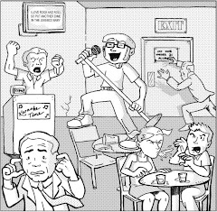
When Chin told me that the Hamsters were returning for a new series in 2008, by Dynamite Entertainment with awesome artist Tom Nguyen, no less, I thought he was joking. At the very least, I assumed the series would face premature cancellation when some Dynamite editor realized, "I swear these hamsters remind me of something I've seen before. Wait a minute . . .!" Alas, these things have a way of coming full circle -- just like a hamster's wheel, and this week, Adolescent Radioactive Black Belt Hamsters #1 hit the new release shelves, completely coincidentally on the week I decided to revisit personified animal-oriented comics for Groundhog Day. It's like it was meant to be.
Don Chin isn't in the driver's seat for this latest incarnation, nor are his title characters even the same, but the same silliness is prevalent, along with a fair share of ninja butt-kicking. In the spirit of the original hamsters, Bruce, Chuck, Jackie and Clint, this "next generation" stars Rock, Jean-Claude, Steven, Arnold, and Lucy -- yes, the hamsters are now graced with a woman's touch (though I wonder if Lucy Lawless would put herself in the same league as those other action star namesakes). When the monastery that raised the two tiers of hamster heroes is under siege, the Dalai Momma appears to summon her, "ummm, . . . second dearest students," who promptly respond and encounter a self-proclaimed reincarnation of Genghis Khan. By the end of this issue, the Hamsters actually aren't faring so well, with Steven and Jean Claude arrow-ridden and Lucy possibly plummeting to her death. These heroes may respect ancient traditions, but when it comes to their safety in this series, I guess nothing's sacred.
Writer Keith Champagne honors Chin's legacy with the right balance of action and humor, though I wonder why he decides to continue the original series' inclination to acknowledge the hamster's fictional world within the constructs of the story. When Steven "dies," for instance, and Arnold asks if he'll "be back," Lucy retorts, "Only in reprints." Between the satire of the hamsters' names and subsequent characters and the derivative nature of their origin, our rodent ruffians have enough in-continuity that they don't need to exploit the confines of their medium. Tom Nguyen's art is as crisp and expressive as ever, perhaps not as detail-oriented as his most recent work on Batman, but just as animated. Colorist Moose Baumann adds that layer of depth the Hamsters' world deserves, from their interstellar beginnings under the influence of space jello, to the snow-peaked mountain peaks of their monastery, to the heroes' rooftop Chicago studio. With such a high-end concept, facing harsh criticism from jerks like me ready to pick apart its most base flaws, beautiful visuals could really save the day -- and they do.
So, the question is, are the Adolescent Radioactive Black Belt Hamsters here to stay? I think their relationship with pop culture is symbiotic; as long as their inspirations remain in the spotlight, the potential for their success still shines, too. I mean, really, are the Teenage Mutant Ninja Turtles or cheesy action movie stars going anywhere anytime soon?
Thursday, January 31, 2008
Salem: Queen of Thorns #0
Salem: Queen of Thorns #0, January 2008, Boom! Studios
writers: Chris Morgan & Kevin Walsh
artist: Wilfredo Torres
colorist: Andrew Dalhouse
letterer: Marshall Dillon
editor: Mark Waid
Every Wednesday, A Comic A Day boldly diverts from the printed page to read and review a different webcomic, examining at least its first, previous, and current installments. If you have a webcomic you'd like A Comic A Day to review, please e-mail me with a link to and a synopsis of your work. Put "Review my webcomic!" in the subject line so I don't mistake your request for spam . . . unless your comic is really called "You've Just Won a Playstation -- Click Here to Find Out How," in which case, tell me more!
I’m cheating this week. Thanks to my review of 2 Guns #1, marketing director Chip Mosher has added me to Boom! Studios’ press release e-mail list, which recently included an advance copy of Salem: Queen of Thorns #1. Salem may not be a webcomic, but reading the issue as a PDF file provided an interesting insight into the potential of the medium’s future. Further, though this issue has since been released, when I received it, it was available exclusively on-line via e-mail for promotional purposes, a characteristic definitive to webcomics. So, in this case, I’m embracing the back door.
Our country’s history is unquestionably tainted by a multitude of civil, political, and religious discords. Few of these calamities manage to boast all three claims as much as the infamous Salem Witch Trials. I am by no means an expert on the subject; in fact, my knowledge of the subject is limited to an obligatory read of The Crucible in high school and a few supplement civics lessons. Still, considering the amount of skepticism a possible Texas UFO sighting elicits from America nowadays, the imagination runs wild with the thought that the fear of witchcraft so gripped a town that they began systematic executions of women with just the slightest penchant for frog’s leg soup. Indeed, our post Industrial Age skepticism deems that era of history as fantastic as those supernatural accusations, chalking up that brief era of madness to spiritual paranoia.
But what if the Salem Witch Trials, albeit false, were simply mankind’s hasty reactions to the machinations of real magic brewing at the time? Enter Salem: Queen of Thorns #0.
In this introductory issue, the darkly garbed Hooke, appropriately wielding a sickle and various other magical tools in his portable arsenal, prowls the Salem forests to both save innocent women from execution and uncover and defeat that real magic lurking behind the scenes. Deacon Wood, gripped by conviction, also attempts to shed spread some righteousness by confronting his superiors, whose investments in both the trials and Hooke’s involvement is obviously more personal than professional. When Hooke, Wood, and a rescued prostitute flee to the forest, they tussle with a few demonic arachnid crossbreeds before encountering the Queen of Thorns, a large, snarling tree that knows Hooke by name. If this is how #0 ends, I can only imagine how the first issue begins.
Salem: Queen of Thorns has the potential to become The Crucible for a new generation, teaching readers about the bitter reality of those dark days while still infusing history with an entertaining sense of supernatural adventure. Our hero Hooke is dressed like a moody Victorian bounty hunter, but his quick tongue is as sharp as his sickle, combating the theocratic hierarchy of his era with wit and bitterness. Handing mild-mannered Wood a pistol for protection, he counters the deacon’s whimpering with the smirk-worthy retort, “Just point it at the bad things and pull the trigger.” I hope Deacon comes of age in future issues, though, as his closeness to the church’s inner circle could prove our heroes a strategic advantage. Hooke might be slinging guns, but the issue of witch hunting surely isn’t just a physical one.
Fortunately, artist Wilfredo Torres seems capable of the dual task. His depictions of the supernatural don’t clash with the colonial backdrop of Salem, and in fact the Queen of Thorns and her demonic minions actually enhance the natural environment. The more text-intensive moments were well blocked, graced with a cinematic quality that paces dialogue, mood, and tension perfectly. In fact, Torres’ pencils and inks may actually be more crisp than material like this really needs; in other words, a little leniency with his rigid ink lines might have layered the tale with a sense of atmospheric spookiness. Nevertheless, his formulaic structure enhances the seriousness of the piece, and even if Salem doesn’t go the way of The Crucible, both script and illustration combine to create all the drama you need.
I may have received this issue via e-mail, but I think I’ll make the tangible purchase, too. If I’m going to buy the rest of the series, I might as well have a hardcopy of how it all began. Salem #0 exposes us to the harsh reality of embracing our humble beginnings, anyway. Those poor, hanging women may not have been witches, but their ghosts will haunt us for a long time to come.
Wednesday, January 30, 2008
Ursa Minors #1
Ursa Minors #1, June 2006, SLG Publishing
writer: Neil Kleid
artist/letterer: Fernando Pinto
creators: Neil Kleid & Paul Cote
Blogger's note: Entry for Tuesday, January 30, 2008.
Ursa Minors #1 definitely suffers from the "judging a book by its cover" paradigm, at least in the context of my current, week-long attempt to review comic books starring animals in honor of this weekend's Groundhog Day. The cover, a brilliant neon example of pop culture art and intrigue, boasts, "This Issue!: Bears! Comics! Midgets! Ninjas!" The snarling, smiling bears in the cover's foreground promised at least a fourth of that surefire equation, but as I dug into this issue's lead story, I discovered that the bears are really our heroes in bear suits. I feel a little betrayed but not entirely disappointed; Ursa Minors apparently explores a future in which humans enjoy dressing up like lesser rings of the food chain. On the first page, we see a guy casually strolling through the park -- in an elephant suit. On the second page, a beggar hides behind a mysterious koala costume.
I wonder, would real groundhogs feel offended if people decided to watch for their shadow every February? Or would those people simply be doing the job most groundhogs refuse to do?
Either way, the effects of this strange future are lost in Ursa Minors' self-appointed coolness. Its hipster heroes hang out on the Internet and in comic book stores and spew pop culture in-jokes aplenty, in the midst of thwarting their midget arch-nemesis, whose only apparent crime was posing as a woman on-line to score a date with one of one of our bear-suit wearing champions. I've explained this script-writing phenomenon before, this apparent need from the creators' perspective to relate to their audience by essentially writing them into the story. Of course, writers often write what they know, and many comic book writers are the geeks that read their books, but how many Star Wars-quip ridden universes do we need? Would "the future in which people dress up like animals" really be less interesting if told through another character's point of view?
Fernando Pinto's art is crisp and expressive, balancing the goofiness of this pseudo-superhero world with the mundane meandering of geeks that try to hook up on the Internet. I wish his style wasn't squandered on those more dialogue-intensive scenes, or that the settings were more diverse and better displayed the breadth of his potential, but the Ursa Minors were minimal in their exposure to the real world. Rabbi Ninja, the star of this issue's back story, is ironically more secular in scope, not to mention more superior in his execution. The Rabbi Ninja tries to balance the sanctity of his faith and the honor of the ninja clan that trained him, and in this first installment, he struggles through a blind date while trying to assassinate a clan enemy. The consistent dichotomy and internal conflict is hilarious, and the Jewish context is one not oft explored in comics, even in jest. A whole issue of this, with a back-up about bear-suit wearing heroes, would have been the better ratio.
Still, Slave Labor knows how to put together a pretty package, and Ursa Minors #1 is no exception. I only wish it had a little bark to its bite.
Midnite #1
Midnite #1, November 1986, Blackthorne Publishing
by Milton Knight
editor: John Stephenson
Blogger's note: Entry for Monday, January 29, 2008.
If raccoons have it tough with their inherently-masked criminal stereotype, skunks got it worse with their repulsive social inadequacies. They stink. Further, their universal ambassador, Pepe Le Pew, is really nothing more than a womanizing, prejudiced sleazeball. I know, I know -- womanizing you understand, but prejudiced? Well, am I the only that noticed his sudden lust for that poor Penelope Pussycat only after her back was accidentally striped with white paint? Makes you wonder, would Pepe even give her a second glance if he really saw her as just a cat? Indeed, his "ambassadorship" is purely colloquial in this context, but Pepe certainly acts with all of the scrutiny of a slimy politician.
Look no further than our potentially first First Husband to catch my drift.
Fortunately, Midnite the rebel skunk don't take gruff from nobody! In her otherwise perfect cartoon world, Midnite's friends at Mrs. O'Leary's Home for O'Ladies have been threatened by the corrupt pig mayor to vacate their property and make way for a new nuclear power plant or else! Midnite and her pals kick the mayor and his minions out of the O'Ladies' home, inspiring the swine to hatch a plot of deceptive niceness, but our skunk heroine turns the tables on that evil scheme, too! While the violence is as consequence-free as a Wile E. Coyote dive into an Arizona canyon, Knight's story-telling is also as fast-paced and entertaining, and, needless to say, I think the mayor got the message.
The most interesting element of Midnite #1 is its art style. Knight, whose credentials apparently include National Lampoon, Cracked, and Heavy Metal, mimics a style tangibly reminiscent of early Disney or Warner Brothers animation. Many of his characters looked ripped right out of a "Silly Symphany," and animation aficionados might half-expect a cameo from Oswald the Rabbit or Betty Boop somewhere in his detail-oriented backgrounds. Since I love those old, muddied cartoon classics, Knight's page layouts were a joy to behold, but this style truly best benefits from the visual and sound effects often associated with it on the big screen. Further, though this issue's bright, energetic cover might elicit a younger reader's attention, I don't know I could recommend Midnite to kids, because the pig-mayor's Animal Farm-like corruption boasts a few adult-oriented undertones, mainly the blatant humping of money sacks. I like cash as much as the next elected swine, but I can't say the sight of George Washington brings out the "Ah-ooga!" in me.
So, I'm really of two minds about Midnite #1. In one respect, I think the exercise in classic cartoon illustration is a refreshing look back at the genre's past, but I don't know if a series like this would hold a place on today's new release stands. The likes of Herobear and the Kid tried a similar animation-to-comics approach, with a few other series on its heels, but I think that niche reached its zenith and settled back into the obscurity of its multimedia pop culture roots. Indeed, even when it comes to skunks, things just aren't always so black and white.
Tuesday, January 29, 2008
Rocket Raccoon #1
Rocket Raccoon #1, May 1985, Marvel Comics
creators: Bill Mantlo & Keith Giffen
writer: Bill Mantlo
penciller: Mike Mignola
inker: Al Gordon
colorist: Christie Scheele
letterer: Ken Bruzenak
editor: Carl Potts
EIC: Jim Shooter
Blogger's note: Entry for Sunday, January 27, 2008.
Raccoons have a bad rap. They’re just cursed from birth. That furry black “mask” around their eyes has doomed them to the stereotype of a criminal. I guess all of that rummaging around in trash cans doesn’t help, either . . . but a mask isn’t always an indication of evil. We geeks know that a mask can protect a superhero’s identity and their loved ones therein. Now we also know, thanks to Rocket Raccoon, that a raccoon can rise above prejudice and become an interstellar, laser-wielding champion.
Huh?
Yes, the image of a raccoon as an interstellar, laser-wielding champion was all I needed to purchase this issue at last year’s San Diego Comic Con. I hadn’t even seen the all-star list contributors yet, including a young Mike Mignola, whose characteristic style wasn’t apparent to me on a cover featuring all animal characters. (Uh, pay no attention to that “MM” in the corner . . .!) Indeed, based on editor Carl Potts’ back page introduction -- appropriately titled, “All Right . . . Who’s Responsible for All This?!” -- Rocket Raccoon’s fantastic world inspired some of comics’ best talents, including Bill Sienkiewicz’s caricatures of the creative crew. Rocket Raccoon was the brainchild of Bill Mantlo, who’s also responsible for my favorite Marvel underdogs Cloak and Dagger, and the little guy first appeared in Marvel Fanfare #10 followed by a guest-starring role in Hulk. Those two appearances obviously sparked all of the interest Rocket needed to earn his own four-issue miniseries.
This first issue introduces Rocket’s native sector of space, the Keystone Quadrant, and his home planet Halfworld. When the snake lord Dyvyne’s toysmith is murdered by his competitor’s trademarked robotic clowns, the tongue-smelling tyrant enlists Rocket Raccoon to bring Judson Jakes to justice. Rocket’s girlfriend Lylla is the rightful heir to Jakes’ Mayhem Mekaniks, and while the raccoon is doing Dyvyne’s dirty work, that slippery serpent has planned to wed his woman behind his back, inheriting his competitor’s company. Obviously, Rocket’s paws are full, but on top of this corporate conspiracy, Mantlo infuses an ethereal subplot about the Quadrant’s spiritual existence. Apparently, these alien animals exist to humor their seemingly insane human neighbors, but these toy companies wish to spin a profit from this entertainment. The thought repulses Rocket Raccoon, which inspires themes about servitude, selflessness, and greed.
Apparently, this superheroic raccoon was hiding much more than his identity behind that God given mask. Rocket Raccoon boasts subtexts I wouldn’t have expected from what otherwise looks like a cosmic fairytale. Indeed, for this, the beginning of week-long series of animal-oriented comics, my theory holds true: that character remains the most important element in an introductory issue, especially if that protagonist bucks stereotypes and exceeds expectations.
Supplemental: Click here to see the beginning of my Man-Cave expose, categorizing the stuff in my cocoon of geekdom!
Monday, January 28, 2008
The End League #1
The End League #1, December 2007, Dark Horse Comics
writer: Rick Remender
penciller: Mat Broome
inker: Sean Parsons
colorist: Wendy Broome
letterer: Rus Wooton
Blogger’s note: Entry for Saturday, January 26, 2008.
Regarding his experience collaborating with Argentinean brothers Enrique and Ricardo Villagran on Time Jump War, which I reviewed yesterday, writer Chuck Dixon described, “The artist takes this drawing to the writer and together they discuss the character’s motivations and reason for being. What sort of world does he live in? Why does he do what he does? From this informal discussion comes the germ of an idea that gives birth to a series. But it always goes back to the character. The title character is everything in Argentina.”
I couldn’t think of a better statement to summarize my thoughts about this January series of “number one issue” reviews. A dynamic plot concept or an intriguing setting are definitely effective baits for hooking an audience to a new comic book series, but the most successful stories are always anchored by a compelling, empathetic character. The timeless examples are the best examples: for every fleeting multi-title, direction-changing crossover the likes of Superman, Batman, Spider-man, or the Hulk have endured, the most popular epics are always the tales that capture their original essence. The Ultimate and All-Star brands, or their cinematic incarnations, are the best examples, because, even the in the 21st century, writers are still drawn to the moments of dire circumstance and motivation that made these heroes iconic in the first place. Yes, independent, sans superhero titles have become more popular in the last thirty years -- Strangers in Paradise precedes Superman in any shop’s box issue bin without a second thought -- but even their character-intensive material is made possible from these superheroes’ internal strife successfully conveyed via sequential art.
Simply put, reading a comic book is like moving into an apartment complex. It might look nice, have a great layout and view and all that, but if you don’t like the people in it, you couldn’t live there more than a few months.
Rick Remender’s The End League epitomizes -- nay, depends on, and therefore exploits, this phenomenon perfectly. Its title alone implies its direction, but its stars bring the concept home; Remender has adapted the superhero paradigm to suit his own means. With heroes named the Blue Gauntlet or Arachnakid, his inspirations aren’t hard to deduce. Further, at first glance, his series appears so derivative it borders on plagiarism. I’ve discussed this idea before, that a multitude of contemporary superheroes are really just artists’ interpretations of classic superheroes, i.e., “Supreme is just like Superman . . . but with an attitude! Captain Confederacy is just like Captain America, but with . . . wait, who’s Captain Confederacy again?” The swipe-an-icon motif has become so played that writers use it shamelessly now, under the presumption of satire for the very genre that spawned their success. “Superman and Batman sure do work together a lot . . . What if they were gay? Enter: Apollo and the Midnighter!” On the surface, this grab for an apparent homage seems just like a shortcut to success . . .
. . . unless the characters, despite their derivative names and costumes, adopt personalities and motivations all their own. For example, Apollo and the Midnighter, under the graces of writers Warren Ellis, Garth Ennis, and others, have become individuals that have shed the skin of their archetypal predecessors. The other characters I mentioned, where are they now? I think Remender’s End League has the potential to fall into the latter category, if their creative team maintains their desperate momentum to keep readers coming back every other month. As a bimonthly, The End League faces twice the challenge of keeping its audience’s attention; unless Archanakid offers something completely unique to his fully franchised web-slinging predecessor, I’ll just pick up the real deal, especially since Spidey’s adventures are darn near weekly now. So, what makes me believe Remender and his End League really want my hard-earned dollar?
They’re hungry. Literally.
We’ve seen Superman, Captain America, and their comrades desperate and broken before. We’ve seen them operate in the shadows, face regulation or annihilation, and even hang up their capes in apathy or disdain. I don’t think we’ve ever seen them hungry before. See, when Astonishman accidentally detonates a warhead in an underwater alien headquarters, the Earth-shaking explosion kills millions and infuses thousands of survivors with super powers -- eventually called the Magnificents. Unfortunately, the new villains seem to outnumber the new heroes, and the world becomes a territorial battleground for conquest and survival. Astonishman and his League are in hiding in his Citadel of Seclusion (ahem), surfacing only to try to find Thor’s lost hammer and food. Both are acts of survivalist desperation, as Mjolnir is the only weapon that impacts the world’s overwhelming forces of evil. If Astonishman could keep his friends alive and still somehow save the world, perhaps he could forgive himself the crime of igniting the apocalypse in the first place.
Remender explains his intentions with The End League with a supplemental essay, in which he explores how and why the darker inclinations of man would rule in light of a sudden super-powered mutation. Further, while his roll call of characters reveals the hesitations I expressed (he ignores each character’s obvious parallel to a more iconic hero in favor of uniting them with an era of comicdom, i.e. Astonishman doesn’t equal Superman, but rather the Golden Age), his pitch makes me want to see more: “The team is a hodgepodge of unfortunate survivors, and the story you’ve begun here is likely their last mission.” That’s a hook! Further, artists Mat and Wendy Broome and Sean Parsons’ style reminds me of Howard Porter’s early run on JLA, with a watercolor-like twist on the characters’ flesh tones. (I think Mrs. Broome digitized and removed her husband’s originally penciled lines, effectively “inking” them with color to make the seamless impression of furrowed skin. At least, that’s the best way a techno-novice like me can describe it. I know Tim Sale really likes this technique . . .) Ultimately, the words and pictures collide in an effective epic of desperation and redemption, and I wonder if, along with the more quirky Umbrella Academy kids, Dark Horse is trying to get a handle on the 21st century superhero.
Then again, if the next issue offers a simple slugfest, I’ll revert to my old standards. There, I don’t have to flip back every couple of pages to remember who’s who -- I don’t want to get out of my league, you know?
The End League was a strategic choice for today’s review for more reasons than its personification of my “number one issue” series. Although the holiday season is now a good twenty-six days behind us, February is right around the corner and in its short 29 (!) days offer as many mainstream holidays as October, November, and December combined. Groundhog Day, Valentine’s Day, Presidents’ Day, and Black History Month all hang their hat on February, and I intend to honor each with a respective series of comics reviews. (Also, I hope to squeeze in some issues of titles I read during A Comic A Day: Year One, so I can derive a second impression during my second month of my second year at this. I really am crazy, ain’t I?) So, with Groundhog Day just a week away, the only significant holiday that stars a real life, living animal (thus excluding Easter and Thanksgiving), the next seven days’ comics will star prominent, presumably personified animals -- similar to my series last March leading up to the theatrical release of TMNT. Of course, these comics will still be first issues until the end of January, effectively crossing over my two series, but The End League may be the end of humanity around these parts for a while . . . which may be something they’re already used to.
We’ll see if character really is the bait to hook open-minded readers like me. If a dynamic personality is so important, it shouldn’t matter to whom or what it’s assigned -- man, animal, even . . . flaming carrot? Er, we’ll cross that bridge when we come to it.
Sunday, January 27, 2008
Time Jump War #1
Time Jump War #1, October 1989, Apple Comics
writer: Chuck Dixon
artist: Enrique Villagran
cover artist: Ricardo Villagran
logo designer: Marc Hempel
Blogger's note: Entry for Friday, January 25, 2008.
Time travel. Let's talk about it.
Like every other kind of practical application technology, I believe that the inevitable advent of time travel would result in sexual exploitation and, eventually, misuse -- the type that might unravel the universe itself. Like the telephone and the Internet, the idea of time travel is really just another medium for interpersonal communication; whereas the phone and the web have conquered the inhibition of distance (and arguably, to a lesser degree, social insecurity), time travel would overcome chronology. Sure, at first, we'd all jump to talk to a long deceased loved one, but how long before someone tries to hook up with "the one that got away" again? Who would be the first to join Cleopatra's male harem? Who would dare undergo a gender change and go back in time to pick up himself?
(I saw that last one on an old HBO sci-fi series, so don't judge me, okay?)
Fortunately, whenever time travel is utilized in mainstream media, it hinges around the optimism of humanity and the benevolence of its benefactors, not the perversion to which most cutting edge technology is subjected. From H.G. Wells' socio-political themes in The Time Machine, to Marty and Doc's more familial intentions in Back to the Future, to Commander Chakotay's preservation of the temporal prime directive in the Star Trek: Voyager episode "Shattered," those that tamper with or are tossed around by time often willingly embrace the incredible responsibility therein, and though their plights are compellingly personal, the consequences of their actions are almost always universal. Interestingly, these time travelling heroes achieve their nobility not by making things better but by simply maintaining the status quo -- by tirelessly keeping things exactly the way they've always been. Just ask Homer Simpson; sure, he expedited the extinction of the dinosaurs, but his family ended up with frog-tongues. Close enough, eh?
Which finally brings us to Apple Comics' Time Jump War. Arguably boasting one of the most conceptually transparent titles I've ever seen in comics (unless Marvel decides to change its upcoming Secret Invasion crossover to Skrulls Are Actually Every Character We've Mistaken Killed or Resurrected These Past 20 Years), I found this first issue at an overstocked book warehouse a few months ago, shortly after Southern California was ravaged by wildfires. My girlfriend and I decided to survey the damage closest to our apartment (which was thankfully some twenty miles away), and we found this dusty old bookstore rife with inexpensive gems. I found some of Matt Groening's early Life is Hell collections, including Work is Hell and Love is Hell (which is begging to be read the week of Valentine's Day), Maus I and II, and a variety of '90s single issues -- a relatively expected discovery considering the market's grim 'n gritty saturation back then. Fortunately, Time Jump War straddles the decade and is free of any excessively violent, obscenely existential undertones. The Silver Age-esque exclamations on its front cover explain it all: "Action in Outer Space! A lone man and woman face a terror from beyond time!"
Though these teasers would be enough to peak the interest of any open-minded, sci-fi-oriented geek, what sealed the deal for me were these two words: Chuck Dixon. Chuck Dixon's run on Batman, Detective Comics, and most notably Robin were formative when I was a younger collector; of course, befitting the character's original appeal, I was attracted to Robin's adventurous adolescence, but Dixon's balance of action and introspection defined entertaining comics for me. Tim Drake bore the weight of the world one page, then effortlessly swung over the Gotham rooftops the next, fulfilling every young readers' fantasies while still acknowledging the burdens of his tumultuous teenaged years. In my opinion, Dixon's faithfulness to the character was the sole cause of his success, and now that he's recently regained the title's reigns, I'll be adding Robin to my monthly purchase list again.
What does this have to do with Time Jump War, you ask? Well, everything. First of all, like my finding this very issue, TJW begins with an unlikely discovery, when German soldiers find a tablet some one hundred meters below their projected construction site. It tells the story of Captain Doyle Macklinton and his co-pilot Lt. Veronica Killy, whose adventure inexplicably began in their native 2098. On a mission to thwart aliens from utilizing a mysterious wormhole to transport their army, "Doy" and "Ronnie" end up destroying the anomaly from the other side, where their crew is attacked in their sleep by the cocoon-inducing alien enemy. Our interstellar heroes barely make it out alive in their respective escape pods, crash landing on an Earth that bares no resemblance to the one they remember -- let alone one to which even the reader could relate, what with that wholly mammoth stomping about. Of course, this is where Doy and Ronnie's epic just begins.
Though this work predates Dixon's saturation in the Batman family, his familiar style is evident in every panel, oozing sympathic character introspection one panel, then "Yee haw!"-style action the next. Also, the lack of mainstream, editorial baggage allows for some much more adult-oriented material, and Dixon lets a few key four-lettered words fly -- truly, the kid gloves were off, making his brilliance is all the more evident. The time travelling subtext actually takes a backseat to the palpable personalities of Dixon's space-faring heroes, which is quite a feat considering Time Jump War's origins as a comic book. Dixon describes in his insightful inside cover introduction that the plot actually sprung from artist Enrique Villagran's character designs. "I . . . asked him what story they went with. He replied that they went with whatever story I chose for them to go with," Dixon explains. Apparently, he elaborates, that's how they make comics in the Villagrans' Argentine process -- draw some characters, presumably with an interesting quirk (in this case, an astronaut meets a cave woman), then build a story around them. Beholding Villagran's work, which boast strong Kubert influences, I can understand Dixon's desire to collaborate; his bold lines and dynamic choreography suck the reader in, and the depths of both the spaceships and the cosmos itself compensates for any lack of color in these stark black and white pages. In fact, I wonder if color would distract from Villagran's passion, as we can see the finished page as he did, and hopefully feel the same modicum of satisfaction.
Naturally, I couldn't travel back in time to prove Villagran's satisfaction, but at the very least I would make an effort to pick up this series fresh from the new release stands, to experience the wonder fans back them must have felt beholding this work for the first time. Spaceships, hot chicks, dinosaurs (I assume) . . . What else makes for a fun comic book? For that matter, what else really makes for a good reason to time travel? If one isn't travelling to the "unwritten" future to get a jump on trekking in space, or going back to see the dinosaurs every child wonders about, why else would humanity even bother? Mankind certainly wouldn’t be writing its own wartime wrongs; we have a hard time agreeing on the battles we’re fighting today, you know? So, sure, yes, time travelling would be an interpersonal communication technology, but it would also be an undeniable chance to communicate with oneself, as well -- to fulfill all of those fantastic thoughts and dreams that have haunted us our whole lives.
Which kind of brings my argument full circle, doesn't it?
Thursday, January 24, 2008
The Savage Brothers #1
The Savage Brothers #1, Boom! Studios
writers: Andrew Cosby & Johanna Stokes
artist: Rafael Albuquerque
colorist: Cris Peter
letterer: Ed Dukeshire
What would you do if the apocalypse began tomorrow? If the sky rained frogs, and your neighbors became flesh-eating zombies, would you still wake up and go to work? Would you continue to pay your credit card bills on time? Would you still give a hoot about Britney’s child custody case?
Obviously, the apocalypse isn’t the end of the world; it’s just the means to that end. Sure, you’re neighbors are zombies, but what if your boss isn’t? I mean, yes, living during the apocalypse would certainly suck, but getting fired during the apocalypse? I don’t know, but when you put it like that, my pride tells me to clock in even if the world is clocking out. A guy still has to make a living, right?
The Savage Brothers feel the same way. In Cosby and Stokes’ apocalyptic series, Dale and Otis Savage are fraudulent bounty hunters, killing random zombies and convincing their clients that their targets’ appearances simply change when they’re undead. In the opening act, when an old lady hires them to kill her undead husband so he will definitely greet her at the pearly gates, she muses at the picture proof, “I don’t remember Cletus bein’ so blond.” Dale replies craftily, “That’s no doubt from him spending so much of his undead life out in sun.” This sleazy ingenuity is an excellent way to establish the characters, as if the tagline on the top of the cover wasn’t enough: “2 dreadneck boys making a living during the apocalypse . . .” Hence, my initial inquiries, eh?
This first issue takes a turn toward its propelling plot when the Savage Brothers are hired by a shadowy, well-dressed fellow to find and kill one Dr. Diller in Atlanta. Though the boys reveal some fear about traversing to the city, the job’s down payment is all the encouragement they need, and soon enough they find the good doctor. Alas, they weren’t the only ones looking for him, and when a group of more well-dressed shadow agents shoot their tires out, a detour puts them in the middle of some sort of cult-like virgin sacrifice. I guess you never can tell what will be around the next corner in the apocalypse.
Despite its darkly prophetic context, The Savage Brothers #1 is a rollickingly fun issue, using the archetypical backdrop of the end of the world to feature two unlikely heroes -- a couple of quick-witted rednecks. With the possible exception of Guy Gardner, Dale and Otis Savage are the only likable rednecks I’ve encountered in comics (and I include Guy only in the charm of his unlikability), particularly because they’re using the end of the world to their advantage. Cosby and Stokes put an interest twist on all of these usually preconceived concepts, and with the makings of a government or corporate conspiracy in the works, I’m sure the Savage Brothers are going to find themselves over their heads, which is probably where they thrive, anyway. Considering the itchiness of their trigger fingers . . .
The Savage Brothers is also A Comic A Day’s second encounter with artist Rafael Albuquerque in just a month, which was completely unplanned by just as enjoyable. Spellgame was more dense in its application of an urban environment, and Savage seems more inclined toward a Mad Max-like perpetual desert, so Albuquerque’s background work is a little vague and undeveloped here, but his depiction of Otis and Dale is just as palpable as the writers’ dialogue. His style is definitely all his own, and perfectly compliments the cutting edge ideas the two books I’ve read from him have to offer.
So, back to my original inquiry -- What would you do if the apocalypse began tomorrow? I think I’d take a page out of the Savage Brothers’ playbook, and simply continue to do what I do best. Sure, the circumstances would be different, but, hey, the customer is still always right, even if they’re undead.
Technical note: I always derive an issue’s publication information (exact title, publication date, company) from the fine print often found on the bottom of the inside front cover or first page. In this case, though the cover clearly boasted a number one, the pub info listed the issue as #2. This issue clearly contains all of the characteristics of a first issue, so I wasn’t too concerned with pursuing its review, but this kind of oversight is an interesting note in the production of a comic, I reckon. Who edits the editors . . .?
Wednesday, January 23, 2008
Multimedia Review: Star Trek: The Tour
Multimedia Review: Star Trek: The Tour
"Star Trek: The Tour is a comprehensive, interactive traveling museum of Star Trek memorabilia and began its multi-city voyage last week at the Queen Mary Dome in Long Beach, California. My girlfriend bought us (really, me) tickets to its second day, and we were wise to wake up early and line up for the 10 a.m. opening, because by 11:30 the Dome was filled with Trekkies and pop culture aficionados alike. In addition to the multitude of costumes and props, the Tour offers two rides, five full scale set pieces, and a round-theater show. The Dome was a logistically perfect venue for the Tour's inaugural exhibit, accommodating all of its features (and the lines for the rides) without overcrowding the prop and costume displays; further, being so close to the ocean, my inner Trekkie couldn't help but remember the holodeck-rendered seafaring scene from Star Trek: Generations. Captain Picard's envy of Earth's earliest adventures surely came full circle with his ship on display alongside the mythic Queen Mary . . ."
The rest of the review can be found here, and a bunch of pics, here.
WWWednesday: Dick Hammer
WWWednesday: Dick Hammer
website: http://tabloia.com/hammerweb.shtml
by Chris Wisnia
Every Wednesday, A Comic A Day boldly diverts from the printed page to read and review a different webcomic, examining at least its first, previous, and current installments. If you have a webcomic you'd like A Comic A Day to review, please e-mail me with a link to and a synopsis of your work. Put "Review my webcomic!" in the subject line so I don't mistake your request for spam . . . unless your comic is really called "Work from Home and Become a Millionaire," in which case, tell me more!
Yes, I'm playing catch-up, thanks to the welcome distraction that was Star Trek: The Tour, the three day weekend, and my infrequent assess to the Internet. Fortunately, these "WWWednesdays" will provide a sense of stability to my cumulative efforts, acting almost as a hard deadline for the days I've missed, since I need to get online for viable, mid-week content, anyway. In other words, no Internet on Wednesdays means nothing even to read, and as a geek that practically sets his watch by when he's reading comics, we can't have that now, can we?
A few weeks ago, I reviewed John Hageman, Jr.'s Social Vermyn because he was my neighbor to my left (your right) at last year Alternative Press Expo, so this week I decided to tackle Chris Wisnia's Dick Hammer, as he was my neighbor to my right (your left). Wisnia, a friendly guy that probably prefers to be reviewed by his first name if only using his last name wasn't just so darn scholarly sounding, obviously has a passion for The Way Things Used to Be, proven in large part by his love of Kirby-era monsters. Though his collected works are quite ecclectic, ranging from the supernatural, to horror, to the downright weird, all of them are bound by an undying love of the Golden and Silver Ages, if not in their blatant presentation, than in their campy-for-camp's-sake wordiness. Interestingly, by totally owning this step backward, Wisnia has made a definitively dramatic step forward in his graphic storytelling style . . .
Enter: Dick Hammer. I discovered Dick (uhm, yes, let's go back to using last names, eh?) while looking for Wisnia's other webcomic Spider-Twins, recently advertised in his Tabloia e-newsletter. Unfortunately, the three-image character design primer wasn't substantial enough to review, though I see where he and EIC Rob Oder are going, continuing their ongoing effort to make their comics linguistically awkward to review. Nevertheless, when I saw Dick Hammer as my other webcomic selection, I couldn't resist, and, yes, when it comes to detective noir, Hammer nails it. Offered in a daily strip format once a week, the incredibly slow pacing of the first two months' installments (featuring one city-scape after another, for the most part) was actually hilarious to behold in sheer retrospect, an undoubtedly intended tongue-in-cheek of the on-line serialization process. I thought the same thing to a much lesser degree with Von Allen's the road to god knows . . .; sometimes, a weekly website visit just pales in comparison to the rapid turning of the page.
Still, once the story gets going, it get going, as Hammer responds to a frequent client/trusted friend's call for help. Beat up by his girlfriend, the wealthy Kaplan wants the girl back, but preferably under the nose of his apparently unsuspecting wife. Hammer respectfully takes the job and finds the dame at her house, dodging a few tails and taking gruff from absolutely no one. He returns the galpal, collects his pay, and even confronts the mrs. in these first few chapters, which read effortlessly once one accepts the tone and smoldering attitude of our fearless hero. Indeed, Dick Hammer is really just Dick Tracy on a series mad-on, sans creepy villains but rife with social commentary and surrounding by an upper class, all with ulterior motive.
Wisnia's art isn't as solid as I've seen him display firsthand, but it's just as confident, stretching the panel boundaries of the standard daily strip format and utilizing his ink to its fullest capabilities. It's moody and scratchy, just like his characters, which compliments the story perfectly. Above all else, from his newsletters to the actual implementation of his art, Wisnia and the whole Tabloia crew know exactly what they want to accomplish with their brand and they go to great lengths to make it happen. At the same time, it seems effortless and fun on their part, which means that it really can't always be.
Warning: Dive into Dick Hammer only if you have some significant amount of time on your hands, because Wisnia and Oder's supplemental material is a visual meal in itself. Still, you owe yourself a comprehensive trip through their entire on-line offerings. I know this because their site always tell me so! You'll see . . . they definitely put the "ham" back in "Hammer," and who knew it was even in there in the first place?
Hawaiian Dick #1
Hawaiian Dick #1, December 2002, Image Comics
writer: B. Clay Moore
artist: Steven Griffin
Blogger's note: Entry for Tuesday, January 22, 2008.
I've never been to Hawaii, but I've seen it on television. It's hard to believe that there was a time at which Hawaii wasn't a tourist trap, that, at one poignant point in American history, it was a pre-state status, post-war island of mythical dispute. Interestingly, the real outsider-oriented interest was most likely more vivid during that transitional time, before becoming a part of the United States entailed a gift shop-driven overhaul of the inherent culture. Again, I've never been to Hawaii, but I've seen it in movies and on Dog, the Bounty Hunter, so I could be commenting out of sheer ignorance here.
Fortunately, Moore and Griffin's Hawaiian Dick sheds some light on this bygone era, thankfully through the entertaining lens of pulp detective fiction. In this first issue, Byrd, a private detective, is hired to find a stolen car belonging to dope dealer Bishop Masaki and that contains a mysterious package in its trunk. In a very compelling first page teaser (the equivalent to a TV show's pre-opening credits "mini-act"), one of Masaki's pawns, who intends to betray his boss and ransom the package, gets ironically carjacked, but Byrd, with the help of his towering cop sidekick Mo, beats the street and finds the ride relatively quickly. After a shoot out with the carjackers, the "package" is exposed as a special lady to Masaki, unfortunately caught in Byrd's crossfire. Then, a large, seemingly angry band of drum-beating island savages surrounds them. To be continued, indeed.
Moore and Griffin obviously go to great lengths to instill character, setting, and mood in this inaugural issue, even offering a dense but colorful two-page guide to "Byrd's Hawaii," including a glossary of native terms and a character concept page. This behind-the-scenes glimpse, usually reserved for trade collections, is a great supplemental piece that not only enhances the story but entrenches the reader, creating a similar investment to that of the creators themselves. Rest assured, if someone calls you a haole, it isn't necessarily a put-down.
Griffin's artwork deserves special commentary, as well, since he is presumably responsible for the inks and colors, as well. The bright, blocky cover is impressive enough (and the ad for #2 is even better), but his internal pages, rife with sweeping ink strokes and watercolor-like hues, captures the symmetry of pulp detective and island environs perfectly. Most of the gumshoes I've read are elbow-deep in the city, all trenchcoat-wearing and rain weary, but Byrd and his assuredly nice tan offer a nice, fresh approach to the paradigm. Most days, I'd trade a trenchcoat for a colorful Hawaiian shirt, too.
Of course, the last page appearance of those island savages instills the title with an instant sense of the supernatural, a subtext sure to be thoroughly explored in this miniseries' following two issues. I think I'll make an effort to find them. Though I'm glad the identity of "the package" didn't go the way of DeNiro's Ronin, this Hawaii seems to boast a completely different kind of unknown . . . as it, for a haole like me, still does.
Goody Good Comics #1
Goody Good Comics #1, June 2000, Fantagraphics Books
by Gilbert Hernandez, Rick Altergott, Johnny Ryan, Jaime Hernandez
Blogger's note: Entry for Monday, January 21, 2008.
Some kinds of storytelling can only be accomplished in comic books. While many iconic characters or compelling stories have been and will be adapted for film, some ideas simply only make sense in a visual sequential format. Goody Good Comics #1 is such an example.
On the surface, Goody Good Comics #1 is an exercise in surrealism, featuring four unique characters bound only by their apparent pointlessness. Still, as I was reading the tale of Roy, a caveman with an alien for a best friend, and as I was marveling at Gilbert Hernandez’s cartoonish, yet beautifully expressive brushstroke, I couldn’t help but wonder if I was missing the point. In his eighteen-page adventure, Roy befriends a boy king, whose injured knee produces a murderous evil clone that usurps his throne. Since Roy knows the truth about him, the knee-clone pits our dim-witted hero against the blood-sucking Froat, a creature as silly-looking as it is dangerous. When undercover heroines from the Leapin’ Elite Corps seek to resurrect Roy by slicing open his knee, I find myself agreeing with their logic in spite of myself. Fortunately, the real Roy regenerates and rises, joining his tight-lipped alien friend as his dark knee-clone kills the evil boy king, and the enraptured Leapin’ Elitists jump into the sunset.
I told you it was surreal. Still, since the story maintains a semblance of linear thought, I wonder if I’m missing some allegorical significance. I also wonder if that’s what Hernandez wanted me to think, using his tale of fun absurdity as a catalyst for fruitless meditation. He has a blast at the drawing board, the rest of us wonder if he meant something more. Or maybe I’m just thinking too much and should relax and enjoy the ride.
Still, the incorporation of an alien and a young despot makes me think something more is afoot. These archetypes bring all the right kind of baggage to make excellent tongue-in-cheek comics commentary. Somebody please comment and tell me I’m nuts.
At least the other three stories are more straightforward in their silliness. Doofus, who stars in two short strips, first foils his own plans for a perfect afternoon in his backyard by accidentally buying gag “beer piss,” then, a few pages later, tries to sneak his friend Henry Hotchkiss into his house under his mom’s disapproving nose. These little goofs, by Rick Altergott, are illustrated with an ironic layer of detail considering their rather throwaway punchlines, but his and Henry’s outfits boast a certain vaudevillian bravado that makes it all okay in the end. Greaseball by Johnny Ryan is just as visually engrossing, with an emphasis on the “gross,” as three kids try to capture a greasily dripping genie, then ask him for three grease-related wishes -- a million French fries, oily hair, “wheelie banana shoes.” Ryan’s style is very kid-friendly in contrast to Altergott’s brewing adult themes, and I can see Greaseball more at home in Nickelodeon Magazine.
Jaime Hernandez’s back cover Mike Hayes is more transparent in its biting social commentary, depicting a five-panel spread about a ne’er-do-wrong football hero. Mike Hayes: every man wants to be him and every woman wants to be with him. ‘Nuff said.
Again, some kinds of storytelling can only be accomplished in comic books. Yes, my emphasis has been on the absurdity of Goody Good Comics #1, but another underlying trait these stories tell is their succinctness. From five panels to five pages, elaboration isn’t the necessary tool of an accomplished artist . . . especially if he really doesn’t have anything to say!
Monday, January 21, 2008
Empty Zone: Conversations with the Dead #1
Empty Zone: Conversations with the Dead #1, 2002, Sirius Entertainment
by Jason Alexander
assistant editor: Keith Davidsen
EIC: Mark Bellis
Blogger's note: Entry for Sunday, January 20, 2008.
And now, for an entirely different look at the future.
In Empty Zone: Conversations with the Dead #1, Corinne, a special agent with a robotic arm, suffers from erratic dreaming and paranoia, losing significant amounts of time and chasing people that may or may not be there. A brief meeting with her boss, Johnny 8, begins to develop this miniseries’ plot involving real estate mogul Anton Filibaugh, but this issue’s driving force is Corinne’s enduring dreamy condition, which leads her to an alley, a trigger-happy doorman, and an underground compound of cybernetic soldiers. The doorman, who suffers a decent beating after shooting Corinne in her robotic arm (“Be thankful it was in the arm that’s cracklin’ and poppin’,” he teased), calls it “Frankenstein bionic, betraying its truly gruesome context. Of course, this issue’s ending has Corinne turning to behold the source of a dangerous, looming shadow -- a typical and always provocative cliffhanger that propels interest and evokes sympathy for the hero’s safety.
I knew that my series of “number one issue” reviews would uncover the perpetual miniseries phenomenon. Yes, in recent years, creative teams have forsaken the ongoing series format in favor of episodic miniseries under the same general title or story. For example, according to Alexander’s back page notes, Conversations with the Dead is the third Empty Zone volume, following the first miniseries, a few one-shots, and Empty Zone: The Hopeless Beginnings, which was volume two. The nagging question is, why do creators opt for this format, rather than the standard, traditional ongoing series? Some creators (Erik Larsen comes to mind) seem to revel in the breadth of their work and strive to achieve a record-breaking issue count; if the other Empty Zone minis offered five issues each, Conversations would put Alexander well into the teens. Why start over at number one just for the sake of a new story?
Ah, you see, I think I’ve answered my own question. While a high issue count is an incredible feat in today’s world of always-rotating creative teams, I’m sure readers interested in Savage Dragon are intimidated by the implied weight of continuity that comes with a number like 135. The question is, “Do I really need to know over a hundred issues’ worth of material to enjoy just this one?” Of course, fans of Larsen’s work know that he wouldn’t want to alienate new readers like that, but the introspective inquiry is certainly valid. Even seemingly timeless characters like the Fantastic Four, heck, especially those archetypical characters, are intimidating to approach considering their decades’ worth of history, hence gimmicks like the “ten-cent issue” or “issue #0.” Remember Superman’s yearly triangle issue numbers? Ironically, these feeble attempts usually end up bringing more baggage than they dispose! No wonder epic-based titles like Empty Zone simply leapfrog from miniseries to miniseries; the continuity is there, but the pretense of a triple digit makes the story that much more approachable.
I mean, I picked up Conversations with the Dead #1, and I figured it wasn’t the real Empty Zone #1. When I flipped through the issue and saw Jason Alexander’s art, I really couldn’t resist. I’ve treasured his one-shot Tower (written by Sean McKeever) for a few years now and have been eager to discover more of his work, so Empty Zone actually conversely filled that void. His balance between finely detailed, thin lines and bold, dark splotches of ink create an instantly gothic mood, and in this case, a morbidly shadowed future. Further, more so than his story, I really got into his back page description of the Empty Zone universe, a futuristic timeless that makes 1984 look like Sesame Street. Indeed, Empty Zone is actually talk radio slang for M-T Zone, short for militant/technocratic zone, a phrase used to describe the umbrella an one-world, computer-based system of authority. Originally established as a global effort to stop hackers and on-line criminals, but upgraded after a worldwide war ignited over the zone’s control of more civil rights and laws, the “Eyemax” isn’t a very big leap of one’s imagination, considering the need for on-line regulation, if you believe everything Chris Hansen tells you (and I do). Couldn’t you imagine those old, established, technologically out-of-touch bigwigs around the world simply saying, “Let’s just cram it all together and fix all the problems at once?” I don’t think that Big Brother will result from a smoky underground conspiracy, but rather the lazy, ignorant attempts of government not quite knowing what they’re doing, and inadvertently opening Pandora ’s Box.
In other words, the only real empty zone will be the one in those officials’ heads when they give something like Eyemax the green light. Only we’d actually call it “iMax,” because we all know who’s going to make it.
Enough sociopolitical commentary, alright? We’re supposed to be talking about comics here! Although, considering the context of America’s politics right now, one could very easily understand the perpetual miniseries conundrum. After all, every four years our government officially reverts to a new “number one,” as well. Subplots continue from previous series, but the direction or focus is essentially episodic. Perhaps Jason Alexander’s morbid future is already here . . .
Sunday, January 20, 2008
Star Trek: Voyager #1
Star Trek: Voyager #1, November 1996, Marvel Comics
writer: Laurie S. Sutton
artist: Jesus Redondo
letterer: Chris Eliopoulos
colorist: John Kalisz
editor: Bobbie Chase
EIC: Bob Harris
Blogger's note: Entry for Saturday, January 19, 2008.
On Saturday, January 19, I had the privilege to go where few fans have gone before. Star Trek: The Tour began its multi-city voyage in Long Beach, California this weekend, and my girlfriend scored me a pair of tickets for Christmas. Now, I've been an admitted Trekkie since I saw the Next Generation episode "Remember Me," which was actually an excellent jumping on point, considering Dr. Crusher's frantic recollections of the series' core characters as they seemingly disappear from existence. I was instantly fascinated by Roddenberry's idealistic future, and just as intrigued by the complexities of his characters, which have coincidentally been the dual, timeless strengths accounting for Trek's forty-year success in the first place. As a fledgling geek, I was hooked.
Alas, I hadn't mustered much interest for the original series, let alone Deep Space Nine and Voyager, until some years later, when The Next Generation went the way of "All Good Things . . ." and my life had a vividly Trek-shaped hole to fill. The "OS" will always have a special place in my heart as the bold series that started it all, but, thanks to my newly acquired DirecTV DVR, Voyager is rapidly becoming my second favorite of the franchise. Its concept takes the "boldly going" thing to a whole new level, stranding its characters in the distant, never explored Delta Quadrant, which also epitomizes a sense of isolation most Trek fans must feel from time to time. Sure, fan clubs and conventions offer Trekkies an exclusive sense of community, but where else can you wear your homemade Starfleet uniform? Who else will understand a statement like, "Come on, don't go all Quark on me with these prices!" Touring Star Trek around the country is the equivalent to touring a band everyone's heard of but only a few people will actually go and see.
So, what better way to celebrate the day than to review Star Trek: Voyager #1, the perfect combination of my Trekkie tryst and "number one issue" series? I own and have read a few TNG comics, mostly published by DC, but otherwise I've generally avoided Trek comics in the past, specifically because of the trappings presented in this Voyager #1. In this inaugural issue, Voyager and her crew attempt to help a Talaxian ship trapped in a dense asteroid field, and when their tractor beam fails in the face of the field's ionic storm, they venture forward to attempt a transporter evacuation. In the end, the Talaxians disappear, much to the Voyager crew's horror, but most likely to the aliens' delight, since their leader's "You know what to do" directive reveals a more sinister plan. Of course, this issue takes the entire twenty-two page story to get there, with a brief holodeck picnic interlude to establish a bit of characterization.
Unfortunately, even the asteroid field's ionic storm isn't enough to spark the kind of interest Captain Janeway and her crew deserve. The holodeck respite is an interesting interlude, and Lt. Paris's casual attitude is present and accounted for (calling Janeway their "fearless leader" in Raphael-to-Leonardo fashion), but the other characters are practically interchangeable in personality, simply sharing their mutual motivation to pass the time before they get home. The rest of the issue is primarily engineering jargon via dramatic character blocking and pseudo-suspenseful starship action, which normally works on my television screen . . . but not on the comic book page. I almost feel sorry for artist Jesus Redondo, as he tries his best to make Harry Kim look compelling, punching buttons at his ops station. He should be commended for capturing the look of each actor so well, while instilling a unique personification of their respective characters, to boot, but I wish he had more to work with. Tuvok swinging a baseball bat is a far cry from hand-to-hand combat with the Borg.
Really, for its first issue, that's what Voyager should have given us: each character's individual strengths in the face of a mutual adversary, versus this bridge-to-engineering formula that often works best for those filler TV episodes between the more plot-advancing epics. Yes, while I really like the Voyager TV series, I'm wondering how many episodes actually proactively tackle their attempts to get home? The frequent distractions are expected and necessary, and the persistent Borg threat is thrilling and fan-pleasing, but Victorian romps on the holodeck? Body-leeching alien parasites? Fun, fluffy filler between the real stuff, I say! When a comic book series starts with such fluff, you can speculate on how soon it will get home, I reckon.
Also, just another note of criticism: this issue's opening act two-page splash featured the Talaxian ship, not the Voyager. Further, any sequences featuring external views of the ship are entertaining, but not as effective as the real thing -- in other words, we see this stuff in comics all the time, so the "wow factor" is best saved for the screen. With a first issue hinging around Voyager "mounting" the Talaxian ship with its landing gear, I can't imagine a future issue featuring narrative from the Delta Flyer's point of view being too far behind, you know? (Yes, Voyager looks like she's humping the Talaxian ship. I know it's lonely out there in the Delta Quadrant, but come on!)
Needless to say, after experiencing much of the Trek universe firsthand thanks to Star Trek: The Tour, this issue had handicap from the get-go. Still, if the tour proved anything, it's Trek's ability to conquer any medium -- even comics. IDW is finally getting it right, and I can't wait to dive into its latest TNG miniseries, the first issue of which hit the stands last week. You can rest assured the ensigns in that series won't be wearing capes, like in DC's first TNG miniseries back in '88. Also, though I haven't read it yet, I'm betting the true charm of the series will come from its excavation of the characters' quirks and personalities. Indeed, the likes of Picard, Riker, Data, and the rest seem to offer as much vast possibilities as even the most uncharted reaches of space. That's where any Star Trek comic needs to boldly go if the franchise's timelessness is to remain intact.
Addendum: Here are a few Voyager-related pics from Star Trek: The Tour. A more comprehensive review of the tour will be posted at my other blog soon enough!


Rust #1
Rust #1, April 1992, Adventure Comics
writer/colorist: Steve Miller
penciller: Phillip Hester
inker: Ande Parks
letterer: Joseph Allen
editor: Dan Danko
EIC: Chris Ulm
Blogger's note: Entry for Friday, January 18, 2008.
Sometimes you have to wonder what's going to stick.
As I was reading Rust #1, and thinking about how I would summarize its story in a few simple sentences, I couldn't help but recognize its similarities to another creator-owned series published around the same time. Consider, in Rust, a straight-laced cop is caught in a horrific accident and presumed dead; however, when he comes back to life, he finds himself terribly disfigured and his wife in the arms of his best friend. Therefore, he does what anyone would do in such a tragic situation: he begins to live off the streets, embracing his peculiar powers and becoming something of a hobo hero.
Sound familiar? Yes, replace "cop" with "soldier," and you're remarkably close to Todd McFarlane's ground-breaking Spawn. Interestingly, an ad for Spawn graces Rust's inside back cover, as if the publishers were trying to say, "If you liked this comic, you're sure to like this one, too." Of course, if that really was their meaning, we now where their good intentions landed them. Again, with two titles orbiting similar premises, sometimes you have to wonder what's going to stick.
Of course, Rust boasts some notable differences from Spawn. For example, though this title offers a new origin for Miller's title character, it isn't Rust's first appearance. Miller is careful to document his hero's previous appearances in a thorough back page bibliography. Rust was originally published by Now Comics and experienced two short lives volumes before the company declared bankruptcy in 1991 and Miller, with Malibu Comics' help (Adventure's parent company), won back the rights to his character. The inclusion of this "Collector's Guide" is an interesting choice considering Miller's adamant introduction proclaiming, "To those who have met Scott Baker before, forget what you know." Hard to do that when every previous issue is summarized after this new lead story, eh?
Still, Rust's latest incarnation offers interesting, unique quirks that create a definitive take on the "resurrected civil servant" shtick. For example, Officer Baker didn't really die but was actually comatose while a liquid rust fused his skin with junkyard metal, under the suspiciously knowing, watchful eye of the yard's resident Junkman. Also, the kiss Rust happened to catch between his wife and best friend Jerry was an accidental one, shared only in a moment of mutual grief. Miller is sure to have Jerry tell Mrs. Baker, "Oh, wait. I just kissed you because I wanted you to feel better . . . I do love you, but not like that." I'm glad I don't have friends like that! Still, when Rust inevitably encounters Jerry later in the series, the reader will have the whole story and will know that Baker's anger is unfounded, instilling a flaw in his still-tragic heroism.
Makes you wonder, is every disfigured hero destined to spy his loved ones denouncing him through his living room window? Spawn, Rust, even the ever-lovin', blue-eyed Thing -- these guys didn't buy blinds when they had the human hands to hang them? But I digress . . .
Finally, Rust boasts an early collaboration of Phillip Hester and Ande Parks, who later achieved acclaim under Kevin Smith's Green Arrow. I don't know when Hester and Parks began their careers, though I have enjoyed a fair share of their solo efforts before, but a combination of elements here betrays the blossoming maturity of their work, from Miller's coloring to the issue's overall production value. Stark black and white might have been a better choice to emphasize mood and make their angular visuals really pop, or if not then crisper color separations . . . even those slicker pages that became all the rage in the early '90s might've helped. Instead, if I hadn't seen this issue's publication date, I might've assumed Rust was originally circulated in the mid-'80s. Well, actually, it was, but perhaps this newer version had yet to shake free a few of those lingering ghosts.
Yet, as first issues go, I enjoyed Rust. I was grateful to know that Miller was starting me off on the ground floor, as he put it, and that he had a long-standing passion for the character. Hester and Parks' potential was brewing under those unavoidable visual flaws, and in some panels their heights were already achieved. Rust as a character is a sympathetic hero, mired in an archetype but still interesting as the personification of America's industrial wreckage. If Miller tried another go at him, I wonder if Officer Baker would be covered in old iPhone parts. Still, caught in the shadow of the more popular Spawn, it's best that Rust remains in the annals of back issue bins. There, he can be rediscovered, and with the benefit of time behind him, earn nostalgic acclaim . . . and his name.
Thursday, January 17, 2008
Anubis #1
Anubis #1, July 1995, SCC Entertainment
by Scott Berwanger
Have you ever watched a television show, seen a movie, or read a book that consumed a significant amount of time, only to realize when the experience was over that you could easily sum up said experience in a simple sentence? I felt that way this past Monday with the Prison Break midseason premiere; after several episodes’ worth of arduous planning, our heroes’ plight seemingly took a turn for the worse when a new warden captured the craftily tattooed Michael and isolated him in an apparently plastic-wrapped hot box. In the premiere, though, things briefly turned in his favor, as the warden attempted to single-handedly solve the mystery of Lincoln’s framing, L.J.’s abduction, and Whistler’s breakout. Of course, as the only one that could vouch for Michael’s story, the warden dies, just like the dozens of comic book characters that discovered the hero’s secret identity a few fatal moments too late.
It wasn’t the waste of an episode that got me, though. It was the series’ writers brazen summation of their entire two and a half seasons to date -- some fifty episodes -- in Michael’s succinct plea to the warden. To paraphrase: “Listen, man, a shadow government framed my brother so I would develop the skills to break him out of jail; now that I have, they’ve stuck me in this impenetrable Panama prison to break out one of their men.” Well, that takes the breath right out of my three year commitment! I could’ve jumped in just last Monday and spared myself many weeks of nail-biting suspense.
I know. Getting there is all the fun. But you know what I mean.
I felt much the same way after reading Anubis, a mid-‘90s independent venture by Scott Berwanger and SCC Entertainment. From his first splash page, I was taken by his intricate art style and strategic use of ink and shadow. From his first verbose series of narrative captions, I could tell that Berwanger was trying to establish a grandiose world of medieval fantasy, one that preserved its protagonists’ sense of pride and nobility as much as it fostered the spoils and innocence of youth. Imminent conflict was gracefully established as a warring force loomed just over the hill, a threat that became as palpable to the comic’s readers as its characters. Though this first chapter was a meager fifteen pages, I felt it did just what was needed to rope me in to a dynamic story . . .
. . . until Berwanger clearly explained that Anubis was his first creative foray into comics, and that, as good as he is in issue one, he’s bound to get better. Independent artists have often utilized the space traditionally reserved for correspondence and broken through the proverbial fourth wall to explain their “process,” undoubtedly in a promotional attempt to establish a connection with the reader or a personality to the work. Heck, I’m guilty of it, as are many creators I’ve been proud to meet in my years on the small press circuit. I like a well written supplemental essay, but the challenge of self-promotion is to remain just that side of line, lest one’s persistent plugging becomes pragmatic pride. “My comic is so awesome, and you’d be stupid not to keep reading it, so you can say you were with it from these humble beginnings!” Berwanger skated this line, and while I understand his motives, his methods pulled me out of the world he had so labored to establish.
Further, Berwanger made the claim, “The emergence of independent material in comics has probably been the single most important factor in the maturity of the art form to date.” While I might agree with him, the fact that he offers such a theory as the thesis for his inspiration and participation in the medium makes his intent suspect. Further, to play devil’s advocate, I’m sure that, for every innovation piece of independent comic book storytelling, another piece negates such advances with either shameless pandering to the past or subpar writing or artwork. In other words, how many indie ventures are simply glorified fan fiction? Is every piece of chicken scratch copied and bound at Kinko’s as valid a contribution to the comics market as Cerebus or Bone, to cite Berwanger’s examples? These questions don’t have textbook answers and can be debated ad nauseam. (Some of them are on message boards, I’m sure.) My point isn’t to prove Berwanger right or wrong, but to show that the argument really can go either way.
So, did I like Anubis? I did like it, right up to the point where I was told I should. I’m sure this wasn’t the creator’s intent, but over a decade after this issue saw its first print run, it’s the impression that I get. Fifteen pages, one sentence: A dying king bestows the care of his prince to his closest friend and most trusted associate on the eve of his death and impending war. Maybe Berwanger intended to establish this story as an allegory for the legacy of corporate comics, and its heir, the indie scene. Or, maybe, I’m too set in my ways to see it any other way. That’s a different kind of prison break completely unto itself.
Wednesday, January 16, 2008
WWWednesday: Alpha Monkey
WWWednesday: Alpha Monkey
website: http://www.zudacomics.com/node/101
by Howard Shum, Barry Presh, Matteo Scalera, Oscar Celestini
Every Wednesday, A Comic A Day boldly diverts from the printed page to read and review a different webcomic, examining at least its first, previous, and current installments. If you have a webcomic you'd like A Comic A Day to review, please e-mail me with a link to and a synopsis of your work. Put "Review my webcomic!" in the subject line so I don't mistake your request for spam . . . unless your comic is really called "A Gift from the Prince of Nigeria," in which case, tell me more!
Sometimes I'll look up a writer or an artist after I've reviewed their comic book to see if I'd be interested in their other works. When I did so for Howard Shum, writer/inker of Fat Boy and Harvey #1, which I reviewed a few days ago, I discovered that the sketches on the back cover of that very issue, featuring a character design for Alpha Monkey that I liked but wrote off as space filler, have evolved into a web-based comic strip. The concept for Shum's strip isn't hard to derive from those few, simple sketches, depicting a boy flying in a makeshift superhero suit, then wearing a monkey mask in plainclothes; obviously, this kid lives among monkeys that mistake his humanity for super powers, right?
Close. "Hitch" is an egotistical elementary school student stranded in Ookopolis that has acquired special powers by eating local bananas, an amusing twist on the whole Superman/yellow sun shtick. In this introductory, eight page strip, Hitch is picked on Peter Parker style until the Alpha Monkey alert flare summons him to fight an interdimensional cheese monster, despite General Grawl's protests. Yet, apparently, if Hitch continues to protect the city against these occasional oversized threats, scientists will help him get home . . . which makes one wonder how the scientists know the threats would be over in the first place. "You did it, Alpha Monkey! Good-bye! Oh, crap, is that a giant ear wax monster? Get Alpha Monkey back here . . ."
Unfortunately, as an inaugural effort, Alpha Monkey doesn't actually battle the cheese monster yet, and the reader is left with a gooey cliffhanger. I've briefly surfed the Zuda Comics website to learn that its contributors are in competition, presumably to win a chance to continue their strip. I could be wrong, but I find myself disappointed at the fleeting thought that Zuda's parent company DC Comics would've actually offered a no-strings opportunity to post original artwork. No, I'm not embittered by the industry's ever-narrowing submissions process in the face of news-making authors and celebrities often, yet vaguely contributing to the medium. I'm just wondering why the portal isn't wide open. DC could still winnow the amateurish strips out, leaving developing artists to their respective blogs until their reach full potential, but the competitive angle cheapens "the comic strip" as "viable art," in my opinion.
Perhaps I'm misinterpreting their intentions. Perhaps their using the word competition as an all-encompassing term to summarize an artist's attempt to connect with their audience. Obviously, every artist cannot connection with everyone. In that sense, all art is a competitive pursuit of self-expression for social acceptance. Still, I'm pretty sure it's just a feeble attempt to keep their hit counter flipping.
Alpha Monkey is an asset to Zuda either way. Its crisp, colorful art is like a still life cartoon, with plenty of moments of visual humor and childish grossness to appeal to a younger audience, yet still retaining the fantastic formulaic nature of comics to keep the older audience interested. This first strip's plot isn't particularly original, as I referenced both classic Superman and Spider-man paradigms to help you understand it, but it has the unsurpassed "monkey factor" which is a surefire attention-grabber by contemporary pop culture's standards, and it boasts snappy dialogue and rapid pacing. Shum mentioned in a supplemental comment that Alpha Monkey's future lies in animation; if that doesn't work, I think weekly syndication in a newspaper's comics section would add a fresh, youthful angle to the dusty old halls of Doonesbury and Ziggy.
Aw, geez. Don't get me wrong; I like Doonesbury, Ziggy, and mostly any ongoing Sunday funnies series, but you cannot deny the tenacity of those old standards. Most of those strips aren't for kids anymore, anyway. Dilbert and Foxtrot's biting sarcasm flies over many kids' heads, but the likes of Alpha Monkey fighting a booger monster? Cutting edge for the eight-year-old set.
Yes, I know I'm terribly behind the times with this on-line comics thing. Fortunately, thanks to Shum, and Von Allan last week, my attempt to review a webcomic once a week has unlocked a few key websites in times of such cyber-need. (Wait until you see what else a confessed geek like me hasn't read!) Man, just look at GirlAMatic, Zuda Comics, the growing maw that is ComicSpace . . . and for every proverbial back issue bin like these, hundreds of fledgling artists are posting directly to their own site, hoping to bring in Zuda's numbers, I'm sure. A competition? Yes, I guess it is. Who will be the alpha monkey?
Tuesday, January 15, 2008
Frankenstein Mobster #1
Frankenstein Mobster #1, December 2003, Image Comics
by Mark Wheatley
alternate cover by Mike Wieringo
A few of my friends have asked me what I think Cloverfield will be about, perhaps because they know that I heard producer J. J. Abrams talk about it at Comic Con earlier this year. Though I know Abrams really wanted to make a memorable monster movie, I usually simply say, "Well, it looks like Blair Witch meets Godzilla," a concept that seems to stimulate the post-fifth senses. I wonder if the film's already dynamic marketing campaign would've benefited from that tagline, sprawled under that haunting poster image of the headless Lady Liberty. Interestingly, that's the only way we seem capable of comprehending anything original anymore, by combining two concepts that are already done and that we can easily understand.
Try it. Write your ten favorite movies on separate little slips and divide them between two hats. Pull one from each to generate a completely new idea! The Usual Suspects meets Charlie and the Chocolate Factory? I'm listening . . .
Seriously, when I saw the title for Frankenstein Mobster, I thought it might be a by-product of this phenomenon. I can see writer/artist Mark Wheatley writing a few archetypal characters on slips of paper, like mobster, pirate, detective, and Frankenstein, picking the first and last ones and thinking, "Mobster Frankenstein? No, Frankenstein Mobster! Genius!" Fortunately, his concept is a little more complicated than that. Set in Monstros, "a city of crime and monsters," Frankenstein Mobster stars the amnesiac spirit of a slain detective on the run from a few fellow but more criminal ghosts. When all of them rush toward and get caught in a harnessed bolt of lightning, they find themselves trapped in a ragtag zombie body, built by the sexy but seemingly sinister Dr. Solva (yes, interestingly, a woman), apparently a mob agent assigned to build an ultimate soldier. The potential for this gruesome monster's sophisticated internal conflict is rife for exploration, more so than any villagers' torch-wielding scorn. Good direction, great visual connection.
In the context of my number one issue analysis, this issue's letters column revealed that there's a Frankenstein Mobster #0 haunting back issue boxes somewhere, so technically this number one isn't the first issue. Fortunately, I didn't know that until the end, and the story was well contained to keep my unadulterated interest. Also, Wheatley's art started strong, a synthetic blend of thick ink lines and digital coloring effects, but lost a bit of its coherency toward the issue's resolution. The inclusion of a cop that turns into a lion was an unnecessary, surreal touch, perhaps offered only to explain the name of Wheatley's monstrous metropolis, but definitely giving Mike Wieringo reason to create his eye-catching cover. It's a shame back issue treasures like this will be the only way I'll discover eclectic 'Ringo works in the future.
Interestingly, the X-meets-Y way of describing something suits a Frankenstein story just fine, considering the monster's origin as a patchwork of people. In any incarnation, Frankie is really just limbs-meets-torso-meets-lightning bolt . . . but garb him in gangster attire, arm him with a Tommy gun, and you get the pieces of a potentially great story. I've reviewed some of Mark Wheatley's stuff before, but Frankenstein Mobster proves that, like both ends of his hero's namesake, he's best off working alone.
Fat Boy and Harvey #1
Fat Boy and Harvey #1, July 2005, Axiom
writer/inker: Howard M. Shum
penciller: E.W. Clayton
Blogger's note: Entry for Monday, January 14, 2008.
Well, Britney missed another court date. Oh, she made it to the courthouse, but like a boy with a "Do you like me?" note circling his crush's locker, she seemed unsure, timid, as if actually going in meant the end of her solo parade of unaccountability. Like many others, I fear for her safety, but I don't know why; I don't know her personally, and if I did, I think I'd ignore her calls. You don't need Billy Bush to tell you that the greater American public is fascinated with celebrity, much like the ancient Romans were fascinated by gladiators, I'm sure. They have bodies we envy and have achieved a potential we can only imagine, but we build them up only to experience the more fulfilling joy of watching them fall. Thinking about it, our fascination isn't "just like" the Romans'; with American Gladiators back on the air, it is the Romans', perhaps reimagined through some Jungian loop of acceptable masochism . . .
What does this have to with Fat Boy and Harvey #1? Not much, actually, other than to emphasize that writer Howard M. Shum understands the capacity of celebrity-oriented disgrace and uses it cleverly as a tongue-in-cheek story. When Harvey, a wanna-be animator, picks up his sizable cousin from the airport, the two find themselves in a streetside tussle, during which "Fat Boy" exhibits enough kung fu prowess to attract one of Fred Durst's handlers and score them a security job at a Limp Biskit concert. Of course, Harvey couldn't fight his way out of a paper bag and relies heavily on Fat Boy's skill, but his foreign cousin's honor and naivete are often more of a hindrance than a help. What follows is a peculiar tale of social satire, laced with Sunday funnies-paced humor really not suitable for an all-ages audience.
E. W. Clayton's pencils, with Shum's heavy black inks, pop right off the page, and his characters are as animated as the script calls for them to be -- perhaps even more so, emphasizing those hard punchlines and site gags with just enough "oomph." Writing humor comics is undoubtedly difficult, but by tethering their characters to a context everyone can understand, namely Fred Durst's latent homosexuality, Shum and Clayton instantly share an inside joke with their knowing audience. Sure, Harvey and Fat Boy are at best exaggerated projections of the creators themselves, who probably haven't worked a Limp Biskit concert in this capacity, but the way they tell it, anyone really could end up walking in on Durst tasting the hot dog flavored water . . . and we'd react the same way.
I picked up Fat Boy at the West Hollywood Book Fair last year, and Shum was kind enough to sign my issue for me. The cover by Sean "Cheeks" Galloway is a striking piece of character design, and perhaps even more coveted now that Cheeks has designed some characters for the forthcoming Spider-man animated series. Also of note, this issue's back-up feature, written conversely by Clayton, stars a ranting superhero that may or may not be satirising the Republican party. After reading this two-page diatribe, you might consider smiting your enemies, which was coincidentally one of my new year's resolutions . . .
If only Britney had such drive. While we hate to love to hate these celebrities, we also love to hate to love them. Most of us deal with this torrid romance by watching The Insider or visiting Perez Hilton's website a dozen times a day; Howard Shum turns it into a comic book. I'm glad something has come from those laps around the courthouse.
Monday, January 14, 2008
TV Review: Terminator: The Sarah Connor Chronicles
TV Review: Terminator: The Sarah Connor Chronicles
airdate: Sunday, January 13, 2008
Last night's premiere of Terminator: The Sarah Connor Chronicles may have been a blockbuster broadcast event, certainly offering no viable connection to the comics industry, but Fox's apocalyptic pilot episode undeniably kicked off an exciting year for geeks and revisited franchises, which requires some analysis from the A Comic A Day front. Indeed, with a fourth Indiana Jones flick, a rebooted film incarnation of the Hulk, and a Star Trek prequel all in the works for 2008 (not to mention highly anticipated flicks like Cloverfield, Iron Man, and The Dark Knight), I see many midnight movie premieres in my immediate future. Fortunately, I didn't have to venture farther than my recliner for The Sarah Connor Chronicles, which suited me just fine. I want to be comfortable for the end of the world.
I should offer the quick disclaimer that, while I'm a huge fan of both Terminator 2: Judgement Day and Universal Studios Hollywood's Terminator: 3-D show, both of which I've experienced countless times, I'm by no means as invested in the franchise as, say, the guy that reviewed last night's premiere at Entertainment Weekly. Yes, I actually read a few other reviews before solidifying my opinion, because of my relative disconnection with the Terminator mythos. Now, I was thrilled by some of the pilot's recognizable moments of continuity with T2, namely the inclusion of Miles Dyson's death and the subsequent destruction of Cyberdine. Even casual viewers will promptly recognize that the very existence of this series reveals how inconclusive rewriting the future can be, so, obviously, his gory, gaspy sacrifice wasn't as permanent as we all thought. Enter this series' apparent premise: discover the new origins of Cyberdine and Skynet and destroy them . . . again. Pretty heavy, Doc.
I should also mention that I never saw Terminator 3: Rise of the Machines. Perhaps I knew then that its story would be futile, obliterated by some obscene use of time travel, and if only I'd shared my predilections on-line, I'd be hailed geekdom's cyber prophet. More likely, I didn't want a hasty "three-quel" to ruin my cherished memories of its high octane predecessor. Thankfully, The Sarah Connor Chronicles feels the same way, actually going to great lengths to preserve the Connors as we knew and loved them years ago yet dropping them in the present, shrouding them in a blessed electric bubble of flannel-wearing sanctity. I wonder how much like our world their 2007 is; I wonder how Sarah would react to September 11th, or who she would vote for in '08. Though she doesn't strike me as the registered-to-vote type.
The most notable distinction in this new series, and the easiest to critique, is the inclusion of a female protector for John, and more pointedly, a young, hot one. (Are we sure Cyberdine was founded in Los Angeles, and not Orange County? Plus, her name, Cameron, is a clever enough tip o' the hat.) Actress Summer Glau has big shoes (literally) to fill as our newest terminatin' hero, and based solely on the pilot episode, she's willing to rise to the challenge (though this latest series could be dubbed Terminator 3: The Rise in John's Pants). Of course, one can assume that her looks will inevitably indicate her origins, that perhaps she's a replication of John's future wife or something, but in the meantime I insist she forsake the pouty glare for a grimace more snarlish. Arnold was the ultimate tough guy, and Robert Patrick's villainous liquid terminator was the unavoidable slime ball (again, in some scenes, literally), so Glau's protector should be the proverbial psycho chick, willing to cross any line to protect her man. Sure, John's gone from a paternal to an emasculating relationship with his robotic guardian angel, but, really, which would you rather have?
Glau isn't the only actor facing incredibly high expectations. As the series' namesake, Lena Heady isn't Linda Hamilton's husky-voiced, sinewy-undersexed Sarah Connor, but she's close. Considering that the pilot's opening act shows Connor happy and engaged, a little meat on Sarah's bones is appropriate anyway, though her jilted fiancee is sure to show his handsome mug again sooner than later -- one less thing the mother of mankind's resistance needs to worry about, eh? Thomas Dekker could easily play a pretty boy anywhere between the Dawson's Creek/Gossip Girl range of teenybopper television, but coat him in a layer of desert dust-flaked sweat and he's enough of a John Conner for me. In fact, his acting prowess may surpass that of predecessor Edward Furlong (Nick Stahl has been wiped from history, remember?), proven by my favorite explosion-free moment of the first episode, in which John denounces his potential as humanity's Messiah. Anyone that has needed a ride to the mall has evoked the heartfelt, "Please, Mom," but Dekker's carried the weight of the world behind it. I only hope he can keep it up.
Really, that's the only way Terminator: The Sarah Connor Chronicles will achieve success and that coveted place as canon among Terminator purists, is if it maintains its pilot’s momentum. As a fan but a novice to the mythos, I enjoyed that every segment was driven by gun-shootin’ or car-chasing’ action. Slow it down for even a moment with a subplot like that fiance's broken heart and those diehards will have time to ponder the series’ flaws -- like why the opening act takes place in 1999, a stated two years after Cyberdine’s destruction, even though T2 was released in 1994. I mean, if you’re going to use time travel in the story, why use it in the show’s premise, too? Argh, see what I mean? I need somebody to blow a truck up right now! (Though to ease EW blogger Whitney Pastorek's mind, anytime a terminator goes back in time, isn't future history effectively reset, so the recreation of Skynet and Cameron's pre-2029 creation an expedited new timeline? Also, recasting even dead characters that just appear in pictures like Dyson make pre-T2 flashbacks possible, eh?) Yes, such momentum will assure the attention of the comic book lot, from an inevitable spin-off series to a set of well-crafted action figures. The elephant in the room is that the Terminator brand has been viable in recent years because of such franchising, anyway.
What I'm saying is, blow up enough stuff, this series will blow up. If it doesn't, either as a result of the writer's strike, its propulsion, or its appeal, or even if The Sarah Connor Chronicles get buried under the rest of the year's fanfare, at least geeks can rest assured of its cult hit capacity. After all, its cancellation wouldn't be the end of the world . . . right?
Subscribe to:
Posts (Atom)