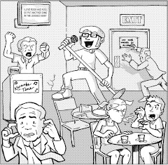
Gene-Fusion A.D. 2310 #3 (vol. 2), May 2003, Beckett Comics
writer: Ivan Brandon
penciller: Neil Vokes
inker: Jay Geldhof
letterer: Ken Bruzenak
color art director: Matt Hollingsworth
colorist: Giulia Brusco
Gene-Fusion A.D. 2310. I don’t get it.
As a fifteen-year fan and student of the comic book as a medium of entertainment and sequential art, I feel like I’ve made a connection with every issue I’ve ever read. Even the most terribly written, most poorly illustrated issue has offered something to my general study of “the comic,” if only to demonstrate how the implementation of the craft is least effective. Or, if an issue is well written and beautifully drawn, but its content or genre isn’t my personal cup of tea, I can usually find an image or a scrap of dialogue that made the read worthwhile. Consider The Nevermen. I made the mistake of reading the mini’s last issue, which was too rife with backstory to stand alone, but even in the thick of plot’s momentum, I discovered a line or two of dialogue that intrigued me – that drew me in, if only for a moment. This is art – overcoming the preconceptions of style, time, and context to connect with the participant. The unique interactive nature of the comic book, from turning the page to following the visual panel-to-panel sequence, simply speaks to me.
Gene-Fusion A.D. 2310 barely whispered in my ear. I couldn’t find that moment, which was, as you can imagine, incredibly frustrating. This issue began with the Gene Fusion team (?) defeating a fusimal, some sort of bull, zebra, lion hybrid. Then, they seek respite in an old style saloon, where the miniscule Ethan is selected to fight in a caged fusion battle – whatever that means. The heroes’ dialogue strikes me as an eager writer’s attempt to purge these characters’ concepts from his mind, and the interplay between two sets of characters is too back-and-forth for me to invest in either one of them. The artwork volleys between a poor Bruce Timm imitation and a rushed attempt to mimic mainstream American manga, and neither really works. The coloring is too unnecessarily vibrant to offer a variant in mood throughout the topsy-turvy story, holding the reader at arm’s length. I just didn’t get what this title was trying to accomplish. The only part I really understood was the penultimate twist, pitting the helpless Ethan in a ring with one of those inexplicable, ferocious fusimals for sport.
That’s it! Despite the violent results, the evil ringleaders of Ethan’s fusimal match are simply cheap entertainment peddlers, like Tina Turner in Beyond Thunderdome, and in an odd stretch of the imagination, my quest to connect with comic books is similar to their futuristic rodeo. I’m on the hunt for amusement! The quest for entertainment! For me, since an early age, comic books have been my art of choice. Maybe in three hundred and four years, bull/zebra/lion grappling will float my great-great-great-great-great-great-great-great-great-great-grandson’s boat. Art may not come in forms we understand, and Lord knows there are plenty of folks that don’t understand comics, but its purpose is still the same.
And you read that realization in real time, folks. When I began this review, I really had no idea where it was going to go. I usually do. I made that connection in retrospect, through analysis, which is what the A Comic A Day challenge is about. You saw it happen here. An association. A fusion.
Monday, September 25, 2006
Subscribe to:
Post Comments (Atom)


1 comment:
Glad to see I'm not the only one one who thought that was a waste of time. I read a promo of it in a magazeen years ago, and liked nothing about it. found that magazeen again, and wondered what had become of the pathetic ting, your article was top of the google sirch list, so aperently it didnt go far.
Post a Comment